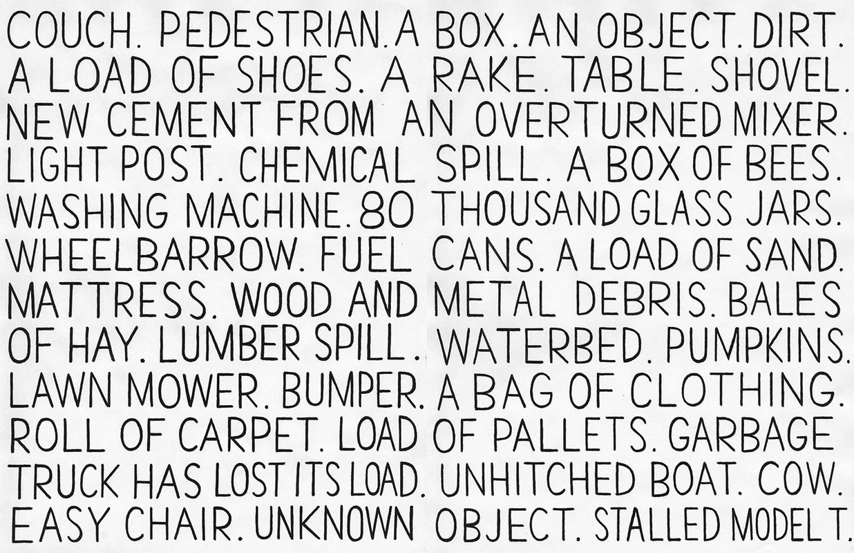
Known for his signature expressionist paintings and drawings featuring cartoon-like imagery, Christian Schumann blends landscapes, still-lives, and figures in his artwork. Born in Rhode Island and raised in Texas, Schumann graduated with a BFA from the San Francisco Art Institute in 1992. With influences ranging from the underground art scene to the animation and video art realms, Schumann creates works that are at once imaginative, subversive and pop-culture infused. Schumann often combines text, abstraction, and figuration to create work that evokes a sense of imagination, and drips with an underlying political and social commentary.
Interview by Mauricio Rocha
What inspired you to transcribe traffic reports, as in your work “Obstacles” featured in zing #25?
I happened upon radio traffic reports on Los Angeles radio stations incidentally as I went about scanning the radio looking for anything interesting to listen to. While most stations were fairly unlistenable, the one thing that universally stood out was the distinctive obsession and personality of the Los Angeles driving experience that stood out in the traffic reports. There was an excited joy in reporting every turned-over trailer full of mangos or stray dog running along a highway. The incidents stood out so much I decided to record them as a list as I heard them.
Do you view obstacles as a negative or positive experience?
Too many obstacles can be draining and I admit I find them to be a negative, although ideally one could take a Zen Panda approach to them, waiting to see if what at first seems to be a negative ends up having a positive effect somehow. The paths of our lives are directed by obstacles to varying degrees, depending upon one’s luck and tenacity.
Why did you want to focus on the text and language of the reports, with no visual representation?
I think reading text describes an image perfectly well in one’s mind. I thought of writing the text as a form of poetry, not exactly concrete poetry but something akin to that. I never considered using visuals and thought of the lines and pages of text as a visual in itself.
I view this project as a form of poetry as well, and sort of an endless one at that. The obstacles in the traffic reveal something about the people of LA in the sense that what they carry with them, matters most to them. Do you think these “obstacles” reveal LA’s personality?
Yes, as you suggest, what physically matters most to people is what they choose to carry with them from place to place as they move. Casualties of these moves constantly end up shattered along the pavement: family photos, clothes, and mementos scattered to the wind and possibly causing terrible accidents along the way and influencing the lives of others.
In Hollywood fashion, I think there is an element of entertainment to the reports. In a city that revels in police chases that are televised as a sort of sporting event, any unusual activity that takes place on the highways constitutes a major element of everyone’s daily lives is noticed and transformed into spectacle. With a general lack of weather to report on perhaps these unusual obstacles fill in as a replacement for “dangerous” weather systems that would ordinarily maintain the interest of listeners.
I noticed many repeat obstacles in your work: varying types of debris (metal, plastic, wooden, glass), animals (dogs, a horse bench, a goose, a box of bees), unknown objects, furniture, and food (avocados, chocolate, carrots, grapes, red peppers, lemons). Do you think these objects are an accurate representation of Los Angeles?
In a utilitarian sense, yes, the city is revealed by its highway detritus. It almost feels like an engineering problem, a side effect of daily use which must be constantly dealt with. Los Angeles is an overburdened hub of transit for international shipping and food transport which results in the occasionally overturned vegetable trailers. Additionally, I omitted many entries in order to avoid too much repetition of the most popular items: gardening equipment, ladders, mattresses and furniture. Lawn care workers are pretty ubiquitous and there is generally a lot of mobility in people’s lives so a combination of flux and upkeep pervades the transit routes. Patterns, habit, entropy at the edges.
Do you have a personal connection to Los Angeles?
I lived there for six years or so with my family and our daughter was born there. I don’t currently have a great personal bond with LA apart from friends that live there.
Do you think the early 2000s were a different time than now?
Not really. I think all the elements that comprise our current state of affairs were in play in the early 2000s as well. If anything I am disappointed in the lack of long term change in our global societies over the past 50 years, let alone the past decade. The patterns of our world are older than we think, its obstacles presented as a spectacle of repetition and entertainment while simultaneously hindering our progress.
That is interesting you find the repetition of society as hindering our progress. That is true because if we keep doing the same things, how will we ever evolve into something different, or better? Do you think that our US society is too comfortable with the familiar and afraid of change?
The structures built by previous generations to inhabit provide for maximum convenience and minimum effort (providing one has funds to support it). Stepping out of these pre-existing paths requires effort, learning and a willingness to discard old things. Those are all very challenging barriers to breaking the system of patterns we all function in. It’s as though a collective neurosis is directing the continuation of increasingly pyrrhic habits of our societies in order to hide us from the reality of what lies ahead.
Take the most common element of highway debris for example: lawn care equipment. These devices are used expressly for the relentless maintenance of a centuries-old European tradition meant to imitate bourgeoise status which exploded across 20th Century American real estate development. Here we are now in the 21st Century maintaining an outmoded status ideal, which apart from being completely detached from necessary to a home environment, also creates a huge economic and environmental burden. Fertilization chemical run off, the burning of fossil fuels to power lawn mowers and their transport, the slow-moving lawn care vehicles also clogging freeways with debris. I believe that the removal of the traditional grass front lawn would have positive repercussions. The benefits would be limited but we are faced with the fact that most aspects of our lives are similarly outdated and the structures built to maintain this toxic civilization are at a breaking point. Human civilization is trapped on the global 405 of its own making.
What sort of obstacles do you see in society’s way in 2020?
We are our own worst obstacle.
After growing up between Denver, Colorado and the Smoky Mountains of Tennessee, Rachel Dalamangas earned her MFA in Literary Arts from Brown University in 2011. She is an author who specializes in creating short works of fiction, non-fiction, and poetry and is currently based out of New York City. Her work has been featured in BOMB Magazine, Bookslut, and zingmagazine, among others, and explores humans’ different states of consciousness. We spoke with her to discover more about her writing process, inspirations, and the future.
Interview by Mauricio Rocha
Your short story in zingmagazine #25, “The Leftovers,” is centered on two elderly couples coming to accept and comprehend the final phase in their life cycle. What do you think the afterlife holds for your characters?
I was writing this story around the time my father was succumbing to terminal cancer. He and I used to go hiking all over Colorado when I was a kid and we would have lengthy, winding, abstract, unlikely conversations about the nature of existence. So I was thinking a lot about what consciousness is and what happens after we die. I think the way the four characters examine the possibilities of the great unknown reflects my agnostic worldview. I’ve always been fixated on death and dying and states of consciousness.
That said, I think reincarnation is my favorite answer. I can imagine Rose becoming an asocial small mammal, perhaps a hedgehog or a mole. Maybe Debbie is freed from the cycle of life and death and transcends into a state of being some sort of otherworldly figure. The Roberts are clearly soul mates, so I think they will have a great love affair in the next life.
I enjoy the philosophical aspect to the story, it has a very stream of conscious feel to it, the way the characters converse with each other and contemplate the end of the world by way of robots, UFOs, global warming or an “orange blast.” It is scary stuff but told in a light-hearted way. Do you like to play with tone and voice in your work, or is something that happens organically?
It happens organically and then I notice myself doing it so I start to do it even more.
Your story takes place near a dog-food factory. Being from Denver, I know that neighborhood as Swansea. Was this one of your inspirations for the setting?
It pleases me so much that you saw the Swansea neighborhood of Denver in the landscape of the story. I was imagining a nameless, nowhere-in-particular place that was an amalgamation of “left behind” places in America I’ve passed through, many of them in Colorado.
I noticed many uses of the color green throughout the story: turtles, a frog, a stegosaurus, teal eyes, turquoise, and even aliens. What does the color green represent for you?
Are all those things actually green? I think aliens are gray, right? Aren’t turtles really more like a bunch of different earthy brown tones? I don’t think green is symbolic of anything for me, at least not consciously. I think all that color is just what my mind’s eye conjures when I think of Colorado.
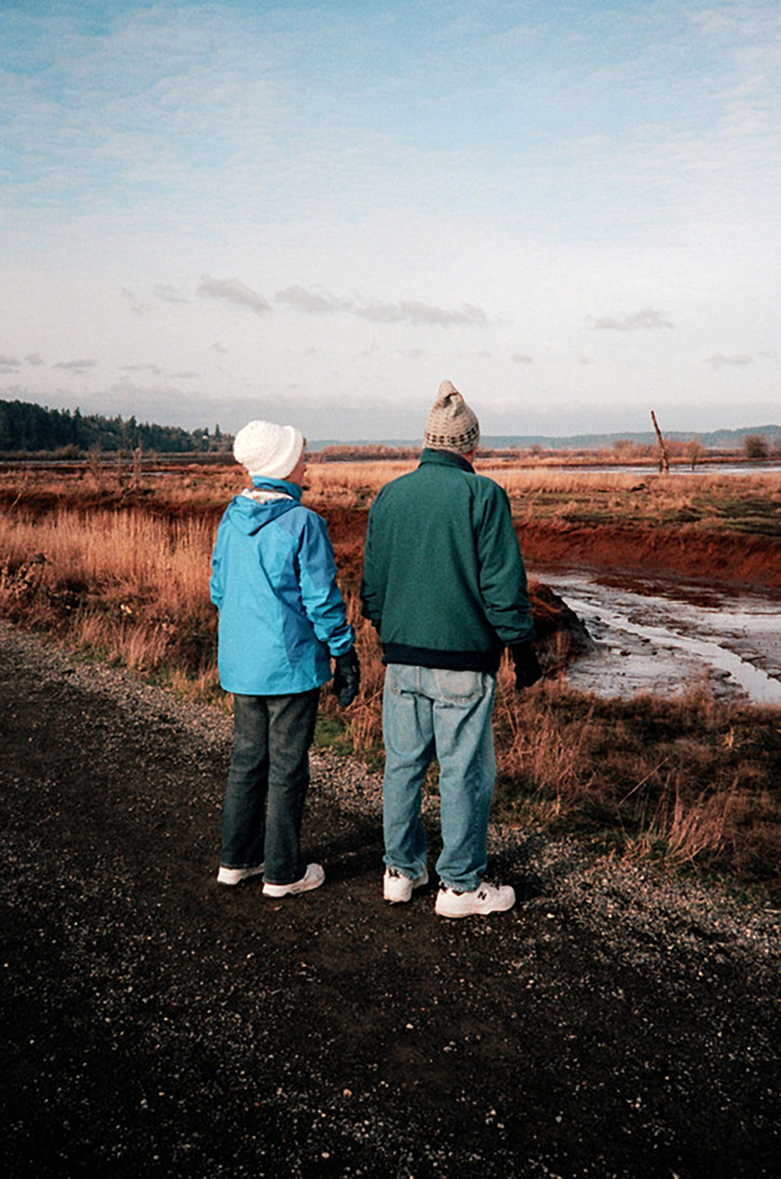
Photo: Levi Mandel
Time seems to be a prominent theme in the story, the passage of it on Earth and the generational gap between the young and old. Do you think time is something to fear or embrace?
Both. Personally, my life always feels like it’s going so slowly, but for some reason it still seems like I’m getting old incredibly fast. But there’s no choice other than to fear and embrace the passing of time. While I don’t look forward to getting older per se, I’m excited about (hopefully) being really old someday because I think I will be great at being a weird old lady. When I’m walking to work on the Upper East Side, I pass these little old ladies in their leopard print berets and big sunglasses and fuchsia lipstick and am taking notes because I’m secretly planning a fabulous wardrobe for when I’m old.
I love that you are already planning your future wardrobe. I look forward to being (hopefully) wiser, and more refined. Is that something you are looking forward to as well? Or do you think that’s something we can start doing today, in our younger years?
I think what’s important specifically in terms of aging well is to drink more water and don’t forget to put lotion on your neck.
The squirrel in the story is funny and it pivots some of the characters against nature. How do you feel about animals and nature?
That’s an excellent question and now that you mention it, I think the squirrel is actually the personification of my own pathetic, toothless misanthropy. When I was writing this story, I was going through a phase where I was trying out nihilism a little bit because cancer is a relevant occasion for nihilism. You can’t stop cancer. You can’t control it. It’s this slow-moving, unstoppable, gruesome, unfair, profane, meaningless disaster that happens. There’s no point and no good reason and no silver lining.
But, there’s also the realization that no matter how big or dramatic your problems feel to you personally, they are of equal relevance to a squirrel’s in the greater order of the cosmos. That sounds so negative, but it’s actually humbling and awe-inspiring to remember how small your existence really is. So for me, it’s important to be emotionally honest about difficult circumstances because sometimes life is just shit and the only way through it is feeling however you feel.
Your story contains moments of magical realism, where dreams and visions blur into real life. Moments like when Rob sees his brother hatch from an egg with egg beater hands, or the light Bert sees at the end of the tunnel. Do you view everyday life as magical, or extraordinary?
I think I’m interested in how the surface texture of reality has changed rapidly as a result of technology. I’m interested in how literary realism attempts to respond to an accelerated, interconnected, image-driven world. I’m also interested in how consciousness works and how the human mind constructs reality especially as technology improves at replicating the human mind and the human mind changes in response to technology.
So I like to explore states of consciousness, and I like to write narrative circumstances where alternate interpretations of what is happening are all equally possibly true and where there isn’t necessarily any need to resolve the truth.
How has the novel, The End of Vandalism by Thomas Drury, influenced your writing?
Well, it’s an extraordinary work of literary realism because of how Drury cannily toys with style. The End of Vandalism isn’t a book I’m sure how to approach critically. It’s a book I keep near my desk and read a little of at random to get the prose in my ear before I start writing. There’s something very lively in the beats of wry, easy humor. It’s the kind of book that wakes me up and reminds me of how much is possible in fiction. Also, it’s one of the most hilarious books I’ve ever read.
Are there any upcoming projects you are working on that our audience can look forward to?
I’ve been working on a short story all year long and it’s still not done. I am probably the slowest writer in the world.
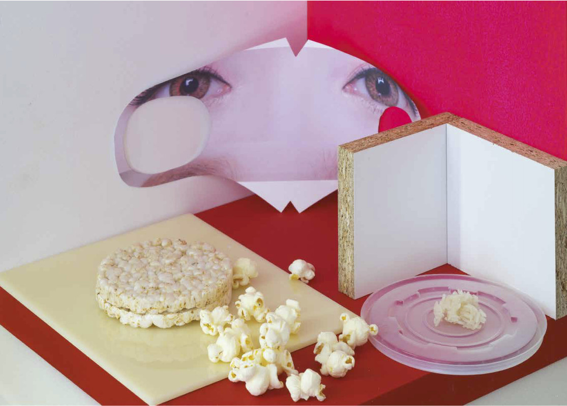
Photo by Tomas Soucek
Romana Drdova is a visual artist from Prague, Czech Republic and has traveled to Seoul, China, Paris, New York and beyond studying and perfecting her craft. Her work explores different modes of communication, expression, and transparency in a “data smog” filled modern world. Using her 2D and 3D art installations, photography, fashion design, assemblage and mixed media, Drdova questions what it means to live in this day and age, how we interact with our environment, and how our surroundings impact our personal experiences.
Interview by Mauricio Rocha
Your work in zing #25, “Mapo Tofu Masks: An Asian Love Story,” explores people’s relationship with technology, food, beauty, fashion, and more. How has your time in Korea and Prague influenced your work?
I went to Seoul as a student with a scholarship and spent an absolutely exceptional time there. I learned how Korean people take care of themselves in the terms of how they eat, how they care about their skin, how important is for them to spend time together, among other things. I couldn’t have imagined how much it would influence me to stay in Korea. When I came back to Prague, where I am based, I started to understand that my destiny is to cultivate my work through this fascination and emotions that I have from Asian culture. I would say that I work like a translator of these emotions to my own language or maybe a better explanation is that in my soul is a recorded hardware with information which matches with those Asian memories. Someone might call it karma.
I enjoy seeing the inspiration from your environment in your work. What are some of your favorite places to visit and work in around the world?
I like the contrast of places I’ve had an opportunity to visit. I have a special bond to China. I consider this place to be the beginning of our civilization and it will probably be associated with our demise . . . but perhaps it should be like the natural circulation of everything, life and death. In Asia I feel as my real self and calm. On the other hand, I love the hustle and bustle of New York and the openness in communicating with people, the freedom they show on the streets. This makes it extremely unique and inspiring to me.
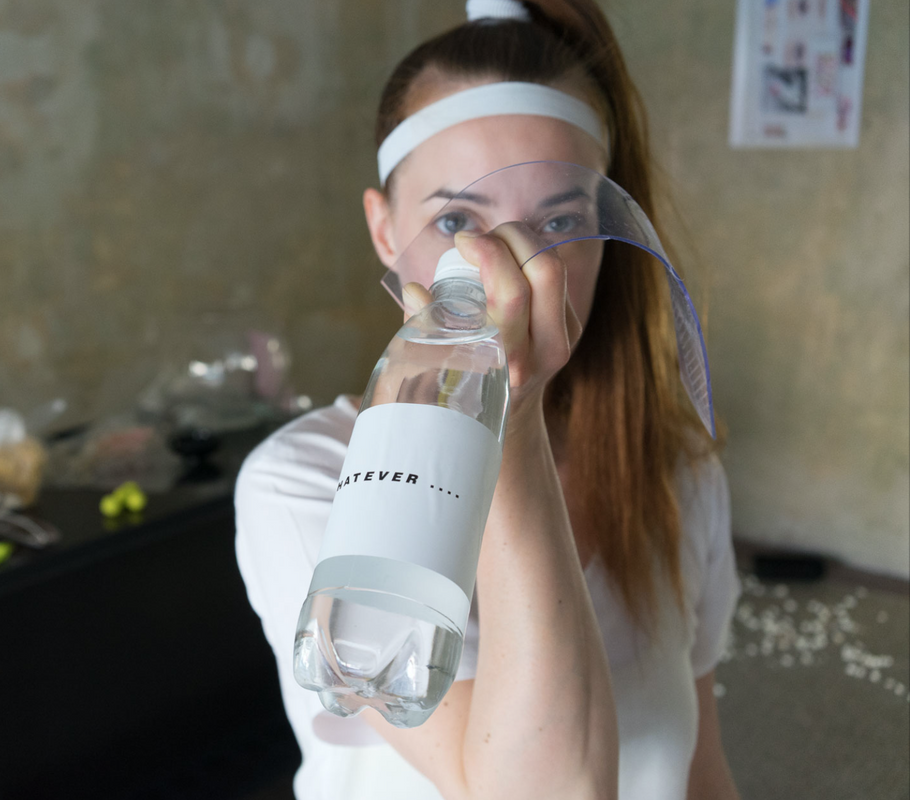
Photo by Tomas Soucek
The face masks you designed are an extension of your work in the magazine, provide a 3D element, and can even be categorized as an art installation. Does your artwork usually feature a combination of art and fashion?
I had to find my own way of expressing myself as a necessity. The combination of art and wearable objects that are fashionable has certainly defined me since my childhood. I am not someone who speaks loudly and is confident in verbal expression. With pictures and text I can say what I can’t verbalize and if I can wear it as clothing, then it is easier to express who I am. This is self-confidence. I always get drawn to a more complicated approach to creation, using layered meanings, but I believe it’s very similar to learning a different language. You meet, fall in love and learn from each other. During my practice I have met so many interesting people and stimuli with similar feelings and I can give them a new insight into the matter. And that’s why I do it. I want people to wear my clothes, to see it in surplus value and to be happy with them. I don’t want to exhibit only in galleries where you feel a distance to objects. I want people to have a real experience when they buy my product.
Do you usually take the photos in your projects yourself or weave them together as a collage?
It depends on topic. Usually I spend days to find visual material that fits to my ideas. Actually I prefer both. My favorite discipline is assemblage; it is more combination 2D with 3D objects in the space or on fabric. After that I am able to sew clothes with clearly given motives or to cut fabrics freely and the result is intuitive improvisation. Now for example I collaborate with French performer Arianne Foks on a series of coats, we are writing texts and taking photos as daily memories. The topic of our work is current and alarming subjects such a global warming, women’s rights, breaking social values, false and true, transparency etc.
You mention a “data smog” in our recent climate, what do you mean by this?
“Data smog” is more metaphor than literal expression. I use this phrase as an explanation for an endless number of stimuli overloading our organs under the weight of everyday pressure that society creates. I first used this term in work from 2015 when I created protective shields against the bustle of city. They are made of plastic with headdress and you can decide if you tilt the shield down or allow people to see your face. It has a purpose: you can see people, but others can’t see you. I was confronted with controversial views from passerby. But I believe we all have the right to privacy and rest when we want it and no one can complain because I look differently than others.
Your work features several foods: sushi, rice cakes, popcorn, rice, gummy sharks, and marshmallows. How do you view food in this “love story” you’ve created?
Eating is very important for every culture regardless of which content it is. I used these fancy motives thanks to their easygoing narrative. There is an immediate link to Japan, infantile style or kind of perversity. I started with masks as my diploma work 2017 as a part of a bigger project with trash recycling. I spent a few months in Beijing before that, and my work was inspired by the inability to keep this incredible amount of newly made things and that which we throw away on this planet. I rented the space and opened “shop” with trash I collected for 5 months. This trash contained plastic bottles, polystyrene, all kinds of weird plastic materials . . . and I installed them at the shop. Customers could come in freely and buy it, take it, and discuss its problems. And of course, part of this project was cooking and preparing of sushi, because it’s easiest and effective. Now I am preparing my second collection of masks as a continuation of this “love story”.
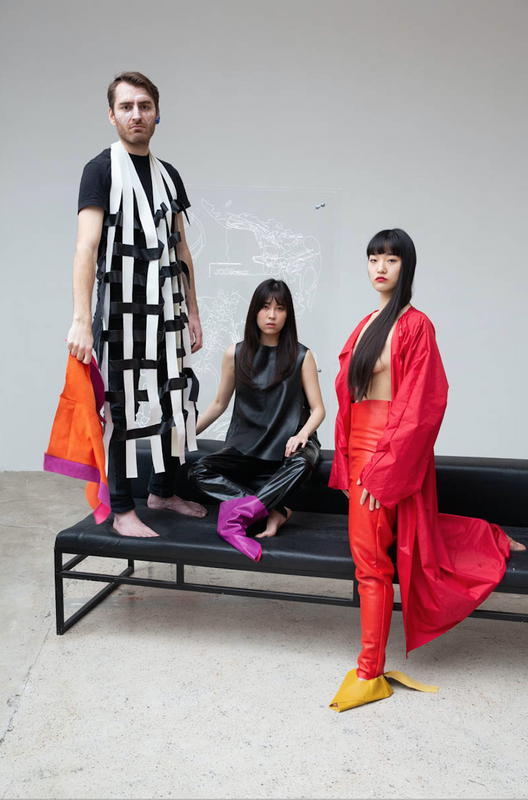
Photo by Julie Hrncirova
What are some of your favorite foods?
I prefer Asian food preparation. My kitchen looks that way too. Haha. I like to discover new tastes, for example, I am currently fascinated by varieties of flavors from Laos, which I first tasted at the Lao Siam restaurant in Paris. They offer banana salads and such delicious tapioca desserts; it was an absolutely excellent experience for my taste buds.
I think a universality in your work is that we are all looking for love, and for food, as both are essential to our survival as humans. Would you say that fashion and art are just as essential for humans?
I would not say that fashion and art are essential for humans. I would say that they are surplus value that we can enrich our lives and minds with. It is a nourishment for our spirit and inner world that each of us can cultivate.
What projects are you currently working on and what can readers expect to see from you in the future?
I started new mask designs for 2020, now I’m preparing cuts for coats with a similar theme. In spring I have a big project based on the circulation of materials supported by the National Gallery in Prague. A great inspiration for this exhibition was staying in New York and my own work from materials that I had the opportunity to obtain at Materials for the Arts. I would like masks and clothing to be brought to the attention of as many people as possible and to make them happy and enjoyable.
Since 1989, Craig Dykers has established architectural offices in Norway, Egypt, England, and the United States. His interest in design as a promoter of social and physical well-being is supported by ongoing observation and development of an innovative and sustainable design process. As one of the Found Partners of Snøhetta, Craig has led many of Snøhetta’s prominent projects internationally, including the Alexandria Library in Egypt, the Norwegian National Opera and Ballet in Oslo, Norway, the National September 11 Memorial Museum Pavilion in New York City, the San Francisco Museum of Modern Art Expansion in California, and the Ryerson University Student Learning Centre in Toronto, Canada. Recently Craig has led the design of the new pedestrian plazas in Times Square and The French Laundry Kitchen Expansion and Garden Renovation in Yountville.
Interview by Brandon Johnson
Your work as an architect is well-known. But your project “Observationalist” in zingmagazine #25 features your photography. What sparked your interest in this medium?
Photography in and of itself is not a standalone technology for observation. I use multiple methods of observing people, activity, and things. Sometimes I sketch, sometimes I commit things to memory, I might be listening to sounds around me so I have recorded audio in the past. And the way I use photography is to capture a very quick snapshot of something. If I need to move quickly, the camera can capture something that I see and allows me to continue moving. Whereas sketching and other types of technology take up more time. I would say that it’s more about capturing moments in very quick succession. It’s a form of note-taking. I don’t see these photographs as a form of artwork or a representation of the photographic medium. It’s the content that is driving it. I am not much of a photographer otherwise. It’s very important to have the right kind of camera. So as cameras became digitalized, to a certain extent it became easier to take these types of photographs. You can be walking and a take a photograph in a different direction, so you never need to hold the camera to your eyes. It’s just more relaxing. Not only for me, but also for people on the street. As soon as you put a camera to your eye it changes the context. I’m trying to capture things as much as possible exactly as they are in that moment in time without preconceptions. Free of the distraction of the camera to the subject or my own artistic intent. When you’re walking with a camera at your waist, it’s very hard to control. You’re not thinking about how to frame the photo. You just snap it. With a couple of those photographs it does amaze me sometimes when you look back at them after you’ve taken them that you’re able to capture an image that seems well-balanced or seems to be as if it were posed or at least framed in some way. I think that’s an interesting point. You can use a quick response technique to create something aesthetically appealing. There’s something about intuition, and not just of the mind but of the body.
“Observationalist” gathers your conceptual yet casual photos of people and things, organized in loose, and often humorous or absurd, association. Had these associations crossed your mind previously, or did it materialize more as you organized this project?
I would say more intriguing to me is not one image in itself, but the comparison of the images to each other. Many of the photographs are of humans. And many of the photographs are of objects that humans make or acquire. The artificial world and the human world being compared to one another. There are invisible strings of meanings between them. Sometimes I try to make those connections more obvious. It tells us something about intimacy, which is a challenging subject. For those of us that live in cities, intimacy is a luxury. That’s part of the thinking for those images being next to each other. Again, I don’t see these entirely as works of art or photograph. I see them as fictional narratives. I don’t very often show them. The last time I did that, by framing them and sticking them on the wall, would make it seem like a photograph, which isn’t necessarily what they are meant to be. So I printed them very, very small, about the size of a thumbnail, and in a strip, like a ribbon. From a distance it just looked like a thin colored line, but when you got closer could see they were photographs. In order to actually view them I gave people prescription glasses that I found at a junk sale. The prescriptions would different, so you would need to stand closer or further accordingly. Then you could go along and see these images magnified. There were a couple different kinds of frames. Some were horn-rimmed, and others 19th-century wire-framed. You could test out a couple different pairs. In any case, you had to get very close to see the pictures. But the point was that it was a different experience than seeing them in a gallery on a wall.
I can see why this would work given their sequential nature. And I can see why it worked so well for our format as a magazine, which is also sequential in nature. Each photo has its own story as well.
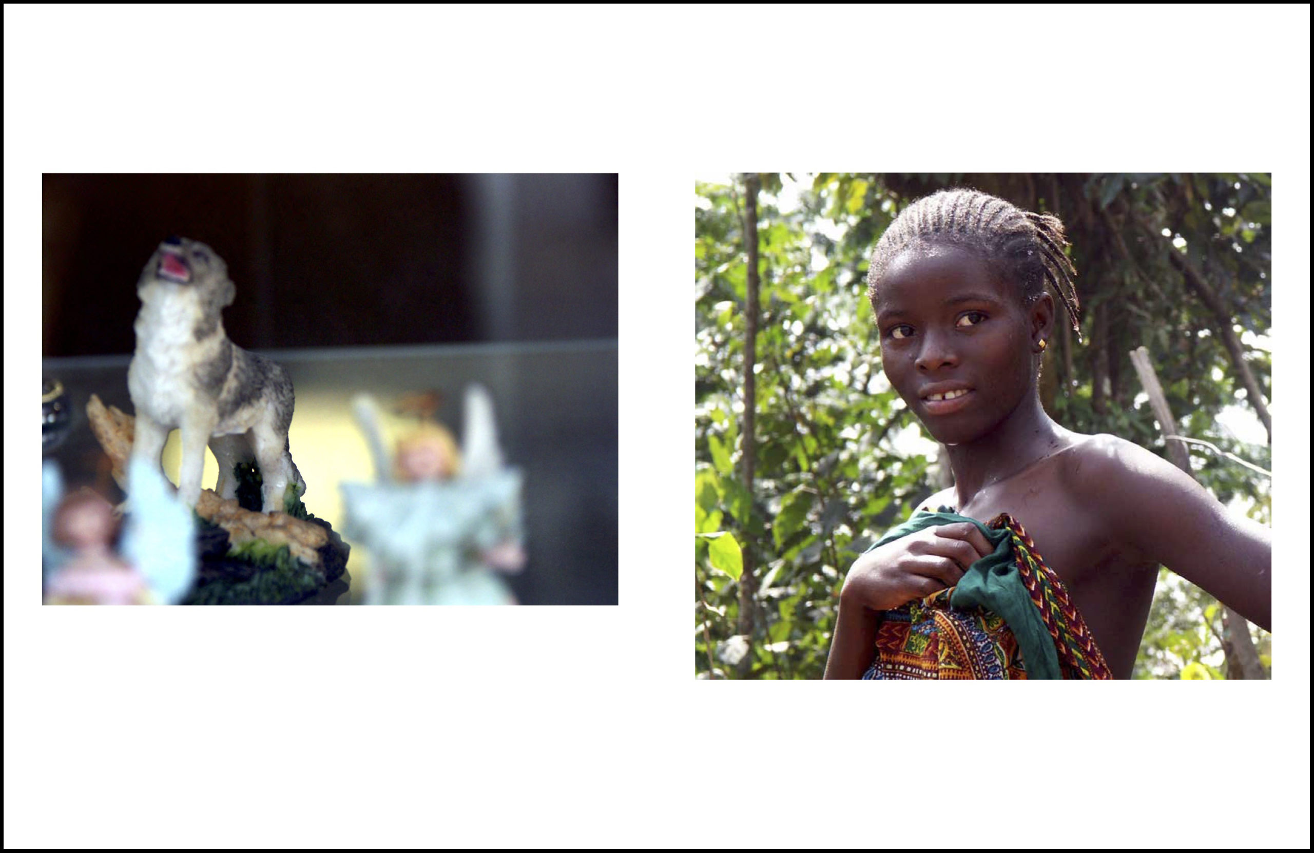
I love that fact that you flip through the project one after the other, and there isn’t a clear description telling you what each one is. The size of the magazine is very nice as it allowed us to use white space in the layout, which I thought was important. There’s a lot of air. And the photos obviously have stories for me. Each is quite special. One photo is of a young woman I met in Guinea, West Africa. I had been traveling through in the countryside, and part of the reason I was there was to understand better what drove people in countries like Guinea and around the world to leave the countryside for cities. We like to talk about how the majority of people of the world live in cities, over 50 percent, but I was trying to understand that statistic, because many people say it with great pride, but I thought there was something strange about that. I went out into the countryside of this place that was just stunningly beautiful, and yet so many people were leaving their villages for the capital Conakry. I was interviewing people and talked to her and she said most of the young men had moved away due to the idea of economic improvement. When I asked what this meant, she didn’t really have an answer. They go to the city looking for money, and in fact don’t find it. It is a complex situation. And all of this beauty and contradiction I read when I look at this image. These stories in my mind are not anywhere in text form, but I feel is embedded in the images somehow.
Your account from Guinea brings me to how the act of observation is integral to your design process, social interactions and how people live. As busy as you might be overseeing a big architectural office, and with other distractions vying for attention, do you make a point to set aside time for observation?
I try to as much as possible. It gets harder and harder as time goes by, but I do. And I’ve even done very unusual things. For example, I’ll fly into a place and instead of taking ground transportation of any kind from the airport to where I have to go, and I have a lot of time, I’ll walk instead. You sense a place in a very different way walking through parking lots, the leftover spaces in between parking lots, through loading docks of some strange big box building to get to another street. Crossing into some forgotten about residential district near the airport, and continuing to walk along larger roads trying to avoid dangerous situations with cars, along the side of the freeway. I’ve spent sometimes five hours walking. I’ve never had a rolling suitcase, only a shoulder bag. It allows me to be pretty mobile when I need to be. So that also allows me to observe things in a very different way. The problem these days is like many I held off on using my phone as a camera for so long, and unfortunately now am using it more and more. I liked holding a camera in my hand. It was heavier and you could feel its purpose. The phone has so many purposes, it’s just watering everything down. Furthermore, the reason you take pictures is so broad now—some for yourself, some for your friends, some for social media, some to record something you need to give someone. It’s now harder to remove the images from your phone/camera. I haven’t been carrying my camera as much as I used to and am a little sad about that.
An object with a single purpose infers more intention?
I want to get a typewriter too. I’m a really good typist. I learned at school at a very young age. And I learned on a typewriter. But that’s another example of an object with a single purpose. You can only write things. You can’t stop, push a key, and then browse the internet, like a computer does. So I’m thinking about reintroducing that to my life. A typewriter and getting my camera back out. This, by the way, doesn’t mean I don’t like computers and other technology, I just find that balance is important. And some of the photographs are talking about that—the difference between a handmade or authentic situation versus an artificial one.
During our initial meeting for this project, you told us about your collections of tchotchkes. In your essay, you say that “looking at man-made objects reveals our deeply seated motivations.” I’m curious as to how these two things might relate—collections of small, decorative objects as manifesting something deeper, and how might this relate to the photos in the project?
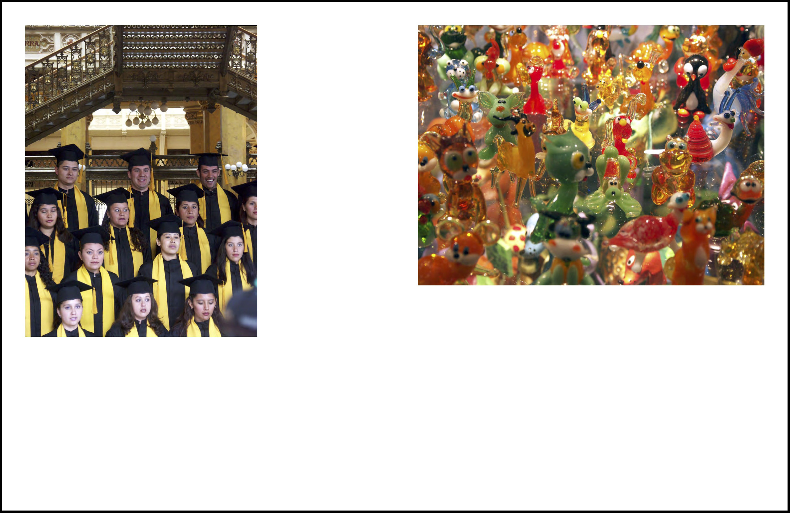
Well I think one of the reasons that we occupy our minds with art on all of its levels is that we want to learn something about ourselves and the people around us somehow. We want to dig deeper into our minds. Some people have dug into their mind for a long time, so they have to dig deeper. And that type of art can be more conceptual, and harder to envision what it is. But many people don’t have the luxury of digging into their minds every day, trying to understand their existence. They have to work like hell to put dinner on the table. Those people see art as something that is just letting them understand who they are and that they have some kind of significance. They don’t like to be alienated. It’s not art the way most of us would think of it, but to them it’s a form of art. An object, something that was made by someone or something else, and it tells them a little story that they can imagine. A lot of these things that I photograph, the kitsch objects that a large percentage of the world buys. And I say that, because everywhere I go, anywhere in the world, there are these things. Not just in Philadelphia, or Hamburg, or Venice. They’re in the most remote places. Clearly, they have significance for us. They tell stories of fantasy and romanticism, how we project our own desires, our own view of ourselves, into the objects that that fill our spaces. These are very inauthentic things that still are authentic, in a way. The trolls kissing on the bench are only objects, but similarly, all of us want to have that moment to have that kiss and not care if anyone is staring at us. Or it’s the ceramic dancers next to the women with similar make-up. They have the same eyes. Or the pictures of the graduates in Mexico City next to the glass figures from Krakow, Poland. The people are dressed the same, but each feels very different and special, just like all the glass animals. There’s something they are desiring, and if that doesn’t happen then maybe they will go out and buy these glass animals and fill their shelf.
Ultimately the meaning of these objects only comes in relation to people and the meaning these people impart on them?
That’s correct. And then the question is whether this is true for anything—conceptual art, vernacular architecture, contemporary architecture. It’s true for everything. But we just pretend there’s a civilized way of seeing things and a less civilized way of seeing things, but that’s in my opinion an artificial distinction.
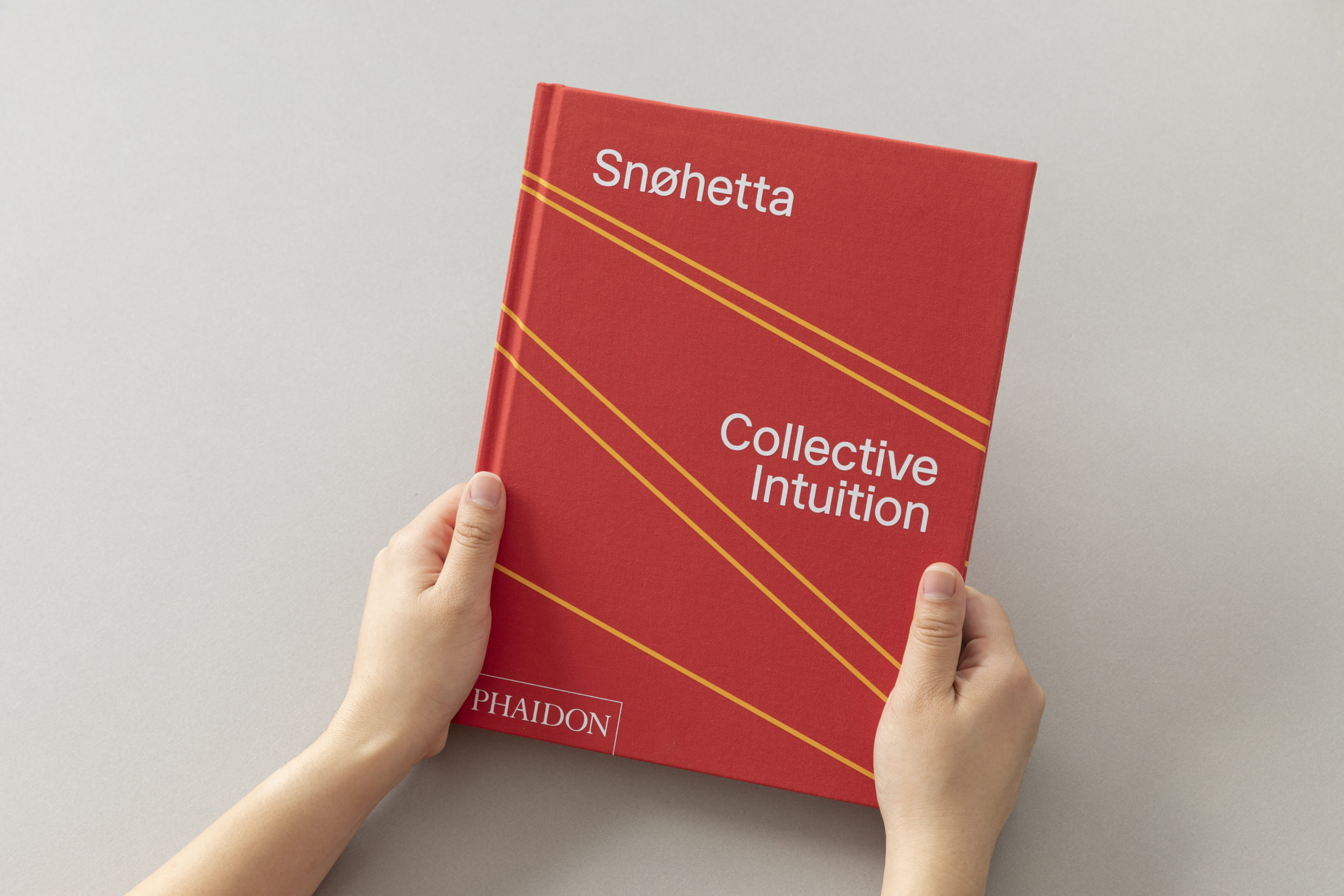
Photo: Michael Grimm
In other publishing news, Snøhetta has just released a new monograph with Phaidon, covering 24 projects from the last decade and their evolution over time. Can you tell us more about that?
These are all built projects and furthermore all documented in their final forms, more so than the design process. As much as possible we try to capture images of our work with people involved. And this happens after building is completed and in operation. The emphasis is with trying to connect people with the building. And you need to think about all the levels of being, the way we exist in the world, in order to create the right environment. That is partially why I take all these pictures of ordinary people; there is value in observing ourselves doing seemingly simple things.
The projects in our book are from throughout our history and are divided into three themes to give further insight. The reason for this is that if we tried to unpack every project and all of its themes it would be hard to read. So we singled out some of the themes, for example politics in the space of society and civilization and how you negotiate that. Another is about generosity, and how if we are to socialize as creatures in larger civilization, there has to be generosity in order to survive. We try to create places that allow for that and collective ownership. The last has to do with our transdisciplinary process and how having multiple groups working together in a studio, as a collective, impacts the work. Many architects think they can do everything themselves and only need other people to tell them they’re right. We don’t do that. For instance, we have landscape architects working alongside architects, informing each other, arguing with each other, pushing the limits of what we do. We have branding and graphic design, we have product design and interior architects, all working together in a collective manner.
How important is publishing to Snøhetta’s practice? And did the office learn anything from the process of putting together this book that might benefit current or future architectural projects?
We have a history of not publishing. For a long time, we said, why should we publish? We design buildings. Other people can publish if they want. We didn’t want to self-author it. This was part of our feeling that we didn’t need a manifesto, but that was at the very beginning when we were younger. As we got older we realized that publishing was an important part of the process, not only for sharing our work with others, but also learning it ourselves. Because in making a book, when you are forced to put the work into words, and choose images to accompany these words, it allows you to look deeper into your motivations and the consequences of what you do. So we have started to publish more books recently. For example, two years ago we did a book on our work on the new San Francisco Museum of Modern Art. That book is different from our monograph because it focuses on only one type of project and our thinking behind making a museum. So we publish in part because there’s been greater demand, and the practical matter of more people wanting to understand our work. The books allow us to give them a certain degree of information. But the real value in publishing is about writing and words. Getting used to an editor, having a collaborative engagement with someone outside of the studio or our life, that pushes our thinking in many ways.
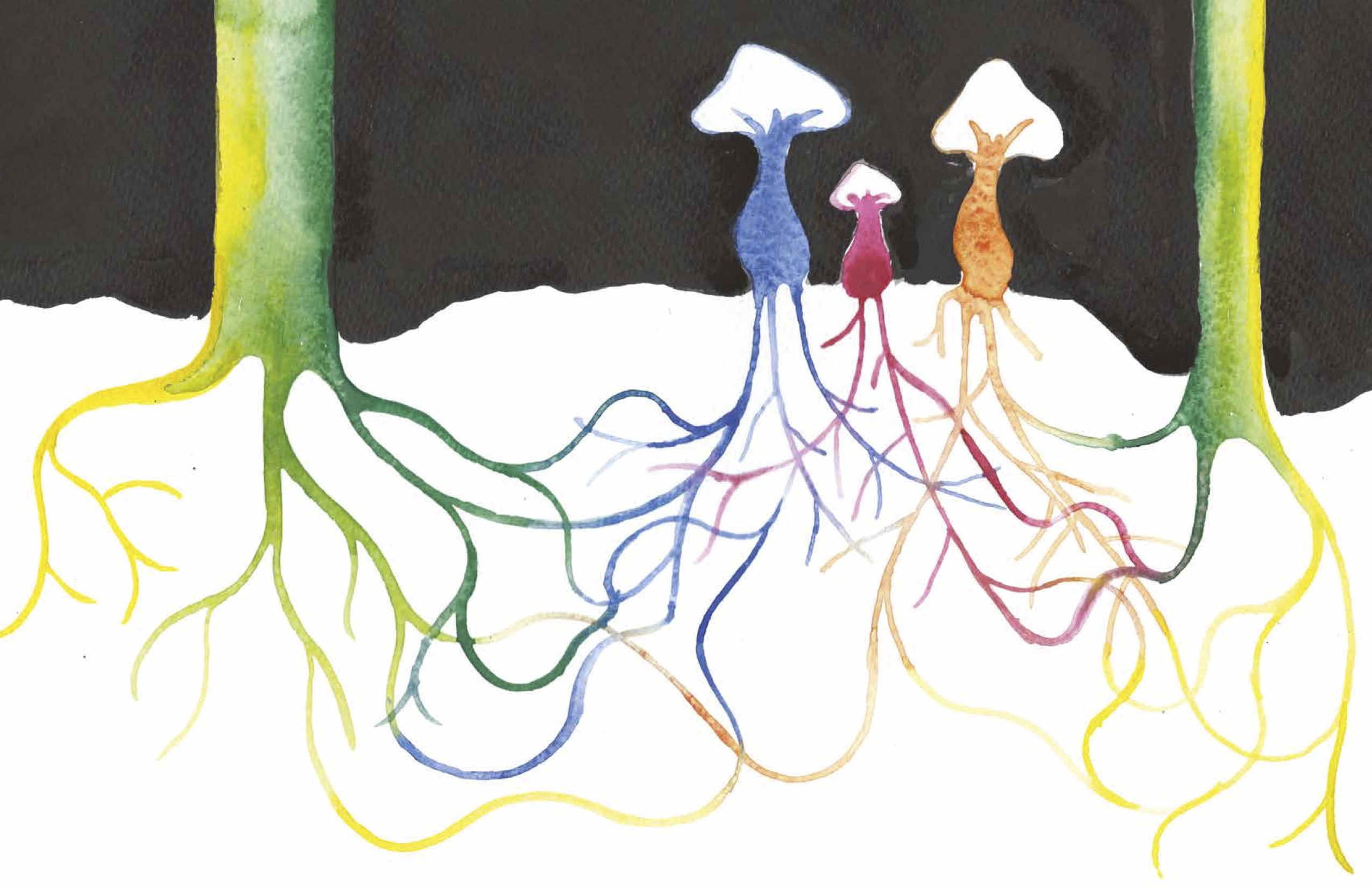
Sarah Staton is an artist working with the social potentials for sculpture, and balances public commissions with studio work and occasional iterations of her ongoing SupaStore project. Her project in zingmagazine “Mycology and Dendrology” celebrates the newly identified wondrous hidden underground communication networks that researchers such as Suzanne Simard are identifying through careful study in recent years. Sarah Staton lives and works in London, and is Senior Tutor in Sculpture at the Royal College of Art.
Interview by Brandon Johnson
How did you first learn about mycorrhizal networks, and what about them sparked your interest as a subject for art?
Around four or five years ago I came across a text that talked about the ways trees send nutrients and water to each other through their root networks and via the nets that fungi make under the forest. This fascinated me. I looked for more information and found the work of the ecologist Suzanne Simard who has been mapping and researching this area for 30 years—her Ted Talk is excellent. As for taking this knowledge as the subject for watercolor and ink drawings, I have enjoyed the visual correspondence between the forms of mycorrhizal networks and the diagrammatic networks that I doodle in academic meetings, which also correspond to the nets that spiders make when they have been fed various drugs. These “Spiders on Drugs” nets provided subject matter for an early set of watercolor and ink drawings. Mycorrhizal networks are a vehicle for me to go forward while go backwards as it were to revisit a visual form that resonates with me, and to do it in a slightly new way.
So would you say your recent drawing practice is about representing interconnection?
I would describe these drawings as pictorial representations, and a vehicle with which to enjoy the play of color and line on paper. In this particular set of drawings interconnectedness is represented, and they are a visual note for speculations on non-sapiens sentience.
How does this fit in with your other work?
Drawing as a way of thinking—I use drawing in a number of ways, sometimes to develop ideas and methods for making sculpture, sometimes as a kind of pictorial diary/note-making, and sometimes in small series to explore ideas. The mycorrhizal networks drawings are one such small series. I see a link with the notion of interconnection with the series “Spiders on Drugs” from 2001. The mycorrhizal network drawings also connect to an exhibition that I made in 2007, “In Situ Ex Situ,” at Mount Stuart, Isle of Bute, in which I thought about the journey living wood takes from forest to home. For this exhibition, I created sculpture from pine furniture, manipulated with digital cutting (CNC), alongside Alpine style furniture that is essentially wood dust held together with resin, tracing a kind of timeline from majestic living wood to abject reject domestic furniture.
It’s interesting to think of something as simultaneously a living thing and material. A transformation takes place where organism becomes commodity, not only in name from tree to wood, but also a separation in the mind where these somehow are two distinct things where origin is lost. The essay in your project expands upon this subject. Are you advocating here for sustainability or at least a consciousness surrounding the consumption of natural resources?
To take your last point first, one might say that we the humans suffer from exponential entitlement issues: our destructive domination of the animal kingdom and our planet’s resources is taking us to the point of no return. How might we step back from the brink? Considering these nascent understandings of communication networks that clearly exist between living organic matter and between living creatures whose languages we don’t understand and sometimes can’t even hear, is helping me rethink consciousness in terms of consumption of natural resources. I find these areas of discovery incredibly exciting in terms of their potential for us to change our behaviors going forward.
In terms of considering the relation between organism and commodity, I am very interested in Peter Linebaugh’s writings in which he studies historic processing of natural resources, along with the labor issues involved in these processes. His writing reveals in some detail the specifics of working with material and in the main he looks at the time before oil transformed our range of material options so exponentially. The pernicious effect of adding oil, petrol, and their by-products to our material register has been and continues to be corrosive on a devastating scale.
Your project in zing uses a rainbow spectrum of color that bring to mind a utopian visual aesthetic associated with the hippie culture of the 1960s. Was this in any way an influence here?
Absolutely this is a direct associative reference, the aesthetics of hippie culture, that point toward content, to name a few examples—in the UK, Oz Magazine, IT and Spare Rib, in the US Bijoux Funnies, the Whole Earth Catalog—this explosive moment post-WW2 for western counter-culture. For Millennials and Gen X-Z, the rainbow spectrum may have a different reference, signifying LGBTQIA+, the double-edged sword of identity politics?
What projects are you engaged with currently?
I’ve been thinking recently about the Bauhaus education model which taught through material knowledge. As we all slip behind screens, how can retain the value of this way of thinking, in education and in the wider world too? In terms of art making, I am primarily creating commissioned public artwork, which I see as a form of applied art that I approach through the filter of material in relation to site. My tendency is to create useful sculpture for the public realm, useful places for doing nothing, that can be enjoyed bodily, structures that can be sat on, or walked on or under. I am particularly interested in inherent material attributes and how they can add enjoyment, bring pleasure, for example I am working with heat retaining terra-cotta on sculpture—making spaces that can be enjoyed into the evening, when the retained heat releases back into the bodies of those who linger and languish late in the evening.