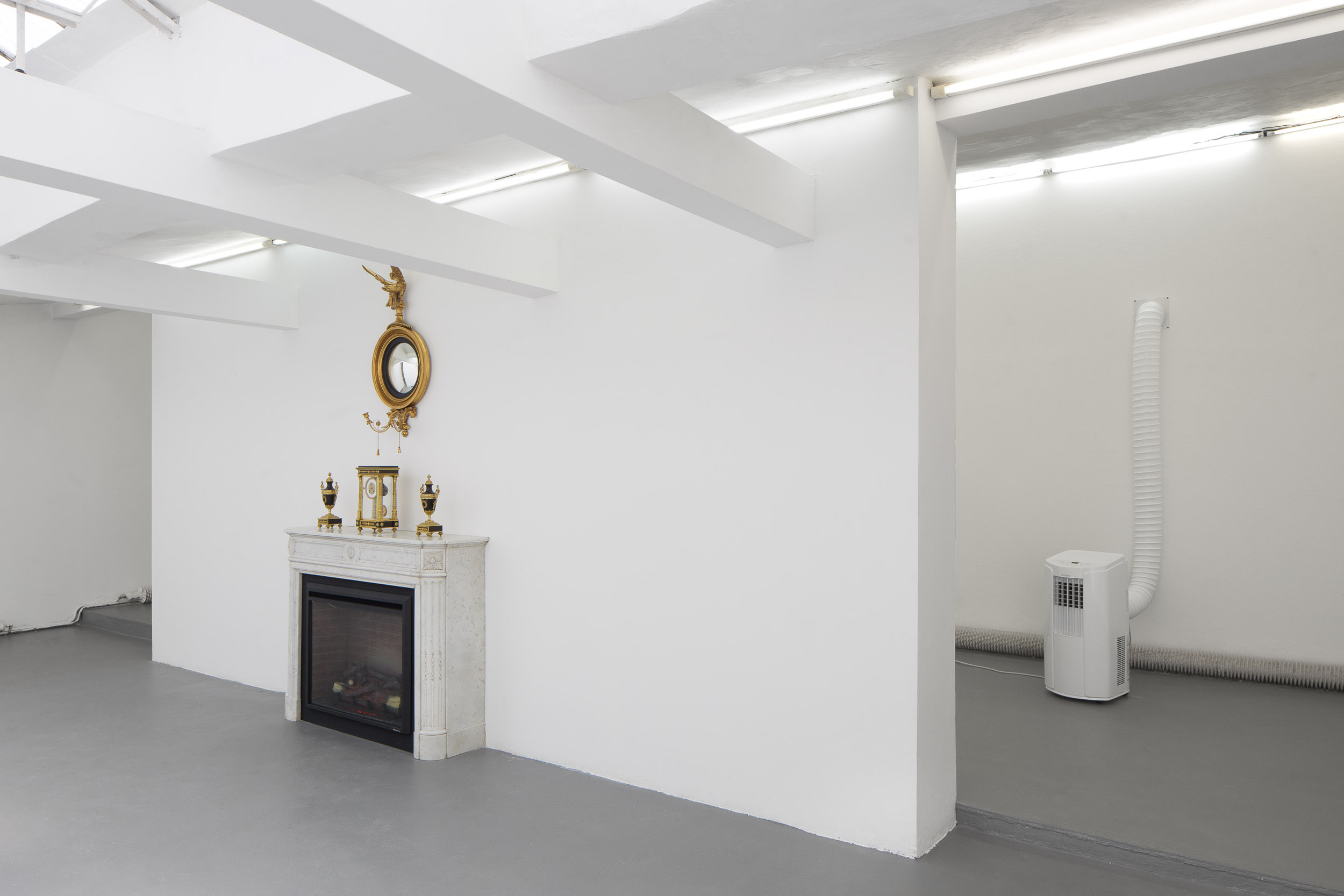
Devon Dikeou “Tricia Nixon: Summer of 1973” installation view
Cortney Lane Stell is Executive Director and Chief Curator of Black Cube, a nomadic contemporary art museum based in Denver, Colorado. Michal Novotny is Director and Curator of FUTURA Center for Contemporary Art in Prague, Czech Republic. In their first collaboration, these two organizations have partnered to host Black Cube fellow Devon Dikeou as a FUTURA artist-in-residence in Prague. This resulting exhibition, “Tricia Nixon: Summer of 1973” is on view at FUTURA through September 16, 2018, alongside concurrent exhibitions by Andrew Norman Wilson and Lenka Vitkovka.
Interview by Brandon Johnson
In collaborating to produce Devon Dikeou’s “Tricia Nixon: Summer of 1973”, each of you are coming from very different cultural and historical backgrounds. How do you see an exhibition focusing on late 20th-century American politics relating to its context of Prague, Czech Republic?
C: The collaboration is simple—it focuses on an exchange between two countries, two nationalities, two artists, and two curators. Part of the vision of the exchange is to create conversation and share in the act of giving one thing and receiving another. So, this exhibition is part of that larger project.
In relation to the exhibition, for me it is mostly about memory—Devon’s childhood recollection of two concurrent news stories . . . a gas crisis and another about Nixon’s daughter keeping a fire and air conditioner on in the White House during this time. For me, seeing the architecture in Prague oozes with historical memory, ranging from Baroque and Renaissance architecture to more contemporary additions coming from the country’s Communist era.
This sense of the haunting of the past is very present in my experience of Prague and also these artworks. It reminds me of a text-based artwork by Anthony Discenza who produced parking signs that said “this is about something that happened a long time ago that continues to affect us today.” In many ways, I think these works also touch on ongoing global, social, and political issues.
Though the stories that Devon culled together are rather obscure—especially for a Czech audience—the air in the exhibition space is opulent (literally warm and cool). This thread roves through the exhibition and gently teases out concepts of ecological challenges, service, and personal comfort—all of which are concerns that traverse national borders.
Michal, I wonder how you read all of this . . . do you catch the same drift? Does the exhibition feel American to you?
M: It feels very American. But, if not the world, at least the society I live in, has been culturally colonized by the USA, so it doesn’t feel incomprehensible. Also, American politics is very present here in the media, maybe even over-present, at least what comes to the real material, economical, locally-political impact, so for me the parallels with the current US political situation are somehow explicit. Maybe even more than they really are there.
However, I do consider the program locally, and what is important for me is that Devon’s exhibition presents something artistically familiar but also uncanny. We have a long history of conceptual art, it is still the dominant discourse, but this exhibition shows something a bit different. Maybe it’s the unnecessity to poeticize everything, there is something a bit more raw in the situation encountered. Even if it may seem narrative, it’s ultimately not-so-narrative.
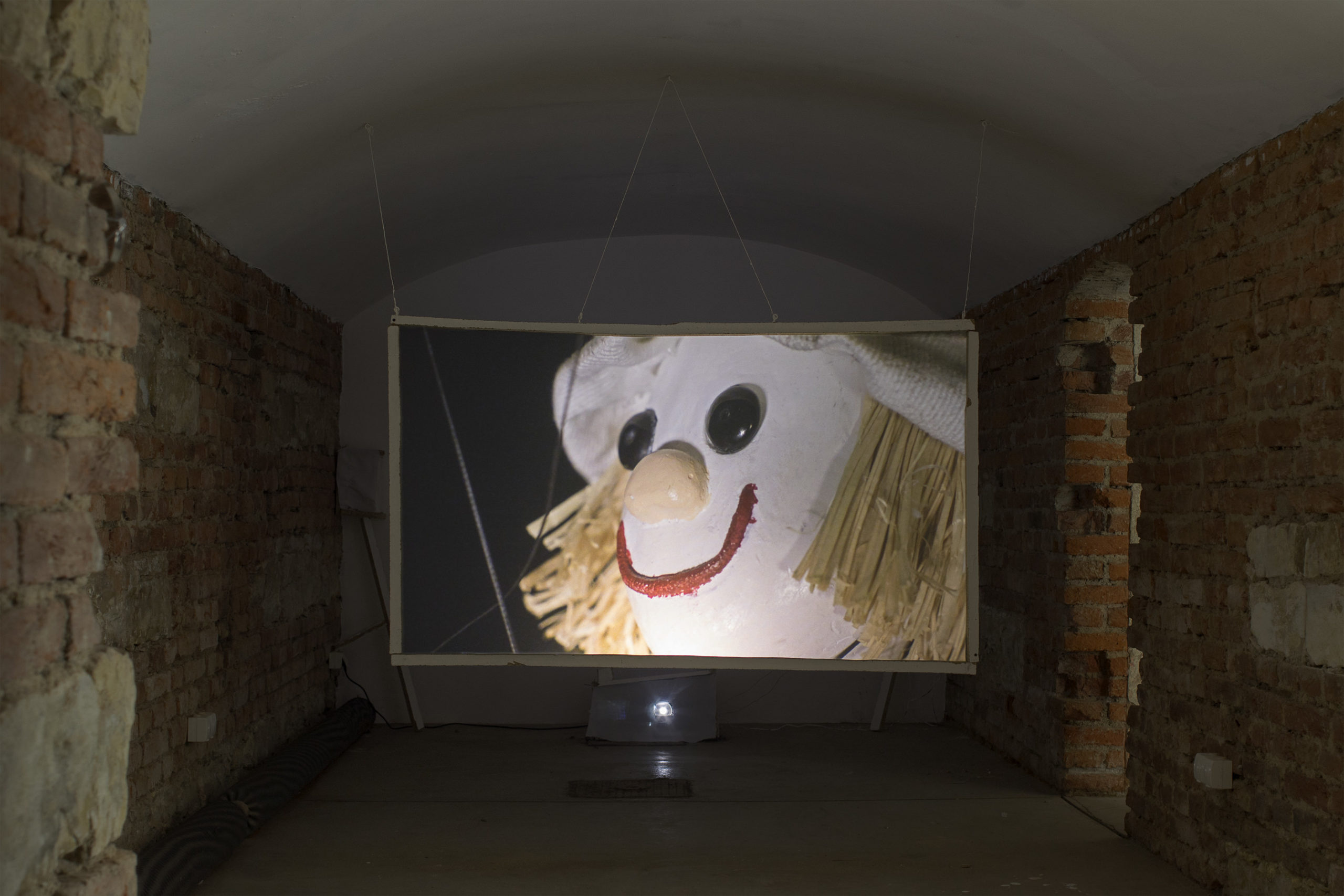
Andrew Norman Wilson “Andrew Norman Wilson” installation view
Going a step further, how do you see “Tricia Nixon: Summer of 1973” interacting (nor not) with the other two concurrent exhibitions at Futura, Andrew Norman Wilson: Andrew Norman Wilson and Lenka Vitkova: Slope? Michal, is there an attempt by Futura to consider in advance how the artists/curators will align, or is this occurrence more happenstance?
M: Of course there is. It is not by chance the two American artists whose solo exhibitions we open this year open also at the same time. On the other hand, the togetherness goes also in contrast, as we hope that if people do not like one exhibition they may like the other. So Lenka’s exhibition is on purpose unpolitical, meditative, intimate, and painterly.
Between Andrew and Devon I see a lot of structural meeting points even though the formal expression may be very different. For example, in the Ode to Seekers video the image of an oil tower merging into a mosquito head piercing human skin and the two remixed pop songs one saying “if it makes you happy, it can’t be that bad” second “I don’t care, I love it” makes a nice echo to Devon for me.
C: I see the three exhibitions in a more complimentary and contrasting way, rather than the connections between them. Given that the three exhibitions are on three floors, they sit like a layer cake in my head, or perhaps like an upside-down body. Lenka, who is on the top floor, being the feet or the earthly sensibility. Her paintings have a materiality to them and are quiet, gentile, and careful (and some paintings are literally feet). Devon, who is on the middle floor, is the exterior senses—stomach, ears, and skin. Her exhibition is rooted in physical sensations and the interconnection with the sociopolitical world around us. And Andrew’s work, which is in the space Michal calls the dungeon, is rather philosophical in tone, residing in the head and projections of the world. For me the three exhibitions are lovely in their contrasts. The differences in materials and relation to the viewer are quite different. I also agree with Michal that Andrew and Devon’s works have more links between them—they are both immersive installations that share a sense of angst.
M: Yes, Cortney that’s definitely a good metaphor, also, in a way, all three exhibitions are about belonging or alienated body . . .
How did FUTURA and Black Cube get involved in this organizational exchange, and what is the next step?
C: Well, Michal and I first met at a curatorial intensive for Independent Curators International in New York. We have stayed in touch since then, Michal has visited Denver and helped install an exhibition back in the day when I was the gallery director at the Rocky Mountain College of Art + Design. Since then, we have wanted to collaborate and this seemed to be the perfect moment to do so. Black Cube’s program allows for exchange to easily happen and Michal has been doing a lot of outside curating.
M: We meet seven years ago at curatorial program in New York sharing a certain healthy skepticism towards art world functioning and somehow a peripheric position. At that time we both hadn’t served the institutions we are at now, so maybe it turned out to be a good idea to decide to stay where we were.
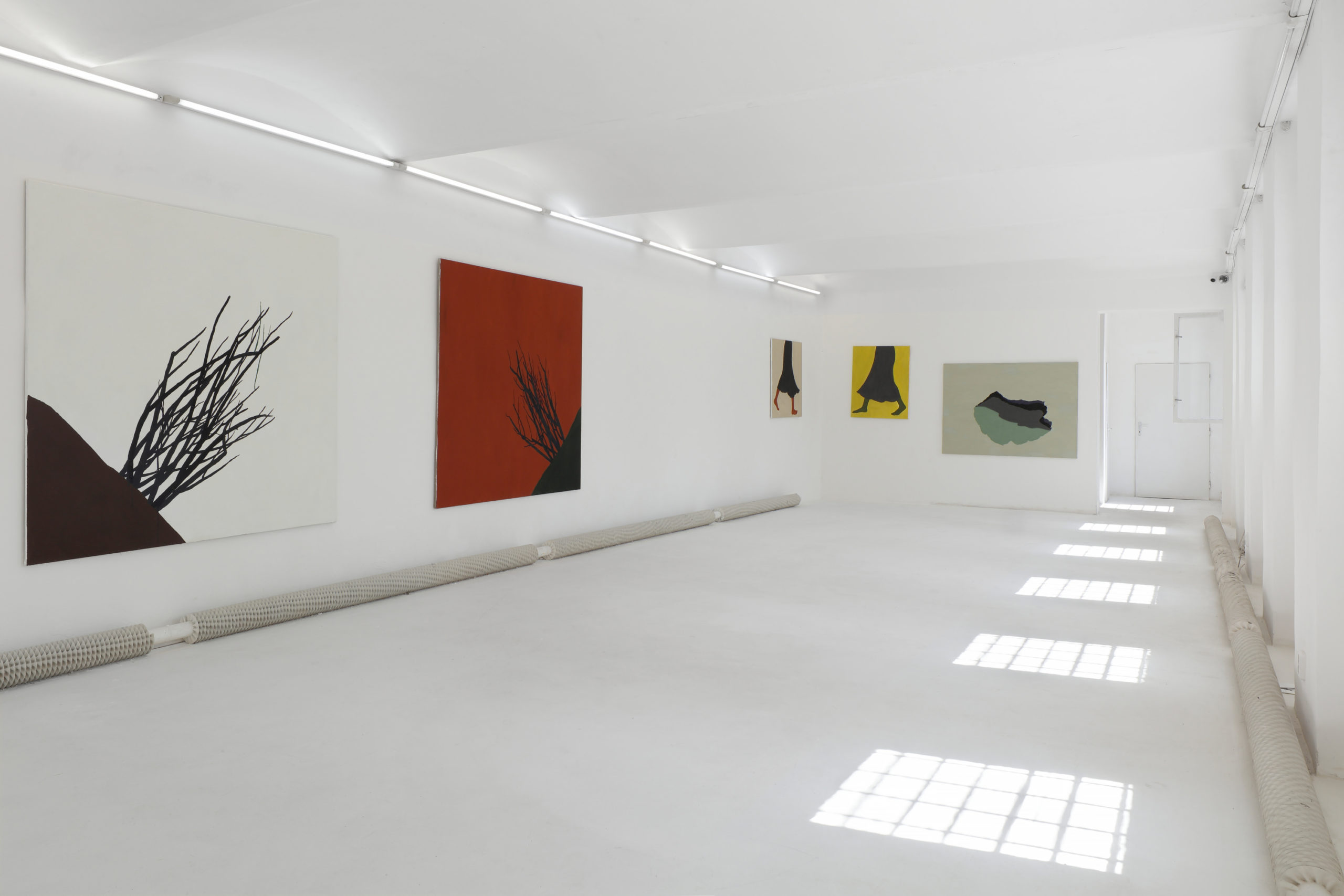
Lenka Vitkova “Slope” installation view
Finally, Cortney can you speak to the current state of contemporary art in Denver and what you hope for in the future? And likewise, Michael can you speak to the same in Prague?
C: Denver’s contemporary art scene is rather small, we have one art museum and one contemporary art museum—these institutions seem rather stable and have very prominent education departments. Since the 1980s the city has had a sales tax that helps fund the larger nonprofits in the area . . . because of this we have a rather top-heavy nonprofit scene and are skimpy on most other areas of the ecosystem. This has created a super small commercial gallery scene, and even fewer artist-run spaces. My favorite part of the scene is the artists, there are some truly amazing people here . . . ranging from those that are embedded in the global contemporary art scene such as Devon to outsider artists that take use of the freedom of the West. But this is all changing as the city is going through a huge growth spurt; I imagine these changes will affect the scene in many ways, currently it seems like the biggest sign of this change is that a lot of artists are feeling the rising rent costs and consequently are moving outside of the downtown area or leaving Denver altogether.
M: Prague’s scene has changed entirely in the last 10-12 years and I dare to say FUTURA helped it. What used to be an entirely local scene operating via underground friend circle one-night event spaces is nowadays, along with Warsaw, the most developed scene in the former Eastern Block with maybe 40 subjects active in a city of 1.5 million. What I tried to create when I took over at FUTURA was a certain bridge for the international to come Prague but also for the Czech artist to get abroad. This slowly became more and more the export and also support to local artist. As the international presence becomes ordinary in Prague, we increasingly focus on supporting the local artists.
However, the scene has still one big problem and that is the absence of large functioning state institutions. There is still no museum of contemporary art in Prague and the sort of substitutes such as the National Gallery or the supposed to be Kunsthalle Rudolfinum do not replace this lack, and due to personal, political, and inner-logic reasoning, fail to be both locally and internationally respected institutions. This however also influences all the rest of an otherwise dynamic and developed commercial and non-profit scene. Artists in their 40s/50s/60s still exhibit in the alternative spaces, as there is no one to do them the proper catalog retrospective, commercial galleries have no sales to institutions, as institutions do not collect anything, and there are no coffee table books to show to collectors, as institutions do not publish anything. Non-profit spaces like FUTURA are competing in the style of low budget, often younger artist exhibitions, with museums that should be doing something else entirely on the hierarchy pyramid. On the other hand, all the scene, commercial galleries included, run on state support, which has maybe doubled over the last decade. It’s not easy securing funding—we are still only two full-time people working at FUTURA, running two venues, residency program, and doing 30 something exhibitions per year. While in most other European countries in the Western direction the state funding towards alternative art spaces is disappearing, in Czech Republic it grows every year. But I also think that in the end it is not a bad deal for the state and the taxpayers. The effectivity of labor is much higher in the small-scale operating spaces than in large institutions. The amount and quality of content we all create is definitely very cheap comparatively.
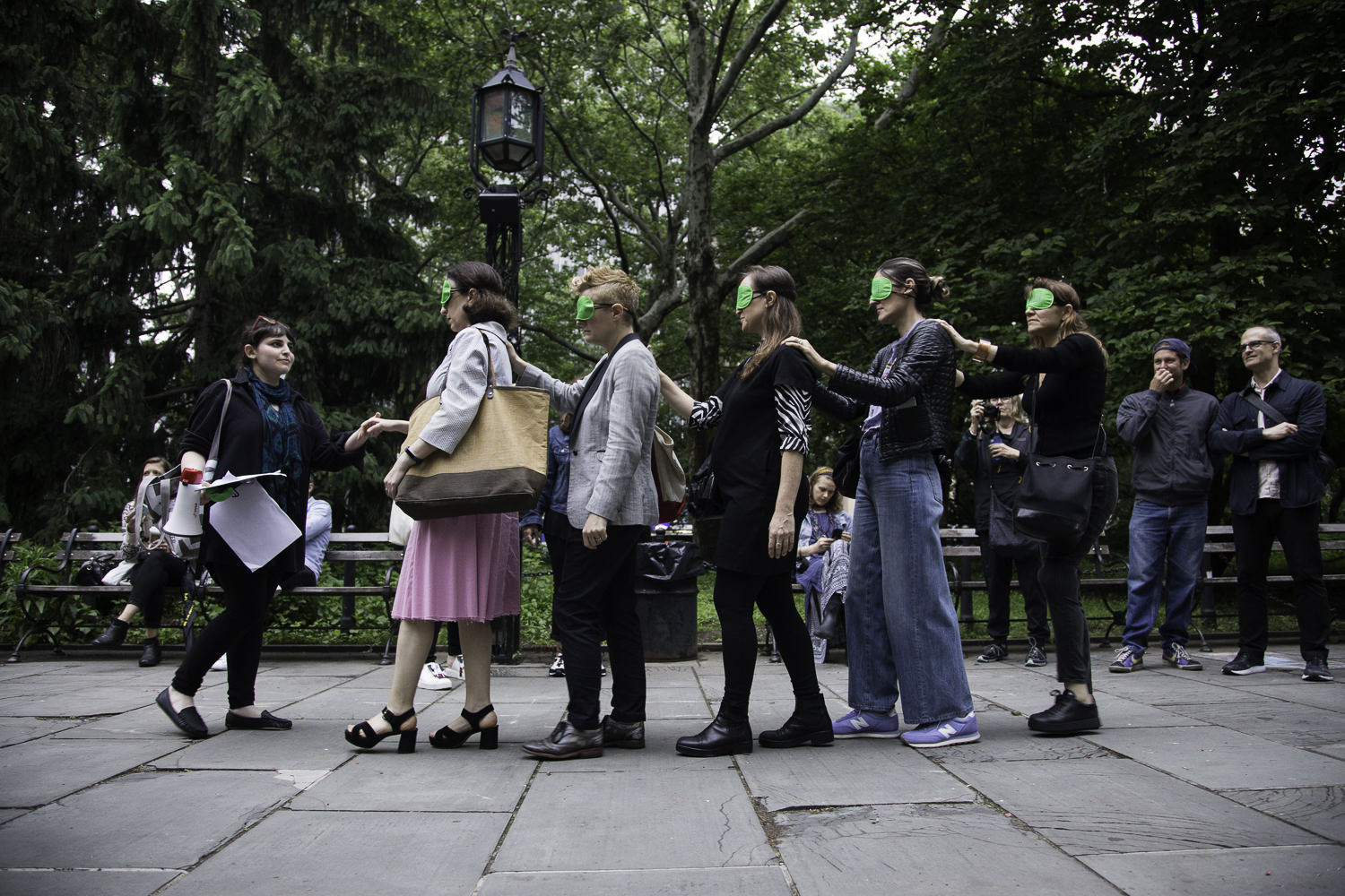
Sari Carel was born in Israel and lives and works in Brooklyn. Her work has been exhibited internationally in galleries and venues such as Artists Space, Nicelle Beauchene, Gavin Brown’s Enterprise and Dumbo Arts Festival in New York, and Tavi Dresdner and The Heder Gallery in Tel Aviv. She has recently partnered on projects with More Art, a New York based nonprofit that supports collaborations between professional artists and communities to create public art and educational programs that inspire social justice. These projects include Borrowed Light at Sunset Park, Brooklyn, in 2015, and Out Of Thin Air currently at City Hall Park in Manhattan. Out Of Thin Air is a multi-channel immersive soundscape of recordings taken from breathing workshops conducted leading up to the installation, in which respiratory illness, air quality, and environmental injustice are at the forefront. Out of Thin Air is on view through July 8th.
Interview by Brandon Johnson
How did you become interested in the breath?
My interest evolved from a few different directions that suddenly came together in this project. The first is actually a personal one. My sister, who I am very close with has been living with an incurable lung disease, lymphangioleiomyomatosis. She is also a philosopher and her diagnosis jolted her into thinking about illness as a philosophical tool. Her essays and books, as well as witnessing her harrowing experience of learning to live with a disabling and incurable illness have changed the way I think about the experience of being ill and more specifically feeling breathless, or gasping for air. Her work has showed me how exquisite breath is, and how fragile. I also work a lot with sound and its relationship to other mediums. So from a sound practice perspective it was interesting for me to zoom in on these gaps and gasps that audio engineer painstakingly try remove to enhance a recording. For this project I wanted to remove everything else and just let us hear and think about breath as a rich and layered vocabulary that is largely invisible to our noisy lives.
You partnered with master teacher Jessica Wolf to conduct therapeutic breathing exercises with New Yorkers living with asthma and other breathing conditions. Recordings from these exercises were used to create the public sound installation. As an artist, do you feel a social responsibility beyond traditional notions of aesthetic beauty when creating public artworks?
I come from a hands-on studio practice and am very committed to the poetics and manifold meanings that can be generated from working with materiality and imagery, in the broadest sense of the word. But over the last ten years I think there has been a steady move by me towards realms outside the art world and outside my world as well as an intense curiosity about other fields of inquiry and research.
This led to weaving other bodies of knowledge into my work, collaborating with scientists, musicians and mathematicians among others. In my exhibition Earth & Sky last year I collaborated with an ornithologist and commissioned work from a craft conservationist. These different kinds of knowledge entered the bloodstream of the work at a very early stage and present themselves very differently from each other throughout the development of the project.
My interest is not just in mining other worlds for materials but to make a series of connections and welcome a whole other set of priorities, principles and ways of thinking into the studio and into the exhibition space.
For this work I wanted to take it a step a further and to develop a work process that from the beginning is tuned into and relies on practices from other fields as well as partnerships with people outside the art world. The workshops were amalgams of a few different things: Participants learned from Jessica Wolfe methods of breathing and exercises to help them breathe in a more sustainable way. We also talked about theories of Illness and ways of thinking about breathlessness. We delved into the recording process both as participants as well as producers. Having all these different vantage points over a period of two hours and leaving with a new set of tools and new insights into breathing practices was an important part of this communal activity. The sounds generated from these actions accrued meaning and vitality in large part because they were the byproducts of doing something together, for real.
I am very occupied with the possibility of making things reverberate in more than one way. I try as an artist to push against the insularity that can sometimes run through contemporary art, and I am truly curious as to what aesthetic repercussions can be derived from and divined out of intersecting activities.
Out Of Thin Air, which was commissioned by More Art, also includes a diverse public engagement program for this very reason. Let art be the occasion for bringing together a variety practitioners, thinkers but also audiences. To have many conversations not just ones that revolve around art and to include activities that bring people together in an act of making and doing, not just talking and viewing.
The site of the installation is City Hall Park. Did being offered a platform in close proximity to the epicenter for New York City government have an influence on this project?
Finding a location that fit the aesthetics and themes of this piece was a journey in itself. When the opportunity to present it in City Hall Park I was very much tempted by exactly that, before actually doing a site visit to determine if it would be feasible and be a good physical context for the piece. Considering breath, breathlessness and air as a commons that belongs to all of us is at the end of the day inextricable from policy.
What was your process for arranging the breath recordings from the workshops into a cohesive, public-facing whole? Anything you valued specifically in the recordings, and any impact you wished the final product to have on visitors?
Editing the strands of sound that I gathered throughout our activities and workshops was mostly done in my quiet studio. Playing around with the materials and trying out different sequences, types of layering and valuing how things come together but also the gaps that are created between different layers that don’t quite align with each other.
I ended up making three vignettes with various gaps between them. the silence in between is just as active as the parts that are full of sonic action. it allowed for a play between foreground and background and I hope they encourage the listener to tune into the sonic environment around them in a different way. Not just hear all the sounds and noises around you but listen and take in the textures they create. The 10 minute breaks between the plays of the complete breath composition aim for a more egalitarian act of listening. Art and site mesh in a changing, open-ended way.
Past projects of yours have also engaged with environmental concerns. Would you consider it a foundational role of your practice to bring attention to the world around us, both natural and unnatural?
Humans have evolved within a certain context, that context is planet earth. The environment is not something outside of me. My senses, with which I perceive space, landscape, language and art would not exist as they are without it. This relational process between the human animal and all other animals in the world as well as the landscape, the air, the horizon line and even gravity itself is at the essence of who we are as sentient beings.
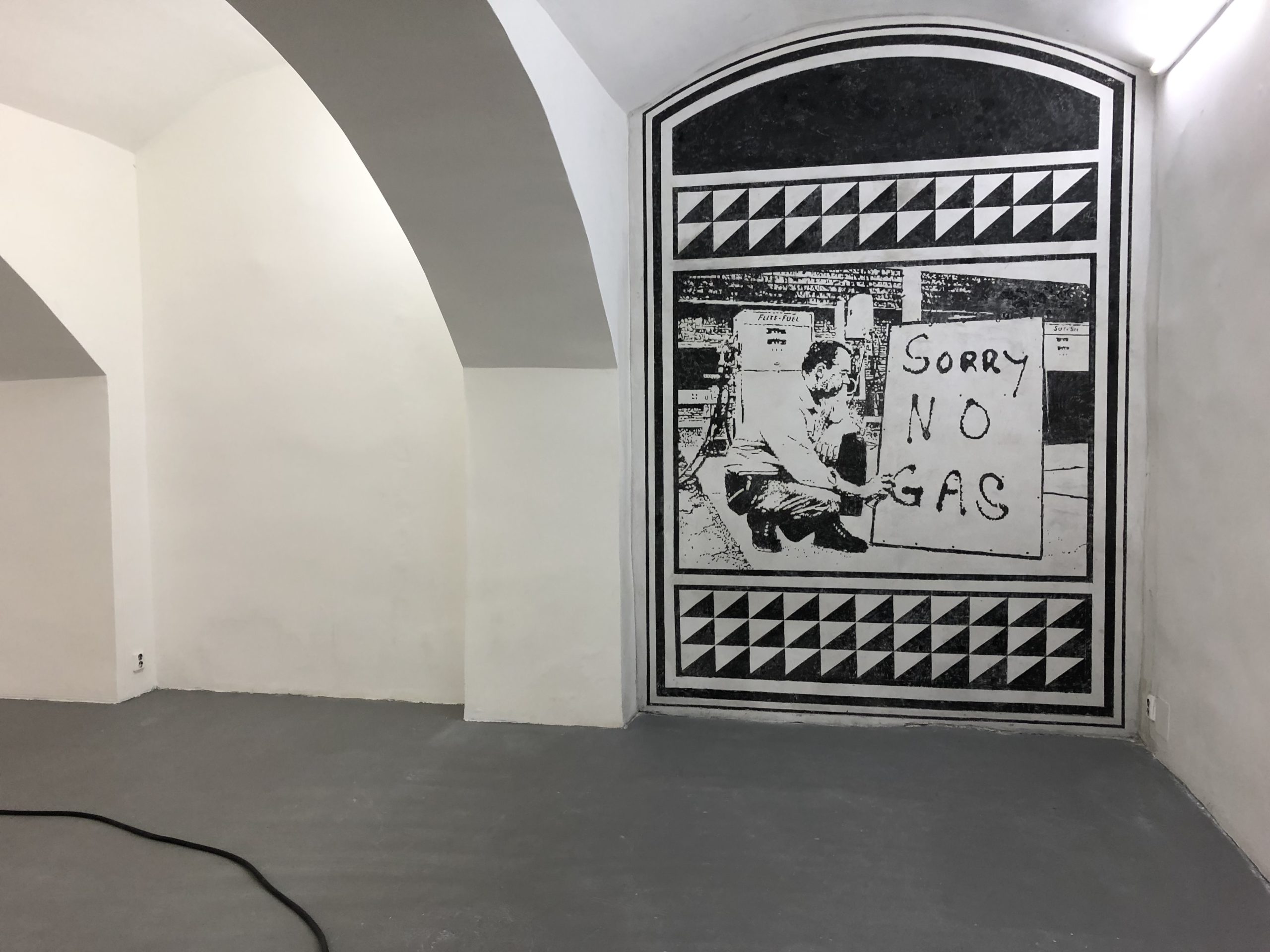
Install: Devon Dikeou, Ring My Bell, 2017-ongoing, working Milton Driveway Bell, Hose, and Anchor, variable dimensions; Devon Dikeou, Gas Shortage, 2018-ongoing, Google Image of 1973 Gas Shortage Etched in Wall Using the Sgrafitto technique, variable dimensions
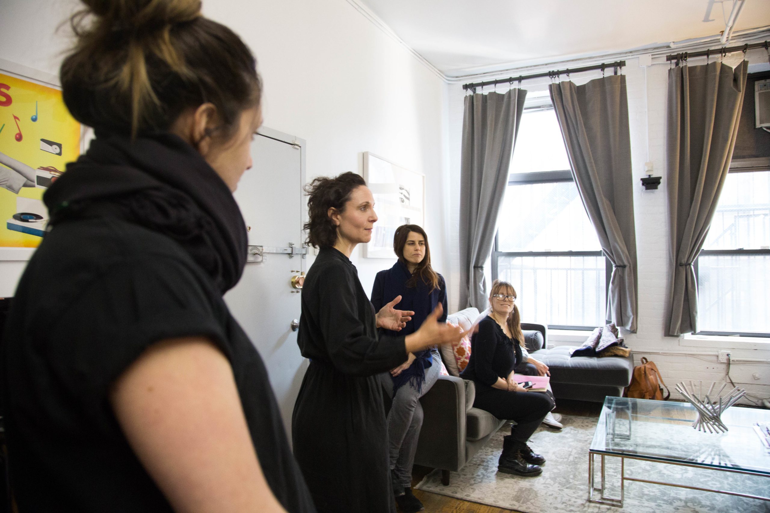
For the past two months, Devon Dikeou has been in Prague, Czech Republic, an artist-in-residence at Centre for Contemporary Art FUTURA as part of Black Cube Nomadic Museum’s fellowship program. Curated by Black Cube’s Cortney Lane Stell, Dikeou’s exhibition Tricia Nixon: Summer of 1973 captures the essence of America during the 1970s, while drawing parallels to present-day crises and politics in the U.S. Pulling from public record and personal memory of the era, Dikeou tells the backstories of the various elements that comprise the installation and how it echoes a time from decades past as well as reflects what is happening now in our current time. Tricia Nixon: Summer of 1973 is on view at FUTURA through September 16, 2018.
Interview by Hayley Richardson
This is your second artist residency, the first one being at Artpace in San Antonio in 2011. What do you value the most from the residency experience?
Well residencies often imply studio. My studio is wherever I am—be that a city, a country, a locale, a room, an exhibition space, and the atmosphere—music, TV, cafés, bars, museums, other artists’ studios, and what you sense there . . . but I do come to all things—exhibitions, residencies, fairs, magazine projects, with my thoughts pretty worked out. The fun and beauty, and I guess value is when they—those thoughts—change . . . What happened in Prague is that once I got to Futura . . . There were extra exhibition spaces available, and the idea of commingling the spaces somehow became attractive, joining them in a way . . . And as my work is really about finding these pockets of in-between, the meandering spaces of Futura were just delicious . . . How could I make them more related beyond just ideas . . .
And beyond that initial response . . . I want to say . . . There’s this great story of Joan Rivers . . . She used to archive all her jokes in an old-fashioned library card catalogue manner. So, she had categories and alphabetized the jokes, and when she needed one, all she had to do was consult this card catalogue—and as time went on, this file became a massive archive . . . A whole room with the little wooden drawers, and 4” x 6” cards full of jokes for when she didn’t have one. And instead of a search engine, she searched her own search engine.
So, as I was arriving in Prague, I was looking at old legal pads which is my archive system of pieces, and I came across a piece which I thought fit really nicely with the “Tricia Nixon: Summer of 1973.” I found “Ring My Bell” (1991 Ongoing). It relates to the gas crisis of ‘73, the lines, the idea of full-service, consumption, and found object, relational aesthetics ideas of activation, and minimal ideas of composition, line, presence, and lack thereof. It seemed like a perfect pairing. And I began to connect the spaces in Futura, not just with ideas but with literal hoses, anchors, and bells—which is how “Ring My Bell” exits as a functioning gas station bell . . . Actually, back then we used to call them “Service Stations,” the attendants come to service you once the bell has rung.
Also, something happens when you get out of your element, in a residency . . . It’s why I love visiting all 17 curatorial departments of the MET . . . Or any encyclopedic museum . . . There is something inspiring about things you don’t know that well, but can appreciate, and if that can enter your practice, so much the better. In Prague, just wandering around I became reintroduced to an old technique called Sgrafitto. I just loved it, seeing it again . . . It’s wood block printing meets fresco, meets batik, meets decoration, meets architecture, the etymology of which produced the modern practice and word, graffiti. I thought why not reverse the process and use an old technique to create something nostalgic even in our contemporary mindset of 2018, from 1973, and convey something, not just technique or decor, that relates to our own encyclopedia of reference. So now we a have piece made in a residency that may or may not have ever come to fruition without the lovely coincidence/gift of Prague, Futura/Black Cube Residency.
The exhibition centers around the U.S. oil crisis of 1973, specifically the then-president’s daughter Tricia Nixon’s frivolous behavior during this time when the rest of the nation was subjected to rationing and conservation of resources. The installation “Summer of 1973: Tricia Nixon” features a faux fire element with marble fireplace, a modern-day air conditioner, and vintage Mickey Mouse clock radio among other objects reminiscent of that time and now. What are the backstories to the different elements of the exhibition?
I live in a loft where the heat is super old school. It’s steam, no control, can’t turn it up, can’t turn it down. When it’s hot you’re in a Russian bath, if it’s freezing, then of course it doesn’t work, and there’s no adjustment available either way. And it screams literally every time it fires up . . . Sounds like someone is breaking in . . . Nothing to be done. There is this tiny room in the loft that I like to go to and just think . . . Virginia Woolf, “Room of One’s Own” style, and sort out the start of the day . . . There I am in this blank white room with a somewhat modern window air conditioner with an old-fashioned steam heater painted silver below it. The heater starts its initial wheezing, graduates to clanking, and bangs out what sounds like Beethoven No. 9. As I was sitting there, in this tiny room, with these two elements of heat and coolness, I was reminded of that 1973 summer—old enough then to comprehend what was happening—and bling: Tricia Nixon. Which brings us to this story that I recall of Tricia turning up the air conditioner in the White House so high so that she could have a fire in one of those over-the-top fireplaces, all in the heat of a D.C. summer. Maybe it’s urban myth, but the craziness of the gesture has somehow stuck with me. And in the spirit of “if these rooms could speak,” from the cranky old loft that spoke to me that morning and reminded me of what may or may not have happened in the White House, this installation germinated . . . So we have a bricolage of White House rooms with replication of different elements from several, essentially a working fireplace, a modern air conditioner, and a clock radio from 1973, which is the radio I listened to every night before going to sleep and woke up to get ready for school. It was a Disney clock radio, and I just a bit too old to really have it, but the dial was a 3-D Mickey, and even though he’s not even my favorite character, I love it dearly both then and today plus it functions! That analog clock radio in the installation serves as the platform from which I learned about Tricia Nixon’s fireplace/air conditioner misstep, and now in our digital age plays CBS news clips from the summer in ’73, including those clips reporting on Watergate, the Pentagon Papers, the sounds of the summer in rock -n- roll, and advertisements. These elements pull the viewer into a new, in-between space, the hallway in fact, and hopefully remind/poke them to think about the relationship of the gesture of combining air conditioning and fire, as well as crisis, privilege, corruption, information, culture, time, much less space, and its value, and any art historical stuff they might have archived in their own memory.
Do you feel “Summer of 1973: Tricia Nixon” takes on a different meaning being exhibited in Eastern Europe compared to the United States?
Well, people say context is everything . . . I hope the three pieces speak universally to a host of different things we can all appreciate. Naturally, that appreciation will fluctuate between cultures, politics, gender, age, geography, history—art or otherwise. They say Prague is the Paris of the East, but I’ve learned from a very reputable source that Paris is the Prague of the West. Let’s see how East reads West, or is it the other way around . . .
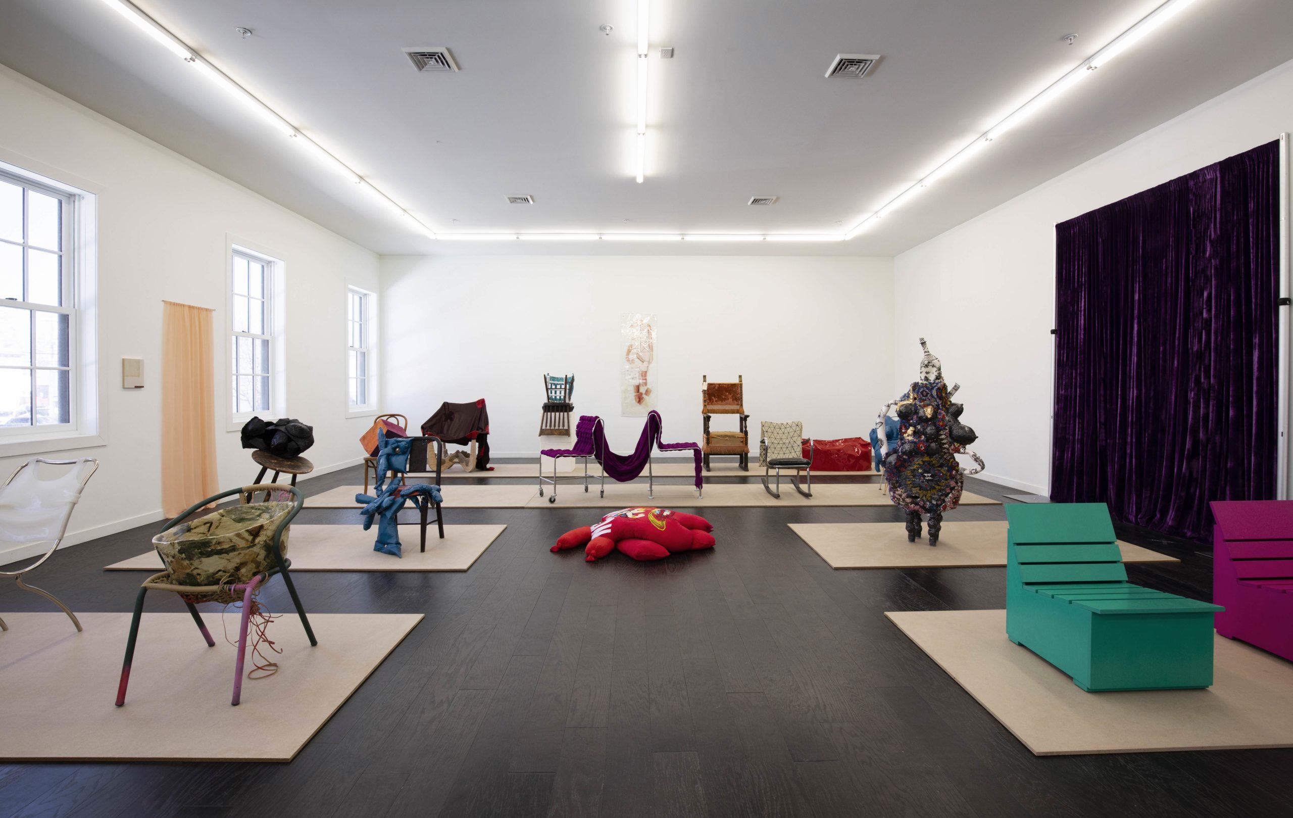
Kristen Dodge is curator and owner of SEPTEMBER Gallery in Hudson NY. Previously operating DODGEgallery in Manhattan’s Lower East Side from 2010-2014, she decided to leave the New York City art scene and focus on building an inclusive artist community in Hudson. SEPTEMBER was founded in 2016 with a missions to serve as “an evolving platform for artists of diverse disciplines . . . committed to engaging the surrounding community, while hosting artists predominantly from Upstate to Brooklyn to Boston.” SEPTEMBER’s latest exhibition Sit-In is on view through May 27th.
Interview by Natasha Przedborski
Sit-In looks into the shift of function on “familiar form.” You left the Lower East Side art scene to join that of Hudson, NY. I can imagine there must be a feeling of shifting familiarity. Was your inspiration for the show rooted in any particular shifts of familiar form?
I’m committed to the idea that change is good and necessary, not just inevitable. The theme of the show is definitely reverberating the ethos of the gallery, starting with our name and branding. September is a season of change, of an impending shift. Creativity is contingent upon change—to create is to make something new. This means shifting into the unfamiliar, possibly terrifying, but definitely exciting space of not knowing. In speaking of the art “world”, this goes for artists, gallerists, curators, writers etc. And so, like the algorithm that adjusts the positioning of the letters in SEPTEMBER every time you refresh or shift pages on our website, the gallery is in a conscious state of movement and change. And yes, my life itself went through a major rejection of familiarity four years ago. And so, to answer your question, this show absolutely reflects an internal interest and approach I have to life both personally and professionally.
It seems that creativity blooms in that exciting space of not knowing. In the case of your show, you force the mind to go against the utilitarian view of seats and discover new functions. As a curator, do you feel yourself more drawn towards an object’s aesthetics rather than utility?
Dysfunctional is my friend. It turns out that the people I willingly surround myself with are unusually functional but see themselves as especially dysfunctional. I appreciate opposites, contradictions, subversions. So, to start with the most functional of forms and make it something else—subtly or violently so—is starting with banal and ending with exceptional. The works in the show have undergone that transformation. I am absolutely attracted to the spectrum of aesthetics from elegant to raw. That range is present in Sit-In, from Jane Bustin, Hannah Levy, and Mary Heilmann on one end to Kate Gilmore, Kianja Strobert, and Jessica Jackson Hutchins on the other end. The question of utility is raised in the context of this show, but importantly these are all artists, mostly sculptors, not designers. An inquiry into the line between design and art is an interesting topic, but not of importance in the curation of this show for me.
The title of the show “Sit-In” appears in a moment in time marked with protests and activist art. In a traditional sit-in, it is human bodies occupying space yet here it is the chairs occupy space. Have aesthetics and composition commodified the “Sit-in” protest and other acts of revolt?
Sit-In is a quietly organized protest against discrimination. Addressing the list of artists, there’s a point of commonality that’s in contrast to the operative, dominant call of the art “world” and our culture at large. There is a word play, yes, and a deeper injection here. In terms of the notion of a seat . . . a seat takes up space and creates a space within itself. What happens when we make room for those who haven’t found any, or enough?
Figures and figurative references are present in the works, and present by notice of absence . . . place-cards. The Dinner Party by Judy Chicago comes to mind. The exception is Barbara Gallucci’s works, which have literally hosted and held willing bodies. Her pieces have created a joyful social space and added the content of participation in the show.
Women are stereotypically seen as submissive and the same could said about a chair. They are both silent and even inanimate yet supportive. With the show, you put chairs and seats at the forefront. Was it in the same vein that you chose to make it an all-women group show?
Who I am, and the women I know and work with are so far from the stereotypes of what it means to be a woman. Submissive, silent, inanimate and supportive are terms from an outmoded power structure that is inevitably dying and being replaced. Creating space and putting underrepresented people in the forefront has been a priority or us and is finally becoming a wider-spreading reality. One by one.
I’d like to add that the content of individual works is not political, but perhaps the accumulation of them, and the purposeful direction of the installation offers underlying content.
SEPTEMBER aims to be different from other galleries. You use the terms “always” and “sometimes” instead of “represent” and “exhibited”. You seem to focus on breaking the frameworks in which concepts and objects lie. Was this always a focal point of yours?
Always 😉
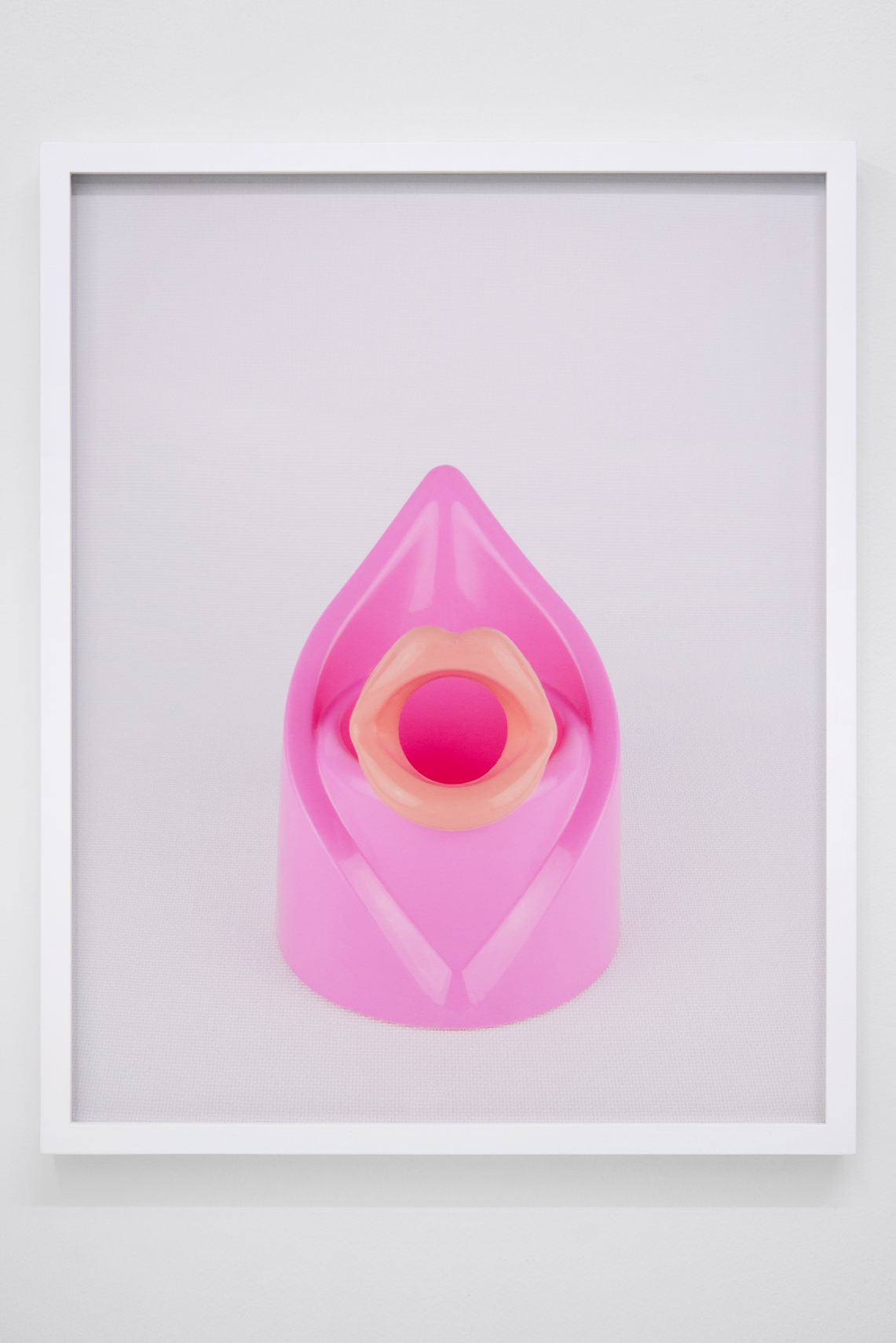
Untitled, 2017, archival pigment print, 20 x 16 inches
Melanie Flood is an artist and curator working out of Portland, OR. Her work is photography-based and finds an affinity with other contemporary conceptual photographers such as Anne Collier, Annette Kelm, Sara VanDerBeek, and Eileen Quinlan. Flood’s solo exhibition “Mirror Mirror” at Fourteen30 Contemporary in Portland features a body of new work using studio still-life photography to examine modern femininity and the female body.
Interview by Brandon Johnson
The show’s title Mirror Mirror references a famous line from the Brothers Grimm’s “Snow White,” in which the Evil Queen asks her magic mirror each morning: “who’s the fairest of them all?” What does this question mean to you? And could the works in this show be considered answers?
I wake up to my reflection in a mirrored dresser and I look at my face. I am getting older and have fewer photos of myself now than I did a decade ago. I am less vain. I see beyond my physical appearance, unlike when I was in my twenties. For me, there’s no looking in the mirror and not having an inner dialogue about aging. Youth is paramount in our culture and is celebrated. It’s impossible for me to separate myself from growing up within the constraints of traditional feminine roles. These experiences have defined my life. It is only now as I approach 40, that the distractions of being young, fecund and beautiful have fallen to the wayside that I can see the world more clearly. It is finally a world I can attempt to make my own, I get to redefine my value.
The Evil Queen believes that power lies in beauty. As Snow White grows from a child into a young woman, she will one day replace the Evil Queen, rendering her powerless. As women age, our fertility declines, stereotypically we become almost invisible to the opposite sex, at times we are replaced. Our value is questioned. The word “fairest” as used in Snow White has a triple meaning, referencing beauty, age, and race. Being young, white, and physically attractive is a currency in Western culture. These ideals have been built on patriarchal, white supremacist foundations. I believe this is shifting, but the burden of gender roles is ingrained in female experience and further exacerbated by male expectations of how women should look and behave. It is unpopular to say, but men are also victims of this antiquated misogynist paradigm.
I see the photographs in my show as reflections, not answers. I borrow my exhibition title from a book I’ve been reading Mirror, mirror: Images of Women Reflected in Popular Culture by Kathryn Weibel written in 1977. Fashion and personal adornment are a major influence in my work as it’s such an integral part of my everyday life.
How has your relationship to fashion changed over the years, and what has this meant for your work?
My relationship to fashion has remained quite steady. I’ve always seen clothing as a way to express myself, to assert my individuality or later, my femininity. What has changed is what I express. I had a lot more interaction with clothes and fashion growing up than I did art. Clothing was a way to fit in with the groups of people I related to. I was very into grunge, hardcore, alternative music scenes in the early ‘90s and dressed in x-girl and Todd Oldham. Then there were raves at Limelight and Twilo and that changed my wardrobe. As I approached my early 20’s, I began dating regularly and wanted to attract men. Sadly it seemed very normal to me to attract partners this way. Living in Manhattan during the years of Sex and the City, stilettos and form fitting dresses became my uniform. My clothes are still about expression, but also about function and comfort while supporting independent female designers/shopkeepers. My awareness of how clothing is used to reinforce ideals that minimize and attempt to control how women should present themselves has grown so has its prevalence in my work.
Outside of the exhibition’s title, how much influence has Kathryn Weibel’s book, or any other books, had on the work you make?
I read a lot of art theory, feminist history, and am a political junkie. Some favorites I’ve read recently include Gender Trouble: Judith Butler, I revisited Femininity: Susan Brownmiller. Consuming the news everyday, was fueling the way I had been contemplating my own experiences of dating, assault, aging, and marriage. The feeling of conservative overlords poisoning the whole planet and trying to control my body, my potential and my future was in the forefront of my mind when in the studio. I had gone back to books I read as an undergrad that were especially formative. Reading second wave feminists Betty Friedan, Kate Millet, Gloria Steinem, validated how I was feeling—this patriarchal garbage has been going on for a very long time. As much as I related to the words, they were leaving out a huge story. White feminism is problematic as it can only view the world from its own narrow perspective, it is my purview too as a white woman. I began to seek out more diverse voices. Space Invaders: Race, Gender and Bodies Out of Place: Nirmal Puwar had the largest effect on me, solidly introducing me to intersectional feminism bridging race, gender, and economics. I also love to read everything in regards to photography particularly from 2005-present. I’m currently obsessed with Sarah Charlesworth: Doubleworld from her New Museum exhibition and have been looking at more sculptors like Sarah Lucas: After 2005, Before 2012.
How do you feel your art practice has evolved since moving to the Pacific Northwest, and Portland specifically?
I was focused on my curatorial practice in New York more than my art practice. But, the curatorial practice was totally inspired by my not knowing how to have an art practice. I didn’t know what kind of work I wanted to make, but knew what I liked to look at and think about. When I started Melanie Flood Projects in Brooklyn in 2008, it was an effort to join a flourishing community I interacted with online. The emerging photography scene was really growing, but I wasn’t meeting a lot of people in person. Opening my home to host exhibitions was a way to bridge that gap, and in turn learn what it meant to be an artist. When I moved to Portland in 2010, the art scene appeared tighter knit and difficult to enter as an outsider. I lived my entire life in New York, so friends and a support system were built in. I had none of that when I relocated, it was challenging.
Everyone I met here was an artist, it was like moving to an arts commune. Everyone had a studio, they were cheap then so I moved into one too. Living outside of a commercial art hub has its advantages. The worries of competition and being visible were less important. I didn’t need a full time job because it was more affordable. I wasn’t partying anymore. I had a lot of free time on my hands and spent most of it making work that was inspired by the artists I admired: Annette Kelm, Shirana Shahbazi, Christopher Williams, Eileen Quinlan, Michele Abeles. There wasn’t much contemporary photo being exhibited or made in Portland at the time so when I showed it to be people it sparked a dialogue. I eventually met a few like-minded artists and started a crit group, and put shows together. I curated an exhibition at Worksound, a gallery started by Modou Dieng who I met through prior zingmagazine Managing Editor Sari Carel. The artists came from New York and Texas, we got a write up in The Oregonian, I felt momentum and energy again. It was different from the frenetic party/networking feeling of the shows I organized and went to in New York. Discourse and conversation are valued. The DIY spirit is so prevalent, it’s held in high regard and supported. In 2014, I reopened Melanie Flood Projects in a third floor space of a building downtown. The set-up of the building is a doppelgänger of The Dikeou Collection. I feel incredible gratitude for the community I am a part of and am deeply invested in it being recognized for its contributions to the national arts dialogue.
Untitled, 2017, archival pigment print, 20 x 16 inches
Returning to the work in the show, the staging of these objects involves a sculptural sensibility. Could you walk us through your process in creating these works?
I choose things for their formal qualities and potential referents—girly, crafty, feminine, figurative. I’m drawn to objects that are marketed toward women by their color or intended use. Exercise devices, bedazzled belts, anti-aging gadgets, pantyhose, bra inserts are a few things I used in making this new work. I never have a clear idea of what I want things to look like, but there are parameters. I made these photographs in my studio on a table top with mixed daylight from my windows and two large softboxes. The subtle lights shifts cast different color hues in each photograph that I really enjoy. After lighting, the tabletop and backdrop has to be determined before I can start working. I used the same backdrop material, a white buckram in each image whether it’s obvious or not. It’s a starched millinery fabric used to make hat forms. The material is a subtle grid, allowing me to place fabric underneath it to let color through, or when I use plexi the buckram reflects a subtle texture to an otherwise slick material. I have all of my props and materials everywhere. I move things around until I see something. The work is really about me seeing it more than it is about me arranging it. Usually the arrangements that are really planned out fail. I embrace chance and I’m always waiting for that moment when the chaos of making tons of combinations clicks.
What makes photography such a compelling medium for me, is how objects can be transformed when they are recorded by film or a digital sensor. The image of the toilet brush holder and silicone lips looks barely like anything in real life, it’s clumsy. When photographed the surface of the plastic and rubber become refined, slick, the reflections of light add a symmetry that makes the arrangement look vaginal and flowery. The styrofoam torso with its Paint Me sticker is highlighted on one side with a purple colored gel, again the photograph transforms the thing itself into a strangely elegant form. I see parallels between photography and how I transform myself through garments, hair styling, make up and other adornments. Eyelash extensions, brow tinting, hair dying. It’s all an attempt to highlight or hide a physical attribute, manipulate the way others see us, and how we see ourselves.
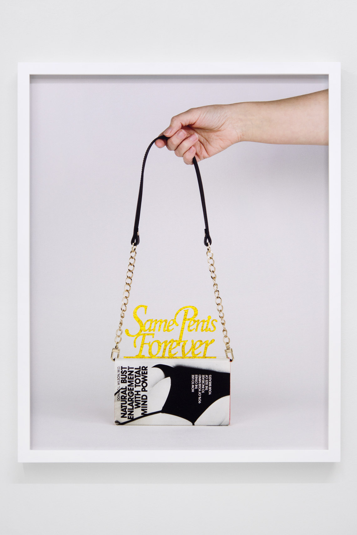
Finally, one photo features a book called Natural Bust Enlargement With Total Mind Power by Donald L Wilson which represents the type of dated (albeit never relevant) patriarchal mentality and form of bamboozling that got Donald Trump elected for president. How much or little have recent developments of political and social dissent, from the 2017 Women’s March to #MeToo, informed your practice?
The book was a gift from my good friend, artist Stephen Slappe who is incredible at finding oddities at estate sales. He text me a photo of the cover, “Do you want it? Yes! I do!” I was mostly curious about how Total Mind Power could enlarge my breasts and as I read I started to see the absurd side of male sexuality and its effect on mass culture. There’s a nostalgic 1970s kitsch in that book also found in Weibel’s Mirror, mirror; it made me want to add humor and awkwardness to some of the work. My mother-in-law posted that picture on her Facebook proud to share the news of my show to her friends. Then she saw that it also said “Same Penis Forever” and got a little embarrassed (she didn’t delete it).
As far back as I remember I have identified as a feminist and my work always had to do with femininity/female experiences. Prior to this exhibition, I was more reserved when it came to revealing the content in my work. I was focused mostly on my experience of the female gender as it related to memories surrounding my Mother and stereotypical rites of passage (first bra, prom, wedding dress shopping). I didn’t want to be labeled a female artist making work about being female. The assemblages were more abstract, materials and arrangements were coded. The recent public events have absolutely informed this work. Last summer I felt it really bubbling over. I was constantly feeling stressed by the stories I heard of sexual assault and harassment in the media and by my friends. Knowing that women in my life who I loved and respected voted in a man who is so clearly a predator left me furious. Replaying my own experiences left me exhausted and angry everyday. I went into this show thinking that I didn’t want my feelings to be quiet. There is still a layer of abstraction in a few of the pieces, but generally the ideas are obvious, front, and center. It’s opened up my life to have frank conversations with other women, and men for that matter that I wasn’t otherwise having on the same scale. I don’t care about being labeled anymore, they’re all constructed by a male art canon anyway. And, artists can be so narcissistic. Who is labeling me, other than myself?