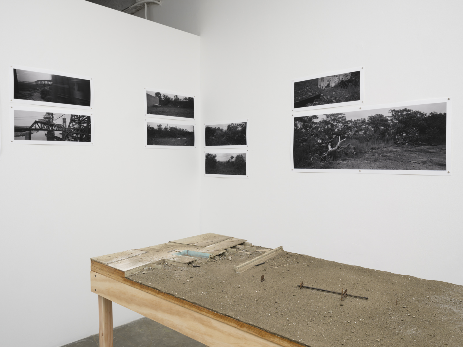
Michael Ashkin “Here, in the desert” installation at FOYER-LA (photo: Jeff McLane)
FOYER-LA’s current project, “Here, in the desert,” unites photographs, sculptures/models, and writing by Michael Ashkin. The work grew out of Ashkin’s lifelong fascination with the New Jersey Meadowlands. Between 1993 and 2000, Ashkin wandered the area and began thinking of the Meadowlands as a site of “found gardens” where hidden struggles within our landscape revealed themselves. With this in mind, he photographed the Meadowlands and built sculptural landscape models using this source material.
Interview by Connie Walsh
I am curious about your choice to often not include humans in your images—how do you see our role as individuals or as a society with the production and transformation of space and how do we distinguish between nature and not-nature/man-made? Is that a distinction that matters to your work?
I generally don’t include humans for a number of reasons. I tend to see landscapes as themselves personified or extensions of us; even if we don’t see people, the traces of all their present and future sufferings and dreams are layered into the landscape. I have sometimes thought of this as a broader extension of Marx’s expression “dead labor.” I also don’t trust myself to photograph people properly, especially close up; I am never sure what is being expressed in the photograph and who is doing the expressing.
I don’t believe the nature/not-nature dichotomy applies. On a perceptual and epistemological level, everything is and has always been anthropomorphized—nothing natural can be represented or known in an unmediated manner. Furthermore, the human has insinuated itself into every relationship between objects on this planet; even objects that appear to be natural (say a rock) cannot exist outside the framework of human intervention. Real estate, the nation state, the park system, the threat of nuclear holocaust, pervasive post-WWII atmospheric radiation are just obvious examples. Nature exists for me but in an unknowable sense—it exists beyond our formulations and is ultimately connected to some divine logic that encompasses absolutely everything. I see my photographs and sculptures as being a place where the relationships between our provisional formulations of natural law and historical human behavior play out. These are places where we can re-envision and re-intuit based on the best of our partial knowledge.
I am also thinking about others’ descriptions of your work—“depicting marginalized, desolate landscapes.”
Everyplace is desolated (or marginalized), the question is in what way. By that I mean that there are unknowable corners and outskirts to every object.
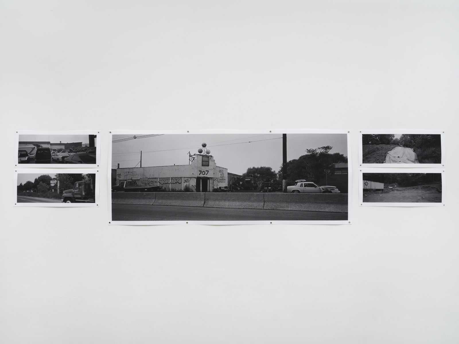
Michael Ashkin-“Here, in the desert” installation at FOYER-LA (photo: Jeff McLane)
What makes the space seem marginalized—is it forgotten-frozen in an in-between state or moment, neither depicting an ever-changing natural state nor depicting a built state in its glory?
I agree, that it is say: forgotten, but by whom and for how long. I believe that on a deeper level, we know everything; we just need to be reminded of it.
I want to go back and look at your images from your time exploring Berlin. Somehow, I feel a sense of nostalgia, but I am not even sure what I mean by that. What do you see when looking at these images: do they represent/explore an in-between moment?
In Berlin perhaps the nostalgia you sense is, if I am lucky, the sense of history buried within the present. Of ruins no longer visible exerting their presence. At least that is what I felt when I took the pictures. The rubble, the barriers, hardened building facades, fences, and obscuring trees gave me the impression of a landscape in which forces were still struggling in seeming stillness and silence. I say seeming because the seismic forces of subterranean history persist and their coincidence can produce events that, for us, will be unexpected.
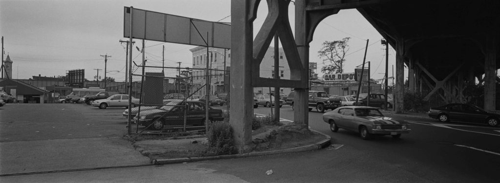
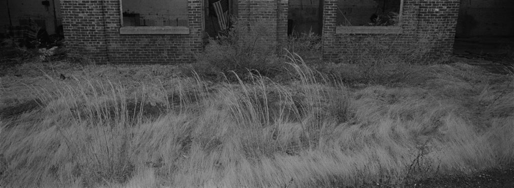
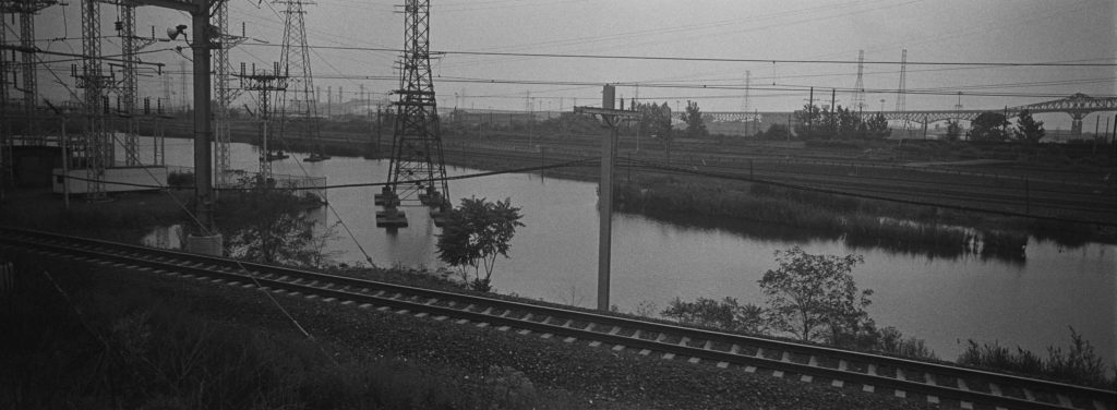
untitled images from the book There will be two of you (Fw:Books 2023)
You speak of violence—violent acts—and the idea of a haunting feeling; can you talk about this more? Who is being haunted and by what? Is it a feeling/tension you are trying to capture? Do you feel the photographs you construct expose violence/or violent acts and if so between what or whom? Is there some responsibility or evasion of and by whom?
If something is haunted, it seems to me, that means that something is being repressed. Perhaps every human decision involves some repression. Every choice involves violence to the extent that one route was taken over another. Entropy brings on a healing or scarring by means of a repressive forgetfulness. But that entropy, at least in the human world, is the result of a choice, political in nature, that is inherently violent. So the humans, their objects, and their landscapes are haunted by all past decisions.
For me, your images contain a representation of some sort of juxtaposition/struggle between nature and industrialization, but it feels almost poetic—like the two aspects/forces are trying to have a copacetic existence. Nature is reclaiming, growing out of the destruction—the industrial wasteland, trying to find a balance or a place to cohabitate.
I like that. Perhaps there are no stable objects, only forces at play, and all forces—at least how we see them—are both natural and human cultural/industrial.
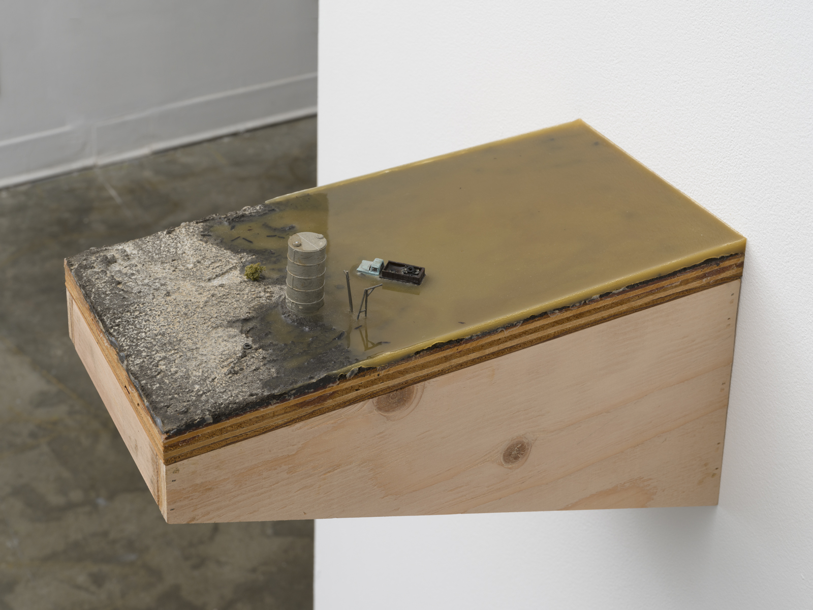
Michael Ashkin-“Here, in the desert” installation at FOYER-LA (photo: Jeff McLane)
I have been thinking about Susan Stewart—the miniature and the gigantic—in terms of seeing your sculptural work adjacent to your photographic work. Somehow the models seem to feel to me as a representation of infinity/endless vast landscapes—expansive. The photographs feel intimate—even when printed large—at times claustrophobic. Which all feels a bit off kilter—thoughts on scale and your usage?
Very good question, I had never thought to compare them this way. And you are right. I know that I considered both the models and the photos to be contemporary “found gardens.” For me gardens, particularly the formal gardens of the Renaissance and the Enlightenment, tried to reveal some image of truth about the relationship between man and nature. I was consciously trying to do something similar in both bodies of work, incorporating the ghost forms (and their negations) of those historical and idealized gardens.
On the one hand, the models were constructed “found gardens” and perhaps, to achieve their truth value, the need existed to show that they were representative extracts from a much larger space. For this the miniaturization of a vast space from which a small piece was cut proved useful. The border, which I placed exactingly for the sake of proper garden proportions, still needed to feel somewhat arbitrary in a landscape of sublime extension.
On the other hand, the photographs, as enframed “found gardens,” responded to a real topography, and the sublime proliferation of their internal logic required maintaining an internal claustrophobia that I could relentlessly repeat in variation from one photograph to the next, either in the form of a very large grid (as at Documenta) or in a long “walking” sequence (as in There will be two of you). The hope was that here truth value could be obtained by the repetition of photographic extracts which appeared to be, but actually were not, arbitrary.
It’s funny you’re mentioning that the larger photos seem claustrophobic. Oddly, they do seem simultaneously both more claustrophobic and infinitely extending than when they are small. Perhaps that is because when they get larger their logic appears to expand internally as more and more details, not discernable in the smaller prints, emerge.
Are you alone? How is the experience different when it is shared? What is the “unspeakable” in your writing? Did something/someone impose an end that you write of in the book or was it a natural ending—the walking with another. I am thinking about presence and absence—both literally with a lack of human representation in your photographs and sculptures and this feeling as a viewer that I feel a part of the represented morphing—the images feel still and yet they feel almost like a film still of a larger act—development/change/deterioration/evolution.
“Am I alone?” I guess the answer would be “yes and no,” or “yes or no.” Whether one or two enter the hanger is beside the point. The sense of feeling alone stretches over my whole Meadowlands experience, but, in actuality, through a series of irretrievable and alien selves. I began walking the Meadowlands to understand them and my relationship to them. But a unity of self and experience eluded me. All I have are the fragments: the images, language, memories, and memories of memories. In the story, “There will be two of you,” which ends the book, there is the momentary promise of unity, even as it dissolves.
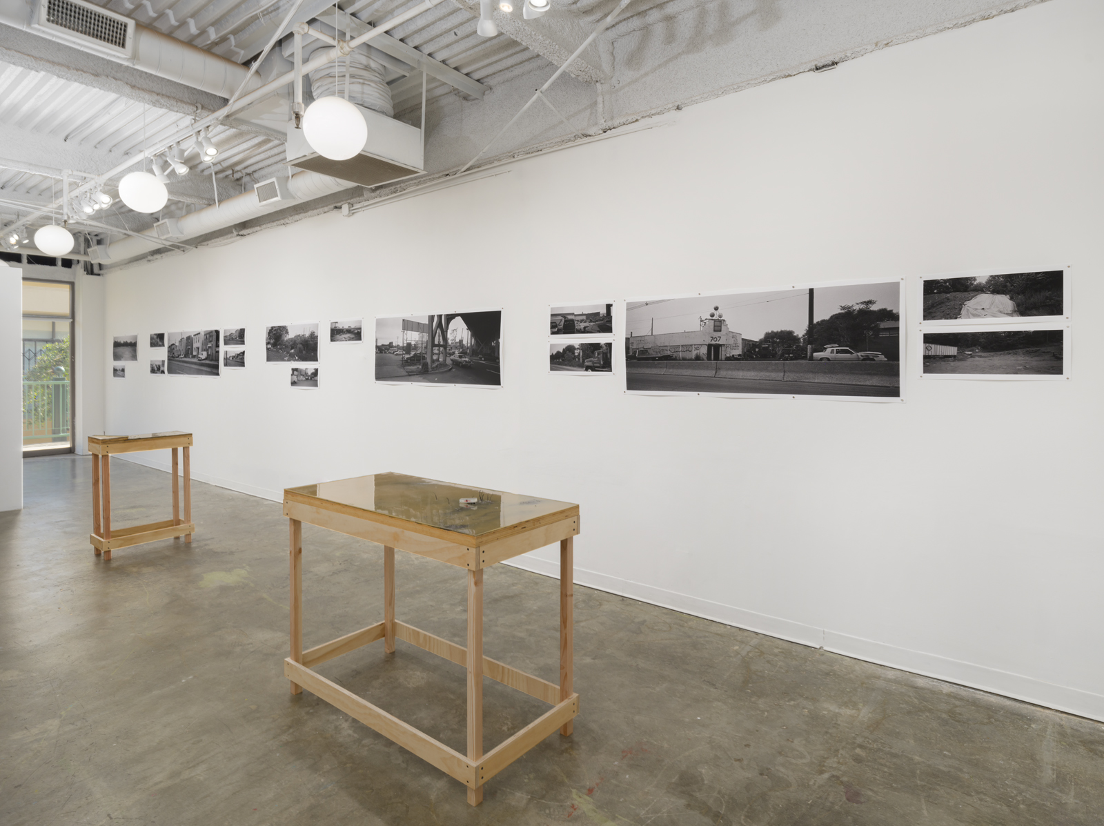
Michael Ashkin-“Here, in the desert” installation at FOYER-LA (photo: Jeff McLane)
You could also here talk about time—the passing of time—and your choice of how to capture it and hold it expose both your experience of time accumulating through your repetitive journeys in this landscape and the environmental effect caused by time passing. Also, the treatment or understanding of time represented in the photographic work vs. the sculptures. For me, I feel like there is a passage/movement in the photographs where the sculptures feel static—like there is a frozen event.
This is an excellent point, but so difficult to answer. If I understand you, I can answer that I am striving to escape from linear time into something approaching a more eternal awareness. And by eternity, I mean a state where the past, present, and future co-exist. Do the sculptures do this because we, the observers, move bodily and temporally in the present around a frozen moment? And maybe the photographs do that because we continue, relentlessly, to pass through a landscape of “difference within similarity” for what seems like an unending day? Relentlessness and implied infinity have always seemed integral for the truth value of my work.
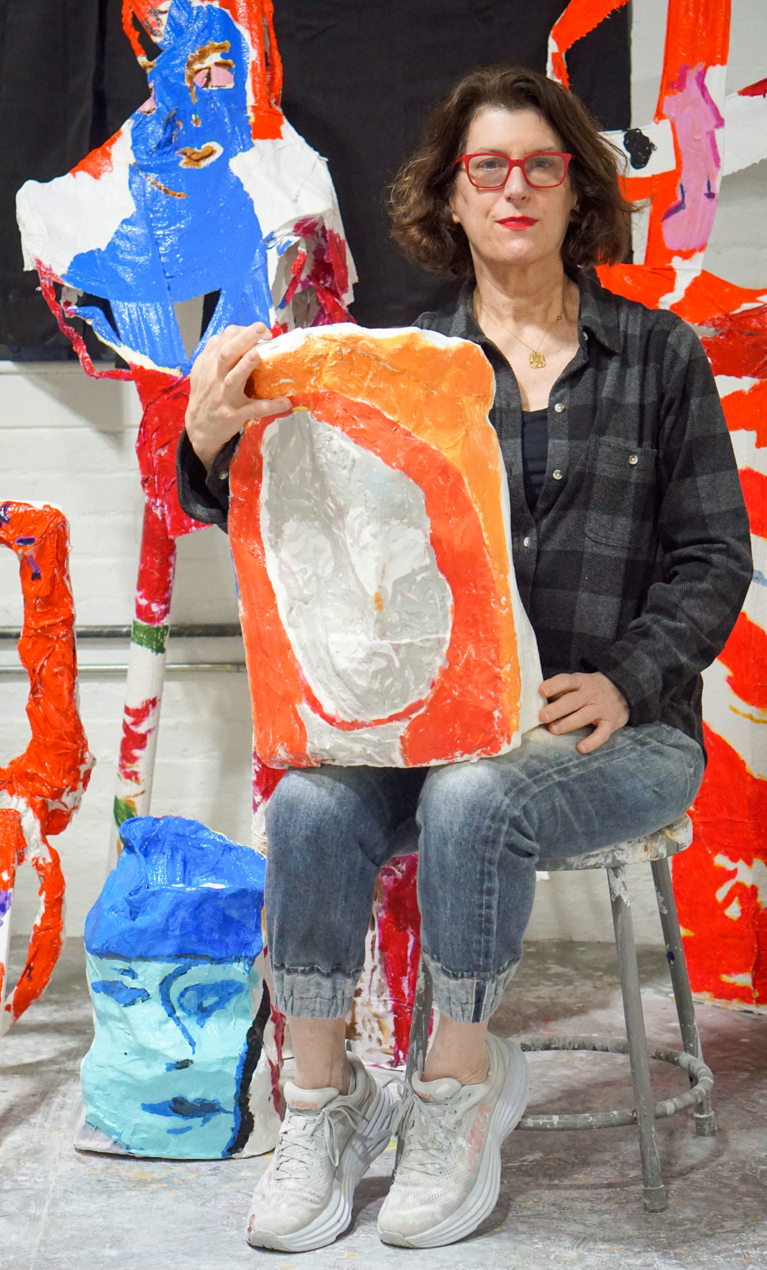
Since the early 1990s, Kerri Scharlin has examined her position as both the creator and the participant of her artistic practice. Whether placing herself as the subject (and commissioner) of bodies of work like “Interview” and “Kerri’s Coloring Book” which straddle the line between fine and commercial art, or painting surreal portraits of young girls and women with seemingly prominent yet vague societal roles, Scharlin maintains a strong connection to the rich and diverse concept of the feminine. “In Her Studio,” an ongoing series since 2014 and the nexus of her project in zingmagazine issue 25, distills Scharlin’s interests in the artistic process and the ever-evolving social dynamics of the art world.
Interview by Hayley Richardson
“In Her Studio” in zing issue 25 features 16 paintings of prominent female artists in, as the title suggests, their respective studios. Is there a common thread between these artists that drew you to them?
I remember when I was a kid growing up in Miami, never feeling like what was in my general vicinity was all there was. I always needed to avail myself of ideas from books to broaden my world. I never felt like I had access to everything, I needed to feed my mind and surround myself with prompts in hopes of elevating my game.
Now, whatever happens to cross my path, if I’m drawn to it, I mark by including it in my ongoing project. There’s nothing systematic about it except that I’ve narrowed my scope to female identifying artists. It’s kind of like having a committee of good examples to remind me of qualities that I want to include in my work. Whether it’s Amy Sillman’s making and unmaking of her visible decision-making processes, Molly Zuckerman-Hartung’s wrestling her multi-directional desires into paintings, or Jessica Stockholder’s coherent forms that emerge out of the layering of divergent kinds of information, I employ their images and so many more to remind me of what not to forget.
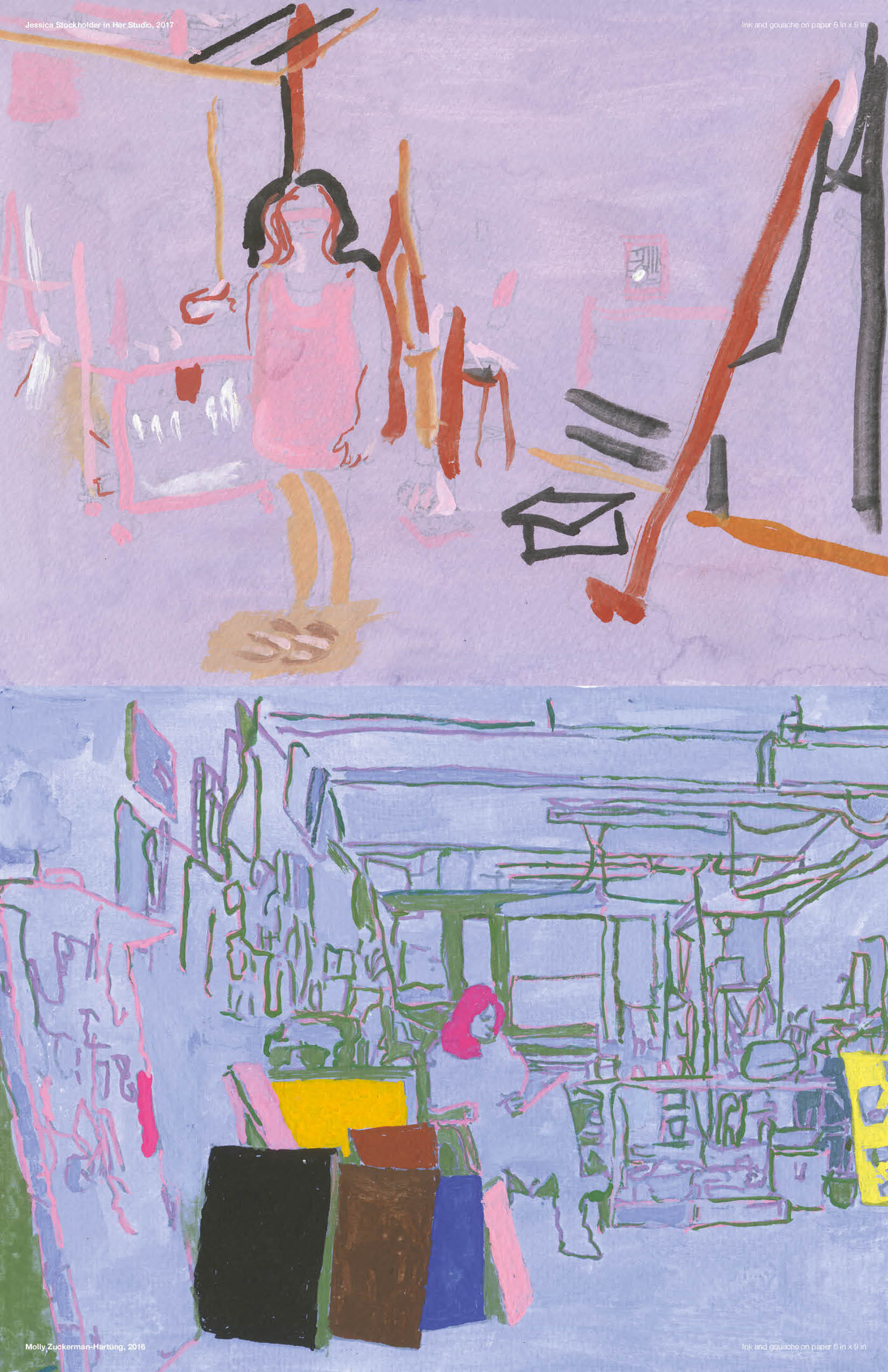
Top: Kerri Scharlin, Jessica Stockholder in Her Studio, ink and gouache on paper, 6 in x 9 in, 2017; Bottom: Kerri Scharlin, Molly Zuckerman-Hartung, ink and gouache on paper, 6 in x 9 in, 2016
Your project statement indicates that you made these paintings out of a desire to be known and connect with these artists. Has that manifested in any way?
Since I’ve started the project, I’ve gotten to know some of the artists that I’ve included. Many I haven’t. When I had a show in 2019, a good number of the artists portrayed came either to the opening or the closing where we met. Having a public opportunity to connect with the work and those artists was wonderful, as the in-person experience is so powerful. Understandably, it can be a little awkward to introduce the project to people over social media.
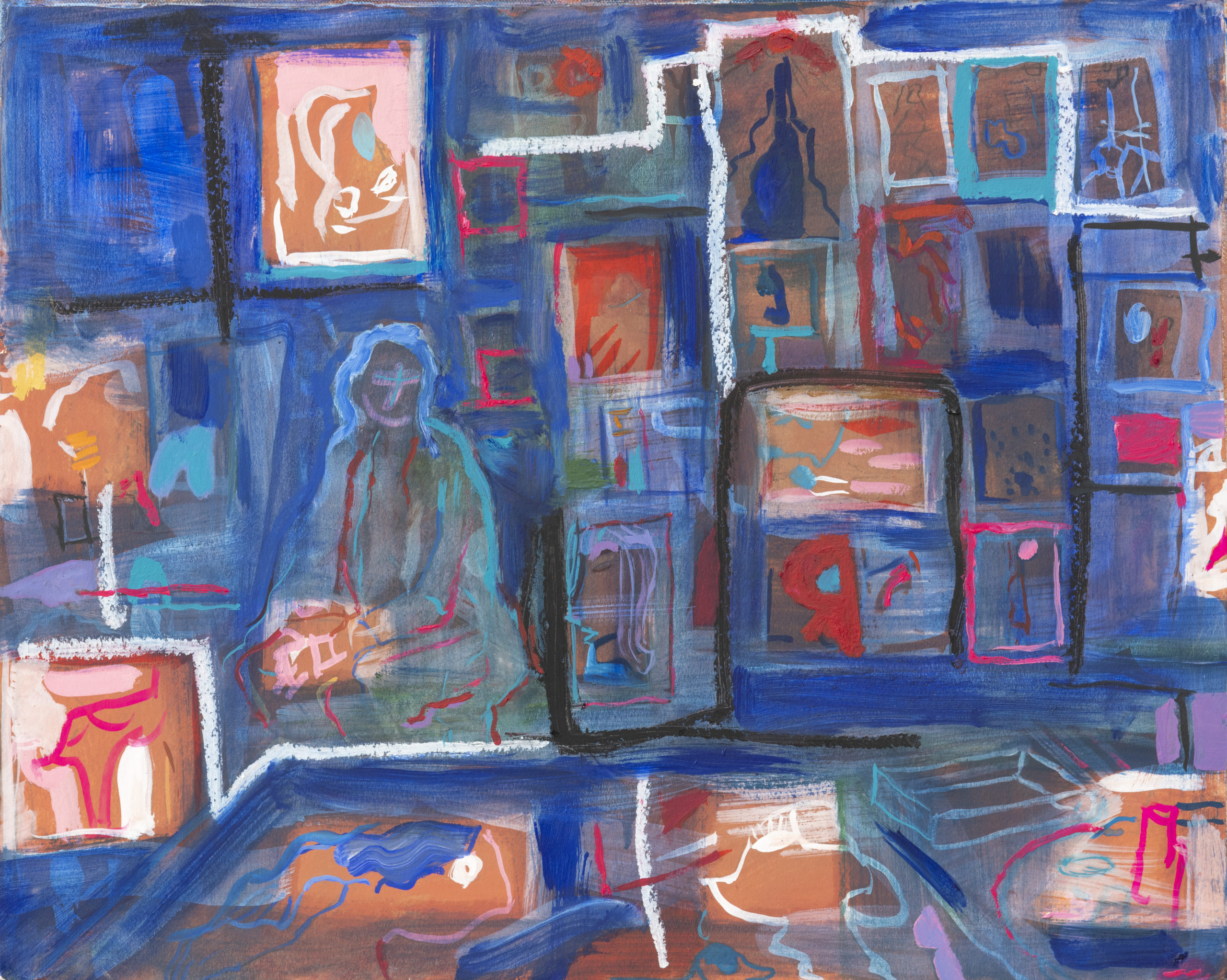
Kerri Scharlin, Wangechi Mutu, oil on paper mounted onto canvas, 16 in x 20 in, 2018. Dikeou Collection
You have an appearance in another zing 25 project, “The Women’s Group: Early 1990s, New York City,” curated by Natalie Rivera. The project profiles 18 artists who engaged, socialized, and networked within The Women’s Group and how it impacted their practices during that time. It is interesting that both projects address female relationships in the arts and appear in the same issue. How has your approach to networking evolved during your career and what form does it take now?
What I’ve learned as I’ve gotten older is how necessary a connection to a community is for me. When I was younger, I felt competitive and now I rarely do. Friendships and the feeling of making this journey alongside others is a salve and in fact the thing that makes this chosen life worthwhile for me. If I hadn’t learned it already, Covid drove the point home.
Always having had the facility to make representational work that looks somewhat “accurate”, I knew that I was part of a club, I was an artist. But the question soon became what do I do with that facility and how do I shape it? What do I decide to make and what do I decide not to make? How do I narrow and organize all my impulses into a particular thing that is my mark, my signature, my contribution to the world? Only then will I potentially be part of a more exclusive Club. Or perhaps a club that I could create myself.
I didn’t just want to narrow down to a signature style but to concurrently express how it feels when the world presents so many options and the challenge of putting myself forward in a unique way. I want to show my difficulties with that exact thing and to interrogate that difficulty, that inherent vulnerability. Some people are lucky enough not to have broken parts inside of them but I’m not one of them. I want to use that uncertainty as my lens to express my perceptions, the part that is looking for certainty and for identity and for, dare I say, acceptance.
Last year you did a residency at Yaddo in Saratoga Springs and Mass MoCA. How was your experience?
Residencies are another way of broadening my circle. Last year at Yaddo and Mass MOCA, having these small temporary communities, while not always the easiest thing for the introvert in me, expanded my boundaries in ways for which I’m eternally grateful. I have seen that it can be important and even feel intimate at times.
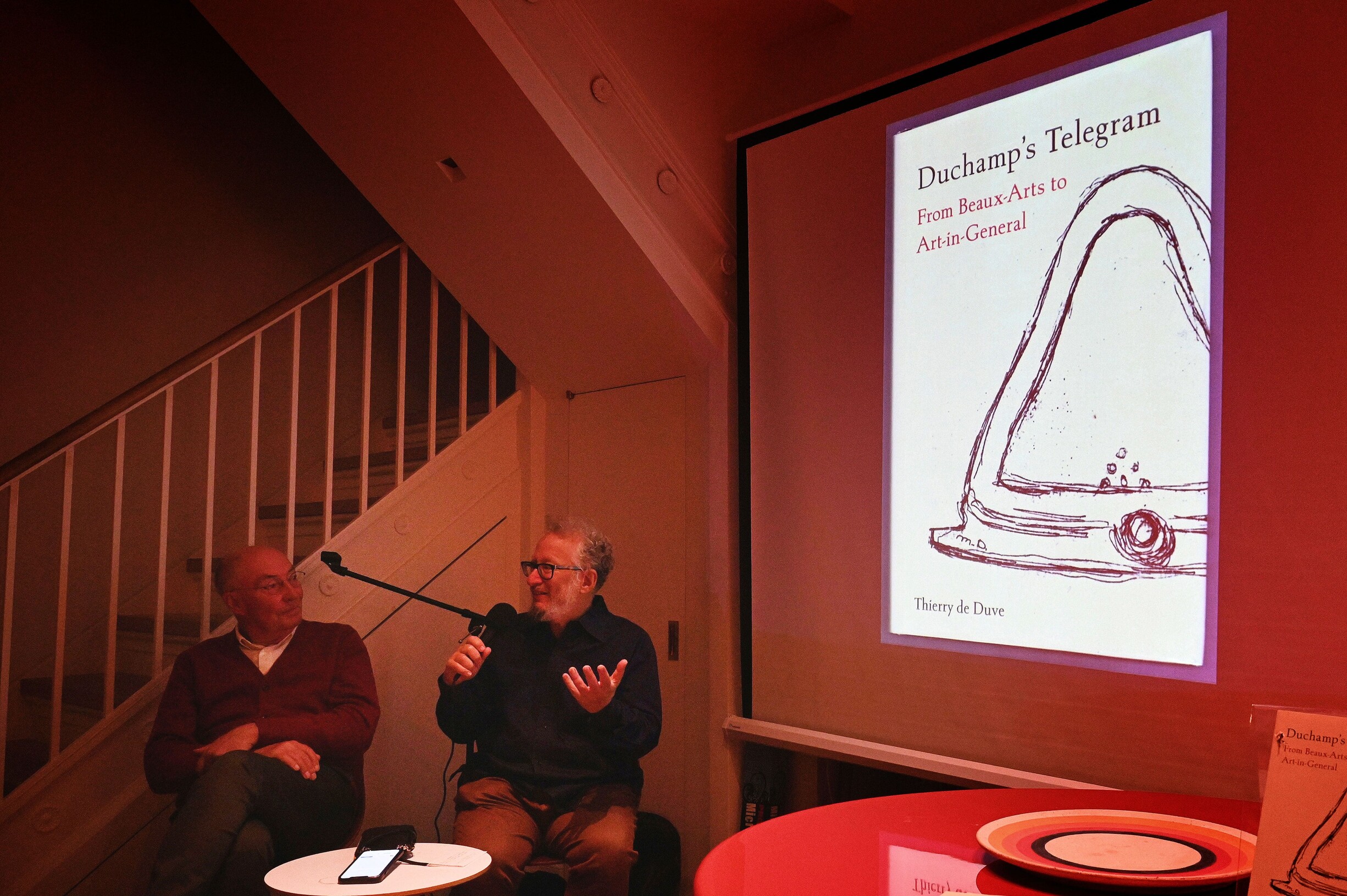
Thierry de Duve and Barry Schwabsky at Scharlin’s home salon
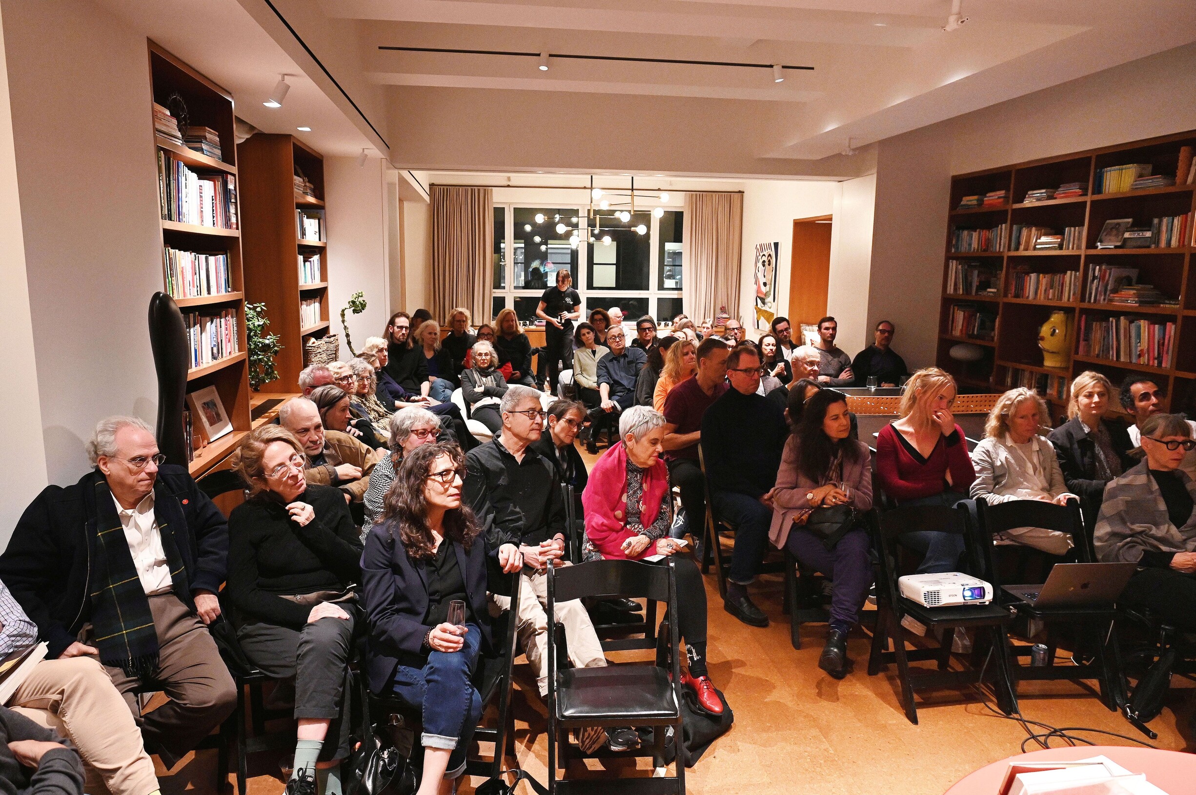
Salon audience
In November 2023 you hosted a conversation between Thierry de Duve and Barry Schwabsky which was published in a recent issue of Artforum. You’ve hosted such salons at your home/studio since 2016. What is the impetus/backstory of these events?
The Salons have been a way for me to surround myself in an intimate environment with friends, a sharing of goodwill with no strings attached, inviting people into my home and studio and to showcase projects in the community beyond objects: musical performances, poetry readings, book launches and discussions, performance art. I would like for them to become more frequent.
What are you working on currently? Do you have any projects or events
you’d like to plug?
Currently I’m revisiting my own images of artists to extend and complicate my compositional vocabulary. I’m using layering to find surprises that interest me. I’m also making sculptures that complement the paintings. I hope to show the work soon.
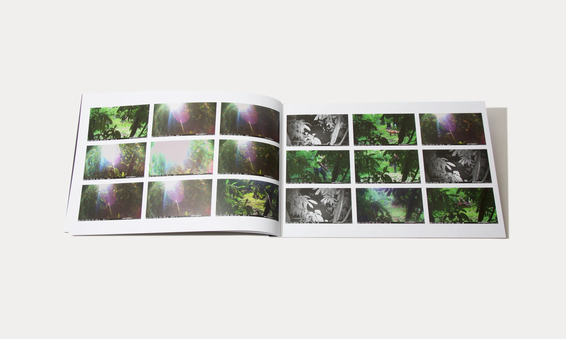
spread from MOURNING
Lisa Kereszi is photographer, mother, and educator living and working in New Haven where she serves as Assistant Director of Graduate Studies in Photography at Yale School of Art. Her work has been exhibited at numerous institutions, including Whitney Museum of American Art, the New Museum, the Brooklyn Museum of Art, and she is represented by Yancey Richardson Gallery in New York City. She has had numerous projects in the pages of zingmagazine; “Drinking” (zing 9), “Night Light” (zing 16), “The Priory” (by Benjamin Donaldson, curated by Lisa Kereszi, zing 20), “Peepshow Creepshow” (zing 22), and “The More I Know About Women” (zing 24), and her work is also part of the Dikeou Collection. Here we discuss Lisa’s work in relation to printed publications—the recently published photo-book IN (Roman Nvmerals) and the forthcoming MOURNING (Minor Matters 2024) that will be launched at Printed Matter Chelsea on March 21 from 6-8pm and April 25-28 at The AIDPAD Photography Show.
Interview by Brandon Johnson
Your work has been the subject of numerous books and magazines over the years. What does the role of printed publications mean to you as a photographer, and in your experience are there any specific challenges or considerations to translate the work to these formats?
I think photography as a medium really lends itself to reproduction, whether it’s on the page, screen, wall, billboard, photo album, in someone’s pocket or wallet—after all it is definitely firmly rooted in Walter Benjamin’s “art in the age of mechanical reproduction.“ A print on the wall might need to be large and can easily be seen at a distance, and maybe even needs to be seen at a distance. But when a photograph is in a book, it is held in the hands, or at least placed on a table, but either way, it’s a very intimate experience. It is often a private interaction, too, not an encounter in the public space of a museum or gallery. Photography first gets introduced to us all in books, magazines and family photos (not photobooks, but non-fiction, informational books in childhood.) (Today, I guess that’s happening increasingly more often than not on screens of varying sizes.) Other than billboards and posters and ads, most people outside the art world probably aren’t looking at too many framed photos on museum walls, so having my pictures viewed up close and personal in book form, smaller scale, feels incredibly natural. I actually pre-visualized IN being smaller, like 5×7”, for some reason. And MOURNING is big, as far as books go, because the publisher wanted the book to echo the handmade grids I assembled out of 4×6’s, and she wanted to put out a consciously large book by a woman as a statement. Women never unapologetically say, “I know that thing doesn’t fit on your shelf: deal with it.”
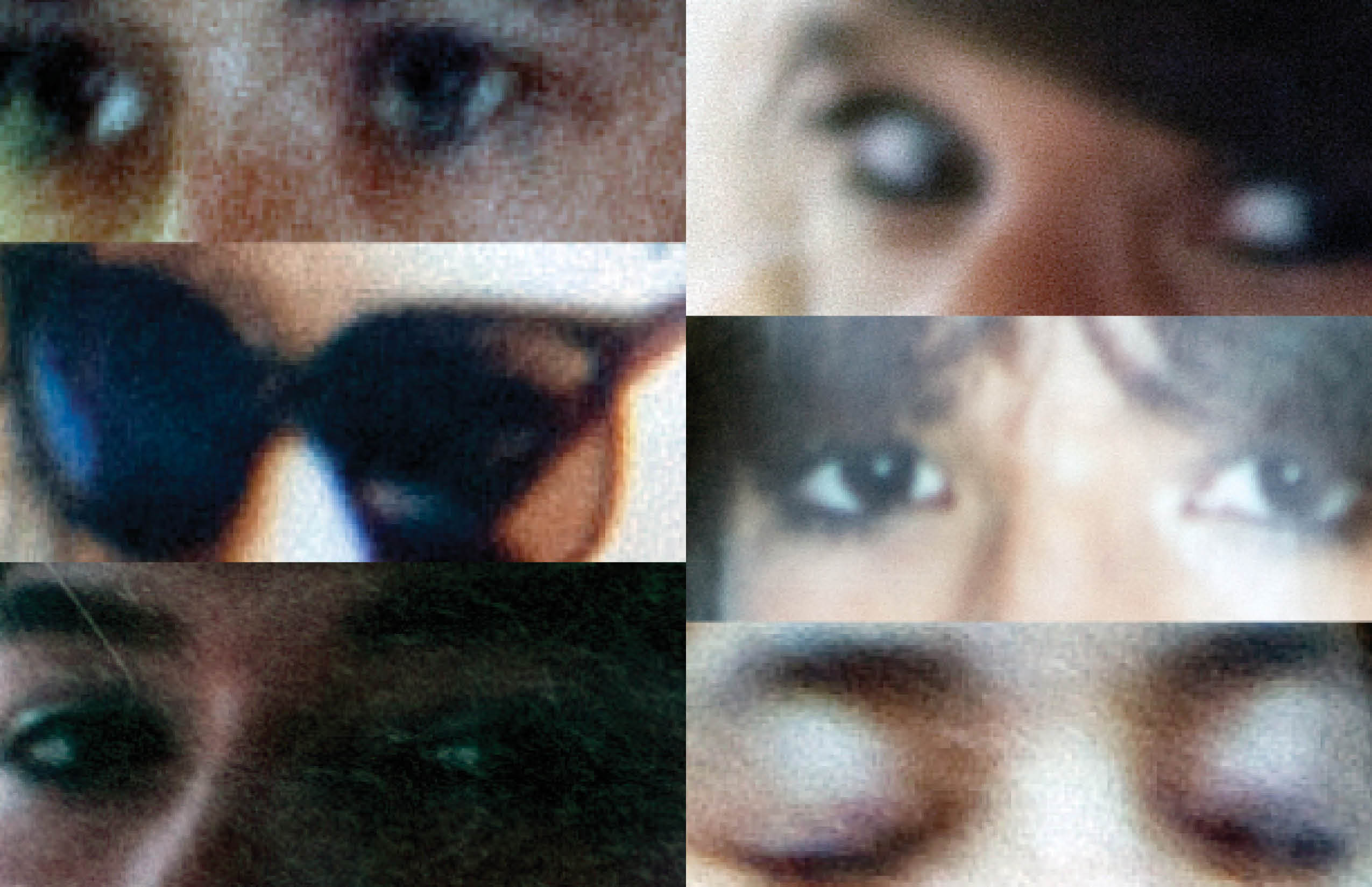
spread from “The More I Know About Women” zing 24
More recently, the subject of your work has revolved around family. Two previous books, Joe’s Junk Yard (Damiani 2012) and The More I Learn About Women (J&L Books 2014) along with a project in zing 24 “The More I Know About Women” engage in the sphere of your father’s life. And now a new book MOURNING that addresses his death. Another recent publication IN is a collaborative photobook with photographs made by “two parents and one child” (yourself, Benjamin Donaldson, and Ottilie Leete). What has led to the shift of focus to family at this part in your career?
Well, I guess it’s actually always been there. I conceived of the junkyard book before 1998 and showed the work that Fall in my very first critique in grad school, saying as much about my plan for it to be a book. I put it on the back burner but made a push in earnest to finish most of the pictures between 2001-2003, during my family’s last few years in the junk business. The book sat on various publisher’s shelves, on and off, for years, finally being published in 2012. It was a long-term investment! The More I Learn About Women artist book came directly out of the research in the family archive that I did for the historical photos I used in Joe’s Junk Yard, after my father handed me a huge stack of albums that contained his own photos that were adjacent to the business—his pictures of cars, motorcycles and women. In 2013 I got pregnant and knew instinctively that I wasn’t going to be the creatively productive person I’d grown to be, so I created that book, which came out the same year my daughter was born, 2014. I was right because it would be a decade until another book came out. But in putting two books out, pretty much at the same time, I guess I made up for the “lost” time. The time wasn’t lost, just focused into something, or someone, else, and also spent becoming someone else—a parent. In fact, the unpublished work I made to help overcome post-partum depression, was also, in a way, about family, or at least reinventing myself as a photographer with a family of my own. It is called “Walking With Ottilie,” and is all work made on walks with my baby, then toddler. (The work sort of ended when she became mobile, and unable to keep in one place in a carrier or stroller!)
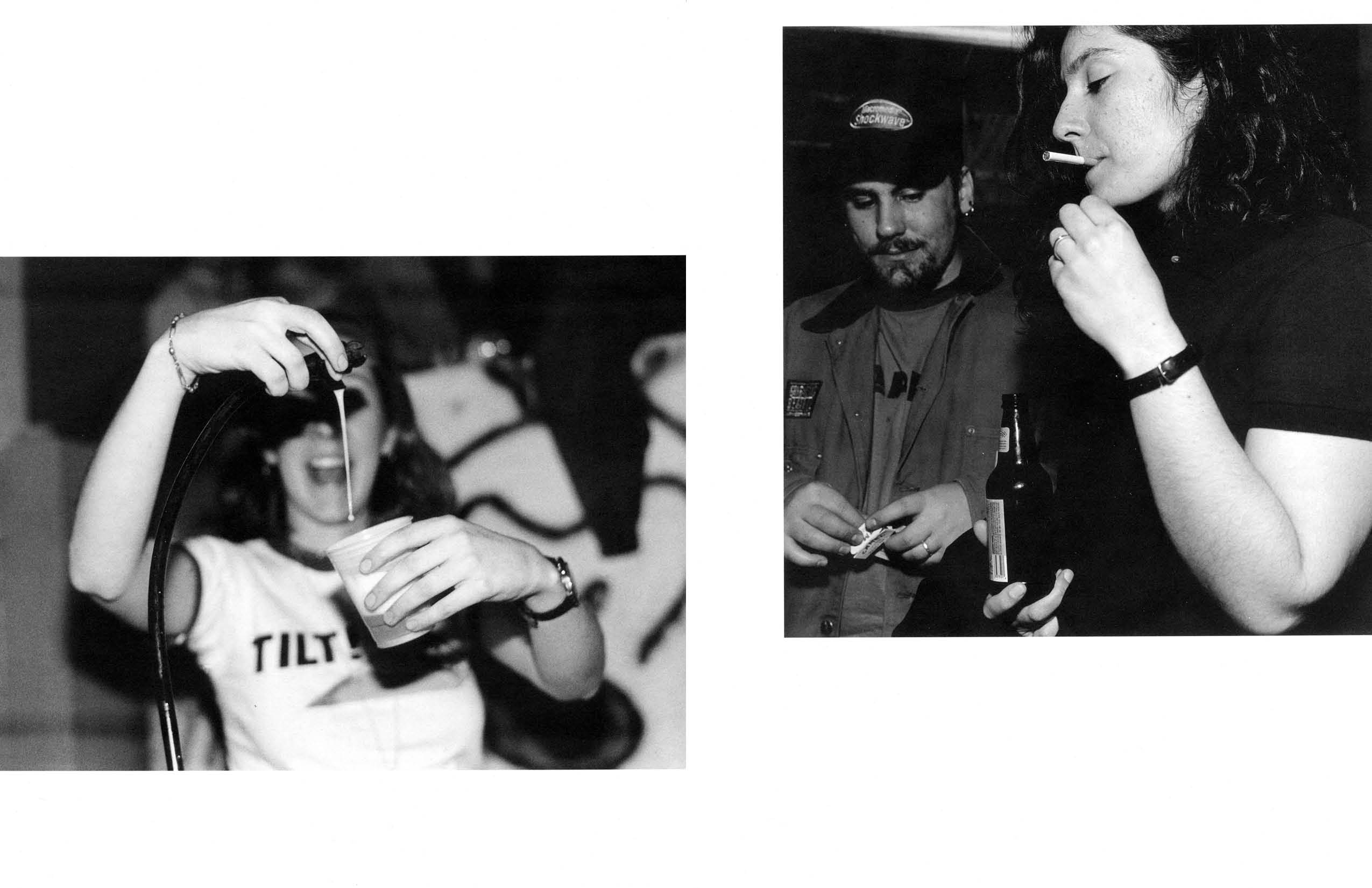
spread from “Drinking” zing 9
But the work of mine that went more widely out into the world looked like it was about things outside of myself and my experience growing up in the family that I was in. And it was—but it also wasn’t. The pictures of bars, nightclubs, strip clubs, cheap motels and disco balls is all about escapism. In fact, the work that is in the Dikeou Collection was made as a response to family baggage. That black-and-white series, “Drinking,” was from my college senior thesis, and focused on drinking and drug use. It was my way to try to get into the mind of an addict like my dad and any number of boyfriends. I was trying to understand it. Those pictures of people partying led directly into the work I started at Yale, which was later in the 2008 and 2009 books, Fantasies and Fun and Games. It was all still really about a kid trying to understand why people like her dad need to escape reality. It’s funny, but my mom solidly being there for us enabled my sister and I to thrive and to become artists, but my obsession creatively is not with her love and care and attention, but instead with the guy who was absent at the dinner table every night.
These two books now are less about all that oblique metaphor around escape, surface and fantasy, and more overtly about family—the one I grew out of, and which is getting smaller year by year, and the one I’m now in and am building with Ben and Ottilie. And the form, themes and way that these newer pictures were made all fit into my busy, working-parent lifestyle—pictures I outsourced to a trail cam, and pictures I made with an iPhone in and around my house with my nuclear family all within arm’s reach, them both co-authors.
Your father passed in 2018, and at the end of that year his black granite gravestone “keeled over backwards under mysterious circumstances” (to quote Marvin Heiferman’s introductory text to your forthcoming book MOURNING). How did this incident lead to the genesis of new photography (from what appears to be the trail cam mentioned above), and ultimately a publication?
Well, someone knocked over his gravestone not soon after it was mounted, sometime between November 2018 and New Year’s Day, 2019. It is possible that it was something (like a deer) coupled with uncured or bad mounting adhesive (yes, you wouldn’t believe it, but these days it seems a squiggle of epoxy assists gravity to keep a stone on the base.) But given the fact that I was locked in a pretty terrible battle with my aunt over my grandmother’s home and things (she had also died less than a year before), I had my suspicions. Of course, I couldn’t prove it, so I went to photography to try to get to the bottom of it—should it happen again. My sister is the one who was in town for the holidays and discovered it, so from a few hundred miles away, I enlisted her and her husband to pick up a trail camera at a sporting goods store and mount it, then my mom and step-dad to maintain it, stuff like the firmware update and changing the batteries.
My dad died in early February 2018, and the one thing I did have control over was to swiftly get a memorial up before the end of the year. (The marker has etched into it one of my portraits of him in his cherished 1956 pink Caddy—“like Elvis’s” he would say, although the King’s was a slightly different year and model, but I am splitting hairs.) So, I imagined that seeing his face looking back at them from the grave was a final straw for her or someone. Or maybe it was “just kids” and a teenage prank.
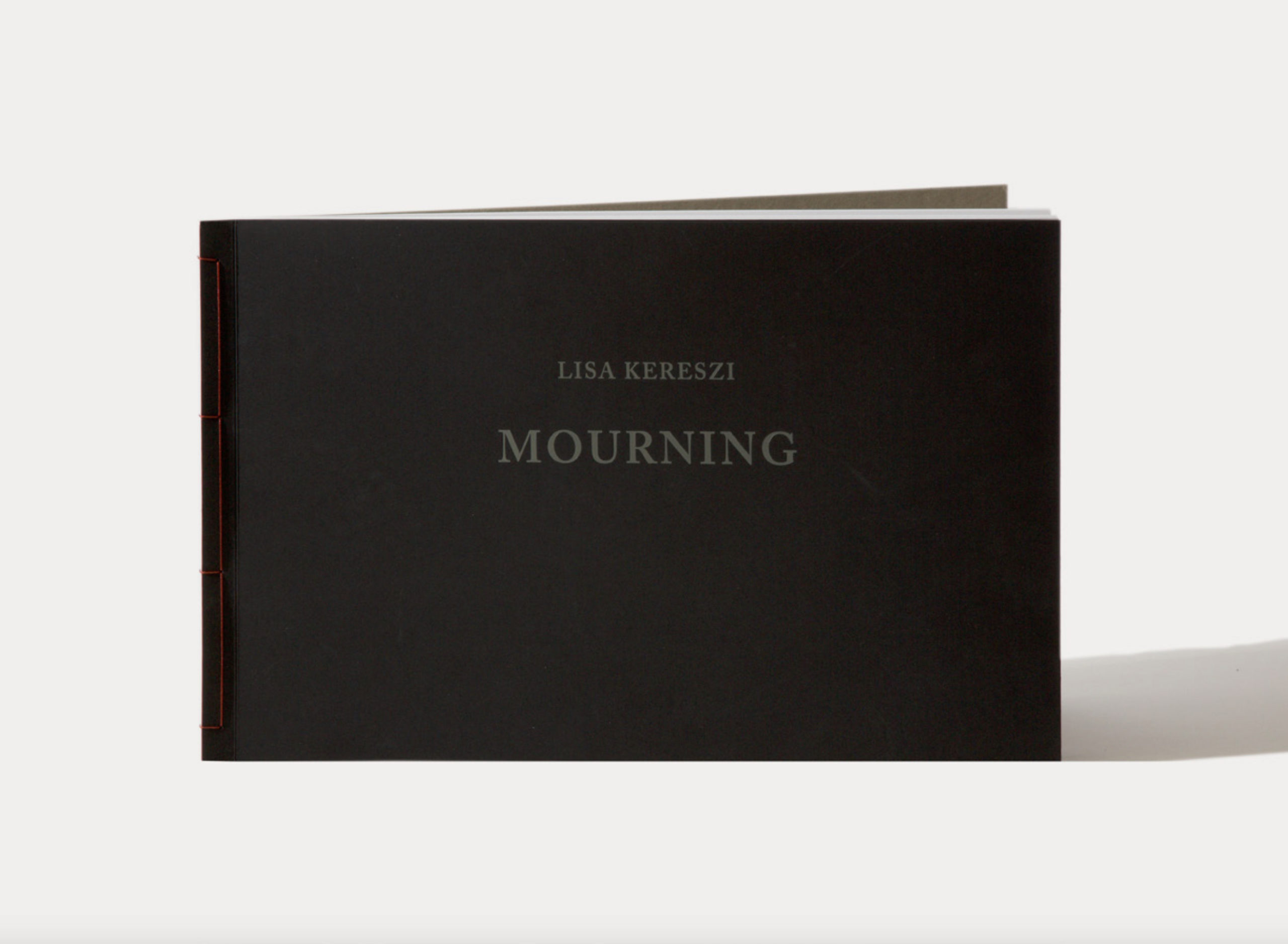
cover of MOURNING
I think the form of the book—those grid arrangements—was also my way of creating order in a sea of chaos. It’s bad enough to lose someone, let alone two people, and all the stuff that comes with dealing with the estates and grief and all of that. On top of that, to be locked out of my grandmother’s house (where he had a bedroom and a garage and backyard where he had kept full of his things), and to try to save any scrap I could grasp, became all-consuming for a year or so of my life. I was tracking down their belongings at pawn shops, consignment shops—even the free store, where my dad’s sister preferred giving things away rather than letting my own sister and I have any mementos. I also made a bunch of other grids of pictures of these material things I was searching for and feared lost, as well as other ordered collections of appropriated images.
All these grids are included in a bigger body of work about all of this family baggage and dealing with loss, and then about moving on from the family you came from and starting a new one. The work is entitled “Sunrise, Sunset.” As soon as I can come up for air, I will finish the series and the book dummy I have sitting on my desk here.
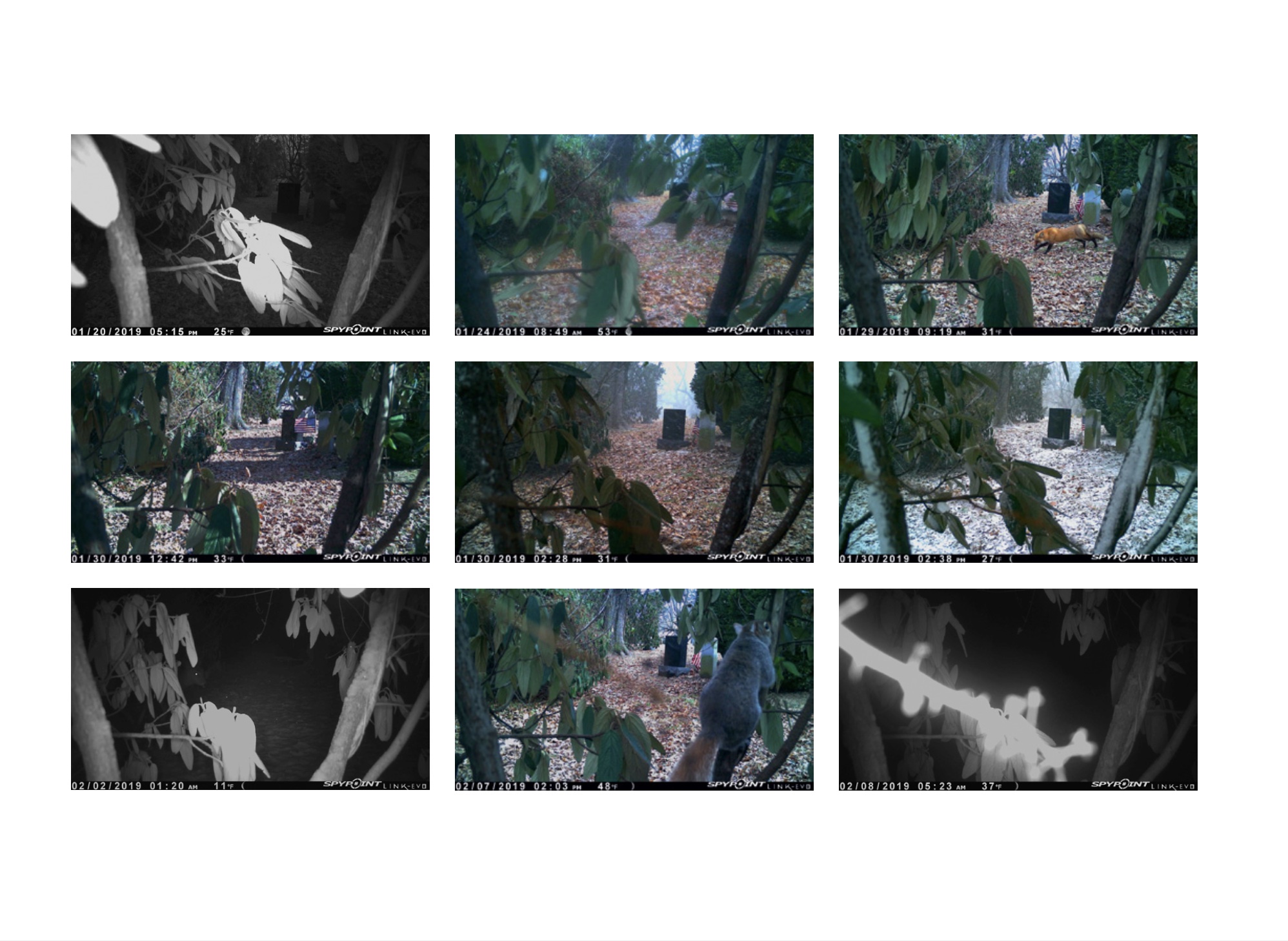
spread from MOURNING
MOURNING is a limited edition with handcrafted elements— board back with stab and thread binding. How did you and the publisher arrive at these material decisions for this content?
LK: During the pandemic, on Zoom, I showed this proto-dummy in loose print form to Michelle Dunn Marsh at Minor Matters Books, hoping she would want to publish it. (Michelle and I met in the Publications office at Bard College in the ‘90s, and she designed the junkyard book.) She zeroed in on the grids, and said she thought that that portion of the bigger project could be expanded on and made into its own thing—an artist book. So, she really was the one who quite literally pulled this “insert” type portfolio out of its bigger context, gave me the push and confidence to let it stand on its own, and then gave it life on the printed page. We toyed with an accordion-fold, thought briefly about a calendar-like format, but ultimately settled on something more like an album—a family album, whose color, shape, and form also echoes a grave marker or monument. So much of the aesthetic choices you are asking about were really collaborative and about me relying on her expertise and her own care and attention to the subject matter from her own experiences with grief.
To let her speak for herself, though, since this was so collaborative, Michelle says:
MDM: Lisa first showed me large pages where she’d taped photographs in grids. As we discussed the meaning of the work, and the forms the project could take, we tried a few different sizes, an accordion format, etc. But at some point, it felt like we’d overdone it, and lost the simplicity, beauty, and intention of what she’d originally created. So, we returned to the grids, and a similar scale to her artist’s book. Mourning has presence but is not unwieldy—you can hold this book in your lap and look at it, and that felt important. It is, after all, a twisted form of a family album.
I have a book from the early 1800s from Japan that is stab and thread binding, and I’ve always loved its visual vulnerability while knowing it is an enduring method of binding. That felt right for this body of work. Initially we wanted heavy board on the front and back, like two tombstones, but the front cover needed flexibility to function, so we went with a heavy paper, double-folded, and die-stamped the author, the title, and then the publisher’s name on the back board to create the physical indentation of letters. The book block, like the front cover, is scored, to relieve some of the pressure on the binding when a book of that scale and weight is completely open.
LK: As for the number of copies, 500 has been pretty standard for the number of each of my previous books—it’s an achievable sales goal for “Photoland.” Minor Matters has a crowd-sourcing model that requires presales that total the amount needed to go to press and print the book, and she usually sells 500 at $50 each. This book tested a higher price-point for it as an art object, since the grids I fashioned at home with 4×6’s and rubber cement are the exact same size as the book pages, so the book binds together replicas of the real thing I made. Selling 250 seemed like an attainable goal for this particular book: while many connect with the subject matter and the experimental use of a trail cam, I think there are others would also maybe not want to look at a bunch of low-resolution images that appear sort of artless and barely-composed, and which are about the death and sadness, to boot. But I hope the moments of surprise and light and life are uplifting, and express that life does go on.
cover of IN
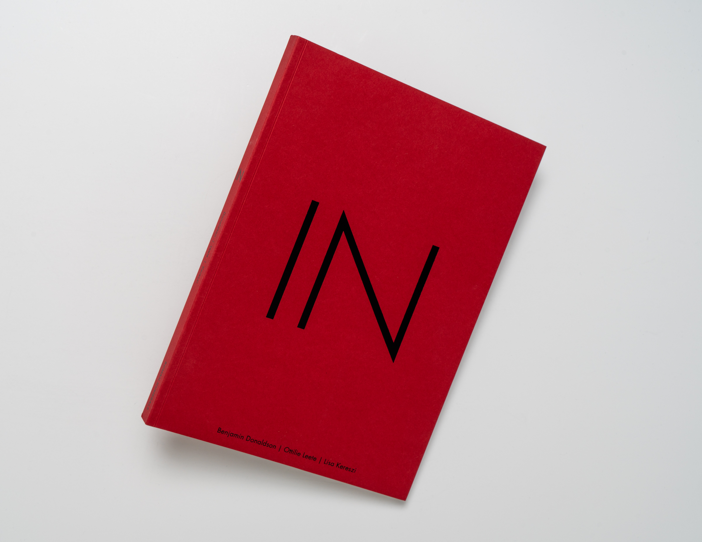
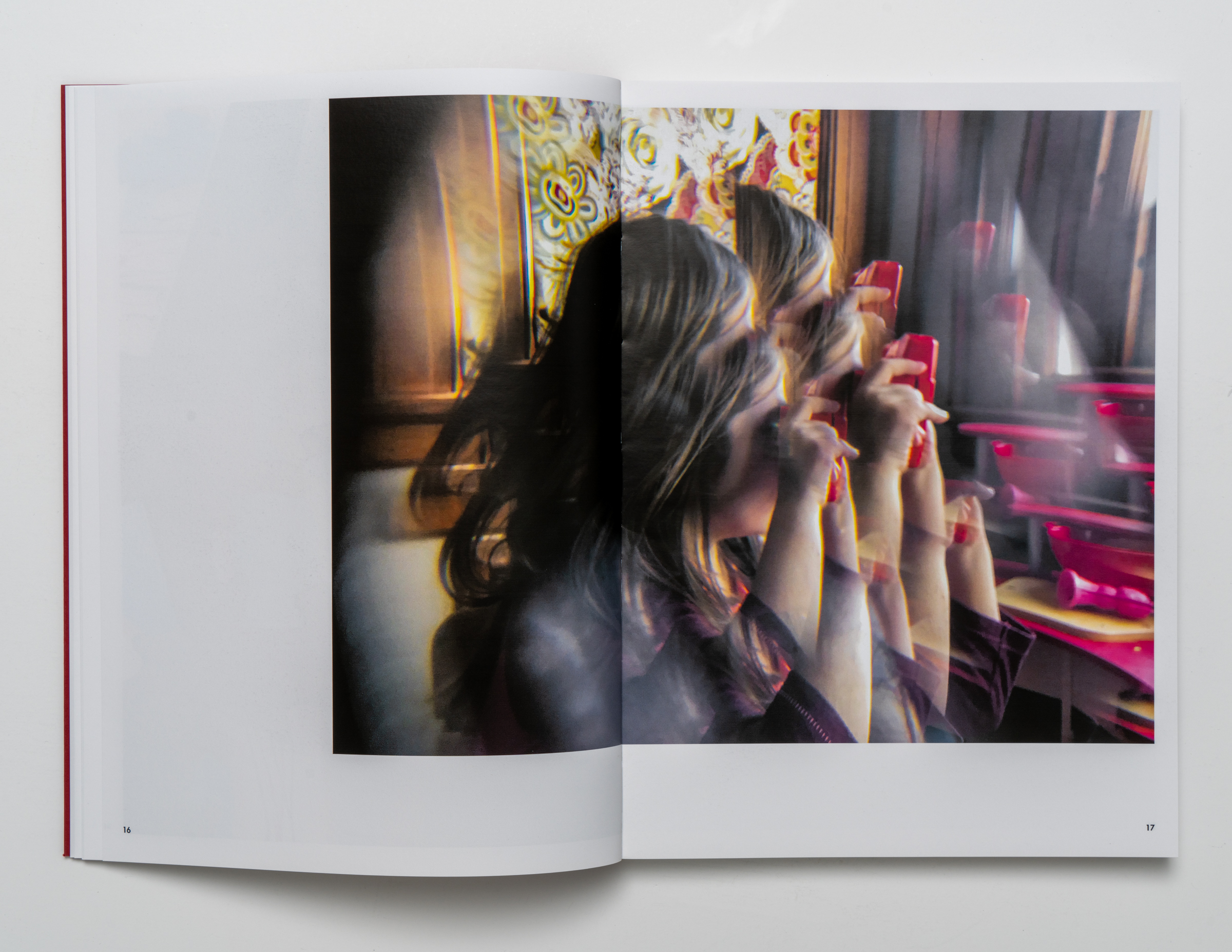
IN is an experimental artist book of photographs made with, as you said, your nuclear family beginning at the start of the pandemic lockdown in March 2020 through Spring of 2021—a situation that radically changed the lives of many into a new more intimate domestic reality with which many of us can relate. Was this body of work and publication just a natural result for two parent-artists and one child-artist living together during this time? And on an editorial level how did it feel to select and share these personal photographs with the public in the form of a book?
Benjamin [Donaldson] also answered:
BD: The project that the three of us undertook separately and together grew from us each needing to perform an act that reflected our reality and made a trace, when we had no idea what others’ realities looked like. It now seems to be a recording from a deep well.
Our family existed in this bubble together, well-aware that there were other bubbles percolating alongside us—everyone caught in their own experience. These pictures now live and belong together, having been made within the confines of the Pandemic days. There were times when each of us went into our own selves, even given our proximity, and our individual picture-making was part of that expression of self under the pressures that many of us felt. It seems to me that it was the natural expression of a family unit living through a very particular historical moment.
The photographs in the book form return these individual experiences to the roaring blur of our small entirety within the larger sweep of Pandemic time. After having such a spare amount that could be communicated with those outside of the three of us (except through a screen), this book stands as a physical memento that can be shared—something tangible that reflects love, terror, and a deeply personal historical record.
spread from IN
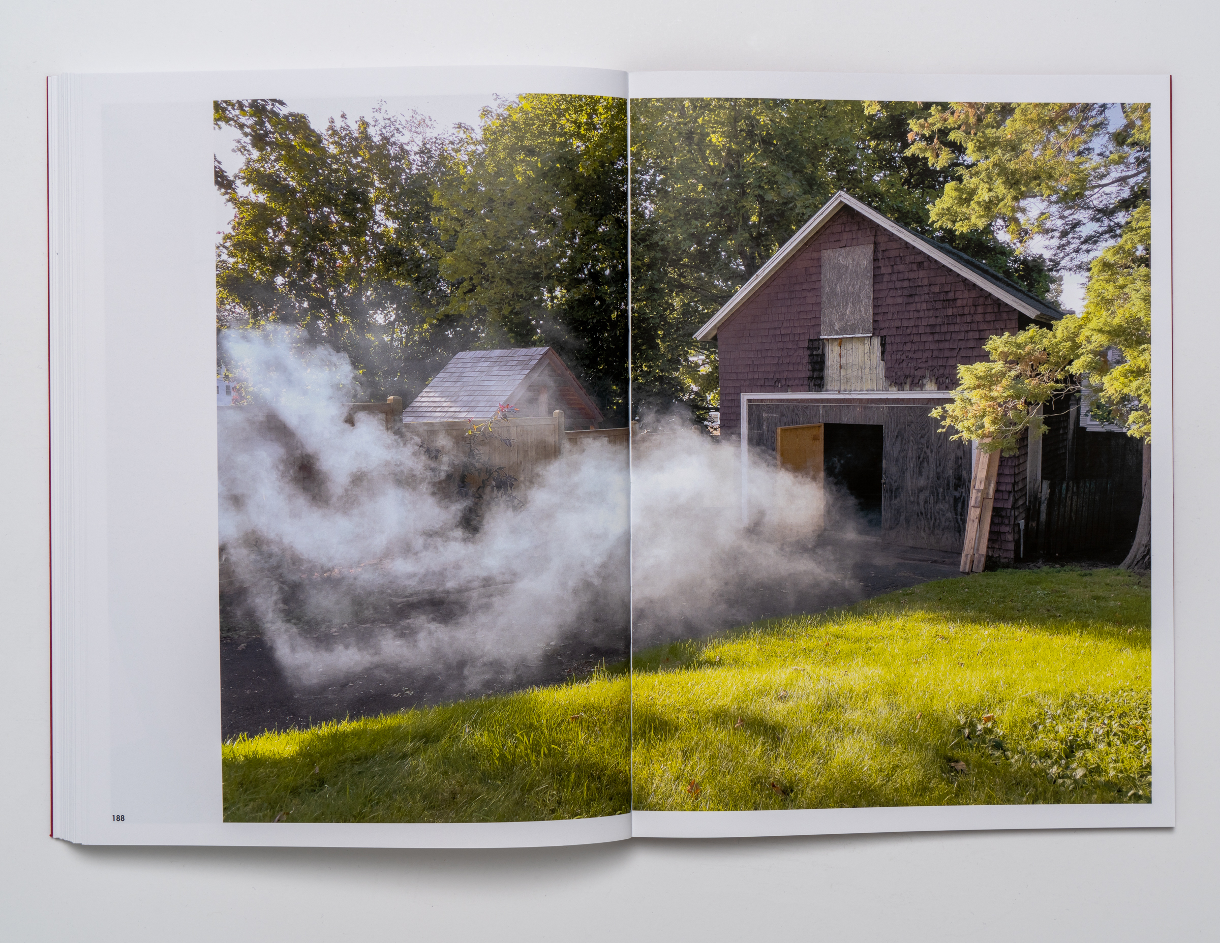
LK: I suppose we naturally all reacted to the situation and tried to cope by, among other things, taking pictures. I honestly just used my iPhone to take pictures of food and flowers, documenting the ups and downs of meal preparation and the annual cycle of rebirth growth and then death and decay that is part of the backyard and garden ecosystem. I had arranged all of these into a book that was as long as IN, actually, in which I guided the reader/viewer through the year chronologically with paired images of a meal and plants. I punctuated the sequence with beach-combing finds, since that was my solace and escape. Ben made pictures intermittently with a “real” camera and lighting of the staged or noticed magical and mysterious moments in the lives of a strange little trio in a big, weird house full of interesting stuff to look at and interact with, dressing up, acting out scenarios and making stuff.
Our daughter was 5 in March 2020, turned 6, then turned 7, and she “wrote” a handmade, construction paper book every day in virtual public school. Sometimes she taped photos in, but she usually drew the illustrations. During classes, and really, all day, she took to drawing and fashioning cut paper houses, with many rooms, and big families occupying them. You see a few of those drawings in the book. She also was encouraged to take pictures with a little pink (then a red) point-and-shoot, something she previously would do when we went to New York, rode the train, drove around to look at holiday light displays, or to document her toys or her face or anything she wanted to remember or save forever. The pictures she was moved to take on her own during this period were still of her toys and Christmas lights, but her out-the-window pictures took on new meaning, and screens became such a big part of her life that she took screenshots, of sorts, too. She also turned the camera on us as well as her food.
spread from IN
We arranged the pictures into three separate volumes, and that is what we approached Roman Nvmerals with: a 3-volume set to be slip-cased. One of the publishers, the photographer Michael Vahrenwald, instinctively knew that was not the answer. (Though Ottilie would vastly prefer that her contribution remain as her own, individual publication, entitled, “Ottilie’s Picture Book,” like the Shutterfly dummy I made.) He asked me for prints of everything, and on his own mixed them all together into something that retained the general chronology, but that was far more interesting. The book as he saw it was not really about individual authorship, but instead the linked rings of a trio who were trapped on this ship in an uncertain storm at sea. Both publishers had a stake in using these unusual, collaborative images in ways that had not exactly been done before. The form followed the content.
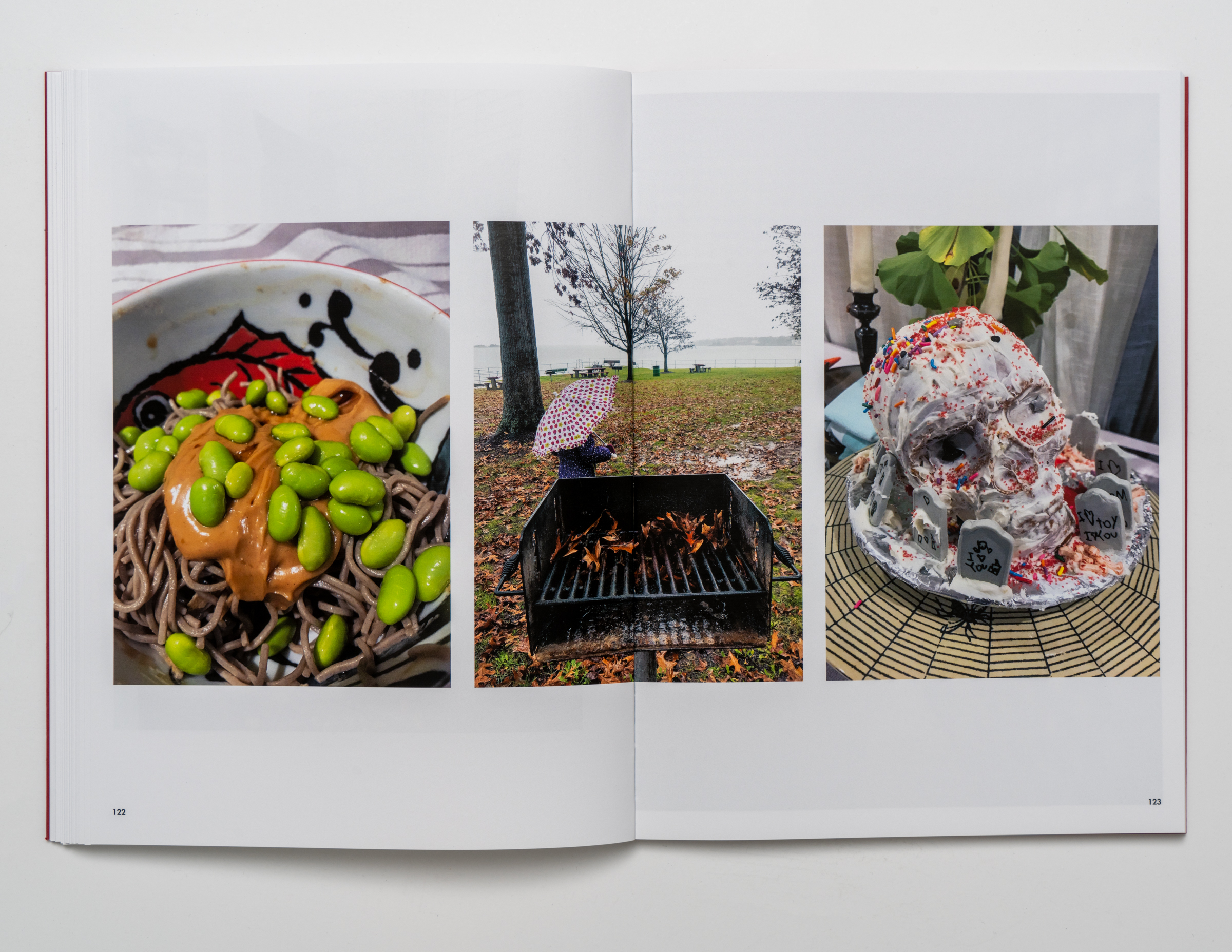
spread from IN
So, in both books here, I relied on and trusted in the collaboration with the publishers, who I count as friends as well as peers in the “business.” That mutual respect and willingness to let go a little bit and collaborate and see what happens is ultimately what allows both books to succeed as experiments, I think. I collaborated with my family in both books, with a motion sensing remote camera, with the writers and the publishers as our editors and guides, and ultimately with the Universe. That’s what photography is anyway, for me at least—a collaboration with what’s outside of us and being open to chance and change.
And so far, the feedback has been good. Sometimes when you put something so personal out in the world, you just kind of shove it out there and let go and then close your eyes tightly and wait. The writer of one of the book’s essays, Cindy House, early on let us know we were making something relatable and valuable when she so perfectly summed it up, “Here is a book of images that are both familiar and strange. Everything is recognizable and nothing is. I know the bubble, the isolation, but this is not exactly my bubble. This book makes me feel like we were all lost at sea in our own boats, none of us in sight of each other out there on the open water, just trusting that the other ships were sailing in the same ocean somewhere.”
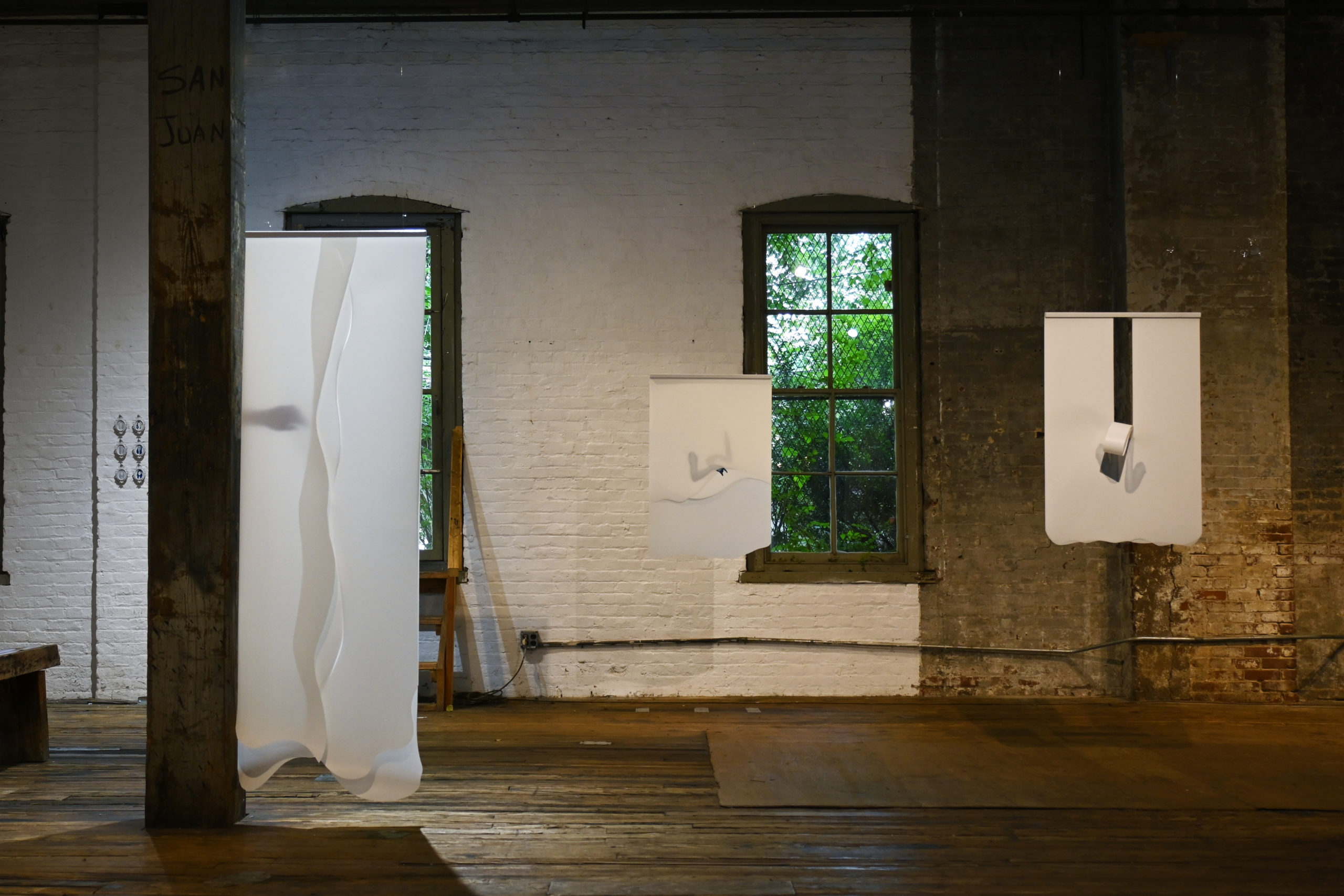
Heather Link-Bergman, installation overview
Heather Link-Bergman is a Denver-based artist, visual communicator, and educator. She is Affiliate Faculty of Art at Metropolitan State University Denver, a Partner of is PRESS (a publishing and design consultancy founded with Peter Miles Bergman), and Director of Intelligence of the Institute for Sociometry, an international artist collective and communications cooperative headquartered in Denver, CO. Her studio work takes form as collage, photography, performance, book arts, and social practice. Her work has been shown at MCA Denver, Center for Visual Art, MSU Denver, Chicago Cultural Center, ICA Baltimore, Printed Matter’s Art Book Fair, Vancouver Art Book Fair, among other venues. Most recently, Link-Bergman completed her MFA at School of Visual Arts in New York City, culminating in a thesis show “Liminal Forms” at The Invisible Dog Art Center in Brooklyn on view July 12 – 23, 2023.
Interview by Brandon Johnson
This body of work comes from your research on spirit photography. How did you become interested in the subject? Any findings that surprised you, or had a significant impact on the work?
Broadly, my art practice explores what’s missing—both literally and figuratively. So, spirit photography spoke to me because it’s all about seeing what is missing by photographing the inexplicable and unseeable, ranging from ghosts, spirits, thoughts, emotions, auras, etc. Through my research, I became interested in the modernist evolution of the photographic language of spiritual presence and the contradictions inherent in these images, how they simultaneously show what is and what is not yet.
While there were many surprises and synchronicities encountered in my research, the most meaningful finding for me was gaining a deeper appreciation of the social function and meaning of these types of images and how their primary purpose really isn’t to prove or disprove the existence of ghosts, but how they reflect our beliefs, anxieties, and/or doubts about the possibility of connection beyond life.
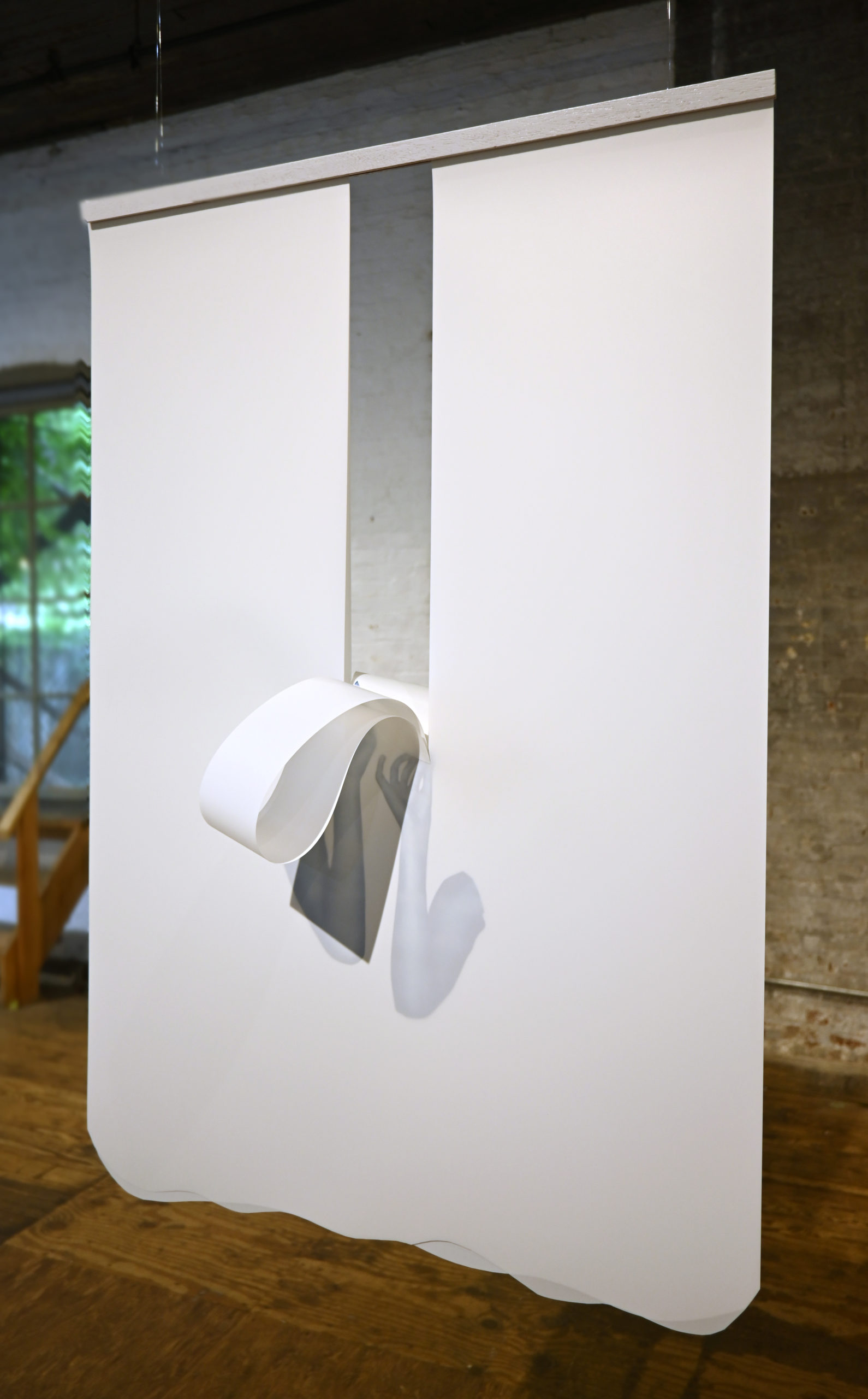
Heather Link-Bergman, Eternal Returns, 2023, Cyanotype on layered polypropylene paper, 38 x 25 inches
On a formal level over the last couple of years I’ve seen your work transition from pop-oriented graphic works to poetic minimal collages, now to a similarly minimal yet scaled up research-based cyanotype works on paper. What influences would you attribute to this progression?
The thread that connects this current project and my previous bodies of work is that they’re all collage in some form or another, and they are all about playing with the visual semiotics of specific genres of images or aesthetics. Spirit photography, as I see it, is a particularly fantastical and artful form of photomontage and collage. Early photomontage, or combination printing, was a laborious process where photographers carefully composited multiple negatives or exposures to compose a single constructed image. By the turn of the twentieth century, the spirits in spirit photography were often constructed from cut-outs taken from printed lithographic images from magazines. This is really where you start to see the visual motif of disembodied human heads, hands, or veils appearing as a visual short-hand for spirit. These observations drive many of the formal decisions I made with this work.
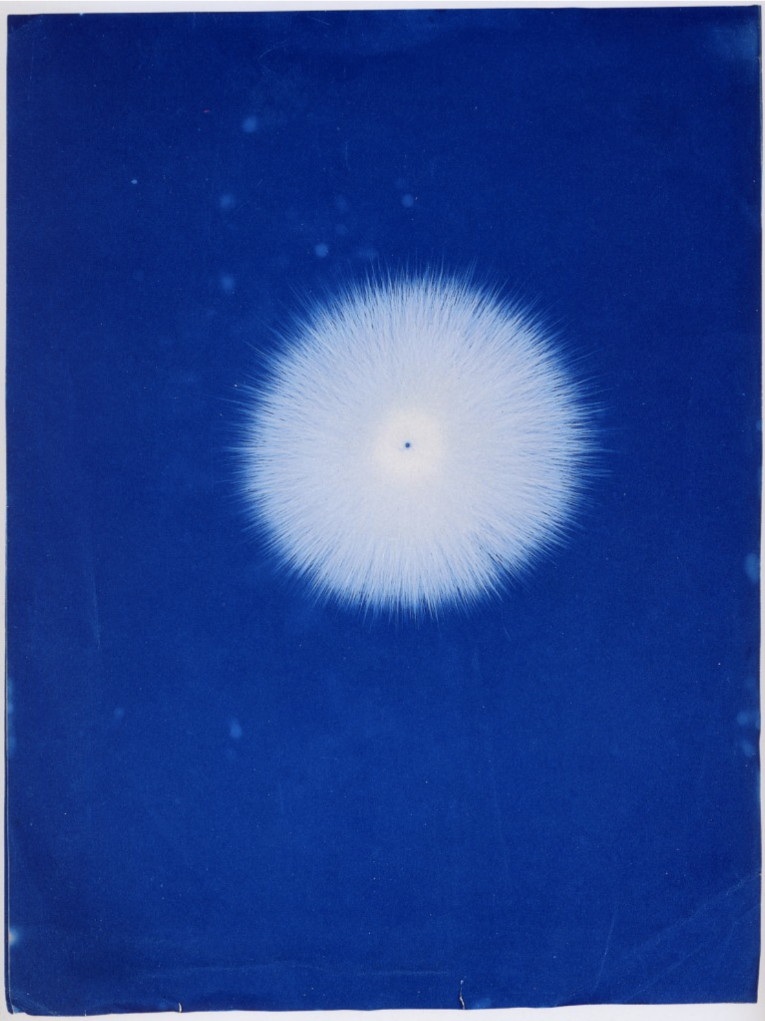
Hippolyte Baraduc, Electrograph of the vital fluid, 1895, cyanotype photograph
Why did you choose cyanotype for your printing method for this work? Is this a new technique for you?
Early in my research, I came across and was really entranced by a cyanotype photograph made by Hippolyte Baraduc in 1895 entitled Electrograph of the vital fluid. Baraduc’s “thoughtography” endeavored to depict what he believed was the universal fluid that flowed from all beings, living and dead. The term ‘universal fluid’ originated from German doctor Franz Anton Mesmer, who first developed these theories of universal magnetism, which became known as mesmerism. Baraduc was intrigued by Mesmer’s theories and hoped to use photography to document the existence of this universal fluid. Like all spirit photographers, Baraduc sought to make the invisible visible through his photography. Similar to more literal examples of spirit photography which feature a living sitter and a ghostly ‘other’, these photographs seek to represent what is present yet not recognizable or representable in our material world. Interpreting Baraduc’s photographic aberrations is like performing divination. We are left to imagine that these could be nothing but darkroom accidents or that they could be anything and everything.
The formal qualities of this image felt quite fresh to me and unlike many of the historical and contemporary cyanotype photography I’ve seen. It got me thinking about ways to use the medium I had written off. I was also excited about the conceptual possibilities of the distinctive blue color, which Yves Klein described as “the invisible becoming visible. Blue has no dimensions; it is beyond the dimensions of which other colors partake.”
While cyanotype is new to me, my approach to the medium is informed by my experience as a printmaker using an antiquated copy camera and halftone screens. I made all of my prints using my UV exposure unit, which is really designed for exposing printing plates. Getting the cyanotype emulsion to adhere to my chosen paper—polypropylene sheets—was a huge challenge. The paper is great as it looks perfectly flat and “untouched” even after taking multiple dips in water. What’s not so great is that it’s really hard to get any liquid, including cyanotype emulsion, to stick to it because it’s so water-resistant. I watched many would-be prints completely dissolve after they hit the rinse! This is where my historic research really came in handy, as I ultimately found my solution in the nineteenth century using a process similar to the gelatin or dry plate photographic process. I was so relieved to find a solution that I bought out most of the Knox powdered gelatin within the 2-mile radius of my zip code, just in case!
The ambiguity of Baraduc’s photographs is an interesting parallel to the way in which interpretation can be an important facet of contemporary art. While for Baraduc this ambiguity may have helped to shield against criticisms of veracity, for contemporary art it can open new potentialities beyond the artists’ original intentions. What role does interpretation play in your work?
This is a great question. Interpretation is part of any artwork, and it’s certainly something I consider a lot in my own practice. For my installation at Invisible Dog, I wanted to evoke a sense of the superterrestrial through my formal choices; I wanted everything to float. While making this body of work, I had written the phrase “hands suspended, awaiting, in an eerie blue twilight” in my sketchbook and I kept returning to that phrase as my aesthetic north star.
The spectral images and veiled forms in my work gesture towards themes of longing, absence, and spiritual connection. However, you do not need to literally believe in ghosts to understand haunting. Whether your ghosts are literal phantoms or just your ex, haunting in all its forms is the entry point for the viewer to engage with the themes in the work and an openness for them to form a more personal interpretation, should they choose to.
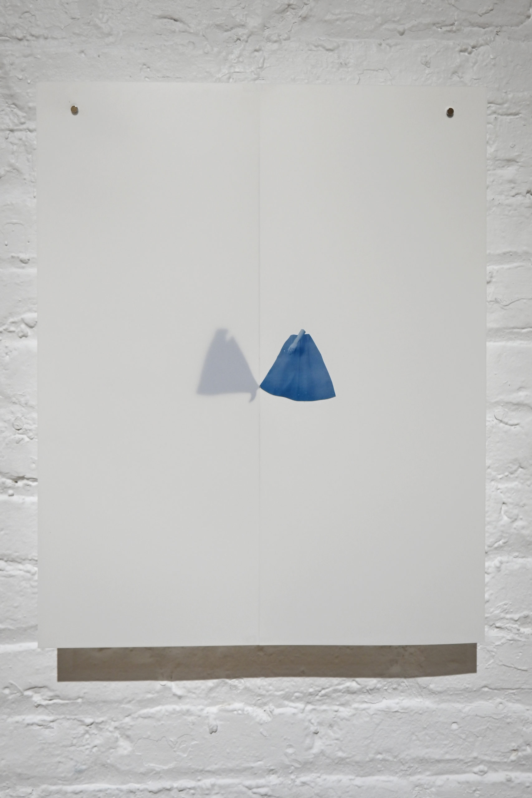
Heather Link-Bergman, Past Lives, 2023, Cyanotype on layered polypropylene paper, 20 x 16 inches
When considering interaction with the spirit world one often thinks of the “veil”—that invisible border which must be crossed to gain access to the other side. The works hanging from the ceiling (especially the tall rectangular one) evoke this notion with their layers and silhouetted hands and arms. Is there something more to the “veil” in these works beyond their physical representation?
Yes, there is definitely more to it, and you articulated it well in your question! There is a great deal of symbolism associated with the veil—it can represent what is disguised, hidden, or divided. Veils can shield or protect, and as a garment, they can take on many different meanings depending on the wearer and their religion, culture, or politics.
In my work, the veil is used as a metaphor to describe where we most closely confront the separation between life and death, consciousness and unconsciousness, or between our material reality and whatever may lie beyond it, i.e., ‘the world of spirit.’ For me, this project brings to mind the concept of ‘Viveka,’ which means discernment in Sanskrit and is the practice of using one’s discernment to see things clearly, as they truly are. Often Viveka is described as seeing the difference between the real and unreal, spirit from matter, and self from non-self. Viveka, in a sense, asks us to dwell on the threshold that mediates what is true and what is not. Spirit photography also asks us very similar things—to appreciate the interplay between the seen and unseen, spiritual and material, real and unreal—and to consider how those distinctions are not always as easy or straightforward as we’d like them to be.
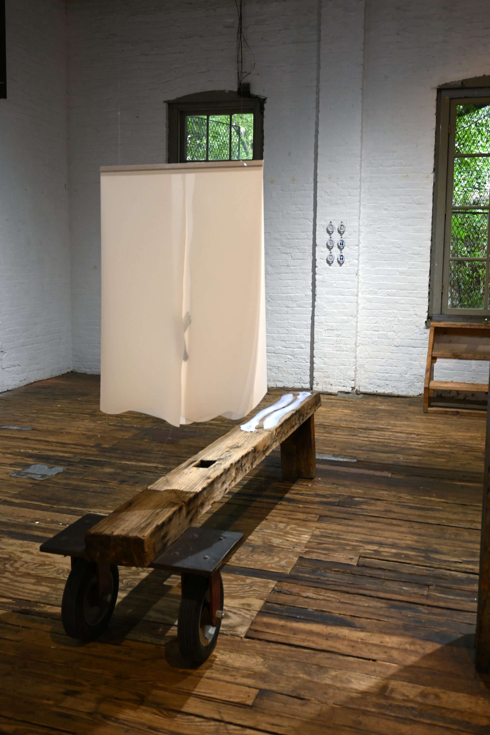
Heather Link-Bergman, Parting, 2023, Cyanotype on layered polypropylene paper, 38 x 25 inches
The show takes place at the Invisible Dog Art Center in Brooklyn, an old factory space with wood floors and columns that evokes 1970s Tribeca and Soho, which is fitting for this body of work due to the association of spirits with older structures. It feels like this body of work could expand into a larger installation. Do you agree? What other kinds of spaces could you envision the work in?
The space was such a perfect counterpoint for the work; I am so glad to have had the opportunity to show this work at Invisible Dog. I don’t think it would have worked as well in the white cube of a conventional gallery. As for expanding into a larger installation, yes, absolutely, I agree! I see lots of potential to expand into not only a larger installation but a multi-sensory experience as well. My ideal scenario would be to take over a residence—perhaps even a whole house—and not only think about how to realize these photographic works on a larger scale but also consider expanding the presence and totality of the installation by creating new works like furnishings, housewares, and wallpaper as well as incorporating scent, sound, and temperature design into the overall presentation.
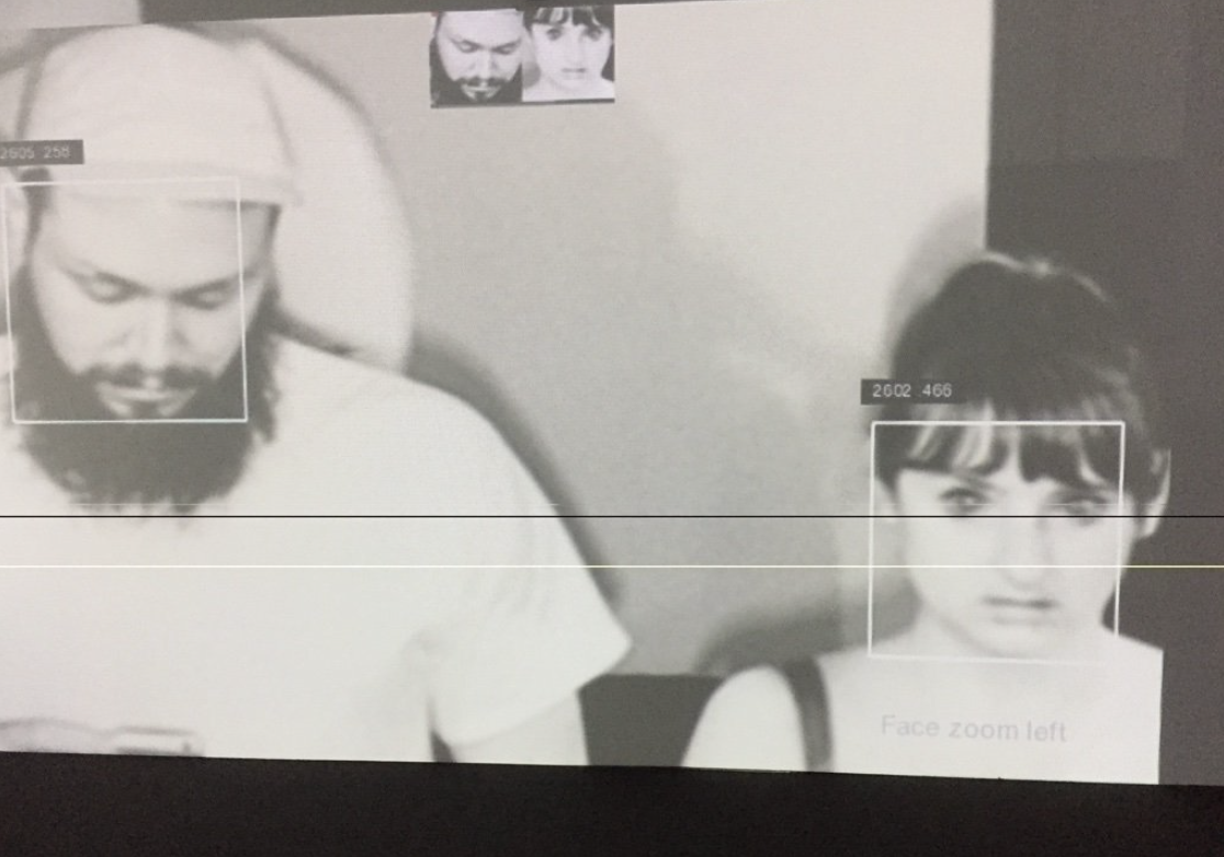
In July 2023, Denver, Colorado will witness the grand debut of an ambitious city-wide festival called Month of Video (.MOV), orchestrated by local artists Adán De La Garza and Jenna Maurice. From DIY venues to massive outdoor projections, .MOV aims to present an array of artists and genres across the video spectrum. As artists whose practices are deeply embedded within this under-represented medium, De La Garza and Maurice have a history of curating accessible programming for video work that is cutting edge, critical, and beautifully strange. We chatted about their early influences, personal practices, and of course all things .MOV.
Interview by Hayley Richardson
Can you give a general overview of your art practice(s)? Where and how did your work take shape, and what are some recent developments/changes you’re currently addressing?
Adán: Some older kids in my neighborhood introduced me to different subcultures really young. Like, I had a Slayer tape and a Terminator 2 skateboard at 7. So my early introduction to art was more through channels of skateboarding, metal, comics, video games, MTV, and Nickelodeon.
My introduction to photography started in middle school when I was enrolled in a class that rotated between black and white darkroom photography, literal card games (think solitaire and gin rummy as a class), and stagecraft. I was placed in this class because I ran out of elective options or was late registering. Initially, I thought I would move into skateboard photography, but I never really got serious and never was super good enough at skateboarding. In my late teens and early twenties, I made videos with my friends doing stunts and blowing stuff up in the desert, and that definitely laid the foundation for my interest in video and incorporating elements of risk-taking, failure, and absurdity into my art practice.
I kept taking photo classes through high school and got a scholarship to Pima Community College, but I wasn’t entirely sure what I wanted to study, so I enrolled in screen printing and photo classes (perhaps a theme is emerging here, haha!). It wasn’t until my twenties that I actually began consciously pursuing art. I had one class with a particular grad student who introduced us to more conceptual, experimental, anti artworks, and I was really resistant to it at the start, but by the end of the semester, I was totally a different person. Up to that point, the majority of high art I was exposed to was about “mastery,” “genius,” and the worshiping of some sort of authority… that never really resonated with me. These works were democratic, chaotic, and more politically aligned with my views. After that, it was something that I gradually kept doing more and got in front of the camera eventually.
I work predominantly in Sound, Video, and Performance Art, and more recently, I’ve been making speculative fiction works about the desertification of the earth, a video about tree canopy density in Denver and how it correlates to income, racism, regional temperature averages, and the history of land ownership, and some new sound performances. I hope to go on a solo tour through the southwest in September to an exhibition with my longtime homies at Everybody in my hometown Tucson, AZ. I’ve always got a few zine projects in the works as well…
Jenna: I was homeschooled (which I loved) but didn’t take any art classes in high school, so I didn’t really have an entry point for anything in art that wasn’t just painting or drawing or sculpture (and I wasn’t really into those). My sisters and I were super into theater and saw a lot of live theater and also participated in live theater all through high school. As a child, I was always interested in our home video camera. My sisters and I would shoot lots of things on that camera and then be delighted to watch them back, but never considered any of that “art.” I remember the day that I looked into a 35 mm camera for the first time when I was 15, and I remember looking through the lens and seeing the frame and the shallow depth of field, and realizing how powerful it was to be able to curate the world through a rectangle. Somehow it was really different than looking through that home video camera. And it impacted me so much that I began taking photographs and then began looking into what being a filmmaker was like. So I went to undergrad for photography and filmmaking, and in grad school, video really entered my practice. I realized that I didn’t want to make stories for people but would instead like to communicate complex ideas that unfold over time. And that’s basically how video art functions for me. I remember while I was in undergrad- going to New York for the first time in my life and seeing a Bill Viola retrospective at a big Museum there and thinking, “Wow. This is really different from films. and I love that. It’s about communicating ideas that seem deeper than stories that sit on the surface of things, and it’s super weird and surprising”.
My practice has always been about relationships and relational dynamics, probably because I have a big family, and we were always really close growing up. It has evolved to also include nonverbal communication as a central point of inquiry. Performance and using my body to communicate something came into play during grad school when I took a performance art class that changed how I understood what performance could be and how the body could be THE tool for communication. So now my work involves video, performance, and photography, and it deals with ideas concerning relationships (with myself, others, the past, and the landscape), non-verbal communication, and the language of the complicated human experience.
One of my most extensive projects (Concerning the Landscape: A Study in Relationships) is a series of performances for video in particular parts of the landscape where I try to build a relationship with the landscape using non-verbal or pre-verbal techniques (such as reaction, mimicry, etc.). I have been working on The Archive of Things series for the past few years. It’s an ongoing project documenting the world through the practice of Lumen Printing. The work in this series explores the question, “What can the sun reveal about objects that humans cannot see with their eyes”? These images are lumen prints- a process where objects are placed directly on black & white paper for darkroom prints and taken out into the sun for hours at a time. The long exposure from the sun lets the sunlight penetrate any part of the object that is not entirely opaque, resulting in a representation of the thing that humans cannot see by just simply looking at the object. Over a period of hours, the sun travels through the object and records details within the object, revealing hidden truths about these everyday items we encounter. The sun also interacts with the emulsion on the darkroom paper, creating colors from where there was only the possibility for black & white printing.
I am also currently working on a video essay that explores the complex topic of “grey areas” and how these areas can be viewed as both places of challenge and chaos (because they are undefined) as well as places ripe with possibility (also because of this area of no clear definition). In this way, my practice is now exploring “relationships” with situations… and not just people and the land. 🙂 I am currently in residence at Redline Contemporary Art Center.
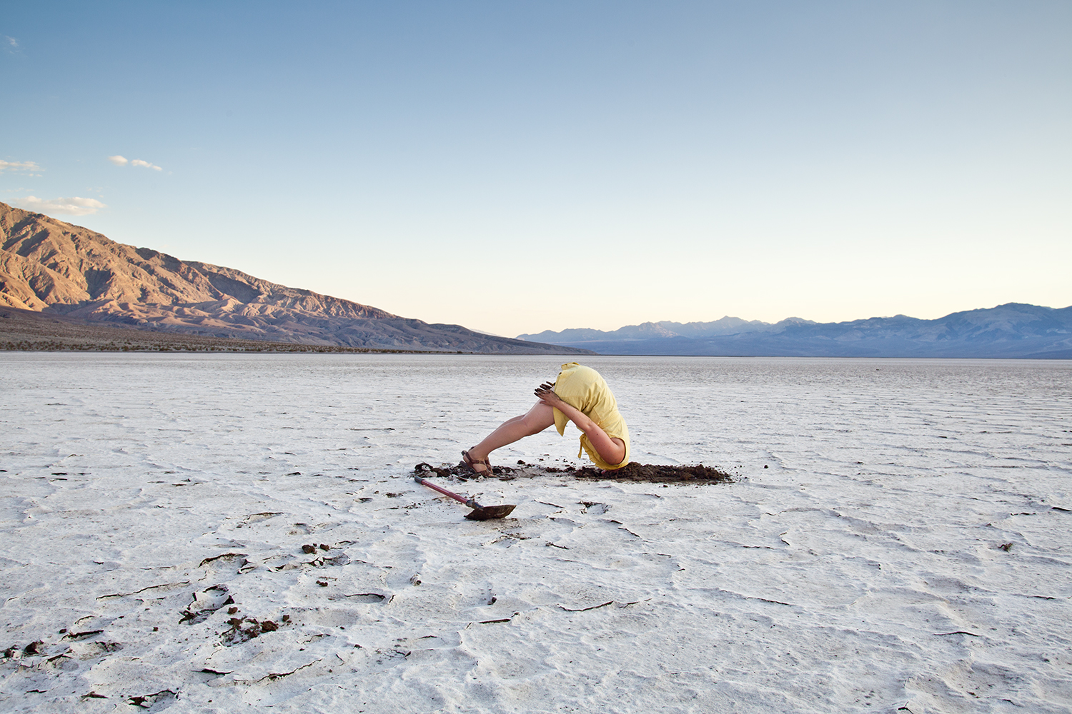
Jenna Maurice, Traverse, at Union Hall curated by Esther Hz
In addition to your individual practice(s), you also have a history of community engagement via curated screenings for the public. Has interfacing directly with a public audience and providing a platform for other artists influenced your own practice at any point?
We both view programming/curating as part of our artistic practice. As contemporary artists, we feel it is our responsibility to champion other ideas and approaches outside our practices. Especially when the mediums and ideas you work within are under-represented in your community. Showcasing time-based works regularly is also a way to maintain an artistic community in Colorado. If you feel like you have no opportunities to show or discuss the work you make in your city, you’ll probably move somewhere else that has that… and might even be cheaper.
I think we both have been able to make significant friendships through shared experience and interest in art. So programming/curating has always been an extension of those goals where we get to share the experience and ideas of others with the community we are in. I think our dream jobs would be to make things happen with our friends that are larger than us, and .MOV has been a way for us to accomplish that desire, be it outside of our day jobs.
In July 2023 you will launch one of your most ambitious projects in Denver Month of Video (.MOV). Tell us how this project developed and what we can expect to see.
Month of Video is a culmination of a few dreams of ours. We are both video artists and just want to see more video art in our city. We wanted to present a whole month where video is the focus and see video exhibited in as many art spaces in town as we would get on board. In Denver, one can consistently see painting/sculpture/photography in art spaces. Video seems to be a bit more of a rarity, so we wanted to be able to go see video art at a bunch of places for one month. We’ve never run a festival before, but there is always a first for everything. 🙂
We also wanted to highlight the different forms of video art, creating access points for things we wish we could have been exposed to earlier in life. The whole festival is based on this idea of making space for time-based works that engage with many ideas and approaches to making work.
So, we have some specific exhibitions for .MOV that focus on these different forms. We also have some really rad friends who are experts in particular realms of video, so we asked them to curate some of these shows. For instance, Understudy Gallery is having an exhibition that highlights performance for video, curated by Quinn Dukes- the Director of the art fair called Satellite. This is a very particular type of performance art that is usually enacted in a specific location, and the only way to document it is with video. So the final piece of art these artists can display is video, but the initial performance act is the communication. We are also highlighting the genre of art video games through an exhibition where visitors can play all of the games on view (this exhibition is curated by a collective that Adán started called Dizzy Spell). Along with this exhibition, we invited a video game scholar (and dear friend), Nicholas O’Brien, to curate a screening based on videos that use game engines in their creation.
Signal Culture (a residency focused on tool-making and video research) recently moved from upstate NY to Colorado, so we are having them program a screening of work from their alumni to showcase the different work happening there.
Another show we are super excited about is one we are curating for Redline Contemporary Art Center from the main contributors of a public secret society called New Red Order. The show- “New Red Order: Crimes Against Reality”- examines the contradictions inherent in a society built on both the longing for indigeneity and the violent erasure of Indigenous peoples, lands, and ways of life. NRO provocatively questions how these desires can be channeled into something productive, sustainable, and transformative. The show includes a selection of video work that invites viewers to critically engage with the complexities of settler colonialism, cultural appropriation, and enacting of indigenous futures.
Check out the website for all of the info denvermov.com

New Red Order, Crimes Against Reality, at Redline curated by Adán and Jenna
You both describe being exposed to the creative arts through pop culture, school, and family at a young age but also express that video is a particularly under-represented medium. What are some additional resources you would recommend or hope to see made accessible to individuals interested in video?
Adán:Realistically the places I would like to see time based arts more is K-12 education and just at more art museums. Most students are first exposed to time based arts in college and we can start having those conversations way earlier. This limitation is often echoed in museums and galleries and that has an effect on what is deemed valuable and acceptable culturally outside of those institutions as well.
Jenna: I totally agree. We both worked in academia for longer than a decade and consistently saw our students having no exposure to time-based arts before college.We would like to see contemporary art “normalized” in the way art history is taught before students enter college. It would be so rad if students were already familiar with artists who are alive and making work about important topics using time-based mediums, and not just familiar with dead white-guy painters. So, access points as well as normalizing video within exhibitions is a great way to help with this.
Is there anything else you’d like to share here? Upcoming projects or places where we can keep up with what you’re working on? (aka shameless plug portion!)
Collective Misnomer might keep doing stuff.
After MOV comes to a close, Maurice and De La Garza will continue their respective video art projects. One of Maurice’s current works-in-progress includes a video essay examining the prolific possibilities within ambiguous “gray areas,” or domains lacking clear definitions. De La Garza, working on “video pieces focused on climate change and the desertification of Earth,” will also embark on a solo tour from Denver to New Mexico and Arizona this September on his way to exhibiting his work at Everybody Gallery in his hometown of Tucson.