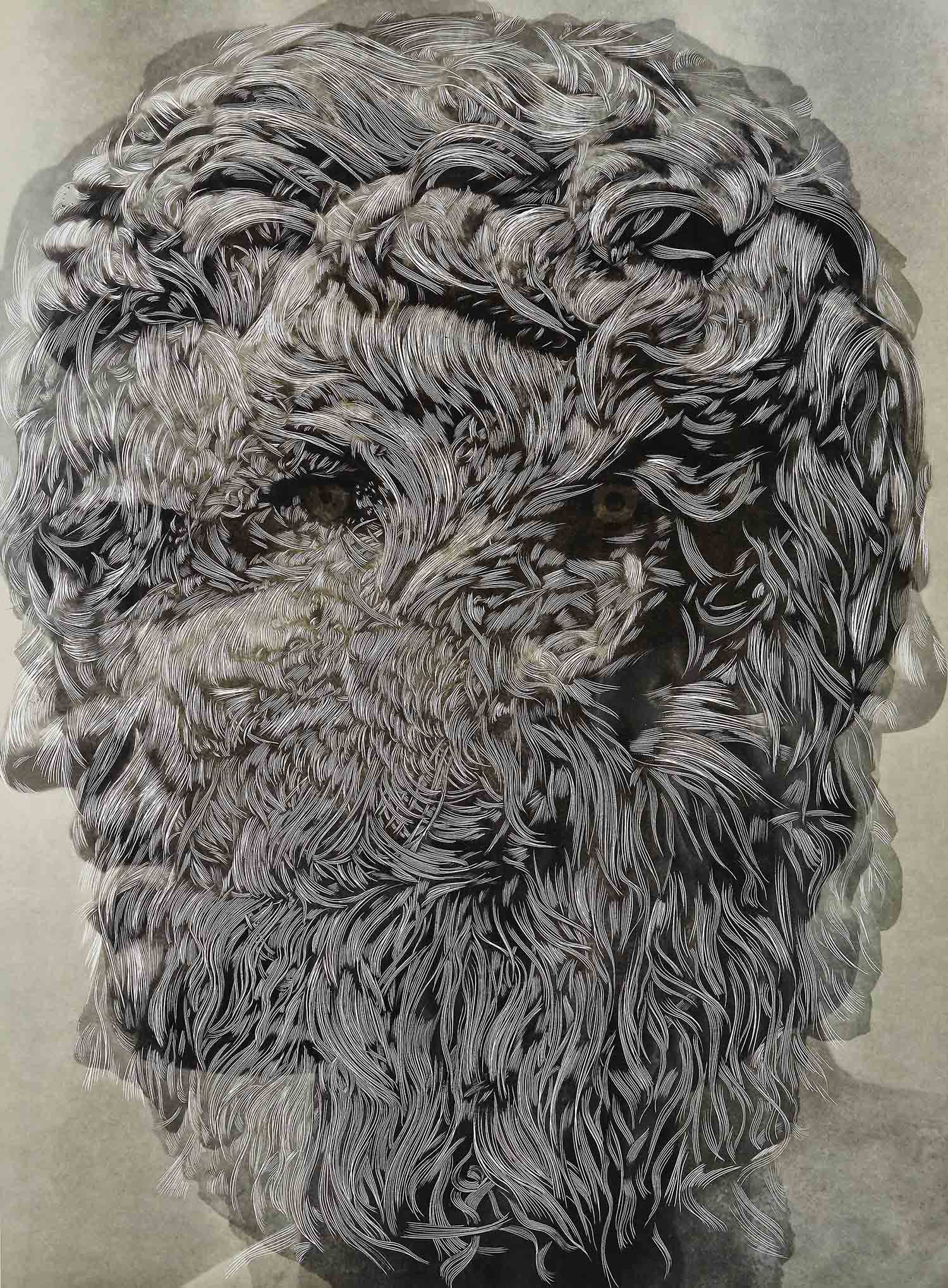
New Portrait: Pedro 1, 2022, ink on archival digital pigment print on paper, 36 x45 inches
These questions are posed to Sebastiaan Bremer on the occasion of his fall exhibition, New Portraits, at the Edwynn Houk Gallery in Midtown New York, on view September 6 – October 1, 2022. All works courtesy Sebastiaan Bremer and Edwynn Houk Gallery NYC.
Interview by Devon Dikeou
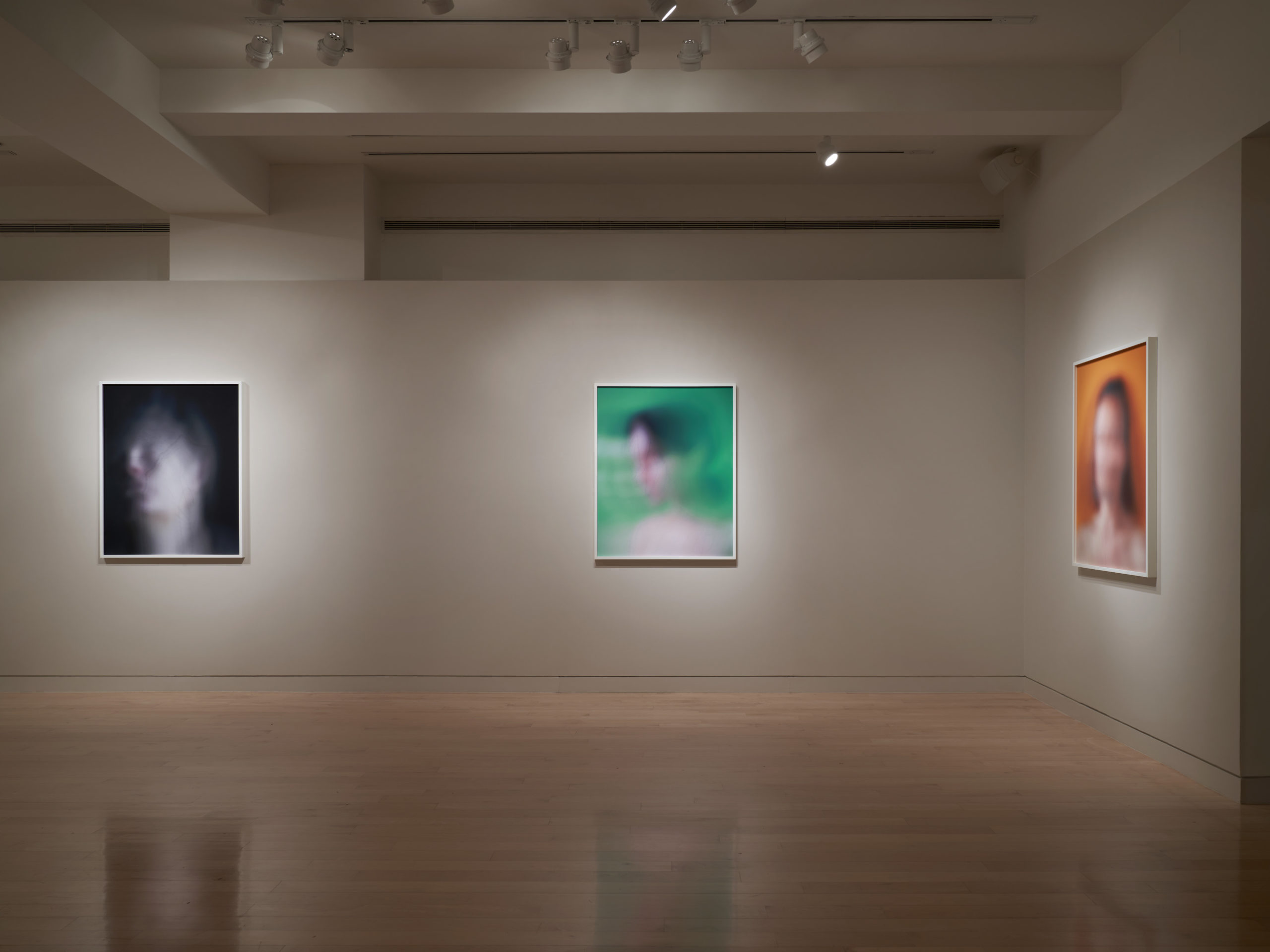
Install Shot, New Portraits, September 2022, Edwynn Houk Gallery, photography by Fyodor Shiryaev
When I visited your studio once you were working on this series and as we were talking, you were working, so talking and working . . . And you had a turntable going. I can’t remember the song or LP but it was a wonderful moment of process intersect . . . Could you speak about that process and intersect? How you come up with the conceptual model, create the parameters, and then set about physically combining the two . . . What is the music that makes that happen . . .
My works take a very long time to make. As the drawing and painting on the photographic print takes shape, I slowly make tiny marks with ink while the outside world filters in. Weather and light make a strong impact on me as well, since my studio has a lot of natural light. I see the sun move through the sky all day. This is not ideal for working with photographs, especially glossy ones, but I love it. The news, tremors, moods and music all end up inside the drawing. I don’t plan this, it happens to me. When I started working in this mode of combining photography with painting and drawing around 1999, this blending occurred organically, and I have embraced it wholeheartedly.
I Held My Breath for 13 Hours Afraid She Wouldn’t Come Home (Pool II), 2000, Unique hand-painted chromogenic print with mixed media, 40 x 60 inches
The idea I start with is morphed into another form and so on and so on. It is similar to bricklaying in that the first brick in a wall informs the position of the next. In music the chord progressions and sequences of notes or beats eventually take shape and form a structure. It can be very surprising to see what appears. Of course, I do set parameters and have certain goals on the outset, but I am open to accidents and surprises. This makes it exciting and confusing at times. There is a parallel to the recollection of dreams: you must have created them but did not control the story somehow. I sometimes have a playlist to set a mood or form an idea—and then I record it within my mark making subliminally and literally. The music of Miles Davis I play often, and the Band of Gypsys album by Jimi Hendrix is excellent for rocking me out of a rut. There are also periods where I work in quiet, or listen to podcasts. When I was a teenager I was always drawing, and when I was with friends I often drew while conversing—it was my thing. I still to this day enjoy talking on the phone or having people over while I work—this does not work all the time obviously—but I do like it. My practice is very solitary and I am a social person. To have visitors is wonderful sometimes—I work long hours and being alone can get a little much sometimes. Still, most of my work is made in solitude, with sound.
It seems to me too that in a way there’s very interesting things happening in this series, New Portraits, at Edwynn Houk Gallery, as they’re studio shots presumably and it takes a certain amount of commitment to a studio process—which creates an outcome in a medium dedicated to reproduction as part of the final outcome . . . And the images then are finished by your laborious individuated and unique treatment creating singular objects, which contradicts notions of photography as addressed by Walter Benjamin in The Work of Art in the Age of Mechanical Reproduction in a way . . . Thoughts. . .
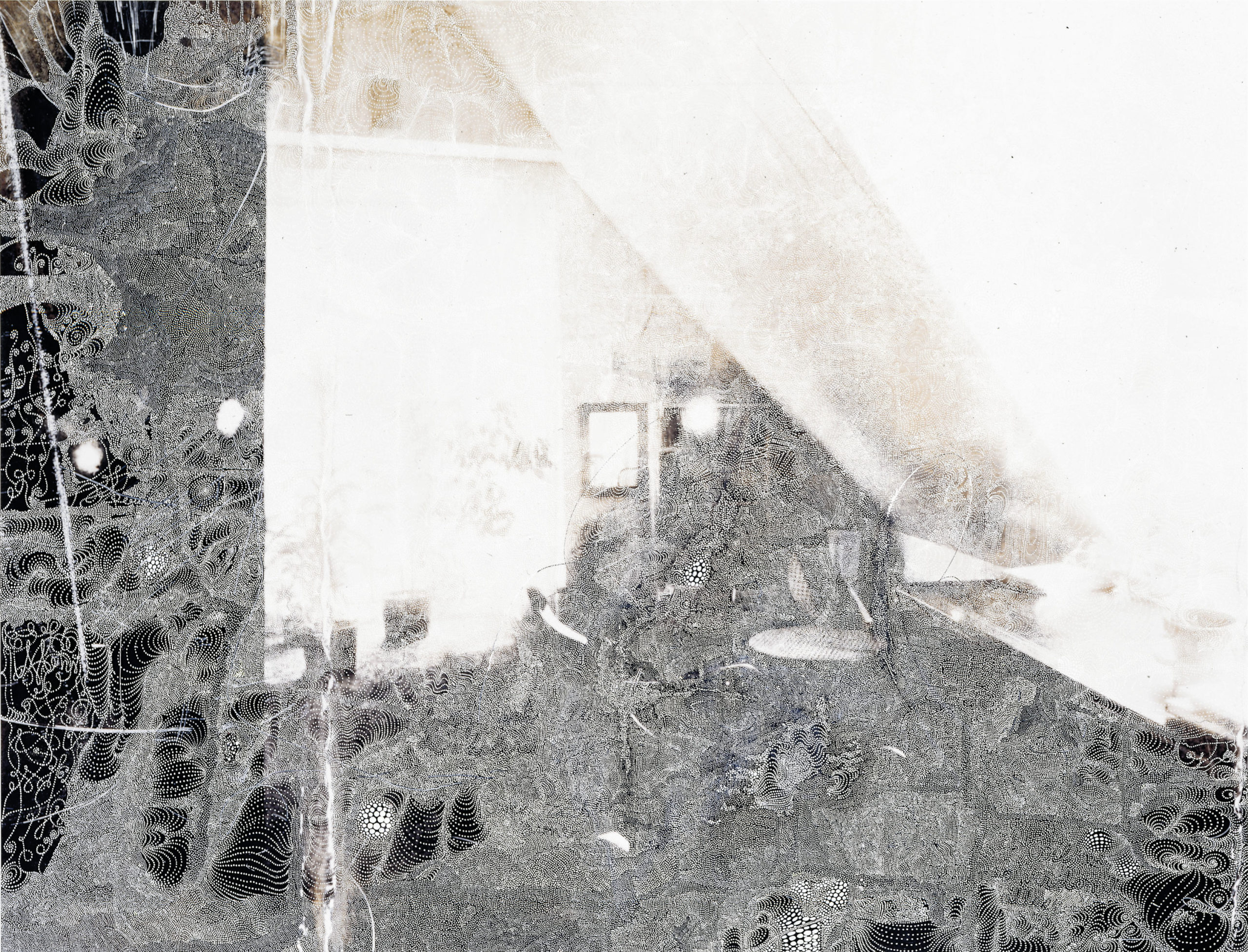
The sources for my works vary, as I am looking for different things to express in each individual work or series. Originally, I used a lot of photographs from my personal archive and transformed them with photo dyes and other means into some interior landscape on which I then worked with small white dots made with pen, paint and/or penknife. The dots became a solution to a problem I faced: I wanted my marks to be integrated, I wanted them to enter the reality of the depicted three-dimensional space of the photograph. By making small marks I felt I squeezed in between the little blobs of emulsion instead of creating a grid or linear filter encapsulating the photograph. Another advantage was that it slowed everything down, and gave me time to think and watch as the drawings took shape. Most of the photographs I worked on were shot by me, but not necessarily made with the intention of using them as works to draw on. Some photographic prints I worked with were quite old, and I had used some as sources for the paintings I made in the early 1990s. The stains, paint drops, creases and rips that I made by accident whilst using them in my studio I incorporated later. I photographed the small prints and printed them large. I also made a series where I used small faded black and white Polaroids. They were shots of the interior of a house I lived in with my family for a few years in the early 1980s. Who took these pictures I never found out, but I think they were made for use by the architect who worked on the house we lived in from 1978-1983.
Castle (I-Study), 2001, unique hand-painted chromogenic print with mixed media, 40 x 60 inches
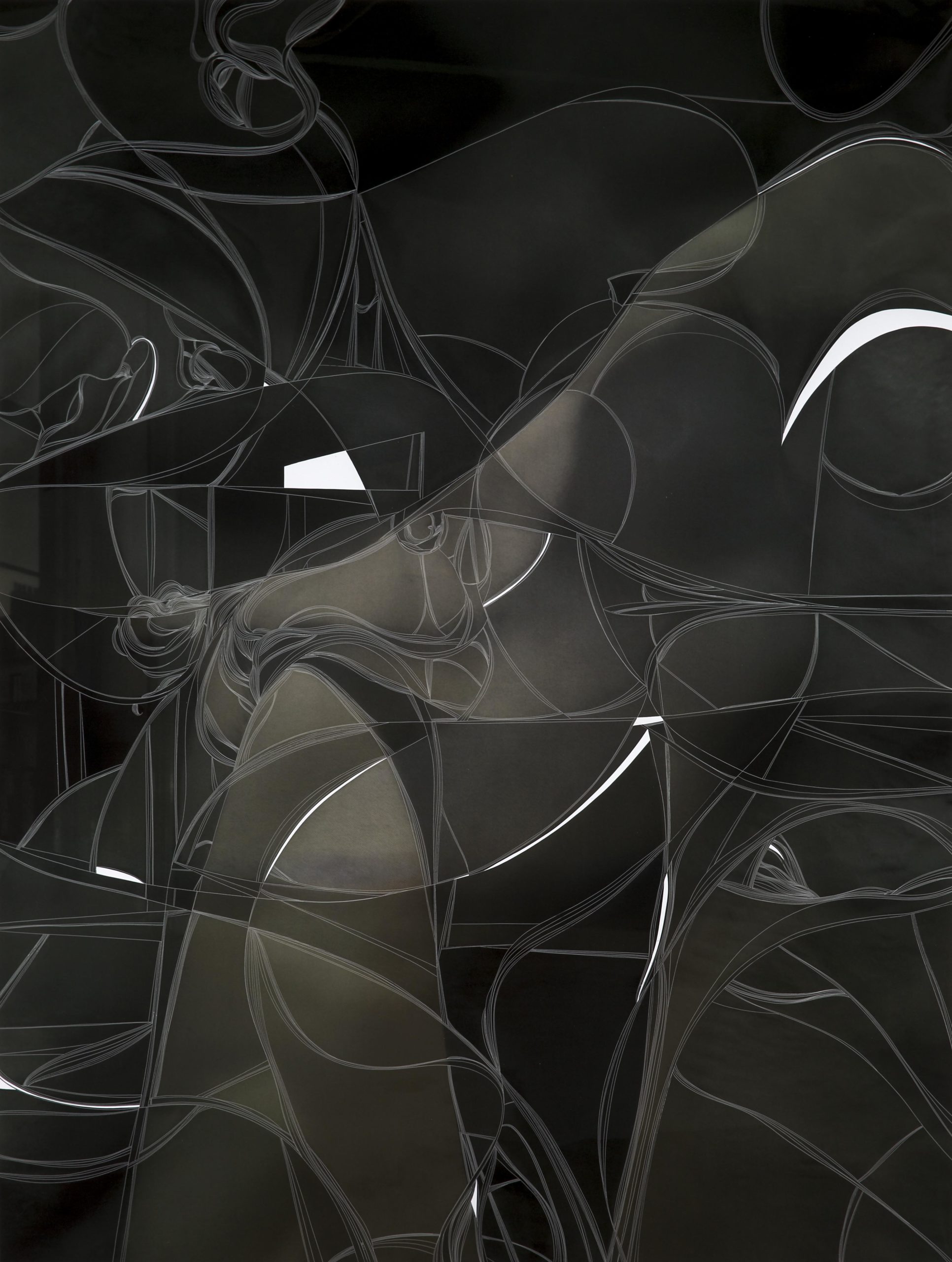
I re-photographed these small black and white Polaroids with a large format camera and turned them into oversized prints on which I drew. These modes of working were dominant for a few years, until at some point I was intrigued by photographic prints without using any negative. By drawing on the dark or black prints I was able to create the illusion of a photograph, a practice which I continue to return to.
I have also made a series or works using pen-knives, making marks by cutting and removing parts of the emulsion, again interfering with the underlying image and the material of the paper, creating a completely different reality and turning the photo into an object of sorts. This was also the only series where I used photoshop, in the crudest way in order to layer images. I am bad with technology and dislike working with a screen and computer. In none of my works besides that series is there any photoshopping. With a computer the possibilities are endless, and the choices overwhelm me.
I much prefer not being able to correct or step backwards and I make all the manipulations of the print with pen, acrylic paints, rips, scratches, inks and dyes.
The physical object, the photographic print with all its different surfaces and sometimes marks of wear and tear are what I love. It is another recording of time in a way. Blemishes are fine, and I have even found that the most beautiful photograph is the hardest to work on. There is little to improve. The joy of squeezing out a meaningful image by manipulating a not-so-spectacularly beautiful print by hand is wonderful.
In most works the print functions as a fully charged battery brimming with content and energy underneath the worlds I build. However, they are not the dominant factor. The image is secondary, the preciousness or meaning I sense in a photo is in some cases the foundation and the combination of my work and the underlying image create an interwoven structure.
Photographs are made for reproduction. A negative can be reprinted over and over, and the surface of a photographic print should not be messed with for archival reasons.
I practice the opposite of that. My works are paintings, in the sense that there is only one work after I am done working with the piece. Any kind of reproduction of my art is just a facsimile, since the texture of the surface and the contrast of the matte inks on the glossy surfaces in most of my works is not reproducible in any true or faithful way. Each artwork of mine is unique, and reproductions fail to capture the surface of the object I create. I do everything anathema to traditional photographic practice and I think I have a relatively unusual relationship with photography. My work lands somewhere between painting, drawing and photography. There is even in some cases a sculptural quality to them, since the surface is very much an active part of the piece. The paint drops I apply become almost like braille, and the light sparkles off the smooth surface of the acrylic. The cuts I make with X-acto knife create ridges that are clearly visible and protrude the surface, and in some cases I removed the layer with the emulsion from C-prints, exposing the white paper underneath.
Glaucon, 2014, unique hand carved chromogenic print, 50 x 36.5 inches
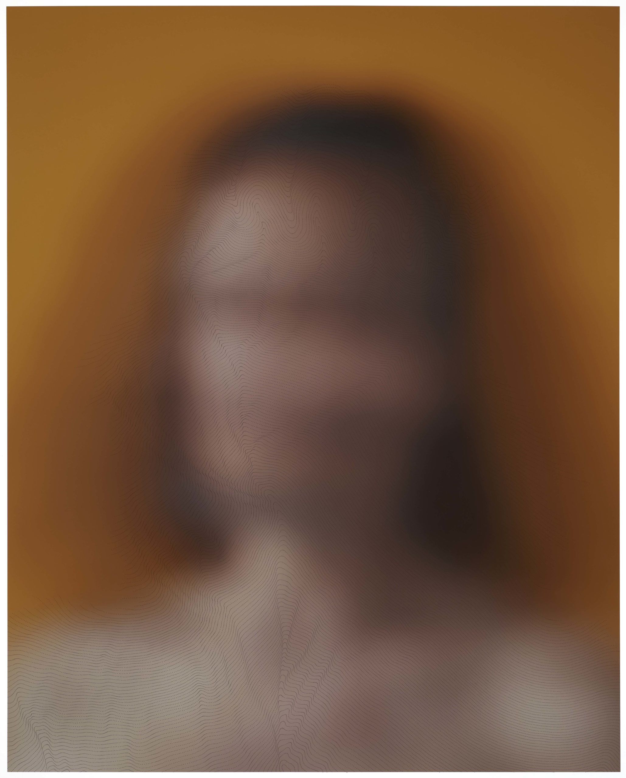
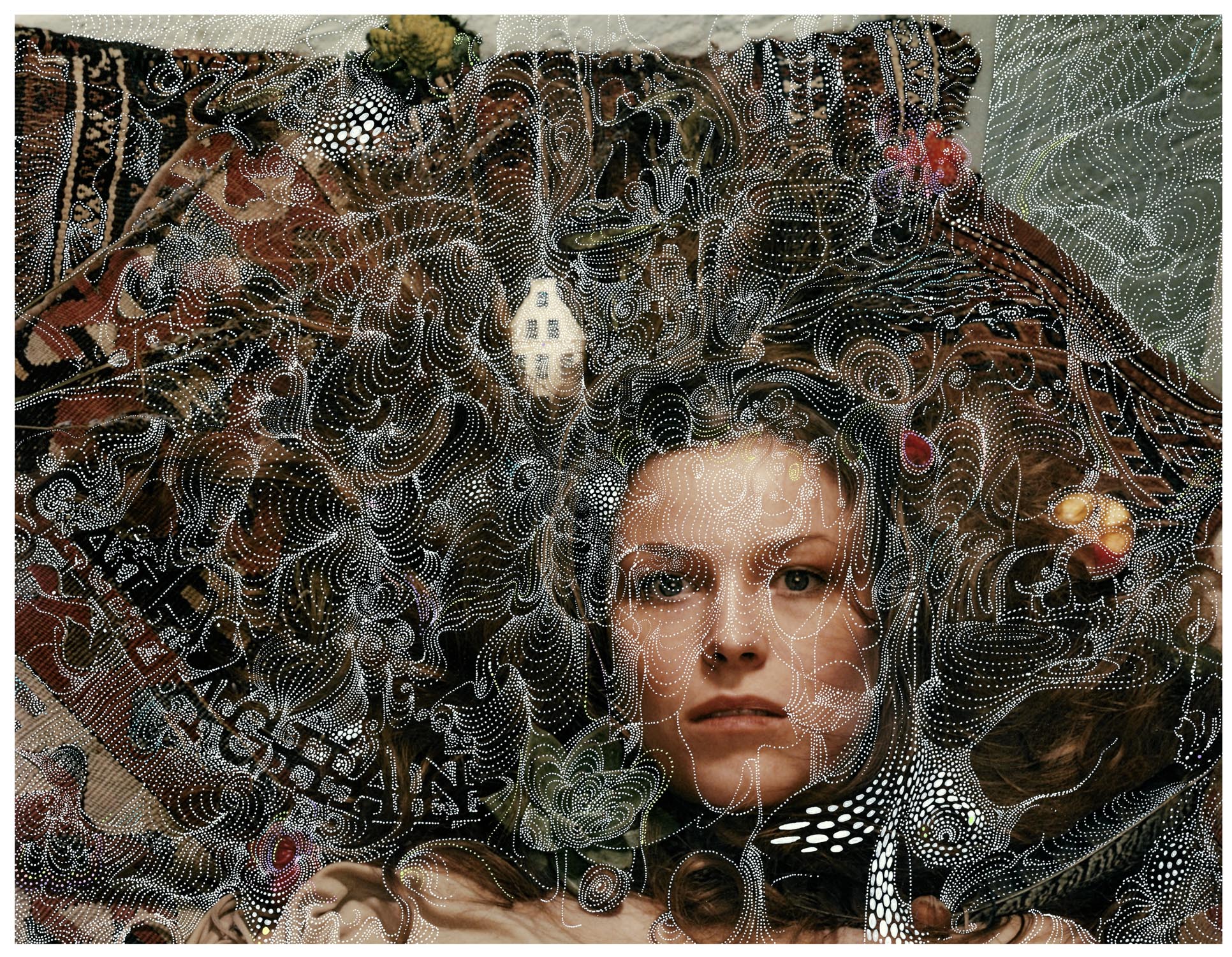
The New Portraits are a departure for me in the sense that photography takes a front seat. I set out to create pictures to work with, and I began by making self-portraits in my Greenpoint studio with the help of my wonderful and talented assistant Fyodor Shiryaev using only daylight. In the first attempts to make portraits I posed in front of a light blue door in my studio and used various scenarios. Most pictures were a bit out of focus and blurred, some were very much blurred because I moved (since in those instances the camera moved as well), and the shutter speed was slow. Slowly I realized what I had been looking for—a depiction of inner space and reflection. I wanted to make work that was elemental and reductive, getting to the strange inner worlds and experiences we all experience, and of course even more so in the period following March 2020. Part of the idea was to get to the heart of some new realities: isolation, solitude, a strange registration and experience of the passing of time. The other reality is our interconnectedness and our dependence on our context, our surroundings. Every moment was stretched in time, silence gave a lot of space to rumination, but still we are all very much in our moment, in our surroundings, blended and rooted in our present but it is very hard to continually realize, practice and observe this. For those and other reasons I posed with eyes closed, although that is hard to see in most images because of all the blurring. After working so much on just self-portraits, and eventually being surrounded by my own head everywhere in my studio, I realized that it wasn’t so much about me, or my experience, but much more about a shared experience and really about all of us, anyone, anywhere, anytime. I found it boring and extremely narcissistic to limit this series to my own visage. It’s not about me, per se.
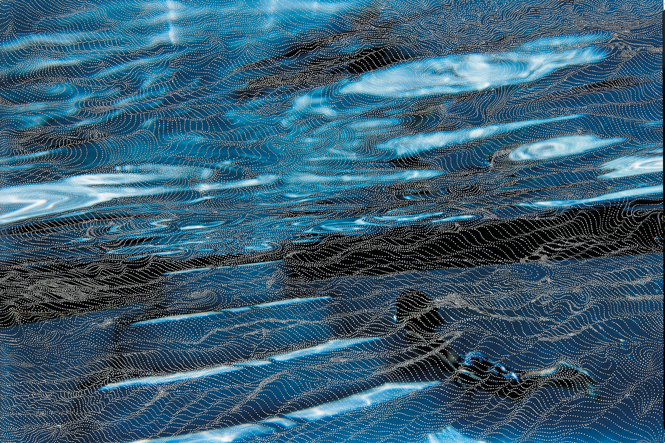
All these ideas are nothing new. It was perhaps more visible and more intensely experienced during this pandemic but it is not specific to this time. These are old ideas and feelings experienced by many people in all times. So, I cast a wider net, photographing my friend Vinoodh Matadin, then my kids and wife, more friends, then kids of friends, and so on. The photographs are all slightly blurred, which happens by making long exposures with a moving camera of people in motion in front of colored seamless backgrounds. In the printed image the colors of the skin and hair are blended with the color of the background, manifesting connection between sitter and background. I chose the colors for each sitter almost in a synesthetic way, and all the works together in the show are some kind of melody or harmony. I wanted each sitter to be comfortable with the color I chose, so there was some dialogue about that. There were quite a few considerations that went into this part of the process. After this the photograph was printed on very soft and smooth paper. The archival pigment prints have a wonderful matte character and the colors seem to consist solely of pure pigment, so much so that I felt whilst making them I had to not only be careful to wear gloves and have a very light touch, I also shouldn’t breathe too much on the surface because it would seem I would blow the pigment off the paper. The next step was that I slowly drew very small dots which formed into undulating strings of black ink, immersing the marks into the texture of the print. Previously many works of mine were made with white inks and paints on very glossy surfaces, creating strong contrasts partly in order to heighten the three-dimensionality. The distance between the photographic image and the white dots was accentuated. In the New Portraits the opposite happens. The strings of black dotted lines had to be very carefully applied since the pigmented soft surfaces of the paper are easily scratched or marked. Even though I of course used gloves and much restraint quite a few works didn’t make it through the process. Any bead of sweat, any nail scratch, any tiny fly poop leaves an indelible mark and that destroys the integrity of the surface, rending the work gone and destroyed. That is not so nice. But conversely the tension, the ropewalking sensation is also investing the work with a special energy. The application of each individual black dot is a pinned down and registered moment of time, and so the works function as a registration of all that is around me, the registration of the feeling of passing time. First there is one long line of dots, with its own geography, which then is followed by the next line which undulates in a parallel move, and slowly the rippling sensation takes place all over the work, in very small increments. They look like the lines on a topographical map, determining the depths and heights and distances. The lines are also akin to soundwaves, and patterns seen in geology. All these associations make sense and are part of the interpretation of the work. These phenomena occurring naturally in the outside world are echoed in my practice. The handmade, physical quality of the work can’t help but reflect my tremors and states. There is very little distance between me and the work. There are no processes separating me from the print. I am right on top of it, seeing all minute details of the underlying picture, and am in that place. In order to get an overview and some perspective I have to hang the paper vertically and step back. And then I take it down again and continue, drifting into the act of drawing.
Papa Bravo, 2013, unique carved digital chromogenic print, 64 x 48 1/8 inches
Subjects . . . Right after your exhibit at Edwynn Houk Gallery we went to Matisse’s Red Studio (MoMA) . . . And there was this discourse literally on view at MoMA, between Matisse and the Russian patron, Sergei Shchukin, about a painting which was referred to as The Artist and his Family. . . After having visited New Portraits—a lovely serendipitous moment transcended about subject . . . The artist and their family is a long tradition, and with New Portraits, the subjects are very much you—the artist and his family . . . can you speak about subject—family/friends in your practice both with this current exhibition, as well as Schoener Goetterfunken at Dikeou Collection and in zingmagazine . . .
‘Write what you know’ is the first thing that comes to mind. Migrating alone to New York at 22 has something to do with it. I still yearn to be physically close to my brother, sister, father and mother but they are far away. Besides the occasional trip, letters, faxes and phone conversations, there is a lot lost and removed. So, using pictures of my family in the Netherlands is probably a way of staying connected to them, and my life growing up in Amsterdam. A lot happened in my youth and I remember it all very well, so there is a lot to unpack there. Another thing is that my father and mother made some really great pictures, especially the photographs I ended up using in the Schoener Goetterfunken series.
Those photographs, taken in the beginning of the 1970s, were shot on medium format color negative film with a Rolleiflex camera. Back in the early ‘70s it was expensive and complicated to print color pictures. It was common in that time to photograph in black and white, and everyone would develop and print the pictures in the bathroom of your home. This was quite common. You cannot print a C-print in a domestic setting. Except for one contact print I once saw I don’t think these images were printed. When I found the negatives in a drawer in my father’s house I was happily surprised. When I made contact sheets of them I was blown away. The colors were just crazy good, full spectrum, in my opinion lusher than Kodachrome.
You could feel and see the joy in these pictures. The exhilaration of thin air, blue skies, and some eternal snow on the tops of the mountains and glaciers of Switzerland was just palpable.
The only one missing from the pictures was me. I must have been only 1 ½ or 2 years old and they left me in the care of my aunt and uncle in Holland for a few weeks. Behind the façade of these pretty and joyful pictures lies another world. My parents were having serious marriage troubles, the trips weren’t easy for my sister apparently, and despite the lovely and peaceful image of the world then, there was the Vietnam war, Nixon’s government, rivers on fire in Ohio, threat of nuclear war taking place. I really wanted to use these glorious images but could not find a way in, a suitable way of working. My dense small marks just obscured the very alluring powerful images, and I started to feel that adding any explicit stories or critique was not a good idea to amplify this reality. I finally resolved to stay away from any critique or discord in my additions, and look into works of art that transmitted joy. There is very little in art history that does this successfully, except in my opinion in the Ode to Joy poem by Schiller and the orchestral work of the same name by Beethoven. I proceeded to crank up the volume and play this music while painting on the surface. I made colored spheres appear on and in the emulsion and just brutally amplified the joy that you feel when seeing these captured moments. The colored marks seemingly interact with the people and objects within the photographs creating a world full of wonder and joy.
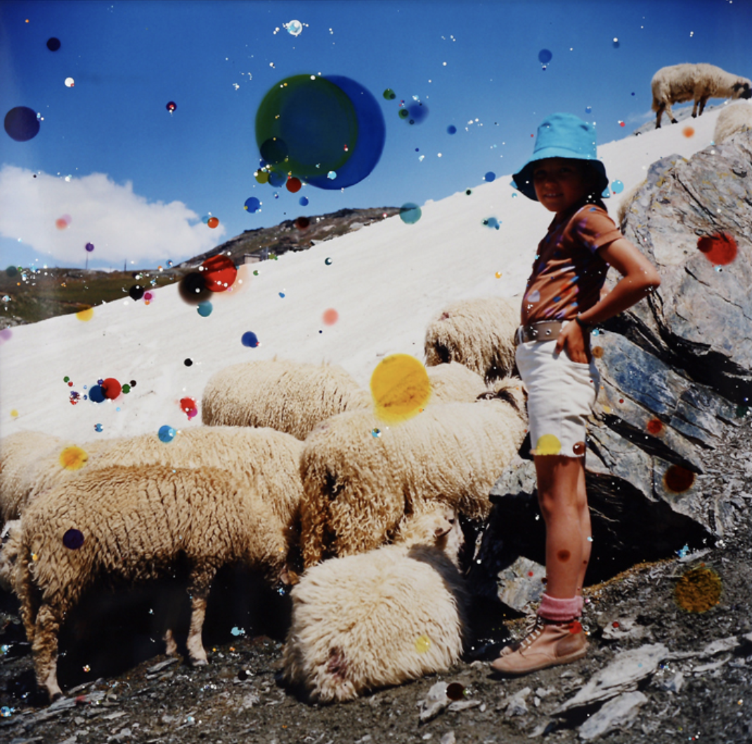
Schöner Götterfunken VII, ‘Joyful As His Suns Are Flying’ (Froh, Wie Seine Sonnen Fliegen), 2011, Unique hand-painted c-print with mixed media, 51” x 50”, courtesy of Dikeou Collection
There’s another connection there, Matisse flattens the space in Red Studio using an overall application of a color to dislocate the viewer’s relationship to space, familiarity, perspective . . . You do a similar thing reasserting the image’s flatness by the application of hand painting on top of a medium where perspective is intrinsic and then further manipulated by the subject’s blurred dislocation.
I love creating an interaction that pulls in all directions simultaneously. I think that this way of thinking and this mode of making art are very fitting and realistic modes of expression. Our reality is necessarily flattened and simplified in our daily life, in order to navigate through our world. In our daily conscious life if you were to completely include the full reality of our experience, our place in space and time, I think you might really lose your balance. Our world, our life, our relationship to other organisms, is infinitely complex. I show a little of that in art using the simplest means. The paper and pen are all I use; no computer or complicated printing is part of my process. In this case the minuscule lines of undulating dots seem to be submerged in the background. From a distance it seems like noise, but coming closer they emerge more clearly. First as lines, or ripples in water. They could also be sound waves, electrocardiograms, seismographic registrations or altitude lines on topographic maps. They slowly emerge and take up more prominence and hover in the foreground. These marks contrast with the very powdery out of focus quality of the pigments printed on the paper. They cannot be taken in at the same time, you can’t focus on far and close at the same time. Still, this happens when you look at these portraits. The result is that in order to observe the prints in their totality you keep having to go back and forth, and even, as I have seen people in the gallery do, move sideways. I also overheard one person wondering out loud if there was a lenticular printing technique involved. I love this strange optical relationship which is forced upon the viewer. Most people, even if they don’t like it or not get it, still spend some time with the works on the walls. I observe people in the gallery going back and forth, squinting their eyes, using their cell phone cameras to zoom in and out. This takes time, and that is a moment that I gain. I get their attention, and I have received this moment in time which they have just given me. Whilst they are trying to figure it out, there is time for a reflective interior process that stretches outside of the scope of the piece that is physically in front of them. In this timeframe there is space to look and reach behind the surface towards an interpretation of the work and the ideas in it.
Mapping and surface, is there a way mapping and surface are plotted . . . Or rather is that organic . . .
I start out with an idea and a direction, and then time and reality intervene. By the time I am done with a work I have veered into a direction I could not have foreseen. When I seriously started painting around 19 years old, I had the sensation that when I would start a painting with an idea in my head. By the end I would have one painting in reality and then still the painting I imagined on the outset existed, so I had two possible directions to go develop from further when I was done. The undulating strings of dots are the result of my hands caressing and tracing the image underneath. It is the registration of the tactile experience, creating a topography which follows the first mark, and goes from there. The first line is like the first ripple in water, and from there the other ripples take shape, echoing the first but slowly morphing into other waves.
Surprise . . . your project in zing, you’ve had several but the one I’m speaking of is with the confetti . . . Spilling out once the plastic covering is opened . . . It was like a prequel for what’s to come . . . Here, with New Portraits, the surprise while less effusive, is stunning, pulling, internal and is created through the play between the depths . . . Of vagueness and precision.
The New Portraits do not seem to be a logical follow up to my previous work. When I started thinking about making portraits I had no idea what else to do, or how to do it. With the benefit of hindsight, it now appears to be a very organic progression. I have combined a few modes of expression, some of which I first used as far back as 1999. Portraiture, and self-portraiture in particular is what I painted when I first got seriously into the idea of being an artist. I had no idea where to start that journey, so I figured I should start close by—and painted myself. This was in 1991. It is funny to see such a return, to see this loop 31 years in the making.
Talk about this kind of unilateral relationship you have with surrealistic game of exquisite corpse . . .
After the first works I made by drawing on photographs with abstract flowing patterns in the very beginning of the 2000s I slowly moved into a more narrative direction. I started drawing small shapes and figures within the flow and lines of the surface of the works. In Ilha das Cobras for example, I have created a layer of swirls of color with Martin’s photo dyes. These dyes are designed to dissolve into the photo emulsion of the prints. They are traditionally used to spot color correct small accidental marks that occur normally in over-sized prints. I apply these horizontally on the print, mixed with water.
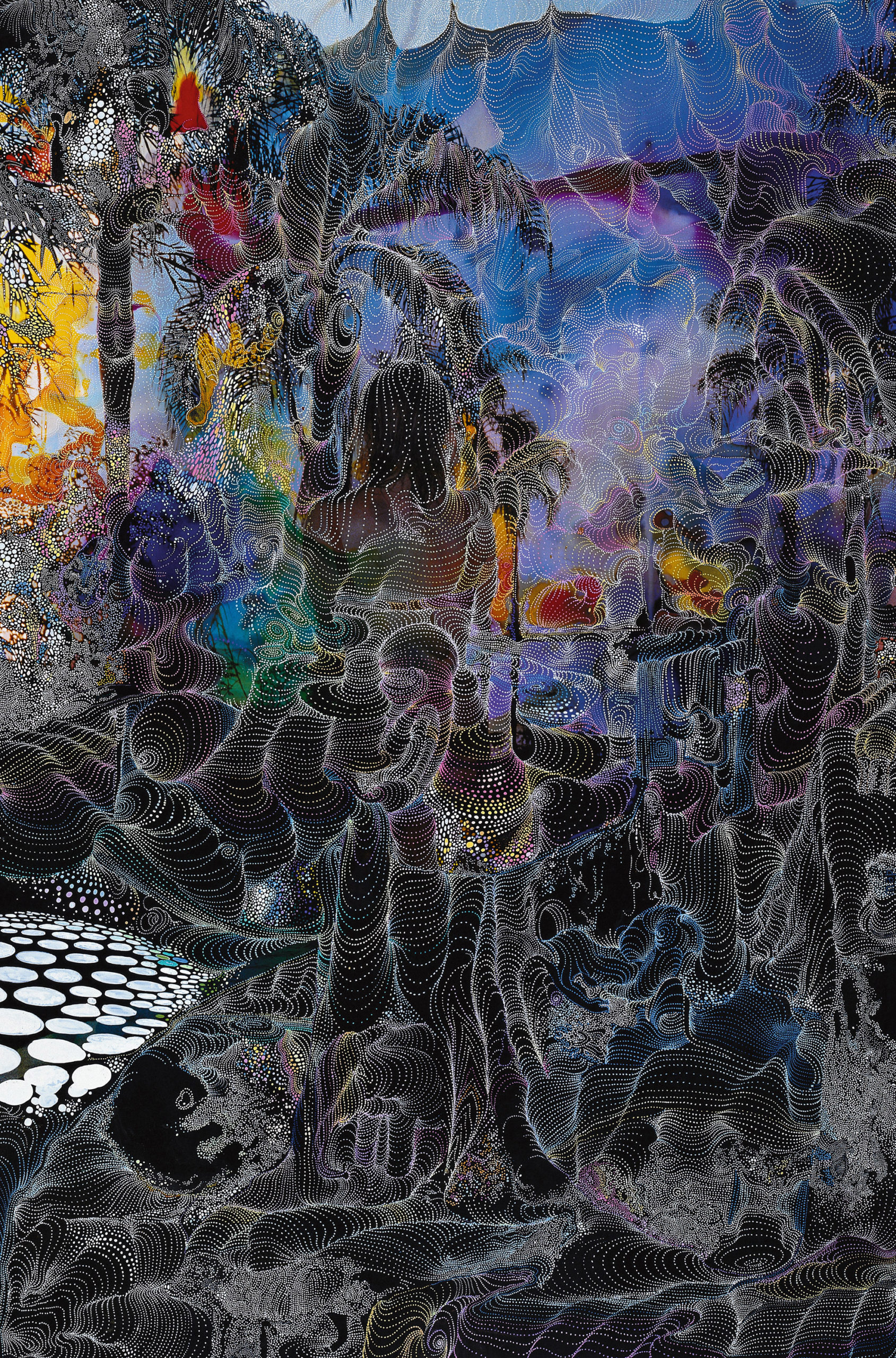
Ilha das Cobras, 2001, unique hand-painted chromogenic print with mixed media, 60 x40 inches
I usually applied a lot of dyes to prints, darkening these works’ overall appearance with deep colors applied to the prints, creating the impression that the figure in the picture is immersed in the surrounding landscape and sky. After this mix of water and dye was all dried up and soaked into the emulsion of the print I worked with an archival gel pen to add small white dots, adding a small baby to the belly of my wife Andrea, who was pregnant at the time I made this work. The image I culled from a small echoscope printout of my son in utero. Later I added vistas, quoted some Hans Bellmer signature drawings of legs and high heels, inserted a horn of plenty. These small drawings which emerge and coalesce upon closer inspection can be read as a rebus, although for a casual viewer it is probably hard to figure out what the meaning is. I continued working in this way for a while. I never really worked much with the exquisite corpse per se, although I did collaborate a few times with the artists Inez & Vinoodh. In this case I would draw my images upon their photograph. On one occasion it was a project for the Callaghan label (then designed by Nicolas Ghesquiere) wherein the model was photographed lying down surrounded by trinkets and a rug specific to my and Inez & Vinoodh’s earlier lives in the Netherlands. These items were jumping off points for my drawings and gestures, giving life to a new kind of Cadavre Exquise of sorts.
Callaghan 2001, in collaboration with Inez & Vinoodh Unique, hand-painted chromogenic print with mixed media, 15 x20 inches
I feel there is a return to an element of the haunting and that surfeit is countered here by the individuals which brings us back to subject . . . Thoughts . . .
As the series progressed and moved from a series of self-portraits to a series of portraits of family, friends and children of friends the series opened up a bit. The color variation, and the feel of the sitters brought a new life to the work. When it was just me in the very beginning, I was working with the idea of the visualized interior of the individual depicted. In some works, the undulating lines of dots extended slowly outside of the perimeters of the face and, connecting the face to the background and also seemingly extending forward, hovering above and within the face. The movement of the sitter combined with the movement of the camera, compounded by the slow shutter speed in the daylight set up in my studio, created a blur which concretized the idea of connection. The colored backdrop of a door in my Greenpoint studio—and later the paper seamless I used— meshed with the hue of skin and hair, creating a mix of colors. The subjects in the picture were photographed with their eyes closed, and the lines of dots, resembling topographic lines or rippling sound waves are a depiction of an internal isolated experience of time and thought. Sometimes I am stuck in thought, feeling separated from others and my surroundings. The sky and the birds, the smells and sounds of my surrounding are barely registered, which is a dark place to be. The reality is that we are surrounded and connected by the world in all its complexity, and this feeling of isolation is not true. The portraits depict this duality: the people have their eyes closed, seemingly lost in thought, but through movement and drawing the connections are visualized.