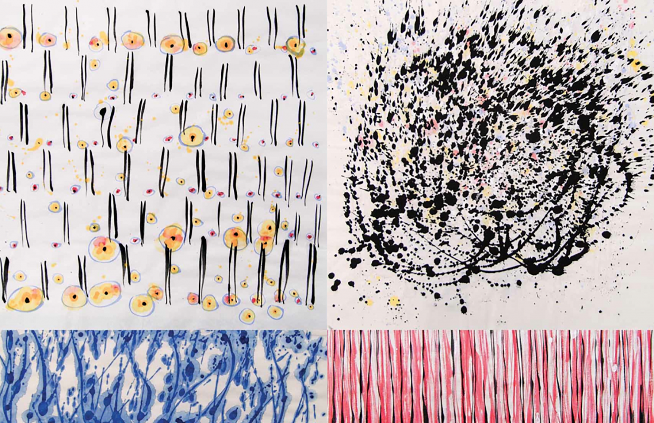
“Mix & Match: Watercolors from Cape Breton” spread from zing #23
From primordial human-scale concrete and cast sculpture made in various abandoned buildings in 1970s downtown New York, to Japanese brushes and watercolor on a remote coastal island, Jene Highstein‘s career has spanned decades, locations, and mediums. Most recently, the Cape Breton Drawings, which introduced color to his notoriously black palette. Moving from the terrestrial to the atmospheric, these works bring the viewer to the “magical landscapes” of Cape Breton, Nova Scotia. The Cape Breton Drawings are currently hanging in a solo exhibition at ArtHelix in Bushwick, Brooklyn. The drawings will also be featured in “Mix & Match: Watercolors from Cape Breton” in zing #23. In person, the man is a witty visionary, sharp of thought and full of personality—first hand experience of what this generation was about: achieving greatness, and having a great time doing so.
Interview by Brandon Johnson
What is the significance of Cape Breton to you personally?
My mother’s family is from Wilmington, NC and I spent my childhood summers on a beautiful white sand beach on the Atlantic. That experience was very moving. We would go to the beach early in the morning and spend all day in the sun swimming in the ocean and fishing off of a long wooden, and later, steel pier, which jutted far out into the Atlantic. We caught a myriad of fishy creatures, which we brought home for supper.
Meanwhile many of my friends had bought property in Cape Breton in the late 1960s, but I had never visited. Among them are my cousin, Philip Glass, and friends Bob Moskowitz and Hermine Ford, Joan Jonas, Rudy Wirlitzer, and Lynn Davis along with many others.
In 2002, on a lark, I took my son Jesse with me to have a look and fell in love with the place. It is very much like the NC experience in that the beaches are quiet, family-type places with few people, but the main difference is the remoteness and wildness of the landscape. The weather is relentlessly changeable, coming from one of four directions in turn so that in one hour the light changes dramatically. The color of the sky, sea, clouds; the fog rolling in and out, the rain coming and going all make for an amazing display of light and color and intensity of sun.
The Black Splash Drawings from 2007 (especially “Gesture (Nature)” and “Atmosphere”) seem to be precursors to the Cape Breton drawings. What initiated the Black Splash Drawings?
I have mixed my own black watercolors for many years but used them on traditional etching and other fine art papers. In about 2004 I began to experiment with what we call rice paper and the Chinese call Yuan paper. These are very different materials with extremely different reactions to the water element in the watercolors. Being in Cape Breton, so divorced from the NY art world and its taboos AND being a sculptor with no real inhibitions as to style and the history of painting, I was freed from all those constraints. I had used Chinese brushes for many years and am comfortable with their extreme sensitivity and ability to convey complex emotional charges. I began to use a kind of splash technique and was intrigued by it. That’s how it began to dawn on me that that technique could work. Over time I was able to become freer and freer with it and continue to do so.
What brought you to watercolor?
In the 1970s I used dry pastels for my black. In the 1980s I switched to black chalks, but by the 1990s I began to mix my own watercolors from bone black pigment which gave me the most dense velvety black that has become the basis of all my two dimensional works.
You have described your earlier sculptural work as not being based on natural forms but evolving in relation to nature, carrying natural associations. Can this also be said about the watercolors?
Yes, I suppose so. The watercolors came about from the intense saturation of my visual world when I went on long walks with friends in the remote areas of Cape Breton. These experiences were also reinforced by exploring the local beaches and bogs, which turn up equally unexpected encounters. The resulting watercolors are not so much impressions of these experiences but perhaps meditations on them.
Many of the pairings have horizontal lines dividing them—are these horizons?
The works are evolving. The more recent ones have a more defined reference to sea, sky, land and water but it’s a fluid transition because one’s experience of these areas is very fluid since they are constantly shifting, making it difficult to say which color or atmosphere would be associated with which . . .
What role does perception play in this series?
That’s an interesting question. In traditional Chinese landscape painting, as I understand it, the artist goes to the site and spends time there but doesn’t make any work. They return to their studios and indirectly interpret what that have experienced. Also, there may be elements of poetry or other language-based parts of the story, not to mention all the seals and comments of the subsequent viewers of the works.
My approach is also indirect in that I set up a studio in the dinning room of our house and began to work there with no particular plan. The work evolved every day on its own without too much intention on my part. It has become increasingly complex and dense in color, but I don’t think it has become more specific in reference to nature. My friend Hermine Ford looked at them and said, “I see, these are looking down, these are looking straight ahead and these are looking up.”
Your project in zing #23 features sections of the Cape Breton drawings paired with one another—4/5 one drawing and 1/5 the other—”mixed & matched” so to speak. Can you explain the thought behind this format?
“Mix and Match” seemed a good way to present a complex subject in a simple way. There is now a large body of the Cape Breton Watercolors, which span the simplest to the most complex ideas so I thought that I would scan through a lot of the images and see if somehow they could be paired into two sets of 4/5-1/5 images on facing pages, which would make sense. I’m happy with the results.
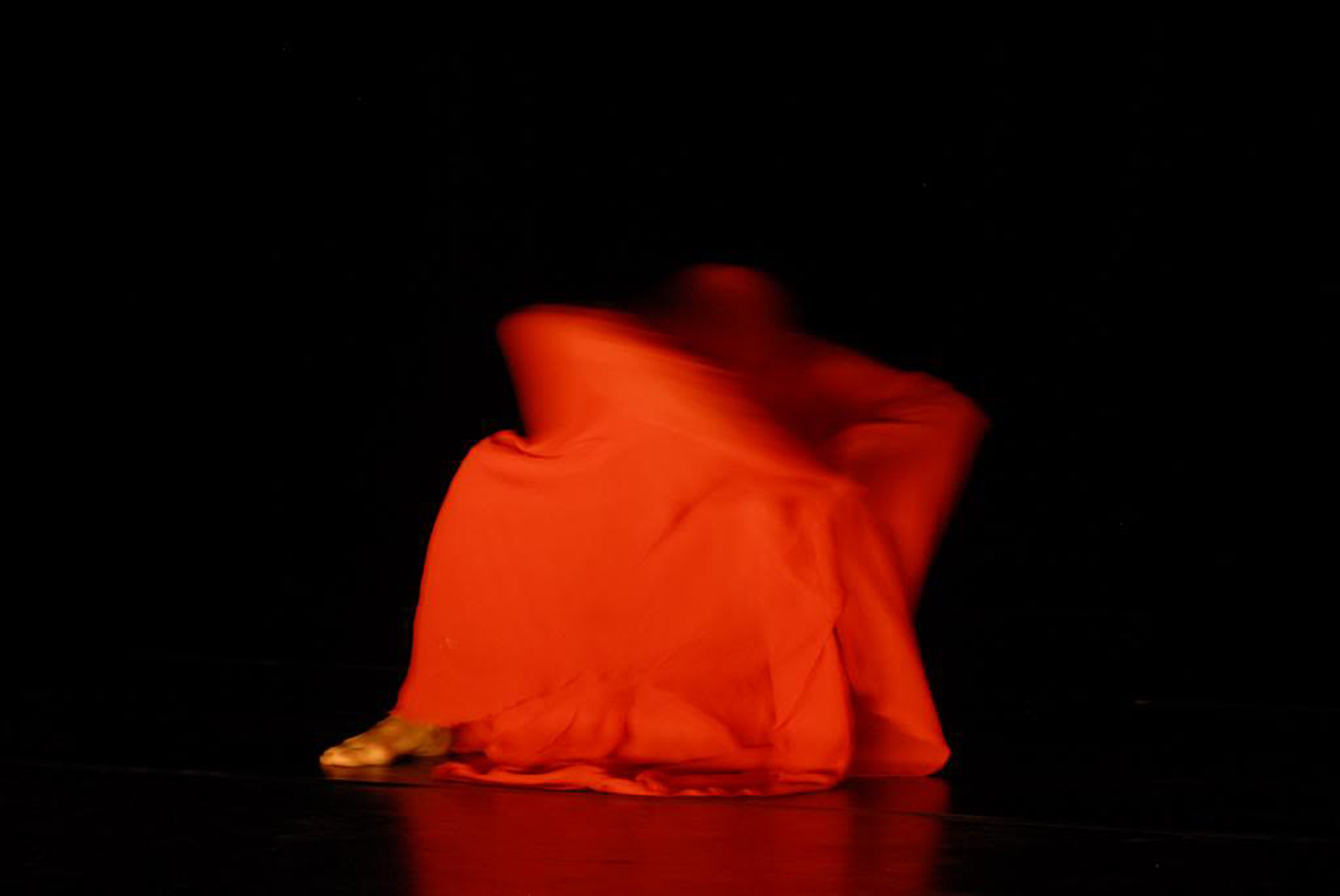
Photo by Dieter Hartwig
Fabian Barba was born in Quito in 1982. He began studying modern dance at the age of 12 in Ecuador. From 2004 to 2008 he studied at PARTS school for Professional Training in Contemporary Dance in Brussels, where he works and resides today. Recently, he was invited to perform his solo work A Mary Wigman Dance at MoMA in conjunction with the exhibition Inventing Abstraction, 1910 – 1925.
Interview by Josh T. Franco
We met in the context of the collective Modernity / Coloniality / Decoloniality (MCD). The particular occasion was a two-week Summer course convened by Walter Mignolo in Middelburg, Netherlands. You were searching for company in thinking about particular questions you had of your discipline, dance, that you had not yet found. Did you find what you were looking for in Middelburg?
During the last three or four years I’ve been trying to make sense of my experience as a dancer who first trained in Quito (Ecuador) and then continued studying dance and working as a dancer in Brussels (Belgium.) In a way I see myself as someone who, through training, came to belong to two different dance traditions, two dance traditions that are not completely foreign to each other but that have established very complex and puzzling relations or non-relations.
During the summer course special attention was dedicated to the question of “decolonizing aesthetics,” a conversation that put into my horizon questions I had not even considered and that I could suddenly discuss with artists coming from different disciplinary and cultural backgrounds. To be immersed in that dialogue was an extremely exciting experience that I haven’t finished assimilating; a very disturbing experience as well, because it further upset the already shaken ground I was and am standing on.
And yet, it was not only finding a common interpretive frame for thinking about different though related experiences that produced my disturbing excitement. It was also the sensation that my personal experience and the personal experiences of the people I met were placed first. We were talking theory, but only because in different ways we need that theory to make sense of our disparate yet related stories.
When I met María Lugones, I met a person first, a person whose voice was present later that summer when I read her Pilgrimages/Peregrinajes, a book that I’m sure won’t leave my thinking untouched. When I met you and you told me the story of Marfita, I was just amazed because even though our life experiences are quite distinct, I could somehow recognize in your story something like my dislocation working in Brussels, trying to make sense of two different and seemingly unrelated worlds. Then I also remember talking with Rolando Vazquez in María’s hotel room, telling him about my struggles to establish a relation with past and history that wouldn’t deny my former experience as a dancer in Quito, and he saying with his kind smile “so funny, I’ve been writing about it for a while now and here you come with this,” then of course I got to read what he was writing and that brought into my practice a perspective I haven’t been managed to articulate, a perspective that carries the kindness of his smile, a kindness that dissolves the discomfort that often accompanies the word “colonialism” when it appears in conversation with my colleagues in Brussels. Then there’s also the sensation of understanding something of the political commitment of Walter and his project of decolonizing epistemology, a political project that involves him fully as a person. So yes, I think I found the company I was looking for. A very warm company. And yet a very disturbing company for the questions it raised. For example, what does it imply to “decolonize aesthetics”? We certainly didn’t have the time to get to the bottom of that.
On February 1 of this year, you performed your work A Mary Wigman Dance Evening as part of MoMA’s ongoing series, Performing Histories: Live Artworks Examining the Past. You were invited to perform in conjunction with the exhibition Inventing Abstraction: 1910 – 1925. Can you describe this piece, and give some history of Mary Wigman herself?
Mary Wigman is an important figure in the history of dance. She is recognized as a main character in the development and consolidation of Ausdruckstanz or “dance of expression.” She started to create her dances in the mid 1910’s and continued working all the way into the early 1960s, passing through the Weimar period, WWI, the interwar period, the rise of Nazism, WWII and the years after 1945.
I will just briefly point out that at the beginning of her career she engaged in an artistic practice that sought to strongly challenge the predominant values of the bourgeois society from where she came. In many aspects what she did must have been shocking: an adult woman (she was almost thirty at the time of her first public performance), single (maybe engaged in a love relationship with another woman), seeking a career of her own, doing dances that lacked gracefulness and that sometimes were performed even without musical accompaniment… She didn’t have it easy the first years. However, from the early 1920s on, she gained recognition and an important place within the dance field in Germany. In 1930 she made the first of her three tours through the United States, where she was received as “The Goddess of Dance,” a real diva whose work seemed revolutionary while enjoying wide popular acclaim. From 1933 she continued working in Germany under the bureaucratic and ideological machinery of the National Socialist party. Her personal stand in relation to nazi policy is a heated subject of discussion. For now, I will only note that a clear change in her artistic production can be noticed—how much of it meant resistance or accomodation to the regime is to be analyzed calmly. You can find a very exhaustive and compelling study of Wigman’s work in Susan Manning’s book Ecstasy and the Demon: The Dances of Mary Wigman. For my work I focused on the first tour of Mary Wigman in the United States. Her performances resembled a music concert, something like an MTV unplugged. The evening was composed of about nine solo dances, each of them had a length ranging from three to seven minutes. Each dance had a different costume, there were two live musicians accompanying the dance. Some audience members would know Wigman’s dances as we might know a pop song, and they would ask to the theatre to include this or that dance into the program, which they did.
A Mary Wigman Dance Evening is a theatrical proposition to imagine how one of those evenings might have been like. I learned three of her solos from video . . .) I also studied principles of movement developed by Wigman with three of her former students who worked with her in Berlin in the ’60’s.
I am thinking about your performance in the context of the exhibition Inventing Abstraction, 1910-1925. Based on our conversations this summer and since, the history of abstraction seems like only half of the story in your thinking about A Mary Wigman Dance Evening. Your other, primary concerns have to do with your particular appropriation of her work in the 21st century, as a male-identified body from Quito, Ecuador, who has lived in Brussels for significant portion of his adult life as a dancer. And all this specificity is perhaps at odds with the premise of the exhibition. How do you see your concerns in relation with the history of abstraction?
Reading texts on decoloniality and post-colonial theory, I became familiar with the critique of un-embodied, abstract Reason and Knowledge. That is, the detachment or abstraction of the thinking subject from the situation s/he studies, as if s/he was placed in a privileged a-temporal, out-of-space point of view.
As far as I know, Wigman and her contemporaries referred to the work they did as pure, abstract dances. At first, that sounded as nonsense to me. To my understanding and sensibility, those dances were anything but abstract. Through my education I had come to recognize abstraction in Merce Cunningham or in Yvonne Rainer’s Trio A. Wigman dances had too much emotion, too much of a pretense for transcendental meaning for me to grant them the status of abstract dances. However, later I came to understand that abstraction for Wigman meant that her dances, or most of them, tried to do without recourse to narrative: there was no story-telling, no pantomime, no identifiable characters. This is how I now understand Wigman’s understanding of abstraction.
At the same time, Wigman was doing a new German dance (Ausdruckstanz). However abstract she claimed her dances to be, they were supposed to express a way of feeling of the German Folk, a Teutonic German Soul, a belonging to a German Soil. There was a strong nationalism in Wigman’s work from the ’20s on that I think doesn’t give much room for the kind of abstraction of the detached, disembodied ‘thinker.’ (This kind of nationalism of Wigman’s early work shouldn’t be immediately conflated with the nationalism of the nazi regime. A great majority of modern dance practiced in different European countries and in the United States was unmistakably nationalistic, including Martha Graham’s work who later forcefully participated in a boycott of a dance festival sponsored by Goebbel’s ministry.)
Certainly, my work focuses strongly in the relation between a dance practice and the cultural context in which it is produced. In a way, contemporary dance could be understood to be a very abstract artistic practice, detached from any specific location. Even if it tells a story or depicts characters, contemporary dance might be understood as a “universal language” as if thanks to its independency from spoken language, everyone could access it. If contemporary dance would be indeed a universal language, it wouldn’t be attached to a region nor to a community of practitioners nor to a specific history; everyone could do it, everybody could join either as a dancer or as a spectator. And this is not false: anyone can join, but at the price of inscribing oneself into a specific dance tradition. A dance tradition that is historically and geographically specific. Contemporary dance is not a universal practice, though it might pretend it is.
Or, there are several traditions of contemporary dance. When I was in Quito, I was doing something we used to call contemporary dance and then I decided to go to Brussels to improve my contemporary dance technique; I thought I would learn to kick my legs higher, that kind of thing. However, through my technical education in Brussels, I noticed later, I inscribed myself into a different dance tradition than the one of which I was a part in Quito. Through learning to use my body differently, I also learned to think of my body differently, and also to think differently about the role of the dancer and of the definition of dance itself. I didn’t improve my contemporary dance technique in the abstract; I became part of a different dance tradition, a very concrete one.
It’s the relation between these different dance traditions that interest me, dance traditions that are practiced in very specific cultural contexts. They’re not artistic practices that dance freely in the air, nor that are despotically rooted to a nationalistic soil.
You have spoken repeatedly about the relationship of time and place playing out in the fields of Modern and contemporary dance; how work from non-European, non-metropolitan companies is often relegated to an elsewhere time. You have been struck by comments like “that’s so 80’s” from prominent dance critics in regard to some of this work. Johannes Fabian called this the “denial of coevalness,” when geo-politics are articulated temporally, relegating a group or activity to a primitive status. It’s a way of maintaining legacies of coloniality to the benefit of those in old power centers. But you have argued that if we look to the specificity of experience and production in these sites instead of reading them through the terms of these centers—so that they appear merely dated—we might arrive at very different conclusions and possibilities. What might we achieve through such an examination, specifically?
I want to make something clear. When I talk about contemporary dance I refer to a specific kind of dance: artistic dance that is created for the theater (as institution and/or physical space). Thus, the epithet contemporary (which I write in italics) names a kind of dance which has to be differentiated from the adjective “contemporary” when this refers to the belonging or occurring of something in the present situation. So contemporary dance (without italics) could be any kind of dance practiced in the present situation: ballroom dances, street dances, etc. The curious thing is that contemporary dance, at least nominally, claims the present for itself excluding from it other kinds of dances. To my understanding, contemporary dance not only says that it belongs to the present, but that the present belongs to it; contemporary dance places itself in the ‘now,’ it colonizes the ‘now.’ Nominally, modern dance wouldn’t be contemporary, and it risks being placed as part of an overcome past.
Modern dance in Quito is not the same as contemporary dance in Brussels. The kind of modern dance I practiced in Quito could be accurately described as modern dance in that its technical, aesthetic and ideological premises filiate it to other modern dance traditions as they have emerged in different parts of the planet. To say that the dance I practiced in Quito is modern is not a problem by itself. The problem is when the contemporaneity of modern dance is denied. The main problem with this, is that if modern dance in Quito is an anachronism, then the only thing left for it to do is to “catch up” to the present exemplified in the work created in the centers. This thinking parallels this sentence by Marx quoted in Chakrabarty’s Provincializing Europe: “[the] country that is more developed industrially only shows, to the less developed, the image of its own future.” This would annihilate the capacity of dancers in Quito to define their own artistic project, subjugating their practice to the assimilation of a project designed elsewhere: coloniality at its purest!
Something important I haven’t made clear this far: I became interested in Wigman’s work when I was in Brussels because in a way it referred me to the kind of dance I used to practice in Quito (mainly due to the central place given to emotion and intensity in both dance traditions: Ausdruckstanz and modern dance in Quito). The problem that appeared from the start is that I set an equivalence between a dance tradition that belonged to the past (the 30’s in Germany) with a dance tradition that belonged to a place outside the boundaries of Europe and the United States (Ecuador in 2000). It was as if traveling outside of those metropolitan centers meant traveling back in time!
The master narrative of dance—before it starts to be critically rewritten in the early 80s by dance historians—said that in the beginning there was ballet. Then early in the 20th century early modern dance appeared in opposition to ballet, with dancers like Ruth St Denis, Laban, Wigman and Graham. Then starting in the early 60’s, Cunnhingham and the dancers of the Judson Church in New York propulsed the post-modern dance (in clear opposition to modern dance) that gave place to the effusion of contemporary dance.
Although this almost caricatural presentation of the master narrative of dance history can easily make me target of harsh criticism, I think that that master narrative, however contested, remains operative in a surreptitious manner. It is this historicist, stagist account of dance history that creates the conditions of possibility to say that modern dance is not contemporary, an anachronism because modern dance came before contemporary dance, and in historicist thinking we’re faced with a sequential logic instead of an additive one: contemporary dance has to displace modern dance, they cannot exist at the same time—thus the denial of coevalness operating in the fight for the ‘true present’ in dance history.
When I started working on A Mary Wigman Dance Evening, I related the kind of modern dance I used to practice in Quito to a tradition that was not recognized as a living dance tradition in 2000—as far as I know, there’s no one actually practicing Ausdruckstanz in the way it was practiced from the mid 10’s until circa 1965. In that sense, the shortcoming of my thinking was that I related modern dance in Quito not only to a past dance tradition (exemplified in the work of Wigman in the 30’s in Germany), but also to a dance tradition that lacked vitality. However, even if Ausdruckstanz couldn’t be considered a living dance tradition in 2000, it did influence enormously the development of different traditions of modern dance, which maintain a living practice that is not relegated to the past even if they are very aware of their genealogy. Thus, when I was considering the filiation between Ausdruckstanz and modern dance in Quito, I could have focused not only on this genealogy, but also in the relations that modern dance in Quito could establish with other contemporaneous modern dance traditions as they’re practiced in different parts of the planet. Examining the specificity of modern dance in Quito doesn’t mean to deny its filiation to Ausdruckstanz nor to isolate it as if it has come out of a vacuum, it can allow instead to recognize its autonomy and capacity for agency in relation to different living modern dance traditions as places that are presently inhabited by dance practitioners that need not, should not, be relegated to an archaic, objectified, detached past.
I am frequently struck by your use of the phrase “embody dance” in regard to dancers you hold in high regard. To the untrained, it seems redundant. Is dance not always embodied?
I usually talk about the embodiment of images, ideas and ideals when referring to the kind of dancing exemplified in the body and practice of a dancer I appreciate. I like to stress the embodiment of ideas and ideals to make clear that these do not exist only in abstract thinking and language, but that they have an existence and a way of transmission that passes through the body.
The dances of Wigman were at first foreign to my body; they existed in videos, photos, textual accounts and exercises I had never practiced. Much of their work is done through verbal language. My approach was the bodily re-enactment of those dances that didn’t exist in the traditional archives. To embody those dances meant to inscribe them in my body, to host them, to give them a bodily existence.
Alison Kuo is a Texas native. She received her BA from Southwestern University in Georgetown, Texas. Her blog Accidental Chinese Hipsters has been featured in Vice Magazine. Currently, she is in her first year of the MFA program at the School of Visual Arts in New York City. We talked in early January, following her solo show Colorful Food at Eleven Seventeen in Austin, Texas.
Interview by Josh T Franco
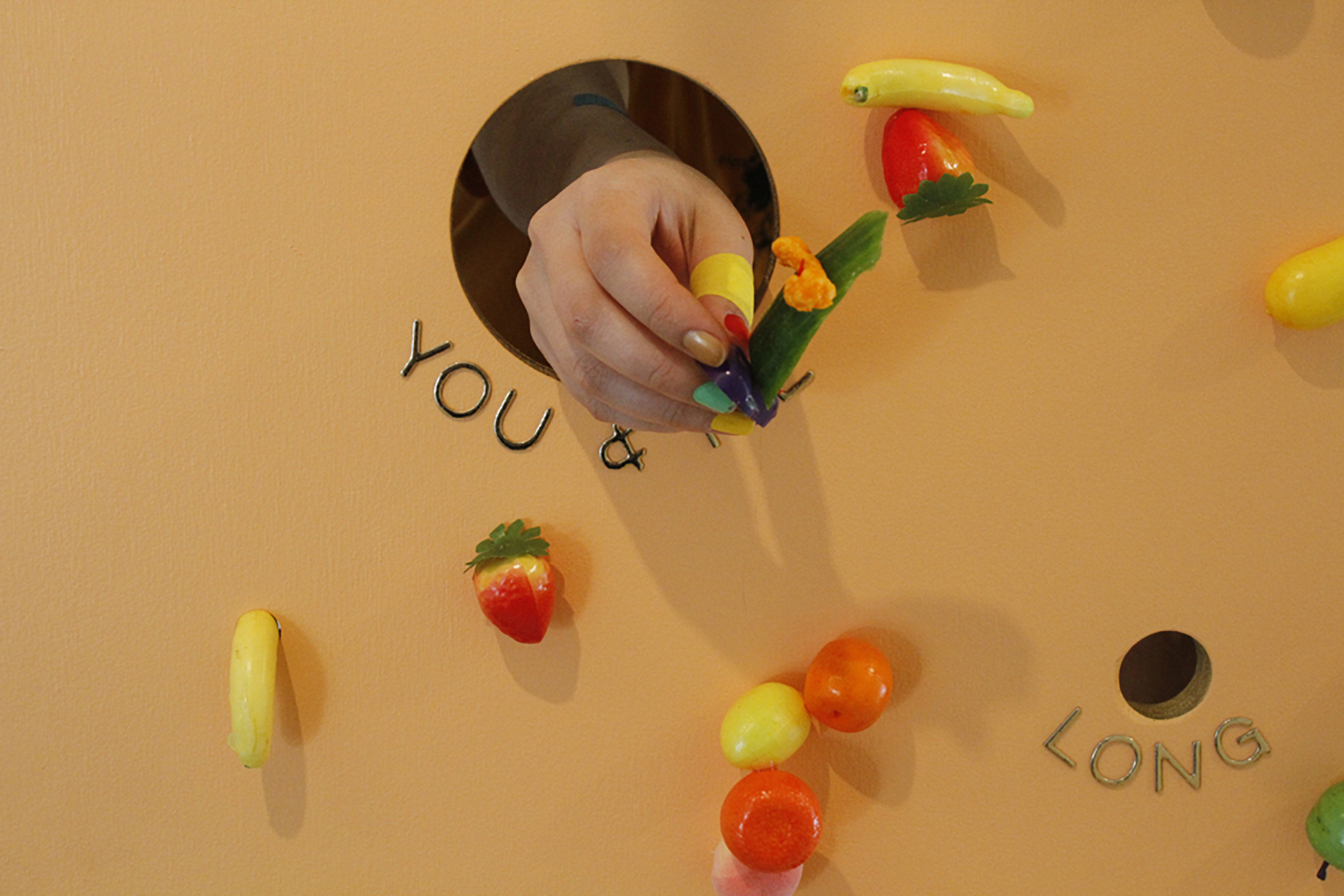
I am back in New York, just a few days after Colorful Food. I am thinking back to the night; there’s a room with four walls bearing your large format photographs. Some are of food, some are of food abstracted beyond recognition, and some are arbitrary shots, in which the shapes, colors, dimensions echo those of other photographs. These photographs are the only For Sale items, according to the price list at the door. Your food-cart inspired offerings and performance are free. (If we can get free food, why would we pay for photos of it? Oh yes, because this is the art world.)
I’m writing you from my studio back home where I’m surrounded by half-reconfigured snack machines, bags of gummy candies, chips and chili peppers, illustrated cook books, and an overflowing unpacked suitcase filled with plastic fruit serving dishes and shiny vinyl letters. There’s a lot to think about after these two public showings of my new work, and in the runaway train that is a two year MFA program I’ve got to try to fix my eyes on the moving landscape to see where I’ve been, guess at where I am now, and also look to the future without getting too dizzy. Having you as a fellow traveler, one that I often encounter here (New York) or there (Texas), helps me to orient myself, and for that I am grateful. That you’ve responded to my deepest, perhaps concealed, intentions for this rather silly performance is wonderful.
The scene: We are in Austin, at Eleven Seventeen, the home/gallery of our friend Joshua Saunders (the space is his goodbye love letter to Austin before he imminently departs). I saw an earlier version of Colorful Food at your studio in New York a few weeks before. This is certainly leveled up; the colors of the specially painted floor and the incisively hung and glued plastic fruit replicas define the space as a space more successfully. The now wooden (formerly foam core) center-piece demonstrates a solid craftsmanship. The choice to rest it on the unobtrusive and equally well-built rusty, rectilinear base made by Ben Brandt makes formal sense as well as radiating a warm send-up to our Austin-Brooklyn back and forth network. The center structure itself is no longer white, but peach. The labels glitter precisely in gold, begging to be spoken, or sung. The holes they name may well be microphones. Front and center, “You & Me” dominates. Appropriate. Then the performance, or the activation, as I prefer.
Performative artwork is activated when it is shown to an audience, as in the thing/idea becomes alive. I think with good art—a painting, a performance or anything—that stimulation, that electric activity, happens in the mind of the audience. In this project I’m harvesting as many of those new associations as I can by having a conversation integrated into the process. At the same time, this isn’t a laboratory or a focus group. Establishing myself as considerate of every aesthetic experience my audience has plays a big role in the trust I’m trying to create, the feeling that makes it okay to let go of control a little bit and eat the squid cracker with mayo, honey, wasabi peas and pop rocks.
I realized something during too many delayed flights back North. Visually, the space of Colorful Food was fine and striking. And the photographs would do well even alone. Yet, watching others partake, calling their menu selections to you through the according hole, the potential spectacularity was mostly lost on me. The space disappeared, and we were at just another East Side party, not a terrible thing. But when I was the transmitter to your receiver and vice versa, I felt deeply the distortion this work produces. Felt it do what art does. I didn’t feel that power as Colorful Food’s demonstration of a relational aesthetic, no doubt how many are discussing it in these following weeks. I felt its action in the disruption of information.
You are right: the installation and other art-looking things, the party, the fun, is almost an act of misdirection. My interest is in how our personal word choices and mental associations shape our daily transactions (commercial and personal), and in turn how much you or I are really engaging with the people we transact with. I often find myself almost unconsciously thinking: Can I get what I want? Is there something that I don’t know that I want that this person could give me? How do I ask? How can I reciprocate? Is there something I can give back that they want that I don’t know they want? Or that they don’t know they want yet but I can provide? What I’m finding is that the smallest act of willfully sidestepping the familiar way things go in an interaction is liberating. The brain says, hey, you’ve gone off the script, and both sides become present in constructing new language for what’s happening. That opens up possibilities for un-preconceived things to manifest.
Like at a food cart, I could place an order. But unlike a food cart, the feedback you built into the work through a seemingly arbitrary menu of signifiers and the “small talk” you require to round out a customized snack was, as feedback is, utterly distorted. Thus, I discovered the excellence of tangy cotton candy wrapped in purple cabbage. Colorful Food then, surprisingly, was about information, how it traverses through our everyday exchanges—morning coffee orders, buying over-the-counter meds, all (commercial) exchanges—and what distorting it might reveal and produce.
One thing that threw me off about the Austin show: it was loud in there! I didn’t expect that the new snack machine box I built from plywood would be so much more sound insulating than foam core (duh), and also (duh) forgot how bouncy noise gets at openings when lots of people are standing around in one room all talking at the same time. So I had to yell a lot and steal looks at people’s faces through the holes, which made for a different, more visceral feeling for the performance. I’m going to think about your use of the word “distortion” as I go forward. Distortion of language read or heard, of sound itself, of taste, of desire, of appearance, of expectation. Dialing up one type of distortion, isolating and accentuating it, could produce more extreme results. I fear not knowing at what level of dissonance I would lose the trust of my audience, but that’s where I need to challenge myself. Certainly at the Eleven Seventeen closing party in February there will be opportunities to test this out, as I’ll be skyping into my performance.
Again, part of what Colorful Food produced was a great party and novel moments of relating, sure. But what I took away was not about the larger networks of sociality, or feeling like I had participated in a “new” way of producing space. What I took away was the power of the small gesture to focus our attention on the massive flow of (mis)information charging throughout our waking and sleeping lives. What I took away was the ways in which art can recharge how we undertake the daily projects of “You & Me”.
In parting, I hope you eat a kumquat soon. It’s a small citrus fruit that looks like a miniature orange, and you can find them in Asian markets this time of year. First shock – you eat the peel. Then it defies you again by being sweet on the outside and pucker-inducingly sour on the inside. Eat one, and then give one to your friend.
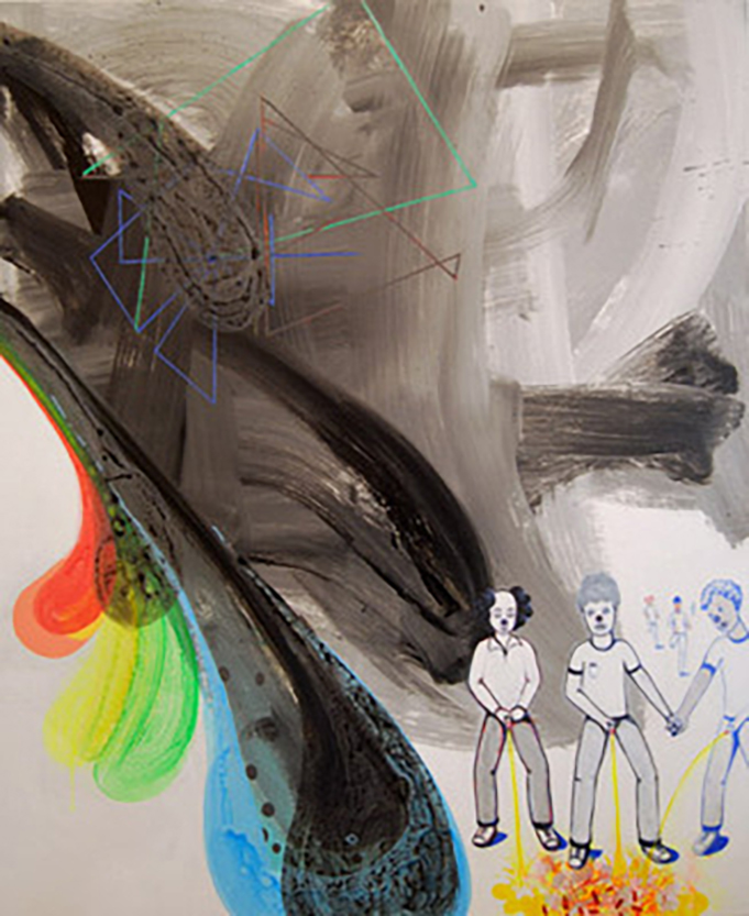
Clown Posse, 2012, 54 x 44″
Artist David Humphrey is a New York-based painter and sculptor, known for his abstract combination of Pop and Surrealism. Fueling this abstraction, Humphrey focuses his paintings on a protagonist, including subjects like puppies, kittens, clowns, and snowmen. David Humphrey is not only an artist, but also a writer. Blind Handshake is Humphrey’s most recent publication. This anthology offers art historical text from a firsthand point of view, which is noteworthy, as art historians often write these historical texts. Currently, Humphrey is preparing for his two upcoming November shows, one of which is in New York at Fredericks & Freiser (November 8-December 22) and the other in Washington D.C. at the American University Museum (opens November 3).
Interview by Eliza Philpott
How would you describe your current style of painting?
It’s a hybrid of modern art, pop and retirement home amateurism.
What are some influences that have directed you to this point?
Are you thinking of drugs? My doors of perception were opened in high school by Van Gogh, Cezanne, the impressionists and a lot of art at my local museum (the Carnegie in Pittsburgh).
Are you aware when your painting style changes?
I’m a restless artist with an appetite for unexpected images in my studio so I’m frequently trying out a range of what might be called “styles” to throw myself off (style is a word I generally avoid because I’m not quite sure what it means, unless I’m using it as an insult.)
What encourages the change?
Longings? Ideas? Other art? Drugs?
You create abstract sculptures using stuffed animals. Describe your process and the idea behind it.
I go to Kmart and buy two overstuffed animals of the same species and bring them back to my studio where I tie them up and cover them with a mixture of hydrocal and paperpulp. Then I keep working on them until they make me as happy as a sculpture by Henry Moore.
Would you say there are similarities between your paintings and sculptures?
Yes! They are equally fucked up. I try to fold some aspect of collaboration into both mediums, sometimes with found objects or images but also with split-off parts of myself: painting as a form of acting.
Your most recent book Blind Handshake is an anthology of your writing on art. What prompted you to publish this book?
The director of Periscope Publishing asked if I wanted to do a book. I’d been writing about art since the early nineties and had accumulated a pretty large archive. We thought it would be exciting to cut up and thematically reorganize that archive with images, in an inspired design by Geoff Kaplan, to make a case for writing as an extension of the studio. The book is mostly about other people’s work but I feel there’s an encrypted manifesto of what matters to me about artworks.
When did you first know you wanted to be an artist?
Somewhere in Junior High when I was trying to grow my hair long, wishing to be a hippie.
Even with a protagonist your paintings are very abstract. Do you have an idea of the meaning behind a painting or your overall vision of the finished product before you start?
I’ve barely a clue, that’s part of the thrill of making a new piece. Sometimes I have a pretty specific preparatory image but it usually changes along the way and when it doesn’t I still need to be surprised by the result.
You are currently preparing for two upcoming shows. Do you have a specific theme in mind for the works you are submitting?
In November I have a show of new paintings at Fredericks & Freiser in New York that will include an accident-prone spaceman, ambient spectators and an overturned cement truck. At the American University Museum in Washington, also in November, I’ll be showing selected work from the last ten years called Pets, a President and the Others.
Who or what inspires you?
My multi-talented and disarmingly funny wife Jennifer Coates, who weighs in on all my work and much else.
Photograph by Elizabeth Cowan
T Geronimo Johnson was born in New Orleans. His fiction and poetry have appeared in Best New American Voices, Indiana Review, LA Review, and Illuminations, among others. A graduate of the Iowa Writers’ Workshop and a former Stegner Fellow at Stanford, Johnson teaches writing at University of California–Berkeley.
His first novel, Hold It ‘Til It Hurts (Coffee House Press, 2012), explores a not-too-long-ago America, four years into war in Afghanistan and on the cusp of the devastation of New Orleans by Hurricane Katrina. The novel follows its main character, Achilles, in search of his adoptive brother through morgues and into drug houses; to a beautiful and impoverished, and then ravaged New Orleans; from the trauma and loneliness of post-combat into the ordeals and imperfections of a love affair. Johnson gets his readers in close to a perspective atypical of American fiction—the sensitive as much as cynical Achilles—a black vet of the war in Afghanistan who was raised by adoptive white parents in the suburbs. It is unusual to come across a several-hundred-pages-long story so unreserved about issues of race, sexuality, and gender in a context that is still so recent and thus so raw in American history, but what is most striking about the work is the haunting quality of Johnson’s realism, which is capable of great sensuality and great coldness in the same paragraph, and can hold the intensity of memory at the same timbre of the present moment in a single sentence. From the shards of baby-doll heads, anonymous bodies, kisses in the dark, mustard-trimmed windows, muzzled pit bulls, spilled brains, nightmares of war, scratch marks in an attic, and the search for a lost brother, arises a love story complete with revelations about sexual technique, early dates characterized by awkwardness and yearning, the mutual alienation of a fallout, the warmth of routine, violent anal sex, embarrassing visits with parents, and an aged sense of mercy in ambiguity.
Interview by Rachel Cole Dalamangas
Hold It ‘Til It Hurts is a novel that is perpetually at war, exploring such conflicts as race, gender, class, domestic violence, a soldier’s life post-combat, poverty, and so on. What’s intriguing is that a great deal of the tension that propels the text is resistance. This is a novel that resists socio-political idealism, resists easy conclusions in regards to intimacy, resists—and is uncomfortably aware of—the white gaze. Moreover this is a novel that resists being segregated to the genre of African American literature while simultaneously not rejecting African American literature as an artistic history. Although not shy about cultural criticisms, this novel insists on being understood as literature, first and foremost, perhaps because the overarching shape it takes is that of a love story in the background of warfare. How does one straddle so many political, cultural, historical, and social fences in the making of serious art?
What first comes to mind is that it reflects my worldview and my hesitancy to try and wrap everything up too neatly because that would feel completely unrealistic and would undermine the power of the narrative. It also has a lot to do with point of view and a desire to write about a type of individual that has gone through these experiences and is not yet able to process all of them, and balancing the risk involved in writing the character as I did. I was aiming more for life than a neatly delineated narrative. Sometimes when I was in school I would find myself reading such stories and felt as though those narrow depictions of the world ignored the social contours that give definition to our lives.
I wanted to avoid that. The driving question of the novel is: How do you learn to care about people who are not like you? This exploration demands a broad range of experiences. This is Achilles question, but it’s also the reader’s. I suppose by opening up a person so much and hovering so close to his point of view readers then finds themselves privy to things we might not share publicly or openly. So that’s part of the straddling.
But it’s not really straddling. We’re all a combination of these myriad influences. Borges says the text is the axis of innumerable relationships; the same could be said of character. The project is more about depth than breadth, or any breadth is achieved through depth.
Another guiding notion was the distinction between what we will say and admit to publicly, what we will say in private only, what we think and will not share, and then there’s all those impulses of which we are not aware. The latter have the greatest influence in our actions and opinions, and the latter, sadly, also resist easy persuasions. Much of the novel resides in that space, and that’s where this notion of resistance is coming from. Beneath the bounds of the polite discourse, at the subconscious level, we can take a look at how Achilles’ social conditioning has formed these particular worldviews, and how he struggles both consciously and unconsciously to reconcile them. From a technical point of view that’s how I was able to straddle these different elements—by not straddling them, but by simply pushing deeper. It was more at the level of impulse than craft.
I’m concerned that white readerships sometimes regard literature by a person of color who is writing about the struggles of people of color, with patronization—particularly in an era like ours that is witnessing a resurgence of overt racism and misogyny and the white guilt that accompanies such. How do you think the reception of American literature written by people of color will shift? How do we address this issue as we move out of post-modernism?
Very often literature by or about people of color conforms to our ideals of this country. It too often takes on the arc of a racial Horatio Alger narrative. Those served a clear social purpose in the past, especially in slave narratives where the thrust was the inosculation of literacy and enlightenment. If you are able to read, you are enlightened. Now North-North America will accept you as a human because it was only a lack of education that defined otherness, and if everyone had known all along that you could read they would have never offered you those agricultural jobs in the first place. We’ve moved away from that but it still often feels that stories about people of color have to conform to that particular kind of arc and characterization called for in Aristotle’s Poetics. I cannot abide that.
We are plagued by the myth of universality. While we do share impulses, needs, desires; while we are ninety-nine-point-nine-x-with-a-smile percent genetically identical; while the Russians love their children too (we hope!); our constructed social identities frame very different social realities[1]. As one author writing about single motherhood said, Even if the story is universal, the truth is in the details, and the details are what matters. In her essay, that author, a single white mother explains how much her reality differs, profoundly differs, from that of a mother in a two-parent household and how the differences in lived experience affect everything from a sense of time to the use of pronouns. I live in a very different world from the white reader. Social space bends differently around me. And this is the problem: How does one present those differences while still reassuring readers of our commonality and of the ultimate beneficence of our society? I’m not sure that we always can, but that is what many readers often want.
Marketing is an issue as well.
For example, a few editors said it was admirable that I didn’t follow the clichéd route and end up on the other side of the rainbow, but they couldn’t sell this kind of story. They think they’re conforming to the market when they are creating it. (At this point I have to say thanks to Jon Sternfeld and Anitra Budd!!) There’s this market pressure for writers of color and the stories about people of color to conform. Authors then are (inadvertently?) expected to do what in any other medium would be a shuck and jive. This pressure to perform a ritual of atonement goes back to the slave narrative. Even on my end, I had to, towards the final stages, interject purposefully a few details and asides to assure the reader of Achilles humanity—because it is not always assumed of black characters (readers don’t fill in the blanks the same way). And those details I inserted, which I will not list here, worked, sadly, as anticipated. That’s not your question, but understanding the pressures that black authors feel when reaching out to “wider (whiter)” audiences is necessary before we can even imagine a shift in perception or shift in reception. And I don’t know how that will resolve itself. If we don’t acknowledge who we are, how will we become?
I will not list any novels here, but the pressure is real. I have been wondering whether or not I would publish through the traditional channels anymore, at least not when you have a group of people who don’t know your experience deciding how you should best represent that experience. So as we move into a new era, I’m thinking less about the Gestalt or political evolution or theoretical shifts. As we move away from post-modernism (if we can, it’s the theoretical equivalent of Saran wrap and has the kinetic energy of Christian typology), as we move away from post-modernism, hopefully shifts in technology will enable people to tell other types of stories without bowing to a mediator. People can build their own markets.
I suppose it can be summed like this: in my artist statement I say that I write for the ones who didn’t get away. In the world we live in, for understandable reasons, people want stories about those that do. I understand that we need those types of stories, but it’s equally important to acknowledge that there are so many other narratives that are lived everyday and in many of these people are not fairly rewarded. (See Turing in the machine.) And if our society does not face these narratives, we will keep writing them—in bone, on flesh.
You said something interesting about how technology will make it easier for people to tell other types of stories—can you expand on that? How do you think technology may facilitate the telling of marginal stories?
I alluded to this above, but the slap of selling a novel guided by a marginal voice is that people alien to the experience are empowered to tell you how to render it, and I’m not talking about craft here. Your life is mediated through alien eyes. The mask and veil become huge zip lock bags, but we can make out faint contours, a ridge there or here, a chin, a mouth in vain. But that frustration is born of a specific publishing model and cultural aesthetic (Long live CHP!). Instead of delayed and hierarchical, distribution is now immediate and lateral (as poets have done for years with chapbooks). Modes of expression are changing as well. A scholar (I won’t name here) of fandom and transmedia heralds the latter as the great narrative equalizer. As the term is currently used, and the theory is currently practiced, transmedia means extending narratives across different media. From this scholar’s perspective, a show such as (I won’t name here) develops minor characters through webisodes and other low cost avenues. He claims this is beneficial for gay characters and others who may not receive ample screen time. (I want to call this ghettoization. Maybe I just did. Who knows?) From my perspective, though, transmedia a way for alternative voices to collaborate in unimaginable ways. Of course self-publishing and micro-publishing are growing, especially in the urban lit genre. And ebooks have enabled many new voices to connect directly to readers. But transmedia is exciting, and it’s probably what I would focus on if I were just starting as a writer today. A story is a cloud, a novel a storm, a transmedia narrative an entire climate.
A particularly interesting and uncomfortable thread through the novel is the intersectionality of gender and race. I hope this line of inquiry isn’t facile because I think it’s still at the heart of much overtly political American fiction: Can white American authors authentically approach writing about the experiences and perspectives of people of color? And can heterosexual male authors authentically approach writing about the experiences and perspectives of women? Essentially, can people of one privileged class effectively portray the perspectives of people who are of a corresponding underprivileged class?
Immediately that struck a cord for me because one East Bay interviewer asked the same question. She’d reviewed me and Chabon over two consecutive weeks. Chabon’s book features black characters and mine white characters. I feel like everyone has the right to undertake the challenge of portraying the lives of others, but it can be difficult. If I want to write about the female experience, I must not only acknowledge my privilege, but also acknowledge what it’s like to live without it, and how that frames the world differently, and acknowledge that I am a partner in oppression. What’s worse is that this involves interrogating my assumptions of what I have actually earned in this world. I think that’s what’s so hard about writing people who are unlike yourself, especially people who are at the other end of the continuum. To do it well, and burrow deeply, you have to move beyond that sense of, “Oh, I make less money,” or “Oh, I have babies,” of “Oh, people think I’m a bad driver,” and consider how deeply engrained sexism is, realize that it is, sadly, rebar embedded deep in the foundation of our culture, so deep that it defines language, self-perception, school performance, that it operates beneath the level of consciousness. I’d also have to consider how that can manifest as resentment and how also no matter how fair or good of a person I may want to be, by virtue of my privilege, I’m still an extension of an arm of oppression. I feel like it’s hard for people to really wrestle that and to face that and to harness that. For example, passive-aggressiveness is associated with femininity, but it’s simply the most practical solution for the acute angle in any asymmetric relationship. So then one wonders how to effectively dramatize that and critique the system at its source, as well as the less informed critiques of the strategy.
To consider a spoke of identity at the end of which is a character with more privilege than me is to face the challenge of avoiding bitterness or resentment, and rendering faithfully a full spectrum of humanity. Perhaps one of the best ways to think about those continuums is to mine the angst that resides where you are least empowered. This then is limited by your social profile. There’s a clear hierarchy in the world, some people have fewer restrictions no matter how you spin it.
Being a black male, if I wanted to write about a white female, at least to some extent I can think honestly about how a black male interprets situations where he is treated unfairly in relation to someone who is white. It’s very ugly because we want to tell stories that are reaffirming. I think, in fact, this is hardest for liberal white males who may want to believe, with all their hearts that we are alike (and tread carefully for fear of being accused of racist depictions). With Achilles, for example, I imagined what would happen if you were to go back 25-years and remove from a black male’s psyche all immediate, personal, positive experience of blackness. The vacuum that remains is filled by popular media. The result is different for a white male than a black male. A white male who meets his first blacks on COPS may be anxious in a dark alley, but a black male who meets his first other self on COPS might be anxious alone in a dark room (as I asked in my official CHP author interview, “How do you duck when you are punching yourself in the face?”). To conceive of that I must be capable of recognizing patterns of representation that are negative and deleterious even though they may not appear so at first observation, such as the color line and good/hair bad/hair debates, and these are the very realities we avoid facing. (Look at the revisionist Harriet Tubman in that Lincoln movie.) It’s hard for people to unravel the cultural threads in their security blankets.
We’re unexpectedly in my closeted space and it’s hard to answer because some of this comes from conscious analysis and some of it comes from artistic impulse, that thing that strikes you in the heart and then drives you to respond.
One of my concerns about the novel, because it’s not exactly hermetic, but it’s so close to Achilles’ perspective, was that people would not catch the flags and would read over the gender issues. Achilles is a Gordian knot of anxiety and negativity about black females. It’s been interesting to hear readers’ responses to the book because a lot of people don’t pick up on the intersection of race and gender. The first who did was a reviewer in New Orleans, a black female who tackled that issue directly in an interview and review because she realized that the issue was not resolved by book’s end. In the process of writing, I felt that if I put too many flags in or resolved that (which would be unrealistic in such a short span), that would undermine the experience for the reader. I didn’t want to narrate the experience for the reader. I also knew I was writing two books.
I believe you are from New Orleans and a huge portion of this book addresses the horrors of Hurricane Katrina. How does one write so closely to one’s own losses? What are the complications inherent to writing about very recent history?
Well, I’m actually in New Orleans right now. Ten minutes ago, I was taking a picture of the house my parents lived in when I was born. That neighborhood is being gentrified. But because the improvements come in the wake of an exodus, I think they call it revitalization.
I always wonder how you don’t write about what’s really close to you. What other purpose can sustain you as an artist in a society that guarantees no validation, financial or otherwise. Without that sense of purpose, I don’t know that I would be able to continue writing everyday. I must be fully engaged and invested and committed to a story that I want to tell, whether or not anyone wants to read it, a story I would be willing to give away. In the case of HiTiH, the research does take a toll on you because you’re processing so many painful emotions—reading morgue lists, looking at pictures, interviewing people, and reading newspaper accounts. It’s a harrowing experience because it feels like you have to read a thousand pages to distill it into that two or three sentences that really capture the essence of the experience.
In terms of writing about recent history, that can be difficult because the world is changing right in front of me, especially in New Orleans—this is my second time here in six weeks. I find myself wondering how much of what I remember is accurate and which memories are glamour shots fogged by nostalgia, and, even, how many of the structural changes are real. Recent history is so illusory. I guess that’s a challenge for all artists who are responding emotionally or critically to conversations not yet being had publically about, for example, demographic shifts. Here, I see white musicians where I used to see black musicians, and white artists where I used to see black artists, and even white beggars at intersections where I used to see black beggars. What am I to make of that? How am I to address and acknowledge my latent fears and anxieties about this shift? How am I to make sense of them to myself, let alone to a reader? Can a tent city be gentrified? Am I feeling saudade myself or mourning someone else’s? Can one even mourn the loss of saudade?
There’s a lot of uncertainty in writing about recent history because there are no fixed landmarks, but in the end—this is so corny—but I feel in the end I was guided by love. I was provoked by frustration and anger and then guided by love in the execution. My biggest anxiety at end was whether or not New Orleanians would feel that I misrepresented the city. I also had this feeling that if I didn’t do a good job, it would look as though I used Katrina as a mere plot point and that would be unforgivable, absolutely unforgivable. I suppose that takes a little more work to write about these types of events because you know that you can’t convey everyone’s experience, but you’re hoping that in some way you can reflect it accurately enough so that someone who wasn’t there can feel it, and it will be remembered when it is not longer so recent. Bradbury said we write about futures so they won’t happen. Maybe we write about pasts we hope not to revisit.
When say you were motivated by frustration and anger, this makes me think of Virginia Woolf’s idea about how social trauma—what she calls “impoverishment” in A Room of One’s Own— is ultimately disfiguring to art and her concern that marginalized writers (in A Room of One’s Own—women) have this special psychological struggle to make art. Although I wouldn’t presume to know how Woolf would assess contemporary American fiction, Hold It ‘Til It Hurts is not what I would rate a “damaged” or “disfigured” novel. The portrayal of Achilles is that of a character warped by the traumas he experiences—particularly evident in how he relates to language, but the novel itself is intact—at the level of narrative arc and sentence, and in the novel’s engagement with beauty. Did the frustration and anger that motivated you present struggle in your process? If so, how did you strategize?
Provocation is necessarily separate from execution. We’re exploring the gap between impulse and execution, and the gap between execution and interpretation. This is where craft—and its myriad of definitions—comes into play, this is where it becomes obvious that what I must write is a novel that appeals to a wider (whiter audience), this is where it becomes obvious that plot must be a generous machine. So the novel tells two stories, one for blacks, one for everyone else. This is not to say that only black readers will divine the story in the song lyrics, religious references, cultural signifiers, etc., but from the beginning I was conscious of the need to play several hands at once.
This became evident in my workshop era when I presented the first chapter. Readers of color read tension in the foreshadowed unraveling of racial identity. Many white readers (usually white male readers, but some females, too) would read chapter one, and say, “This cannot be a first chapter. It presents no driving, enduring question.” or “What is it about?” or “The story must be about more than whether or not he finds his brother.”
In retrospect those experiences strike me as odd because the response to the book has been positive and receptive. But, because of those responses, while I knew there were receptive readers, I also considered myself to be, on some level, writing for a hostile audience, or at least an audience alienated from the day-to-day reality of my characters.
So there was much strategizing (I am embarrassed to admit). Many of Achilles’ less favorable thoughts merely reflect common discourse, but I knew if I put those thoughts and words into the mind and mouth of a white character, the wider audience would recoil (not necessarily with self-recognition, but that would be the case with some). Likewise, Ines’ more strident race comments issued by a black male would alienate the wider readership. In fact, Ines has been referred to at times as “serving only to teach Achilles lessons” and “strident,” but what she is really doing is making comments usually heard only behind closed doors. This is part of what gives HiTiH some of its gravitas; the reader gets to be a fly on the wall. Conversations and attitudes that are of import but marginalized are brought to center stage where they can be juxtaposed against a more forceful articulation of conservative white values. Ines sounds strident only if one doesn’t know that a lot of black people agree with her. There is also a significant amount of ambiguity and doubling. In addition to a few other elements, the brothers’ names, for example, signify Greek myths, but that allusion is an allision. Craft, strategy, and privilege intersect here. Stanford and Iowa were not only exceptional educations, and sites of valuable exposure to how different people read, but also intensive extensions of my continuing education in biculturalism. At end, I am lucky to have both the social capital to get this book out, and a keener sense of how to balance the competing interests, desires, and dreams. Yet capitulation remains a concern.
As for Woolf, though she has much useful to say about the connection between art and financial independence, I’m unresolved on her observation about Bronte, and there is one point in A Room of One’s Own at which I bristle. Early in the essay she describes the narrator sketching a professor whilst pondering several treatises on the inferiority of women. The narrator is shocked when she notices that the professor is distorted. “Anger had snatched my pencil while I dreamt.” The narrator doodles cartwheels and circles all over the face until it resembles nothing more that “burning faggots on Hempstead Heath.” That distorted face, I argue, is a valid point of view. In brief, this is connected to the slave narrative and the concept of literature defined by the necessity of the time, but I’d argue that we need more “anger snatched pencils” and fewer fires on the (distant?) Heath. At the moment she blankets her expression of honest rage with innocuous doodles, she commits a violence to herself and her art, the same violence that is done when mainstream sensibilities and politesse silence marginal voices. I accept the efficacies of craft, but reject the assertion that rage is disfigurement.
I thought that the complex character compositions were especially successful in this work. In the first pages, Achilles’ adopted (white) mother encourages him to find his (black) birth parents, warning him that he shouldn’t leave himself, “undone.” Many of the characters are “undone” in some deeply personal fashion that is entrenched in larger cultural issues, but none of them can be categorized via easy assumptions or stereotypes. While it’s very clear that Achilles is not a mouthpiece of the author, are you concerned that readers will assimilate you with him?
Very, very. I’ve come to realize that maybe that’s a compliment. I had written a story that was in Best New American Voices a few years back, and it involves an African American graduate student who struggling with a cocaine addiction. He relapses toward the end. At some point shortly after that came out, I was at a dinner with a group of writers. I ordered a drink and a person in authority asked me if it was okay for me to be drinking. And I said, “I think so, I mean I paid for it.” (Consider, reader, that answer). It was one of those events where the institution pays for your dinner, but not your drinks. (Probably always wise with writers). “But you’re drinking,” said this person. And I said, “Yeah, why not.” And this person said, “But you’re drinking,” and repeated it two or three times, and it was a little bit odd. And finally the person said, “But what about your story?” And I realized that this person thought that the story (Winter Never Quits) was autobiographical. (So, now I have to ask myself why I am even at the event? Is it charity?) There are many reasons, there are many reasons to be offended by this exchange. But one thing that I’ve taken from it because I’ve told this story a couple times, is that to some extent it means that the story was convincing enough that it seemed based on personal knowledge. (Talk about wrestling an angel).
Rationalizations aside, this compliment is always problematic because the underlying assumption, as Sapphire argues, is that artists of color lack sufficient imaginations. This may also be connected to complaints that people of color write so often about race. But the same charge of lack of imagination could be lobbied against people not of color who never do.
With Achilles my concern is not that people think that I’m Achilles. My concern is that people will not read Achilles critically. I’ve never worried too much that someone will assume that I think about the poor or the homeless the same way Achilles does. My fear rather is that someone doesn’t stop and ask why Achilles thinks that way and consider how his opinion reflects our society. Achilles is a mirror. We’re all undone.
I found the juxtaposition of the progressive, compassionate, and educated Ines to the skeptical, disenchanted, world-weary Achilles interesting. Even their approach to social critique is disparate: Achilles criticizes culture frequently through profanities and his “soldier’s humor”; Ines through an academic vocabulary and passionate seriousness. I expected this “war” of sorts to be settled between them, with one worldview winning out over the other. Yet, these perspectives are never resolved—they’re given space, eye-to-eye, both uncomfortably undefeated beside each other. Why did you choose to leave the conflicting perspectives in this world shifted, but ultimately unresolved?
I couldn’t have resolved them within the book and written a believable story. That’s the first thing. The novel went through several drafts and several endings. I knew that the ending would be to some extent unsatisfying. Initially I didn’t think it could have an ending that would be satisfying at all. Where it has landed is a miracle of the third order.
The thought that Achilles could in such a short period become a different person is just so implausible. What’s really unfortunate is that Ines could become a different person, I think, more quickly than Achilles. Horrors and atrocities change us much more, and much faster than does love. Achilles’ active duty experiences, which are compounded by Katrina, are another reason the novel must resist too neat a resolution. He’s been exposed to disaster and violence on a scale that is overwhelming and so constant that some measure of desensitization is the only hope for survival. I have a lot of friends who’ve served and a lot of friends that are cops, and that’s one of their coping mechanisms, of course.
I was also resistant, in this novel, to over-narration. The experience of reading is more pleasurable and fulfilling if both of these worldviews have their time on the page to express themselves fully for readers to examine on their own as opposed to if I were to try to lean too much in one direction or the other, or contrive what would clearly be an artificial resolution. The worldviews are also part of the symbolic structure of the story, and are intimately intertwined with notions of assimilation, acculturation, mental colonization, the body as metaphor, internalized oppression, fear of intimacy, the burden of masculinity, love as balance, and a few other things.
From the perspective of a writer, the most realistic arc would be a falling out, a falling apart, shattering, not a coming together, and certainly not a full conversion. Achilles can’t be Saul on the road to Damascus. HiTiH is not a parable; it describes the arc of a life.
The social critique that unfolds in this novel rejects depictions of race and poverty by mainstream as well as academic perspectives. Facile good-intentions, armchair progressiveness, and superficial resolutions are rendered irrelevant by violence, marginalization, and grief. And yet, compassion ultimately survives in the world of this text. For example, one of the most disturbing moments for me was when Ines verbally and physically attacked a child for his response to Hurricane Katrina. This is an unexpected thing for her otherwise tolerant, socially responsible character to do. And yet, while this episode certainly adds darkness and dimension to Ines, it doesn’t ultimately tarnish her activism and humanitarianism. I would call the voice and perspective of the text, “a ruthless compassion.” How do ruthlessness and compassion figure into artistic process for you?
I suppose I have to talk myself into this answer. There are several different types of personalities in the book. I wanted to depict—obviously Achilles and Ines are at opposite ends of the spectrum with other people in between—I wanted to depict everyone as fairly and clearly as I could. While hope is a requirement to sustain oneself in the face of adversity, being progressive feels like a privilege. I like the phrase “ruthless compassion.” Along that vein I was thinking of a clarity of vision, a vision of a whole person, and compassion is a prerequisite, or co-requisite, for apprehending the whole.
Often we require personal security before we can extend compassion and concern to others. When you do not feel safe and secure, emotionally and financially, it’s hard to reach out to those who are less fortunate than you. Of course there is the story of the old lady in the bible, but that only proves the point.
Also, it seems that progressivism and liberalism are not always open to critique, or at least are difficult to critique because of their porosity and malleability. But nonetheless, it depends on a sense of security—it’s an issue of worldview. None of this is meant as a critique, as much as an acknowledgement of how frail our positions are. And that even is not a critique, but reminds us that much work and energy goes into maintaining a life about which one can feel good. I suppose in this case the critique is offered by way of juxtaposition and the novel is eidetic because part of the project is to humanize unpopular positions and to explore how people arrive at conclusions that we may not want to agree with or that we may actually agree with but not want to acknowledge harboring.
In terms of the process, HiTiH had to be eidetic. It had to be a realistic depiction of events instead of being overly impressionistic, though it is at times. And it had to be so close to Achilles’ perspective that we could come to this understanding that even though truth is personal and subjective, it is experienced as an absolute.
The force that this novel reaches for with agitated passion as well as with severe tenderness—and no less political than any of the other motifs—is love. One way that love works in this text is through subtle clairvoyance and the faintest suggestion of magic: early in their romance, Achilles claims to “hear” Ines’s thoughts, for example. Indeed a great deal of their dialogue—whether flirtatious banter or heated argument—is at a slant. This got me thinking about how literature itself is essentially a psychic leap across planes, a bridge between cultures that are really still terribly alien to each other. Where is the novel as an entity situated in the great landscape of cultural discourse?
It’s hard to say exactly where it’s situated. So many novels claim to be about or are described as being about the healing power of love or the power of humanity. I feel like that’s no less so the case with Hold It ‘Til It Hurts. But my philosophy is that we often love people in spite of who they are and not because of who they are, or, in spite of who they are as much as who they are. They say love is without judgment. I suppose that’s often true, but it has to be about understanding on some level. That driving question, again, is: How do we learn to care about those unlike us?
Achilles and Ines don’t always understand each other, but the hope is that the reader can understand both of them, and then share in their subjective gazes, which are driven by rich desires. But as you say, there is this “subtle clairvoyance” between the two of them, and yet we see them more fully than they see each other. Without this gap, the reader would feel less for them.
In the cultural landscape, the novel is opening the box to take a closer look at what we may not openly discuss or otherwise acknowledge, putting unpopular positions on the stage. I think that there are a lot of people like Achilles, but they’re not writing books. He’s been described sometimes as an anti-hero and I don’t know that he’s an anti-hero, but I think that’s more telling about our expectations of literature and expectations about the architectonics of stories and characters and whatnot, and points to a cultural divide.
While writing I knew it might be a story that people would not want to read and once I made peace with that, it freed me to be open. But where does that place it? I hope that it’s an un-varnished mirror. But in terms of cultural discourse, I don’t know if I have a good answer for that, because everyone’s reading the book so differently. Some people see the racism, some people see the gender, some people see only the war story. I suppose I’m still waiting to see how it will be positioned. I do like your concept of the psychic leap. I’ve always thought of written texts as alchemical bridges.
This is a novel preoccupied with appearances particularly in regards to how people are classed based on their appearance and in regards to how skewed mainstream views of disaster frequently are. What are your thoughts on other depictions of American involvement in conflicts in the Middle East? Why examine the reality of contemporary American warfare in the context of fiction?
We’re never really at war only with the other. We’re simultaneously waging internal battles, collectively and individually. This is important because part of going to war has always meant dehumanizing the enemy in the minds of both the troops and civilians. As of late, we’ve gone from communism as the specter to terrorism to alienism. It seems very much worth exploring how that type of ideological campaign affects both those at home and those who execute the mortal arm. Then especially what it means when they come home after having been conditioned and trained to kill—to cross the line. So, writing about the war is the same, to me, as writing about home. And not writing about a war that’s been going on for ten years seems to me an act of willful blindness that I find puzzling. Ernest Gaines once said that unless white students know the stories of black folks, they only know half their own history.
I didn’t read any fictional accounts of the American involvement in the Middle East while writing this novel. There weren’t that many until recently. I read primarily nonfiction accounts. This year a slew of books about the war have been released, and I will be reading several of those.
Who goes to war is also worth examining because those kids often have few other opportunities. That complicates the experience as well, especially for minorities. In Achilles’ case, the first time he’s ever in an environment where the majority isn’t white, he’s on active duty and everyone is in his sights so to speak.
One of the most sophisticated—and yet understated—gestures of this text is the uncensored exploration of a traumatized inner life. What’s radical about this quality of the novel is that it’s a rare, raw look at how one individual—privileged in a couple ways and extremely marginalized in others—is processing the culture wars of America. We see Achille—via frequently painful self-awareness—sort his feelings about domestic violence, addiction, poverty, sexuality, and so on. At a time when it’s artistically “in vogue” to write about contentious subjects from multiple perspectives, why did you chose to write this work from a single relentless perspective in depth?
As much as I love multiple perspectives and even use them the larger section from which this novel is taken, that would be too easy. The aim was not necessarily to reveal each perspective as an incomplete, or insufficient, account of the world, though that is suggested at times. The novel is not about seeing or hearing the perspectives, but trying to process them. The aim was to explore what it means to live what you believe.
The depictions of poverty were particularly visceral. One thing I think about when I attempt to write about trauma is what gets censored and what doesn’t. Your novel is a work that refuses to look away—refuses to not see the most disturbing, the most difficult, and thus also the most intimate, ranging from a merciless slaughter of dogs to shit on Achilles’ penis after having rough anal sex. Yet, this isn’t torture—or poverty-porn. I don’t get a sense that the gaze is voyeuristic—searching and insistent yes, but neither leering nor paternalistic. What advice could you give to writers seeking to presence difficult subject matter?
The saying is “To be cruel, be cold.” Be as clear as possible, almost clinical in your descriptions of those heightened events. I’m now apostate in all things craft, so I don’t follow this advice faithfully, but there is always a draft, be it the 1st or 10th, where it is helpful consideration. And I don’t know if this is good advice, but to avoid poverty-porn, I tried to avoid erecting a language barrier.
As literary writers we want it to be beautiful and we want sentences that no one has written before. We want the language itself to be the experience. But the odd thing with a story like this is that, even though the language (words) is the first level of experience, the medium of apprehension, I didn’t want the language (diction/figurative language/etc.) to filter or impede the experience. I guess I’m saying that there are times when extremely poetic language can be very effective at provoking emotion, but there are other times where you demand clarity over all else so that readers can have the response that’s appropriate for their own lived experience. You’re hoping that there’s enough clarity that the reader will have this accretion of responses resulting in a significant emotional experience that is more profound than it would be if obscured too much by language. I’m not making an argument for pedestrian language. I’m saying that there are times when prose can be so lush that the words themselves obscure vision and experience. And because Achilles is traumatized by what he sees, I wanted to present those same images to the reader. I wanted people to see so that they could feel.
What forthcoming works do we have to look forward to?
This was part of a novella collection set in Atlanta and New Orleans, and each features a character that does not know how he or she is impacting the others’ lives in critical ways. That project includes Wexler, Troy (Achilles’ brother), Pepper (the drug dealer that Achilles sets out to kill), and a few others. I have another project about four students who protest a Civil War reenactment by staging a lynching. But that doesn’t go too well because being city folk they are not good with knots. It’s funny. Then there is one about the seventh coming of Christ. I’ll say only this—Cover you eyes.
Those are the three projects I’m working on now. And a very short Trayvon Martin essay.
Read at excerpt of Hold It ‘Til It Hurts here: www.zingmagazine.com/tgeronimojohnson.pdf
[1] And research into the mind/body/build environment connection suggest that the various lived realities result in different psychological, emotional and physiological outcomes, so even those of us who share public space streets cannot, at end, claim to live in the same physical environment, at least not so long as we have the current correlations between race, ethnicity, gender, SES, and mortality rates.