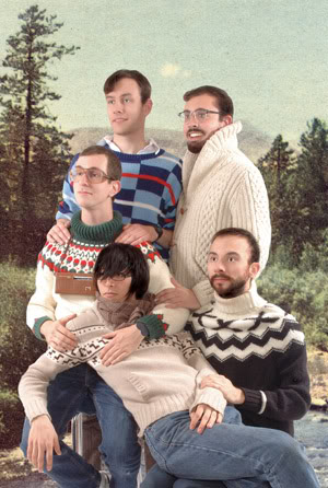
Team Macho is a Toronto-based “collaborative illustration and fine art effort composed of Lauchie Reid, Chris Buchan, Nicholas Aoki, Jacob Whibley, and Stephen Appleby-Barr.” Their first New York solo show “Long Time Listener, First Time Caller” opened this past Saturday, September 19 at Giant Robot in the East Village. Their paintings and prints of fancy lies and painful jokes are hung above stacks of their book Fancy Action Now: The Art of Team Macho and postcard book Precious Gems. I met up with Lauchie and Chris at the opening for a discussion on the sidewalk in front of GR. Jacob and Nick found their way out a little later.
Brandon Johnson: So, uh, Team Macho is . . .
Lauchie Reid: Five weird dudes who draw together, live together, and are, sort of, inextricably linked. Like . . . a dirty family.
B: A dirty family. I see. How did you guys meet?
L: We met at illustration school. At this really suburban art college where we all sort of bonded for a mutual disdain of the coursework, well not the coursework so much as the people and the attitude forced on us. We kind of got together doing that and . . . yeah, that kind of didn’t work so hot for the other people at the school. So, we became something of segregated pariahs. The bond forged in blood is hard to break.
B: So you met each other, hung out, and decided to make work collaboratively?
L: Well, we sort of identified each other as the hard-workers, the people who cared a lot and sort of gravitated towards one another, and we just sort of did our homework together and then we got the idea of trying to work together and it became a thing that felt really comfortable, well it was sort of uncomfortable at first, but it became a thing that was intimidating and fun at the same time.
B: Would consider yourself to be a collaborative . . . collective . . . do you have a way of thinking like that?
L: I’d say . . . I don’t know. Collaborative definitely, collective not necessarily. There’s not a huge mission statement. But yeah, it’s sort of like a . . .
B: A team.
L: Yeah, it’s a team. A team effort.
Chris Buchan: We’re a team without a coach.
L: Exactly.
C: But a team that’s all driven to one purpose.
L: A utopian anarchist collective . . . just kidding.
B: The extent of my knowledge of Canadian collective / collaborative groups is the Royal Art Lodge, who have had projects in zingmagazine. So, Team Macho reminded me of that in certain ways, but maybe it’s inevitable as a group of Canadian illustrators . . .
L: There are elements that are probably similar, and it would be an absolute lie to say that some of us aren’t big fans and really enjoy them a lot. I wouldn’t say that our work is necessarily informed by it [The Royal Art Lodge]…
B: But you’re cognizant . . .
L: Oh yeah, there’s got to be similarity. I mean, they’re from Winnipeg. Their whole thing is this weird Canadiana. It’s amazing stuff, but the intent is very different, the practice is very different, and the content is quite different as well.
B: Would you have any sources of influence that you could identify? Even if it’s not in the realm of fine art, maybe something outside of it?
L: Everything from Greek philosophy to, I don’t know, Impressionist painting. Most of us, if you ask us what kind of art we like, it’s pre-20th century paintings, things like that. We’re pretty classical in our appreciation and understanding of art. Contemporary art, there’s tons of good stuff, but it doesn’t really work its way into our art-making process.
B: Yes, it [Contemporary art] is very pluralistic. Would you say you integrate things as you come across them?
L: Yeah, absolutely. Really we gain a lot of inspiration from each other. That’s where most of our work comes from. It’s aimed at one another with a lot of common reference points that we share, that we can use to make each other laugh, or . . .
B: Yeah, I noticed this humor, it’s a black but colorful humor, that runs through the work.
L: Like a joke that makes you cry a little bit. But I would like to emphasize the point that we’re not just making work for each other and we’re not trying to make people pay attention to our “cool little gang.” It’s not that at all. We make art for each because that’s why we do it. That might be the jumping off point for why we do it . . .
B: It’s a good enough reason for me.
L: Yeah, it’s to give people insight into our minds, like any artist would do. To share our ideas.
B: Right, but at the same time you’re finding your audience. Trying to identify your audience. It’s kind of nice that you know who’s receiving it. You know that the others are going to look at the work. They’ll have something to say about it probably . . .
L: There’s a like-mindedness that goes through the work that the people who see the work can identify with. Pluralistic is a good word for it because it comes through the minds of several people all the time, so it’s not pedantic, in a way, or didactic I guess, it’s just sort of like . . . here it is.
B: Now I just wanted to talk about this show, because this is what’s going on. This is your first solo show in New York.
L: Yes, indeed.
C: In the United States, as well.
B: That’s pretty exciting. So you’ve mostly shown in Canada?
L: Canada, Toronto. We’ve shown in Amsterdam. We’ve participated in shows in the United States, in other Giant Robot locations. We’ve been in group shows here and other places like France, Berlin. It was an opportunity for us to swoop down and investigate your neat-o city.
B: Pretty neat-o in my opinion.
L: I like it.
B: For some of you, this is the first time you’ve ever been to New York.
L: Most of us.
B: Wow, that’s kind of amazing in a way, but I suppose not necessarily.
L: I can imagine why people in New York are like “You’ve never been to New York?”
B: Yeah, I suppose being here you sort of forget about other cities. New York is very self-centered.
L: What, you’ve never been to Toronto?
B: I have been to Toronto, actually.
L: Oh, well never mind then [laughs].
B: [Laughs] Take it back.
L: I will. I retract my statement.
B: Let this be stricken from the record. So this show, did it have a concept behind organization?
C: Like a theme?
L: You know what, two months ago, we didn’t even have a show in New York. It was very short notice. They [Giant Robot] had a spot to fill. They called us up and we said, “Well, absolutely we’ll take it. We can’t say no to this.” That’s why the show is called “Long Time Listener, First Time Caller” because we’ve been paying attention to Giant Robot. It’s been a big thing in our lives for years and years, so this was our first chance to participate directly and we wanted to create a nice overview of what we do and the different incarnations that our work has taken over the past five years.
B: The curatorial thought behind it is like it’s a mini retrospective?
L: Yeah, retrospective slash primer maybe. We’re sort of like “Here’s the bread, a cross-section of what we’ve done, check it out and see how the work has changed.”
B: An introduction of Team Macho for New York.
C: Yeah. Here’s some new work, there’s some old favorites.
L: Some of the work. It’s caught on pretty well. We’ve gotten good responses via the internet and things and people are like [in a weird voice] “I LOVE THAT”.
B: I like your website.
L: Yeah, our intern designed it.
B: Oh, so you have interns. Like you have it on your website and people write you . . .
L: No, no. I guess it’s because they’re forced to intern for their illustration programs. So, we’re getting the status as the guys who are fun to intern for because we’re like “Hey, you wanna make a puzzle?” Because we’re not exactly the most professional of operations. We just kind of hang out and help them. Teach them whatever they want to know. They’re welcome to come and work at our studio. They’re more just like a buddy to come hang out, and if we need help lifting something. An extra set of hands.
Jacob Whibley: Actually, our last intern decided to move into the building with some of his friends. So, it’s like a weird little . . .
B: Ex-intern situation?
L: Yeah, we primed him and pushed him out. Like some sort of little mutant.
B: Team Macho, the next generation. So, one thing that came up earlier was that I first came across your work through my roommate who has a painting of yours of a basketball player breaking his ankle, or something and he was telling me a little bit about what was behind that painting. If you could re-iterate . . .
L: That painting is an emulation of my favorite illustrator. He went by the name Frank Netter. He was a doctor. He did thousands of oil paintings of medical illustrations that are like the WORST things you’ve ever seen.
B: So, it’s like Doctor-Horror paintings?
L: It’s just so ’70s and really pumped out. It’s like, “Alright, this guys got a fever, he’s sweating, I’ve got to make a sweat face.” So these people will have these big lumps of sweat on their faces. So, he’s like “Oh, now I need another one of that guy.”
B: He was doing it for medical purposes?
L: Yeah, straight-faced medical journals. He’s considered like the God of Medical Illustration . . .
C: Anthologies of his work, just documenting it . . .
L: From an art-practitioner’s point of view, he’s like horribly under skilled, but from a medical perspective he’s God.
B: But from your perspective, he’s . . .
L: From my perspective he’s kind of a weird genius.
C: He’s the Henry Darger of the medical world.
B: That’s the new Outsider art. Medical art.
L: We’re dreaming of curating a collection of his works, because I imagine it’s in an old vault somewhere at a pharmaceutical company.
B: So that painting came from . . . you copied one of his paintings?
L: Yeah, it came from a study of trying to understand that guy’s process and like, understand what could drive someone to do something like that.
C: There was also the mutant hand.
B: Where did you find his work?
L: There were a pile of his journals on top of a parking meter and we were like “YES SIR!” because the top one was like mutations and retardations in children and we were like “OHHH!”
B: It was just there?
C: Yeah, on this busy street in Toronto. Like [musical voice] do-da-do. Oh, yoink!
B: That was the source for that painting. Do any of the paintings in this show have a similar story?
L: No, that was like four or five years ago. That was just a project I was doing on my own and when were given our very first show, I was like “Yeah, I’ll throw in a couple”. It was probably copyright violation, but . . .
B: I think in painting you’re in the clear as long as it’s not a person with an iconic image, like Elvis or someone like that who copyright their image.
L: And he’s dead and stuff.
C: You really cleaned those things up. Made them look a lot nicer than they did.
L: It was an excuse to learn how to paint like a terrible painter. Like, what were you thinking when you were doing this? “Neat. Brown plus white equals skin.” The pallor on his patients . . . the guy had no understanding of what looks good. It was all what works for him.
B: But he’s this huge icon for the medical industry.
L: Yeah, I didn’t know it at the time. I thought he was some weird guy. But apparently he’s revered.
B: When was he working?
L: He died in 2000 or something, but we worked for 50 years, so he was in the last half of the 20th century. Pretty amazing stuff. Look it up.
B: An unknown master.
L: Nothing since that has really been appropriated. We got away from doing that because it’s not really worth it. I’d rather do things on my own.
B: The content of these paintings, drawings, and illustrations are from your own vocabulary?
L: Yeah, they’ll come from a book we’re listening to. We listen to books-on-tape at our studio all the time.
B: And you come up with images . . .
L: Yeah, there’s a painting here called “Legacy of the Force” because as we were working on a show we were listening to all the Star Wars novels, so we started incorporating elements of Star Wars.
B: You’re making visual motifs from these books-on-tape.
L: Exactly, that’s the diaristic element of what we do. So much of it is day-by-day transcripts of what went on with us. It’s what we did that day or what’s going on that week. Our latest obsessions.
B: You’re all sitting in the studio . . .
Jacob Whibley: And we enter into a dialogue that eventually reaches some sort of logical conclusion. Like, “You know what? That would look good as something. Let’s make it”
B: How often are you in the studio then? Do you keep hours?
L: Everyday.
C: Seven days a week.
L: It’s rare not to see all of us in the studio in a day.
C: It’s also rare to have all five of us in the studio at the same time.
L: We come and go.
B: So, that’s in Toronto. What part of Toronto?
All: [enthusiastically] The Nox!
B: The Nox?
L: We’re the only ones who call it the Nox. It doesn’t really have a name.
C: It’s a pretty rotten neighborhood.
L: Toronto is a pretty neighborhoody town, but for some reason the ten square blocks around our studio is just nameless.
B: That’s very Beckettsian.
L: Yeah, that’s why we call it the Nox. It’s pretty decrepit and bland.
C: In ten years it will be up-and-coming.
B: Is there any Beckett on book on tape?
L: We’ll probably pick some up now.
B: That would be really great to listen to. The prose is so dense and repetitive.
L: Books on tape are great because you can sort of tune them out and come back to them.
B: And if not, that’s a good project for someone to do. Make a book on tape of Beckett.
L: Oh, I’m sure there’s a lot. There’s a free project online where you can just sign up and read a book.
B: Do you know the name?
L: Can’t remember. I’ll email you. They’re terrible. They’re really bad, almost unlistenable.
B: Do you guys plan on sticking around Toronto?
L: I think so. Toronto is a good place.
B: What’s so good about Toronto?
C: It’s a lot like New York. But cheaper.
L: Cheaper. Scaled down. Not as friendly, oddly enough.
B: Really?
L: I find New Yorkers to be extremely friendly.
C: On the street, maybe, but not in the stores.
B: There are definitely some unfriendly ones.
J: Yeah, Toronto. We’re going to stay there for now, because it has everything we need.
B: I’m not saying you have to leave.
C: It is a common practice for artists to re-locate.
L: Where we work strongly influences what we do.
Nicholas Aoki: We’d have to establish another hub.
L: Plus it’s hard to move five dudes and spouses, fiancés, and stuff so we kind of . . . live there.
B: What do you do outside of Team Macho?
L: Two of us teach at the Ontario College of Art and Design, one TAs, Jacob works in graphic design, and . . .
C: I wash dishes.
L: He washes dishes. We all have solo things that we do that are not part of Team Macho. We’ve all had solo shows at some point. You know, we’re not too precious about Team Macho. We just like doing it because it’s weird and fun. Gives you a good excuse to try out all kinds of stuff.
B: Brings friends together.
J: It helps you become less self-involved.
L: We’re thinking of expanding our practice out into . . .
C: Performance art?
L: . . . just anything. And naming it the Star-Surfer Magic Corporation. So that’s a possibility.
The exhibition runs through October 14th at Giant Robot, 437 E 9th St, btw 1st Ave and Ave A. Visit their website, www.teammacho.com for more.
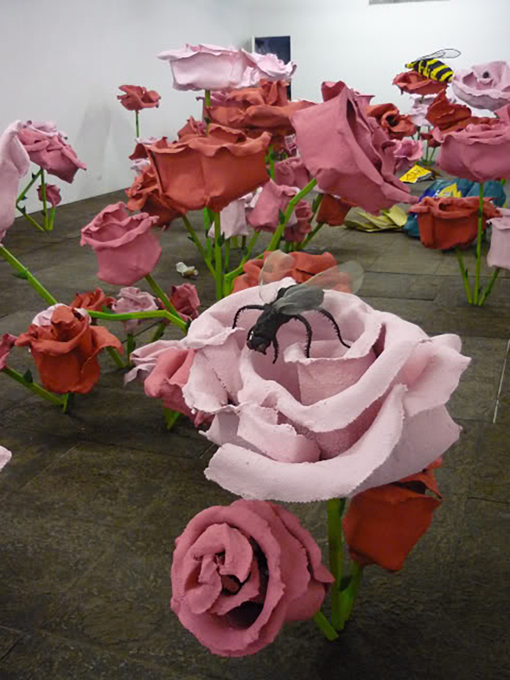
On Friday, Sept. 3 I had a chance to meet Will Ryman and preview his upcoming show “A New Beginning” at Marlborough Gallery in Chelsea. The installation consists mostly of oversized roses, but also includes insects and pieces of trash. The pieces are quite large, with the tallest pieces at about 6 or 7 feet, making for a “rodent-sized” view of this detritus-filled rose garden. The show opens on Thursday, Sept. 10 and runs through Oct. 10.
Will Ryman: It’s a monster installation. It took a long time. There are thirty-nine objects, thirty-nine pieces, all of steel, plaster, aluminum, paint, and epoxy resin. The floor is all handmade steel. We wanted to put it on a grid to bring the pieces together. When they’re all individual, it’s very formal. So, what kind of questions did you have?
Brandon Johnson: I just wanted to look at the show with you and talk about it. I had a couple of questions in mind, but we can discuss whatever.
W: Okay. I guess I started off wanting to make an urban garden. Like you would see in New York, or any city, where you would see trash.
B: Hence the cigarette butts, crushed Starbucks cups, etc.
W: And I was kind of going towards big corporations. I wanted to use the rose because it was a symbol of commercialism, Hallmark, you know. Also, I just love the way they look.
B: Aesthetically appealing, of course. So, as symbolic objects they sort of represent a thing that’s used in marketing or . . .?
W: The roses, you mean? Yeah, that plus the many other meanings attached to them . . .
B: Culturally . . .
W: Yeah, and globally. I wanted to make them look like they’re not so beautiful, you know? They’re wilted. There’s something edgy about them.
B: They’re cartoonish, sort of, what’s the word I’m looking for? Caricatures? Exaggerations . . .
W: Yeah, cartoonish.
B: Exaggerations of the actual thing. The stems are very straight and boxy, and the material is definitely present, which is a good quality, at least in my opinion.
W: Well, most of my work is about process so I always reveal the materials I use, the inner-materials, because I want to show how I made them. Process is important to me. Basically, I’m known for doing figures. So this is a new direction for me. Things are starting to change a lot. This is the beginning of the change. I’m working on stuff in my studio now that is even more different. It’s evolving. So, you know, we’ll see where it goes.
B: In terms of influence, for me someone that comes to mind is Claes Oldenburg, with the large scale and cartoon quality. But obviously that’s a generalization and he’s kind of a hard figure to miss.
W: [laughs]
B: But who would you name, if you had any general influences or for this show in particular?
W: Nothing for this show particularly, but I guess my inspiration comes more from writers than the visual arts. You know, growing up I was in an artist family, so I was around art. None of it really impacted me consciously. But old playwrights and philosophers inspired me a lot.
B: You were a playwright and sort of transitioned into visual art more recently?
W: Right, about 5 or 7 years ago.
B: So, you’re taking a very literary angle. I mean flowers are certainly one of the most literary of symbols you can find. You know, then there’s Baudelaire . . . these are almost a Les Fleurs du mal with the flies and hint of grotesquery.
W: Yeah, absolutely. I think I responded, when I was writing, to the absurdists. You know, Ionesco, Beckett, and I think that is where my aesthetic is, where I was respond to in my visual art. This is sort of an absurdist viewpoint.
B: Definitely. It has the kind of absurd comedy that Beckett and others had. Another Irish writer that I like, a fiction writer, Flann O’Brien . . .
W: Right.
B: He’s very much a black humorist, extreme absurdist.
W: Exactly.
B: But this reminds me of his work because he’s on the more cartoony side of Beckett, and I don’t mean to keep using that word, but . . .
W: Well, you know the whole concept, the question, is the meaning of life I guess. The meaning of life is sort of absurd. Our role in the world, our role in the universe, is somewhat absurd and therefore meaningless, unless you’re committed to a greater good, whatever that means. You know what I mean? There are no specifics to it. But I always sort of gravitated to that ideology I guess. Not that this is questioning the whole meaning of life, but it’s . . .
B: Kind of taking it down to a smaller level.
W: Yeah, I exaggerate all the proportions, and nothing is to scale.
B: Right, that Titlest golf ball is enormous.
[Ryman’s assistants leave gallery]
W: Ok, see you guys next week. Sorry.
B: No problem.
W: My assistants.
B: Oh okay, nice. Where’s your studio?
W: Brooklyn. Williamsburg, actually.
B: Where at?
W: South 1st.
B: Oh, really?
W: Yeah, do you know Williamsburg?
B: Yeah, I used to live on S 4th and Driggs.
W: My shop is further east, just east of the BQE. So, if I threw a rock, I could literally hit the highway.
B: Gotcha. I just noticed the bag of chips over there. What brand is that? I didn’t see the label.
W: Wise.
B: This is like walking around in Brooklyn, especially Williamsburg. It’s something you’d see on the side of the street. There are a lot of growths, too, like on Metropolitan and Driggs there’s this huge bush. I can’t believe something would grow that big from a crack in the sidewalk. But it was just covered in wrappers and trash . . .
W: Well, just think about the scale of a person, if they were looking down at this. It would be huge. If I had a figure standing outside looking at this, with a bag of chips. It would be great. But most of my work is about an experience. It’s interactive. I like to create environments, worlds that a viewer could walk in and experience.
B: Yeah, this is sort of an Alice in Wonderland, an Alice in Brooklyn. It’s really nice to have it at eye level. It’s not overbearing or towering, but it still feels like…
W: You’re “in it.”
B: Yeah, “in it.”
W: You’re the same scale as the trash. I wanted to go much bigger, to make people feel like bugs, but . . .
B: That would be a serious amount of work.
W: Exactly.
B: I like the insects, though. The ladybugs, what’s that black one?
W: A beetle or something.
B: Of course the flies, the bumble bee. I think it looks really great.
W: Each flower has a bug.
B: Each group?
W: Yeah, each cluster.
B: That’s a good piece of trivia. Well, thanks. I don’t want to put you on the stage too much, unless you had something else . . .
W: I can’t think of anything, unless there’s something else you had.
B: Actually, yes. I had seen an image of a previous work you had done, Bed.
W: Did you see it installed?
B: No, just an image. But one of the themes I saw carried over were some of the trash or wrapper items. That’s one of the things I immediately noticed of this installation, were things like the Doritos wrapper or the Ballantine’s, the art historical wink at Jasper Johns.
W: Yeah [laughs].
B: Which I thought was kind of cool because I was doing this project where I transcribed beer cans, transcribing all the language from the can, making it into a kind of concrete / conceptual piece of writing.
W: Right
B: And I did Ballantine’s also. So, it’s like if you’re going to do a can, you kind of have to hit on that . . .
W: Right, might as well [laughs].
B: But here you continue with the Budweiser, the Coke can. Anything in particular about junk food wrappers that is of significance to you?
W: Basically, I just wanted to use commercial junk food from corporations . . .
B: Of course these are the top of the top, Starbucks, Coke . . .
W: Wrigley’s, Y’s, Coca-cola, Budweiser. Just that whole thing was tied in with the symbol of the rose in its commercialism as well. I mean no one would ever get that, and I didn’t necessarily want that to be . . .
B: So overt?
W: Yeah.
B: It has this regional, even local, realism, with the Wise chips and other specific brands you would find in New York.
W: Right. Realist and also symbolic as pieces of trash with these corporate labels in the gardens. I was kind of hinting at that, but didn’t want to make it obvious. I was more interested in making it approachable. I don’t like it when I see things that are so heavy-handed and obvious, delivering a message that we all know.
B: I don’t feel that it comes off as that. I think if you recognize the labels that are used, you’re like “Oh, I’ve seen that on the street.” Literally. That’s just a fact of a street in New York.
W: Right [laughs]. Exactly. You know, I try to make stuff that is inspiring and . . . fun. You know, approachable.
B: So, this seems like it was a lot of work. How long would you say you were working on this at your studio?
W: Probably for 8 months. A lot of it full time.
B: Wow. And so you have a couple of assistants?
W: Yeah, two assistants. They help me build these things. I started off doing it by myself . . .
B: But realized you were going to need back up.
W: Right. I try to make things that are from my heart, that are approachable. Because a lot of what I see is stuffy and a turn off in some way.
B: Like overly cerebral?
W: Yeah, or you have to be at a certain status to even understand this.
B: Well, I think with the size, the general visual appeal, and recognizable objects, it comes together. Almost anyone could walk in here and be like, “Oh, I get it.”
W: Exactly.
B: Well, thanks for the time. Best of luck.
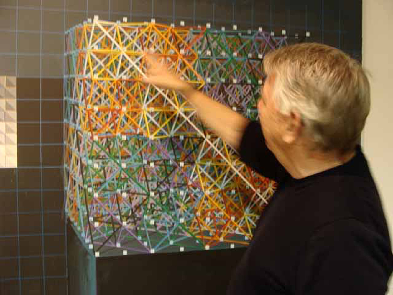
Prominent Denver painter and Head of Painting at Rocky Mountain College of Art and Design, Clark Richert has been at work for over four decades. His studio, housed in Redline Gallery (one of Denver’s premiere contemporary art spaces), is full of scientifically-oriented, yet aesthetically pleasing art projects. In 1965 Richert founded Drop City, an artists’ community formed in southern Colorado. The artists (Gene Bernofsky, JoAnn Bernofsky, Richard Kallweit, and Clark Richert) constructed geometric domes based on the triacontahedron and other zonohedra. Inspired by the architectural ideas of Buckminster Fuller and Steve Baer, Drop City won Buckminster Fuller’s Dymaxion award for innovative and economic housing construction in 1967. Much was born out of Drop City, including the decoration and pattern-based artists’ group Criss-Cross in 1974, and one of the first solar energy companies—Zomeworks, in Albuquerque, NM. Originally planning to become a scientist, the sight of a Rothko painting caused Richert to change his plans. I had the good fortune to sit down with Mr. Richert at the studio in Redline to discuss his work, past and present . . .
Interview by Eryn Tomlinson
What an interesting life and career you have had. Are you still in touch with any of the artists that you lived with in Drop City?
Yeah, there’s a lot of stuff coming out about Drop City. There’s a Drop City documentary being made. Gene Bernofsky, Richard Cohen . . . I’m in fairly good touch with them.
How would you describe your lifestyle/experience in Drop City?
To me that was one of the most exciting times of my life. It seems like the media wants to show Drop City as a hippy commune, but we always called it an artist’s community. It was a very synergetic and creative place. A lot happened there. The ideas generated at Drop City are still very important to me. The media likes to mis-interpret the Drop City. They think Drop City means “drop out” or “drop acid” but Drop City was before those words were around. It came out of Drop Art [a movement informed by the “happenings” of Allan Kaprow and performances by John Cage, Robert Rauschenberg, and Buckminster Fuller at Black Mountain College].
Do you think being around other creative people helps the artistic process?
Yeah, that goes all the way back to Drop City. Before starting Drop City I had attended several Buckminster Fuller lectures, and he talked about this idea of synergy, which means that the whole is greater than the sum of the parts when you have all of these hard-working individuals. But when you have interaction between the people you get a result better than an individual could produce.
You are currently the head of the painting department at Rocky Mountain School of Art and Design. What do you enjoy about teaching?
I like to teach. I never think that “teaching” is the correct word. But I am there and the students are there and they work on their art and I’m looking at them working on their art, trying to nudge them. And I like that a lot. It definitely affects my own thinking and my own work, and there is a little bit of dread of retirement because there would no longer be that synergetic relationship between the students and myself. Although here at Redline [Gallery] there is a lot of the same synergy as in an art department.
Would you consider art to be another form of scientific exploration?
I think “art” is a very big word. There have been paintings done by artists that have been studied where the artist is operating in a scientific mode. But I also think that artists use a lot of mathematics in art. Fractals [fragmented geometric shapes that can be split into parts, each of which is a reduced-size copy of the whole] were pioneered by artists. The geometry of the quasi-crystal was invented by a couple of artists, and one of them was me. As an artist I am free to work with scientific ideas without being bound by the scientific rigor.
There is a certain spiritual/philosophical presence in your paintings that is achieved by exploring the invisible structures and infinite possibilities of space. Are the emotive qualities in your work tied to these explorations, or is there also a more personal level of emotion involved?
Well, I do think that the emotional side of paintings is very important. A lot of people don’t think of my work as very emotional or spiritual. I feel like my work in tessellations and patterning often compares to the work done in Islamic Mosques. These artists in 1200 AD Persia were really just as much mathematicians; there was no line between making their artwork and mathematics. When I walk into an Islamic Mosque—and I’m not Muslim—I feel that it is so beautiful that it’s a spiritual experience.
Would you say that the process of making art is both spiritual and mathematical for you, then?
Yeah, I would, especially this working of tiling patterns and tessellations. My decision to switch over from science to art came when I was in high school. I was enrolled in all science classes and then I saw this book that had Rothko in it. Rothko just astounded me and I had no idea that there was something like that that could be called art. This was back in 1958 and I got so interested in Abstract Expressionism that I started subscribing to this Abstract Expressionist magazine called IT IS. Right around when I graduated from high school I went to New York. I went to the Guggenheim Museum and saw four large Rothko paintings. I was stunned by these paintings, and this was the only time that I had been moved to tears by art . . . So, that was an emotional experience for me . . .
How would you say Rothko influences your process?
I always considered Rothko to be such an incredible genius when it comes to proportioning and color. I don’t see myself as a colorist. I sometimes call my process ‘color-coding’. I want it to look as good as possible, but I am not a color genius like Rothko. My major interest is in Buckminster Fuller. Fuller said that space is stretched in tension, and I compare that to a canvas which is stretched in tension. I think that Rothko used this tension of the canvas. I say I am influenced by Rothko, but a lot of people look at my paintings and they don’t see it. I see it because I am thinking of this surface stretched in tension, and I try to feel the same way that I think Rothko painted, and I don’t know many other artists that are into that.
How would you describe the personal aspect of your artwork?
A lot of people look at my paintings and they say that I should paint with a computer. But I don’t want to paint with a computer. My feeling is that there is something about the hand-made brushstrokes that is really important, and a computer does not make these kinds of brush strokes.
So the process of using your own hands is personal to you?
Yes, it is all very important to me, I really get into the symmetry between my hand, the brush, and the canvas . . . although I don’t think many people see that in my paintings . . . I’m into facture. Facture in France means the ‘artist’s touch’ and the way a paint surface is constructed. My meaning of facture fuses those two definitions.
Is your exploration of space also an exploration of time?
Well, lately it has been because what I have been working on in the last month has been video work. I use some camera work but mostly I work on the computer using computer animation. It is mostly structures moving in time. I have been working on the relationship between “nothingness” and “something-ness.” More empty space is “nothingness,” so I have been working on animating this transition between “nothingness” and “something-ness.”
Do you believe that all reality is interconnected through seen and unseen structures?
Yeah, that sounds about right. I think that most reality is unseen, that we see a very small part of the spectrum.
It seems like sciences and spirituality sometimes go hand in hand.
Well I like the title of the book the Tao of Physics. That book talks about fusing physics/spirituality.
The use of chance coin tosses to determine the direction of the serpentine lines in your mural at MCD [Metropolitan State College of Denver] creates a very dynamic quality of motion and life. Do you still use any elements of chance in your work?
Yes, but kind of secretively. I still do droppings and I am interested in randomness. I recently put pennies out in the environment to see how long they would stay put, about 20 dollars worth of pennies, I would just lay them out on the pavement, sometimes in arrangements, and it was amazing how long they would stay there and people wouldn’t pick them up. Also, this was a funny one. I went to a bus stop and I put a little envelope and pasted it in the bus stop, and wrote on it ”Please do not take Charlene’s bus money.” I put some dollars in and then watched all day long and all these people that you’d think would take it didn’t, until the end of the day some kid took the money. But it lasted a lot longer than I though it would.
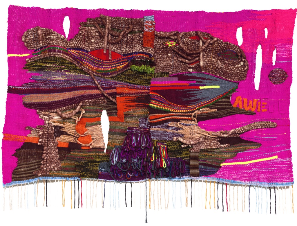
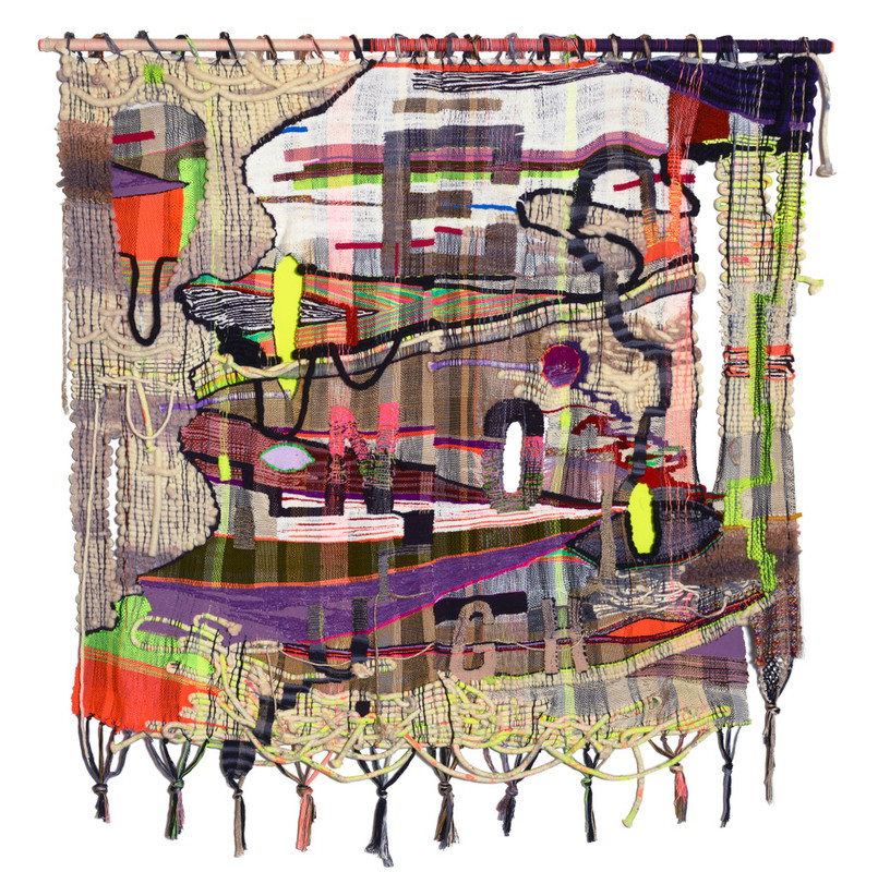
Awe/ful, 2018, wool, acrylic, cotton, metallic fibers, 45 x 64 inches
Terri Friedman’s “Rewire” at Cue Foundation (September 2–29, 2020) directly engages with the psychic reality of our strife-filled current times – but rather than critiquing the subjects at hand, her work delves into the tender drama at play within individual brains and bodies worldwide. Friedman’s woven paintings are abstract, colorful, and multi-textured cross-sections of brains under the spectrum of emotion, with a gentle suggestion to consciously alter the patterns and pathways away from a default of negativity, as she states: “cultivating elevated states and happy hormones is a political and personal weapon against indulging in despair.”
Interview by Brandon Johnson
This body of work is both a sign of the times, and a suggested antidote – to “re-wire” the brain from the current default of angst and worry. Was there any specific event or spark that initiated this series, and over what period of time were the works made?
This series is part of a larger body of work that I have been working on since the last election. I think the national unrest and political volatility sparked my own personal anxiety. My work journals the world around me and my own inner world. I’m wired for worry, but between Climate Change, the national and global uncertainty, racial inequity, the fake news, our President . . . I could go on, I just started feeling despair. My weaving became my medicine. An antidote to all the heartbreak and grief. What if I made protest posters like Sister Corita Kent with words, color, and abstraction. Tapestries that were healing, life affirming, but also agitated yet affirmative screams. Brain and cognitive science has found that the brain, which we assumed was not plastic after childhood is actually able to be rewired. This is neuroplasticity. So rewiring which is actionable is about repair. It’s optimistic.
The suggested connection between neural networks and weaving is made visceral through the variation of textures, sizes, and methods by which the materials are adhered—the end result being an expressive diagram seemingly composed of tissue, vessels, and other bodily matter. For this reason, did your process of weaving feeling extra charged either psychically or physically? How was it to make this works?
That’s such a great question. No one ever asks how it was for me physically or psychically to make this work. It’s actually a very important question. I am so interested in the somatic and psychological experiences of artists. Weaving can be back breaking. Such physical work. But, also immersive and meditative. Sometimes I just lose track of time. The repetition kind of puts me in a trance state. Psychically it was exhilarating. I just love working with so many textures, fiber, and colors. It is like a fiber orgy. I have accumulated so many clear tupperware boxes filled of colored fibers the past years. All kinds from naturally dyed wool to cotton piping which I paint with acrylic paint to metallic to acrylic to hemp and more. I draw out the piece ahead of time with diagrams of textures/fibers/colors/warp design and graph it out. Then I select all my fibers and begin. The pre-weaving process is lengthy.
You mentioned Sister Corita Kent as an influence in terms of subject, spirit, and presentation. Are there any specific artists or weaving traditions that have informed your work on a more material level?
I came to textiles late in my career, 2014. I painted and made kinetic sculptures before that. Though the connective thread though all my work has been color, body, breath, and brain. I am most informed by painters/artists (mostly women) who indulge in color and odd materials like Joanne Greenbaum, Sarah Cain, Shara Hughes, Judith Lynhares, Kathy Butterly, Rachel Harrison, Katharina Grosse, Katherine Bradford, Nick Cave, Polly Apfelbaum, Jeff Gibson, Franz West, and more. Textile artists that I look at are Sheila Hicks, Hannah Ryggen, Josep Grau-Garriga, Anni Albers, Magdalena Abakanwicz, and numerous younger living artists. On a material level, so many artists who stretch materials are interesting to me. I define craft as attention to detail. So, it’s a broad interpretation.
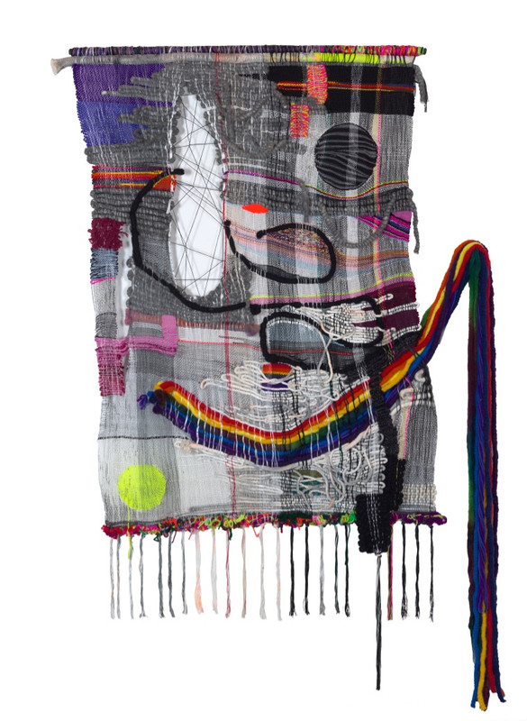
Enough, 2018, wool, cotton, hemp, acrylic, metallic fibers, 77 x 50 inches
Text also appears in these works in the form of single words or short phrases – often slanted toward the negative, such as AWE/FUL, E/NO/UGH, IF ONLY. Did these words arise in your mind organically (almost mirroring their presence in the artworks) or was there a process from which you arrived at them?
The words are more disbelief or antidotes to anxiety: like Pause, Awake, In/hale/ex, and more. they can be either positive or negative. They are ambiguous. AWE-inspiring + awFUL (thus AWE/FUL). ENOUGH connotes ‘stop! enough!’ OR I am ‘good enough’ as I am. IF ONLY is regret, but also kind of romantic, living in the past, kind of naive because it’s done. What good is regret? Just move on and take action now, in the present moment. Awake is a reminder to wake up to the volatility and it’s a call to action. I like small benign or ambiguous words. Words that are spacious and give the viewer a roll in completing. I don’t want to lecture, they are more of a suggestion or direction. They blend in and are almost camouflaged. The words arise at the same time as the drawing. They are like another color or shape. I don’t illustrate the words, but I do try and have the piece emote with color and form what I am feeling. Like the burning pink, so hot and inflamed with ‘Awake’. OR the eye chart and busy anxiety of E/NO/UGH. I like abstraction and words because they feel generous and not didactic. Immersive.
Oxytocin, 2019, wool, acrylic, cotton, hemp, chenile, metallic fibers, 77 x 70 inches
One of my favorites is “Oxytocin” which is composed mainly of shades of gray, with a half-smile of rainbow drooping off the side in a way that is bleakly humorous. There is a certain messiness to these works that communicate a degree of confusion and stress, but the bright colors and titles such as “Looking for what is not wrong” indicate an underlying search for the bright side. Is perseverance part of the thesis of this exhibition?
Oxytocin is a happy hormone like serotonin and dopamine. My titles and palettes do reflect perseverance. Rewiring takes effort but is a positive action. In some ways, this work and the titles are my attempt to rewire my brain for positivity given how dark and bleak the world feels right now. And, they are remedies for the personal and national anxiety and grief. So much loss with COVID, the criminality of our government and more. Humor or delight are very important to me. I had an art history professor in college use the term ‘sickly sweet’ to talk about Chagall’s work. He did not like the work and was disparaging. And, all I could think was ‘I love sickly sweet’.
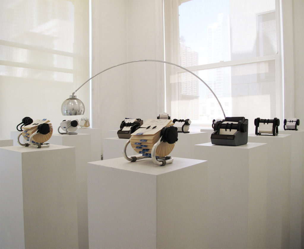
Devon Dikeou, Do I Know You?, 1991 ongoing
Devon Dikeou’s retrospective “Mid-Career Smear” opened at the Dikeou Collection, Denver, in February 2020. Soon after the COVID-19 pandemic forced art venues around the world to close their doors and postpone their programs. With the exhibition on pause, we reflect on the background and ongoing context of the show and work included.
Interview by Brandon Johnson
What does the “Mid-Career Smear,” a retrospective, mean to you as an artist at this point in your career?
Hmmmmmm well given the circumstances it’s hard to speak on MCS. My hope is sometime in the future we can all get out to see all the art that is out there on view (but closed at this time) and then enjoy, wonder, be inspired, because at this time it’s needed more than ever. We are living in our version of the bubonic plague . . . let’s try to think of how art influences us even if from centuries, generations before, or more currently . . . there’s Bruegel’s “The Triumph of Death”. . . which fills the well of what life might have been like. . . even as it was painted later than the actual pandemic. Other artworks in the 20th century offer a different take. Rothko’s chapel in De Menil Museum campus . . . Rothko’s architecture and paintings in the chapel reflect that along with the monumental Barnett Newman sculpture, “Broken Obelisk,” that flanks the chapel structure—all non-denominational places of solace, worship, meditation. And then there are Norman Rockwell’s Saturday Evening Post magazine covers during the Great Depression and WWII, a great example, “The Four Freedoms.” Another seminal piece is Robert Indiana’s “LOVE” made in 1967 during the Vietnam War. . . Much less Keith Haring’s AIDS awareness posters and paintings, during the AIDS epidemic: “IGNORANCE=FEAR.” Art fills a special place. A comfort, a critique, an illustration, a reflection of life’s strife, as well as moments of jubilation. My work of 30 years gets nowhere near all those aspirations but tries very hard to touch them.
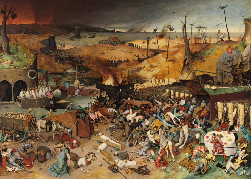
Pieter Bruegel the Elder, The Triumph of Death, c. 1562
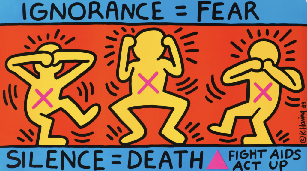
Keith Haring, Ignorance = Fear, 1989
While you were born and raised in Colorado, most of your development and exhibiting as a visual artist has occurred elsewhere, with perhaps your most formative period being in New York City during the 1980s and 1990s. Can you speak about this and what it means to show a deep survey of your work in Denver to a mostly Coloradan audience?
Well Colorado and Denver, these places, were my first tutorial. Really the Denver Art Museum and Denver Public Library were the retreats I ran too, á la Claudia in the Mixed Up Files of Mrs Basil E Frankweiler. The library is where I read that book, DAM is where I saw all the art I could—from Armand Hammer’s exquisite soup tureen collection to pop paintings in the DAM Bonfils Gallery including a mesmerizing drugstore window by Richard Estes. One show is about objects, soup tureens, which are magical in a Maurice Merleau-Ponty way, even if you don’t know phenomenology. The other drew me into a window, which paintings are, a painterly window, and as realistic as can be imagined in content. What are windows, of course they are also mirrors. Manet teaches us with that in “The Bar at the Folies Bergere” and the Velvet Underground with their song “I’ll Be Your Mirror,” inspired by Warhol, then appropriated by Nan Goldin’s ‘90s slide installation of the same title. These windows, mirrors, and objects: they are “The Lion, The Witch, and the Wardrobe” given and exposed to just one among many youngsters in Denver in the only Gio Ponti building in America and in my case the Eugene Field Library. The Ponti BTW is where I first applied for a group show with “old school” slides. The curators were Deborah Butterfield, Peter Plagens, and Marcia Tucker. My piece “Security Secure” was selected for the show “Colorado 1990.” Weirdly, the best thing happened . . . during the opening the lighting staff left the cherry picker in front of my installation of gates and glass, not realizing my installation was a part of the exhibition. Inbetween that gate and glass installation . . . I also ended up with a few Encyclopedia Brown books . . . all overdue. Another inbetween.
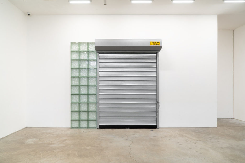
Devon Dikeou, Security/Secure, 1989 ongoing
As a collector I know you value an individual’s ability to view an artwork over a period of time and see how their relationship to the work changes—an essential notion to the Dikeou Collection. As an artist revisiting your own earlier artworks, did you find that you relate to them differently now? Any specific examples you can offer?
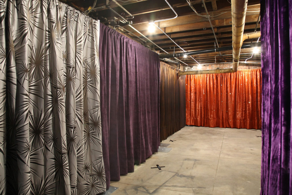
For sure. But also not simply because of MCS. As a publisher/editor of zingmagazine and by extension a collector with the Dikeou Collection, both kinda took over. My art practice lost its ummmph, just rested. I saw to those other two uses of my energy as part of my practice more thoroughly. And they were well-tended. So there were many zing projects that opened the way to viewing so many artists and other creatives. And the Dikeou Collection like zing was a platform to share and I hope we have . . . From time to time during this less productive period of my art practice, cause I’m such a weird archiver I’d look at some of my work from years past in the binders above the computer. Looking at images of work reminded me of my sometimes prescient ideas as a practicing artist then, all in hibernation. In those moments I was reacquainted with old friends and that re-immersed me in their boldness, i.e. the “Here Is New York” security gate series, most recently shown at James Fuentes, as well as many little bits that at the time I thought were supremely unmonumental . . . Surprisingly, little turns out to be big, just like in Alice in Wonderland. The Rolodexes are a crowd favorite . . . they almost were not included.
Do you identify primarily as an artist? If so, how do you believe this has affected your approach as a publisher and a collector?
Yes and no. It’s a trifecta, I think. As an artist in the mid-late ‘80s and early ‘90s I’d visit and do the gallery tour. Sometimes alone sometimes with others. Then you’d gobble up the Friday NYT and the Wednesday Village Voice. I remember a quote from VV somewhere along there, that went like this . . . “The Cindy Sherman show at Metro Pictures is like shopping at Bergdorf’s at Christmas. At Paula Cooper, the Jennifer Bartlet show which has orange painted chairs and other objects in front of the paintings, a collector was heard saying as the dealer left the room, ‘If we buy it, can we put the chair in the closet’”. It’s funny as an artist to hear or read those words. And then as always my thoughts kinda come from words, and my work didn’t really get much written attention so I started writing my own. You’d see all this amazing work of your contemporaries and why their work wasn’t being shown or collected, much less published. And that’s the genesis of both my publishing and collecting instincts. Hence both zingmagazine and the Dikeou Collection, which by the way, along with just being artist, editing is perhaps the most powerful tool one can possess in all three practices.
Who/what have been your greatest influences over the course of your career? And how have they, if at all, influenced “Mid-Career Smear”?
I have a daily diet of 24-hour TV, but really it’s the same as everyone else. Learning, looking, curiosity, inspiration. No matter where these impulses come from . . . but most likely they come from close to home. For me that would be from my mother LSD and her friend Frank for decor and fashion, both of which are a huge part of my practice. Don’t think of decor and fashion as the frill but the set. It sets you inbetween you and the people you meet and see. My father—space and the relation to it, what a space like a parking lot could mean, and understanding what that represents . . . something inbetween big and small, commercial and other. Brother, it’s belonging and knowing you always will, cause often there are cracks. My fellow, who helps me execute, is out front when I hold back. There are many more: the homeless that pick you up off the street after tripping, other artists that feed you ideas and suggestions, edits you may not have considered. There are the teachers, Wendy Edwards, at Brown University, Ursula Von Rydingsvard at The School of Visual Arts, Mrs Emery’s after-school art at Graland, Mr Burrows at KDCD, all segues and that’s not all. . . There’s the professional curator who directs and guides and intuits your vision to fruition . . . not an easy task, and one that has taken over seven years and lots of different considerations, by Cortney Lane Stell, and she was the inbetween, behind the curtain . . . However, it’s always, always a new thing, an old thing each day . . . sometimes it’s just sleep. And sleep is something to try to look forward to . . . another inbetween space . . . be brightened because you’ve found it and surrendered if even in a small repetitive way, which is the inbetween of everyday . . . sleeping and waking.
June 2020