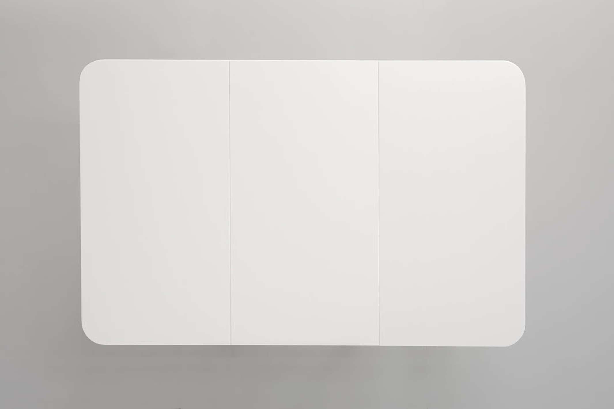
A Wall Sculpture of a Drop Leaf Table, 2010, Enamel paint on maple, 75-1/2 x 29-1/2 x 48 inches (views from front and side)
I’m a sucker for multi-disciplined artists, so being introduced to the work of Roy McMakin made me feel like a kid in the candy shop. McMakin is a furniture maker/designer extraordinaire with commissions like The Getty Museum on his resume. He is an artist/object maker—showing internationally not just at Lora Reynolds in Austin, TX but also at the Matthew Marks Gallery in NY. And he is a highly acclaimed architect with wonderfully fanciful and naturally familiar domiciles—domiciles immensely cherished by his clients in his portfolio. I’m a huge fan of his website www.domesticarchitecture.com so be sure to check it out, he just released a monograph “Roy McMakin: When Is a Chair Not a Chair”, and he has a solo show, In and On, at Lora Reynolds in Austin, TX. Did I say he is multi-disciplined . . .
Interview by Devon Dikeou
Your fluency with color both in your architectural pieces and individual works is such a force, whereas in the works at Lora Reynolds there are just moments of color and White is an overall theme that you deftly contrast among all the pieces in the exhibition . . .
The white chair holds the Eames-like airport chair station
The white colors play Mondrian games on your tabletop canvas
The white contact paper reassembles the dresser—almost holding it together
The white netting meshes together the book photo series, as does the white of the book’s paper
And well, the pillows and pedestals are white
What does white mean to you?
What does white MEAN to me? Hmmm, meaning in color is such a wonderful riddle. I often remember as a child both considering and discussing with other kids what one’s favorite color is, with great seriousness. In a way it’s one of the early “things” I tried to make sense of. So, on to white. It’s not a color, so in a way I am released from all my varied and intense color baggage. Which is important at times. But then again, it’s as much a color as any other color. I sometimes pretend it’s really invisible paint, not white paint. Or underwear. Which is to say white pretends it’s neutral (like black, only white) and instead it’s the most loaded of colors to me. I think the white of my slatback chair is trying to be discrete in the same way the modernity of the Eames (I think they are real Eames, or at least Herman Miller) tries to be discrete. In a sense it exposes all the chairs for being filled with meaning and stuff. And the slight kinkiness of that piece wouldn’t be there if the chairs were not white, I think. But dorky kinky, like a flasher still wearing underwear. And white allows shadows to be seen the easiest of any color. Which is partly why I painted the dresser white (it’s not contact paper), as it asserts the sculpturalness of the thing. I could go on and on and on, as I think about this a lot, but don’t always get to be articulate about it, but you have other questions……
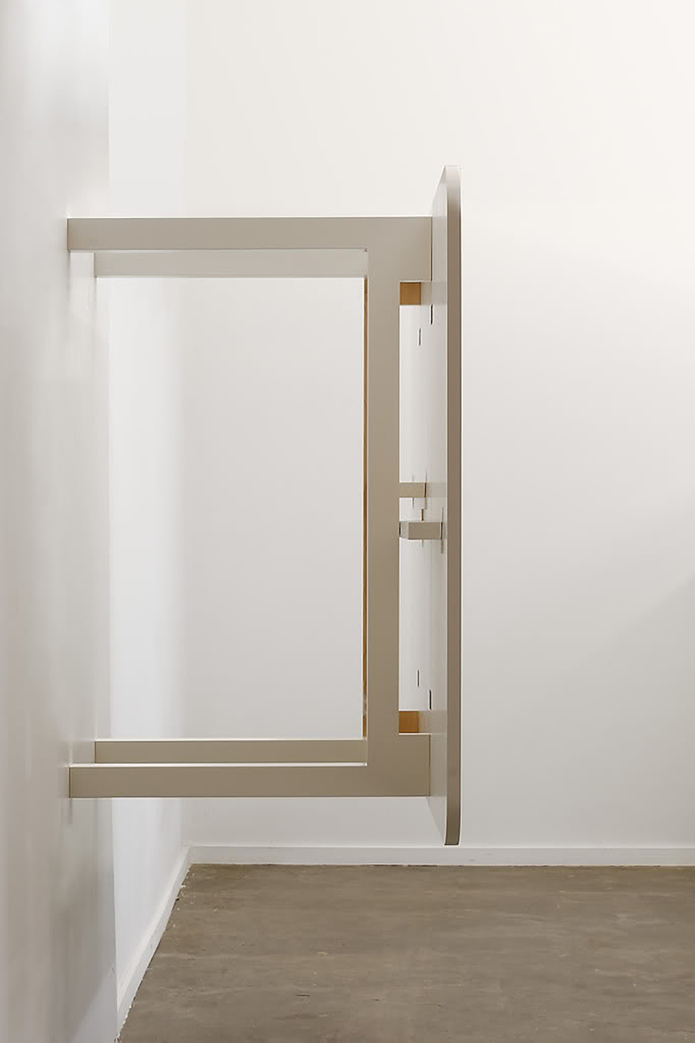
The tabletop piece “A Wall Sculpture of a Drop Leaf Table”—in which you literally attach a table to the wall—is a play on minimalism’s fight to find the end of painting’s practice. It creates what is a white painting, cum sculpture, cum installation. How did you come to this point?
Actually, it is just a table, on a wall. It matters to me that it is a real table. I mostly see it as a love poem to a table. I kinda think it’s heart breaking in a way. It’s so pretty, even aspiring towards transcendence, but it’s just a table. And you can’t even use it, at least while its on the wall. I see it as about function/dysfunction, perception and how objects reveal themselves. And it is about painting, and sculpture, and furniture. I found in my journey with objects that minimalism helped me see objects, so I think of it less a play on minimalism than attempt to demonstrate the potentiality of both transcendence and mundaneness within objects, even the same object. Maybe it’s partially about “point of view”.
Your objects often reflect the architectural space that they occupy. Did you employ the architecture in the gallery, or the architecture in Austin as source material or did you make this exhibition work with a neutral sphere/space in mind?
I hadn’t seen Lora’s gallery before I conceived this show, but I had done a previous show in her previous space, and I looked at the floor plans of this space a lot. So I definitely conceived this show for this space. I have wanted to build the table piece for a while, but seeing in my mind how it would work on the wall where we hung it was where I started. Then I came up with the title and then conceived the rest. I like the title. I might use it again. And, of course, I did the show with Lora and her lovely gallery team in mind. They are all so smart and serious about what they do I wanted to do a really great show. In other words I wanted to do a show that moved my investigation along in a serious way.
It seems you connect often with the work of somewhat indigenous architects i.e. Ellsworth Storey—Seattle, Irving Gill—California, and clearly to a lot of indigenous American styles from Shaker to Craftsman, to Mission and Prairie. Let us know your feelings about these influences/relationships. Have you heard about Austin’s own local hero/architect Abner Cook?
I tend to connect with proto or pre modern architects a lot. I don’t completely know why, but I think because they addressed of lot of things in a completely contemporary way; at times, I think, even more contemporary (to me at least) than the next generation of architects. I like architecture that can be rigorous but still be charming and sweet. I am very American in the way I see things, I’m kinda a homebody. And I don’t know Abner Cook’s work—will you show me when I’m in Austin next?
Back in the ‘80s there was this commentary in the Village Voice about Jennifer Bartlett’s work at Paula Cooper. She was showing these paintings with lots of dark colors and flashes of bright orange. In front of the paintings she displayed bright orange objects, like a table for example. The Voice commentary quoted a collector out of Ms Cooper’s range asking her spouse if it was, “Okay to put the table in the closet?” should they buy the coveted piece. First of all, it seems that people that live with your work love it! And you embrace the idea that your works play with the line between object of desire and usability, and blur ownership and user. Can you talk about this in relation to the work shown at Lora Reynolds?
The functional use of an art object is so interesting. I figured out long ago that if, as an artist, you allow folks to use your works it changes everything. I think this is a deeply profound notion, and also kinda silly. I think I reached out to objects as a child for psychological reasons, and they were there for me. At one level they were safe because they didn’t cause me harm, but they were really just the remnants of human behavior. I went looking for love in objects because I wasn’t finding it in other places in my life. As love seeking beings we can be keen readers of it. I was looking for objects that were the physical manifestations of love. And these were sometimes paintings and sometimes a chair. It didn’t really matter to me—I couldn’t see hierarchies as a kid. But my career has been bumping up against the very real hierarchies of objects since the beginning. My stuff at Lora’s exists in a funny place where the usability is both implied and real, but also kinda ridiculous. I think I do that to engage, demonstrate and illustrate the issue of use versus non physical contemplation, which I think is very real, but that in my own life I am nearly blind to.
Explain your relationship to building/designing objects as opposed to choosing/co-opting already designed objects or existing objects and manipulating them to achieve your ends? This is particularly true in “My Slatback Chair with a Pair of Attached Chairs” . . .
Well, that all depends on what my ends are. And my goal is generally a combination of exploring my romantic relationship with certain objects and trying to manipulate a viewers experience to replicate what I experience with objects. Basically, I see the playing with the difference between found objects and those made by me as one of the tools in my belt to get my point across. I guess what I am saying is, I see it as kinda the same thing, only different.
With all your pieces, initially it seems it is all “exterior”—how the outside of these objects are perceived. Perhaps address what’s going on “inside” (the drawers/pages) “underneath” (the pillows/table) “below” and “in between” (the chairs) . . . maybe speak about what is behind Oz’s Curtain?
Hmmmmm, I don’t know if it’s Oz’s curtain. I don’t think there is a little man inside making my stuff work. People know how to make them work. Everyone knows what to do with a table. Even one on a wall I assume. A book is always an exterior object until it is read. One could suggest that the people are missing, not the interiors. Or are they. You were there.
Roy McMakin’s In and On is on view at Lora Reynolds Gallery, 360 Nueces, Suite 50, Austin TX, Tues – Sat 11am-6pm, through May 15. Visit www.lorareynolds.com for details.
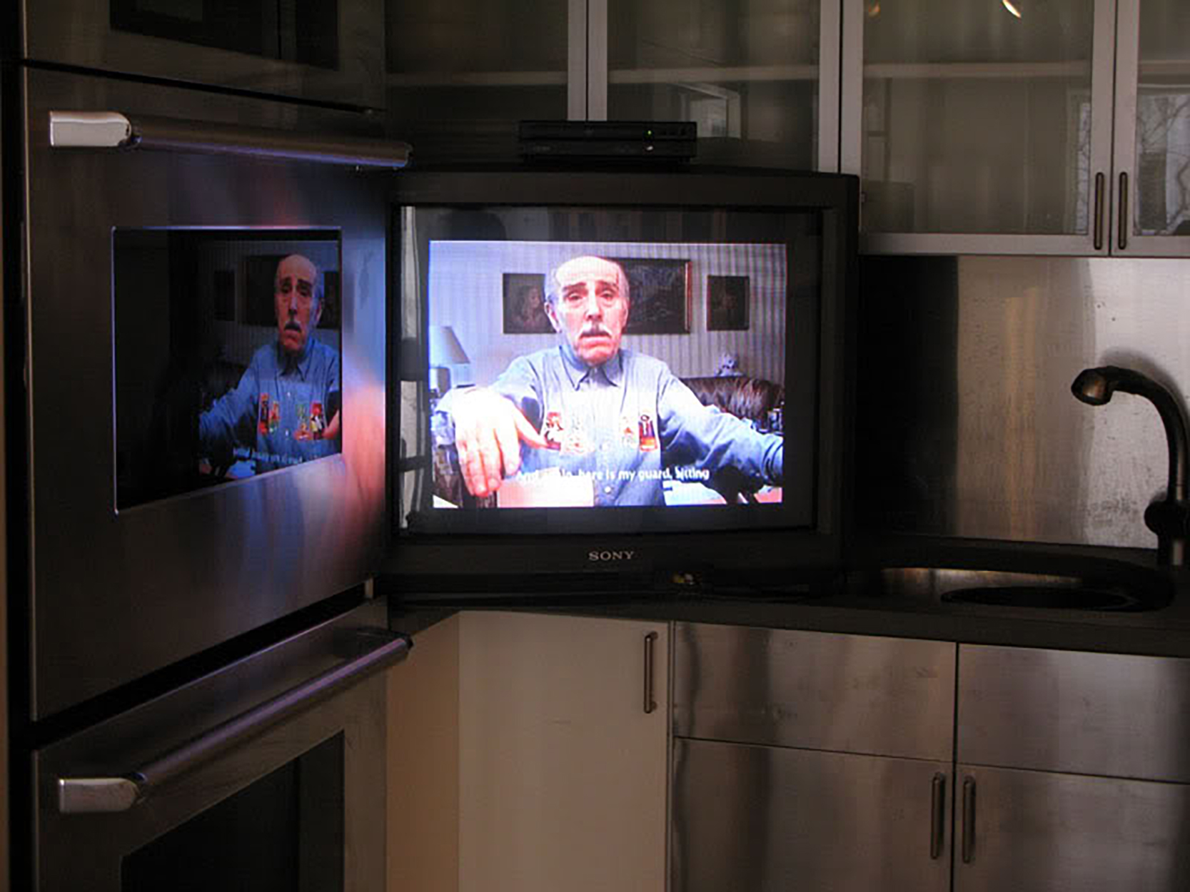
Rainer Ganahl’s “Language of Emigration & Pictures of Emigration” is now on view at Alex Zachary Gallery. The show consists of video interviews with German-speaking migrants who came to New York to escape Nazi persecution. The videos are accompanied by photos of the interiors of their New York apartments. Part of Ganahl’s art practice focuses on the study of foreign language. These migrants are all German-speaking, as the Austrian-born Ganahl is himself. However, Ganahl’s interview partners “carry with them a language that has vanished”—preserving the German idioms and accents once used in 20th-century Europe that are now out of use. Ganahl explores how language “works in the mind of the speakers and messes with memory, grammar, syntax, and personal lexica . . . The relationship between language, trauma, and loss became audible.”
Interview by Brandon Johnson
How did you find the German emigrants / New York residents you interviewed? Are these your neighbors? Where do they live in New York?
I found most of these interviewees with the help of other people I had previously interviewed. This project, which I started at the end of the 1990s with the title: “Language of Emigration,” consists of interviews and photographs of former Nazi victims and Holocaust survivors. I’m interested in how trauma, forced emigration, distance, and loss has influenced the mother tongues of these mostly German speaking people who have been living in New York for many decades. Each work combines a lengthy unedited video interview with photographs taken of the people and their homes.
Several years ago I was seated in an airplane next to a lady with such a fate and became very curious and perplexed. I was very surprised and realized that many people of that horrific period of European history are still living among us with quite a few in New York, which is also my home town of choice for the last 20 years. As an Austrian born after WWII, I simply and naively couldn’t imagine the proximity and continuation of such a brutal time.
Mary Silverman’s interview was recorded in her apartment, but she did not physically appear in her video, unlike the other interviewees. Why was this?
She decided not to be in seen on camera, hence the camera pointed to one “of her China sets which she was able to recuperate from Austria.” Her interview is called “Pictures of Emigration” since the subject of her story is not only about how they saved their own lives through a lucky escape from Nazism, but also the near complete restitution of her father’s incredible art collection relatively soon after the war. This collection, consisting of several Rubens, a painting by Lukas Cranach, and a work by Botticelli, is now still hanging in a private apartment on the upper West side, with flowers touching the canvases and barely any climate control. In front of a Rubens, there is a flat TV screen and other contemporary objects that seem uncompetitive with the history of these fine and valuable paintings, creating quite a funny impression.
You mention that this particular group of people are “in possession of a language that has vanished” and that one of your interviewees used “theater-ready” German, a dialect no longer in common use. You say “Emigration[…]preserved idioms and accents[…]that have vanished back on the continent.” What happened to these dialects, idioms and accents?
Well, most of my interview partners left Europe in the 1930s and don’t speak German on a regular basis – hence they are speaking and preserving a language more or less as spoken at the time of their departure. Needless to say, every language mutates and so did German as well as any other language. You can see this in recordings of people in the 1930 and 1940s. Usually, people adapt in a linguistic context and change with the times. Not so with people who live outside their original linguistic environment.
For example, Prague was part of the Austrian-Habsburg Empire until 1918 and had a large German speaking, partly Jewish population. Kafka was the most famous member of it. That group lived there until Hitler’s politics made it impossible for them. With the final eviction of all remaining German-speaking people from Prague in the 1940s – after the war – no German/Austrians lived there any longer. Nobody there could give us an idea of Kafka’s linguistic surrounding. I was therefore very surprised to hear an emigrant woman here in NYC who grew up in Prague in a fancy building that now houses the US embassy. As if to make it more “Kafkaesque” a letter by a Mrs. Kafka was on her table, with an US sender.
Along these same lines, do you consider it important to preserve these examples of language? Should all languages be preserved or is there a natural linguistic Darwinism?
I am not a linguistic preservationist. The world doesn’t need to be turned into a museum. Linguistic changes happen and there is a reason for it. One lady, speaking in a perfect recording-ready “historic” Austrian-German idiom told me that “today, in Vienna, even intellectuals speak like used to be only horse coachmen did.” This trend is, of course, a reflection that more people from lower classes found access to universities and knowledge. More attention is now paid to linguistic pluralism—hence using even regional dialects in discussing subjects that are beyond regional concerns. I myself am such a case.
But for Language of Emigration, we are talking about a loss that is the result of brutal and abrupt circumstances. We are also talking about people that were ignored for a long time by their former perpetrators. When I was in school we got only rudimentary information about these Nazi-atrocities and were not told that so many people were still living. So, getting an acoustic experience of a time destroyed was, for me, a bit like filling a void that we—post-war generations—all felt. Paying special attention to the linguistic nuances of this group of people was not only in line with the rest of my art work and my general interests (i.e. the ongoing studies of foreign languages as my art practice) but also a way to differ it from regular holocaust studies or the massive archive Spielberg has accumulated.
Your question about “natural linguistic Darwinism” I would answer with yes, if we can understand “natural” as socially made and driven by economics and politics. In this work we can see how traumatic political events followed by displacement and cultural loss played a crucial role in the lives and speeches of these emigrants—often lives with undesirable accents.
I’m not addressing here the problem of languages that disappear because of modernization, globalization, and the general destructive movements that characterized the 20th century, including the fundamental disturbance of the last indigenous people found far away from our understanding of “civilization.” Although disappearing languages cannot be preserved by orders and wishful thinking, they can and should be recorded and documented—an endeavor I recommend for anthropologists and anthropological linguistics.
The 20th century had a profound effect on language, especially with Western Imperialism running at full force. The meeting of cultures on a power-based level created a coercive relationship between the languages of the colonizer and the colonized. Many indigenous languages experienced violence and were driven to extinction or reduced to marginalized positions. However, some of those who learned the language of the colonizer could benefit, as Kurt Frankfurter did while in German concentration camps. Do you have any thoughts on political history and its effect on languages?
Kurt Frankfurter had an incredible history of survival based on his understanding that volunteering was saving his live. While volunteering on his day off, he not only got more to eat than during the entire work week but he also got to know the people who permanently made decisions over life and death in Auschwitz. He survived Auschwitz for nearly 3 years, which is extraordinary. To know his native German was indeed of help there. When I was spending a couple of months in Leningrad, during the end of the Soviet Era in 1991, I could observe the difference between those who spoke some foreign languages and those who knew only Russian: it was the difference between eating or not eating, the difference between knowing people from the West who had basically no choice but to go the markets where food was plenty but only affordable for those with access to Western money.
One of the biggest changes in language politics that has gone unnoticed and unlamented for, but which affected half of the world, was the disappearance of Soviet Russia after the fall of the Iron Curtain. All former Soviet satellite-states, extending from Eastern Europe to Northeastern Asia, including African nations, used Russian as a common language. Beginning in the early 1990s the biggest linguistic forgetting campaign initiated and everybody switched to English as a lingua franca. Currently, I’m working on a video in which a German woman complains in front of a Karl Marx statue in Chinese that the entire world is now Chinese. The text is written so we see a world where English is supplanted by Chinese, as French was by English early last century. This scenario makes a lot of sense since we only have to listen to the products we are touching, using, and consuming which already only speak Chinese. I have been studying Chinese regularly since 1999 and it is a wonderful language that can be learned as easily as any other. But what’s really interesting (and very difficult but wonderful to train people’s minds) is the Chinese character being based on a non-phonetic writing system that requires all the qualities that are needed in today’s world economies: concentration, precision, visual memory and association all combined with a lot of stamina.
A new system gained notoriety at the end of the 20th century. What sort of effect do you think the Internet has had on language?
Let take my own experience: I am definitely consulting on a daily basis foreign news media with a click of a finger and hence can read, see and listen to foreign languages. I also use it for my Chinese studies and can learn easily without extra costs and effort. Now to the net as such: when in the beginning it looked as if only English users were using the net, today we know that the entire world is doing so and very successfully. So, I think that the net is helping to proliferate the most dominant cultural formations through its medium in the same way to reflect their demographic, social and economical appeal and power—but not much more or less. So, if Chinese people as a demographic, economic and social force are spread over the globe, so are their communicational networks. But that goes with any group and invites even the smallest social groups to keep up with their imagined and now networked communities. It is a win-win for all be it the dominant linguistic and cultural hegemonies as well as the small and subordinate ones.
I noticed that the interviews were not all conducted in German. For example, Bertold Adler’s interview was in English. Why was this?
I always ask people whether they want to speak in German or in English and some prefer English. English is also a language that was not used during their sufferings. Hence, I was told several times that saying things in English was a way to distance themselves from the past. I had also some significant examples where interviews switch back and forth between the two languages—emphasizing their reaction and affection to what they said.
Alongside the interview videos are photographs of the interiors of your interviewees’ apartments. They all seem to follow distinct styles, a vernacular similar to the particular forms of language that were being preserved. Does this group of people play a similar role in preserving the idioms of interior décor, as well?
I was very struck how often I would see German and Austrian decorum in their houses even though they must have had enough of it. Looking through their libraries and across their floors and walls is a bit like scanning their present for their past. Not only do I give a picture to a story we were told only in the most abstract terms, but we also get an idea to what degree cultural influences persist and materialize. I was often told that it wasn’t the fault of the “German language”— something that could also be said of many German and Austrian materials I saw in their homes. I remember one woman who refused to speak to me in German and was still very bitter towards anything Austrian but she offered me Mannerschnitten (Viennese cookies available in NYC delis), used Austrian wooden furniture, Austrian China, and had images of Austria everywhere.
Diaspora can have the effect of strengthening cultural identification. People removed from their original geographic culture will value cultural tradition more than those in the homeland. However, these emigrants seem to have a more tenuous relationship with their cultures while maintaining the role of preservers. Could you give your perspective on how the people you interviewed relate to the cultures they left?
The Nazi persecution of Jews, Gypsies, Gays, Social Democrats, and many others who weren’t considered Aryan and participating in Nazi empire building was horrific and disastrous in its consequences for everybody involved. People I worked with over the course of my project were basically persecuted and attacked by the same people with whom they had lived in peace up to a certain moment. Most people were quite secular and anti-Semitism wasn’t as obvious before the arrival of Hitler. They most identified with their home culture before the dominance of Nazism. Hence, cultural identification for these elderly Germans and Austrians is not easy. I always ask how they feel about Austria and Germany and most of them like it quite a bit, yet show a certain hesitation. In most cases I have been embraced by the people I visited but sometimes I was told—like in the case of Frankfurter—that had I not been introduced by a person whom he trusted, he wouldn’t have talked to me. But this was more of an exception. Many do visit Austria or Germany regularly when they are (still) in a position to do so.
Rainer Ganahl’s Language of Emigration & Pictures of Emigration is on view at Alex Zachary Gallery though April 25, 16 East 77th Street, Thu – Sun 12-6pm. Visit www.alexzachary.com and www.ganahl.info for details.

Parking Space, a Chicago-based collaborative project initiated by Andrew J. Greene, E.J. Hill, and Matthew Schaffer, opened its second show, This Is Not For Sale, on March 12th. This Is Not For Sale features work by Annie Purpura, Austin Eddy, Alexa Loftus, Danny Greene, Dorian McKaie, Karen Bovinich, Kristen VanDeventer, Nick Fraccaro, Nina Mayer, Tanner Veatch, and Xavier Jimenez.
Interview by Brandon Johnson
ZING: Let’s start with your name. Where did it come from?
Matthew Schaffer: I think it was Andrew who came up with it. Our first show was in an abandoned garage and we thought it fitting. Then we thought that it could be used as a concept: us parking in other people’s spaces to do shows.
Andrew J. Greene: Our name literally refers to the parking structure behind Matt’s apartment that housed our first show, but the idea of a “parking space” refers to the transitory nature of our curatorial practice as well as other “pop up art spaces” found commonly in Chicago.
EJ Hill: There was a two-car garage behind Matt’s apartment that wasn’t really being used for anything. Over the course of a couple months, we transformed the garage from a moldy storage space to Parking Space. And actually, we only had our first show there. That was the Helter Sculpture show at the end of October and it started getting really cold really quickly, so for our second show we moved things upstairs into Matt’s apartment. Then for This Is Not For Sale, we moved to my apartment. We’ve talked a bit about continuing to move around the city to different locations but keeping the name. So I think the name has taken on a completely different meaning since the days of the garage, but yes, Matt’s garage is where it all started.
ZING: Now you’re doing a show, This Is Not For Sale, exploring the apartment gallery, something that in my experience seems to be more prevalent in Chicago than other cities. Why do you think is?
Andrew: I think the alternative art space has thrived in Chicago for the past several decades due primarily to fairly low rent and a Midwestern pride that wants to react against more conventional venues for art viewing. Historically, Chicago has always been a place that has demands attention with an idiosyncratic voice . . . deep dish pizza, the Sears tower (I guess it is called the Willis Tower now . . .), Vienna beef, the Cubs. Maybe the apartment gallery is just the way our art community manifests that gimmick.
EJ: Yeah, I’ve heard this a few times now actually, that Chicago has a rich tradition of apartment galleries and alternative spaces. I haven’t had much exposure to art communities in other cities, so I just assumed that apartment galleries were the norm. I saw a show recently at a space called Medicine Cabinet, which is literally a medicine cabinet in someone’s bathroom. And I haven’t seen this yet, but I’ve been hearing that there’s a gallery inside someone’s purse. This woman walks around with a purse and if you catch her on the street, she’ll open it to show you the current work that’s being exhibited. Bizarre, right? But that’s what I love about living here. It seems if you can think it, you can do it.
ZING: In the press release, you state “This Is Not For Sale refuses to ignore the conventions of the alternative art space, opting to embrace the opportunities implicit with operating outside the prevailing structure of the art community.” It seems strange to think of alternative art spaces abiding by conventions since the idea behind an “alternative” art space seems to be to avoid convention. Can you define these conventions as you see them, maybe in Chicago in particular? What opportunities are available outside the structure of the art community?
Andrew: In my understanding of “the conventions of the alternative art space,” I see the opportunity to take curatorial and artistic risks in a supportive environment (made up mostly of peers) that should be motivated by a desire to move forward with an artistic discourse that attempts in some way to re-contextualize or reposition what it means to make/show art in a contemporary setting. In a sense, an alternative art space should be defined by its innate institutional critique (in its “do-it-yourself” structure) and its ability to react against the short-comings in communication that the commodity driven art market seems to produce. Unfortunately, the idea of the alternative art space has been marginalized to such an extent that oftentimes its participants forget the “alt space’s” prescribed role as catalyst to the “avant-garde” and only poorly mimic more institutional spaces. In theory, an alternative art space has the ability to communicate with a much more captive audience than more conventional art spaces and thusly should be motivated to take risks to create a dialogue with that audience.
EJ: Planning this show was a bit tricky in the beginning because we knew we wanted to have it in an apartment but we didn’t want it to be just another apartment gallery show. And that term “alternative space” is a tough one too, because granted, our shows aren’t in white-walled, traditional gallery spaces with track lighting, but how many times can something be alternative before it becomes mainstream? There are apartment galleries all over this city and for the openings, all of the furniture and other objects that are normally in a living space are moved or stuffed into bedrooms and closets, in an attempt to mimic “the real thing.” For this show, we said fuck it, we’re not emptying the living room and moving the TV and couch into bedrooms. This is an apartment, not a commercial gallery. We’re not trying to sell anything or compete with others in any sort of market. We just want to be around good people making interesting work and create dialogue within the larger Chicago art community. And because we’re more concerned with building community and exhibiting work and less concerned with turning a buck, there’s more room for experimentation and taking risks. So we went forward with acknowledging the space for what it is and what it isn’t, and made that the subject of the show.
Matthew: We have the luxury of not having to worry about making money, so we have the freedom to show work that cannot be purchased (performances and site specific works). Opportunities: we can do what we want and don’t have to justify or answer to anyone but ourselves.
ZING: Any other thoughts on the Chicago art community? How do you think it fits in with the national / international art scene? Are there any regional qualities that make Chicago distinct?
EJ: On the home front, Chicago is definitely the underdog. You’ve got New York and L.A. as the powerhouse players and a lot of the time, Chicago gets overlooked. I’m still not sure how I feel about that though. Because sometimes I enjoy being a part of a well-kept secret of Chicago being this gem between the two coasts, and other times, I want nothing more than for Chicago to be able to play on the “big kids’ playground.” It’s definitely a more affordable place to live than New York or L.A. and that may contribute to why new galleries and exhibition spaces are popping up all the time in apartments, storefronts and even garages. Chicago is also a huge city with a small Midwestern hometown kind of feel. During my first month of living here, I was riding the subway and working in my sketchbook when the woman sitting next to me started telling me how her children are artists too. Before she got out at her stop, she gave me her card and invited me to dinner so I could meet them. I haven’t been in many cities where people are able to slow down just enough to actually engage with the person sitting next to them, but it seems to happen quite often here.
Andrew: In a way Chicago is self-defeating: too many of our artists continue to leave for NYC or LA, and in general Chicago’s yearn for international “stardom” has always been paradoxical. Chicago demands to be treated as an equal to New York and Los Angeles, but in that demand the city undercuts its potential by acting subservient to other locales. There is a community of people here that have stuck it out and have become successful, but at a certain level of success the majority will always seek a larger pond to be a bigger fish within.
ZING: How did you find this group of artists? Most of them appear to be Chicago-based. Is there are reason why you chose mostly Chicago artists?
Andrew: We sat down together and thought about whom of our peers could best contribute to the conversation we had started about the apartment’s dual role as living space and as art space. Keeping in mind that we wanted to pull from the several communities that are sometimes at odds with each other, we wanted to curate in such a way that positioned somewhat more well known young artists (within Chicago) with lesser known artists as a means to create a platform to democratize who was allowed to participate in the conversation within Chicago.
EJ: When we sat down and came up with the curatorial concept of the show, we considered artists whose work or way of working would best fit that idea. We were familiar with the artists’ work in some capacity and selected them based on their current practice and many of them having shown in apartment galleries several times before. We’re all students as well, so a lot of the artists we’ve met individually or through Parking Space are other students, faculty or administrators at Chicago academic institutions. And these artists are very familiar with the apartment as exhibition space and could speak earnestly about what that means to them and to the rest of the Chicago art community.
Matthew: We are artists in Chicago and we hangout with other Chicago-based artists, so it’s just natural. We would like to build a strong sense of community. Before we started we noticed that there were shows where all students were from either SAIC or Columbia and we thought that it was a bit of a drag that we all couldn’t come together. So, when we choose artists for shows we try to pull from all the art communities in Chicago, and being that Andrew is at SAIC and EJ and I are from Columbia, we have a real opportunity to pull from our respective groups.
ZING: The show is titled “This Is Not For Sale.” Will the artwork in the exhibition not be sold? Given that it’s an apartment show, could it be a reference to real estate?
Andrew: The work in the show was not for sale. In this way we felt that we were dealing directly with some of the “conventions of an alternative art space,” a place where ideas should be more important than potential monetary gain. A majority of the work was made and installed specifically for the space and operated performatively, therefore somewhat negating its marketability as a sellable good. We were also very aware that the title of the show could simultaneously refer to the fact that an apartment is indeed “not for sale,” and enjoyed that we could use that title as a starting point for curation.
EJ: Paying bills, buying groceries, buying materials to make art… all of this stuff adds up financially. It would be more than nice to be able to pay for it all by selling work, but generally speaking, the majority of audiences at apartment shows are not there to buy anything. It’s a different kind of vibe and that’s what we wanted to explore with this show. We had agreed that if anyone wanted to buy a work, we would cross that bridge once we got there and so far, it hasn’t come up. As far as a head nod to real estate, I never had that in mind, but it’s interesting you mention that especially since Parking Space doesn’t have a permanent or even consistent home. We’ve had a show in a different space each time, which definitely reflects the living patterns of young people in cities.
ZING: Can you elaborate on the statement “This Is Not For Sale demands an artistic discourse where context and concept are directly correlated?”
EJ: The work in the show directly referenced and interacted with the space as a site for exhibiting artwork but also a site for making toast, sleeping or taking a shower. Since these sites are so unique to Chicago and since we were using my apartment this time, the most exciting part for me was just seeing how the artists would creatively respond to where I live. But I think we were all pretty excited to explore the intersections between the properties of the space itself and the subject of the work in hopes to raise questions about how reliant they are upon one another.
Andrew: An artistic discourse where context and concept are correlated is one where an artist does not ignore site specificity and therefore deals with the baggage of a space or context and allows that context to influence how the work operates conceptually. In “This is Not For Sale,” we wanted the artist to be aware of how his or her work dealt directly with how an apartment can function multi-stably as a living space and as a space to show artwork.
ZING: Where did you get the idea to start Parking Space?
Matthew: Andrew and I where playing basketball behind my apartment and next to the court was an old abandoned garage, so we decided to explore it and Andrew jokingly said that we should have a show it here. Then we had some drinks and talked about it some more. EJ was excited at the idea and it just kinda started from a basketball game, curiosity, and drinking and then a lot of hard work.
Andrew: When we conceived Parking Space, we collectively saw the need to build a bridge between the disparate art communities within Chicago that have been created out of previously existing institutional structures. There was and still is a defined lack of communication within what is a relatively small city. We saw and still see the opportunity to for our city to look inward and prop itself up. Essentially, we have to fight for each other or we face the risk of remaining perpetually subservient to other cities. We saw Parking Space as a small way of doing that.
EJ: It was Matt and Andrew who initially talked about it and I was pumped on the idea. I offered to help out in any way that I could so we made some Home Depot runs a few times, cleaned and painted the garage, fixed some things and off we went.
ZING: The three of you are artists, as well. How do you think this affects your perspective as curators / project co-directors?
Andrew: Because we are artists, our role allows us to take certain liberties with curatorial decisions that a traditional curator could not make due to monetary restrictions or popularity of idea. As artist-curators it allows us to organize shows around concepts we may not be able to directly manifest within our own work, therefore allowing us to speak in a voice we normally couldn’t communicate with.
EJ: We’re more flexible. We understand how artists operate and how important it is to be able to show your work. It’s really a group effort in every sense and not just between the three of us, but for all of the artists involved in our shows. Everyone brings something different to the table and gearing into a show presents us with a very different group dynamic each time. It’s challenging and sometimes really stressful but we all want to show the best work we can. So I think we’re all willing to work very closely with the artists and each other to make that happen. We’re not wearing white gloves and directing people where to arrange things. We’re up on ladders, drilling, getting dirty and installing work too.
Matthew: It is easier to communicate ideas and concepts to a fellow artist than it is to business person.
ZING: Who should we look out for in Chicago, in terms of artists / spaces / writers / bands / anything cultural? Any recommendations for visitors?
Andrew: THIS IS VERY DIFFICULT, I’ll try and be as succinct as possible.
Spaces: Monument 2 Gallery, Golden Gallery, Roots and Culture, SubCity Projects, The Suburban, Kavi Gupta Gallery, Shane Campbell Gallery, Dan Devening Projects and Editions, Julius Ceasar, Andrew Rafacz Gallery, Happy Collaborationists Space
Bands: Dad, White Car, Geffika
Matthew: Jettison is a really great (currently) web based publication coming out of Chicago and The Smith Westerns are an amazing young Chicago band.
EJ: Jettison Quarterly is doing huge things here in Chicago. It’s an online publication that you should definitely keep your eye on. Happy Collaborationists Exhibition Space is also making waves. They are committed mostly to performance and installation work and just really great people to work with.
ZING: Anything else coming up that people should know about?
EJ: I’m showing a new work titled Solo Exhibition at Happy Collaborationists Exhibition Space on Saturday, April 3 from 7-10pm. I’ll also be participating in a group performance including Guillermo Gómez-Peña and Roberto Sifuentes of La Pocha Nostra at The Conaway Center at Columbia College on Saturday, April 17 at 5pm. And of course, more shows from Parking Space are sure to come.
Matthew: MORE SHOWS!!!
Andrew: More shows in Chicago . . . look for Parking Space and a little taste of Chicago in your city coming soon.
PARKING SPACE is currently located at 2246 W 19th St, #3R, btw S Oakley Ave and S Leavitt St. Email them at parkingspacechicago@gmail.com for more information.

Slow glow lamp for Droog by NEXT Architects & Aura Luz Melis
Photographer: Robaard/Theuwkens (Styling by Marjo Kranenborg, CMK)
Renny Ramakers is co-founder and director of Dutch conceptual design company Droog. We first worked with Droog during Pioneers of Change, a festival of Dutch design, fashion, and architecture on Governor’s Island, which occurred in Fall 2009 during NY400 week, a celebration of Dutch culture in New York. Mary Barone and I met with Renny and Sheldon LaPierre at the Droog storefront in Soho to discuss slow food, Droog, and the future of design.
Brandon Johnson: The Pioneers of Change is our launching point, since that is when we first came in contact. We donated zingmagazines to be placed in the Go Slow Café. We’re interested in your involvement in the slow food movement, or how that relates to the Go Slow Café, and how it all ties in with Droog and your ideas about design.
Renny Ramakers: We started the Go Slow Café in 2004. Not because of the slow food movement. The slow food movement is based on regional qualities. It started in Italy and is based on using what to land is giving you, not transporting it all over the world. That is part of it, but was not the main objective. The main objective was to give attention to processes. Because we live in a world where you only buy final products—especially here in the States. If I go for an orange juice, it’s already there. In the Go Slow Café, in Milan where we first presented it, we were pressing the orange juice by hand. And maybe that’s not allowed here . . .
B: It’s allowed, some places do it but it’s more expensive.
R: You see the people don’t know where things are coming from. Children think that milk comes from a factory and not a cow. So, that was behind it. The second thing we wanted was the serving and preparing of the food to be done with attention and care and people who would sit down at the Go Slow Café didn’t have to hurry. They can sit and have a nice time. They can sit there all night if they wanted to.
B: That’s perfect for Governor’s Island, as a location, an escape from the city. When I was out there to drop off the magazines, it was a like a whole other world coming from the Financial District where the ferry departs.
R: We also did it in Milan. There was a big hustle and bustle, everyone was excited to see as many shows as possible during the furniture fair, but they sat down and spent hours at our café.
Mary Barone: The city is so frantic during the Milan Furniture Fair.
R: The idea of using seniors [as employees of the café] opposes the normal practice of using people who are very young as they are cheap and maybe because they are easier. Instead we used retired people to work at the café for the week at Milan and two weeks at Governor’s Island. People loved it.
M: Yes, I ate there. They were wonderful.
R: We have done it in Toyko, we have done it in London. In London we had ninety-year-old ladies. They had to sit very often, which was not a problem, but every half hour they would sit down. And in Tokyo we had a man in his eighties, and he was so young—so fit and energetic. It was wonderful because people are used to being served by younger people and here there were people who could be their grandmother or grandfather. In Milan, they started singing songs from the childhood and giving massages.
B: In that sense, the “slow movement” is literalized in the word “slow”. I had previously interviewed an artist in Williamsburg, Mike Ballou, about an installation he did at a restaurant called Diner. They source their beef from a farm in upstate New York and he did a large sculptural portrait of a cow from that farm, which was then placed on top the restaurant. The individual, the original source is represented in that piece. Now, Droog is taking it in a more literal linguistic sense, slowing down the process of eating.
R: Yes, very serious, but we also want things to have a twist.
B: Right, because there’s some humor to it as well.
M: When I dined at the Go Slow Café on Governor’s Island, the food was represented in a diagram according to its origin. Like where the walnut came from. Then it finalized on something very traditional.
R: The moon. Black and white powder. It’s a kind of licorice. We say it’s dust from the moon. But the idea is that food is transported all over the word. We wanted to show the food in proportion to its distance traveled. So, there was very little “moon powder” because it had to arrive from the moon, so to speak. It gives you an idea of where the food is coming from.
B: And obviously it takes energy to transport the food.
R: And that’s a damaging thing.
M: They sourced the ham from West Virginia.
R: The butter from Russia.
B: So, it’s proportionate to the distance it traveled?
R: Yes. It’s a message that you can eat a lot of the things that are grown around you and less of things that come from far away, like Japan.
B: Makes sense.
M: One always thinks you need Italian prosciutto or Serrano ham from Spain, but it fact there are delicious hams nearby.
R: There you go.
B: How would you tie the Go Slow Café into Droog in a larger sense?
R: It’s part of our whole philosophy. You see there are objects here in the storefront. But most of the objects are coming from our projects. For example, the Slow Glow lamp in the window, had been designed for the Go Slow Café, but now we are selling it.
B: That lightbulb lamp?
R: It’s filled with fat. When you plug it in the fat is solid, but as it heats up, the fat slowly melts. It was a product of the project.
M: Who designed that?
R: NEXT Architects. We have all been interested in a conceptual approach and projects that activate the visitor. Interaction is very important to us as well as showing processes. Many of our products are based on interactions, like the marble bench downstairs. It’s an experience.
It’s part of our philosophy to produce things that make people happy. Many people start smiling when they see our products. There’s a sense of humor, but it is understated.
M: it’s a dry sense of humor. Because “droog” means dry, right? The English are said to have a very dry sense of humor. The Dutch, I think, as well.
R: Yes, it’s the same word in Dutch. There’s always a twist. It’s not meant to make something humorous. It’s meant to produce something to make people happy or to convey a message, or something else along those lines.
B: What’s going on at Droog now? Any upcoming projects we should be talking about?
R: We want to continue with Pioneers or Change. We are now talking about presenting it in Bangkok, but it’s still very early. Pioneers of Change can be repeated in every city all over the world. It’s based on collaboration with local parties, interaction, local context, and current topics. The second part is Droog lab. We started this last year. The first one we did in Dubai. The leaders of the Droog Lab are always one or two established designers, so Rami Farook, Jurgen Bey, and Saskia van Drimmelen went to Dubai with a few designers. The idea is that you go to a region, learn from a region, be inspired by a region and come back with something new. Our goal, and this is very ambitious, is to define the next generation of design. When I started Droog lab, I noticed that entire design world is only concerned with products. We had these fantastic projects in Milan, but the press is only showing a few products. Also, many designers are only interested in making products, limited editions. We also produce limited editions, but for us a story is more important than owning an object. Because it’s been going so well that last few years with studio work in limited editions, you see companies asking designers to do limited editions. So, there’s no story anymore. There are too many objects in the world right now and not enough stories.
M: What are the designers in Dubai working on?
R: Yes, this is where we are leading into. They went to Dubai and came back with all kinds of observations. Now they are working on a new model, presented digitally, of collaborative design. I cannot explain it yet, because it is being developed. But there is a new model based in collaboration that will eventually produce products. Also, maybe a different kind of currency based in time. The original ideas have nothing to do with objects or products, but in the end there will be a number of very beautiful products based on this philosophy.
The second group is going to northern Canada in June. The topic is sustainability. Winy Maas and Cynthia Hathaway, she’s Canadian. There are always also local designers involved. They’re going to see how the Inuit people in the far north survive, to learn their way of living. I have no idea when they are coming back.
M: That’s very exciting!
R: We want to do a third project in New York, based on the service economy here. Yesterday on the street I saw someone walking with the dogs. Dogwalker is a new profession. I’ve only seen it here. We don’t see it as something negative or positive, but only interesting.
Sheldon LaPierre: One thing that resonates for me about the lab is that it’s about exploiting already positive qualities of an existing situation. The designers are not saying “We’re here to provide a solution, we’re here to attack a problem.” It’s not that way at all.
R: There is no problem for them.
S: It’s about using these qualities that may already exist in this inherent situation—something I’ve even tried to employ a bit in my own life having learned about this method. The person who manages the lab will actually be here later today.
R: Perhaps I should explain why they came back from Dubai with this model. They saw three clear qualities of Dubai. For one, it’s very ambitious because it’s a desert. They have made this entire city out of nothing. The second is that there is a wide hierarchy. The top is very small, only the sheiks. The third thing is that Dubai is a hub. A hub for richness, for luxury. We wanted to make a hub of content, creation. Those were the observations and that’s why they came back with this model. A few weeks ago I told this to someone and they said I was not critical of Dubai. I said “Of course we are critical. But that’s not the issue at this moment.” We are critical of this hierarchy where some have outrageous amounts of money and others have none. So, we’re thinking about a timebank, where you pay with time or with something you are able to do. Someone is a hairdresser and pays for their purchase with a haircut. It’s just a model of course, but that’s where it comes from.
There’s one more activity we would like to pursue. We are presenting a kind of parasite product. Say you have a porcelain cup produced in China. If it were made in our countries, you could not afford it. It comes from China, and it’s not quite right, so it goes back and forth all the time. Because of this, it takes a long time for products to be developed. We were also thinking there are already so many objects in existence already. We have glasses, our neighbor has glasses, the shop down the street has glasses. Do we need so much glassware? Then there’s the financial crisis. Each month in Holland there are 500 companies that go bankrupt. What happens to their products, their inventory? It goes to auctions on the internet. We started bidding on all kinds of items: napkins, a table, glasses, you name and we bought it. We asked about 15 designers to see this as their raw material. Each designer came up with an idea. There’s a lot of commentary. It’s fantastic. In three months time, we will present about 20 new products.
B: Based on the products that were procured from the auctions.
R: The designers came up with such unexpected things. One example, not sure if he will succeed, was given a water dispenser. A cooler. He has taken it apart and is making a perfume dispenser from it. He also has 100 salt glasses that he making into perfume containers. This whole idea gives a new brainwave for designers. They don’t have to think about the system, the system is there. They just have to stage it. That goes for all the products. There is cutlery, which takes years to design. But here, the designer already has it at hand.
M: Will you be staging an exhibition here?
R: In Milan. We will sell as much as possible. If we have things left we will sell it in the storefront here in New York.
M: The fair’s coming up soon?
S: April.
R: They will be limited editions because there is only so much material available. We are also thinking about moving beyond bankruptcy auctions to work with existing things.
S: To make access limited is interesting. A new perspective.
R: We work with other companies as well who demonstrate a similar spirit.
B: I was reading up on the history of Droog before coming here and it’s interesting how these ideas tie in with the founding of the company, designers using discarded and pre-existing materials. It goes all the way back.
R: It’s not on purpose, we aren’t forcing ourselves to do it.
B: It’s natural?
R: The idea returns in a cycle. It’s in my genes to do these types of projects.
M: The store is a great resource in SoHo.
R: Yes, we are trying to make it more lively. In the beginning we were a bit of a showroom and now we’re trying to change that by bringing in smaller items and doing more interactive projects.
B: We’re looking forward to it.
Michele Abeles/Margaret Lee\Darren Bader
A project organized by Margaret Lee at White Columns in New York
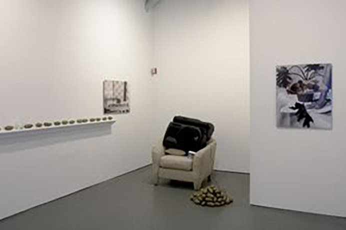
Devon Dikeou: Margaret, how did you come up with/organize the idea for the show, the pairings, the idea of collaborating and reacting to, well potatoes . . . and each other as artists, much less the curatorial combination of artists.
Margaret Lee: The title of the show is actually those 3 icons, camera, potato, cd/music note. When Matthew invited me to do something in a White Room, I drew a complete blank for a few days. I knew that I wanted to use my potatoes again. I had used them in two other installations but neither of those times did I think they were being used the way I thought I wanted them to be used. I originally started making the potatoes as a way of pairing down my practice into something really basic; I wanted to have something almost neutral to use in creating pairs or in coming up with absurd pairings between disparate objects.
With them as my base, I started thinking of artists/works I have seen recently. Michele Abeles and I met in the desert (Joshua Tree) while participating in a HDTS. I first saw her photos there and immediately knew there was some kinship—mostly because she took the kind of photos I would like to take if I had any photography skills—cold, almost dead, unnatural, with little emotion between herself and her subjects. There was a photo of a plant with a hand in front of it which I saw a few months before getting the White Room invitation and it was in recalling that image that I knew I wanted to work with Michele. I really wanted to see my potatoes in her photos (or that photo specifically) but did not want her to take portraits of them as singular artworks. Rather, I wanted them to disappear into the background or be featured in an arrangement of her liking. I wasn’t sure what would come out of this fusion, which I wouldn’t call collaboration. First off, I told Michele that she would have full control of the image and could do as she pleased with the potatoes. With that, we decided to meet in a few weeks/months and see what came about. I then sought out Darren Bader, who I barely knew but felt as though maybe we approached art making in a similar way, or at least looked at art making in a similar way—since I had just gotten into curating and using other artists’ works within my own pieces and Darren, well read his book James Earl Scones and you will understand. We met and talked a bit about the project, though no specifics were exchanged. I again made sure Darren understood that I was not handing him an assignment or asking to collaborate on something, although in the end we did end up collaborating on the chair/speaker/potato sculpture.
Neither Darren nor Michele had any communication during the process. They had never met. I wanted each artist to have a relationship to the potatoes rather than to each other.
DD: How did your thinking as both an artist and organizer influence the other artists and vice versa?
ML: I think Michele, who doesn’t collaborate, had a difficult time with this at first. But she was really familiar with my last curatorial project, “Today and Everyday,” and understood where I was coming from. Though I invited her from a curatorial standpoint, we discussed the show as two artists. She didn’t need to ask me for permission to do anything and I told her to continue making the photos she was in the process of making but try to subtly insert the potatoes into her compositions, without having to make them the focal point. When Michele was done with her photos, I passed them along to Darren. At this point, I still wasn’t sure what the final installation would look like or what Darren would bring to the room, which I think we all felt OK about because of my dual role as curator/artist. There is something about that hybrid that I think makes the wide-open and unknown doable because the show was not curated in a traditional sense; it’s not based around a formal or thematic statement. I wasn’t trying to push artworks into a story that I created before hand. Rather, I wanted the story to unfold while we moved ahead. Also, in working with other artists, especially one like Darren, you know that you can’t force your agenda onto them and their work and how it is organized.
DD: How orchestrated or incidental was the outcome?
ML: I was absolutely devastated when Michele sent me her two first photos. Both of them featured a naked male body part. It’s funny, because although I told Michele that she could do whatever she liked, I never considered that she would use male nudity, mostly because I would never, ever in a million years consider using male nudity since I never include the human figure in my work. I laughed and told her I was having difficulty with them. She understood but asked me to sit with them and also sent me some others. In the end I chose one of the two difficult images. Actually, I chose the more difficult and graphic one. Darren only told me that he wanted to include the song “No One” by Alicia Keys (a song I’d never really liked before). Darren and I met repeatedly, talking about possibilities but we both knew that we wouldn’t really know until the installation started. Part of the project was working with unknown elements, the outcome was supposed to be incidental or at least I wanted the elements to be incidental. My goal was to take these incidentals and pull them together into a really tight installation that looked like a solo show.
DD: Speak about the application icons that appear on the invite, website, press material, as well as alongside the actual images of the show: camera, potato, tunes . . .
ML: I wanted to come up with a title for the project but since it was a non-thematic three-person show, I found myself resistant to coming up with a catchy title. Recently, I’ve been obsessed with emoticons on my iPhone, these cute little icons that stand in for words. I find myself sending messages like “balloon, wrapped present, champagne glass, cake” to say “Happy Birthday”. So, for this project, I reduced each artist and their included work down to an icon, basically to convey who was bringing what. I liked using this “new” language. It seemed web 2.0 to me, as did the actual project. Not in that we were using technology in any way, but in approaching the project using: interactivity, collaborative authoring, and a move away from individuality, the last of the three points being the most important to me. In reducing an artist and their work into these icons, that could be interchangeable and reused, I felt like it was a nice move away from the idea of the singular artist as genius concept. Also, the title of the show is also an artwork. I made the icons myself and the grouping is now a wall piece in an edition of 10.
DD: We can all imagine from experience what the tune icon implies, as well as that of the camera. What does the potato application do, or what could it potentially do.
ML: It’s funny because there was no other option but to have the potato icon, since that is all I brought to the project. It’s the most absurd of the icons and I like the way it is something very “natural” in between two “technological” implications. The potato icon, nestled in between, also conveyed to me something really human and basic. These potato sculptures connected the works and the artists. It is an unlikely function for them, but a good one!
DD: There are elements of tension between realism and photorealism, as well as a dialogue between constructed space and literal space. These dichotomies are the thrust of several divergent artists whose work seems to be not just influential, but is almost echoed or specifically cited and twisted in the work of all three artists. This range of artists—from Rachel Harrison to Frank Stella, Robert Mapplethorpe, John Miller, and Richard Estes—even Magritte comes to mind in varying degrees. Please speak about your influences, as well as the mark that the mentioned artists might or might not have on your communal strategy as well as the individual strategy of each of artist in the grouping.
ML: This is a hard one for me to answer. I don’t like thinking of the trajectory of art in linear terms anymore. Part of the Web 2.0 mentality that I like or identify with is you are bombarded with images/ideas that you really could not process in a rational, linear sense. You take bits and pieces and they come together in ways that are unexpected. You find yourself looking at say, a Magritte (who, of the artists you list, I think would be the strongest influence), and then find yourself thinking about some funny video you saw on youtube, rather than what came before or after the Magritte in art terms. I could say supermarkets, interior design, Madison Avenue and the museum gift store, influence me just as much or more than artists who have influenced me in the past. But if I were to mention anyone, it would be Louise Lawler.
The communal strategy comes out of a desire to contextualize work again, after years of Art standing as luxury good and galleries showcasing work as such. It’s an attempt of my part not to make or showcase work for the mid-century modern home. The shared authoring of the project stands in complete opposition to artistic genius and curatorial wit.
DD: Onto something a little less, less or more . . . What do you think about ketchup or catsup . . .
And about steak? What do you think your collaborators think of it?
ML: Ah, Darren would LOVE this question. I don’t eat steak but love ketchup, though I’m trying not to eat it since it’s so salty and kills your taste buds for hours. But French fries without ketchup is a sad thought; I’m too American to give it up. [Editor’s note: Jonathan Swift coined the spelling “catsup” in 1730.]
DD: There is a balance between trompe l’oeil and found objects that is both coolly obscuring and hotly obvious in this show. Brillo vs Ballantine Ale, or rather Brillo and Ballantine Ale vs Hans Haacke.
ML: THANKS! I want the Brillo and Ballantine Ale. I’m hoping that we are moving in a direction when artists realized the limitations of making “political” art and see that the politics are actually in your movements and actions. I just don’t see the point of making political art and showing it in a commercial gallery nor do I think I am making political art at all. It’s never my intention. I don’t want to comment on institutionalism, I want to move away from it, without strong rhetoric. It’s not so complicated for me. I want art to live in a space and feel alive for the duration of the exhibition.
DD: Where do potatoes and you go from here?
ML: Hmmm, dunno really. Potatoes may be retired for a bit. From now until the end of May, most of my energy will go into trying to keep 179 Canal going. I think I will try to practice playing the piano and work on my cake decorating skills.
See Michele Abeles/Margaret Lee\Darren Bader at White Columns, 320 W. 13th St (enter on Horatio) through February 27th, 2010.
More info on Margaret’s non-profit space 179 Canal can be found at http://www.179canal.com.