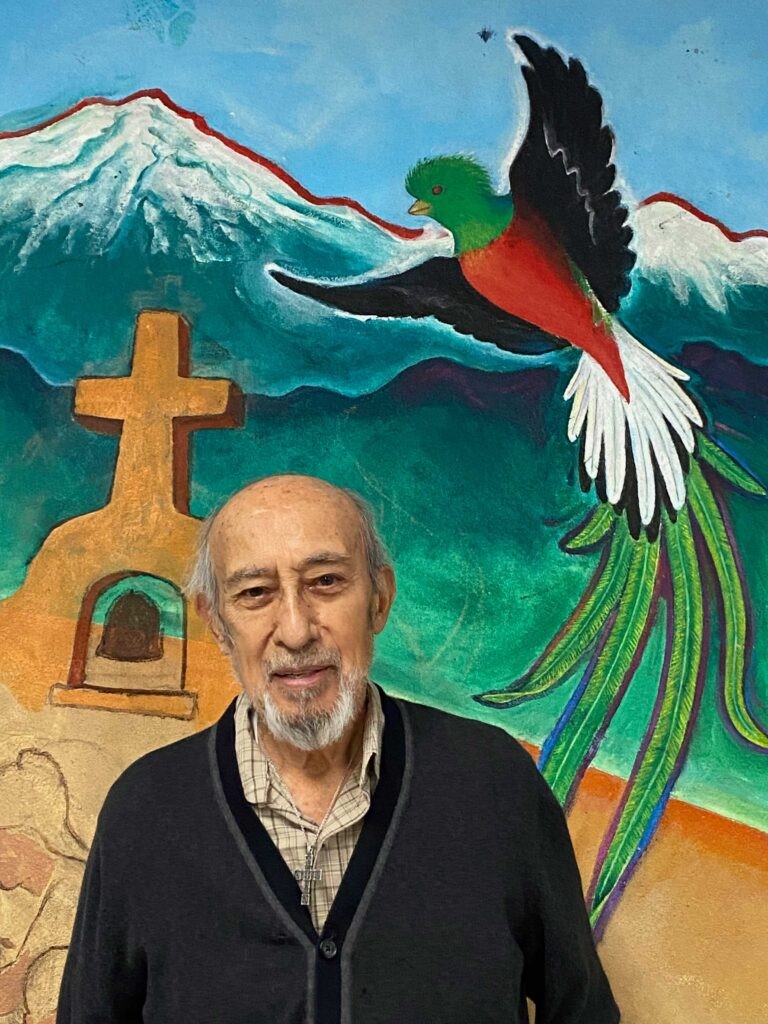
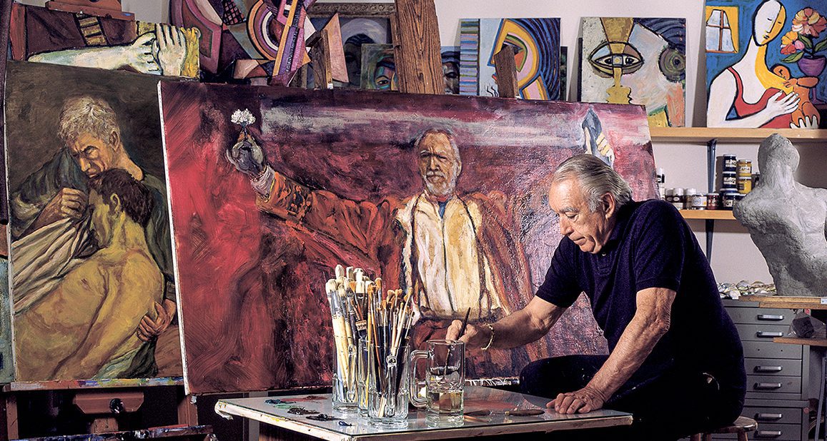
Leo Tanguma (b. 1941) is a Chicano muralist known for his works that integrate Mexican American heritage, spirituality, social justice and autobiographical elements. Born in Beeville, Texas, he began his career in Houston with ambitious murals that advocated for social change. In the 1980s, he moved to Denver, where his public works made waves in the Denver International Airport, and he continues to create murals throughout the Denver community, most recently at Ricardo Flores Magon Academy. This is the second interview with Leo Tanguma to appear on zingmagazine.com, the first was conducted by Rachel Dalamangas and can be read here. Leo will be featured on the ARTiculated: Dispatches from the Archives of American Art podcast, produced by Archives of American Art | Smithsonian Institute oral historian Ben Gillespie.
Interview by Ben Gillespie and Josh T. Franco
You’re coming up on nearly 40 years in Denver—how has your understanding of the Denver community changed in that time? What excites you now in Colorado?
When I moved to Denver in late 1983, the Denver community, especially the Chicano community, was experiencing a severe problem of gang violence. After attending meetings which sought to address the problem, I observed the actions already taking place in dealing with the gangs I was deeply impressed with what I saw. I immediately added my contribution to those efforts by constructing a movable, sculptural mural on gang violence. I designed this mural to be shown in one area, dismantled, and then taken to be shown at another site in order to reach as many viewers as possible. My understanding of the issue developed into an admiration for the city and for the Chicano community in particular.
During the past 40 years, Denver has only increased its kindness towards me. This situation has remained constant as I have seen my work welcomed despite its frequent political or radical content. For example, the following are some of my most political murals:
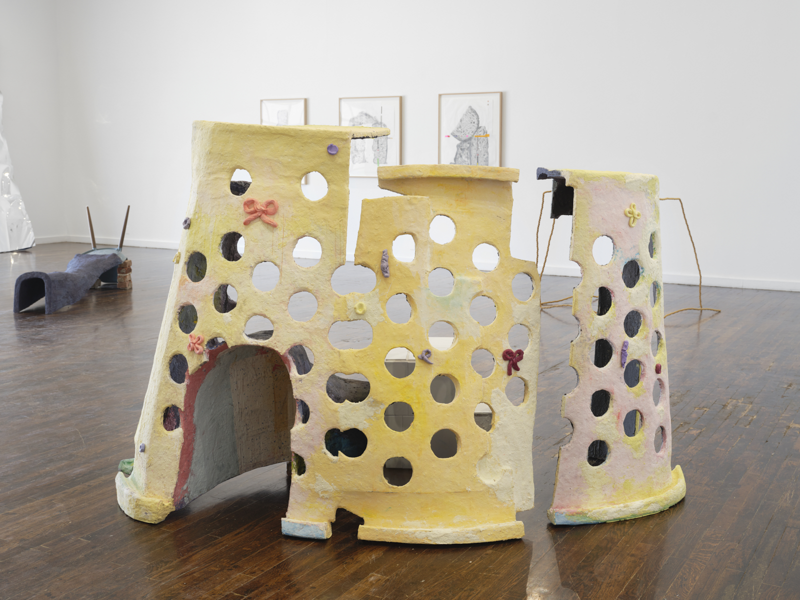
Beyond This Cross (1986): This was a sculptural mural in the shape of a cross, 33 feet in height by 45 feet at the base, and was exhibited for an extended period at the Denver Center for the Performing Arts in downtown Denver. The painted imagery on the cross was a condemnation of the United States Government’s support for Central American dictators who oppressed and murdered many people using the military as well as death squads.
The Torch of Quetzalcoatl (1989-1990): A sculptural mural 72 feet along a curved base by 12 feet in height tapering down on its ends to 2 feet. This mural was commissioned by the Denver Art Museum in 1989-1990. Its subject was the Chicano Movement and Movement for Civil Rights in the United States.
In Peace and Harmony with Nature and The Children of the World Dream of Peace at Denver International Airport (1993–1995). I painted two sets of large murals with a total square footage of 692 square feet: I was assisted by my daughter Leticia Tanguma as well as a few other Denver artists.
Given Denver’s openness to progressive artwork, I wonder why more Denver artists, especially mural painters, in the Denver area have not seen fit to examine social and cultural issues in paintings and offer them up for the public to enjoy or scrutinize? I call Denver’s stature one of down-to-earth sophistication with tough demands but with high rewards for those who try.
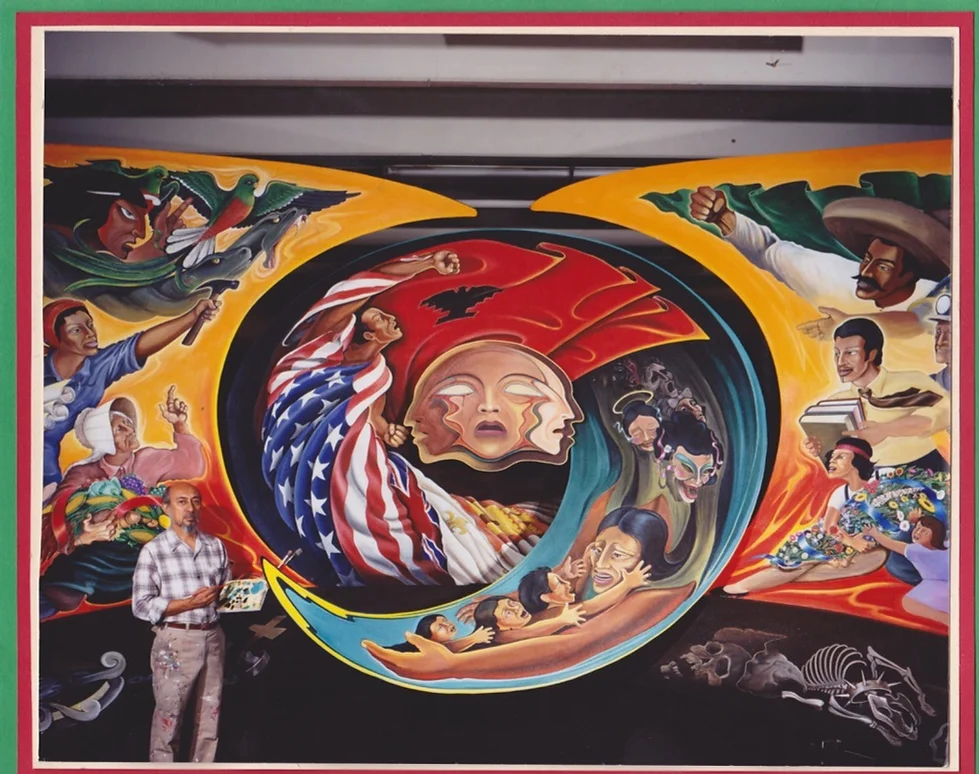
Leo Tanguma, The Torch of Quetzalcoatl, 1989-1990
You’ve described human dignity as a foundational impulse for your work, how would you define it? How have collaborators defined it or changed your definition of it?
My sense of human dignity comes from religious Christian ideals instilled in me by my farmworker parents during my youth. The murder by the Sheriff of my mother’s two cousins at their ranchito in my hometown south of San Antonio, Texas inspired my rebellion against authority. I realized that the social order and its authority over us demeaned, and it often destroyed, our human dignity. What the Sheriff did that day was to attack our self-respect, that is our human dignity, especially since we could do nothing about it. The Sheriff was exonerated in this case as he was in other cases that involved his killing of other Mexican-Americans.
Following the murder of my mother’s cousins, our local community resumed its life, and we were soon back “normal” again: Happy in our homes and our barrio. Later I saw this return to normalcy as our reclaiming our human dignity.
As I matured, I painted mural depicting the struggles of all oppressed people fighting for a better life and thereby for their human dignity. I became aware of the Christian philosophy of Liberation Theology that stressed that Christians must have a preference for the poor and the oppressed. In essence I have been doing this all my life as a mural painter. I am not sure that my example has inspired other artists. Although I have spoken and advocated for an art reflecting not only our community’s culture but also its political struggle.
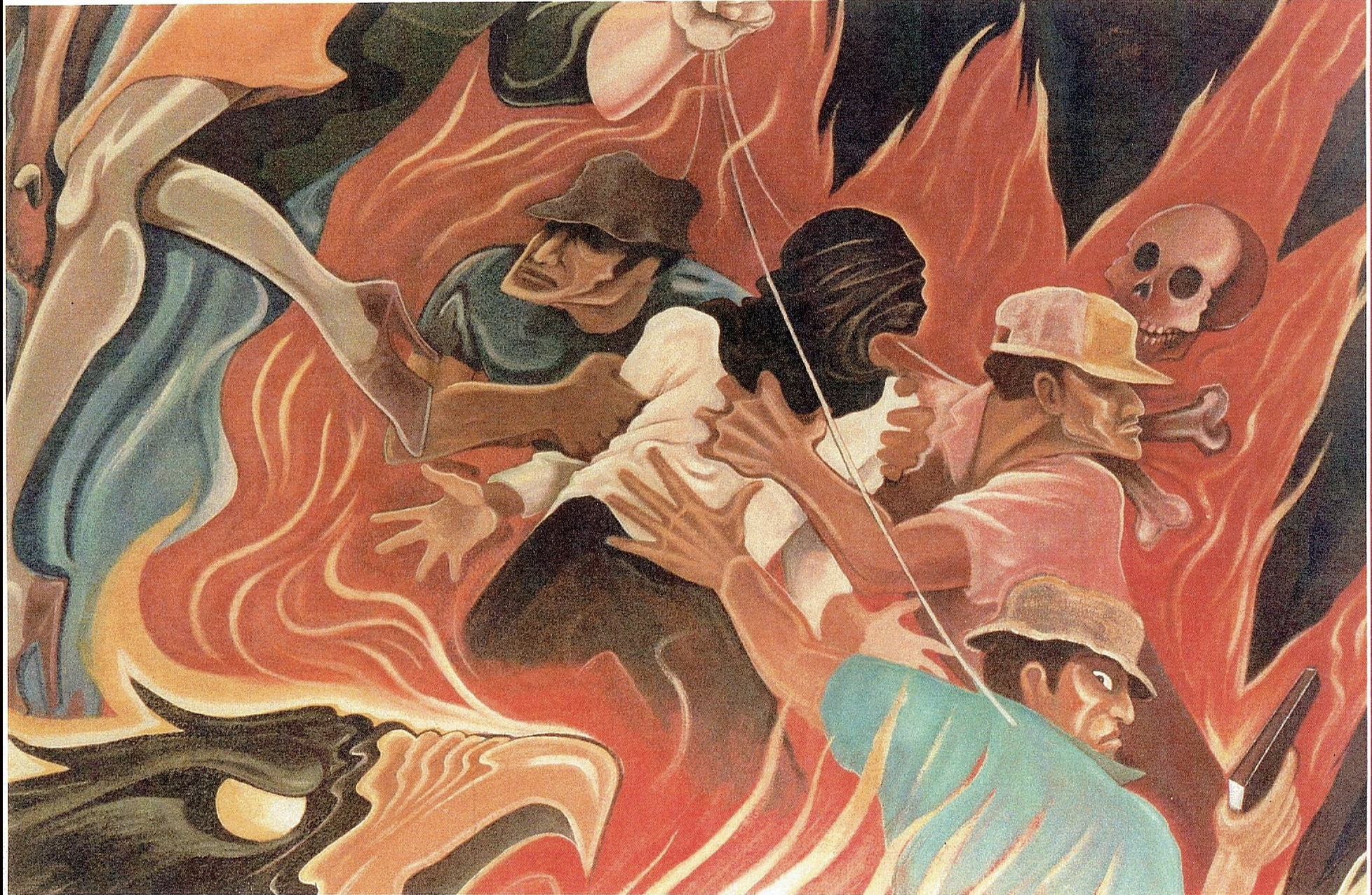
Leo Tanguma, Beyond The Cross (Detail), 1986
How do nature and the natural world factor into your murals?
I have shown nature in some of my murals. I equate beauty and fragility of nature as something spiritual, something that touches our senses with awe at the spectacular beauty of this mystical creation all around us.
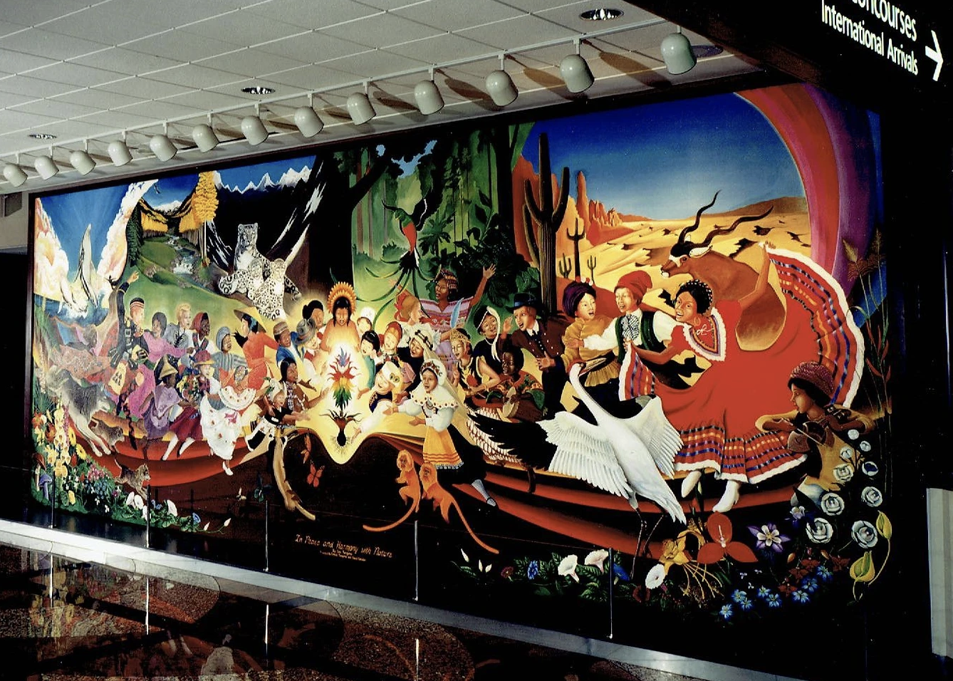
Leo Tanguma, Leticia Tanguma, Cheryl Detwiler, In Peace and Harmony with Nature, 1993-1995, Denver International Airport
David Alfaro Siqueiros and Dr. John Biggers were major influences for your approach to mural making and meaning—how do you hope to influence artists today and tomorrow?
Dr. John Biggers, Professor of Art at Texas Southern University, stated that the greatest experience we can conceive of is the human struggle through the ages. He said, “Our struggle for Civil Rights is part of that monumental struggle for human dignity of which we are a part of.”
David Alfaro Siqueiros told me in an interview with him in his Cuernavaca studio that we Chicanos should not only paint the folkloric and cultural identity of our community, but also the political and social struggle. Siqueiros also referred to leaders and revolutionaries of whom we were aware. He also pointed out unknown and forgotten martyrs and heroes in the human struggles of the past.
At my age I can only say that hopefully my example alone could be of some value.
Looking back on your long career in art and activism, what does “Chicano Art” mean to you today?
Chicano Art means to me the representation of my community’s aspirations for liberation through the mediums of artistic creation. However, the artform which most lends itself to that expression is mural painting.
I have often said that mural painting is our Mexican heritage going back two thousand years B.C. in ancient Mesoamerica. I am not sure about the following being applicable to our Chicano Art, but I suggest that the cave paintings of Altamira, Spain, should be incorporated into our Chicano sense of history.
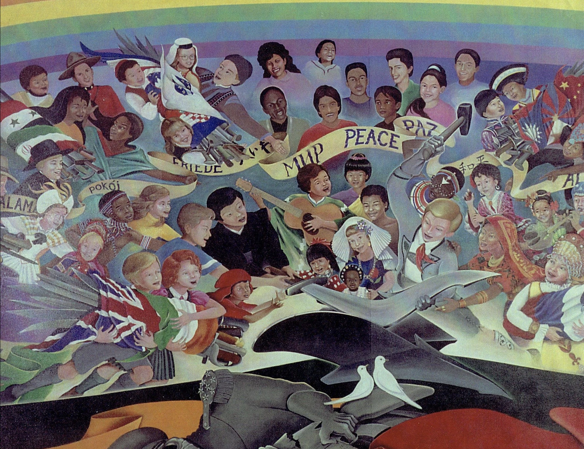
Leo Tanguma, Leticia Tanguma, Cheryl Detwiler, The Children of the World Dream of Peace (Detail), 1993-1995, Denver International Airport
You often collaborate with young people. What do you hope they take from the experience of creating murals with you?
In most, if not all, of my painting with youth, I use the symbolism or figures which we may be painting in a mural as messages about their intrinsic worth. Often in developing a mural topic to be painted with youth, I point out the importance of what we are about to do. Instilling this mindset at the beginning, our planning inspires those youths to more meaningful ideas for a mural. I suggest that while painting a mural is a fun experience, it can also tell a story or message with their pictures in a mural.
On more than one occasion, I have been approached by middle-aged persons who have said to me “Do you remember me? I painted with you in Arvada Middle School?” Or many other locations where I painted with youth. A particularly memorable experience was when someone said, “Remember me? I painted with you at Platte Valley!” (Platte Valley Youth Services Center, a youth correctional facility). He added “And you talked to me!”
Everyday heroes from many cultures come together in your murals—who or what is a symbol of heroism for you today?
I am inspired by many revolutionaries of the past. But my heroes are my parents, a friend in our barrios of many years ago, and the following very special people:
My sister Enedina who was raped and had a child but continued to work in the fields to help support our family.
My Uncle, Pedro Jarro, who fought in battle in France in World War I.
Dr. John Biggers, my African-American professor at Texas Southern University, who advised me and encouraged me to continue painting murals on the street.
But most of all my wife Jean, who endured more than ten years of domestic abuse from her partner before she met me. She, nonetheless, fought for social justice for others starting in college and has continued in the struggle to the present day. Since I met her over 40 years ago, she guides and inspires my work. Her progressive ideas have greatly influenced me. Beyond that is the person who she is: her ability to love deeply and never expect anything in return. Her love for the oppressed, especially those in our American society who struggle daily for a better life. Her patience and smile always move me, and I thank God for such a love in my life.
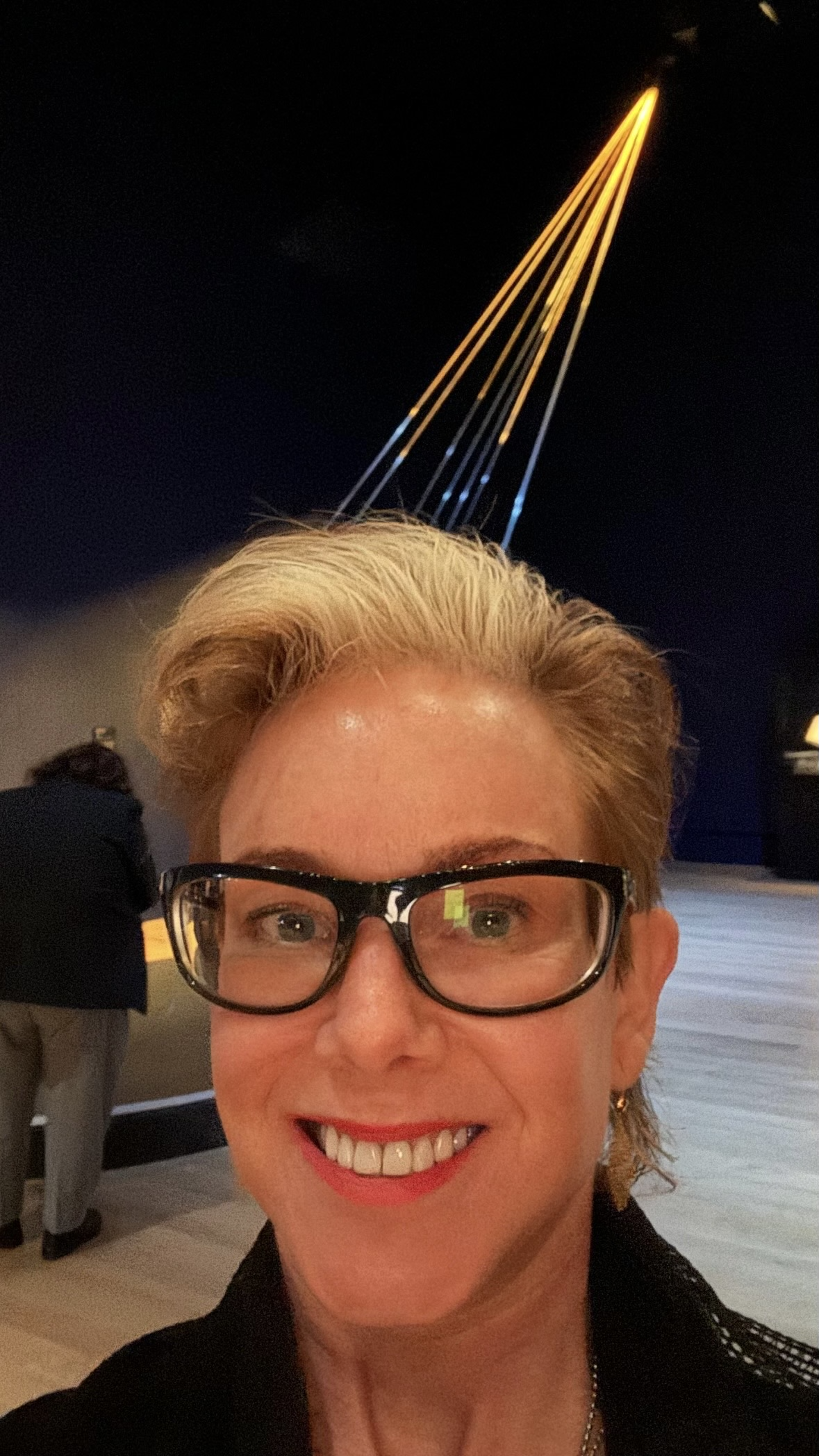
E.V. Day in front of her installation Golden Rays/In Vitro at Getty Museum
E.V. Day’s work considers feminism and sexuality, often within the context of popular culture and in the form of suspension-based installations, ranging from deconstructed couture to skeletal big cats. Based in New York, she has been artist-in-residence at Versailles Foundation Munn Artists program at Claude Monet’s Garden in Giverny France, Artpace San Antonio, and the American Academy in Rome. Her work has been shown at The Whitney Museum of American Art, Herbert F Johnson Museum of Art at Cornell University, Lever House, and Lincoln Center, among other institutions. Her most recent solo exhibition “Velocity Drawing and My Crazy Sunshine” featuring mixed media two-dimensional work was on view at Baldwin Gallery in Aspen, CO from July 26 – September 2, 2024, and her installation Golden Rays/In Vitro is currently on view at Getty Museum as part of “Lumen: The Art and Science of Light” through December 8, 2024.
Interview by Devon Dikeou
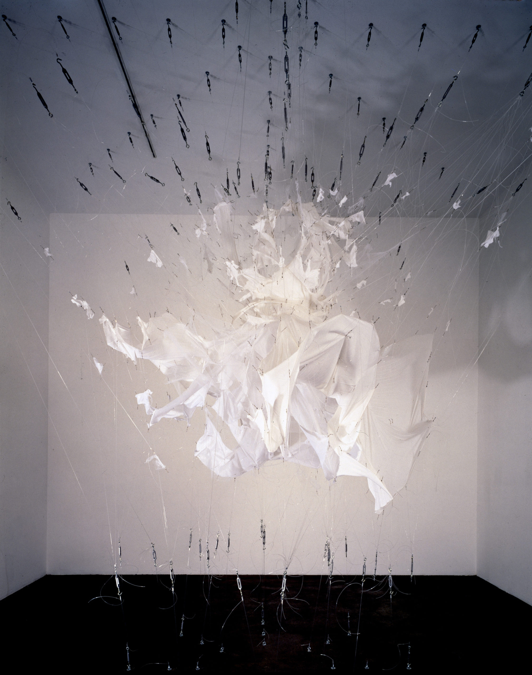
E.V. Day, Bombshell, 2000, white crepe dress, tulle, hardware. 16’ h x 16’ w x 16’ d
Your career bio cites your work in some interesting collections, among them the Smithsonian’s National Air and Space Museum . . . And in your work there is a question of velocity vs stillness that is very much what the National Air and Space Museum is about, a museum that brings things that garner such otherworldly force to a standstill . . . That impulse very much embodies your work, I’m thinking saber-tooth tigers suspended in animation while in the midst of a fight, familiar opera costumes dancing in air without their divas. Rockets in wait, sans flight . . . Iconic dress in exploding deconstruction without the icon . . . Talk about what attracts you to this juxtaposition . . . Of velocity and stillness . . .
I feel the relationship I am after or the juxtaposition I am attracted to is more “velocity” and “capture.” Capture by freezing time. I’m looking for that juicy moment before the subject dissolves into something unrecognizable. And I am not just freezing the moment but animating it. Like Harold Edgerton’s famous flash photograph of a bullet’s penetration through an apple. I’m especially drawn to the fragments that result from the forward thrust of the projectile and the bits of debris from the part the bullet passed through. The magic of this experiment is that the core of the apple is still intact at that moment. I like the image of rupture coming as well as going. This is the kind of energy I want in my sculpture.
Rupture and capture are an essential relationship in many of my sculptures. Bombshell, from the “Exploding Couture” series, is a perfect example. But it’s different from the action of Edgerton’s photo, because I’m not portraying forces of penetration. I’m animating the garment by pulling it from all directions as if the explosive force of raw energy comes from within the dress. The power is generated inside. The “suspended sculpture,” as I call it, is trussed up in a gesture that suggests the familiarity of the iconic image of Marilyn Monroe’s billowing dress from the iconic scene in The Seven Year Itch (1955). Frayed fabric and debris of the partially deconstructed dress are suspended with tension of the fishing lines, and they appear as projectiles directed away from the center. I use tension as a material. Without the tension on the lines, there would be no sculpture. It’s a tensile sculpture.
I also think of what I do as drawing lines in space. Visually, the translucent lines glint when lit, like contrails of the tattered fabric. The monofilament suggests movement by the way the light interacts with the translucency of the material and at the same time it’s literally capturing the material. It’s all a paradox: stillness and motion, tension and release, all captured at the same moment. The tension on the lines themselves is somewhat ethereal but it is also the scaffold holding everything together.
Another aspect of capture is suggested or emphasized by the oversized tensioning hardware I use to anchor the lines into the floor and ceiling. I want to emphasize these terminal points to suggest the strength and force, the power and velocity it takes to dismantle such a stubborn societal cliche fixed in place by “the male gaze.” And by attaching the lines to the floor, ceiling, and walls, it suggests this problem of sexism, living through the male’s perspective, is part of the very architecture we inhabit—the social fabric. If these images of my Bombshell sculpture were as familiar or became as iconic as the Marilyn Monroe picture, it would be a great victory. I want the explosion to be ecstatic, orgasmic. The work is a rebellion and celebration of female empowerment. A visual explosion, a moment of transformation frozen in time.
E.V. Day, Golden Rays/In-Vitro, 2024, aircraft cable, gold leaf, monofilament and hardware, outdoor/indoor installation 40 ft and variable, (installed at the Getty Museum, 2024)
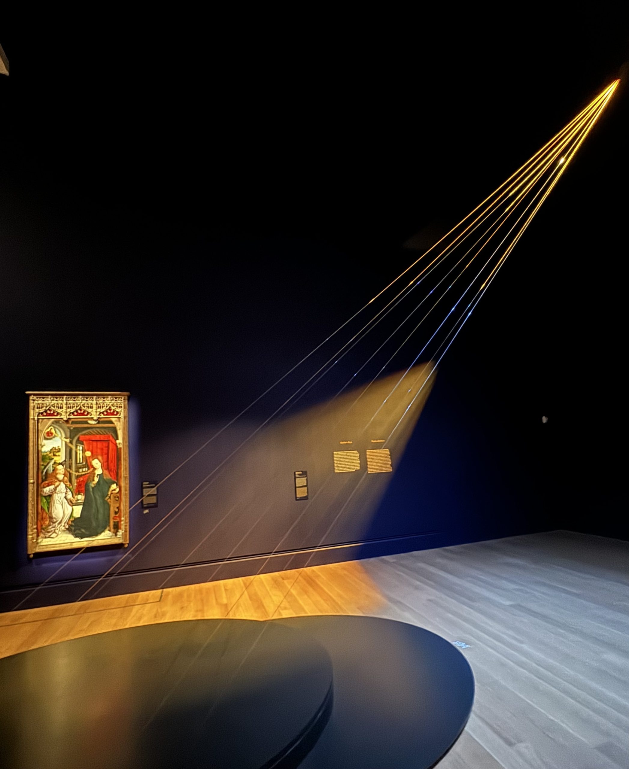
The Annunciation (Detail), Master of the Retable of the Reyes Cathólicos, Spain, 15th century
Which brings us to the illusion of movement in your work . . . A spiritedness both in subject and realization that teases movement but only in an illusory manner . . . I’m thinking of your Rome Prize installation Golden Rays/In Vitro a glass bending illusion of ethereal light from god or sun made sculptural and literal . . . Please elucidate . . .
My first stop in Rome was to see Bernini’s Ecstasy of St. Teresa. This marble masterpiece captures the saint writhing in ecstasy on a cloud that seems to float. But it wasn’t the depiction of a saint experiencing an orgasm that fascinated me, it was the golden rays in the background that activate her and set the entire ecstasy scene in motion—complete with an angel about to launch a golden arrow at her heart.
The rays are made of streamlined, gilded strips of wood, which contrast sharply with the otherwise heavy materiality of the baroque stone carving. Their sleek, modern look reminded me of modernist art of the 1950s and ’60s often seen in bank foyers. They also resembled renderings from science fiction films—images of transport beams like “Beam me up, Scotty” or the exaggerated rays from a cartoon ray gun.
From there, I began collecting hundreds of images of golden rays from paintings, most of them depictions of the Annunciation from the medieval and Renaissance periods. I also gathered images of light beams from science fiction illustrations and films. I connected the two and started calling them “Shazams.” The rays in Annunciation scenes became rich material for me to explore themes of overt sexism in the Catholic Church, especially around Mary’s “non-consensual” impregnation and the concept of the Immaculate Conception. If pregnancy occurs without the intersection of male and female sex organs, then where does it happen? In a petri dish? It felt like an early suggestion of in vitro fertilization, and the golden rays themselves seemed to resonate with contemporary communications, satellites, laser beams, fiber optics, and Wi-Fi.
I wasn’t sure what to do with this obsession at first, but I eventually decided to create some golden rays of my own. I suspended gilded aircraft cables through my studio skylight, 32 feet above the floor, extending them out a pane of glass to a gravel terrace 45 feet away. The installation worked best at night when it could be illuminated, but during the day it almost disappeared, becoming lines that captured light.
Rays of light are ethereal, much like the concept of God. Light is intangible, and in creating my rays I was trying to materialize that intangible quality for myself. This is where my sculpture, Golden Rays/In Vitro, originated. It feels like a miracle, perhaps even from God, that my rays—which I recently installed in The Getty’s show “LUMEN: The Art and Science of Light”—landed in this exhibition about light in art from the medieval and Renaissance periods, surrounded by artworks that inspired my sculpture. The Getty commissioned me to re-make Golden Rays/In Vitro as an indoor piece, and it’s suspended in the gallery right next to an Annunciation painting that I had used as a source image. The context is perfect!
Light and rays are not physically tangible, but they carry a mystical power, an invisible force, announcing divine presence. You can’t capture a ray of light with your hand but you can feel its warmth and energy. I often find myself trying to make the ethereal tangible.
E.V. Day, My Crazy Sunshine I, 2024, paint and pencil on paper, mounted on board, 36” h x 60” w
But moving onto the series of two-dimensional works at Baldwin Gallery in Aspen . . . The twenty pieces titled “Velocity Drawings and My Crazy Sunshine” still capture the essence energy and motion while resting firmly within specific two-dimensional confines, even frames . . .
The drawings at Baldwin Gallery, which was my first show of two-dimensions, are soaked in the aesthetic of Italian Futurism—I emphasize the aesthetics, not the Fascist politics of that era. It was a time of industrial acceleration, much like the technological speed we experience today with computers and AI. I’m drawn to the aerodynamic style and the promise of velocity it represents. In college, when I discovered Italian Futurists like Balla and Boccioni, I had an “a-ha” moment—I suddenly felt connected to their vision of a world shaped by cars, trains, and airplanes, all designed for speed. This phenomenon feels similar to the acceleration of today’s tech evolution, like Apple’s sleek “retro space-age” designs in white plastic. What I love about Futurist paintings is their attempt to render transcendence—pushing beyond the still-life to capture motion.
Other influences of mine include Moholy-Nagy’s plexiglass drawings, photograms, and Brancusi’s sculptures, which are full of velocity. Growing up, I attended vintage car races with my dad, who used to race a 1949 roadster. I loved the feeling of speed, the centrifugal force of turns, the sound and smell of it all. Coincidentally or not, these drawings have an automotive origin story. I was commissioned by Jimmie Johnson, the NASCAR Cup Series Champion, to make an artwork from the fire-suit he wore in 2006 when he won his first Daytona 500. He and his wife, Chandra, collect contemporary art, and had seen my work. For my proposal, I made a 3-D wireframe model of the suit in a state of suspended deconstruction. Once complete, I experimented with distortions of the wireframe model and all kinds of dramatic compositions evolved. It was so much fun, I wanted to live in the drawings! The lines felt like they cut the space with velocity just the way I like it. I started putting them on paper and canvas, using only the colors in the suit, with pen, pencil, and paint. So, the “Velocity Drawings” were born, and the next composition series became “My Crazy Sunshine.” I have never made something so bright and sunny, it seemed crazy. So that’s the title.
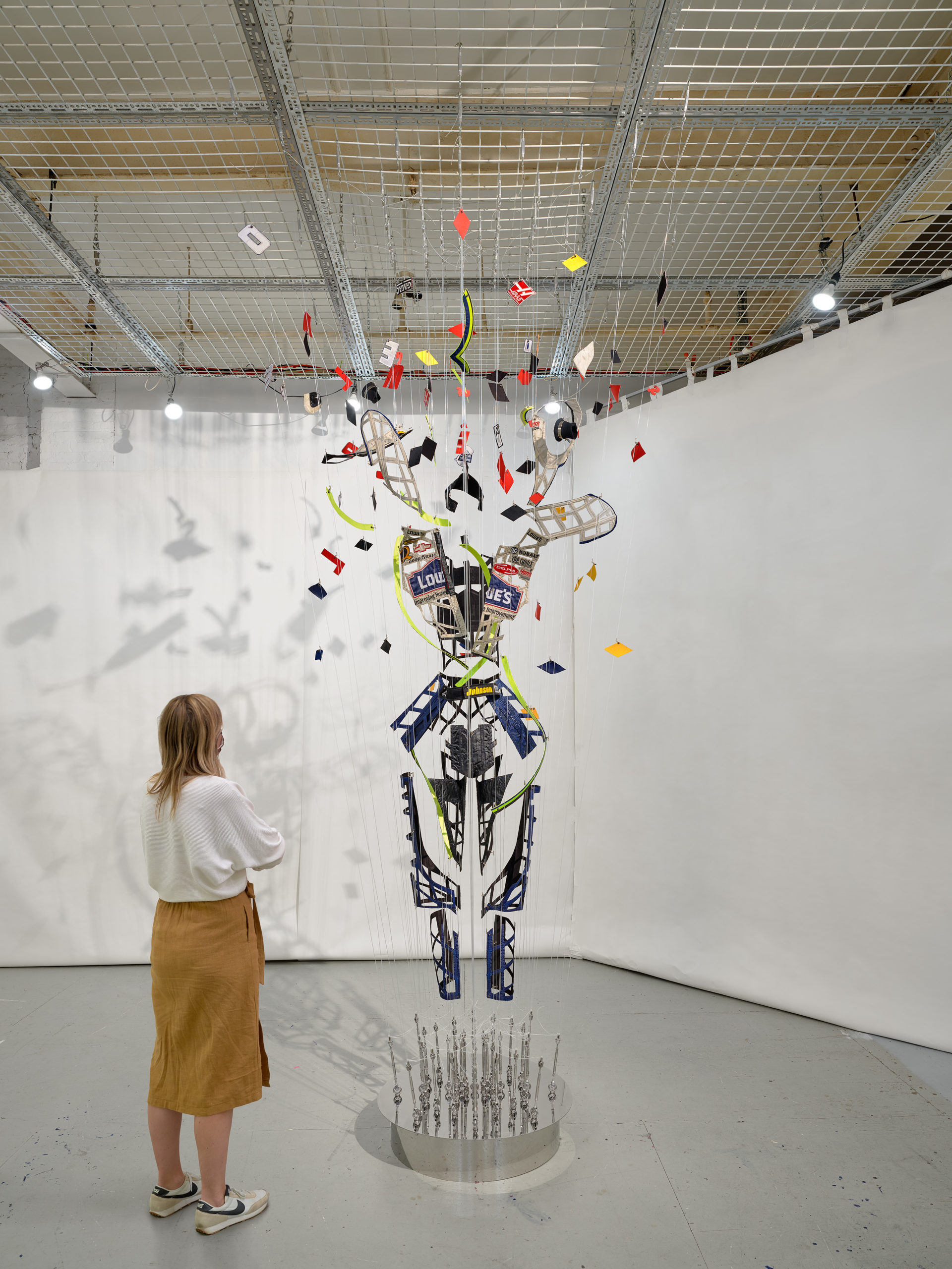
E.V. Day, Daytona Vortex, 2020, Commissioned sculpture for Jimmie Johnson, NASCAR fire suit worn by Jimmie Johnson at his first Daytona 500 win, monofilament, hardware, and mirrored stainless steel base, 149” h x 96” w x 96” d
Some pieces even cite Zaha in the title . . . Is that a reference to Zaha Hadid, who in my mind certainly embraces ideas of futurism in her architecture . . . Can you address Zaha, and titles in general.
For me, Zaha Hadid captures the narrative of speed better than anyone. I first discovered her work when in college while browsing architecture magazines in the library—a habit I miss for the serendipity of finding new things. Her drawings felt so familiar, almost as if I already knew them. It took me a while to realize that Zaha Hadid was a person, not a movement or collective, and even more surprisingly, a woman! Back in the ’80s, technology hadn’t quite caught up with her vision, but she was already speaking to me through her work.
These two drawings are in the “Velocity Drawing” category. They’re identical but face away from each other—one in a bluish palette, the other in yellow. I felt like I was plagiarizing her work, though I couldn’t find the exact drawing I was thinking of. It’s an ode to her. When asked who I’d want to share a two-person show with, I said, “A Zaha Hadid building.”
E.V. Day, Flyby Zaha (Blue), 2024, Paint, ink, tape, acrylic medium, pencil on canvas, 32” h x 48” w
A couple of spacemen and ghosts of the commercial Lowe’s logo crop up in these drawings that bring a more contemporary pop touch (Rosler/Warhol) while also making reference to the grandfather of movement Cubism and collage . . . Speak about elements of collage and or pop in your work . . .
I’m a fan of pop art; my work often originates from themes addressing popular culture, but it is definitely not pop art. In some of the drawings, I collaged images of astronauts that I screen grabbed from 2001: A Space Odyssey (1968). The figures’ spacesuits show a cut cord as HAL has ejected them from the mothership. They are floating toward an energy field or a black hole. I imagine the drawings as immersive and infinite, so I included those untethered little spacemen for scale.
E.V. Day, Spacewalk, 2024, paint and pencil on watercolor paper, 11” h x 8.5” w
Lastly, Edison or Tesla . . .
Tesla, of course, but I’m not eager to own the automobile version. They are prematurely “automatic,” driverless, etc. Tesla was a creative genius; Edison was an all-out marketer who exploited him for his ideas. I read that had Edison not marketed electronics, we might have free electricity. Tesla is my man; I even made an artwork called Tesla’s Mistress. It’s a bit melancholy, but I wanted to honor him in some way regarding the visualization of electricity. This idea came about as I was interested in trying to visualize the flow of electricity. In his biography, it is said that he never had any romantic relationships, but at the end of the book, he has the companionship of a pigeon/dove that visits him regularly at his window in the New Yorker Hotel building, where he died alone and impoverished. Very operatic. It could be a good story for an opera, with the rivalry between Edison and Tesla, where the main character who dies in the end is male, as opposed to the usual woman . . .
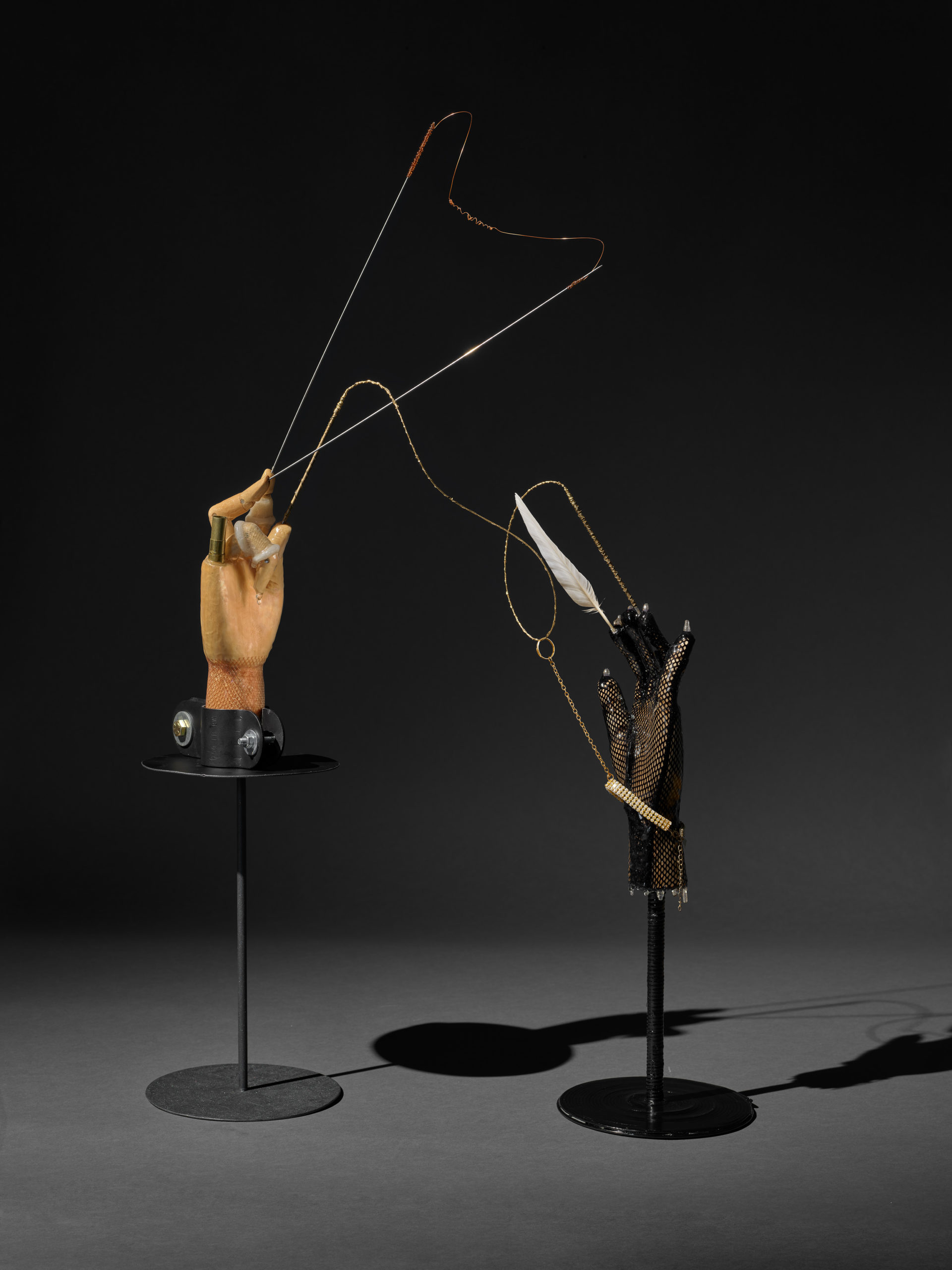
E.V. Day, Tesla’s Mistress, 2020, Wooden mechanical hands, fishnet glove, metal, gold leaf, rhinestones, resin, and feather, 36” h x 22” w x 9” d
To return to your question about NASA: I was commissioned by NASA to create an artwork for the Smithsonian National Air and Space Museum. I was invited to visit the Jet Propulsion Lab north of Pasadena, where I met rocket scientists, engineers, geologists, and astronauts. At first, I felt like a fish out of water, but quickly realized about these experts that we had more in common as we are all explorers, dreamers and problem solvers. Most artists I think are curious people, trying to satisfy something that’s never existed before, by exploring, experimenting, and optimism about potential discovery. Problem solving. If there is any overriding theme to my process as an artist, it is problem solving. Experimenting with combinations of materials that are new to me, logistics, learning about the infrastructure of various museums and buildings to figure out how to securely hang my artwork. Like with Golden Rays/In Vitro piece I mentioned that I recently installed at The Getty, which is a Richard Meier building, you’re not allowed to paint or touch the exposed, brawny I-beams in the ceiling, as mandated by Meier. And the floor similarly cannot be marred in anyway. So, it’s been a real creative workaround with the installation team and exhibition designer, and we figured out how to make it work.

Mars Rover “Opportunity”
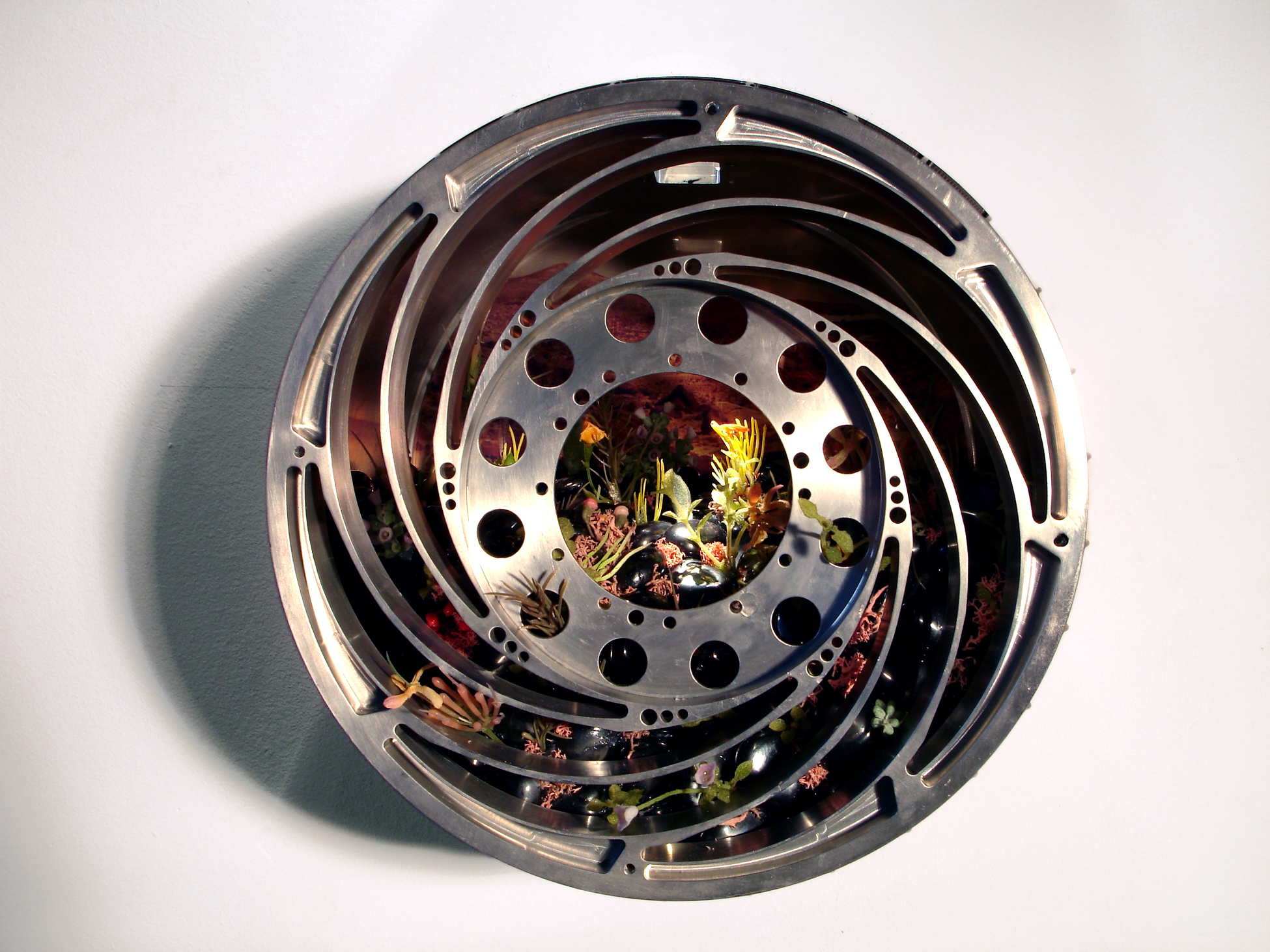
E.V. Day, Wheel of Optimism, 2006, Milled aluminum tire from NASA Mars Rover, hematite rocks, artificial plants and photo, 9” h x 9” w x 8” d
But back to NASA . . . initially, I envisioned a project that would explore the concepts of stealth technology, velocity, and space travel. But most of the people I met were exclusively searching for evidence of water on Mars. I met engineers who were building a machine, named by the acronym RAT, to carve out Martian soil samples. I caught the “search for water” bug from a geologist, who showed me images of the surface of Mars, mostly iron ore with concentrations of sphere-shaped nodules of hematite, referred to as blueberries. I imagined miles of polished reflective hematite rocks like the ones you see at the gift shop at a nature museum, covering the land. To me this image seemed really outer space-y, otherworldly, a little like a backdrop for Barbarella’s habitat, and a new approach to my project was sparked—especially when one of the engineers handed me a spare tire from the Mars rover, and asked, “Could you do anything with this?” He handed it to me, looking straight into my eyes like he was entrusting me with a holy relic, which it kind of is. The idea was that I would return the tire to the space program but as a work of art. It was a magnificent specimen of engineering, a sleek, silver cylinder milled from solid aluminum and measuring 8 inches by 8 inches by 9 inches. As I ran my fingers over its smooth, cool surface, I could feel the weight and precision of its construction. It is the prosthetic toe of humankind on Mars. The tire became the centerpiece of my project, symbolizing the potential for life and growth on Mars. I imagined the interior hollow space as a lush oasis, filled with diverse flora, mineral-rich rocks, and an image of a Martian vista in the background from their archives. The diorama was a tangible representation of my vision for a hydrated Martian world. I ended up making something not just about space but more about hope and the endless quest for discovery.
Ester Partegàs at opening of “Steady” at Marfa Ballroom. Photo by Sarah M Vasquez.
Ester Partegàs is an artist and educator born in Barcelona, and based in New York City while being a part time resident of Marfa, TX and Barcelona. Her work has been shown at Fundació Joan Miró (Barcelona), Essex Flowers (New York City), Pure Joy (Marfa), The Drawing Center (New York City), The Museum of the City of New York, MACBA Barcelona, SculptureCenter (New York City), Whitechapel Gallery (London), among other venues. She was recipient of the 2022-2023 Rome Prize, a 2004 Joan Mitchell Foundation Grant, and has been an artist-in-residence at Chinati Foundation. She’s been faculty at Yale School of Art, Virginia Commonwealth University, SUNY Purchase, and Parsons School of Design. She was recently part of a two-person exhibition with artist Michelle Lopez at Ballroom Marfa titled “STEADY” (April 17 – September 8, 2024), organized by Daisy Nam. The exhibition will travel to CCA Wattis Institute for Contemporary Arts in San Francisco, opening January 21, 2025.
Interview by Devon Dikeou
Ester Partegàs, Twilight (laundry baskets), 2024. Courtesy the artist and Ballroom Marfa. Photo by Heather Rasmussen.
So “STEADY”. . . Your show at Marfa Ballroom (with Michelle Lopez) in my mind is an exploration of the mundane and balance . . . Can you speak about your relationship to the mundane, balance and your work’s juxtaposition with Michelle’s . . .
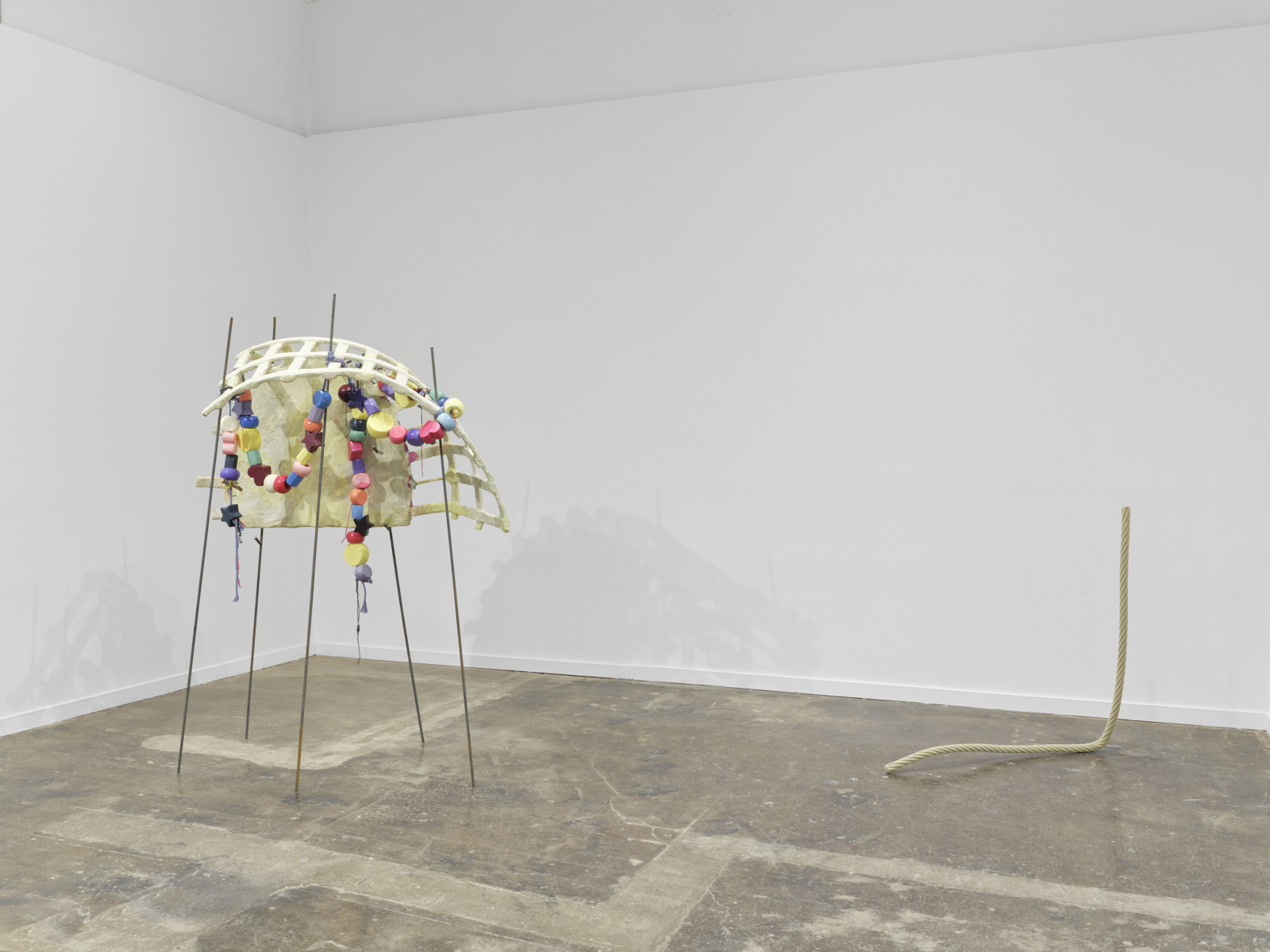
There are many juxtapositions between my work and Michelle’s. All the works in “STEADY” play with balance in a seemingly precarious way. Michelle’s ROPE PROP REVERSAL (2023) held upright through a careful balance of tension and counterweight, for which she has torched the steel to make impossible movements and bends. The main body of my sculpture Knots (2024) is held up in the air by five unattached rebars, and Twilight (2024) as much as Host (2024) needs other collaborative bodies to stand up. The sense of imminent collapse is palpable. For both of us, balance is only real and believable when it integrates contingency and vulnerability and accepts another’s support. Daisy Nam, the curator of the exhibition, explains in her introduction that balance here is not an independent act but interdependent.
The mundane is the position I want to speak from. The present continuum that’s right here right now that pervades everything all the time. The mundane allows me to demystify and present a different perspective on what has been deemed important and memorable. Both Michelle’s and my work render power structures vulnerable and propose a material landscape that is tender, alive, and playful, instead of separated and authoritative. Take into account that our embodied experiences as women artists, mothers, and immigrants also play a big role in our works.
Mundane are also my materials: cardboard, fabric, wool, bricks, steel rods, and paper mâché; specifically, for the “laundry basket” series. I wanted to make sculptures without a pre-designed final form but provoke a form that can reveal itself while making, by articulating discoveries, by assimilating contradictions. I wanted to work like a painter works. In this process, the materials are forced into a cycle of destruction, deterioration, and mending, giving the work a vital experience. For these reasons, the materials had to be easy to manipulate, not precious, malleable. My wish is for the viewer to sense that working.
Ester Partegàs, Knots (laundry baskets), 2024, and Michelle Lopez, SINGLE LINE, 2023. Courtesy the artists and Ballroom Marfa. Photo by Heather Rasmussen.
Also, I feel like your work, and this is for a long time now, is really engaged with moments. Much like Vija Celmins. Bringing the moment to the monumental . . .
I would say attention. Or moments in the sense of the small and ephemeral. Of something that is ever present but invisible at the same time. I love Georges Perec’s neologism of the “infra-ordinary.” The “infra” points to yet another level of depth of something we assumed had touched ground, or had nothing else to offer.
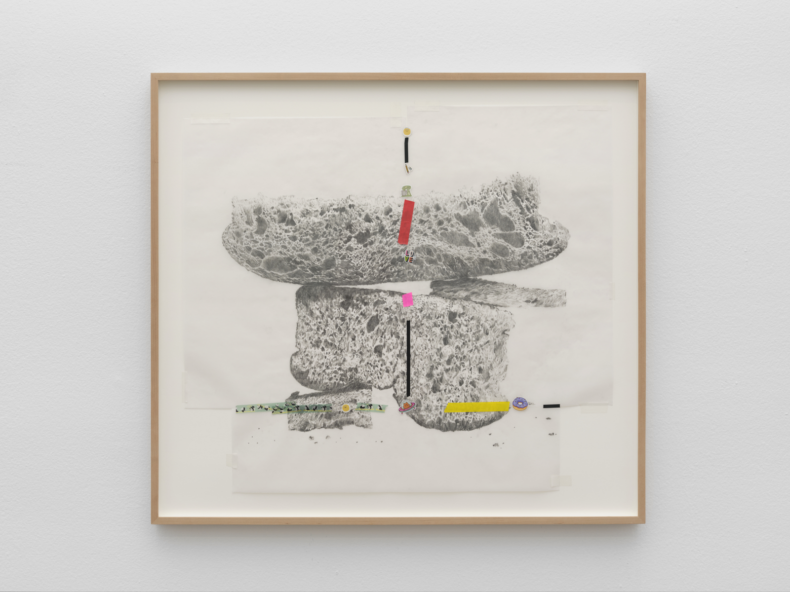
You won Rome Prize 2022/2023 and started a series of drawings of bread . . . Some of which seem to come from that Rome body of work are in “STEADY”. . . Drawing the bread super hyper-realistically and then taking it back to our other hyper-reality by putting/attaching stickers that act as emojis to the drawings . . . That surface gesture in the real form of course changes the spatial integrity of the realism . . . Can you speak about that . . .
The realism of the bread seemed necessary to blur bread and stone together. The drawings portray slices of bread that behave like stones: piling up, balancing, and building shapes. The pencil drawings looked very precious, maybe too precious, a bit archaic, or old, and I had to bring them to the present. The mundane for me is irreverent because it is direct and can’t hide, it presents itself as is without filters. Part of the irreverence is that it leaves interpretation directly onto the viewer, the mundane hasn’t had time to be managed.
The stickers came about via colored tape, which simply was what I had in hand to temporarily put together several 8.5” x 11” sheets of paper to produce a larger drawing surface. And it was only later that I realized that was exactly what I was looking for. Since my daughter, 8 years old, has access to my studio, her materials—colored tape and stickers—are around. Both the tape and the stickers allowed me to structurally bring the sheets of paper together in a similar way the sculptures are put together from different fragments. Again, an interdependence. And by structure, I mean something that holds things together in a material and also immaterial way, like the little messages we send to family and friends throughout the day expressing affection and care.
Ester Partegàs, knead, penetrate, let go (cat spaceship donut), 2024. Courtesy the artist. Photo by Heather Rasmussen.
In issue 17 of zingmagazine we published a poster of a drawing you made, which subsequently became the series, “Detours”. . . It was a brilliant super-realistic drawing of what one could potentially buy at the store that day . . . A receipt, the kind most people crumble up and throw away . . . Or just toss into a pile of stuff to deal with later . . . that bit, that generally escapes one till the beginning of April and the accountant . . . Purply in the way receipts are . . . However, looking carefully reveals it’s not dish soap or toothpaste but abstract ideas . . . Buying some notions/sundries/household goods and saving its receipt, a most beautiful and complete gesture . . . But buying thoughts/happiness/unhappiness/the metaphysical while maybe unattainable or attainable may also be equally fulfilling or unfulfilling . . . And that body of work—“Detours”—informs the commemoration of life’s banality . . . Much as “STEADY” does . . . Thoughts . . .
I work from the assumption and proposition that nothing is banal. Behind each small act there is a huge emotional investment. When you buy a $2.00 chewing gum, you might think “I have bad breath,” “I feel anxious,” “I need something in my stomach before dinner time.” When I make these drawings, my exercise is to listen carefully to the many thoughts my brain produces regarding that little action. The series is called “Detours,” referencing the psychological detour we take, like nothing is a straight line. If you make that observation within yourself, I am sure you will be able to translate every desire into an actual purchase, into a receipt. Besides all this, I find paper receipts per se quite beautiful, literally like drawings of the everyday. Unfortunately, the non-digital ones are slowly disappearing and soon will be non-existent. I recommend spending some time looking at the different fonts, ink colors with their mistakes and blots, read the amount of information disclosed as a testimony of that precise moment.

Ester Partegàs, Detours (Somedays I Feel So Worthless), 2002, poster published on occasion of zing #17
It leads to my last question about the sculptural enlargements/fragments of laundry baskets highlighting their psychedelic melting quality . . . Certainly tackling issues of home and life in general, but on a formal level also leads to questions about space, sculpture, line, even painting. Frank Stella made a career of addressing these formal issues. In the ‘80s he influenced the whole scene of artists—his contemporaries at the time of his second retrospective at the MoMA—as well as other generations from Rachel Harrison, Isa Genzken, to Jessica Stockholder. . . The works in “STEADY” address issues of painting and sculpture and our recent history both formally/visually . . . Can you speak more about your work in a more formal sense . . . Because I think there is a real relevance to Stella’s critical treatise Working Space and the generational work that came out his practice/ideas in your work. . . And the work in “STEADY” . . .
I am glad you are bringing painting into the conversation. The color in the laundry basket series is informed directly from the commercial laundry baskets themselves. They mostly come in pastel colors with implications of softness, quietness, and order in an attempt to idealize the domestic of course. I am interested in working with those assumptions and then working on those colors attaching them to other moods. I want to make them seductive and also repellent at the same time, I want to make them scream or act bitter. I modify the intensity of the color by adding other pigments, dirtying them, or layering them. As far as your mention of Stella, I need to clarify that growing up in Spain we had other influences. Thus, I have not read Stella’s book, but now I am eager to hear what you have to say about it. The lineage I received ran through modern giants like Dalí, Miró, Picasso, and Tàpies, always presented like larger-than-life characters I was completely mesmerized with. This is a simplified version of my history, but for the sake of brevity, I can say that for me it jumped directly to Warhol, Beuys, and the ‘90s, where I encountered Jessica Stockholder. Both Warhol and Stockholder have been huge influences especially when it comes to dealing with consumer objects. I can trace a before and after in my own working and thinking. With Jessica’s work, I had never seen the freedom objects and colors could produce together. The work exuded energy, aggression and playfulness, while also standing as really good painting and sculpture in a way that is fascinating and unfathomable in the large installations.
Yolanda Fauvet, exhibition curator
What am I? ¿Qué soy? at Museo de las Americas showcases Anthony Quinn’s rich and varied artwork, highlighting his lesser-known talent as a visual artist alongside his renowned acting career. Through self-portraits, sculptures, and prints, Quinn explores themes of identity, heritage, and self-discovery. His work reflects his Mexican-American background and the duality of his public and private selves. The exhibition emphasizes Quinn’s lifelong journey of examining his origins and the roles he played both on and off screen. I chatted with exhibition curator Yolanda Fauvet about how his art invites viewers to engage with their own identities, encouraging reflection on how personal and cultural histories shape who we are.
Interview by Hayley Richardson
How did you first become acquainted with Anthony Quinn’s artwork? What is the backstory of how this exhibition came to fruition?
I didn’t know much about Anthony Quinn when I was invited to submit a curatorial proposal about his artwork last October. I hadn’t seen any of his movies that I could recall, so most of what I learned about him I had read online. And I have to admit, it took me some time to warm up to him and decide to submit a proposal. Not everything that comes up on the search engine is exactly favorable and, as I went down the rabbit hole of movie trailers on youtube, I felt sensitive to the disrespectful ways many of the female characters where treated or portrayed. To that point in particular, I had to remember that many of these films date to another time and reflect the social norms of my grandparents and not our own (and heck, I even have trouble watching movies and shows I grew up with now). But in a time when we are now pushing to make room for more non-hetero male perspectives, I felt I needed to find something personally meaningful to connect to before being able to stand behind this project.
And then I came across a 1994 tv interview conducted in Spanish alongside Mexican actor Ricardo Montalbán (you may know him from Fantasy Island or Planet of the Apes). Both actors were being commemorated for their contributions to enriching Mexican cultural pride abroad. As I watched, it caught my attention the ways in which Anthony Quinn’s Spanish was subtly and not so subtly corrected, an experience that hit very close to home and has often left me feeling vulnerable. It was in this shared vulnerability that I was able to connect to the human experience of growing up as a Mexican-American in the United States. Albeit in different eras (Quinn was born in 1915 and I in the ’80s), it was inspiring to see how he was able to shrug off with a smile and joke something that, when done by certain people and in a certain tone, has hit like a dagger and made me feel like I didn’t belong in a country that I’ve longed all my life to be a part of. So all of a sudden, deep in the pangs of my always longing heart, my quest to explore different aspects of Quinn’s bicultural identity alongside his artwork became apparent. I don’t think it couldn’t have fit a better audience in Denver than that of Museo de las Américas, a museum dedicated to exploring and celebrating Latin American culture through art.
Once my proposal had been chosen, the next major challenge was narrowing down the selection of work. Museo is not exactly a small space, but Quinn was very prolific, and it took me three site visits to the Anthony Quinn Estate to make my final selection. Several works on paper, sculptures and paintings of all scales, and a vast personal library fill the equivalent of three barns, not to mention the pieces displayed throughout the Quinn family home! Fortunately, his wife Katherine has done a wonderful job of preserving and cataloging his work, and it was such a pleasure getting to know her and her own story over this past year. It was in conversations with Kathy during my visits to their beautiful Rhode Island home where I began to get to know the “Tony” she knew, the “Tony” that loved his family and was a fierce creative being, not just a juicy subject for the tabloids. In these conversations, I also learned of the many youths that the Quinn family has inspired and supported since his passing through the art scholarships given by the Anthony Quinn Foundation. And just as Kathy’s face would light up when speaking of her husband, I began to notice a similar effect on other people I spoke to who knew of him through his films.
Anthony Quinn in his studio, image courtesy of National Hellenic Museum
So through my conversations with Kathy and with close friends who are bicultural artists working today (Adán de la Garza, Ethan Bradford Barrett Villarreal, Viera Khovláguina, and Amanda Beard Garcia), I began to identify a progression of self-portraiture in Anthony Quinn’s work that would allow me to talk about identity, centering on the question of What am I? Which is something we’ve all asked ourselves in one way or another but can be particularly poignant for someone who was born in Chihuahua during the Mexican Revolution to an indigenous Mexican mother and first-generation Irish-Mexican father and grew up in LA after living in Texas along the US-Mexican border for the first five years of his life. We can only imagine the different waves of stereotypes Quinn was confronted with while working during the Golden Age of Hollywood up until his last movie filmed in 2001. Even though much of his artwork doesn’t overtly address topics we’d expect to see in Chicano or Latinx art today, his body of work gives us the example of someone who dared to ask life’s difficult questions, and we can find a camaraderie in the inner searching he portrays.
Listed throughout the wall plaques of the exhibit, I take the viewers through reflections that expand on the question of What am I?, like, for example, What could have been? This is posed next to an excerpt of Quinn’s writing displayed in golden text in which he himself asks if the Spirits were mad that he had left Chihuahua. Even though he and his mother left out of necessity, there is still a wonder deep within him of what would have happened if he hadn’t of left the place he was born, which I speculate is also something many people living in Colorado can relate to. How many of us are living in homes where we or our parents come from another culture or country?
The title of the exhibition, What am I? ¿Qué soy?, intrigued me because I have often wondered what actors do to psychologically maintain a sense of self when they work so intensely to transform into roles that are constantly shifting. But even prior to becoming an actor, Quinn felt a deep desire to know and understand himself culturally, spiritually, professionally, socially, and creatively; a quest that spanned his entire life and manifests in his artistic legacy. While curating this exhibit and learning about his life, do you feel there are any artworks (or eras) that most potently capture his essence, his sense of self? Perhaps this question has no definitive answer, but I’d love to hear your thoughts.
To your reflection of how an actor would maintain a sense of self when giving themselves fully to their roles and fictional storylines, Anthony Quinn blurs those lines in works where he has depicted himself as characters he portrayed, such as the bronze cast of him as Zorba the Greek (1964) or the painting where he appears as Ukrainian Archbishop Kiril Lakota in the Shoes of the Fisherman (1968). Because he did this for only select films, we have to ask what was it about those roles that compelled him to create these artistic portraits?
We could speculate they helped him understand his characters more deeply, but I’d also like to posit that he found an affinity somehow to what those characters went through. I’m thinking specifically of the painting where he depicts himself as the biblical Barabbas in a barren desert who at the end of the film is crucified and we as viewers are left to decide whether he died believing in God or not. This theme calls to mind another painting in the exhibit titled Promises-Religion that is part of Quinn’s Unfulfilled Promises triptych (1975-2000). This large-scale painting depicts a preacher that is standing next to a crucifix and emphatically addresses a large crowd. While we don’t know the nature of the broken promise in this case, this scene may be a reference to a short time when Quinn was a preacher himself before he began acting.
Anthony Quinn: What am I? ¿Qué soy?, installation view, Unfulfilled Promises triptych, image courtesy of Museo de las Americas
We also know he used to make art on set as a way to help him stay focused in his characters, and perhaps it was a way to ground himself as well. When visiting his barn studio, Katherine showed us the portable box full of the wood carving tools he’d take with him wherever he travelled. In a floating vitrine near his movie portraits that displays four small-scale mounted maquettes, we also have a small wooden carving possibly titled for another film he starred in, Bedouin. Looking at these intimately carved miniature sculptures, I imagine him collecting wood from the different regions he visited while filming or working from a found piece of driftwood from his walks along the shore.
The title of the exhibit comes from the same interview I previously mentioned where Quinn tells an anecdote about when he was a young boy. Given the task of filling out his nationality on a form for school, he asks his father ¿Qué soy, papá? What am I? Which, if we recall his multicultural background, it was not an easy question to answer, and probably less so in the 1920s in the United States. So his father, perhaps in rebellion against this form of categorization, wrote every nationality that he could think of on that card. Quinn tells this story with pride many years later after he went on to portray many nationalities through his many film roles around the world. In another interview clip that’s on view in the exhibit, we learn that this was one of his biggest motivations as an actor, to be able to become a Greek, Italian, Mexican, just about any nationality he wanted, on screen. It’s through this ability that he was able to surpass the stereotypical demeaning roles given to him at the beginning of his career and go on to be the first Mexican-American to win an Academy Award for Viva Zapata! (1952) alongside Marlon Brando and later a second for his role as Paul Gaugin alongside Kirk Douglas as Vincent Van Gogh in Lust for Life (1956).
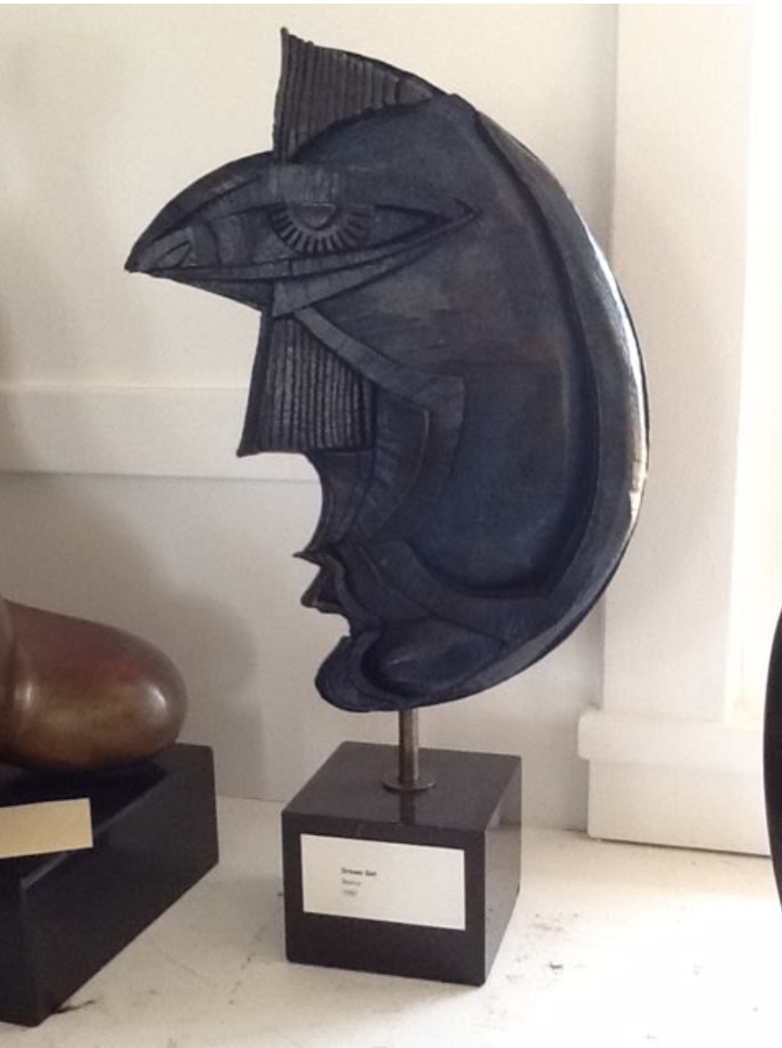
Thinking of Quinn’s interest in becoming different people from around the world brings me to your question of a specific artwork that is representative of him and the sculpture titled Drifter stands out. Much like a literary archetype, we have a sculptural representation of a roaming figure who in someways could belong anywhere and in others doesn’t quite know where to call home. Quinn writes about walking the lonely deserts and sailing the seas with a sense of longing to feel whole, also coming to live in different places in hopes of filling this void. In Drifter, both the original olive wood carving (1978) and its slightly larger iteration in black marble (1980), our eyes are carried along smooth circular formations that overlap into each other, creating this sensation of reaching outside of ourselves in search of answers to the greater mysteries and then circling back inward again in a continuous inward and outward flow. There are no obvious signs of a face here, but I feel it strongly represents a part of Quinn that those of us on our own quests to feel whole can identify with. This is magnified when we add in the bicultural layer of those that may feel, and my apologies for the cliché but in this case it becomes very real, that they are from neither here nor there.
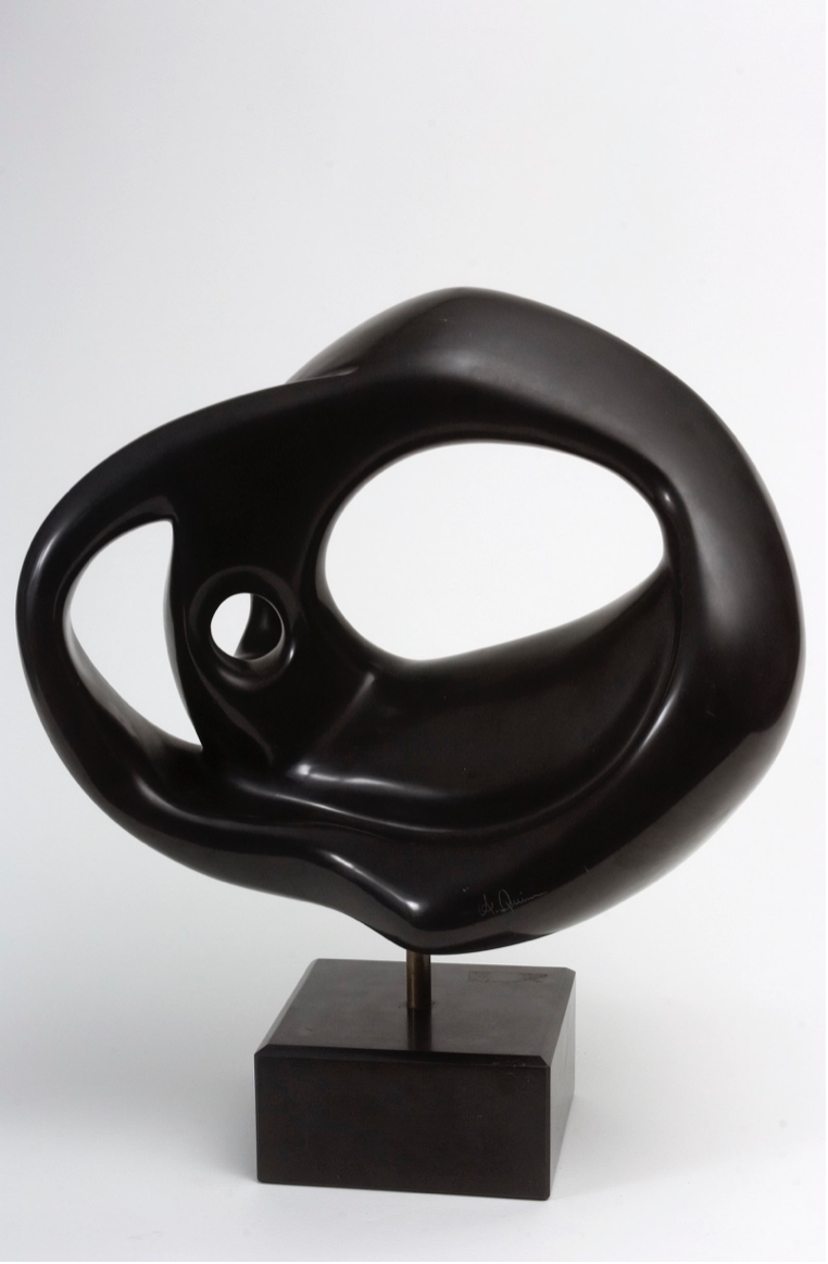
Anthony Quinn, Drifter, 1980, Black marble, 14 x 17 x 9 in, 35.6 x 43.2 x 22.9 cm, AQ2012.004.2), image courtesy Anthony Quinn Estate
In terms of eras, as you noted on our walkthrough together, many pieces selected for the exhibit date near or during the 1980s, Drifter included. At this point, Quinn was in his mid-sixties to mid-seventies and had already acted in over 150 movies! He continued acting throughout his entire life, of course, but his most seminal films were behind him at this point and he was ready to focus on his longtime calling to be a visual artist. It’s something he’d fostered since he was young, drawing portraits of people and taking classes when he could. He had even earned an opportunity to study architecture with Frank Lloyd Wright in high school. Katherine described Quinn as someone who was often compelled to draw what he saw. You’d easily find him sketching on the backs of restaurant menus or stopping whatever else he was doing to capture the magnificent landscape before him. But something happens around the 80s where he has the time and space to work more consistently and freely.
Now he is able to move past what I would consider to be studies in techniques into more experimentation where he really expands his use of color and scale and begins to define his own unique mark making. We can definitely notice influences from Joan Miró and Pablo Picasso, and I believe you also mentioned Georges Braque. But whether we’re looking at a lithograph, wooden assemblage or bronze cast from that time, there’s something that makes it uniquely Anthony Quinn, particularly in the eye imagery that we see repeated throughout the exhibit. It’s also important to note that he had his first solo exhibition in 1982 in Honolulu, where reportedly he sold every piece on display. This probably would have been very encouraging and meaningful to him because, up until that point, he’d only been the subject of an art exhibit at the MOMA in 1968. Titled The Career of an Actor, it featured 140 of his movie stills and pays beautiful homage to his true talents on screen, but I have an inkling Quinn would have preferred to be shown amongst the visual artists with his own creations.
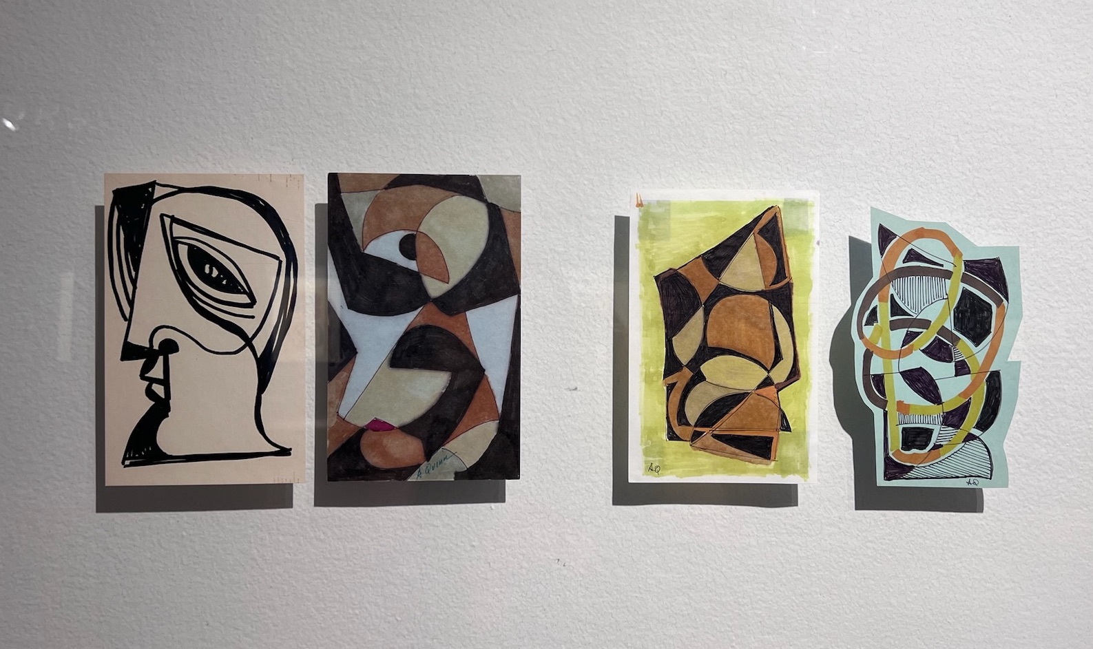
Self-portraiture is the central theme of the exhibition, but there are many highly abstract works depicted through the various media Quinn utilized. How do you think abstraction represents “the self” in his artistic output, or for artists in general?
One of the most enjoyable parts of installing this show was grouping pieces together that connected visually somehow, whether through color palettes, composition, or repeated geometric forms. My hope was that any viewer with any level of art could feel the invitation to engage in their own visual explorations and make connections between artworks from different eras and even materials without feeling like they had to read anything or have any prior art history knowledge. In this exercise, to my surprise, progressions began to emerge where the drawing of what was very clearly a face with a boldly drawn eye morphs over the course of four drawings into a completely abstracted figure composed of overlapping outlines of triangles and circles going in all different directions. Or in another example, a small geometric horizontal drawing, when turned upright, becomes the side profile of a man’s face that we see in the two bronze versions and original wood carving of Maquette II.
Drawings by Anthony Quinn, image courtesy Yolanda Fauvet
Up until the day of the opening, I was still finding semblances of faces where I hadn’t seen them before. This was partly because I had first experienced the artwork either online or in a dimly lit barn, so once the pieces were up in the gallery with professional lighting on them, many of the works seemed to take on a whole other life. The installation period was also when I truly had an opportunity to spend time with the work in person and really delve into the analysis of the question I had laid before me to explore Anthony Quinn’s self-portraiture and see what we could learn from it. So in this progression of unexpected portraits, I landed on a larger oil painting titled Circles with Interruptions (1994), which draws us into a mesmerizing pattern of concentric circles made up of varying bright shades of green, blue, yellow, and white.
Anthony Quinn, Circles with Interruptions, 1994, Oil on canvas, 48 x 36 in, 121.9 x 91.4 cm, (AQ2004.321), image courtesy Anthony Quinn Estate
Visually akin to a walking labyrinth, this painting might lead us to imagine an artist journeying towards the center of oneself, or at least in search of some kind of grounding. Although in this particular curving path towards self-reflection, we are taken off course with straight intersecting lines, most notably a thicker white line down the middle of the bottom half of the entire circular pattern. In the wooden assemblage to the right of the painting, we find a similar line that cuts the composition vertically and forms the outline of a face that is looking to the side. It is enmeshed with another face that is looking forward directly at the viewer. The dual perspective presented to us here is repeated in a few other pieces throughout the show and brings us back to Quinn’s dual identity as a Mexican-American. There is a richness of perspectives when growing up in a multicultural home that is often forgotten because we get caught up in the longing to belong to one side or to the other or a completely different place all together. So in terms of representing “the self,” abstraction and the celebration of all the different parts of us that make us unique was complementary to not only expressing his mixed cultural background, but also the many and varied characters he came to portray in his films. As I said in the inaugural remarks, we won’t find one single Anthony Quinn, but my hope is you will find yourself reflected in one of the many faces found in the exhibit, and I’d add that we can come to celebrate the many identities found within ourselves.
In that sense of refracted abstraction, we can easily identify his cubist influences, but in thinking back to the 1980s when he actually was making this work, we also had artists like Agnes Martin at the time that were turning their abstraction towards the land. In the way Martin painted meticulous repetitions of geometric shapes to portray the beauty and awe she experienced in the New Mexican landscapes where she lived, we can consider that Quinn created his Great Spirit lithographic series in his own response to the land and the spiritual inspiration he found in the wisdom shared by the Native peoples of the region. His mother and grandmother lived for a time with the Tarahumara in Northern Mexico, so it perhaps was with him all along, but in the intro of this artist book that houses the twenty lithographs, he wholeheartedly calls on the Spirit to guide him. So while at first glance we may not place Quinn alongside a minimalist artist like Martin, I think we can consider him within the broader category of artists that sought to capture their impressions of the West through abstract and geometric expressions, like Georgia O’Keefe and even Denver’s own Clyfford Still, whose artworks only add to the sense of pride we feel for this expansive and intrepid Western region.
I love that you consulted with artist friends who share the bicultural affinity with Quinn as part of your curatorial/research process. It’s easy to get tunnel vision when curating solo-artist exhibitions and become hyper-focused working with materials, writing etc that already exist rather than opening the topic up to other people who are exploring it for the first time just like you but still resonate with the work. If you had the opportunity to reimagine this exhibition as a group show, what other artists (both past and present) would you like to include? You mention visual connections with Picasso and Miró. . .
Oh wow, what a fun question! I especially appreciate it because one of my early sketches of the exhibit did include the first three artists I mentioned earlier (Adán, Ethan, and Viera). In the end it wasn’t possible to pursue the route of a group show, and perhaps I was being a little too ambitious for my first solo curatorial endeavor anyway. Certainly, I’m bummed it didn’t work out, but thinking of what a show could look like with these artists together has certainly planted a seed for future projects. Overall, I feel like the show fell into place as it needed to, as a solo exhibit, and will further situate Anthony Quinn as a visual artist in the public eye. Though perhaps an important next step would be to exhibit him alongside other artists and begin to look more thoughtfully as to where he falls within the larger art conversation.
As part of that, there’s also the question of are we looking at his artwork because he’s famous or does his artwork have the merit to stand on its own? I’m pretty sure Devon hinted at this when she brought up Sharon Stone during our pre-opening walkthrough together. It’s something I’ve been pondering since, and it’s an important question to raise for someone whose movie fame will follow him forever. In terms of the art I selected for this exhibition, there was a local relevancy to not only Quinn’s interest in the spiritual traditions of the region, but also in Colorado’s connections to his birthplace due to the large community of Chihuahenses living in the area. I also felt that his presence on Santa Fe Drive pays homage to the longtime Chicano community of the La Alma-Lincoln Park Neighborhood that houses the arts district. In terms of the art itself, ultimately it’s up to each person to decide what is art for them or not, but my personal —and very subjective— measure often lands on whether I feel the work is honest or not. And by golly, I can’t get through reading his entire Great Spirit introduction without choking up or look at The Breath of a Buffalo lithograph without a serene smile on my face. He bared his soul into his creative endeavors and, from what I’ve seen over the course of the show, people can feel it.
My consideration for showing Quinn alongside Adán, Ethan, and Viera wasn’t just because they all share varying degrees of Mexican or Latinx identity, but because of their shared renegade spirit with which they approach their artistic practices. When you live and breathe more than one cultural perspective, you’re bound to push the envelope somehow, and I wanted to celebrate that. In continuing to think of this hypothetical group show, I’d open it up to artists with roots in other parts of the world as well. Another Colorado friend, Tamar Miller, is doing some fascinating textile and text-based work, and Amanda Beard Garcia, the other artist friend I mentioned earlier, paints incredible murals and is fostering community among other Chinese-American creatives like herself with her project Lucky Knot Arts. If you start to think about it, you might know more multicultural people than you think! And by no means would the work in the show have to be about identity directly. It’d actually be rather refreshing and interesting to see what identity themes might naturally emerge without trying to force any particular message.
The thought of exhibiting Quinn with past artists calls to mind another one of his posthumous shows, The T’ang Horse, curated by Ysabel Pinyol. She paired his artwork with objects from his personal collection and we learn that Quinn also admired Henri Matisse. The show draws visual connections between Matisse’s Blue Nude series and Quinn’s own female nude sculptures, and in a similar vein, the style of British sculptor Henry Moore as well, whose nude painting also hangs in the Quinn home. Moore was one of Quinn’s favorites, and we can also see his influence in works like Quinn’s large figurative bronze sculpture titled Destroyed but not Defeated (which was not in the exhibit but his son Ryan writes about it here).
When considering all of Quinn’s influences, we can revel in someone who wasn’t afraid to try out the styles and techniques of the artists he admired. In the wooden assemblage portrait Fez, we see a starburst much like Miró’s in one eye, while the other eye feels reminiscent of the way Picasso would paint eyes with stylistic protruding lashes. In art school we may have been looked down upon for doing this, or at least I felt pressure to come up with my own style without even having learned all of my art technique ABC’s. But as one visitor said when looking at Fez, we can see the historical references are there, but Quinn’s approach feels open and free.
So there’s definitely more to be explored between Quinn and his influences, and a show like that could serve as a brief art history survey of sorts. In some ways, he could be the bridge for people who don’t frequent museums but might recognize him from his films and be inspired to go check out his art. I would be wary of bringing back the male gaze perspective with the nudes, though (unless we’d also have the space to talk about it with a critical lens). For the purposes of this exercise, I would rather focus on works that inspire imagination and storytelling perhaps.
Anthony Quinn, Dream Girl, 1982, Bronze with patina, 16 x 12 x 1 1/2 in, 40.6 x 30.5 x 3.8 cm, (AQ2012.002.5), image courtesy Anthony Quinn Estate
Thinking back to the show, I was drawn to Quinn’s use of blue, the most striking being the all-blue version of Dream Girl. That piece is more fantastical than some of his other portraits, and the blue makes it magical. We can also find it in more unexpected places, like in the highlights of his mother’s hair in the large portrait of her in the Unfulfilled Promises triptych, or even in his own hair as Archbishop Kiril and Barabbas. There was also a vivid blue version of the bronze Song of Zorba that I wanted to include in the movie portraits section, but we couldn’t get a base for it in time. Once you start looking for blue in Quinn’s work, it appears even in landscapes and several of his portrait sketches. Matisse had no lack of blue paintings and Picasso’s blue period comes to mind as well. I’d even include some blue paintings from Van Gogh and Paul Gaugin’s blue trees, as surely we could speculate he may have been influenced by them while working on Lust for Life. Even Henry Moore has some metal sculptures with a blueish patina that I have to think influenced Quinn’s own experimentation of patinas just as perhaps Joan Miró might have inspired him to explore lithography. I’m not sure if I’d be committing some sort of art historical or curatorial crime, but it’d sure be a grand and beautiful show to put together.
Anthony Quinn: What am I? ¿Qué soy?, installation view, image courtesy of Museo de las Americas
On a more personal topic, you spent several years living in Mexico City where you studied in a literary translation program and have since developed this into a profession steeped in community and creativity. Please share more about what you do and what current projects you have!
Two major projects got their ground during my time in Mexico: my translation business, LATERAL, and the literary translation collective that I’m a part of, FALSOS AMIGOS (a play on the nickname for false cognates in Spanish). We’re based in Mexico City and the eight of us got together after graduating from our translation program at UNAM. Our main mission has been to promote collaborative translation processes, mainly by working intimately together on projects, but we’ve started to teach workshops as well. We also use our instagram account to explore different translation issues, techniques, and practices with the greater public. Some of the most compelling posts have been exploring the ways in which translation appears in our everyday lives and getting to hear other people’s thoughts on the subject.
Pretty much as soon as we decided to form the collective we dove right into a large undertaking that carried us through the pandemic and keeps us busy still today. It was our collective mate Dian Barberena-Jonas that brought up the idea of translating an anthology of science fiction short stories written by women that had just been published at the time. Dian’s a huge sci-fi buff and write’s their own science fiction as well, but the rest of us were a little intimidated by the idea of working with a genre we weren’t as familiar with. But as we read the stories we quickly connected to the very personal female experiences and societal issues that were being explored through these fictitious or futuristic scenarios, and so we took it on. We were excited to see the ways in which women have always been at the forefront of the genre, and it’s been pretty rewarding to have our translations of the stories be received amongst science fiction and writing communities throughout Mexico.
Edited by Lisa Yaszek, the full title in English is The Future is Female! 25 Classic Science Fiction Stories by Women: From Pulp Fiction to Ursula K. Le Guin. For the Spanish version, we worked with the publisher Almadía and divided the anthology into three smaller tomes: Mundos alternos, Retro futurismos, and Futuros distópicos. I believe all three are out in Spain and the second, Retro futurismos, just hit the shelves in Mexico. Actually, I’ll be going to Irapuato, Guanajuato, to present the book with a couple other collective mates in mid-September. We’re also in talks with the publisher to begin working on the second volume that Yaszek put out last year. The first volume chronicles early stories from the 1920s through the 1960s and the second focuses on the expansion of the genre throughout the 70s, and boy does it pack a rebellious punch.
As for my other project, another collective mate Paulina H. Marroquín and I have been working on translations together for over five years and this collaboration has morphed into a small business called LATERAL. It’s based in the US and we mainly work with art-related texts, for example, translating articles for the Texas art magazine Glasstire and translating exhibition texts with Elyse Gonzalez over at Ruby City. We have also been working on social justice related projects with the Othering & Belonging Institute (OBI) over the past few years. Recently, we also delved into the world of translating in code with a few interactive training projects working with artist and program manager Adrián Aguirre at New Mexico State University. This past spring I also co-lead a bilingual mural ambassador program alongside Amanda and the Punto Urban Art Museum for the residents of the Punto Neighborhood in mine and my husband Saniego’s new home of Salem, Massachusetts. Sometimes Paulina and I will also pull in other FALSOS AMIGOS collective members to help out on LATERAL projects as well, so between both groups it’s a very fluid mix of art, literature, friendship, exploring new translation approaches, and pushing each other professionally.
I also like that you mention community in your question because many of the clients I work with now are people I met through the art world in Mexico City and Denver. Plus, translation, or at least Spanish, has always gone hand in hand with art for me. I’d say it’s my visits to Mexico as a child and into adulthood that inspired me to study art in the first place. Later in college I’d find myself in situations where my Spanish skills were needed, as rough as they were, to interpret for visiting artists (most memorably Regina José Galindo whose kindness still warms my heart). The need for Spanish also came up in collaborative projects with M12, like with Campito, where we interviewed a South American migrant worker about the sheepherding routes he would take through rural Colorado. My Spanish wasn’t to the level it is now (at that point I’d only really spoken Spanish at home and with family), but as it happens with most everyday translation scenarios, I was the person who knew the most and was willing to help, and somehow we got through.
Speaking of community, I have to say that Devon hiring me to translate the Dikeou Collection’s cellphone tour during my first months living in Mexico in 2016 put me on the path I’m on now. It was one of the first times I’d really been hired to do that kind of work. I enjoyed it but realized I needed to expand my skillset bigtime. I immediately started studying Spanish formally at UNAM, which later lead me to the translation program there as well. I know I’m supposed to be talking about current and future projects, but I can’t help reflecting on the past at the same time. Especially because this Anthony Quinn show has been like a returning to home of sorts. Besides the fact that I’ve literally been staying with my Mom while in Colorado, my first job out of college was at Museo de las Américas and never had I imagined I’d be curating a show there several years later. It’s been like a big warm hug being back in the familiarity of Denver and the wonderful people here that I’ve gotten to call my friends over the years.
So, thank you, Hayley, for all of these thought-provoking questions and giving me the space to reflect on all that’s happened. Working in translation has taken me to some unexpected places and we’ll see where things go from here. For now I didn’t realize there’d be so many social engagements following the opening, so I’m eager to return to the quiet of my desk and get caught up on all the translations I owe!
Anthony Quinn: What am I? ¿Qué soy? is on view at Museo de las Americas in Denver through September 22, 2024
Figure and Landscape, 2024, oil on linen, 108 x 144 inches
Juan Eduardo Gomez is a New York artist, born in Bogotá, Colombia. A longtime assistant to legendary artist Alex Katz, Gomez is dedicated to the craft of painting with his own practice— working skillfully in watercolor, acrylic, oil, and charcoal to achieve exceptional works of art. Indebted to painting in the traditional sense, his work is distinctly contemporary, seeking a direct relationship between artist, canvas, and viewer. He’s had three curatorial projects in zingmagazine: “Share” (issue #10), “Rhythm” (issue #21), and “Blow Up: Paintings by Alex Katz” (issue #22). His work is held in institutional collections, including Dikeou Collection, Museum of Fine Arts Boston, High Museum of Art, and San Antonio Art Museum, and has been exhibited at Aldrich Contemporary Art Museum, High Museum of Art, American Academy of Arts and Letters, Art In General, and most recently at James Fuentes’s new space in Tribeca in a solo show titled “Dusky Rainy Sunny,” on view through September 7.
Interview by Brandon Johnson
While I was talking to you at the opening, someone pulled out their wallet with a badge of some type. Who was that?
Oh, that was Lee Quiñones. He came out of nowhere flashing a police badge and asked me to come with him. He scared the heck out of me. The whole evening was so exciting.
How do you know Lee?
We met a long time ago, mid-’90s. My ex-wife, she was friends with many graffiti artists, and he was one of them. I used to see his work all over the place. There was a great show of Lee Quiñones at James Fuentes, that one blew my mind. I spent a lot of time with his painting. There was one at my house, a Speed Racer. I admire him. Such a great guy, a great artist.
Did you ever write graffiti?
No, not at all. But I like the approach of graffiti making, which is like direct painting. You can do it with a roller. There are many people that do it with a brush or spray paint, but it’s just the immediacy. You approach a wall and just go for it. For me, it’s kind of related to skateboarding—you need to practice. It’s very much about the physical, the movement. It’s almost athletic in a way, and it has a lot of thought behind it. It’s subversive. Rebellious.
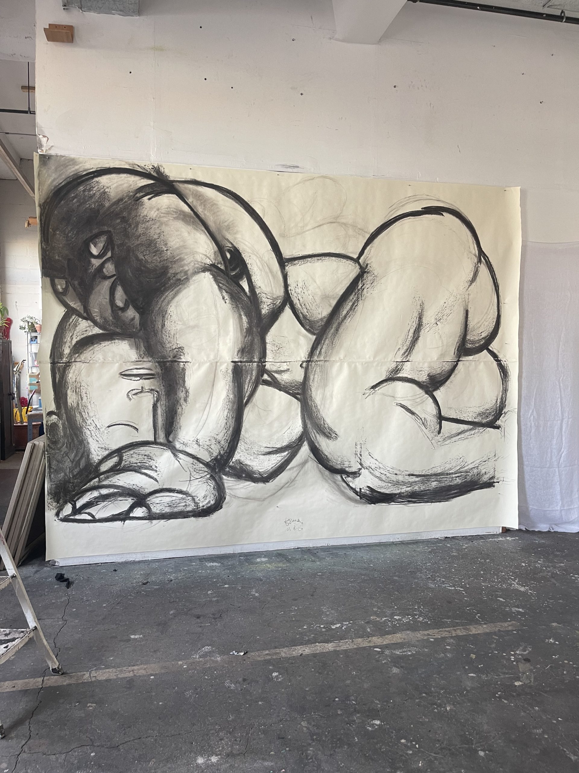
Charcoal study for Reclining Figure 1, 2024
Last time we saw you was at your studio in Navy Yard, maybe two years ago? You had a bunch of paintings, different sizes and styles on the wall, leaning against the wall, turned around facing the wall. When I walked into the show, at first the work felt very fresh and not immediately like something I’d seen during that visit. I remember the flower paintings most vividly, but then started thinking back and could see the new paintings coming out of things you’d done previously. Can you tell me from your perspective, how you arrived at these paintings?
I love painting, and I love painting big, especially. Charcoal and paper is awesome for me because I can keep producing quickly. When the pandemic hit, I was doing large charcoal drawings of human figures. Many things have happened since then, and now I’ve been noticing a sense of evolution while refining a theme. It just pops in and out, effortlessly. I picked up exactly where I left off some time ago. Even the first attempts continue to feel better than when I develop it more. And that’s great because I used to have a sense that you must do something for a long time to become good at it or to have a sense of accomplishment. But in reality, it’s like blinking, or opening a door, a window once, and going back and opening it again. It’s just there, fresh. And it’s not related to time and development. It’s more related to stepping back into it, and you’re on. Like riding a bicycle. The first time you start riding again, it feels great.
Paths that you’ve been developing over the years. For example, painting figures—it probably feels natural for you to just step back into that? You said these paintings were made over the last two months? That’s a quick turnaround.
The studio visit from James gave me a lot of energy. So, I set out to do one-to-one scale charcoal drawings of the paintings I wanted. Gardens, a lot of flowers and vegetation, from spending time upstate in nature.
I remember during our visit you were talking about gardens. You mentioned blooming morning glories in your yard or on the street in Brooklyn growing on a fence. And that your grandmother had a garden in Colombia when you were growing up?
Yeah, we were in the tropics and my grandmother was in tune with nature. My grandmother was influential. She had this thing of let’s lay down on the floor and look at the stars. Going to a flower and say, look at these flowers. Look how beautiful it was, when I was two, three years old. And she’s always pointing out things that maybe you don’t really take the time to observe. I’ll always remember her through flowers and gardens, and that feeling of looking at things and appreciating.
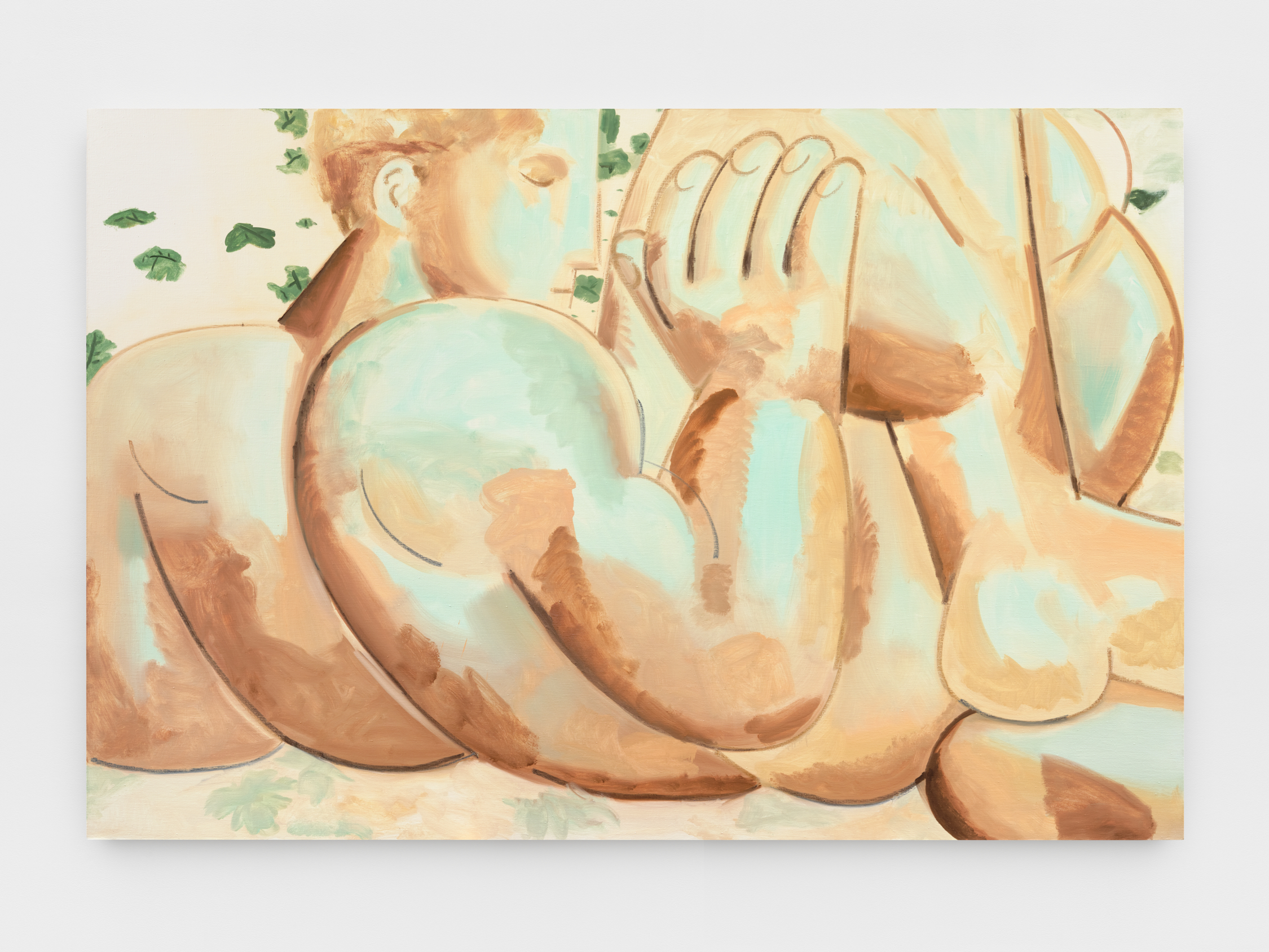
Reclining Figure 2, 2024, oil on linen, 132 x 84 inches
The press release from the gallery suggests you “set out to render a landscape or garden—but the human figure repeatedly appeared…” I was curious about this personification of the garden or landscape expressed as the human body. That’s very interesting, sort of a transfiguration…
Ah, you’re using my favorite word—transfiguration. Probably one of my favorite paintings is titled The Transfiguration by Raphael. I do observational work where I study things in a very academic way. I’m also sometimes thinking of something that I believe is important and try to bring it into the canvas or paper, but often I just let things happen on their own. And that’s when it gets most interesting, because I get to experience things that I didn’t know were there but they’re a main subject in my subconscious. They appear in front of me and it’s like looking at myself in a clearer way. It has a lot to do with the moment. And in these drawings the figure came and I just let it be. Then I made several drawings, and each time I increased the size of the paper, the figure expanded—the larger the paper, the larger the figure. I couldn’t fit the figure into the paper. That was the reason why they’re all cropped. That felt unique. I just thought, you know, it wants to be that way. And maybe it’s related to the landscape painting. The body becomes the landscape because it’s not synthesized or a concrete object on a background. It becomes the background and the object at the same time. At our studio visit James asked me how do I imagine a show of my work, the question lingered and helped me focus.
He asked you to consider how the work is experienced in the gallery rather than in the context of your studio?
That’s not something I always think about because I’m just focusing on each painting. I don’t care about the one before or what comes after. I’m not thinking about the paintings in space. Later James invited me to the gallery in Tribeca, which was still under construction. I stood there, and thought about large format paintings. Back at the studio I made large drawings using charcoal as if it was paint on a brush, just like an air guitar painting for me.
The paintings are very large with figures that are larger-than-life. What does it mean for these figures to be so big, taking up the entire canvas, and for somebody to be experiencing that in the gallery space?
It’s really about an immersive physical experience of inhabiting the body. It’s like you’re at a mountain experiencing the landscape and you say, I want to remember this forever. You ask someone to take a photo of you, and then you go back to the city, and realize the photo doesn’t convey the moment. It looks artificial. The scene could seem diminished, and the sense of the environment is not there.
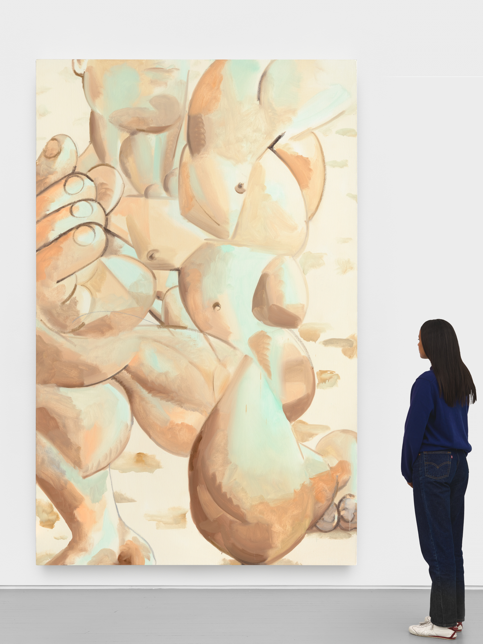
Vertical Figure, 2024, oil on linen, 132 x 84 inches
Is the scale of the paintings tied in with the body as landscape? For example, the vertical painting of the male figure that is kind of contorted and upright. You can get lost in the different parts of this figure’s body…
The paintings are an in-person experience, it’s good to be in front of them to get the full effect. The sensation, the landscape of the body. I wanted to convey the feeling of the body, not the body in an anatomic or concrete way. Sometimes I aim to encapsulate the subject. This time I wanted the sensation. So, I allowed distortion to acknowledge feeling of the body. I wasn’t paying attention to the proper anatomical placement. Like you say, it’s much more related to the interpretation of a landscape that way. The hand, the muscle, and the experience—I’m trying to forget about the appearance and legibility.
There’s a sensuousness in these paintings that’s not necessarily erotic, but in that it’s involved with your senses, how you sense a body. Your projects in zing #10 and #21 were erotic, but I feel like there’s this line through your work of sensuousness, of a living body, a body in motion or in action, and how it can be experienced rather than like a corpse just there to be observed…
I didn’t want to glorify it or fetishize it nor denigrate it. I just wanted it to be how I was experiencing that journey through the body. The paint was helping me make that trip.
Painting from “Rhythm” zingmagazine #21
The garden is a symbol of innocence, purity, fertility, life. These characteristics are personified in your paintings with the same sensuousness of somebody like Michelangelo, often credited as an artist who understood and celebrated the body. I see some relationship there—his bodies are contorted, there are muscles, and vitality.
I think I agree with you. Michelangelo’s works are a celebration of the body. You can feel his sincere involvement with what he was doing. The David blew my mind.
When did you go there?
A long time ago. I saw The Slaves, the David. So great. There are other sculptures and paintings from the Renaissance with incredibly technical achievements, which are impressive, but they don’t have the sincerity I find in Michelangelo. His approach is personal. I feel the emotions attached to his carving. He’s completely immersed in the creation.
He was also working large. For example, the Sistine Chapel. He had to make those figures very large so people can see them from the ground. For him painting, the body’s larger than life.
Absolutely, that’s great to think about right now. How are people going to see it? How visible is it? Graffiti writers think about that too.
One detail I noticed in the show is that a flower made its way into one of the paintings. During our visit a couple years back, you showed us an amazing flower painting that was very delicate, expressive, colorful. In this show a hand holds a similar flower. Is this a nod to things that came before, things you were working on? Is this a little piece of history that made it into a painting?
Yes. Are you inside my head or what? It comes from many things coming together in one place, not one thing in particular. I never work from a single idea.
It happens on the surface?
It happens on the surface. And then I start seeing all the references, like, maybe that’s related to this occasion or that one. And that painting has many references. But someone who is special to me was having a birthday, and I forgot about it. I had a little remaining piece of linen, so I took a sharpie and I drew a hand with a flower, holding it, and I gave it to her for her birthday.
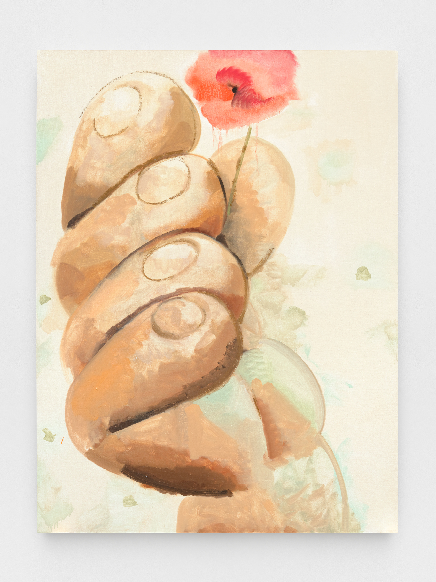
Hand and Flower, 2024, oil on linen, 96 x 72 inches
So, it came from that experience?
Not directly, but I see the reference. Another might be Tarkovsky’s film Nostalghia (1983). This guy has a candle, and he’s trying to walk a path without the candle going out. He tries to walk across with the lit candle to the end of the path he set for himself. The wind blows and he has to go back and light it up again, trying to get across. And the wind keeps blowing the candle out, like Sisyphus maybe. The flower in that painting, I’d say it has to do with the feeling of wanting to keep going. Fragility.
The flower is being held out to the viewer in a way, almost being passed to whoever’s beholding it, which I also hadn’t really thought about until now. That’s beautiful.
The painting is not necessarily about these things, but I’ll look at it like a mirror and see these references in it.
I feel like your work is criminally underrated. But James Fuentes is the perfect gallery for this show in a lot of ways, he works with serious painters who take the long view. You’re in the right company there.
James is important and Devon [Dikeou] also. So grateful.
I’m not sure I ever got the whole story on how you met Devon. Zing is down the block from Lucky Strike and she would go there all the time. That’s how you met?
I was working at Lucky Strike and she gave me an opportunity in zing. Imagine how cool that is, she looks at me as an artist. Big accent back then, even more than now. Less of a vocabulary. And just for her to say, let me see what you’re doing. That’s a huge deal.
Devon’s always done that with zing, giving opportunities to emerging artists. The drawings in issue #10 were simple, of bodies and figures.
I was mid-twenties. Those drawings were like handwriting and are actually very similar to process of making the charcoal drawings I’m doing now. I love that project.
Drawing from “Share” zingmagazine #10
One more thing I was interested in is that you studied at the Art Students League of New York, where I assume you were doing a lot with the figure?
I had a student visa. I had to be registered in school and show up full time. I was at the League, it was a very academic place. I had no stipend or anything. I was working, doing moving jobs at a trucking company. They had night classes and early classes so I could move my schedule around every week in a way that I would make the quota for my hours. And obviously, I was happy to draw and paint. And they helped me. I got a scholarship.
When did you start working for Alex Katz?
Early 2000s. I work with him where he produces paintings. I was tired of doing restaurant work and I quit. I was walking down the street in Soho and ran into Lyle Starr, a painter I know. He said that he got offered this job with Alex Katz, but he couldn’t do it. But if I was into it, I could go meet Alex and maybe I could get some work.
Spread from “Blow Up: paintings by Alex Katz” curated by Juan Eduardo Gomez, zingmagazine #22
I’m sure you’ve learned a lot from him?
A lot. Alex is an interesting guy. He’s complex. It’s been great. He’s a New York artist, the influence he’s had in the scene and the influences he had from the scene are all alive in him. And it’s been good to be around him. His approach to painting, living a life as an artist, how to be professional, production, what to prioritize, and all that has been extremely helpful. He’s been a great support. I learned about myself as an artist.
Anything else you’d like to say?
That’s all. Thank you.