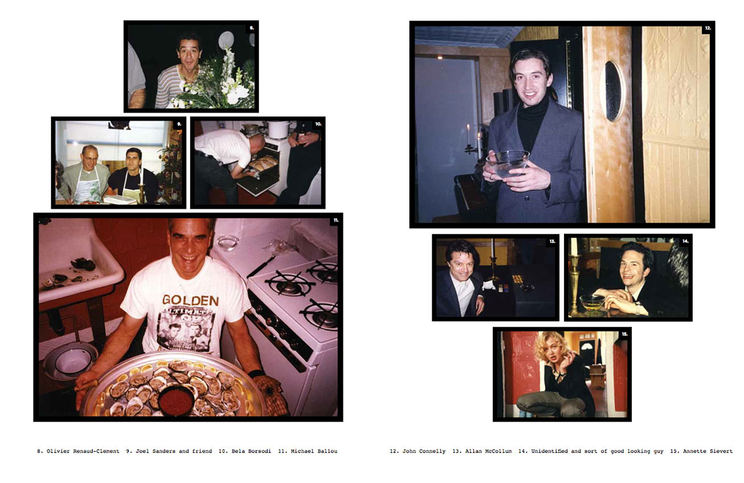
A page from Cocktail Hours at The A-Z Brooklyn NY 1996-1998, curated by Andrea Zittel for zingmagazine 23
Andrea Zittel casts a critical yet sensitive eye upon society and its constructs. She questions the value and implementation of social design, both the psychological and physical, and aims to provide insight and solutions to these questions through her artwork. Her investigations have culminated into an incredible range of artistic output, from modular living units, egg incubators, and functional textiles, to the creation of floating islands, desert communes, and interactive public art installations. The nature of Zittel’s artwork calls for utility and interaction, but simultaneously values aesthetic autonomy and personal solitude. This dichotomous relationship between form and function, public and private, is indicative of how her work effortlessly straddles the lines between art, architecture, and design. Her project in zingmagazine issue 23 documents the usage of some her early prototypes, and provides a glimpse into her social circle of the time. Rachel Harrison, Wade Guyton, Maurizio Cattelan, Gregory Volk, Roberta Smith—these are just a few of the people who could be found in Zittel’s three-story row house on Brooklyn’s Wythe Avenue on Thursday evenings, in a time before the borough became the creative hub that it is today.
Andrea and I began to exchange emails back in March, when she was in the midst of organizing and installing an exhibition of her “Aggregated Stacks” at the Palm Springs Art Museum. In April she welcomed the first of two groups of people to her A-Z West outpost for open season in Joshua Tree, California to facilitate their personal explorations in art, life, and self. She is currently preparing for another solo exhibition, The Flat Field Works, at the Middleheim Museum in Antwerp. Her ability to maximize efficiency and productivity is something we all strive to achieve, but her capacity to do so creatively and philosophically is beyond exceptional.
Interview by Hayley Richardson
Your A-Z enterprise began in a small row house in Brooklyn in the 90’s, known as “The A-Z.” This was the site for the popular Thursday cocktail hours in which local artists and people from the neighborhood would gather socially and test out your new living systems. Your project in zingmagazine 23 features candid photographs from these congregations, and these photos can be seen affixed to the walls of the apartment. Your work calls into question the usefulness or function of space and day-to-day objects, so I am curious if these photographs, these memories, serve(d) an important purpose in your routine.
I know my work has often been described along the lines of functionalism—but I’m actually not so interested in practical function as I am in psychological function and things like social roles, or value systems. So The A-Z, my Brooklyn rowhouse/storefront functioned as a testing grounds for these experiments—and as a space that allowed my works a kind of autonomy from traditional exhibition spaces. Thinking about various forms, independence or self-sufficiency has always been an important focus—both back in Brooklyn and here at A-Z West in the desert where I have tried to create a center outside of any existing centers.
In trying to create a “center” in Brooklyn we created our weekly cocktail hours, which were basically open to anyone who was willing to attend. I loved the cross sections of people who would find their way through the doors, including other neighbors on the block, fellow artists and curators, critics, gallerists and then the more established artists who made the trek out from Manhattan. Back then Williamsburg was considered totally remote and peripheral to the art world in Manhattan, so I remember being pretty blown away when people like Jerry and Roberta made the trip out.
And the photos were really just a way of cataloging the journey—a sort of sentimentality of sorts. My grandma had photos of her grandkids, and dogs and horses on the wall of her ranch-home. I had photos of my friends and people who made it out to my nook in Brooklyn. As I look back at these images now I think it’s sort of amazing to see my peers and myself in these early years of infancy.
Are there any memories that you are particularly fond of from these gatherings that you’d like to share?
We used to try to think of fun things to do for the cocktail evenings—I remember once Mike Ballou prepared an amazing spread of raw oysters. I can’t quite remember why, but I seem to recall that he did this while wearing boxer shorts. And we found a book of personality tests, so sometimes we would drink cocktails and give each other the quizzes so that we could compare personalities. Also I had a huge 80-pound weimaraner named Jethro who we used to have to muzzle because he would go sort of crazy with all the people around. I’m still really grateful to everyone who tolerated my really annoying dog.
It has been 15 years since you moved to Joshua Tree and began A-Z West. Can you talk about how this endeavor has evolved since its initiation, both for you personally and for the people who have engaged with it? Has anything ever unexpectedly occurred at A-Z West that had a lasting impact on how you view the project conceptually, or how it functionally operates?
Sure—talking about the community at A-Z East, it makes me realize that in a lot of ways A-Z West has actually become very similar, though this wasn’t my intent at all in the beginning. Originally the two projects were related in that they were both meant to be places where I could make prototypes, live with them, and make them public in their original contexts. But the difference between the two was that I really wanted to have more time alone and more removal from the art world out at A-Z West. I’m never bored and rarely lonely. When I first moved to the desert I could go days without seeing anyone. The phone would ring and I would try to answer it, but find that I had lost my voice from not speaking to anyone in several days.
Now at A-Z West I have a full-on studio with a group of people who I work with. We have open season in the Wagon Station Encampment twice a year (our open season actually starts today [April 20]—and throughout the course of the day ten people are going to arrive to spend various amounts of time here) and A-Z West also has a guest house, and two shipping container apartments for people who come to work on projects. So the desert has become a really active community with lots of activity and people coming and going.
Ultimately A-Z West, similar to A-Z East, has become an entire organism that is bigger than myself and bigger than my own life. I think that it’s super interesting when this happens—and at some point I can see it growing into something that may have a life of its own that will allow me to go explore some other new context—maybe starting with something more remote all over again. (Though If I do that—I think I’ll work hard to keep the next project a little more low key!)
It is interesting you say this because your work has this tension between a desire to be communal and social, and a desire for isolation and escape. I think this is a universal dynamic that all people grapple with inn some way. Is this a deliberate pattern, where your time in solitude is like a hibernation period that brings forth new ideas about public/collective life?
It isn’t deliberate, or at least it isn’t something that I thought about and planned to happen—but I feel that you are completely right about this being something that we all struggle with. Trying to find a balance between private and public, individual and collective. But I have noticed that being alone for periods of time helps me to appreciate and value people more. So that is the beneficial part of being able to create distance.
You are currently preparing for a show at the Palm Springs Art Museum Architecture and Design Center, in which you collaborated with the museum’s curators and selected works from the collection to commingle with your “Aggregated Stacks.” According to the information presented on the museum’s website, your focus in on integrating your Stacks with Native American weavings. What was your thought process in selecting from the collection? Will other, perhaps three-dimensional, objects come into play in this exhibition?
The collection actually had a lot of different works that I was interested in—for instance it has really amazing Albert Frey archives that include all of his receipts and bank statements and personal photos! But the work in the exhibition really had to do with the space itself—which is a newly restored Stuart Williams bank building. It’s a really wonderful piece of mid century architecture that is strongly tied to the grid. I knew right away that a body of my own work titled “Aggregated Stacks” would tie in perfectly with the architecture—these works also are based on a grid, but theirs is more of a decomposing grid where everything is a little off kilter.
Then culling through the museum’s collection I was really drawn to the textiles. I used a lot of Native American weavings in the show, and also some mid-century table cloths and a piece that I think may have been a curtain at some point, as well as a contemporary tapestry by Pae White. All of the textiles are arranged in a gridded composition on large pieces of carpet. So the textiles aren’t three dimensional—but displaying them on the floor does alter their reading and in a sense gives them a more spatial quality that I’ve been really interested in lately.
In a recent series of art21 segments, you mention how the lines between art and design are continuously blurred and redrawn and that your aesthetic is constantly changing. How would you describe where you are at right now, aesthetically and along the art/design spectrum?
Even though I’m a Virgo and super practical person, I feel like my work has become increasingly existential and philosophical over the last ten years. There has been a strong graphic quality in my work from the start—and I’m still going with this, but also trying to evolve toward a new level of restraint or subtlety. And I’m sure that all of this is coming directly out of some of my changing views about life—I’ve always had strong sociological interests in things such as rules and social systems—but as I get older I find myself taking some of those questions a bit deeper into questions about reality or even consciousness itself.
Yes, I’ve read about how you feel rules and structure are important in generating creativity. Do you still feel this way? Can you talk more about these new questions/thoughts you’ve been having?
Yes, I totally still feel this way—I think that we can use rules to “liberate” ourselves in a sense. Sometimes when everything around us becomes totally overwhelming and oppressive the only way we can make sense of freedom is to create a set of rules or limitators for ourselves that are smaller than the larger, socially imposed restrictions.
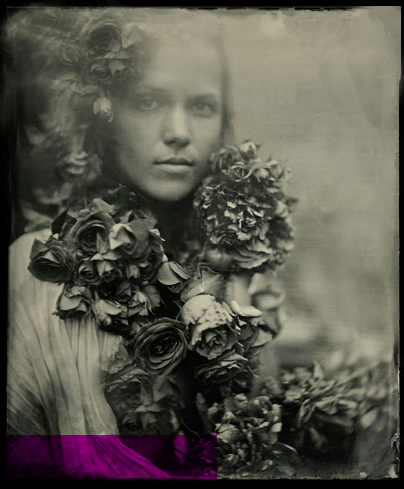
Portrait by Mark Sink, 2012.
With a portfolio that dates back to the late 1970s and an omnipresent energy, Mark Sink has made himself a steadfast pillar in the Rocky Mountain art community. He started his career in commercial photography in New York, canoodling with the likes of Andy Warhol and the rest of The Factory crew, and now lives and works as a fine art photographer and curator in his hometown of Denver, Colorado. Mark is fully dedicated to the medium, and prefers the traditional collodion process and aesthetic to the modern convenience of digital technology. His images, typically portraits and nudes ornamented by flowers, leaves, and water, are ethereal and haunting, and harken back to the work created by his great-grandfather James L. Breese who was an early twentieth-century photographer in New York. Right now Mark is working harder than ever to make this fair mountain city a known art destination on an international level, and he does so by showing endless support for artists and the venues that show their work. He was one of the original founding members of Denver’s Contemporary Art Museum, and curates dozens of gallery shows each year.
Mark’s most ambitious project to date, though, is the Month of Photography, a biennial citywide celebration of the photographic medium started in 2004, which is in full swing right now. This year he curated twelve exhibitions, all occurring during the months of March and April. Also during MoP is a weekly happening he organizes called The Big Picture, where artists submit their work to be shown in public as wheat paste posters. Of course he was generous enough to spend some time exchanging emails with me as he dashed around to meet deadlines and attend openings during what is undoubtedly his busiest time of year.
Interview by Hayley Richardson
In 2013, during the last Month of Photography, you did an interview with Gary Reed where you expressed that you were thrilled with how much the event has grown but cautious to not let it get so big that it becomes a struggle to manage. You said, “I like it the way it is right now it’s big enough!” In reference to that statement, how do you feel about the way things have taken shape for MoP in 2015?
I like the size it is now. We are at max capacity . . . I do MoP myself, my wife Kristen does the posters and fliers. We don’t have major funders. I like it moneyless. It has great potential and could be a cash cow of funding . . . but money ruins everything . . . it would ruin my MoP.
The show you curated at Redline, Playing with Beauty, is the signature exhibition of MoP and you’ve said it took two years to put together. Working with a broad theme, you must have come across an astonishing array of work. Did you encounter anything that challenged your perspective of beauty? What kinds of trends did you pick up on that might be surprising to others seeing this show, and what kind of work didn’t make the cut?
The title was first “On Beauty.” I changed it to “Playing with Beauty”. . . partly because I really opened Pandora’s box with the subject of beauty. My mission was to present my rather serendipitous encounters with the different interpretations of beauty with the human form and the western landscape.
Not making the cut . . . I was struggling with social documentarians and making them fit . . . I had a few in line like Kirk Crippen’s (love his work) and work from Africa . . . sometimes it was purely budget and or dealing with big Blue Chip Galleries that really look down on loaning work to little ole Denver. Borrowing work from one big east coast dealer was harder then assembling the whole show.
The Big Picture is another stand out event for MoP in Denver, and has spread all across the globe. How do you go about selecting which pieces become part of the The Big Picture? Also, why is The Big Picture a black and white project?
We have a standard submission link . . . the submission fee pays for the printing. I pick the work . . . I am the easiest judge in the world . . . if I don’t like the work submitted I often go to the artists website to pick something . . . often I find great work they didn’t think to submit . . . they go from the barely making it in to a top image . . . I also like picking from the website cause a I have more visual and curatorial control. People send the strangest things then their blogger site has amazing things.
It’s black and white because of the Kinkos plotter machine that makes the prints . . . it was made famous by Sheppard Feiry, JR, and others. Cheap fast easy and the thin paper absorbs the paste well.
The history of photography is quite fascinating because it has a rich variety of processes and styles. Now, with so many cross-disciplinary approaches developing in the art world, the qualities that define a photograph are continuously blurred. Galleries hosting MoP exhibitions are showing work that is sculptural, mixed media, etc. and placing it under the photography umbrella. Can you articulate what you see happening here? Is there a new movement taking shape that has no immediate connection to the photography process but somehow relies on it on some conceptual level?
Anything goes with art photography . . . Lots of searching is happening now.
I like the direction work is going that is true to the medium, not faking another medium.
Digital has remarkable new ways of seeing very low light with highly sensitive chips . . . and projectors are strong and can shoot on mountains and buildings, laser etching..great things are happening . . . why try and look like an old Silver Print or Platinum print . . . I hate that fakey instagram filter thing . . . that has swept the app world. Just awful, it’s a reflection of our fake-ness in society.
I see a movement with the gushy romantics in still life and portraits ..the master painters of light . . . the Vemeer light. People like Hendrik Kerstens, Bill Gekas, Paulette Tavormina.
A giant movement has taken off world wide with reverse technology. Pinhole, alternative processes, and conceptual of shadow and mirror. The early lost art crew is a huge quickly growing community I am close to. I personally am going reverse . . . I am at the 1850s with collodion tintypes and heading further back to camera-less and camera obscura.
Yes, your work has a strong connection to the past, both in the processes you utilize and with your aesthetic, which feels reminiscent of a ghostly, bygone era. You often cite your great-grandfather, photographer James L. Breese, as an influence and you feature his work on your website. You’ve done a lot of research about him. What has that process has been like, putting together the pieces of your family history, and how has it directed the course of your career/practice?
It has been slowly trickling in for several decades. Many times it’s another researcher looking for information on another character in his circle that will fire me up to put more pieces of the Breese puzzle together. All and all it’s very exciting to bring his story into the light. It has led me into researching that period in NYC in depth. History passed him right by . . . then I will get a book like ( Camera Notes by Christian A. Petterson ) the history of Camera Notes and the Camera Club of NY and there on the first page, “The primary inspiration of the Camera Club of NY was James L. Breese.” I find it interesting how much history passes over so many . . . including women.
I use his camera and lenses for some of my work so yes it has a pretty direct play in my work. And I love simple portraits of women. That is 90% of his work as well.
Throughout your career you have maintained a strong connection to the young, emerging artists of Denver and have undoubtedly become a great resource and mentor to some of these people. As an artist who honed his craft in the Mile High City in the 1970s and ’80s, how would you characterize this generation of local artists compared to those of previous decades?
It’s a new world . . . far more instantly connected and yet the community is somewhat a bit disconnected at the same time. Great unique ideas and talent always emerges and flies off on its own wings without much help. I enjoy watching this happen.
What I am most sad about is the new generation of young artists and how they are burdened by terrible debt from school. Crazy crazy amounts. Fanny Mae in co-hoots with the franchised for profit colleges and universities saddled on them . . . debts of 100k or more from a small local state school? Please. I have become very down on the higher education system for artists . . . it’s growing anger and sadness from many directions. I know many amazing educators but the system is driving a direction of under paid teaching staff, that then draws in really low level frustrated and angry educators, generally art world drop outs. I have personally visited many art classes in our regional colleges and left appalled and depressed. It’s a bad scene that nobody seems to notice or care about.
I agree. The higher education system is like a train running off the tracks when it comes to keeping costs manageable for students. I’ve reviewed artist submissions for galleries in the past, and directors often want to know what schools they graduated from before even looking at their work, so it can be very challenging for hardworking artists who can’t afford a degree to even get noticed. Do you have any advice for young artists struggling with this conundrum? What are some viable alternatives for an artist without a degree to be taken seriously?
I don’t have a degree so I am an example that it is possible to make it in the world without degrees. I wish I had an easy answer. If I had a magic wand I would trim a few nukes and put the billions into supporting art schools and students. History always looks back at the greatness of a culture by the art it produces.
Outside of the visual arts, what inspires you or has an impact on your work?
Walking my dog. Community gardens, getting to know your community through gardening, teaching kids . . . walking in nature.
You are a man who wears many hats: artist, curator, educator, community organizer…When you meet someone for the first time, and they ask “What do you do?” how do you typically respond?
Artist in general . . . During MoP curator . . . Asking a new muse to sit for me . . . a fine art photographer.
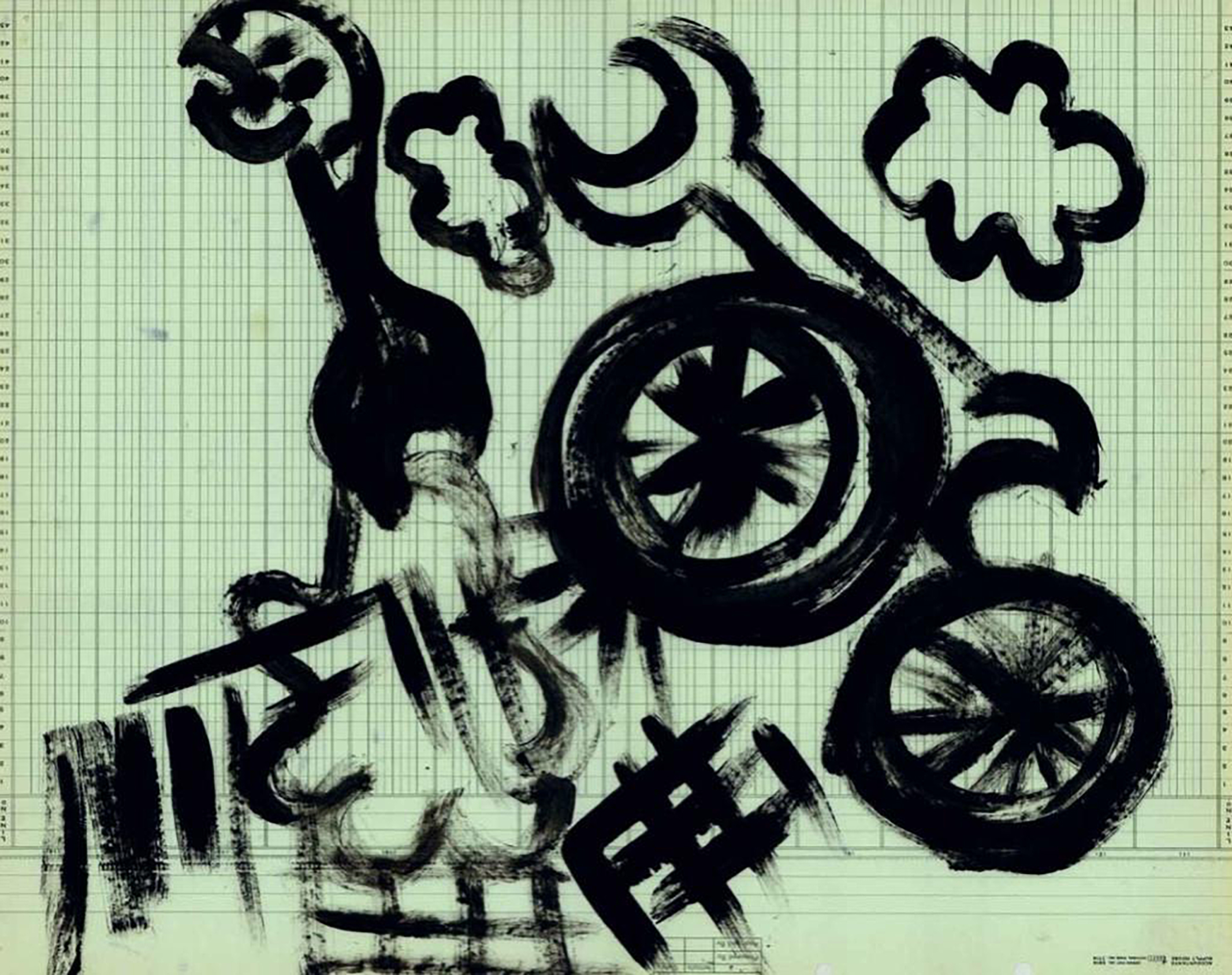
Illustration from Passenger Landscapes: Planes, Trains & Automobiles by Agathe Snow in zingmagazine #23
Agathe Snow’s artwork is driven by action, participation, and creating an experience. She has been synonymous with the downtown New York art scene for over a decade, but has been living in the country for the past five years. At one time it was difficult for her to be removed from the city, which is an integral component to her creative practice. She has since acclimated to her new surroundings and is inspired by the change in scenery. It has been nearly a year since Agathe participated in an exhibition, but she is currently preparing for a show that will reveal some gems that she has kept locked away for the past decade.
Interview by Hayley Richardson
You’ve often described New York City as serving as an extension of yourself. A few years ago you moved away from downtown to Mattituck on Long Island’s North Fork and have been raising your first child. Can you bring us up to speed on what life is like for you now?
[Laughs] It’s different, it’s very different. But I am still really close to New York City; it’s about an hour and twenty minutes so I come in and out all the time. I need my fix, obviously. It took me a while, though. My son is going to be five this summer. So the first year was really crazy and busy with shows and stuff. After about six months I would come home and feel so bad that I was not there taking care of him, so that’s when I started to get settled and got really serious about my artwork and where I was going, but still freaking out about not being in the city, not seeing people . . . so two years into it I’m freaking out. But now it’s been about a year that I feel really good about where I am, much stronger, things matter more. I’ve learned so much, I‘ve practiced, I have much more space to work out here. The people who owned this place before were car collectors, so I have this huge studio space, tools, new materials, new space, new thoughts . . . The world matters. It’s a new me, new world! I felt so guilty never ever thinking about the future, somehow. Everything was day-to-day in New York, so all that’s changed. So I live in the countryside, I have like four acres of land. I don’t see many people, but it’s good. It’s a good thing for me.
Have you exhibited since The Weird Show at CANADA Gallery last year?
That’s the last one I had. But basically, I’ve been working on this big show that’s opening at the Guggenheim this summer, where it’s works from the last ten years of my career and then there will be a screening of my 24-hour dance marathon [which took place] at Ground Zero. I always said I would put the footage of that away and do something with it in ten years because it was too fresh, too much video, too much everything, too many feelings. So I put it away in a safe. And now it’s ten years and the Guggenheim said they would love to premier the video. They asked if I be willing to show it as part of a big survey show where I would get my own space and show work from the last ten years and then premier the video. So that’s what I’ve been working on, basically, this whole year and now it’s almost ready. I have to work on a book about it that’s basically like a 24-hour movie that follows exactly the 24-hour dance marathon. It was shot with nine cameras in 2005 and so the movie screen is divided into seven blocks and you follow the action from seven different angles at all times for 24 hours. And that’s premiering this summer. So, yeah, I’ve been pretty busy with that! I am working on another show about illegal immigration that’s in September. So I got two projects so far.
Sounds like a really big year for you.
Yeah, I am so excited! I have so much energy, my kid is big now and goes to school. It’s a different time, and it’s nice to wrap it all up with this show, you know. Ten years, start something new. It’s good. It’s definitely a big year.
The imagery in your zingmagazine project for issue 23 was inspired by the blur of scenery one sees out the window of a moving vehicle, and in your curatorial statement you reveal that you had just gotten your first driver’s license at that time. Some of the images are scenic, with mountains, clouds and trees, while others appear more urban with bicycles and buildings. What areas/locations were you driving in at the time?
I think it was Colorado, actually. Yeah. We have family in Telluride so we go there a bit.
Do you enjoy driving, or do you prefer to be a passenger?
Yeah, a lot! I love it, I really do. It’s amazing, and I do it a lot to get to the city. I get a lot of thinking done. My road from here to the city is straight line going east and west. It’s so powerful, but it was so scary at first. I failed my diver’s test four times. Eventually I went to the city and passed it really easily, but out here they’re making it hard, you know, because people drive all the time everywhere. It was a real nerve wracking experience, but I love it now. I love it, it’s great. It gives me power and flexibility.
Your artwork is usually very colorful, so it is interesting that you worked with a monochromatic palette in this project. The accountant paper is also unique. What motivated you to portray landscapes in this manner?
I usually try do something with the stuff I find around me, so the people who had the house before, the guy was an accountant. So when we arrived to move into the house, they were still burning old files from their clients. He was in his pajamas over this big burning fire, and we told him we would take care of it, I’ll use it and paint all over it. We had to throw out tons of stuff from the house, but I kept the paper, though.
I’ve always been so afraid of painting, so I had to start really slowly. I used black, black is enough for now [laughs]. I was just working with basic lines and black. I was actually using the same exact lines for the backdrop on this wall piece I’ve been doing, but with a little bit more color in the lines. It’s just enamel paint, it’s just so easy to play with. I would love to learn how to paint one day, but I’m not there yet.
Well that ties in to my next question. Is there any media that you don’t have experience with that you would be interested in trying?
Definitely painting, but I’m terrified of it. I feel like I need to just throw myself in puddles of paint and just move about. I’m completely terrified of it, but it’s so beautiful.
Can you remember one of the first things you created that you or someone else identified as a “work of art”?
It was like a little mobile thing on a clothes hanger, and I just made this cut-out thing with fake fruits. It was really fun, I love doing those, just make things that were completely useless. Then someone at the time at Reena Spaulings was like, “No don’t throw it out. We can do something with this.” So that was my first “official” artwork.
I heard that you studied history in college. Is this correct? What historical periods or events interest you most?
When I was in college I studied northeastern European and Russian history because growing up in western Europe it was just the most fascinating place to me, especially with the spies. My mom and her friend, they went to Russia in 1984 I think, or ’82 or something, and I was so sure they were getting messages to bring back. And then my grandparents, they went on a tour and their tour guide had given them this little ceramic bunny rabbit. And then years later I found this paper inside of it. I pulled it out and there was nothing on it. No messages. But I have always been, like, completely obsessed with it, the mystery, you know. So that’s what I studied. I like it all. The 20th century, though, is just amazing. You can just dig and dig and dig. I went to McGill University in Canada, and I had really good professors and research. I learned how to study it, write about it, approach it. It was fascinating. I loved it, but you can’t do much with [laughs]. It really teaches you to ask questions rather than give answers. You have to constantly ask questions, and as an artist I feel it’s a good way to approach what you’re doing. You’re not really trying to teach anything, just question it.
Do you see your work as relating to any current movement or direction in visual art or culture?
I don’t know . . . I don’t think there’s been enough time or enough space. I did have a group of friends in the ‘90s and the 2000s and we’re all together and stuff, so obviously things bounce off each other and elements pop in and out of each others’ works, but I don’t know if it was really a movement. But at this point I feel pretty far away from anything that would be considered a decision as being part of a group.
Laurel Consuelo Broughton is the Creative Director of WELCOMEPROJECTS, a design practice that engages with everyday objects in a variety of scales and purpose. From architectural developments to couture accessories (created under WELCOMECOMPANIONS), she seeks out the underlying story that makes the ordinary come to life. She is also currently a lecturer at the University of Southern California’s School of Architecture. Laurel’s curated project in zingmagazine issue 23, THE VILLAGE, demonstrates how she sees beyond the normal functions and size of items we use on a daily basis and gives them a new narrative for us to explore. Prior to her work in architecture and design, Laurel worked as managing editor of zingmagazine.
Interview by Hayley Richardson
In the WELCOMEPROJECTS statement for zingmagazine issue 23, THE VILLAGE is described as “the place all WELCOMECOMPANIONS call home.” This home comes to life in the Retrospective City, “where common objects have been transformed into functional building types as suggested by their forms.” This work, in both its 2-dimensional and 3-dimensional forms, possesses a Duchampian spirit, especially with the chessboard layout and lobster telephone. How and why did the surrealist lens become so important in you?
What’s interesting about Surrealism to me is that in a number of different media it sought to create a jolt or distance from familiar things so that we could see those same things in a new way. In my work I’m interested in the same end particularly through playing with the shapes of familiar objects but creating alternate functions for them. The shapes then reappear at different scales sometimes building-sized, sometimes object-sized, and sometimes somewhere in between.
The illustrations for THEVILLAGE are like architectural blueprints. Do you create these types of preliminary designs for all your WELCOMECOMPANIONS items or WELCOMEPROJECTS? What’s your creative process like?
In The Village I was interested in thinking about how the shapes of certain everyday objects could if enlarged be similar in proportion to building types we are very familiar with—such as the high-rise apartment building, the office complex or corporate headquarters etc. The cordless phone becomes the high-rise apartment building and the button becomes the office complex or corporate headquarters.
As far as my process goes, drawing definitely plays a role in all sorts of different ways. In The Village the project literally is the drawings. For WELCOMECOMPANIONS drawing might be used in the beginning to explore an idea and then to convey the designs to the manufacturer and then often we use drawings in our promotional materials.
Storytelling is another central element in your work. Are there any particular stories that made a significant impact in your life that may have laid the foundations for how you work and conceptualize now?
I was a voracious reader as a child and I think that definitely had an affect, particularly the magical realism that you find in children’s and young adult books—like The Borrowers or even Madeleine L’Engle or The Phantom Tollbooth. In a certain way it’s that same kind of wonder that I try to instill in my work but though objects and our interactions with them.
Speaking of stories, what is the story behind the name of your company?
The name WELCOME came about because I didn’t want to use my own name and I also didn’t want a studio with a faux research-y sounding name. I wanted something that seemed familiar. The studio is called WELCOMEPROJECTS and so WELCOMECOMPANIONS seemed like a natural offshoot for a line of accessories.
You recently collaborated with director, artist, and writer Miranda July on a collection called “Classics” for WELCOMECOMPANIONS, which “takes the phenomenon of a named bag to its most extreme.” The bag, The Miranda, is simple and unassuming from the outside, but inside there are specialized compartments for eccentric things like a single almond and a tissue-sized security blanket. Who else do you think would be an interesting person to collaborate with on a super-custom namesake bag?
It’s interesting you can learn so much about someone via what they carry around in their handbag. The Miranda really evolved in the design process from being just a namesake bag to being the limited edition art piece that it is now. I’d love to know what Joan Didion or Sophie Calle carry around in their handbags.
What would one find inside a Laurel bag?
I don’t know that there is anything particularly unexpected in my handbag . . . up until recently I carried around a two-dollar bill that I got 15 years ago on a visit to Monticello, Thomas Jefferson’s home in Virginia. The house is full of all these customizations specifically to Jefferson’s day-to-day life- such as his bed existing in a the wall between his study and his bedroom—so that on one side of the bed he got up in his study and the on the other side he got up in the bedroom—this was in case he wanted to get up and just start working immediately.
You have an educational and professional background in architecture and teach at USC’s school of architecture. What new ideas or projects are you and your students currently exploring?
With my students I’m most interested in providing ways of seeing and thinking that pertain to design. Most of my studios are about getting the students think outside of pre-conceived notions or conventions.
Los Angeles has served as your base of operations for many years. What is it about the city that keeps you inspired, or helps facilitate your means of production?
I constantly find Los Angeles inspiring from the oddities of the built environment to the culture of narrative and make believe that originates here. It’s also still a center of production which means you can find nearby almost any material you can think of. It’s hard to imagine trying to make things in a place where every material has to be ordered and shipped in.
What’s on the horizon for WELCOMECOMPANIONS/WELCOMEPROJECTS in 2015?
WELCOMECOMPANIONS has a new collection launching in February called Wrong Side of the Bed, which I’m pretty excited about!
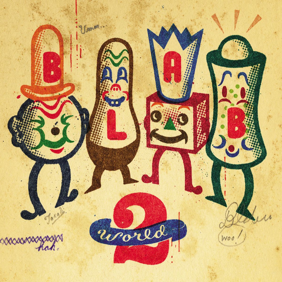
Cover art by Gary Taxali; Blab World #2
Monte Beauchamp is the award-winning, Chicago-based founder, editor, art director, and designer of BLAB! magazine, a comics anthology first published in 1986 as a self-published fanzine, with book projects including The Life & Times of R. Crumb (St Martin’s Press), Striking Images: Vintage Matchbook Cover Art (Chronicle Books), The Devil in Design (Fantagraphics), among others. BLAB!, in its current form of Blab World, is now a highly-regarded venue for contemporary artists working in sequential and comic art, graphic design, illustration, painting, and printmaking—a love song to these underground worlds often placed on the periphery of the visual arts. Monte teamed up with photographer Paul Elledge to produce BLAB! magazine: Inside Out, a project in zingmagazine #21 in which the artwork within BLAB! finds its way out into the cold, cruel streets of Chicago. I met Monte for the first time in 2010 at the opening of the outstanding BLAB! exhibition he organized at the prestigious Society of Illustrators in New York. I’m now fortunate to once again get to opportunity to speak to Monte about BLAB!, his project in zingmagazine, the world of print, and his newest book, Masterful Marks: Cartoonists Who Changed the World, published by Simon & Schuster, which features top illustrators telling the stories of sixteen monumental figures in the world of comic art and pop culture, including Walt Disney, Dr. Seuss, Charles Schulz, The creators of Superman, R. Crumb, Jack Kirby, Winsor McCay, Herge, Osamu Tezuka, Harvey Kurtzman, Al Hirschfeld, Edward Gorey, Chas Addams, Rodolphe Topffer, Lynd Ward, and Hugh Hefner.
Interview by Brandon Johnson
What did you set out to achieve in founding BLAB! magazine?
There were no grand plans whatsoever. How BLAB! came about was a total fluke. One evening after work back in the mid-’80s, I began bellyaching about shenanigans taking place at work where I was employed as an art director. To help take my mind off it, my wife at the time suggested I draw a comic book, which I didn’t have the desire to do, but several days later the idea of creating a fanzine about comics flashed in my head.
I had always felt that if it weren’t for MAD magazine, the sixties counterculture may never have happened. MAD ingrained in its readers the ruse of advertising and the distrust of corporate authority. MAD‘s publisher, William M. Gaines, also issued a very fascinating line of comic books known as E.C.’s, featuring incredible page-turners such as Tales from the Crypt, Weird Science, and Two-Fisted Tales, which were discontinued during the great comic book witch hunt of the mid-1950s.
So I decided to contact the counterculture cartoonists themselves to see if they’d write essays about what influence, if any, MAD and the rest of the EC line had on their work. And much to my surprise nearly all of them gave the project a thumbs up; they agreed to blab about it—which in turn gave way to the title BLAB!
So I self-published a one-shot limited edition of 1500 hand-numbered copies which I schlepped around to independent record, book, and comic book stores and placed on consignment. I also placed a few ads in several comic book publications.
Not long after, I went to the post office box on a Saturday morning and it was jam packed with orders; it was like this for a good solid month and then came a lull in orders—and then four to six weeks later, the post office box again became jam packed with letters, this time with letters from fans raving about BLAB! and inquiring when the next issue would be out, which in turn inspired me to attempt a second issue.
The same week that BLAB! #2 was printed happened to coincide with Chicago’s big summer comic book convention, so I brought a handful of copies to show around hoping to drum up sales. Kitchen Sink Press—which published the work of several of my heroes: R. Crumb of Zap Comix fame; Harvey Kurtzman, the creator of MAD; and Will Eisner, considered by many to be the father of the graphic novel—was exhibiting there so I gave a complimentary copy to its founder Denis Kitchen, who flips through it, and immediately offered me a publishing deal—which blew my mind. Right then and there we sealed the deal with a handshake.
Denis tripled BLAB!‘s press run, expanded its page count, and we also reformatted it as a square-bound, digest-sized paperback. I began adding more comic book stories by the incredible Joe Coleman, Zap artist Spain Rodriguez, and a talented newcomer—Richard Sala. I also assembled a compendium on the influence R. Crumb had on popular culture (which 10 years later was expanded into a trade paperback published by St. Martin’s Press—The Life and Times of R. Crumb). That same issue also sported a magnificent cover by RAW magazine artist—Charles Burns. Partnering with Kitchen Sink Press put BLAB! on the map; from the incredibly brisk sales, I knew we were on to something. Four years later, issue #7 of BLAB! won a Harvey Award (the comics industry’s equivalent of a Grammy) for Best New Anthology of the year.
So that’s how BLAB! got rolling; it was never something I set out to do—it was just a matter of being in the right place at the right time. I had no inkling whatsoever that BLAB! would take on a life of its own and evolve into the full-color, hardback compendium of comics, illustration, found graphics, and articles that it is today.
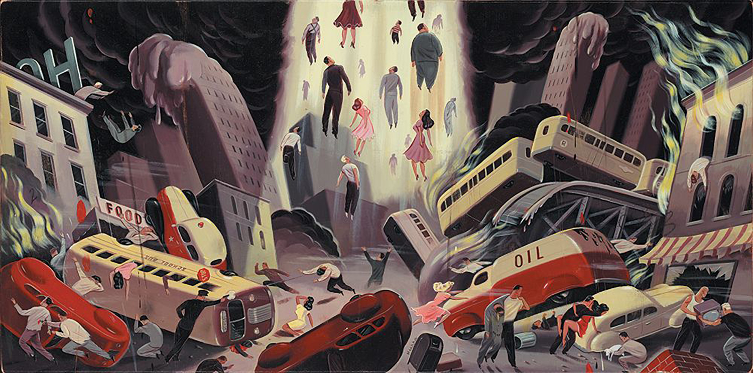
The Rapture, Ryan Heska; Blab World #1
How does a typical issue of BLAB! come together? Do you always have specific artists in mind for each issue?
Nowadays the process is very nonlinear, intuitive, one that starts with a single inspirational idea and builds from there. For example, I was walking around downtown Chicago one afternoon when a humongous storm hit. Massive gusts of wind were whipping all sorts of objects about and as I ducked for cover, off in the distance I saw a funnel of garbage swirling about in the air being sucked skyward. It was an eerie yet awe-inspiring sight, which set me thinking about The Rapture—and then a scene of people rising skyward interpreted by BLAB! artist Ryan Heshka flashed in my head. So I ran the concept by Ryan who dug the idea, and created a masterpiece. Ryan’s painting was so inspiring I began asking other artists to create “end-of-the world” scenarios that I compiled in a feature titled “Artpocalypse” for the first issue of BLAB!‘s sister publication BLAB WORLD, which in turn set the tone for the comic strips and feature that appeared in that of volume.
You curated a project in zingmagazine #21 called “BLAB! magazine: Inside Out” which features various works that appeared in issues of BLAB! in different formats and mediums and photographed these in outdoor environs around Chicago. It’s sort of a magazine within a magazine—a peek into the world of BLAB! What inspired you to present BLAB! in this way?
Actually zingmagazine did. One aspect of zingmagazine that I always admired was it’s offbeat curatorial nature, which inspired photographer Paul Elledge and myself to present BLAB! in a similar fashion. Rather than shoot the artwork in a hoity-toity setting—such as a gallery—we took a less precious approach and photographed the artwork itself sticking out of garbage dumpsters, in alleys, and on the streets of Chicago.
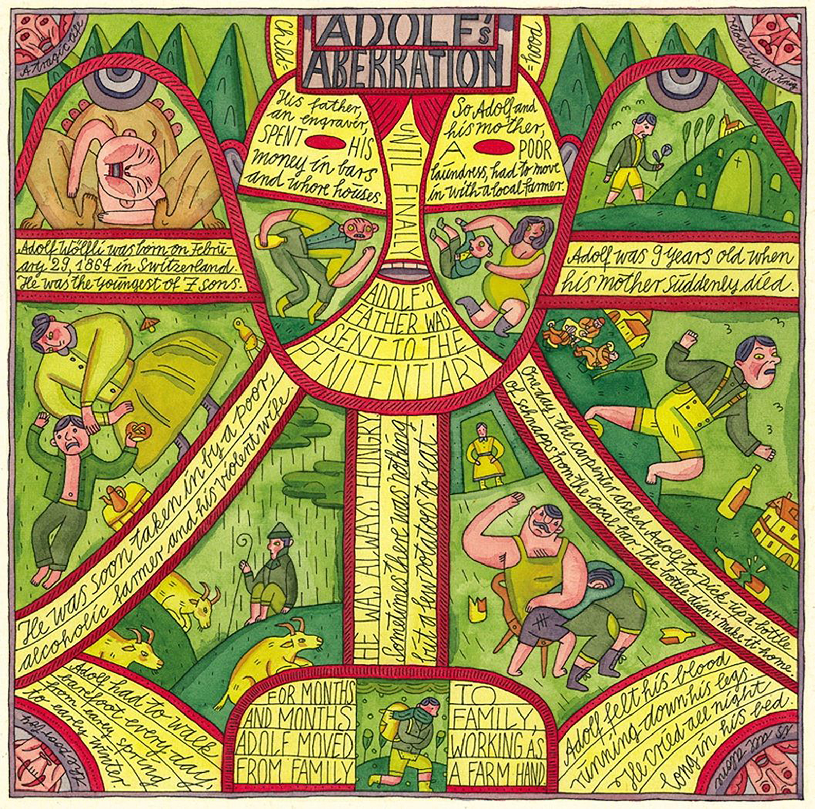 Adolf’s Aberration; four-page story by Nora Krug; Blab World #2
Your new book Masterful Marks: Cartoonists Who Changed the World is a collection of biographies of 16 legendary cartoonists presented through an equally graphic medium as created by other illustrators. There’s a double curation here—first the subjects, and then their corresponding artists. How did you conceive of this idea, and how did you select each group?
In late 2007, I was fishing around for an idea for a graphic novel to produce and the media blitz surrounding the release of the final Harry Potter novel earlier that year set me thinking about the far-reaching effects fictional characters can have on the world. I began thinking of popular literature equivalents from generations before. Mary Shelley’s Frankenstein came to mind as did Sir Arthur Conan Doyle’s Sherlock Holmes, followed by Edgar Rice Burroughs’ Tarzan—whose successful spin-off as a newspaper comic strip set me thinking about cartoon characters of equal iconic stature. Disney’s Mickey Mouse flashed in my head, followed by Dr. Seuss’ Cat in the Hat, followed by Siegel and Shuster’s Superman—the archetype for all superheroes. And then it dawned on me—had it not been for iconic comic characters such as these, the entire cartoon industry as we know it today wouldn’t exist. So I pitched my New York City agent on a collection of short-story biographies told in the very medium the industry itself had spawned—the comic strip—about the monumental creators who pioneered the entire cartoon medium—from syndicated newspaper comic strips to comic books, manga, graphic novels, caricatures, gag cartoons, children’s books, and animation. She loved the idea and that’s how Masterful Marks: Cartoonists Who Changed the World came about.
Any particularly difficult editorial decisions in this process?
Such a grandiose undertaking is an obstacle course, there are always editorial hurdles to get over, roadblocks to maneuver around. Fortunately my agent sealed a deal with a wonderful, seasoned editor at Simon & Schuster—Anjali Singh. Anjali, what can I say except that she is an incredibly insightful, intuitive, and brilliant senior editor who has a knack for signing fresh and original projects. For example, she brought the graphic novel Persepolis to America, which became a hit and was turned into a feature length film. Anjali turned out to be a dream editor to partner with; we really worked well together and she backed me 100% on the team of illustrators and cartoonists I assembled—fabulous seasoned talents by the likes of Drew Friedman, Peter Kuper, Sergio Ruzzier, Nora Krug, Arnold Roth, Greg Clarke, Nicolas Debon, and so forth. As Masterful Marks was nearing completion disaster struck—Anjali, along with several dozen other Simon & Schuster employees, were laid off. When the news arrived that we wouldn’t be ushering Masterful Marks into the world together, I was devastated. Completely. The very person championing my book was gone and all sorts of turmoil can happen when a book is orphaned. Fortunately, the project landed in the lap of a junior editor who got the project back on track. And then as we were completing the book, what happens? He takes a position with another publisher, and Masterful Marks landed in the lap of yet another junior editor, Brit Hvide, who did an admirable job ushering the book into print. After seven years, Masterful Marks was released this past September and received incredible accolades and reviews from the press. For example, it was included in Entertainment Weekly’s “The Must List,” plugged in USA Today, The Huffington Post, and Library Journal. A most wonderful and totally unexpected perk was receiving a letter from Hugh Hefner (also featured in the book) stating that Masterful Marks was “… a grand compilation.”
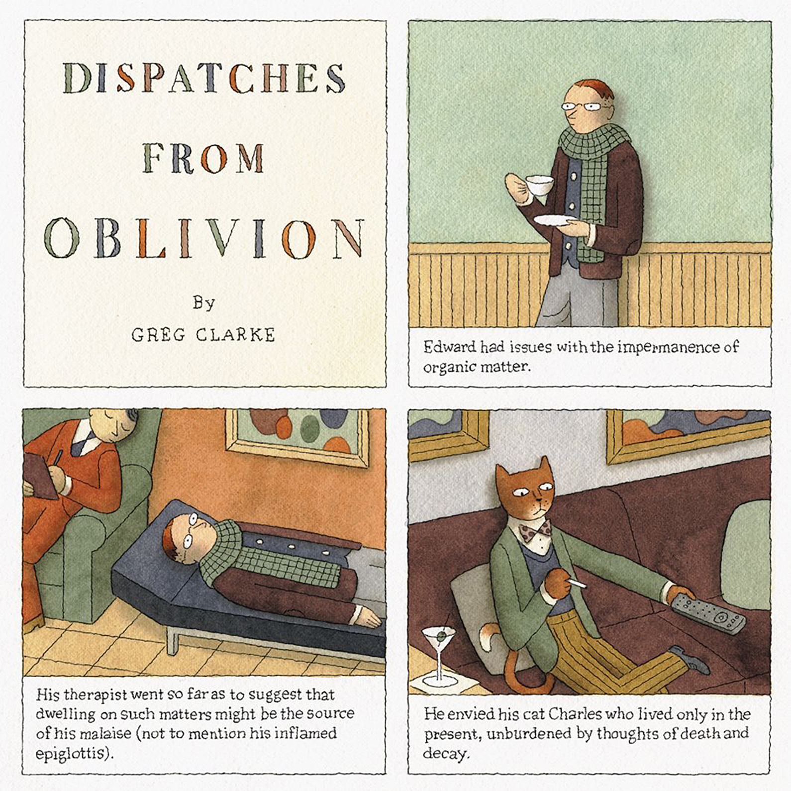 Dispatches From Oblivion; four-page story by Greg Clarke; Blab World #2
Why do you continue to make print books in this dematerializing world of media?
Well, there’s a caveat to all of this. As long as I’m allowed to edit, design, and package visually content-driven books that I have an intense passion for, that I believe in one-thousand percent, I will continue to create books. It was a long, arduous road to get here. Looking back on the unexpected twists and turns my professional career has taken, I sometimes ponder that had I remained in advertising, I’d have a house all paid off, a hefty savings account, and my dream car—a light green ’56 Chevy with a 3 speed column shift to tool around in. Yet, on the other hand, a rewarding career isn’t always about money, it’s about the love of the game.