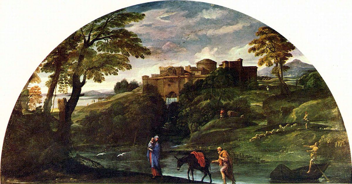
Annibale Carracci, Landscape with the Flight into Egypt, c. 1604, oil on canvas, 122 x 230 cm (Galleria Doria Pamphilj, Rome)
Annibale Carracci’s Landscape with the Flight into Egypt (c. 1604) is regarded as a breakthrough artwork in the genres of landscape and history painting. Carracci’s virtuosic attention to rolling greenery, atmospheric skies, shadowy thickets, majestic architecture, and shimmering water, populated with birds, camels, sheep, cattle and their caretakers envelopes the lunette canvas. The land is sublime and historic, more so than its biblical subject of the holy family. During her fellowship residency at the American Academy in Rome, Devon Dikeou, winner of the Jules Guérin Rome Prize, channeled Carracci’s emphasis on that which is often relegated as “background” or “in-between,” and titled this project “The Inconspicuouses.”
“The Inconspicuouses” is not a single physical artwork, but a conceptual framework for all the artwork she introduced at the Academy—whether it be Ongoing pieces with a 30-year history, collaborative projects, new creations, or ephemeral moments that continue to resonate with time.
Devon Dikeou as Interviewed by Hayley Richardson
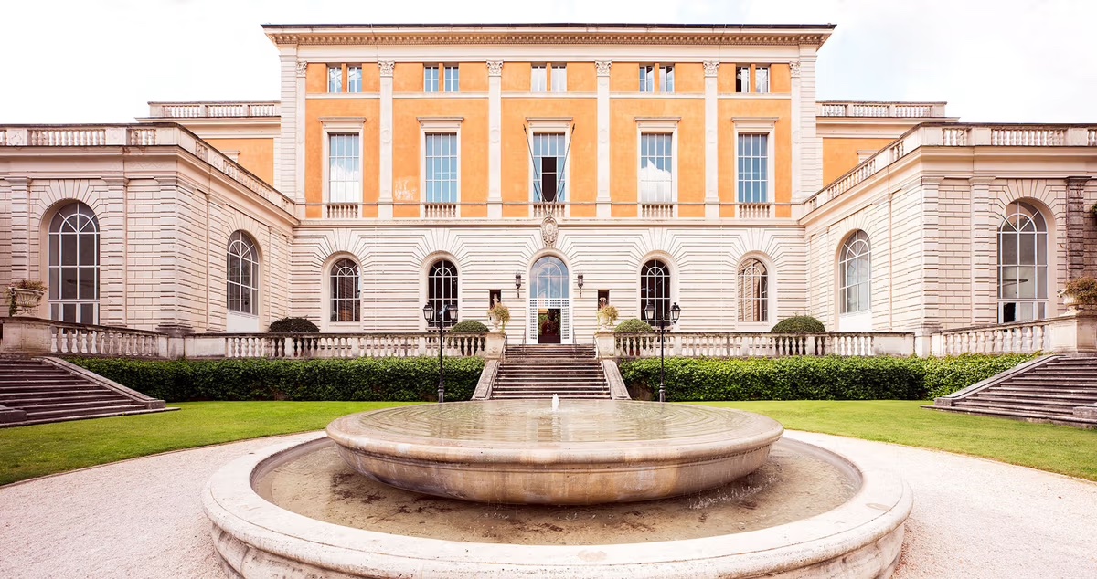
The American Academy in Rome, McKim, Mead and White Building, Photo by altrospazio
As the recipient of the Jules Guérin Rome Prize, you arrived at the American Academy in Rome (AAR) for a 10-month residency in September 2024. What were your initial impressions upon arrival?
Flabbergasted frankly. The history, and the physical presence of the McKim, Mead and White Building changes you. The relevance . . . You feel it even before entering under the watchful eyes of Janus, god of the transitions, endings and beginnings . . . Janus is a symbol of the Academy, proudly yet discreetly displayed above the front entrance. Back to relevance . . . So, the next word that comes to mind is adjustment. Adjusting to the building, the people, and of course Rome.
Your Ongoing artworks, like Suck, continued to expand at AAR while you simultaneously conceptualized and executed brand new work. I am curious about the most recent developments in your studio . . . what can you share?
The moment you arrive and get the keys, they (the studios), are overpowering just on scale alone. My studio, 263, the Mr. and Mrs. David Rockefeller studio, has a window that is superbly set in another era, another time—that of McKim, Mead and White and all their glory. The window is a single window made of 12 large panes of glass and stretches vertically, practically to Mount Everest. Through the window the immediate surroundings offer a landscape that includes giant umbrella pines, regal conifers—reaching like fireworks to the sky . . . And what are windows but canvases, and mine is “a readymade” given by McKim, Mead and White, and this formed the genesis of the “The Inconspicuouses,” the title of my Rome Prize project. “The Inconspicuouses” explores the emergence and nature of landscape as a primary subject matter through the lens of Annibale Carracci . . . And this window, with the landscape spilling in, became my canvas into those Carracci gestures and nuances.
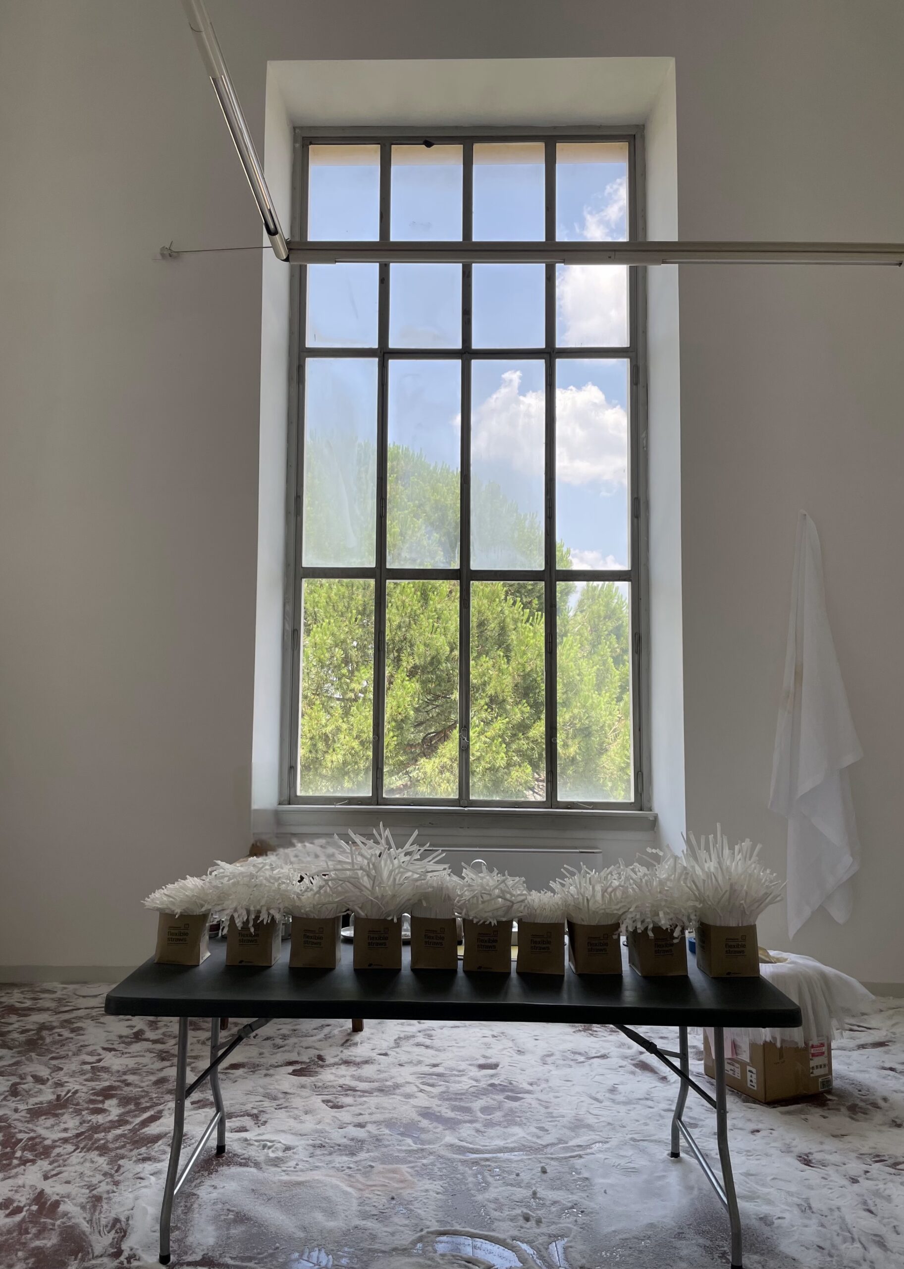
Devon Dikeou, Annibale / Suck, 2024/25 Ongoing / 1991 Ongoing, Live Performance as the Wind Creates Movement with the Umbrella Pine Outside the Window at the American Academy of Rome, Mr and Mrs David Rockefeller Studios, 263 / Live Performance as the Fan Creates Movement with the Straws Made for the Rome Prize
To counter this gigantic window, real and literal, and magically surreal, I eventually came to Stevie and “Landslide.” Supposedly written from a window in Aspen, where Stevie Nicks worked as a domestic, my impulse was to photograph the landscape from the same window that inspired that “landmark” song. But its location is a coveted secret, and unknown, except to Stevie, so I decided to commission Ana, an Aspen domestic, to photograph her idea of a landslide from a window from our home in Aspen . . . Ana’s image, with all its “Star Trek” reflection, was enlarged and printed from the printouts of my AAR “vision board.” It is yet another study in landscape using collage, trompe-l’oeil, and, with a wink to Annibale, to that newly discovered middle ground and landscape as a primary subject matter. And what is landscape as a primary subject matter? Well, my answer became two windows facing off . . . And middle ground, that lovely in-between . . .
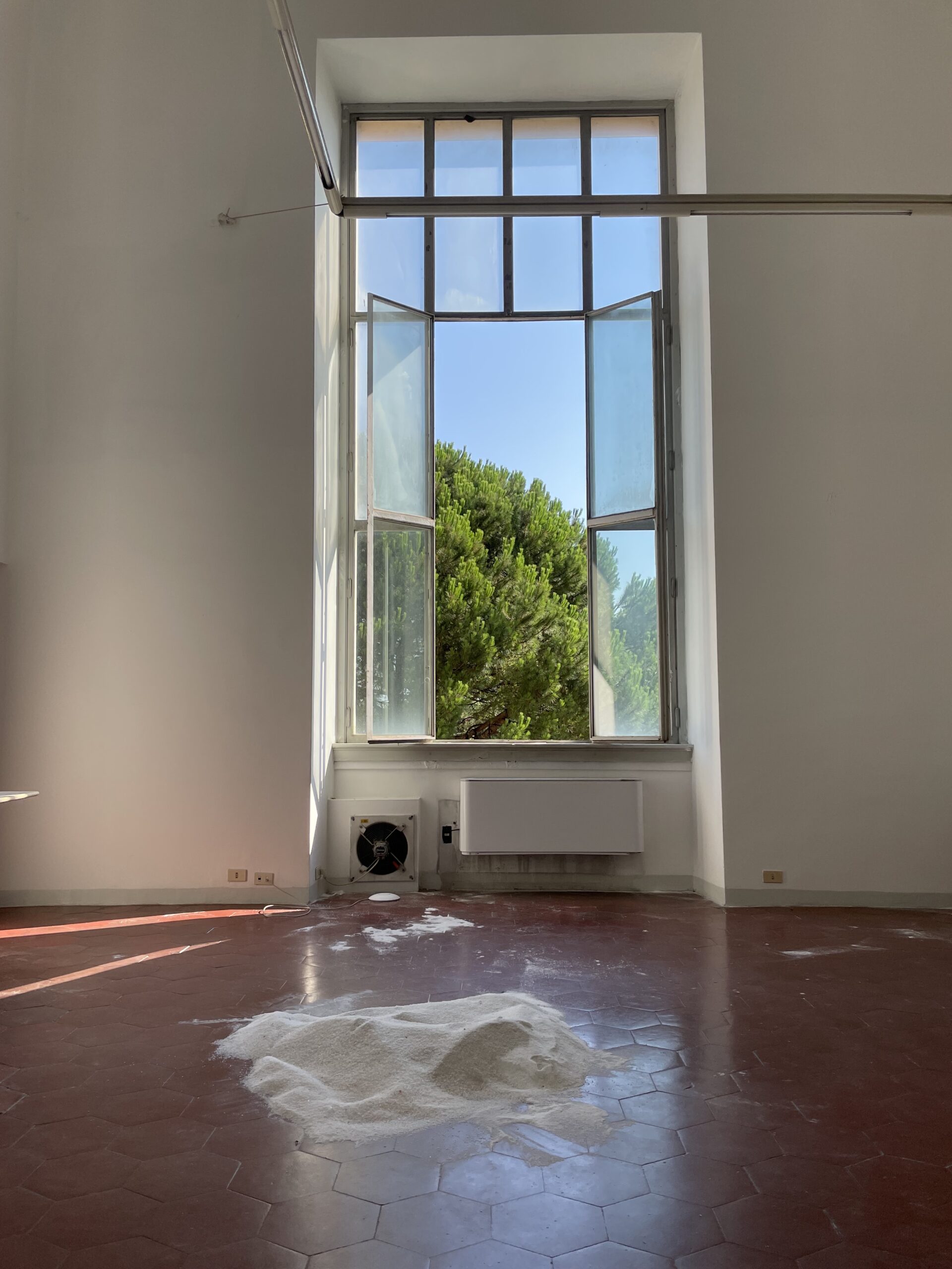
Devon Dikeou, Aspen Snow (Rome Prize), 2024/25 Ongoing, Various Blends of Salt Spread over McKim, Mead White Building Floor at The American Academy in Rome and the Tracks of Viewers
I affirm, and continue to argue, landscape can be anything . . . And I tried to make anything . . . Anything that could bridge these two canvases, two windows, two views, including a bunch of straws (Suck), an Ongoing piece of mine since 1991, that exists as a series of straw bouquets, usually used, but not in this edition . . . Straws can desolate our landscapes/oceans/planet, but here they just shimmer and shake against the mighty pine fluttering its way to majesty in the temporal wind. Look the other way towards the Aspen window for a landscape of another kind . . . No pleached elegance, but a futon covered in airplane blankets snagged by AAR Fellows and their Fellow Travelers, and visiting friends . . . It’s called Red Eye and rests underneath the Aspen window. And then there is the salt . . . decidedly spread all over the studio floor in mounds, in spatters, in the way perhaps snow looks and sometimes feels, and contrasts with the red terracotta floor, while the white artificial weather is a stand-in for Aspen snow . . . Funny, you put salt down to melt snow . . . It does look like a first snow on Main St or simultaneously the remaining days of Carthage . . .
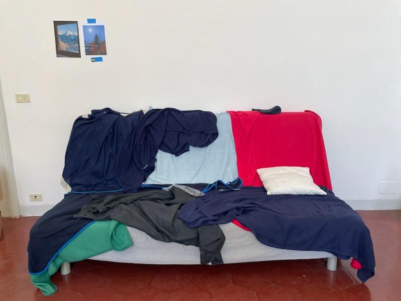
Devon Dikeou, Red Eye (Rome Prize), 2024/2025 Ongoing, Airplane Blankets from Lufsthansa, United, American, Delta, Air Canada, and Latam, Collected by Fellows and Fellow Travelers on Transatlantic Flights
A reoccurring element of your practice is allowing your work to permeate beyond a prescribed exhibition space, like placing installations outside the booth at an art fair or utilizing unconventional settings like offices, parking lots, or retail spaces. What kind of activations occurred outside of your studio during your residency?
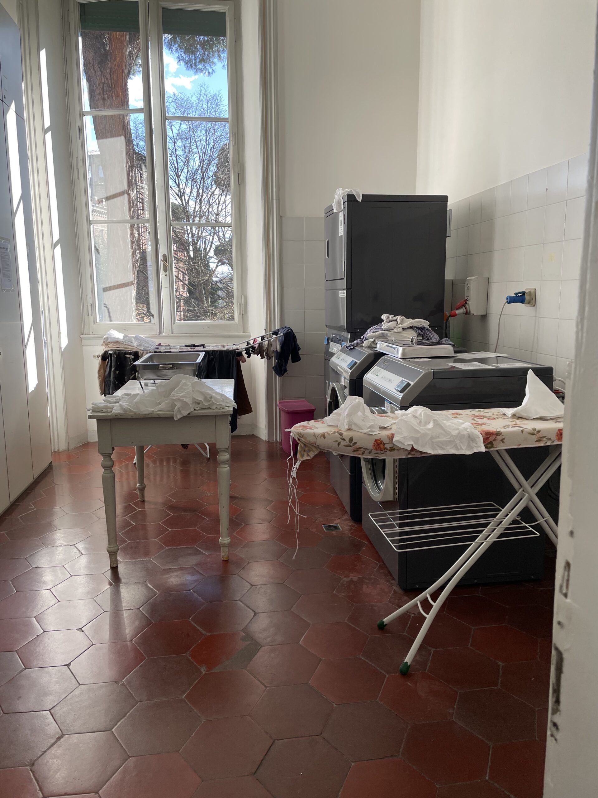
Devon Dikeou, “Out, out damn spot” – Macbeth, Shakespeare (Rome Prize), 1992 Ongoing, Happening: 300 Warm Towels Served to Viewers, Who Enjoyed, Used, and Discarded Towels, Relic of Happening, Variable Dimensions
Well, I’m not a typical studio artist. It took a while to get used to my new surroundings, but a typical studio visit with me explores my surroundings, most likely my home, and the Academy was my surroundings/home. Soooooo the vehicle for that was the McKim, Mead and White Building, often through interventions, like Out, Out, Damn Spot in the laundry room, Hot, Shake and One Little Piggy in the communal kitchen, Suggestion Cards with a prompt to drop the card in the Suggestion Box, (which is right next to the mail boxes), to Pay What You Wish but You Must Pay Something, the donation box series originally exhibited at NADA Miami in 2014/currently on view at the Dikeou Collection in which 20 American museum institutions (so far) have participated. Each museum provided schematic plans of their donation box for replication and visitors make voluntary cash donations. The money is documented and forwarded to the institutions. The donation box was not realized at AAR.
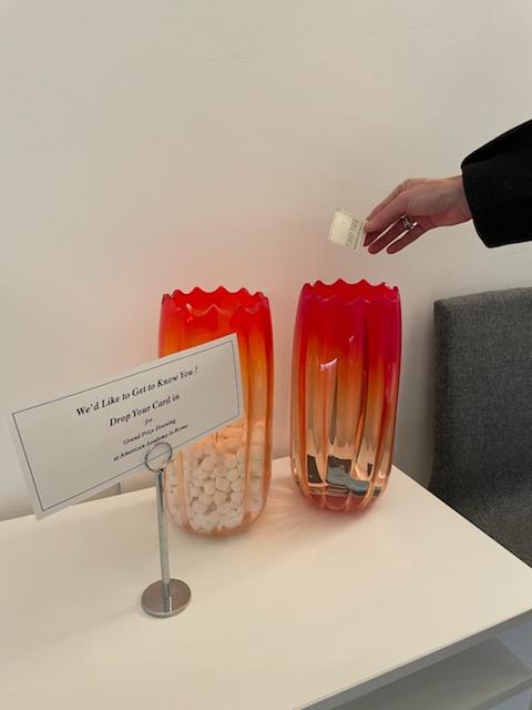
Devon Dikeou, We’d Like to Get to Know You (Rome Prize), 1991 Ongoing, Salviatti Vases, Placard Querying Viewer’s for Business Cards with the Potential to Win Prize, After Dinner Mints, Viewer’s Business Cards
Plus, We’d Like to Get to Know You, placed in the Residential Life Office. Eventually, the lovely Titziana, one of a few who kept us caffeinated and more, picked the Grand Prize Winner out of all the business cards deposited into the American roadside tradition that was gussied up AAR style. The business card picked by Titziana from the Salviati vases belonged to AAR’s Arts Director, Ilaria Puri Purini’s, daughter. Is the fix in . . .
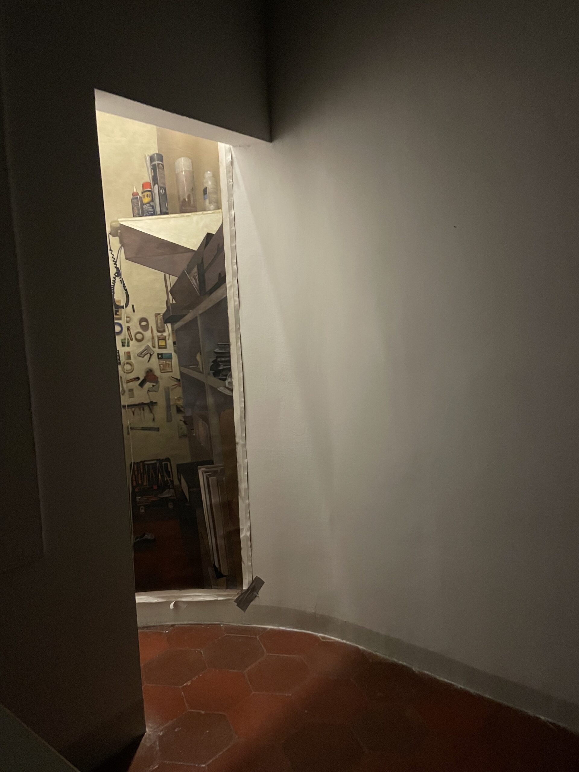
Devon Dikeou, Contrivance: Rome Prize, 2017 Ongoing, Oil Painting on Canvas of Tool Room in David Rockefeller Studio, 263, Rome, Dimensions Variable
Of course, the newest additions of The Niney Timeline, which chronicles the life and times of my security blanket, Niney, as she traverses the art world, including the McKim, Mead and White Building, while resting comfortably in her bedroom/our residence. A toilet paper piece, Entertaining is Fun, installed on the wall with toilet plungers in the WC. There’s Contrivance, a series of photo-realistic paintings of the tool rooms of the various non-studios I’ve had, including at other art residencies. It is a nod to the studio—an intervention that adds to the cycle. My AAR tool room was in the closet of my McKim, Mead and White Building studio. I displayed the photo-realist painting opposite the actual tool room in the nave of the entry, peeking out into the world of in-between windows and lands . . .
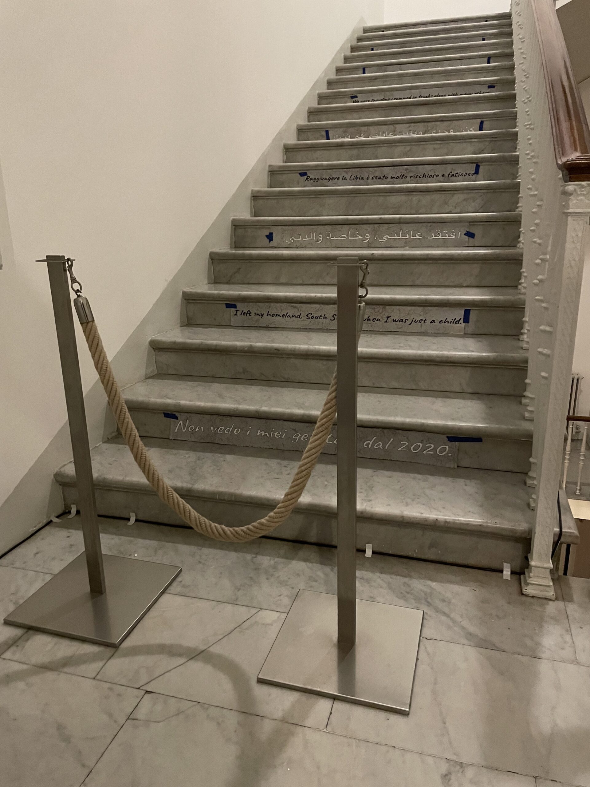
Devon Dikeou, Velvet rope (Rome Prize), 2024/25 Ongoing, Dimensions Variable
And lastly, Velvet Rope, in which I used the AAR rope stanchion placed at the foot of the staircase—meant to keep those deemed “not worthy” away from private areas of the Academy. I acted as bouncer . . . And I let everyone in, one by one, marking them with a Sharpie, just like they were getting into Studio 54, Palladium, the World, Area, or even the Academy. It’s a very exclusive club . . .
One of the most enriching aspects of residencies is the opportunity to collaborate with fellow residents, as well as with locals in the community. What kinds of collaborations were you able to partake in at AAR?
Julia Rose Katz, awarded the Anthony M. Clark Rome Prize, (Circe’s Wand: Reimagining Antiquities in Early Modern Europe) and I were paired for ShopTalks—an AAR program which typically pairs a visual artist with a scholar to make a joint presentation based on their projects/practices and talk about the cross-pollinating that might happen . . . (This program is not open to the public). We decided to not only make a presentation of both our practices, but also, in a unique manner, to make/do something that eventually could be shared with the public, challenging the traditional lecture model. I presented in the form of a studio visit that encompassed the McKim, Mead and White Building. Julia explored her study of how early Modern artists and restorers creatively reimagined damaged ancient sculptures, and how her personal affliction on her leg has influenced her vision towards study and life with regards to film, classical sculpture, modern presentations of sculpture, installations, fashion, semiotics, bricolage etc. The platform of our collaboration is a book . . . We combined our shared interests, and each chose approximately half the images and published a limited-edition run under zingmagazine books. Permanent Accident was the result.
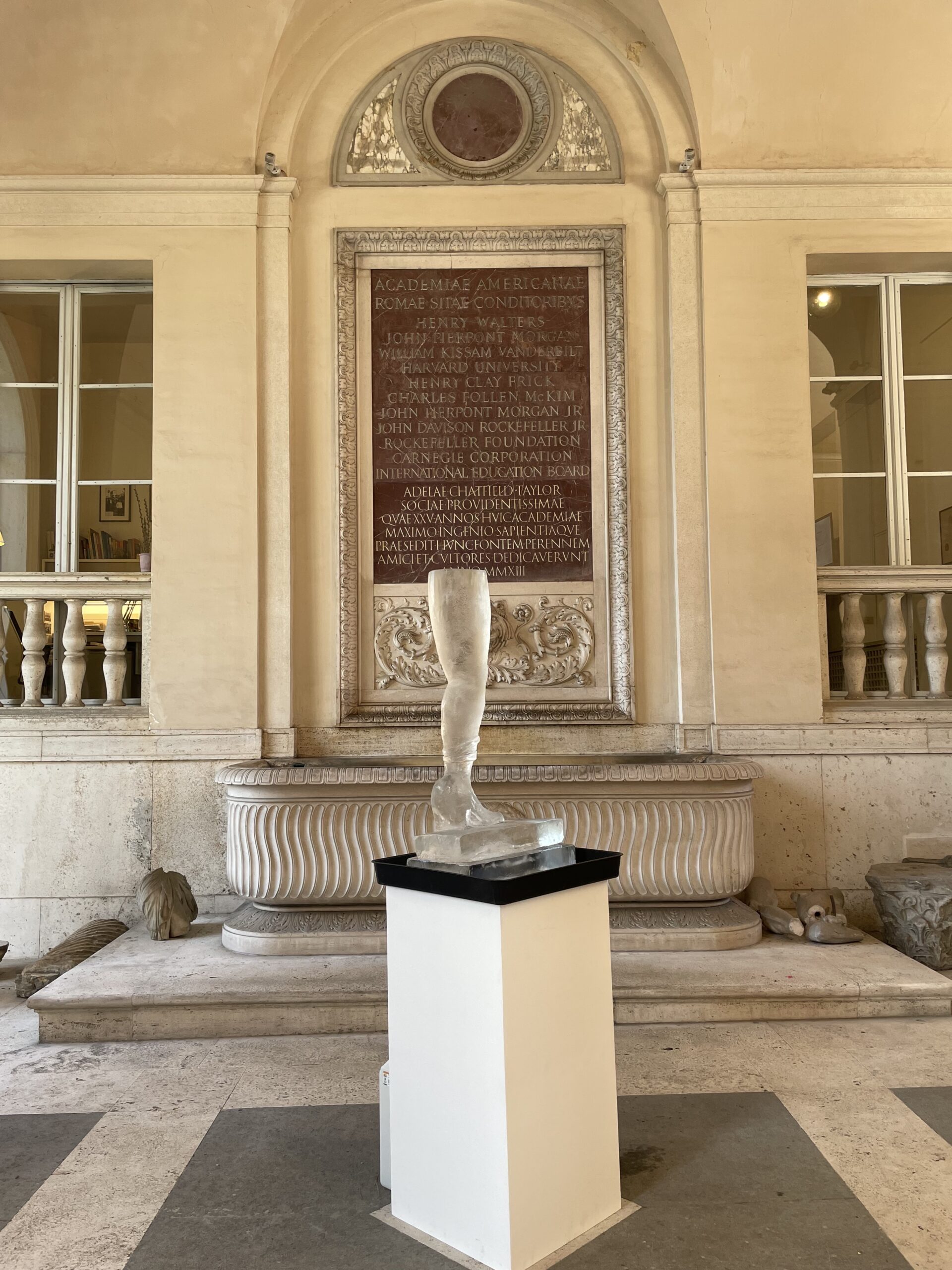
Lizzi Bougatsos, Self-Portrait, 2012, Ice, Artwork curation by Devon Dikeou and Julia Rose Katz at American Academy in Rome, March 2025
Further, drawing from our unique position as curators, Julia and I decided to raid Dikeou Collection and recreate a wonderful installation in the foyer of the Academy where much of the Archeological work was happening—with all the fragments and fountains and study tools . . . There, a leg in the form of an ice sculpture by Lizzi Bougatsos entitled Self-Portrait stood tall and wildly clear in its medium. An inherent vice by nature, the ice glowed among treasures from the ancient world, still giving and sharing their secrets. Self-Portrait is both a sculpture and a performance, which lasts about fours hours as the ice melts and eventually collapses on itself, culminating with the destruction of the leg, because that inherent vice would be painfully bad for the immediate surroundings. Julia did the honors.
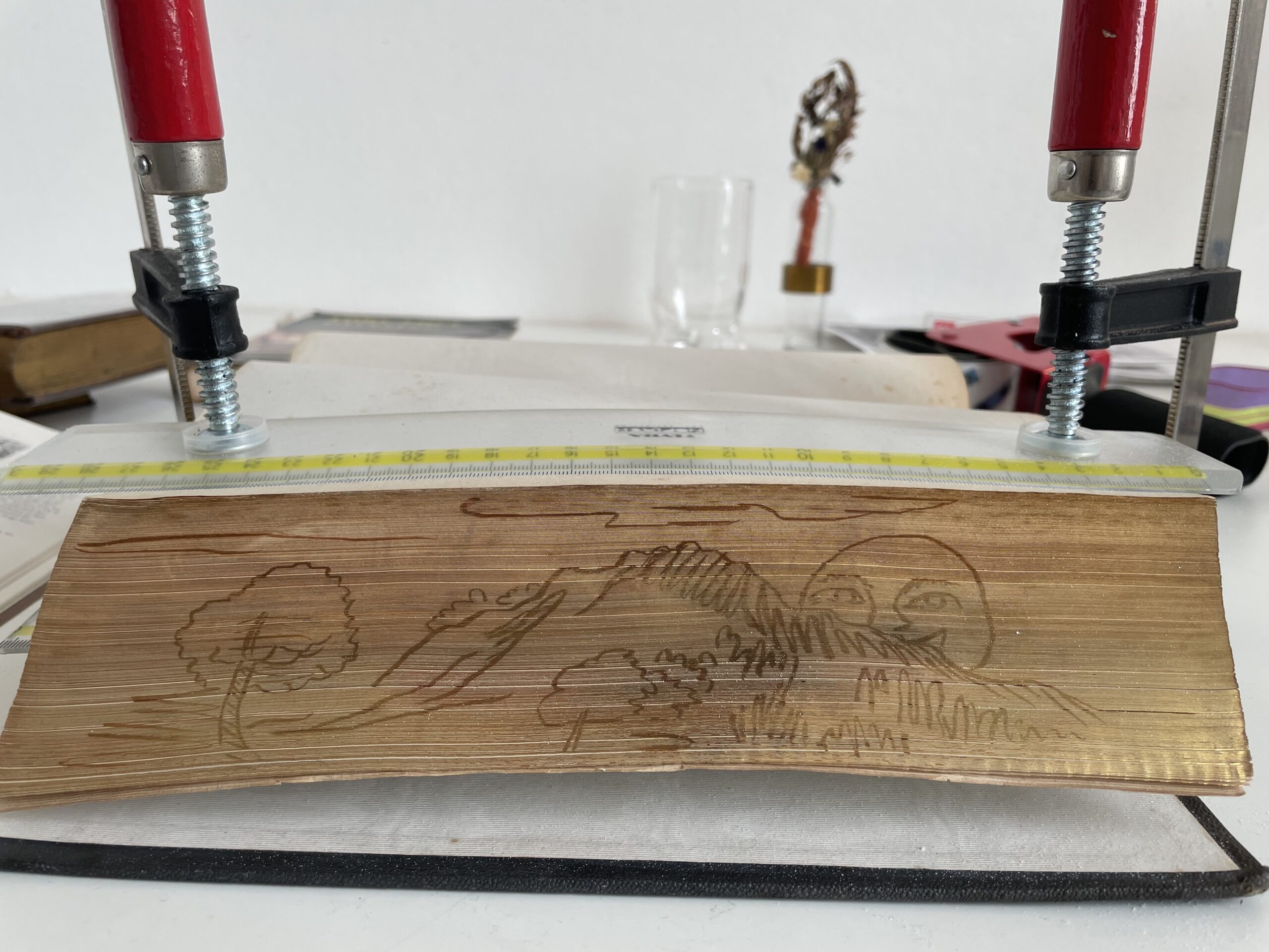
Katherine Beaty and Devon Dikeou, Fore-edged book, after Annibale Carracci, 2024/25
I also collaborated with Katherine Beaty, winner of the Suzanne Deal Booth Rome Prize (A Technical Study of Italian Archival Bookbindings). Together we created a fore-edge book, which are usually insignificant titles but with a gold edge on the paper . . . Bend and twist the paper of the book and it reveals a genuine treasure, a painting of some sort . . . I happen to have a collection of fore-edge books given to me by my father . . . And thinking about Carracci, I was inspired to paint a sketch of his on the side. Strangely enough, Katherine and I met just before the award announcement ceremony at Carnegie Hall and we spoke about fore-edge books and naturally what our projects might entail . . . I’m not that talented of an artist, but she kept encouraging me . . . I’m a little “grey cell Poirot” type-artist. But eventually, we decided to create a fore-edge book together, with the image by Annibale that I selected and her expertise in all things books, including painting on them. It’s now the very first fore-edge book at the Academy’s library.
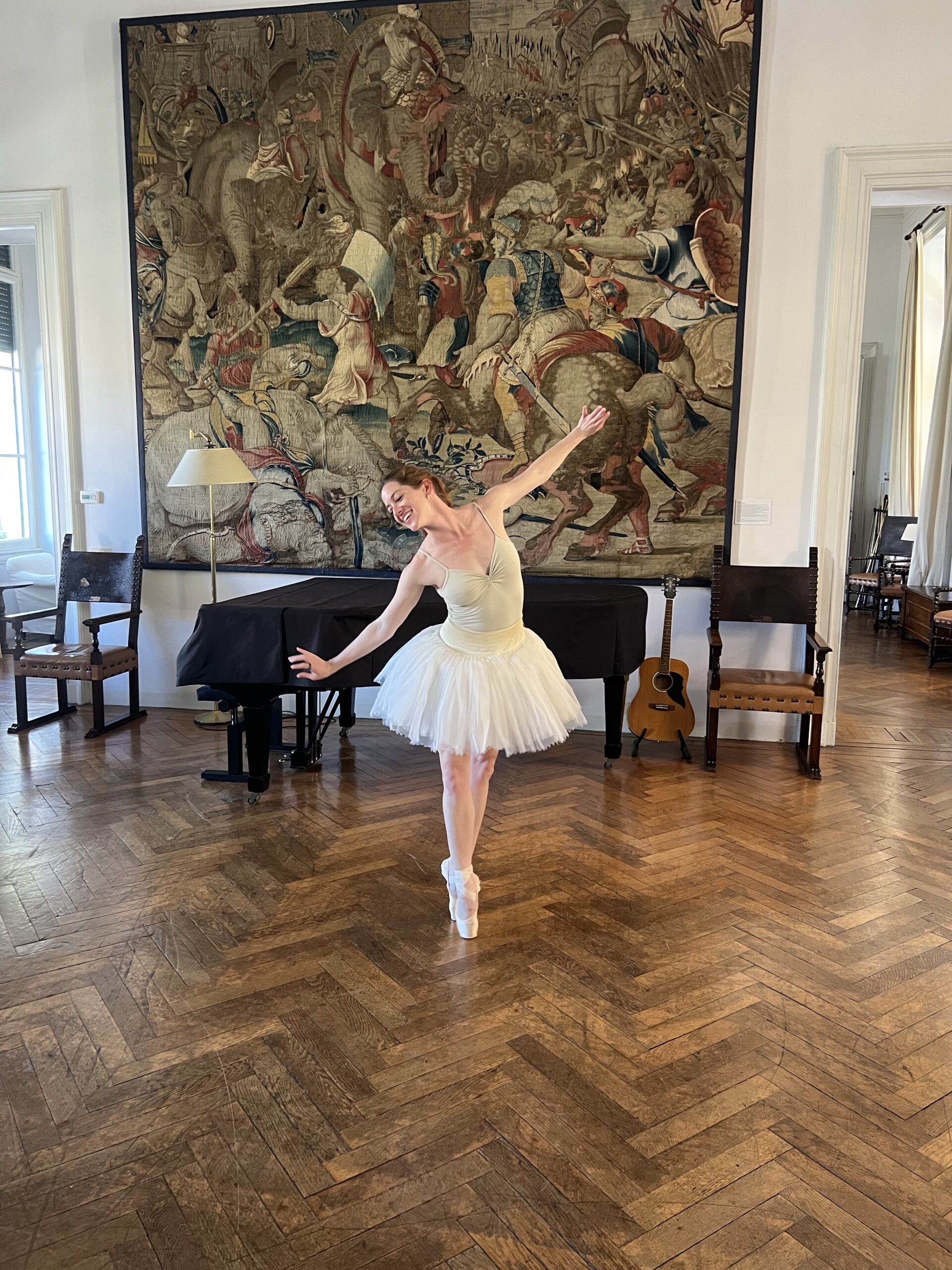
Prima (Rome Prize), 2024/25, Collaboration and Ballet Performance by Prima Ballerina, Holly Dorger, of the Royal Danish Ballet at the American Academy in Rome
Another collaboration was with the prima ballerina, Holly Dorger, of the Royal Danish Ballet. When she visited the Academy, I invited her to do a pirouette and a leap. What she did was a wonderful improvisational performance that ended with me asking for just a bit more, that fantastic leap, all the while Bea, an intern at the Rome Sustainable Food Project, sliced 100 pounds of roast beef on a professional meat slicer, and I made sandwiches for my performance piece, One Little Piggy Ate Roast Beef. I loved sharing dance and food with two other amazing types of creatives . . . It was a great three-way . . . One with someone I just met (Bea) and the other my cousin (Holly), who I know in a forever way.
Shake . . . Ongoing since 1991, the piece is almost improvisational. Moving to NYC, I immediately bought a set of Po-Mo salt & pepper shakers at MoMA . . . They looked good, but they didn’t function. This was followed by another purchase on Bowery—Wayne Thiebaud diner style shakers. Suddenly, I had a collection. Much later the real collection emerged . . . And much, much later for a group exhibition at PS 122–where each artist was given a snow globe as an artistic prompt. My snow globes were recreated into S&P shakers with the actual shakers submerged in the salt and pepper within the snow globe. It is a portrait of friends and travelers over time . . . From the 90s to now . . .
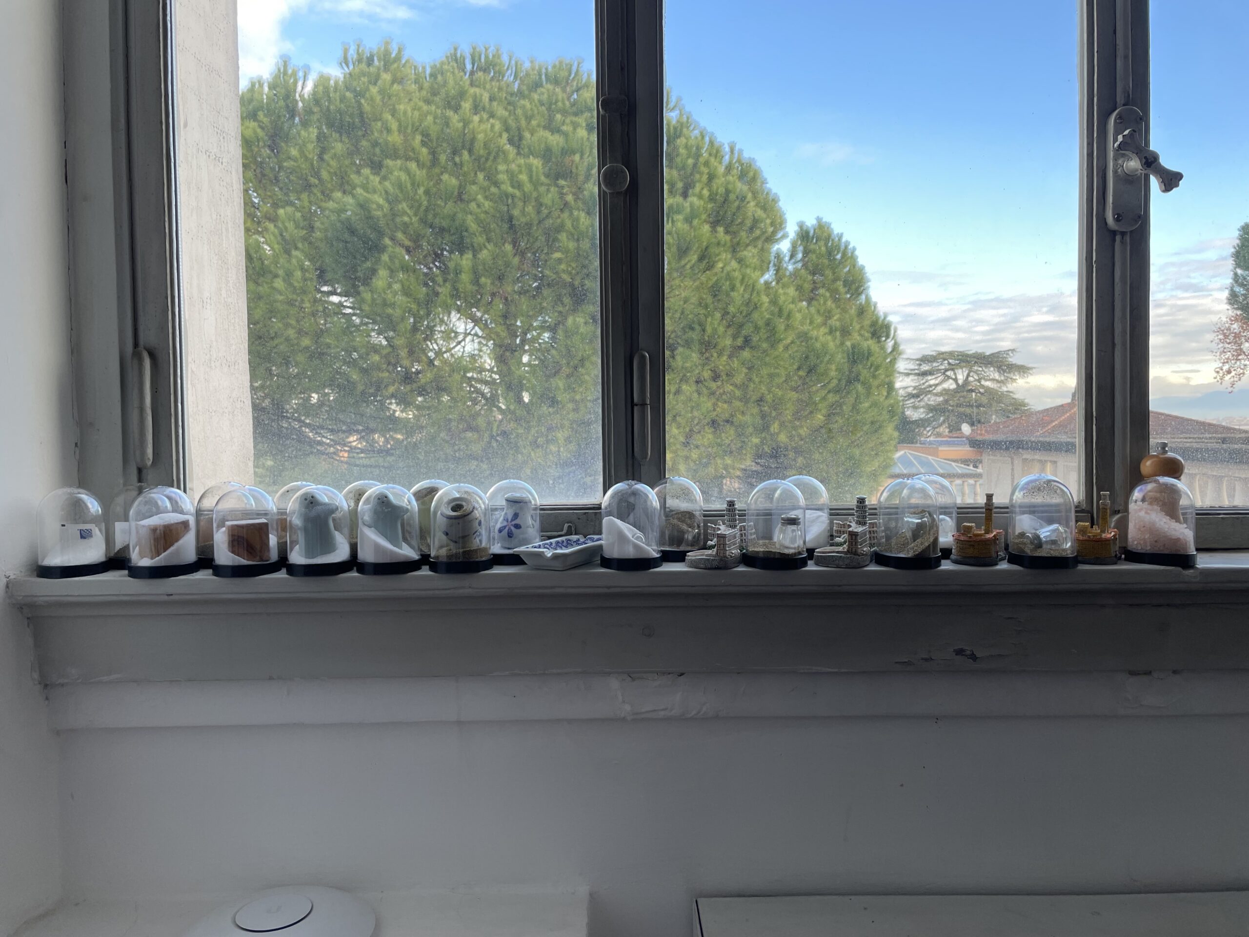
Devon Dikeou, Shake (Rome Prize), 1991 Ongoing, Installation View of Snow Globes Altered to Become Functioning Salt and Pepper Shakers, Each Filled with Salt and Pepper, and when Used, the Diminishing Salt and Pepper Reveals the Actual Accumulated Gift Collection of Shakers, 3 1/2”H x 2 1/2” in Diameter
That gesture was something I felt immediately applicable to the environment at AAR, all the different passions and personalities . . . I realized and felt a group portrait would rock, so I engaged all fellow Scholars and Prize Winners to collaborate in a salt and pepper project. I gave a small stipend to purchase two sets of S&P shakers, and I would create two sets of my ongoing Shake project, one for them as a self-portrait of their time at AAR, and the other which would function as a group portrait of our time at AAR together. Almost everyone participated, but sometimes I found ways for those tardy to the party to represent.
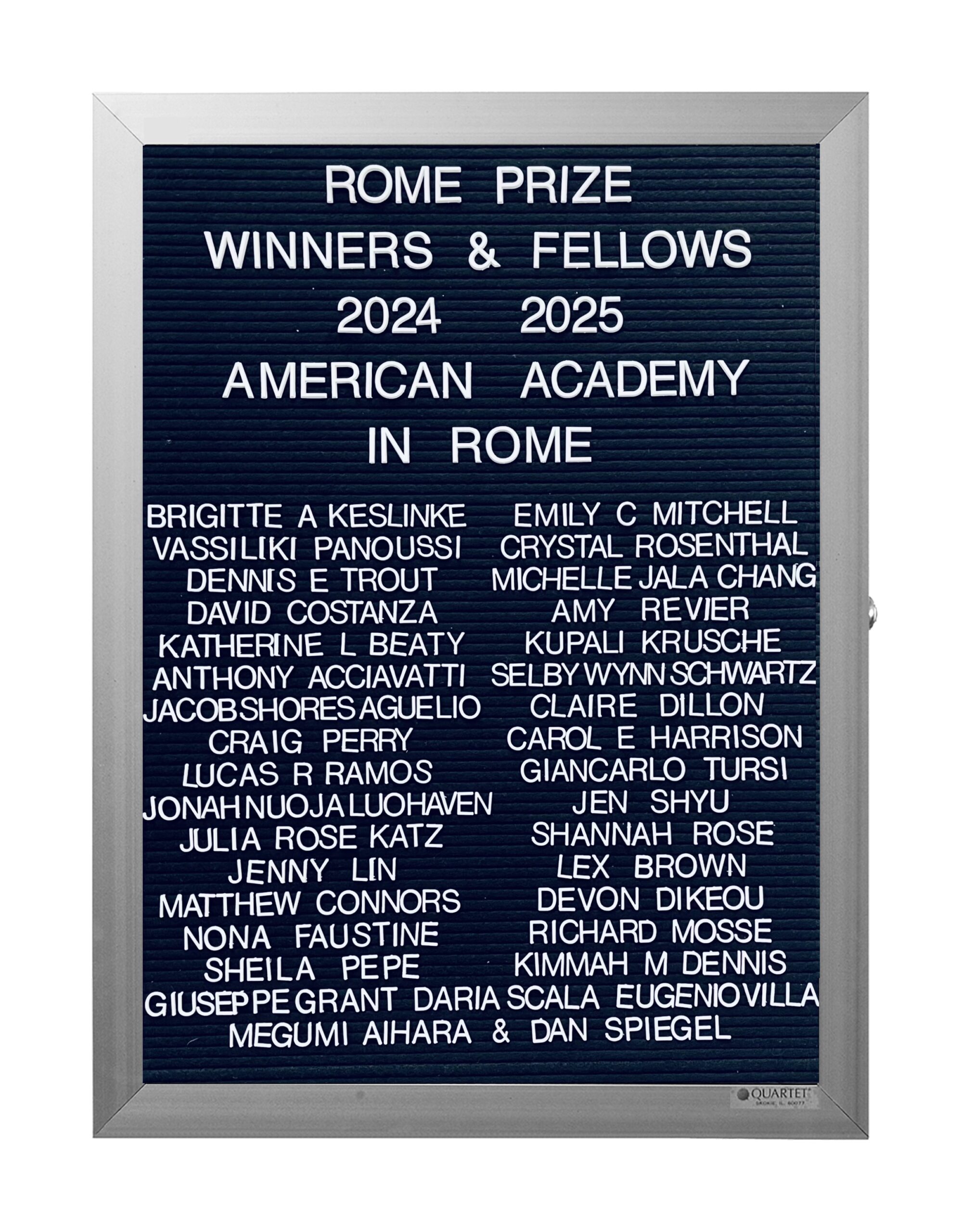
Devon Dikeou, What’s Love Got To Do With It? (Rome Prize), 1991 Ongoing, Rome Prize Winners & Fellows, Lobby Directory Board Listing Artists, Gallery, Curators, Exhibition Titles, Dates Replicating the Lobby Directory Board at 420 West Broadway (Series Initialized for the 1st Group Show in which the Artist Exhibited, and Made for Every Group Show Thereafter), 18” x 24”
Perhaps the longest and most important collaboration, however, began in 1991 with my Ongoing series “What’s Love Got to Do With It?” Inspired both by the Pictures Generation and their use of appropriation and by my aspiration to exhibit in the storied Leo Castelli Gallery, I replicated that equally storied lobby directory board. The one I created sported the names, curators and dates of one of the first group shows in which I participated . . . I realized this board could not be the only one, so I created one for every group show since (about 160 now) plus the table of contents for each issue of zingmagazine, and Dikeou Collection acquisitions. My first proposal as Rome Prize applicant some 15 years ago was to recreate this series for all Rome Prize Winners . . . The first I made was for class of 2024/25. Ongoing . . .
Another new work you realized during your residency blends the myth of Hercules with that of Elsa the lioness from Born Free, creating a completely new narrative about labor, care, conquest, and sacrificial love. Additionally, the presentation of this work at Seconde Vue, a location outside of the Academy, extends our conversation about collaboration and exhibiting art in non-traditional spaces. Who were your collaborators for this new work, both in myth and reality?
One of the goals of the Rome Prize is to embrace an aspect of Rome that will enhance your project. So in my case, “The Inconspicuouses,” it was only natural that I visit the Carracci masterpiece in Palazzo Farnese, aka the French Embassy . . . Naturally, it’s quite an ordeal as it IS a governmental building. But I did manage to visit five times. And the thing about Rome is, it’s full of is all these fabled miscreants and heroes portrayed in statues, frescoes and a plethora of other mediums depicting myths, history, who’s who and more . . . And Farnese adopts both Hercules and Carracci . . . Hercules as a mascot and perhaps Carracci as well. (Notoriously, Carracci is paid a pittance for his exquisite cycle, “The Loves of the Gods,” which includes Hercules). As the myth of Hercules goes, he must complete 12 labors as penance for bad behavior. The first of which is to kill a lioness, which he does with a club. He sports the skin like a Michael Jordan jersey in game two until victory in seven. At the Palazzo there’s a magnificent replica (original in Napoli) of Hercules leaning on his club, skin draped over his shoulder. It’s a great preamble for what’s to come as you tour the Embassy . . . The Carracci cycle—a cycle based on mythological subjects, including Hercules.
But back to the show at Seconde Vue. “The Inconspicuouses” is most decidedly about something Carracci explored outside his work at Farnese, and yet he snuck something in . . . Beautiful snippets of landscape teasing characters in the cycles and the architecture as well. And I very much felt that I’d like to sneak something out of the Academy. And that was an off-site exhibition . . . addressing other aspects of Carracci’s practice and that of my own.
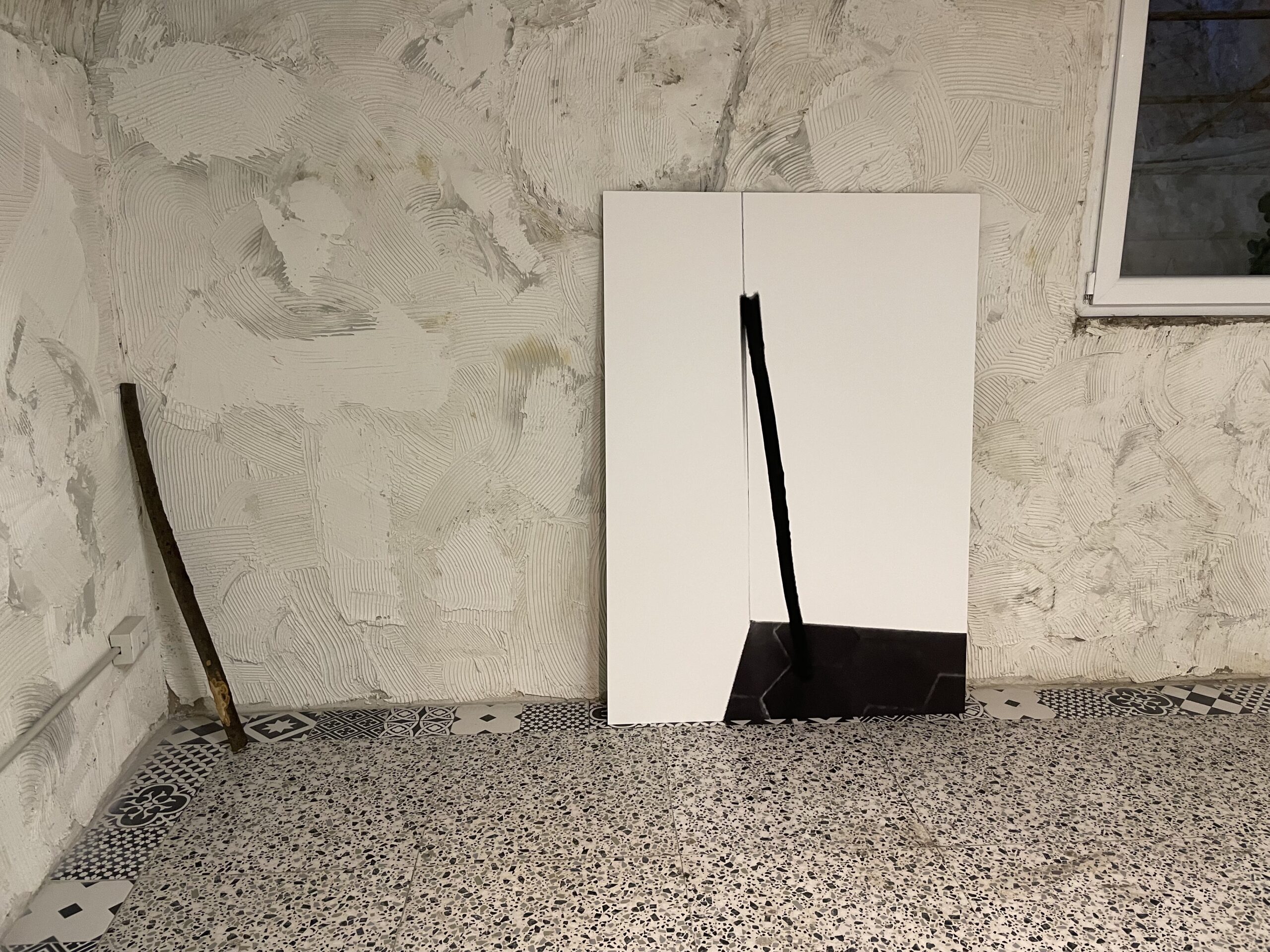
Devon Dikeou, Club, 2025 Ongoing, Found Object from the American Academy in Rome Garden;
Devon Dikeou, Hercules, 2025 Ongoing, C-Print of a Found Object from the American Academy in Rome Garden Positioned to Replicate Ercole Farnese, Farnese Hercules, 3rd Century AD, Club as Leaned on by Hercules Statue Signed by Glykon
The result: “From Fulfillment to Adaptation.” Shown at a Seconde Vue, a concept space by Federica Dollfus Di Volkersberg and curated by Guglielmo Corbo who was introduced to me by a French curator Gèraldine Postel. The exhibition entailed two pieces. A club found by Andrea and Fernando on the Academy campus—ostensibly to fix a sagging clothes rack—but turned out too short for the task. I couldn’t not see it as Hercules’s club, forlorn in the corner, without function. So I adopted it, as I often do, and photographed it—letting the object make the piece, both suture and photograph.
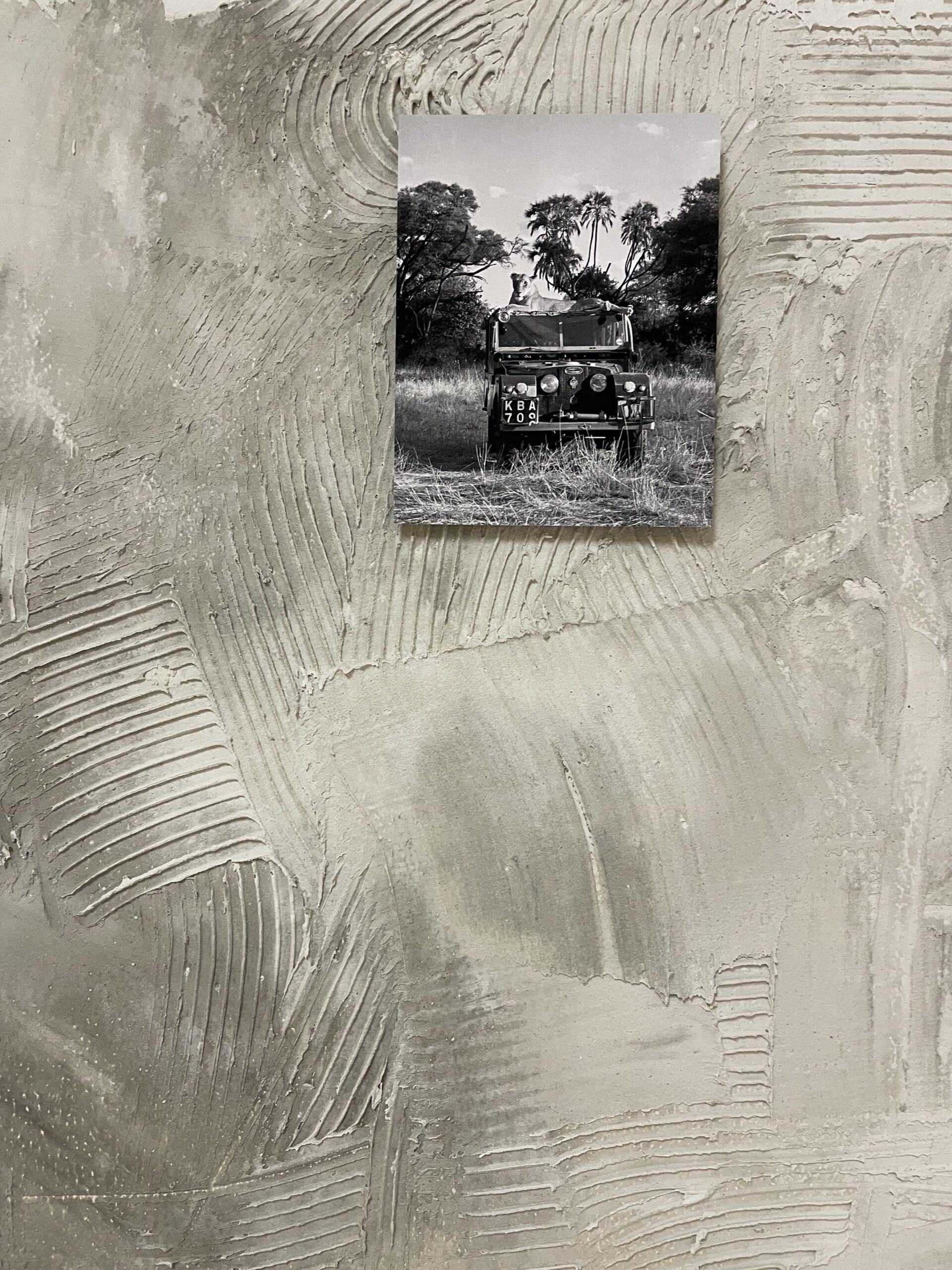
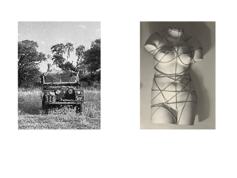
Elsa the lioness of Born Free fame laying on the roof of the Adamson’s Series 1 LandRover, Kenya, 1960, 26.4 x 34.5 cm, © Joy Adamson
But what’s the club without the lioness, and Elsa from Born Free is that, a modern day myth . . . It was a nice contrast to what I was showing at the Academy. Hercules has 12 labors, Elsa one. I love them both for their humility . . . And their spirit. One is born free; one fights to gain that . . . spirit/freedom . . . Or is it the other way around?
Your work as an artist, collector, curator, and publisher/editor is deeply informed by the different platforms in which art is experienced and exchanged, be that between people and/or spaces depending on their respective roles and contexts. Considering the vast size, history, and diversity of Rome and the generous amount of time spent there, did the city itself spark new insight or perspective within this guiding modality of your practice?
Janus. The god of the in-between. Looking both ways, Janus is two faced, not in a catty way, just recognizing the give and take in life and most certainly the creative process. I don’t go to the studio every day . . . And my “practice” traverses lots of different arenas as you mention. Editing/publishing a magazine (which is hosting this very interview), and a collection of contemporary art exhibited in five locations in Downtown Denver, including hosting studio space for the Clyfford Still Museum’s Institute Residential Fellowship Program, as well as my own personal practice. So, I have a lot of chips on the table . . . Hedging this way or that . . . And Rome is a little like that. It’s slow in a way that ancient places are. It gives you insights and glory, little by little. Even when they are the big things . . . Like the Sistine Chapel or the Coliseum, you crawl along and are no different than the pilgrims, tourists, and those just drawn to history and beauty over the years or the locales visited. Which is why the 10-month duration of the residency is essential somehow . . . It used to be longer . . . I wish in a way it was.
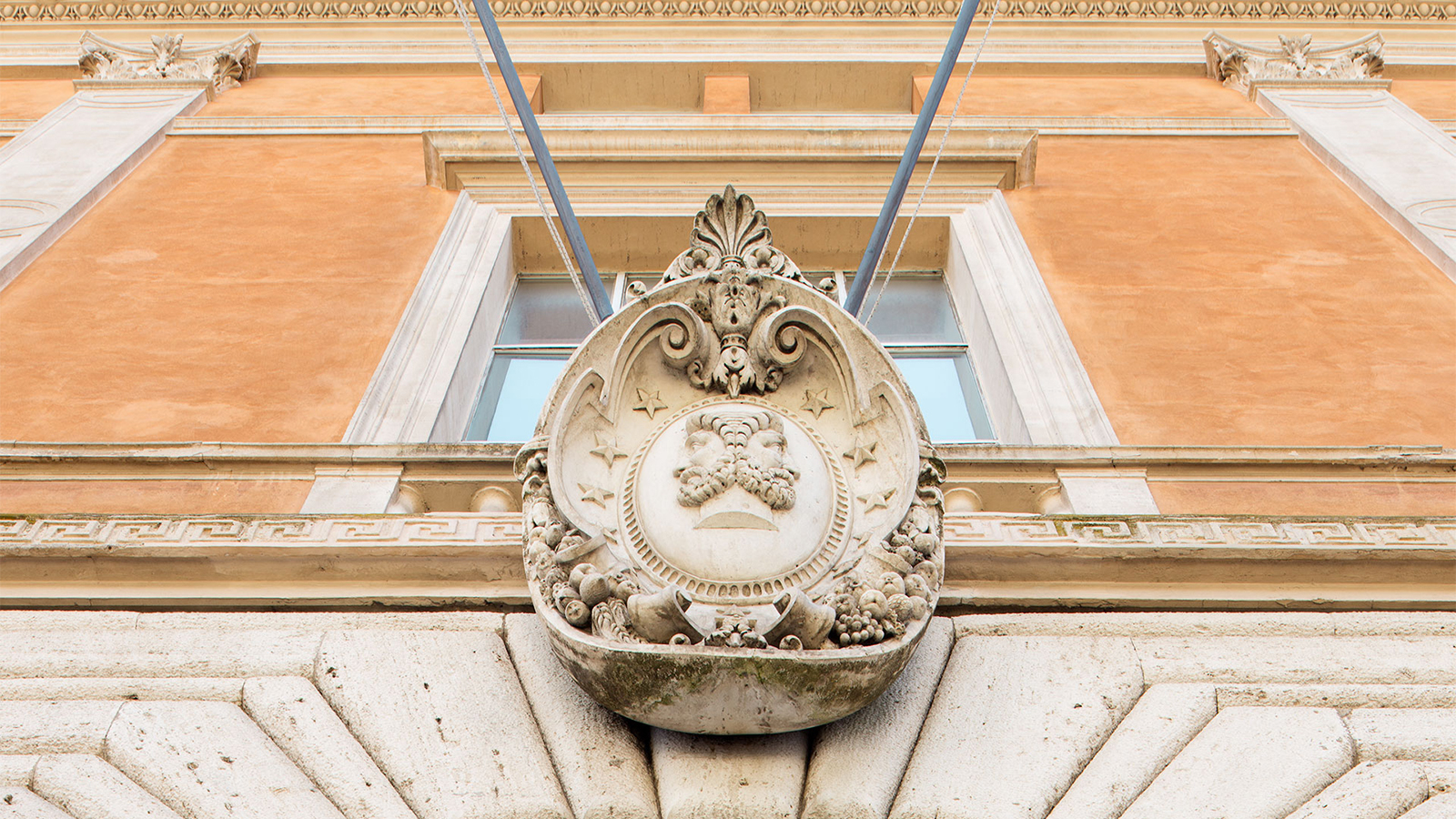
Janus above the front door of the American Academy in Rome’s Mckim Mead & White Building (photograph by altrospazio)
But AAR changed me . . . As one creates, it seems the process is intuitive among visual arts, but for my practice, intuition is not consciously there, and that means adjustment . . . My practice uses planning and time realization, it is very much edited long before it is executed, and that’s not the case from my experience of what to produce during a residency at AAR . . . Suddenly, time and Rome changed and sped up, pushing, coaxing new things out of me that I’m still feeling . . . New ways of working, even making work at the last minute, moments before the Uber ride to the airport, and even now at an elevation of 5280 in Colorado I’m still thinking about those 1200 hundred meters in Rome. These moments and works in-between fast and slow, and adjustments made me a better artist. I hope what I imparted at AAR was resonant, in slowness through adjustment in speed.
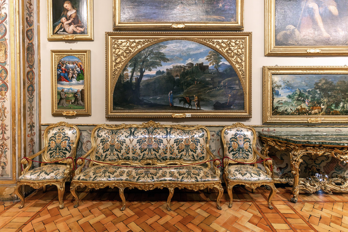
Doria Pamphilj Gallery
Share. Which is always been my inclination. But share in the most personal way . . . somehow in the end that’s the most meaningful. Doria Pamphilj Gallery . . . it’s where the Carracci masterpiece Flight into Egypt is housed, and that is my supposed inspiration . . . But on that foggy day, when I visit that old friend, in the grey loneliness of a treasure of a museum, or conversely in the blazing heat while the slow dark treasure seeps out . . . Either way it’s good to recognize those treasures within treasures . . . And that’s what the Academy epitomizes at its best. Look left and right . . . Sinistra . . . Destra . . . Janus.
Hayley Richardson
Denver, Colorado
2025
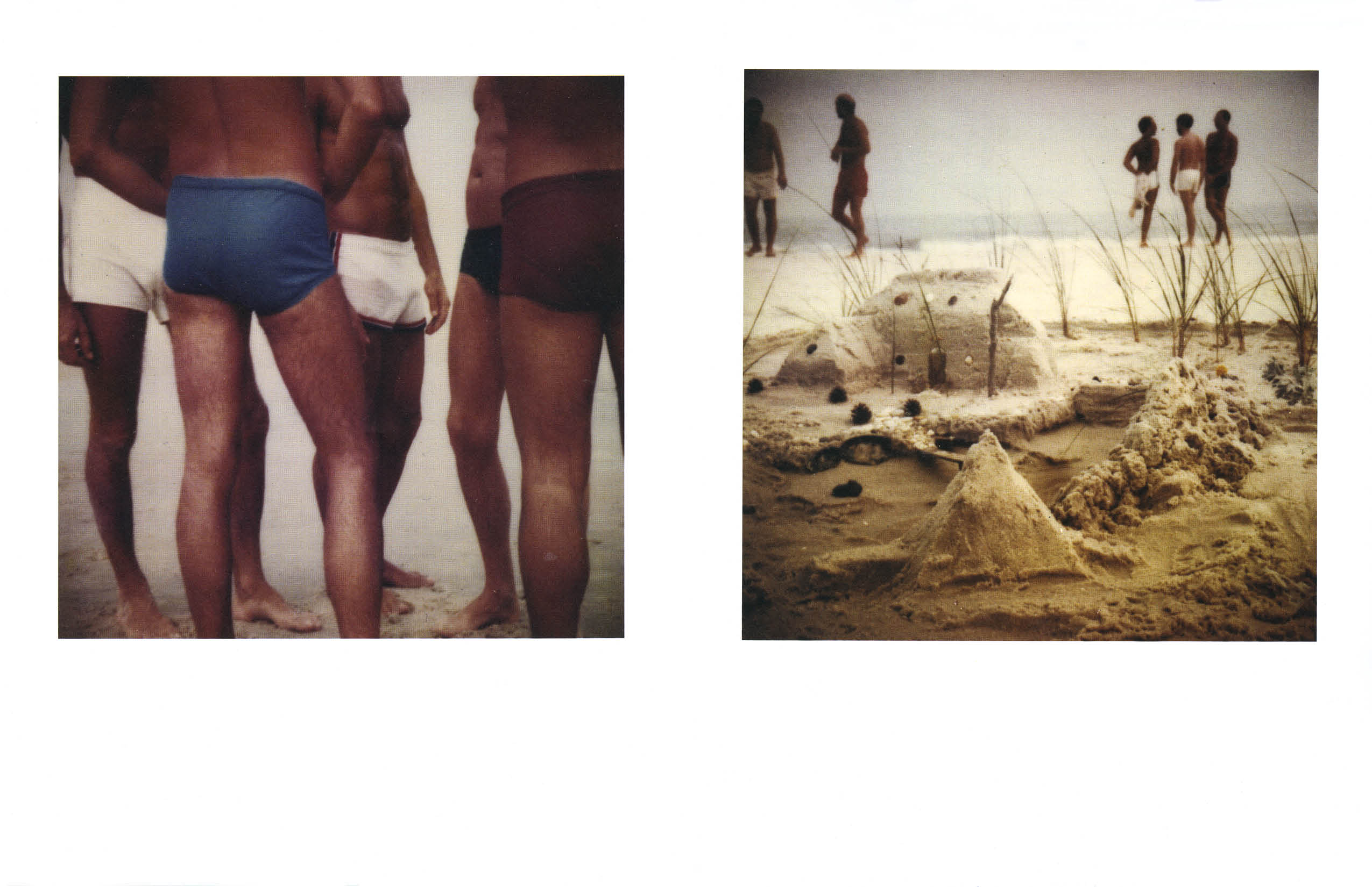
Joseph F Lovett’s passing this summer marks the loss of a pioneering voice in documentary filmmaking and LGBTQ+ cultural memory. To issue 21 of zingmagazine, Joseph joined Mary Barone in curating a selection of Tom Bianchi’s Polaroids from the 1970s, which were incorporated into his 2005 film GAY Sex in the 70s.
In his curatorial note, Joseph recalled watching Bianchi take these same Polaroids decades earlier and being struck by the sensuality they captured. “I was so happy to be able to use them in the film,” he wrote, “and to show a selection of them in zing.”
Rachel Dalamangas
New York, NY
September 2025
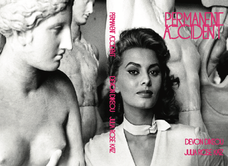
A soft collision of ancient glam and sexy ruin marks the recent collaboration between Julia Rose Katz and Devon Dikeou—both recipients of the 2025 Rome Prize in their respective fields: Julia, winner of the Anthony M Clark Rome Prize for Renaissance and Early Modern Studies, and Devon, the Jules Guérin Rome Prize for Visual Arts.
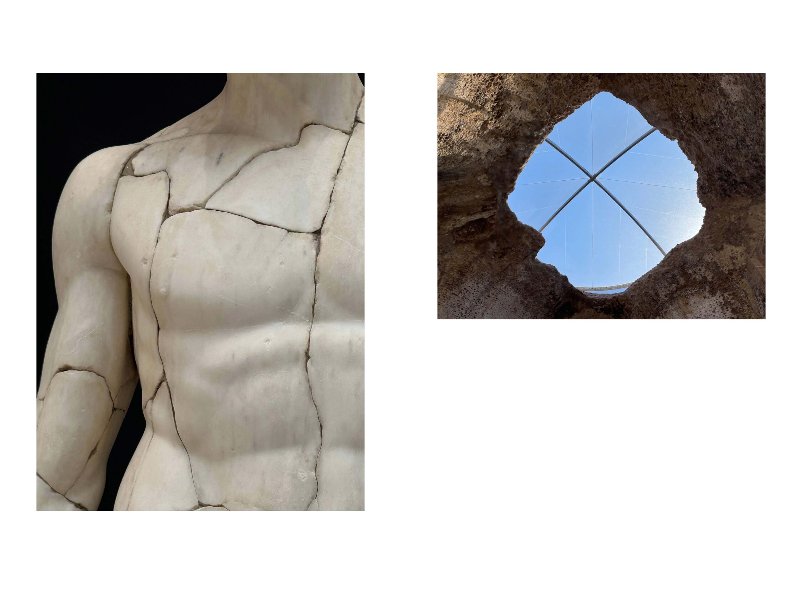
While on fellowship at the American Academy in Rome (AAR), they were paired in a program called Shoptalks, a public forum for Rome Prize Fellows to share their current and ongoing work with each other. The result of their working in collaboration was an idiosyncratic limited-edition book of images sourced from Renaissance paintings, Ancient Roman sculpture, film stills, fashion, and photography as well as their own photographs and artwork. The only text that appears are statements from Julia and Devon, and chapter headings: Entrance, Break, Pop, Part, Joy, Rock, Exit.
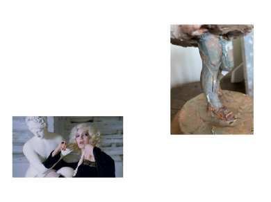
Permanent Accident—a seemingly enigmatic title that was taken from a glitter spill in the studio—is both artwork and book, and one look at the cover alone tells you everything you need to know about how to read it: a young Sophia Loren posed next to a Roman statue, looking with catlike self-possession directly into the camera as she sneaks one hand toward the statue’s breasts as if to make a grab at them.
Which is to say, these images talk to each other—fractures appearing on the torsos of figures amidst ancient ruins, a Saul Leiter photograph of a woman examining cracks in the sidewalk, doorways and gates to devotional altars. It’s more poetry than narrative, more art than history, more history than narrative.
In conversations leading up to their Shoptalk, they realized that they shared a connection to artist Lizzi Bougatsos–Devon as the largest collector or her artwork, and Julia whose work is influenced by personal experiences that evoke themes of breakage and repair as well as the use of found objects, also characteristic of Bougatsos’ work. As part of their Shoptalk, Devon brought Self Portrait, a mold of Bougatsos’ leg in ice to the entrance hall of the Academy.
Devon Dikeou & Julia Rose Katz
as Interviewed by Rachel Dalamangas
During your AAR Shoptalk where the book-in-progress was presented, I noticed the concept and references of breakage and repair in the sense of (art) restoration, the body, and even the way that the images are presented breaks their original framing. How does the title Permanent Accident apply to your contributions to the book? How was the title decided?
JRK: We came up with the title together over a meeting in Devon’s studio. I mentioned loving the glitter that covered a book layout displayed on her table. Devon told me she had mistakenly spilled glitter all over the studio, and that it had become “the most beautiful permanent accident.” This was the genesis of the book’s title, but it does have a deeper meaning too. The idea when compiling the book was to convey a sense of randomness, so the selection of images appears almost accidental. Of course, it is not actually accidental at all, but we wanted it to feel that way. In reality, the images are carefully chosen, organized, and arranged, but we intended the rationale behind the selections to be invisible.
DD: Another title could be Invisible Accident. Invisible and Permanent are diametrically opposed. One must look, truly look, not just glance, to see. Sounds a little too phenomenological but it’s relevant. When Cezanne is looking at those oranges and realizes the next time he looks, they won’t be the same . . . It’s both a still life and a phenomenological realization that brings on Cubism. (Cezanne’s Doubt, Maurice Merleau-Ponty). We look at that glitter, hoping it stays permanent. “All that glitters is gold”, right . . . But that glitter from a second ago will float . . . As glitter does, and become slightly lost in the diaspora of life. Invisible, I know the invisible, the back door, the place uninhabited, the forgotten and yet treasured . . . The land of misfit toys . . . to which I most belong. And I would hope my compatriot and foil in glitter among all things to be there: Julia . . . Who knows the permanent.
It interests me that you both work across disciplines as creative thinkers: Julia as an art historian and artist; and Devon as an artist, curator, and editor. How did your backgrounds inform the creation of the book?
JRK: I don’t consider myself an artist. My interests are curatorial, so I treated the book as a curatorial project. I considered each image an object, situated in relation to what precedes and follows it. We each provided half of the images in the book, and my contributions comprise my own photographs, as well as found images that relate to the book’s themes and my personal interests as an art historian.
DD: I am an artist. But my practice encompasses both editing/publishing zingmagazine, a curatorial crossing, (est 1995 Ongoing) and collecting and assembling the Dikeou Collection (est 1998 Ongoing) . . . All three of which are very much curatorial by nature. And curating is a collaborative endeavor . . . In my mind, Julia and I set out on an adventure, initially on the platform of a book. But deeper than just the book, our collaboration took on another voice in the making of Shoptalks: and that was doing a real event, a real and literal presentation of our thought process. That was bringing in an ice sculpture by Lizzi Bougatsos from Dikeou Collection. It’s a leg, Lizzi’s leg, and the sculpture lasts about four hours. In the end, it can/needs to be broken. Inherent Vice. Its own medium is the cause of its destruction. So both the book and culminating moment of the performance were an exchange of ideas and images, thoughts, hopes disappointments and eventually . . . As that’s always what happens with books and performance, it’s finished, and once the exhilaration of the publication has been exhausted, there’s that . . . And performance is that friend dusts at the bar. Sometimes you may reunite . . . But books live on in their small capacity beyond the life of a show/exhibition/performance . . . Those sage words were spoken to me Kenny Goldsmith as I was delivering zingmagazine to Paula Cooper, which at the time, I knew will never get to her . . . Solice . . . Scott Joplin chimes in, with poetic and clear love of just trying to create, collaborate, and communicate . . .
It seems to me that there’s a kind of conversation taking place between images that I can partially understand just enough to follow a pattern although I am also unsure how much I’m projecting meaning (like being an American with very little Italian in Rome!) The images also cover a lot of art-historical-cross-disciplinary ground including ancient statues, fashion, black and white film stills, pop, and contemporary art (including your own). Can you share some insight on your choices of images and how the book was arranged?
JRK: If you’re projecting meaning, then you’re responding to the book exactly as you should! Sometimes our approach was more aesthetically driven, other times it was more playful. It was very important to us that the images in each spread converse with one another, but it’s your job as the reader to uncover the hidden significance. My work as an art historian focuses primarily on ideas of bricolage—the combination of ancient objects into new compositions—all of which directly inspires and informs the assembly of images in Permanent Accident.
DD: Sections: we divided the book into sections/chapters with input from both of us in terms of both image selection and placement under section titles, and then as a juxtaposition with each other. Those section titles we settled on are: Entrance, Break, Pop, Part, Rock, Joy, Exit. If a reader finds a clue here or there, by chance or projection, we might create a memory, a pretty important exchange between reader, curator, editor, artist, and audience.
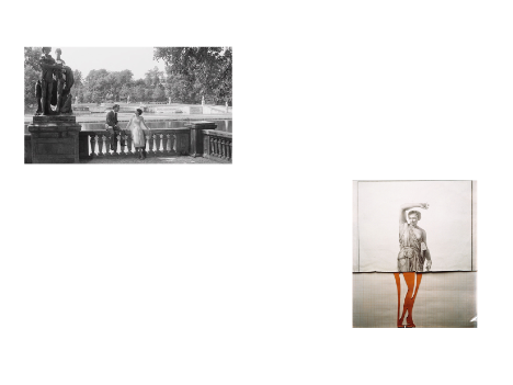
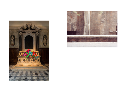
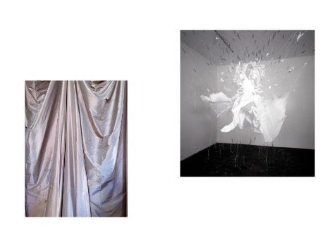
Ok, very simple and yet very hard question: How does one “read” this book? It’s interesting because the images are all out of their original contexts (your studio art, reproductions of museum objects, and gallery pictures), and the book itself is a new original work of art. In a way, it only makes sense for it to exist as an actual object (and not an ebook) in a time where content is getting hoovered up by the great maw of the internet, which tells me physicality, especially regarding how the images are presented in a two-page spread, matters a great deal here.
JRK: Yes, this is absolutely correct. The book would not work the same way in a digital format. The tactile experience of holding the book, flipping through its pages, and engaging with it as a physical object is crucial to our conception. We live at a time when we are inundated with images, and our intention here was to bring value and focus to each page. Our hope is that the reader brings their own meaning to these visual compositions by montaging together disparate elements.
DD: Reading is subjective. Of course, Gertrude Stein and more recently, Calvino, Kundera, Cortazar, Auster among others teach us this. The reader in the postmodern world, much less the universe of magical realism, is an active reader, who participates with their interpretation of the published work and goes down whatever rabbit hole that may lead. I hope it’s a good as Alice’s, which is both real and unreal.
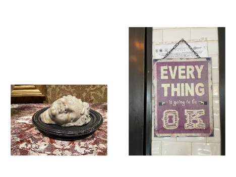
I LOVE the cover of Sophia Loren in Rome with the statues and of course it’s very clever the way the image wraps around the cover. It winks at the sense of humor and playfulness you both brought to this project. Even the decision to use “shocking pink” for the cover text teases out a little bit of scandalousness and sexiness, and no small amount of glam and feminine confidence. How did you arrive at the truly brilliant choice of using this particular image?
JRK: We were perusing photographs of old film stars and came across this shot of a young Sophia Loren surrounded by casts of ancient sculptures. The image relates to my academic work on the revival of antiquities in Italian cinema and our common interest in popular culture, specifically the women who defined that culture in the twentieth century. The use of the color “shocking pink” for the text draws on the history of the color by Elsa Schiaparelli, who adopted it for her brand and for the packaging for her perfume, designed with a then scandalously shaped bottle that recreated Mae West’s torso. “Shocking pink” became representative of female strength as well as the avant-garde in fashion, and this 1930s history inspired us as we developed the book, which aims to confuse or shock with its sometimes unclear juxtapositions.
DD: Sophia is there, present in all of Italy. Not like how you might see her in little Italy. She’s just there, permeating the air and telling you she is its ethos . . . Choosing the cover is perhaps the most important task of editors/curators . . . In the same way when I select a cover zingmagazine, where I go is to the NY Picture Library, and physically going to the building, and search specific topics, in folders, under the fluorescent lights for something in the long lost selection of images by some picture editor/librarian—nameless—I might find an image that might pertain to that which should be conveyed. But Rome itself is a library. A visual, architectural, filmic library and as you peep, revere, absorb . . . Sophia shines bright . . . Coddled in and next to the gods, drinking their nectar, how could you resist. Why shouldn’t she take Front, Back, and Spine.
Rachel Dalamangas
New York, New York
September 2025
Image Credits:
Man Ray
Lina Mertmüller
Deborah Kass
Luigi Ghirri
Patricia Cronin
E.V. Day
Hiroshi Sugimoto
several photos taken by the authors
Devon Dikeou and Julia Rose Katz
Sophia Loren at a studio in Rome, 40.6 x 26.7 cm © Science History Images / Alamy Stock Photo.
Elsa the lioness of Born Free fame lying on the roof of the Adamson’s Series 1 Landrover, Kenya. 26.5 x 34.5 cm, 2018 © Mark Boulton / Alamo Stock Photo.
Man Ray, Vénus Restaurée (Restored Venus), 1936. Gelatin silver print, 16.5 x 11.4 cm (6 1/2 x 4 1/2 in) © Man Ray Trust ARS-ADAGP.
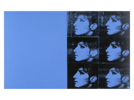
Deborah Kass, Blue Barbras (The Jewish Jackie), 1992. Silkscreen ink on syntehtic polymer paint on canvas, 91.4 x 114.3 cm. Courtesy of the artist.
Luigi Ghirri, Amsterdam, 1980, from the series ‘Still life,’ 2011. Blue felt-tip pen on paper, 75 x 56 cm (20 x 24 in). © The Estate of Luigi Ghirri. Courtesy Thomas Dane Gallery, Matthew Marks Gallery, New York and Los Angeles, and Mai 36 Galerie, Zurich and Madrid.
Patricia Cronin, Shrine for Girls, Venice Saris, 2015. La Biennale di Venezia, 56th International Art Exhibition. Photography by Mark Blower. Courtesy of the artist.
Luigi Ghirri, Pantheon, 1982. Vintage chromogenic print, 32 x 47 cm (12 x 18 1/2 in). © The Estate of Luigi Ghirri. Courtesy Thomas Dane Gallery, Matthew Marks Gallery, New York and Los Angeles, and Mai 36 Galerie, Zurich and Madrid.
E.V. Day, Bombshell, 2000. Dress reproduction of Marilyn Monroe’s costume in the film “The Seven Year Itch,” 16 x 16 ft. Collection of the Whitney Museum of American Art. Courtesy of the artist.
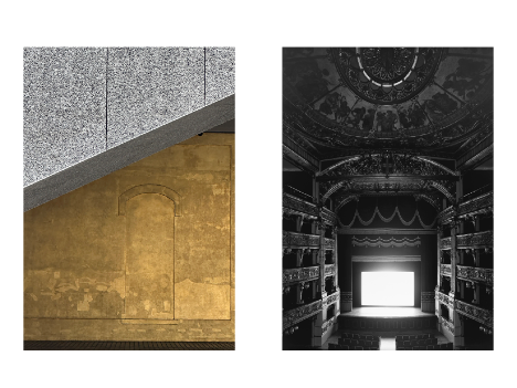
Hiroshi Sugimoto, Teatro Carignano, Torino, 2016. Gelatin silver print, 1492.2 x 119.4 cm (58 3/4 x 47 in) © Hiroshi Sugimoto. Courtesy Fraenkel Gallery, San Francisco Lisson Gallery.
This July, Denver’s Month of Video (.MOV) returned with its second citywide iteration, transforming nontraditional spaces into screens for experimental film and video art. Among the standout contributions was “Moving Still: Video Art Highlights from the Dikeou Collection,” a layered exhibition embedded within Devon Dikeou’s sprawling “Mid-Career Smear” retrospective. Curated with intention and wit, “Moving Still” explores how video inhabits—and disrupts—space, stillness, and perception. Featuring works by Momoyo Torimitsu, Serge Onnen, Dan Asher, and Dikeou herself, the exhibition examines themes of capitalist spectacle, ambient media noise, and ecological elegy, all while mining the slippery terrain between fiction and reality. Here, we talk with the Dikeou Collection director and curator of “Moving Still”, Hayley Richardson, about the selection process, the political charge of background visuals, and the surprising archival discoveries that deepen the show’s resonance within both the Dikeou Collection and the broader .MOV program.
Hayley Richardson as interviewed by Rachel Dalamangas
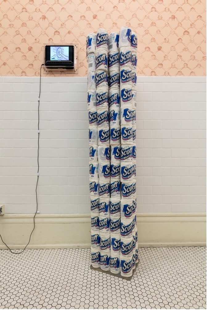
Serge Onnen, Break, Cell Animation DVD with Sound, 2:11 minutes, edition 1/5; Serge Onnen, Silence Fence, Wallpaper Designed by Artist
Devon Dikeou, Entertaining is Fun—Dorothy Draper, 156 Scott Toilet Paper Rolls, Unrolled to a Diameter and Stacked to Attain the Height of the Artist
How did you decide on which video works to include from the Dikeou Collection’s roster, particularly those by Devon Dikeou, Momoyo Torimitsu, Dan Asher, and Serge Onnen?
“Moving Still: Video Art Highlights from the Dikeou Collection” exists as an exhibition within an exhibition, as it comingles with Devon Dikeou’s “Mid-Career Smear” (MCS) retrospective. When asked to participate in Denver Month of Video (.MOV) by organizers Jenna Maurice and Adán de la Garza, the plan was to highlight as much video art represented in Dikeou Collection as possible while maintaining a flow and cohesiveness within MCS.
Most of the video artworks in the Dikeou Collection are part of multifaceted installations with various media, and it was crucial to have these installations exhibited in their entirety. This was not viable for certain artworks, but I was able to achieve it successfully for Serge and Momoyo. Serge’s video Break is accompanied by wallpaper of his own design, which is permanently installed in the Women’s bathroom, so it was easy to incorporate his video within its preexisting context. Momoyo’s Miya Jiro combines video, sculpture, and photography, and is installed in the same room as Devon’s We’d Like to Get to Know You where the entire room is covered wall-to-wall, floor-to-ceiling in business cards. Considering Miyata Jiro is about business and has a businessman crawling on the floor, it was a perfect match and one that will likely remain permanent. Dan Asher’s Creature and Devon’s The News Too are standalone pieces, so their inclusion and placements were more straightforward within the context of MCS.
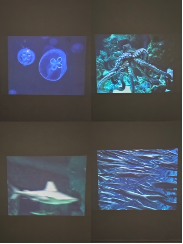
Dan Asher, Creature, Stills Showing Jellyfish, Octopus, Shark, and Sardines, DVD Projection, Variable Dimensions
With works spanning from the mid 1990s to recent pieces, are there overarching themes or threads—such as stillness, media critique, or sensory perception—that unify the works in this exhibition?
Serge’s video is about animation’s power to make the most impossible situations become real, and the ubiquitous yet ephemeral nature of drawing. Momoyo’s work explores the tension of reality and authenticity in a capitalist society, and her videos are documents of an unsuspecting audience experiencing that tension in real time. Devon’s video removes the bias and the blabbering of cable TV news and allows the repetitive stillness of the background to create harmony in a fractured, media-obsessed nation. And Dan’s projection of sharks, fish, octopus, and jellyfish floating in water transports the viewer to a peaceful, meditative underwater world . . . but the reality is these animals are in captivity at the London Aquarium as their natural habitats grow more dire and scarce by the day.
So, a unifying thread is suspension of reality. Our fixed perceptions become malleable when experiencing these works—fiction becomes fact and vice versa.
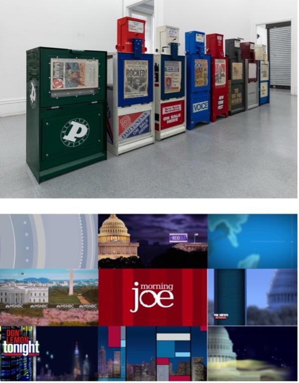
Devon Dikeou, The News, Series of Fully Operational New York City Newspaper Dispensers, Available for Viewers to Use for the Duration of the Exhibition, Papers Updated on Daily/Weekly Basis by Appropriate News Agencies
Devon Dikeou, The News Too, Background Graphics of 9 Popular American Cable News Broadcasts, Looped After 5-Minute Duration, Variable Dimensions
Could you speak to Devon Dikeou’s piece The News Too—how it distills network news into ambient visual noise—and its significance within the show?
In order to talk about The News Too (2019 Ongoing), I need to talk about its sibling, The News (1992 Ongoing). Nearly all of Devon’s artwork is dated Ongoing due to each piece’s nature to grow, expand, and take on new meaning within every new context and interaction, but this is one of the few works in her practice in which an “updated” version is born from a pre-existing artwork.
The News is comprised of eight NYC newspaper machines. When originally shown in an exhibition called “Certain Uncertainty” curated by Kenny Schachter at Deutsche Bank, each machine received its regular daily or weekly delivery of newspapers. The exhibition title was apt for this installation, as the news is a type of certain uncertainty.
The News Too exists as a video installation where the backgrounds of nine American cable news shows are arranged in a grid à la The Brady Bunch. Some backgrounds are animated with waving flags or swirling stars; some are still graphics of grids and panels. Some display the name of the show and/or host, some are anonymous. The backgrounds play for 5 minutes before the final frame appears displaying the name of each show and then loops and plays again. This presents an interesting contrast with The News, in that it does not share any news at all. There is no certain uncertainty. No Left vs Right. The diabolical squawk box that is cable news is now patriotic ambience, swathed in stars and stripes, and red, white, and blue.
As for its significance in the show, it is worth noting that The News Too has been on view at Dikeou Pop-Up: Colfax since 2020 as part of MCS. Devon’s art practice has always been embedded within the curation of the Dikeou Collection, and since “Moving Still” exists in tandem with her retrospective, it made sense to include this particular video in the show.
How do you see “Moving Still” fitting into the broader scope of the Month of Video festival programming across non-traditional spaces and public screens?
.MOV is a true DIY endeavor. It was founded by artists with the goal to boost the visibility of video art through public art activations and artist-run gallery / programming spaces, all of which are free and open to the public. “Moving Still” is exhibited in Dikeou Collection, which is an artist-founded, free & publicly accessible non-traditional space. What sets this exhibition apart from other .MOV programs is that it highlights video artwork that is part of a private collection. While video has certainly gained traction among art collectors over the last 20 years or so, it still represents uncharted territory when compared to highly collected mediums like painting, photography, and sculpture.
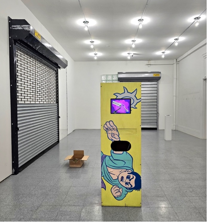
Christian Schumann, Evel Machine, Painted Wood Kiosk Displaying a Still of “No. 2” by Sweden from zingmagazine Curatorial Video Crossing, vol. 2;
Devon Dikeou, City Gates, Room Installation of Security/Insecure, Security Secure, and Security/Kisosk, Variable Dimensions
The exhibition features compilations from zingmagazine’s Curatorial Video Crossing and early Zapp Magazine. What role do these curatorial projects play in dialogue with the individual artists’ pieces?
Like The News Too, the zingmagazine Curatorial Video Crossing videos were installed at Dikeou-Pop: Colfax as part of MCS. The videos are presented within a kiosk painted by Christian Schumann, which was part of another collaborative art project called Evel Machines Devon helped organize in collaboration with Mike Brown in NYC in the 90s. Artists Rachel Harrison, Ricci Albenda, Kenny Schachter, Lee Stoetzel, Rainer Ganahl, and Schumann were commissioned to customize these kiosks and have them placed in NYC businesses like Naked Lunch, SoHo Grand, Family of God, and The Void where they served as informational booths with local recommendations for bars, restaurants, hotels, galleries, museums, clubs, and other cool spots in the neighborhood. For “Moving Still” I decided to place the kiosk in proximity to Devon’s City Gates to give it that New York on-the-street feel as part of its original conception.
Considering the potent overlap between Devon’s art practice, art collecting & curating, and editing & publishing zingmagazine, it was impossible to ignore the relevance of the zing Curatorial Video Crossing project she initiated in the early 2000s for this exhibition. There’s a total of 42 videos across all three compilation volumes, and several of the participating artists are represented in Dikeou Collection, such as Dan Asher, Marcel Dzama, Sebastiaan Bremer, Lisa Kereszi, and Rainer Ganahl. The zing videos allow for more Dikeou Collection artist representation in the exhibition which was important for me.
Zapp Magazine, Issue #01, March 1994
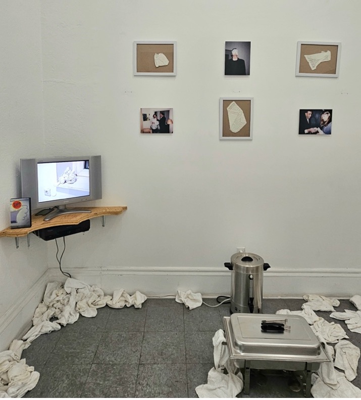
Devon Dikeou, “Out, Out, Damn Spot” – Macbeth, Shakespeare, Happening Professional Waiter Serving 300 Warm Towels to Viewers, Who Enjoyed, Used, and Discarded the Towels, Variable Dimensions
Zapp Magazine was a surprise discovery when digging through the collection’s archives in search of more video treasures. I spent about a week watching all the artist tapes and DVDs I could find. I saw a lot of weird, wonderful stuff, but the decision to include Zapp Magazine was immediate because it shows Devon’s Out, Out, Damn Spot – Macbeth, Shakespeare performance installation when it was exhibited in “Bodyguard” at Hohenthal und Bergen Cologne in 1994. Out, Out, Damn Spot is currently on view in MCS, and the video is placed within that installation. For context, Zapp Magazine was an international videozine distributed on VHS from 1993-1999 that presented “exciting developments in contemporary art through registrations of shows, performances, artists’ video’s, interviews etc.” While the presence of Devon’s artwork on this particular tape was the main reason I decided to include it in the exhibition, Zapp Magazine really was on the cutting edge of collecting and compiling video art, interviews, and exhibition documentation in a cohesive and serialized format. These tapes are rarely shown in public and are not digitized, so I am grateful to share this work.
As far as the dialogue between the compilations and the individual artist videos, I’d say it’s about camaraderie, variety, and providing a different viewing experience for the audience. As previously mentioned, there are Dikeou Collection artists represented in the zing compilations, and, additionally, there are several artists in the Zapp videos who have affiliations with zingmagazine like Vito Acconci, Janine Antoni, Karen Kilimnik, Richard Agerbeek, Simon Bill (also a Dikeou artist), Sarah Morris, and Raymond Pettibon, among others. The overlap between all the artists among different projects and platforms is boundless. I love discovering these connections and I hope that resonates with audience as well.
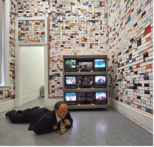
Momoyo Torimitsu, Miyata Jiro, Mixed Media Robotic Man, Six Performance DVD Videos, Variable Dimensions
Devon Dikeou, We’d Like to Get to Know You, Business Cards, Variable Dimensions
Dikeou Collection is right at home in this neighborhood of cross-pollination between media, platform, content, etc. Can you share some of the cross-conversational elements of the video art exhibited at Dikeou Collection and corresponding zing projects and archival items?
Yes! The videos by Serge Onnen and Momoyo Torimitsu are part of expansive installations that represent other aspects of their artistic output. This is a central tenet to Dikeou Collection’s approach to collecting—to collect an artist’s work in breadth and in depth so we can exhibit the full range of their practice. Momoyo’s Miyata Jiro is, in my opinion, one of the strongest examples of this approach in the collection. The nexus of the artwork is a performance in which Momoyo took the Miyata Jiro robot to six major tourist and financial districts around the world and had him crawl through the streets while she, dressed as a nurse, tended to him along the way. The six videos in the installation serve as performance documentation, as does the photograph from the New York performance. Then, of course, there is the robot itself on the floor . . . all of which is now set in relation to Devon’s We’d Like to Get to Know You. So much cross-pollination happening in just that one room!
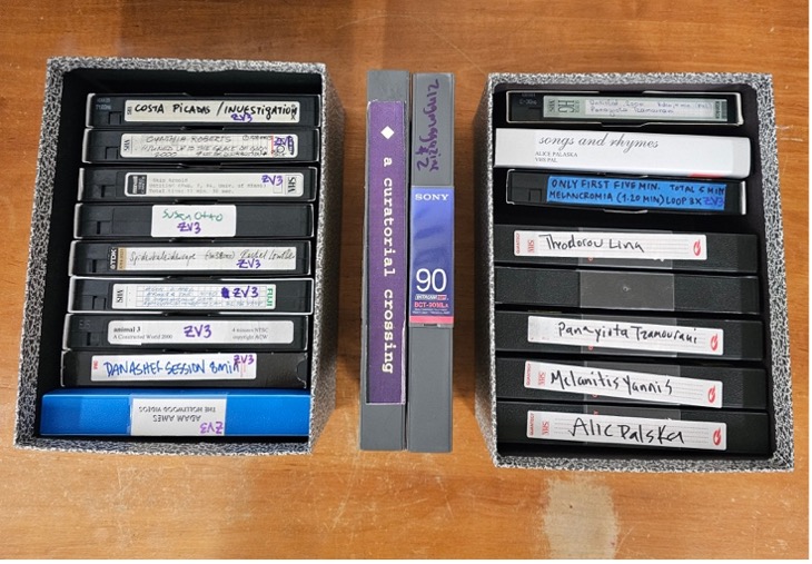
Various Artists, VHS Tape Submissions for zingmagazine Curatorial Video Crossing and final master tapes on Betamax
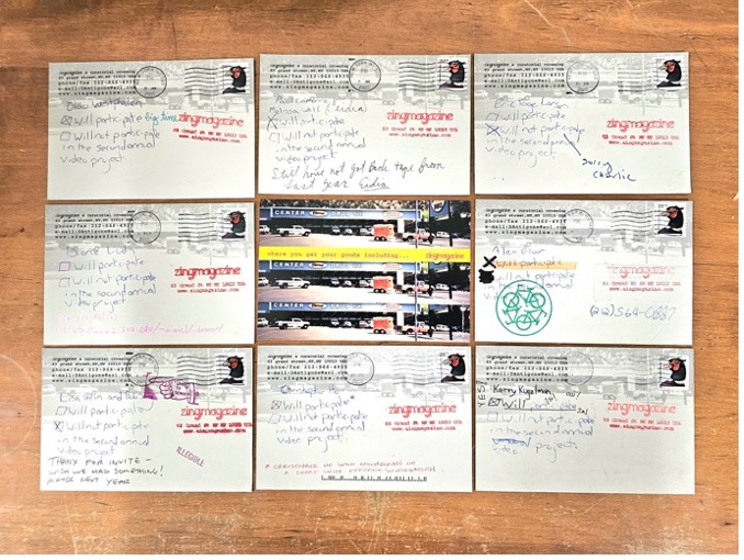
Select Postcard Requests for Submission for zingmagazine Curatorial Video Crossing
Another unique feature of the “Moving Still” exhibition is the inclusion of archival elements of the zingmagazine Curatorial Video Crossing videos. The extensive archives at Dikeou Collection open the doors to a deeper understanding of the magic that happens behind the scenes in the studio, at the collection, and at zing HQ. During my archival deep-dives I found the original VHS tapes submitted by the artists for inclusion in Curatorial Video Crossing. These individual tapes were compiled into master tapes on Betamax, which are displayed in the exhibition. One of my favorite discoveries in the archives was a batch of self-addressed & stamped postcards sent from zing HQ to dozens of artists requesting their participation in the Video Crossing project, with two handwritten checkboxes for “Will Participate” or “Will not Participate.” The cards reveal the DIY-ness of it all, and the intimate relationships between artists. Each one is personal and delightful.
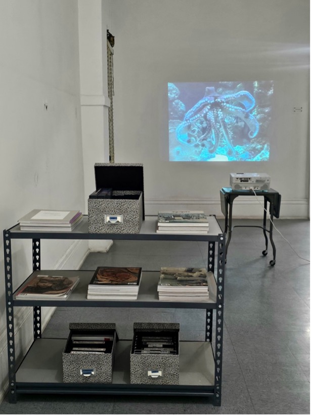
zingmagazine Curatorial Video Crossing archival display with VHS and Betamax tapes, postcards, and zingmagazines; Dan Asher, Creature, DVD Projection
The zingmagazine Curatorial Video Crossing videos emphasize the magazine’s ability to extend beyond the printed publication, but the magazine itself has featured numerous projects that pertain to video, film, cinema, moving images, or images viewed on a screen or some kind of projection. I went through every zing project, bookmarked the ones that fell into those categories, and included them in the archival display. Some of the strongest examples of these projects include Susan Robinson in issue 1, Tamas Banovich and Brendan Quick in issue 2, Jonathan Horowitz in issue 3, Rachel Harrison in issue 4, Neil Goldberg in issue 6, Jane Hart in issue 15, Drazen Bosnjak in issue 18, Alix Lambert’s project in issue 24 as well as mine on Harry Smith, and Maria Antleman’s project in issue 25.
Researching and incorporating archival ephemera and artwork that addresses video in a printed format was my favorite part in organizing this exhibition, and, I think, a distinguishing characteristic of “Moving Still” within the .MOV landscape.
Rachel Dalamangas
New York, New York
August 2025
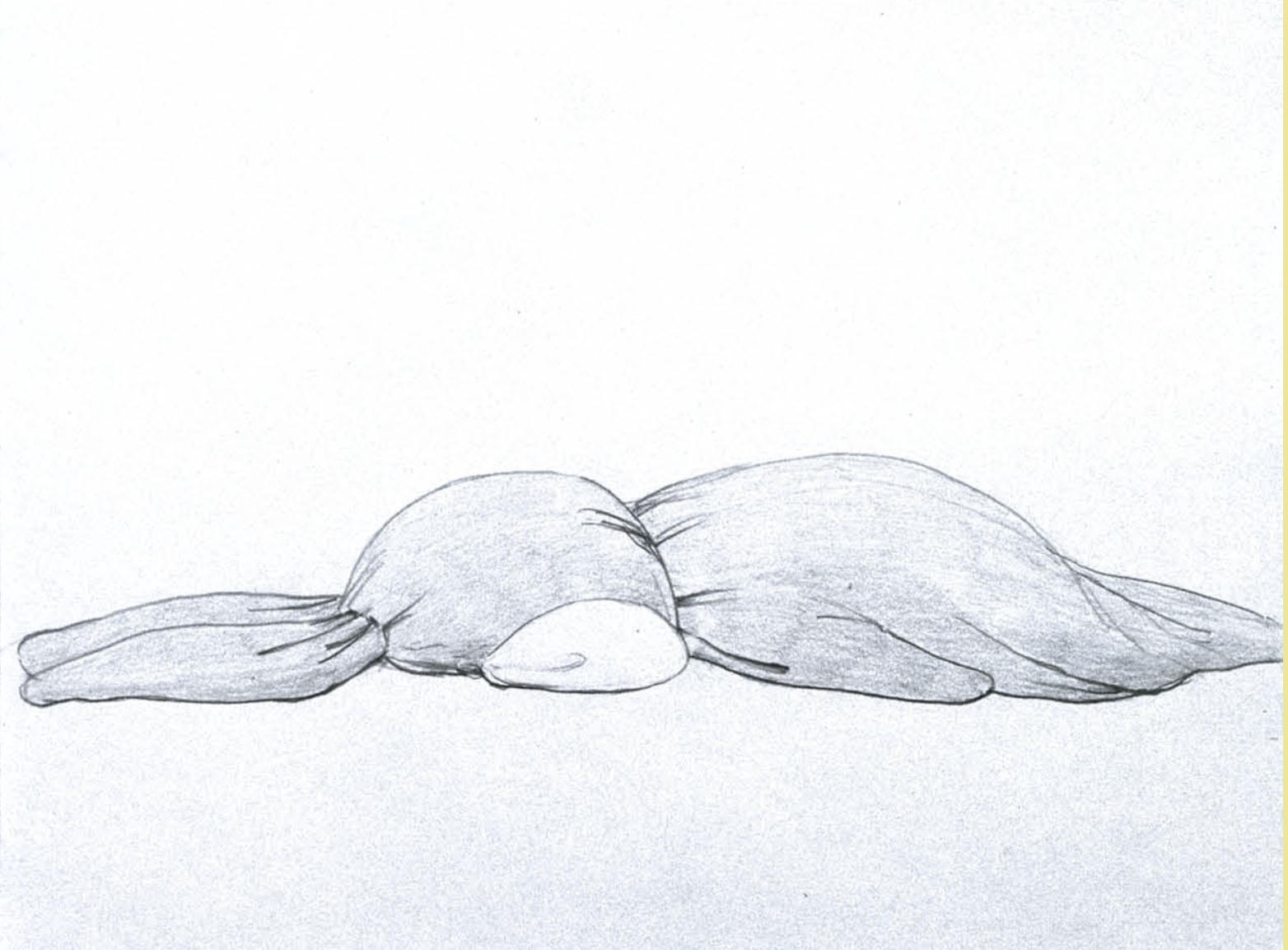
from zing #15, Momoyo Tormitsu “somehow i don’t feel comfortable”
What could artistic commentary on the Japanese commercialization of cuteness at the turn of the millennium predict about the state of the world in 2025? In some respects, quite a lot.
Momoyo Torimitsu debuted the iconic installation somehow i don’t feel comfortable, two inflatable pink bunnies scaled so that they appear cramped and uncomfortable in a gallery exhibition space, in Paris in 2000. It was a year when the texture of reality had already begun to feel slightly fake – often, if not always – in a fun way, so long as you didn’t look closely enough to notice the brewing problems that would only become more complex and dire in the coming quarter century.
Some other interesting things that happened the same year:
You could wait for your grandmother’s flight at the gate instead of beyond a ticketed obstacle course.
Cellphones and wi-fi were still rare and quasi-futuristic.
Social media didn’t exist (though AOL chatrooms did).
4chan didn’t exist yet.
Incels did, but in their gentler, mostly feminine, original form.
Jeff Bezos founded a private spaceflight start-up; Katy Perry released a debut album of unremarkable Christian music.
Peter Thiel was spinning Roth IRA straw into gold.
Donald Trump soft-launched his political career.
Vladimir Putin became president of Russia, then cautiously projected to be on a path of democracy.
Al Gore, winning the popular vote on an environmental platform, conceded the presidency to George W. Bush, who expanded foreign oil investment—widely seen as a sign of democratic stability in the U.S.
Britney Spears and Justin Timberlake graduated from high school, and publicly announced they were bf/gf.
See more from ‘somehow I don’t feel comfortable’ in zing #15 here.