This July, Denver’s Month of Video (.MOV) returned with its second citywide iteration, transforming nontraditional spaces into screens for experimental film and video art. Among the standout contributions was “Moving Still: Video Art Highlights from the Dikeou Collection,” a layered exhibition embedded within Devon Dikeou’s sprawling “Mid-Career Smear” retrospective. Curated with intention and wit, “Moving Still” explores how video inhabits—and disrupts—space, stillness, and perception. Featuring works by Momoyo Torimitsu, Serge Onnen, Dan Asher, and Dikeou herself, the exhibition examines themes of capitalist spectacle, ambient media noise, and ecological elegy, all while mining the slippery terrain between fiction and reality. Here, we talk with the Dikeou Collection director and curator of “Moving Still”, Hayley Richardson, about the selection process, the political charge of background visuals, and the surprising archival discoveries that deepen the show’s resonance within both the Dikeou Collection and the broader .MOV program.
Hayley Richardson as interviewed by Rachel Dalamangas
Serge Onnen, Break, Cell Animation DVD with Sound, 2:11 minutes, edition 1/5; Serge Onnen, Silence Fence, Wallpaper Designed by Artist
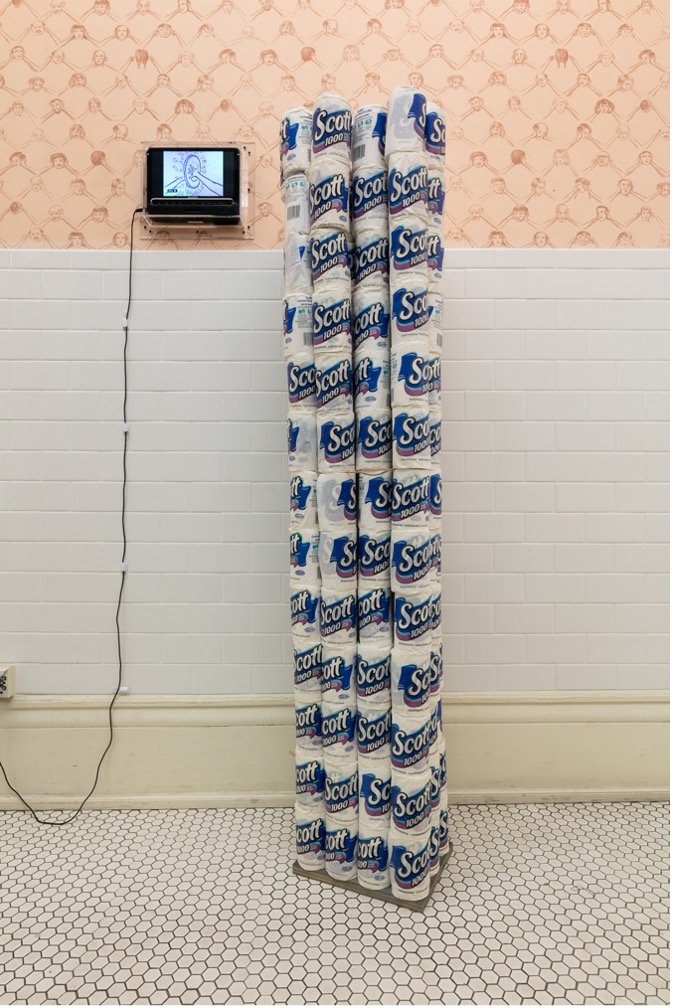
Devon Dikeou, Entertaining is Fun—Dorothy Draper, 156 Scott Toilet Paper Rolls, Unrolled to a Diameter and Stacked to Attain the Height of the Artist
How did you decide on which video works to include from the Dikeou Collection’s roster, particularly those by Devon Dikeou, Momoyo Torimitsu, Dan Asher, and Serge Onnen?
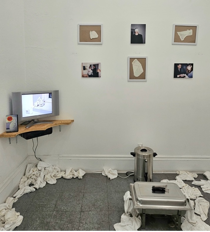
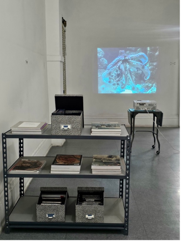
“Moving Still: Video Art Highlights from the Dikeou Collection” exists as an exhibition within an exhibition, as it comingles with Devon Dikeou’s “Mid-Career Smear” (MCS) retrospective. When asked to participate in Denver Month of Video (.MOV) by organizers Jenna Maurice and Adán de la Garza, the plan was to highlight as much video art represented in Dikeou Collection as possible while maintaining a flow and cohesiveness within MCS.
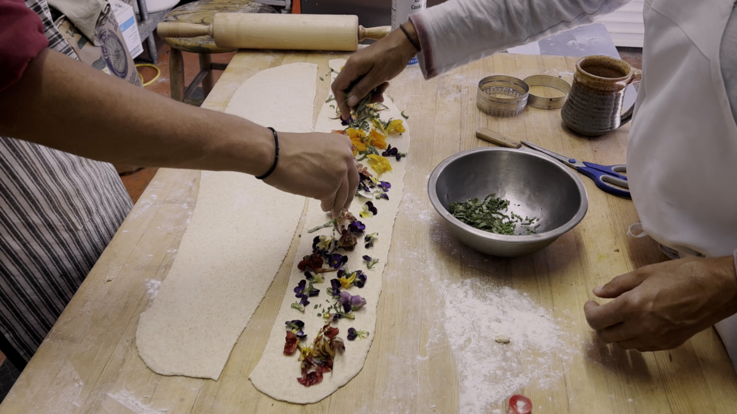
Most of the video artworks in the Dikeou Collection are part of multifaceted installations with various media, and it was crucial to have these installations exhibited in their entirety. This was not viable for certain artworks, but I was able to achieve it successfully for Serge and Momoyo. Serge’s video Break is accompanied by wallpaper of his own design, which is permanently installed in the Women’s bathroom, so it was easy to incorporate his video within its preexisting context. Momoyo’s Miya Jiro combines video, sculpture, and photography, and is installed in the same room as Devon’s We’d Like to Get to Know You where the entire room is covered wall-to-wall, floor-to-ceiling in business cards. Considering Miyata Jiro is about business and has a businessman crawling on the floor, it was a perfect match and one that will likely remain permanent. Dan Asher’s Creature and Devon’s The News Too are standalone pieces, so their inclusion and placements were more straightforward within the context of MCS.
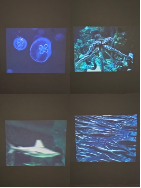
Dan Asher, Creature, Stills Showing Jellyfish, Octopus, Shark, and Sardines, DVD Projection, Variable Dimensions
With works spanning from the mid 1990s to recent pieces, are there overarching themes or threads—such as stillness, media critique, or sensory perception—that unify the works in this exhibition?
Serge’s video is about animation’s power to make the most impossible situations become real, and the ubiquitous yet ephemeral nature of drawing. Momoyo’s work explores the tension of reality and authenticity in a capitalist society, and her videos are documents of an unsuspecting audience experiencing that tension in real time. Devon’s video removes the bias and the blabbering of cable TV news and allows the repetitive stillness of the background to create harmony in a fractured, media-obsessed nation. And Dan’s projection of sharks, fish, octopus, and jellyfish floating in water transports the viewer to a peaceful, meditative underwater world . . . but the reality is these animals are in captivity at the London Aquarium as their natural habitats grow more dire and scarce by the day.
So, a unifying thread is suspension of reality. Our fixed perceptions become malleable when experiencing these works—fiction becomes fact and vice versa.
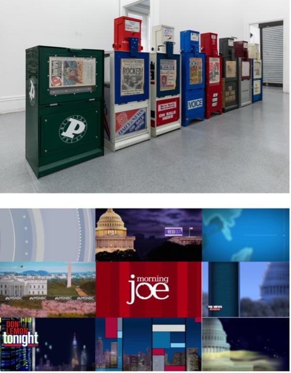
Devon Dikeou, The News, Series of Fully Operational New York City Newspaper Dispensers, Available for Viewers to Use for the Duration of the Exhibition, Papers Updated on Daily/Weekly Basis by Appropriate News Agencies
Devon Dikeou, The News Too, Background Graphics of 9 Popular American Cable News Broadcasts, Looped After 5-Minute Duration, Variable Dimensions
Could you speak to Devon Dikeou’s piece The News Too—how it distills network news into ambient visual noise—and its significance within the show?
In order to talk about The News Too (2019 Ongoing), I need to talk about its sibling, The News (1992 Ongoing). Nearly all of Devon’s artwork is dated Ongoing due to each piece’s nature to grow, expand, and take on new meaning within every new context and interaction, but this is one of the few works in her practice in which an “updated” version is born from a pre-existing artwork.
The News is comprised of eight NYC newspaper machines. When originally shown in an exhibition called “Certain Uncertainty” curated by Kenny Schachter at Deutsche Bank, each machine received its regular daily or weekly delivery of newspapers. The exhibition title was apt for this installation, as the news is a type of certain uncertainty.
The News Too exists as a video installation where the backgrounds of nine American cable news shows are arranged in a grid à la The Brady Bunch. Some backgrounds are animated with waving flags or swirling stars; some are still graphics of grids and panels. Some display the name of the show and/or host, some are anonymous. The backgrounds play for 5 minutes before the final frame appears displaying the name of each show and then loops and plays again. This presents an interesting contrast with The News, in that it does not share any news at all. There is no certain uncertainty. No Left vs Right. The diabolical squawk box that is cable news is now patriotic ambience, swathed in stars and stripes, and red, white, and blue.
As for its significance in the show, it is worth noting that The News Too has been on view at Dikeou Pop-Up: Colfax since 2020 as part of MCS. Devon’s art practice has always been embedded within the curation of the Dikeou Collection, and since “Moving Still” exists in tandem with her retrospective, it made sense to include this particular video in the show.
How do you see “Moving Still” fitting into the broader scope of the Month of Video festival programming across non-traditional spaces and public screens?
.MOV is a true DIY endeavor. It was founded by artists with the goal to boost the visibility of video art through public art activations and artist-run gallery / programming spaces, all of which are free and open to the public. “Moving Still” is exhibited in Dikeou Collection, which is an artist-founded, free & publicly accessible non-traditional space. What sets this exhibition apart from other .MOV programs is that it highlights video artwork that is part of a private collection. While video has certainly gained traction among art collectors over the last 20 years or so, it still represents uncharted territory when compared to highly collected mediums like painting, photography, and sculpture.
Christian Schumann, Evel Machine, Painted Wood Kiosk Displaying a Still of “No. 2” by Sweden from zingmagazine Curatorial Video Crossing, vol. 2;
Devon Dikeou, City Gates, Room Installation of Security/Insecure, Security Secure, and Security/Kisosk, Variable Dimensions
The exhibition features compilations from zingmagazine’s Curatorial Video Crossing and early Zapp Magazine. What role do these curatorial projects play in dialogue with the individual artists’ pieces?
Like The News Too, the zingmagazine Curatorial Video Crossing videos were installed at Dikeou-Pop: Colfax as part of MCS. The videos are presented within a kiosk painted by Christian Schumann, which was part of another collaborative art project called Evel Machines Devon helped organize in collaboration with Mike Brown in NYC in the 90s. Artists Rachel Harrison, Ricci Albenda, Kenny Schachter, Lee Stoetzel, Rainer Ganahl, and Schumann were commissioned to customize these kiosks and have them placed in NYC businesses like Naked Lunch, SoHo Grand, Family of God, and The Void where they served as informational booths with local recommendations for bars, restaurants, hotels, galleries, museums, clubs, and other cool spots in the neighborhood. For “Moving Still” I decided to place the kiosk in proximity to Devon’s City Gates to give it that New York on-the-street feel as part of its original conception.
Considering the potent overlap between Devon’s art practice, art collecting & curating, and editing & publishing zingmagazine, it was impossible to ignore the relevance of the zing Curatorial Video Crossing project she initiated in the early 2000s for this exhibition. There’s a total of 42 videos across all three compilation volumes, and several of the participating artists are represented in Dikeou Collection, such as Dan Asher, Marcel Dzama, Sebastiaan Bremer, Lisa Kereszi, and Rainer Ganahl. The zing videos allow for more Dikeou Collection artist representation in the exhibition which was important for me.
Zapp Magazine, Issue #01, March 1994
Devon Dikeou, “Out, Out, Damn Spot” – Macbeth, Shakespeare, Happening Professional Waiter Serving 300 Warm Towels to Viewers, Who Enjoyed, Used, and Discarded the Towels, Variable Dimensions
Zapp Magazine was a surprise discovery when digging through the collection’s archives in search of more video treasures. I spent about a week watching all the artist tapes and DVDs I could find. I saw a lot of weird, wonderful stuff, but the decision to include Zapp Magazine was immediate because it shows Devon’s Out, Out, Damn Spot – Macbeth, Shakespeare performance installation when it was exhibited in “Bodyguard” at Hohenthal und Bergen Cologne in 1994. Out, Out, Damn Spot is currently on view in MCS, and the video is placed within that installation. For context, Zapp Magazine was an international videozine distributed on VHS from 1993-1999 that presented “exciting developments in contemporary art through registrations of shows, performances, artists’ video’s, interviews etc.” While the presence of Devon’s artwork on this particular tape was the main reason I decided to include it in the exhibition, Zapp Magazine really was on the cutting edge of collecting and compiling video art, interviews, and exhibition documentation in a cohesive and serialized format. These tapes are rarely shown in public and are not digitized, so I am grateful to share this work.
As far as the dialogue between the compilations and the individual artist videos, I’d say it’s about camaraderie, variety, and providing a different viewing experience for the audience. As previously mentioned, there are Dikeou Collection artists represented in the zing compilations, and, additionally, there are several artists in the Zapp videos who have affiliations with zingmagazine like Vito Acconci, Janine Antoni, Karen Kilimnik, Richard Agerbeek, Simon Bill (also a Dikeou artist), Sarah Morris, and Raymond Pettibon, among others. The overlap between all the artists among different projects and platforms is boundless. I love discovering these connections and I hope that resonates with audience as well.
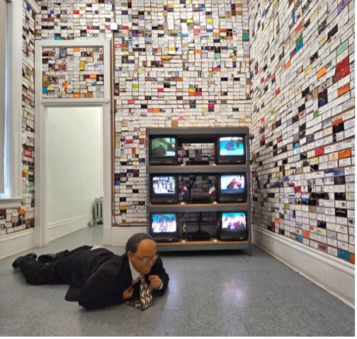
Momoyo Torimitsu, Miyata Jiro, Mixed Media Robotic Man, Six Performance DVD Videos, Variable Dimensions
Devon Dikeou, We’d Like to Get to Know You, Business Cards, Variable Dimensions
Dikeou Collection is right at home in this neighborhood of cross-pollination between media, platform, content, etc. Can you share some of the cross-conversational elements of the video art exhibited at Dikeou Collection and corresponding zing projects and archival items?
Yes! The videos by Serge Onnen and Momoyo Torimitsu are part of expansive installations that represent other aspects of their artistic output. This is a central tenet to Dikeou Collection’s approach to collecting—to collect an artist’s work in breadth and in depth so we can exhibit the full range of their practice. Momoyo’s Miyata Jiro is, in my opinion, one of the strongest examples of this approach in the collection. The nexus of the artwork is a performance in which Momoyo took the Miyata Jiro robot to six major tourist and financial districts around the world and had him crawl through the streets while she, dressed as a nurse, tended to him along the way. The six videos in the installation serve as performance documentation, as does the photograph from the New York performance. Then, of course, there is the robot itself on the floor . . . all of which is now set in relation to Devon’s We’d Like to Get to Know You. So much cross-pollination happening in just that one room!
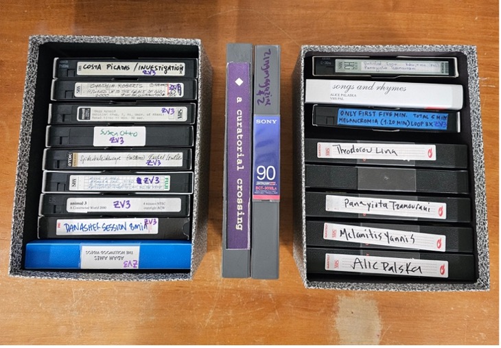
Various Artists, VHS Tape Submissions for zingmagazine Curatorial Video Crossing and final master tapes on Betamax
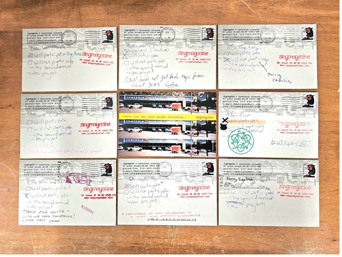
Select Postcard Requests for Submission for zingmagazine Curatorial Video Crossing
Another unique feature of the “Moving Still” exhibition is the inclusion of archival elements of the zingmagazine Curatorial Video Crossing videos. The extensive archives at Dikeou Collection open the doors to a deeper understanding of the magic that happens behind the scenes in the studio, at the collection, and at zing HQ. During my archival deep-dives I found the original VHS tapes submitted by the artists for inclusion in Curatorial Video Crossing. These individual tapes were compiled into master tapes on Betamax, which are displayed in the exhibition. One of my favorite discoveries in the archives was a batch of self-addressed & stamped postcards sent from zing HQ to dozens of artists requesting their participation in the Video Crossing project, with two handwritten checkboxes for “Will Participate” or “Will not Participate.” The cards reveal the DIY-ness of it all, and the intimate relationships between artists. Each one is personal and delightful.
zingmagazine Curatorial Video Crossing archival display with VHS and Betamax tapes, postcards, and zingmagazines; Dan Asher, Creature, DVD Projection
The zingmagazine Curatorial Video Crossing videos emphasize the magazine’s ability to extend beyond the printed publication, but the magazine itself has featured numerous projects that pertain to video, film, cinema, moving images, or images viewed on a screen or some kind of projection. I went through every zing project, bookmarked the ones that fell into those categories, and included them in the archival display. Some of the strongest examples of these projects include Susan Robinson in issue 1, Tamas Banovich and Brendan Quick in issue 2, Jonathan Horowitz in issue 3, Rachel Harrison in issue 4, Neil Goldberg in issue 6, Jane Hart in issue 15, Drazen Bosnjak in issue 18, Alix Lambert’s project in issue 24 as well as mine on Harry Smith, and Maria Antleman’s project in issue 25.
Researching and incorporating archival ephemera and artwork that addresses video in a printed format was my favorite part in organizing this exhibition, and, I think, a distinguishing characteristic of “Moving Still” within the .MOV landscape.
Rachel Dalamangas
New York, New York
August 2025
from zing #15, Momoyo Tormitsu “somehow i don’t feel comfortable”
What could artistic commentary on the Japanese commercialization of cuteness at the turn of the millennium predict about the state of the world in 2025? In some respects, quite a lot.
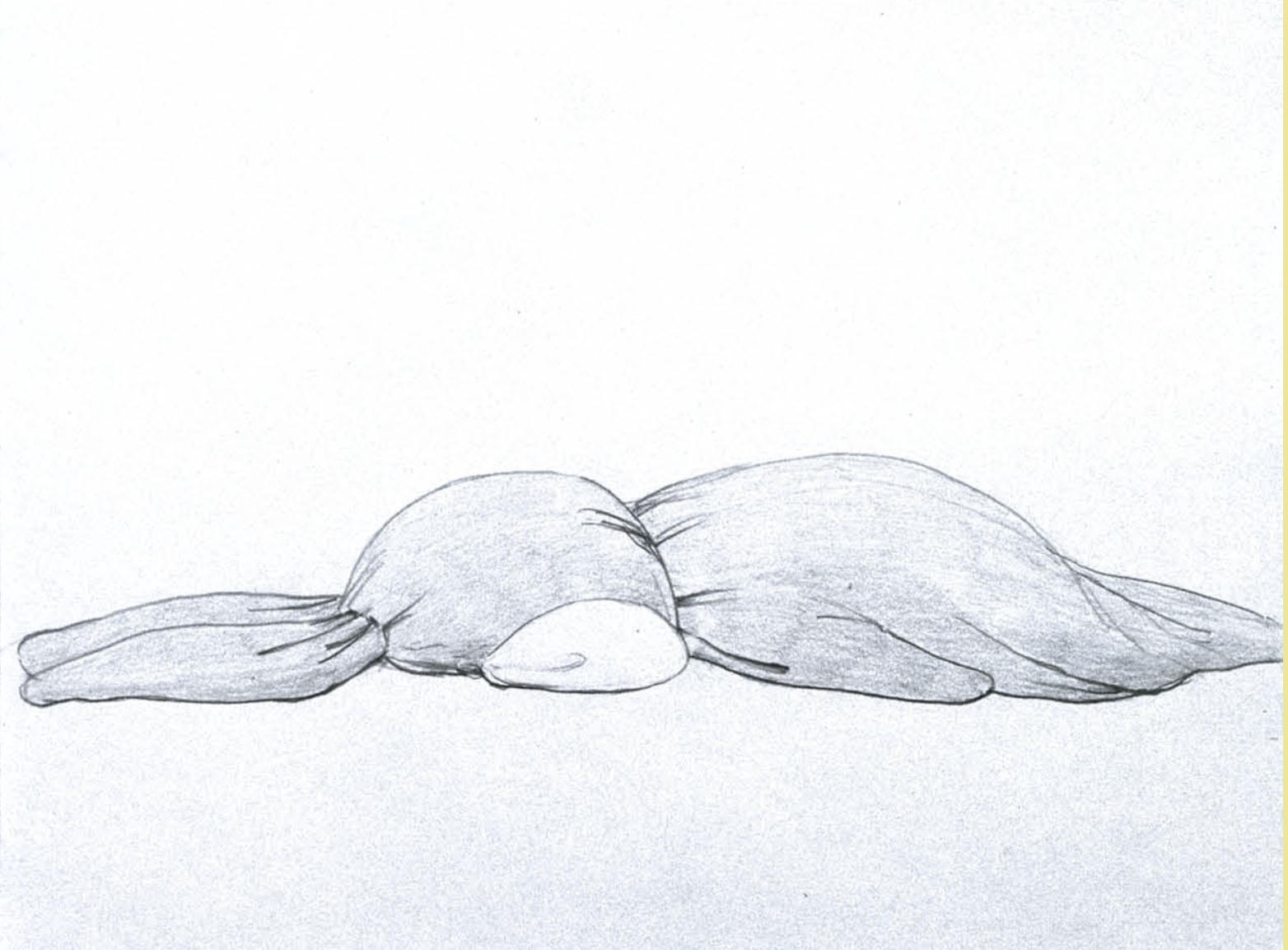
Momoyo Torimitsu debuted the iconic installation somehow i don’t feel comfortable, two inflatable pink bunnies scaled so that they appear cramped and uncomfortable in a gallery exhibition space, in Paris in 2000. It was a year when the texture of reality had already begun to feel slightly fake – often, if not always – in a fun way, so long as you didn’t look closely enough to notice the brewing problems that would only become more complex and dire in the coming quarter century.
Some other interesting things that happened the same year:
You could wait for your grandmother’s flight at the gate instead of beyond a ticketed obstacle course.
Cellphones and wi-fi were still rare and quasi-futuristic.
Social media didn’t exist (though AOL chatrooms did).
4chan didn’t exist yet.
Incels did, but in their gentler, mostly feminine, original form.
Jeff Bezos founded a private spaceflight start-up; Katy Perry released a debut album of unremarkable Christian music.
Peter Thiel was spinning Roth IRA straw into gold.
Donald Trump soft-launched his political career.
Vladimir Putin became president of Russia, then cautiously projected to be on a path of democracy.
Al Gore, winning the popular vote on an environmental platform, conceded the presidency to George W. Bush, who expanded foreign oil investment—widely seen as a sign of democratic stability in the U.S.
Britney Spears and Justin Timberlake graduated from high school, and publicly announced they were bf/gf.
See more from ‘somehow I don’t feel comfortable’ in zing #15 here.
No Poem Animation
Elegiac as well as strangely hopeful, director Catherine Gund’s docu-poem, MEANWHILE, which premiered last year, has been one of the only things in recent memory that I have found soothing about the nature of humanity and the future of the world.
In close collaboration with Jacqueline Woodson (text), Meshell Ndegeocello (soundscape), Erika Dilday (support), and M Trevino (structure), Gund made a living – breathing – film that captures quiet, reflective moments from six artists in NYC as they continue with their lives and work throughout the many crises faced worldwide 2020-2021.
The themes evoked in MEANWHILE – survival, life, empathy, resilience, identity – feel even more relevant and urgent in 2025. By the time I saw the film this spring, the first planes of kidnapped immigrants had landed in El Salvador, a good friend at the Institute of Peace had called me to tearfully recount being physically removed from her workplace, and the United States seemed then as it does now to be marching with horrific determination toward authoritarianism.
Where do art and artists fit in during times of crisis? The conviction that art should or even can make meaning from and has potential to impact minor and major events, essentially that art matters – evident in the making of MEANWHILE – is as instinctual and vital as breath itself. “I believe there’s no way to survive without art,” Gund says, and what’s so moving in MEANWHILE is that without preaching or platitudes or predictions based in false hope or the end of the world, are messages about what art has to do with living and staying alive, and creates a humanistic portrait of how to face struggle with both softness and grit.
Catherine Gund as Interviewed by Rachel Dalamangas
The title MEANWHILE is evocative of time both on the scale of history as well as human life, and even the fleetingly momentary. The word is also suggestive of simultaneous action, and at various times throughout the film is associated with poetic themes of respite, freedom, and breath. When and over what period of time was this film shot? How did the word ‘meanwhile’ shape your approach to storytelling?
The title MEANWHILE was the beginning — it came before the film itself. That word held space for what we couldn’t yet articulate. We were living in a moment where the future had no language. In the face of the pandemic, the uprisings, the collapsing of systems that were never built for everyone, we were suspended in a kind of breath. MEANWHILE gave us a way to speak, poetically, politically. It holds multiplicity: the passing moment, the lifetime, the historic scale. It reminds us that while one story is unfolding, another is too — parallel lives, joys, violences, resistances, all breathing side by side. And never all joy or all violence.
If we’re always in a state of tension and chaos, and that energy is always moving, maybe the problem is that I’ve tried to stay still inside of it.
Is there a way to do things differently or to imagine
differently or practice living differently?
I don’t know that the natural condition of life is a state ofrelief.
Natalie Diaz
The film was shot over the course of 2020 and 2021 — those ruptured, reshaped years — but it wasn’t a linear shoot. It moved like breath, in and out, across time and tone. That rhythm shaped the structure: six verses, each a different facet of how we live, how we resist, how we care for each other. Some days were cinema verité, some days were poetry. Some moments were built on rage, others on care. We weren’t documenting a crisis — we were existing through it and creating from within it.
The word meanwhile grounded us. It reminded us that every image, every voice, is in conversation with something larger — with the past that made this present, and the future we’re still fighting to imagine. This isn’t escapism. It’s simultaneity — a way of being present to contradiction, to multiplicity, to all that breathes at once. Even in grief, there’s beauty. Even in stillness, there’s movement. MEANWHILE is a refusal to flatten the moment into one narrative. It’s a way to hold complexity — to breathe inside it.
Shamel Pitts and Tushrik Fredericks
The film is formatted as a docu-poem in six parts. Did the author Jacqueline Woodson write the poem first and then the film was made, or was the film in progress and she responded to the footage?
Like the meanwhile, our film reveals synchronicity and simultaneity. We breathe to remember. We breathe to forget. The film began with Meshell Ndegeocello and me wanting to work together — to meld our associative, emotional, presence practices. Her sounds didn’t score the film; they scored the silence, the urge, the becoming. They created a space I could move inside. From those early pulses — breath and distortion, longing and loop — the film began to shape itself. Not in outline. In feeling. In time.
There was no sequence to our making. It wasn’t image, then music, then words. We were all inside the same storm. Meshell would send a sound, and I’d hold it up to the light of the footage. Jacqueline would listen, then speak a line:
“Like the newborn baby
who hasn’t yet heard the sound of her own cry,
we know, without the tears, that we’re alive.
We know long before we feel the pain of the outside world
that we are whole.
The fight already in our breath,
the fight in our hearts.”
Those words would ripple back to the edit, bend the image, slow the cut. We are born into interruption. Everything was responsive. We weren’t documenting — we were composing a present tense. Existing alongside.
The film unfolds in six verses. Not chapters. Not acts. Verses — because poetry was the only structure that could hold us, could breathe with us. Jacqueline didn’t write about the film; she wrote inside it. Her words were not commentary. They were blood and breath. Sometimes I would send her images pulled from her language. Other times, in the middle of this breath, this heartbeat, this fire, I would cut a scene just to leave space for a line to land:
“Even in the fire, we can’t extricate ourselves.
We’re all connected. Ancestors, aunts, uncles, children.
The blood that moves through our veins sings the same song —
a song we can pretend we don’t hear,
a song an inch away from our ears,
a song being sung always in the meanwhile.”
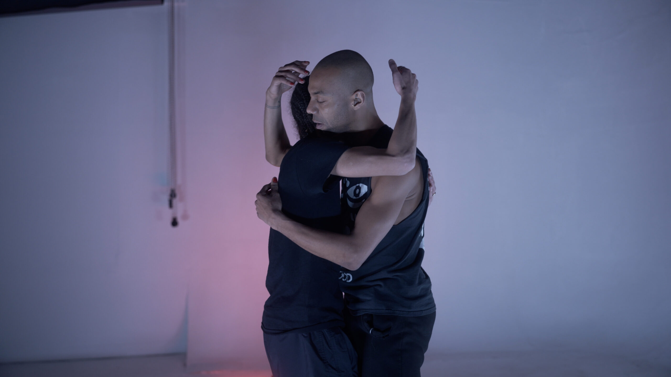
Everyone who appears in the film also creates from their own fire, their own heart, in an exchange that reverberates. We were finding a place where everyone’s path touches another — or doesn’t pass at all, but lingers nearby. In rehearsal, dancer Shamel Pitts says:
“There’s still this heat between us,
the sense of touch without touching,
and the heat that comes between this, from this —
and that we keep that alive.”
We weren’t illustrating a thesis. We were living a practice — of listening, of responding, of being changed by the work and each other. Nothing was finished until everything was. And even now, I don’t think of the film as complete. It’s still pulsing. Still saying:
“And we keep on keeping on
in all the ways, in always,
in all the spaces of time —
including in the meanwhile.
Meanwhile, we live.”
Juli Vanderhoop baking
The theme of breath is relevant both in the form of projective verse poetry as well as politically to the BLM movement, which adopted the last words of Eric Garner as slogan. Was this an intentional motif or one that arose organically through the process of making the film?
Breath was never a motif. It is the medium. Breathing is the pulse of the film, the rhythm that sustains and connects every frame.
This understanding didn’t begin as an intellectual choice — it emerged as a force, moving through us, through the footage, through the sound, through the words. Breath is political. It always has been. It’s the first act of life and the last. It’s the rhythm of survival — the breath that sustains, that resists, that says: I am still here, even in the face of forces that would seek to silence us.
In MEANWHILE, breath is the connective tissue — between image, sound, and word. It was the anchor of the time we were living in: the pandemic, where breathing became dangerous, measured, protected by machines; and the uprisings, where breath was denied. When Eric Garner said “I can’t breathe”, those words became a collective reckoning. We didn’t set out to make a film about breath, but breath insisted on being seen, heard, and felt. It rose up in Meshell’s looping, gasping, panting soundscapes; in Jacqueline’s verses, which returned, again and again, to one essential instruction: Breathe.
Breath is intimate. It’s ancestral. It’s violent. It’s liberating. We hear panting, inhaling, gasping, exhaling. We hear people breathing throughout the film. And the film breathes – expands and contracts, grips and releases – following the tension of our lives. Then quiet. This is the rhythm of the film’s structure – our fight to move through grief, through rage, through hope.
The film is about living in that tension. We breathe to remember. We breathe to forget. Breath is not just metaphor — it’s a condition of resistance and resilience. A refusal to be erased. A way of holding space for the past and the possible. It is the heartbeat of MEANWHILE, beating in rhythm with the ongoing fight for racial justice, for lasting freedom.
When Jacqueline says, “The fight already in our breath, the fight in our hearts,” she isn’t just talking about survival. She’s invoking the right to live fully, audaciously. To breathe freely and unapologetically is a radical act and I think of how breath moves invisibly, but always between us. How it connects us across time and struggle. How it carries memory. How it carries forward.
It’s the unspoken and shared, the invisible force that connects us across time, space, and struggle. It’s the space where our histories converge, where we hold each other in the weight of what we carry. Meanwhile, in the fire, in the heat, in the breath — we keep going.
Fire Dancers Animation
Questions about identity begin with the individual, and move outward into race and its constructs, questions about masculinity and about who gets to be American, and through the interconnectedness of New Yorkers going about the quotidian and quiet labor of an artist’s work, a portrait of humanity emerges. What was your approach to capturing that spectrum when choosing participants and how did you think about balancing the political with the deeply personal?
Identity is not a static form, a fixed shape; it’s a dynamic condition we inhabit. It evolves, stretches, contradicts, and becomes through our interactions, our memories, our exposure, and our familiarity. It’s not something we craft from a distance. It works on us, over time, through relation. And the questions it raises — about belonging, about freedom, about who we are allowed to be — are not theoretical. They live in our bodies, in our practices, in how we move through the world.
MEANWHILE was made with people I love, people I’ve been in conversation with for years — sometimes decades. Meshell. Jacquelin. Daniel Alexander Jones. Juli Vanderhoop. Dana Davis.
The film didn’t begin by assembling a cast. It began in community.
It began in trust. These aren’t interviews. These are continuations — of friendships, of artistic dialogues, of shared wondering, shaped over time. The people in the film are artists, yes, but they’re also thinkers, caregivers, visionaries. They’re in the middle of making something — not just a piece of work, but a way of living, of imagining beyond what’s already here.
We filmed across many places — Ohio, California, Massachusetts, New York — and what emerged wasn’t a portrait of place, but a portrait of relation. Of people listening to one another. Showing up. Risking being seen. The political and the personal were never separate — they’re part of the same breath. They shaped each other.
“We’re not always legible to one another… this idea
that something’s sort of hiding in plain sight, or that we can see
one another in lots of different ways — or not see
one another. I’m really interested
in that idea of degrees of not seeing.”
Teresita Fernández
That idea — of degrees of seeing, of allowing space for what can’t be named yet — became central. The film invites a kind of seeing that is slower, more generous, more curious. A seeing that doesn’t close down with certainty, but opens toward connection.
MEANWHILE doesn’t claim to define identity. It holds it in motion. It asks: What can we be, together, when we listen beyond the obvious? When we allow each other to be in process? The film became a kind of shared language — not to simplify who we are, but to stretch what we think is possible.
Artist, Ella Mahoney
In the first couple minutes of the film, a participant makes an appeal to empathy (“I see what you see”). It’s interesting because I believe that that is the reach that quite a bit of art makes – the gap between what I see and what you see. After making the film, what do you think art can do in the face of injustice, cruelty, and greed?
I believe there’s no way to survive without art. It shapes how we live inside the world, how we metabolize what it does to us. Art heals, it educates, it dignifies, it can be glorious despite the unbearable, it transforms us. It gives us somewhere to place the weight. The film doesn’t offer answers, it offers presence, a shared space where questions can breathe.
I think of that moment you mention — “I see what you see” — not as a claim to sameness, but a reaching across, through, towards. An opening. In MEANWHILE, that reach is what binds everything – between strangers, collaborators, neighbors, generations. Not agreement, but proximity. Not clarity, but care. That’s what art can do: make space for what doesn’t fit anywhere else or what has been systematically erased, sidelined, omitted. Hidden in plain sight. Art keeps watch. Art will make time for what has been refused. Make beauty without asking permission.
And in the meantime — in the meanwhile — art becomes a site of resistance. But also of tenderness. Of imagination. When the systems we live inside are built on extraction, on forgetting, on violence, art says: still, we breathe. Still, we make. Still, we sing and speak and move. Even here. Especially here.
Art doesn’t end injustice, but it refuses to normalize it. It offers a space
to metabolize, to feel, and to grieve
the violence more deeply. It keeps injustice from calcifying
into silence. It’s not decoration. It’s declaration. A refusal
to disappear. A way of holding on — to memory, to vision, to
each other.
In MEANWHILE, the act of making was a way to stay alive inside a brutal moment. Not to escape it, but to be fully awake to it — and still imagine. Still dream. Still build. Still create something big enough. Something tender, spacious, honest enough to carry us. I think of the dancers in rehearsal, the breathwork, the slowness of Jacqueline’s line landing, “Even in the fire, we can’t extricate ourselves… the blood that moves through our veins sings the same song…” That’s what art can do. It doesn’t look away. It sings in the fire.
I believe art is a space where grief doesn’t collapse
us. Where beauty isn’t naive. Where the imagined is as real
as the inherited. Where we can
say — we are still here. And we are still dreaming.
Rachel Dalamangas
New York, New York
May 2025
Image credits: Abramorama
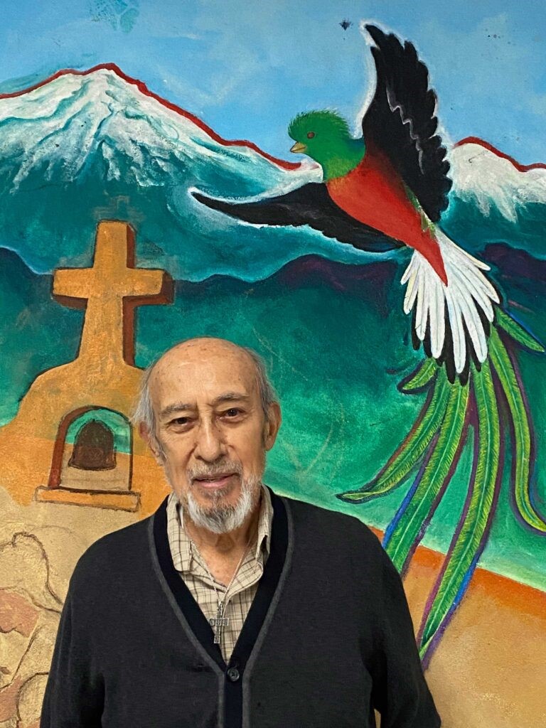
Although his work hasn’t thus appeared in a print edition of zing, Leo Tanguma has twice appeared in interviews for this blog – first in 2012 when I profiled him and years later when he was interviewed by scholars Ben Gillespie and Josh T Franco from the Smithsonian’s Archives of American Art.
Originally from Texas – and claiming that his first mural was a chalk drawing of the town’s corrupt sheriff who terrorized the Chicano community – Tanguma’s presence for over 40 years in Denver and contributions to contemporary art and public arts projects have been meaningful to establishing Chicano art and muralism as integral to American history and modern culture.
His murals, in the same legacy as Siqueiros, are often political, telling stories of overcoming oppression, violence, and greed. His public profile was raised later when two major works on permanent view at DIA: In Peace and Harmony with Nature and The Children of the World Dream of Peace caught the attention of online conspiracy theorists who were determined to prove DIA had an apocalypse bunker for the wealthy and powerful. (My own late father was the superintendent of labor for the West Terminal and said there’s a tornado shelter, but no luxury bunker).
When I took a bus out to the foothills and visited Tanguma for that first interview in 2012, I was struck by how sincere and eager he was to do good with art – that he fiercely believed it was art’s job to address hardship.
For Cinco de Mayo (especially if you’re in Denver), read about Tanguma in zing here and here.
-Rachel Dalamangas
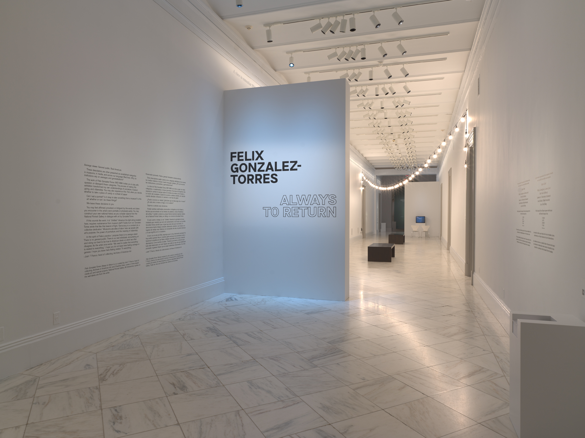
Installation view of “Felix Gonzalez-Torres: Always to Return”
Photo by Mark Gulezian/National Portrait Gallery
Art historian Charlotte Ickes is Curator of Time-Based Media Art and Special Projects at the National Portrait Gallery in Washington, D.C. Among her recent projects, she co-curated Isaac Julien: Lessons of the Hour—Frederick Douglass (2023–2026) and Viewfinder: Women’s Film and Video from the Smithsonian (2021). She also commissioned Birthright (2022), a performance by Maren Hassinger. Her latest exhibition, Felix Gonzalez-Torres: Always to Return, is co-curated with Josh T Franco, Collector at Large at the Archives of American Art.
Charlotte Ickes as Interviewed by Claire Dillon
I love it when people say: ‘But it is just paper. It is just two clocks next to each other. It is just light bulbs hanging.’ I love the idea of being an infiltrator. I always said that I wanted to be a spy. I want my artwork to look like something else, non-artistic yet beautifully simple.
– Felix Gonzalez-Torres in conversation with Tim Rollins, 1993
The exhibition Felix Gonzalez-Torres: Always to Return begins outdoors, beyond the walls of the National Portrait Gallery and Archives of American Art. Visitors first encounter strings of lights from “Untitled” (America) (1994) hanging from the venue’s façade, lining 8th Street NW, and shining through the windows of the Martin Luther King Jr. Memorial Library next door. When I saw the exhibition in December 2024, “Untitled” (America) was also intertwined with a second set of lights, which decorated the local holiday market. As they subtly swayed in the crisp air, the warm glow of the artwork’s frosted bulbs contrasted with the clear lights installed for the season’s festivities.
A label accompanying this installation can be found indoors and through QR codes pasted to the sidewalk. The text in the library explains the key components of the work, and continues with an interpretation:
When illuminated, “Untitled” (America) requires continued maintenance from library staff who must replace burned bulbs. ‘Democracy is a constant job, a collective dedication,’ Gonzalez-Torres wrote in a statement about “Untitled” (America). As a beacon hovering between promise and precarity, this work, like democracy, requires choice, maintenance, vigilance, and labor. During election season, the DCPL [District of Columbia Public Library] serves as a voting site. Without voting representatives in Congress, D.C. residents are only partially enfranchised. Exhibited in this context, what meanings about democracy does this work generate? As the artist said he hoped the work ‘will light some peoples’ spaces, at least for a short time.’ Hopefully, “Untitled” (America) ‘lights your space’ as you read, eat, and attend civic programs at the library, the museum across the street, and elsewhere.
This brief description of the installation raises several themes that permeate the work and this exhibition: by using everyday objects to create untitled artworks, most of Gonzalez-Torres’s pieces remain open to infinite interpretation. While his parenthetical titles suggest directions for contemplation, the responses of the audience and curators are just as important as the artist’s intentions. In this case, the title of the work and its installation by a museum of portraiture prompt consideration of the conventions of representation, not only of people, but also of concepts like America.
Site-specific interpretation is a recurrent theme in this exhibition of Gonzalez-Torres’s art, and it is particularly significant because this is the first major presentation of his work in the nation’s capital in three decades. Collaborating between the National Portrait Gallery and Archives of American Art, Ickes and Franco staged original juxtapositions between the institutions’ permanent collections and Gonzalez-Torres’s work. In doing so, they interrogate the themes of portraiture, institutions, politics, and constructions of public, private, identity, and history. For example, the artist’s photographs of the American Museum of Natural History’s memorial to Theodore Roosevelt—documenting only the engraved words Historian, Scientist, Statesman, and Ranchman rather than the infamous equestrian statue—are displayed next to Roosevelt’s painted portrait in the Gallery’s permanent exhibition, America’s Presidents. Gonzalez-Torres’s nonrepresentational approach challenges expectations of what a portrait can be, and this exhibition created unique opportunities to compare his work with traditional definitions of this genre.
The extension of Gonzalez-Torres’s work into other exhibitions within the museum and into the city recalls an oft-quoted 1995 interview with Robert Storr, in which the artist stated:
There’s a great quote by the director of the Christian Coalition, who said that he wanted to be a spy. ‘I want to be invisible,’ he said, ‘I do guerilla warfare, I paint my face and travel at night. You don’t know until election night.’ This is good! This is brilliant! Here the Left we should stop wearing the fucked-up T-shirts that say ‘Vegetarian Now.’ No, go to a meeting and infiltrate and then once you are inside, try to have an effect. I want to be a spy, too. I do want to be the one who resembles something else. We should have been thinking about that long ago. We have to restructure our strategies and realize that the red banner with the red raised fist didn’t work in the sixties and it’s not going to work now. I don’t want to be the enemy anymore. The enemy is too easy to dismiss and to attack. The thing that I want to do sometimes with some of these pieces about homosexual desire is to be more inclusive. Every time they see a clock or a stack of paper or a curtain, I want them to think twice.
Today, his piles of candy and stacks of paper stand quietly, but powerfully, among works in the permanent collection. In my mind, the presence of Gonzalez-Torres’s work amidst both a holiday market and an exhibition of presidential portraits is a perfect demonstration of this strategy. In another example, pictured below, the artist’s paper stack “Untitled” (Death by Gun) (1990)—a record of 464 victims of gun violence in the first week of May 1989—sits beneath Christian Schussele’s painting Men of Progress (1862), which depicts American inventors, including firearms manufacturer Samuel Colt. The men are represented in a fictive meeting in the very building in which this exhibition is now held: the former U.S. Patent Office. This pairing attests to the artist’s ability to intervene in such institutions, and the curators’ careful consideration of the site in which they work.
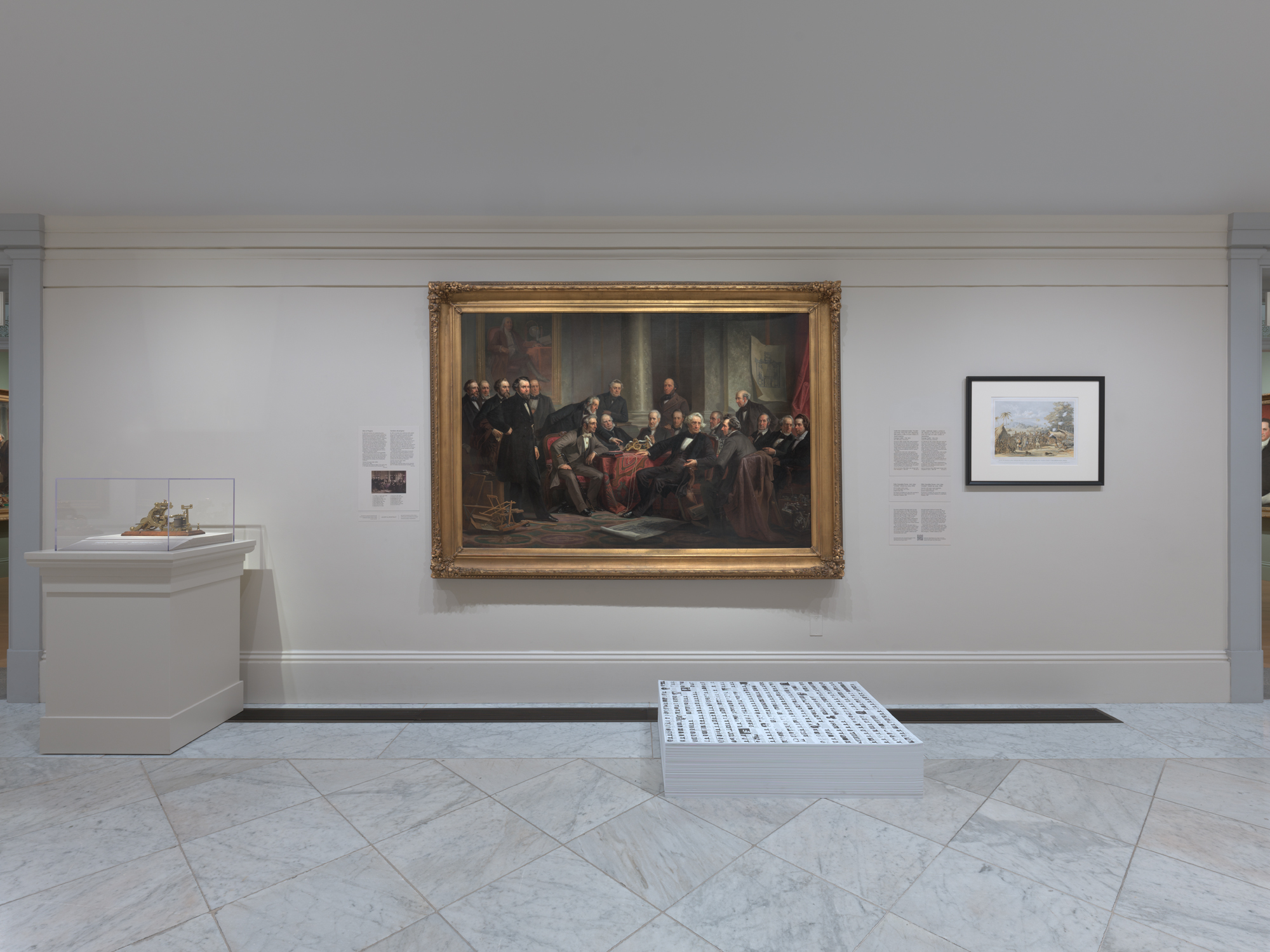
Felix Gonzalez-Torres, “‘Untitled’ (Death by Gun)”
© Estate Felix Gonzalez-Torres
Courtesy Felix Gonzalez-Torres Foundation, Photo by Mark Gulezian/National Portrait Gallery
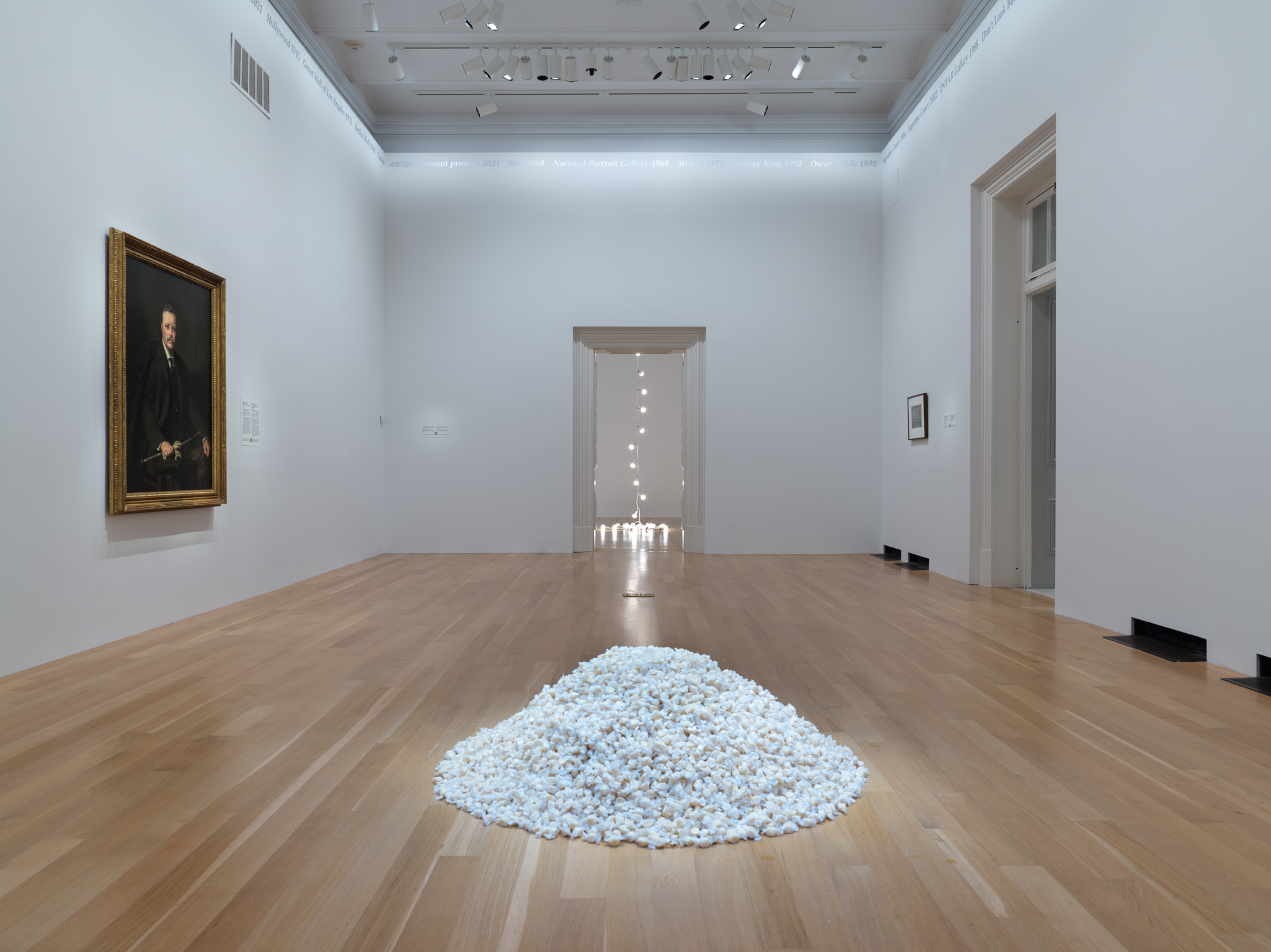
Gonzalez-Torres’s art also reaches into the present, which is most evident in his exhibited word portraits. These portraits, composed of formative events listed in silver paint around the perimeter of a room, were made with the input of their initial owners to create a timeline of personal and public moments that represented them. New versions of a portrait can be created with the owner’s permission, and in this exhibition, events such as “CDC 1981” are joined with “PrEP 2012” and “CDC 2020,” which occurred after the artist’s untimely death from AIDS-related complications on January 9, 1996. Other posthumous events include “January 6 2021” and “Equestrian Statue of Theodore Roosevelt 2022.” In this way, Gonzalez-Torres’s work, and particularly his conceptual portraits, represent not only specific people, times, or places, but also the broader contexts that surround their beholders and the institutions in which they are exhibited.
Felix Gonzalez-Torres, ” ‘Untitled’ (Portrait of Dad)”
© Estate Felix Gonzalez-Torres
Courtesy Felix Gonzalez-Torres Foundation, Photo by Mark Gulezian/National Portrait Gallery
When I visited Felix Gonzalez-Torres: Always to Return, I was struck by the juxtaposition between the interpretive openness of Gonzalez-Torres’s work and the specificity of the National Portrait Gallery’s mission to “tell the story of America” through portrayals of the nation’s people. How did you formulate the ideas behind the exhibition?
I saw Felix’s word portraits at Andrea Rosen Gallery in 2016, in an exhibition curated by Julie Ault and Roni Horn. They blew me away with their complexity, as they told history differently through portraiture, and I wondered how that process could be modeled in an exhibition.
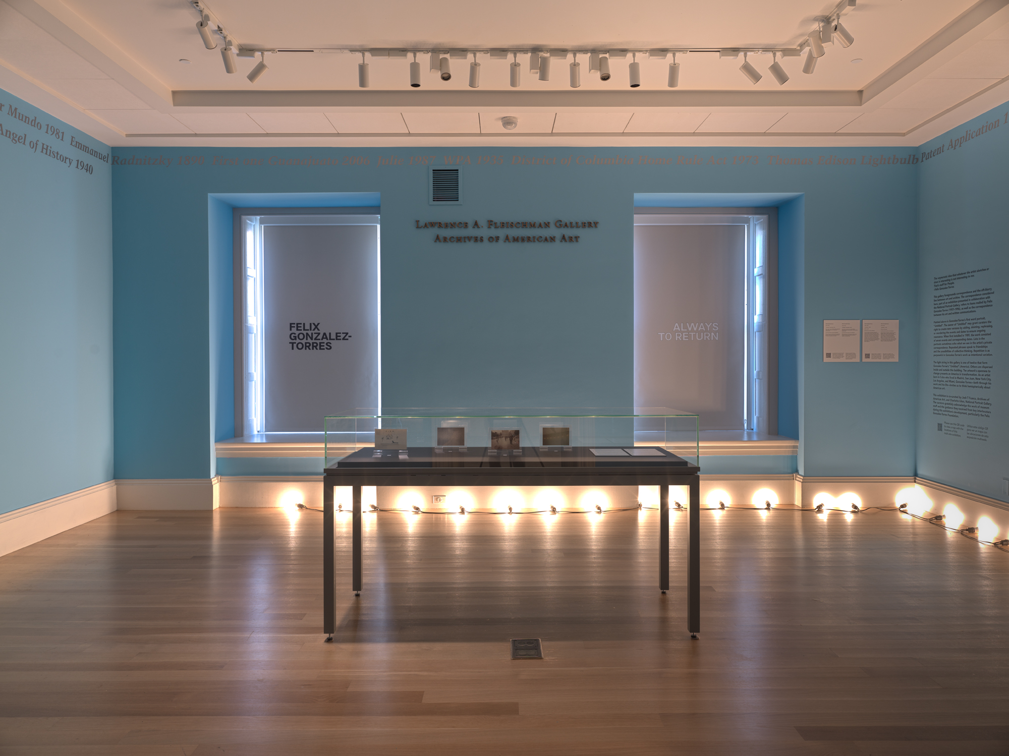
Felix’s work is exhibited all around the world, so I knew that place and context would be critical in order to bring something additional to the work. We got very specific about site: our site as a collection, our site at the Smithsonian, and our site in Washington, D.C. This involved placing art from the collection in conversation with Felix’s work, and then moving the exhibition out into our city.
When I started at the Portrait Gallery and learned that the Archives of American Art was home to the Andrea Rosen Gallery records, I approached Josh Franco about a potential collaboration between us and our two units, as we call them in the Smithsonian. I like collaborating, and more than that, I was trying to create a discursive conversational format that would make the sum greater than its parts.
Collaboration pervaded my experience curating the show and writing new versions of his word portraits. This approach complemented the doubling, twoness, and coupling that are present throughout Felix’s work. With the Archives’ footprint in the museum building, we had the opportunity to move beyond one single space, which highlighted the multifaceted nature of his portrait practice. Between his artwork and his correspondence, we see the logic of lists, the major and the minor, and other themes echoed across different materials. The Archives offered a great space to do that work.
I was originally thinking about a survey of his portrait works, but we moved away from that format through conversation and deeper thinking. That’s something I’ve learned from Felix: his work is about being open and humble enough to know that you might start with one idea, but you also have to learn and let your thinking change. This is now how I want to approach everything I do.
There are moments when the exhibition refers to the history of the institution, and I noticed that, in some ways, the galleries form a portrait of the National Portrait Gallery itself. Did you and Josh see your work in this light? In what other ways did the venue inform the exhibition?
As a curator, I think one of my responsibilities is to create a conversation between the context in which the work was made and the context in which it is exhibited now. Greg Allen articulated this so beautifully in a recent blog post about the show. It just so happens that, within this exhibition, some of that conversation includes the history of the building and the institution.
I hadn’t originally thought of the exhibition as a portrait of the institution until I was asked. I think that it could be. Felix made word portraits of institutions, which prompt a key question: who gets to represent the institution? A really beautiful takeaway from the institutional portraits—like “Untitled” (Portrait of MOCA), which we have on view—is that an institution is ultimately made of people. It’s a portrait of MOCA, but there always has to be a person to make the versions of the word portrait, or interact with lenders, and so on. That tension is really interesting to me. An institution is a mission statement, it’s a building, it’s a set of systems, but it’s also made of people, and it’s not static. That informed our decision to write and sign two different introductory statements to the exhibition. We wanted to destabilize the idea of an authoritative institutional voice. While the exhibition relates to the institution, it’s also a model of how we tell history, which I see Felix working through in these portraits.
I did fear that that displaying figural works from the Portrait Gallery collection alongside Felix’s pieces, speaking directly to some of his parenthetical titles, could close down the potential meanings of his work. I hope that this approach presented the art in unexpected and meaningful ways. In doing so, I could see his work with fresh eyes. Through that process of thinking about these connections, I strove to model the kind of history-writing that he proposes with his art.
What was the process of contributing to the word portraits? Did you think of these interventions as expanding a portrait of the subject, or of creating a portrait of you and Josh, or as something else?
When you borrow a word portrait, you don’t automatically have permission to create new versions, but we were granted that right with all three of the word portraits in the exhibition. The process for each portrait was different, and frankly, I didn’t know what to expect going into it.
Robert Vifian, the subject of one of the exhibited portraits, is amazing. I’m so thankful that Felix’s work allowed me to be introduced to him. Robert collected other works by Felix and commissioned this word portrait; he is a really visionary collector. He happens to be both the owner and the subject of this piece, and it was great to co-write this version with him.
This is the first time that his portrait has been shown in the U.S., and we took a pretty light touch with it. He told us which version he wanted to use, and most of what we added spoke to the context of the room in the exhibition. Then, as a result of our conversations, Robert added a few new events and dates. Josh had the opportunity to go out to Paris and saw a version of the word portrait installed in Robert’s home, ate at his restaurant, and went to visit the Gertrude Stein & Alice B. Toklas grave, which was the subject of two of Felix’s other works in the exhibition. It was Josh’s first time in Paris, and it was all kind of framed by Felix.
Bringing “Untitled” (Portrait of MOCA) to the East Coast, to a very different kind of institution, came with a very different kind of site specificity. When displayed in the Smithsonian, “MOCA” is not necessarily recognizable, as it’s not even spelled out in the title. It required a real balance between being a portrait of MOCA or the Portrait Gallery, and our thoughts of MOCA and L.A.
I would say that “Untitled” was the hardest one. I still think about it—and have my regrets! This was Felix’s first word portrait. When it was first shown at the Brooklyn Museum for VisualAIDS’s inaugural Day Without Art in 1989, it only consisted of seven events and dates. But now there are more than forty versions. It also grew during his lifetime. We wrote two versions of “Untitled” for the exhibition. One version is installed in the main corridor of the exhibition, and a different, shorter version is in the Archives of American Art gallery in the same building.
We couldn’t help but think about the fact that, at one point in time, Felix called it “Untitled” (Self-Portrait) for his show at the Hirshhorn in 1994. He ultimately landed on “Untitled.” It’s the only word portrait without a subject named in parentheses. That makes it hard: it’s totally expansive. At the same time, I couldn’t get out of my own head knowing that a lot of the work’s reception centered on the former title, “Untitled” (Self-Portrait). However, these interpretations are not mutually exclusive: biography is there, and so are other things. They inform each other.
The word portraits are supposed to include events and dates that were formative for the subject. But this one doesn’t name a subject: could the subject be us, our personal lives, our professional lives? Does that distinction even matter? It’s a really difficult process and a huge responsibility. There is a generosity to it, sure, but Felix makes you work hard, and in ways that you aren’t trained to work.
To begin drafting new versions of “Untitled” for the exhibition, we reserved the Archives of American Art conference room and covered long tables with butcher paper. We read aloud all of the past versions of the word portrait, wrote them down, and started moving things around and talking it out. You begin to notice patterns and repetitions across portraits. It’s an overwhelming amount of information. I asked an intern to research almost every single term. Of course, sometimes we just didn’t know what a term meant, and each one could have multiple possible meanings. We tinkered on our computers for months at a time, had another retreat, printed out the text to scale and arranged it around the rooms, and we only stopped when we had to get a quote from the sign painter. We also had to make decisions during the installation. For example, all three portraits call for metallic silver paint, but we had to decide what that meant. The Archives space is painted blue, so it was harder to read the paint color that we used upstairs on white walls. With our permission, Sean Danaher, the sign painter, added a little pewter to make it more legible.
Installation view of “Felix Gonzalez-Torres: Always to Return”
Photo by Mark Gulezian/National Portrait Gallery
I imagine all of these materials from the retreats are kept somewhere?
I think it’s all in Josh’s office. The paper has food stains on it from lunch and snacks; we were in that conference room all day. That’s the thing about this work—you can’t just put something on view and write a wall label.
The work really brings people together; I love picturing Josh in Paris with Robert.
The world Felix built was so amazing. Some of the people we’ve met… I treasure those conversations. In terms of this exhibition, I’m very cognizant that we curators come from a generation that is several generations removed from Felix’s life. Many of the great shows were done while he was alive, with people who knew him, or who had lived experience of his generation. I’m very aware of our distance, and I’m not saying that one is better than the other. It just is.
Did the nature of the art or of the exhibition create opportunities to work in new ways, either for you as a curator or for your colleagues? I’m struck by the amount of physical work involved: clearing debris from the candy piles, straightening up the paper stacks, and so on.
The caretaking is significant. Josh and I have done a lot of hands-on work, including during the installation. The maintenance of the show is a huge amount of effort—it’s way more than I expected and has been a real learning experience. We’ve done at least five roll calls with our security colleagues and are in continuous conversation. The work also entails care and tending in physical ways: replenishing piles and stacks, tidying things up. I’m always removing the scuff marks from “Untitled” (Death by Gun).
It’s so complex. This is only the tip of the iceberg, but I know that my experience with Felix’s work and keeping it on view will forever change the way that I approach my curatorial work. His art will always be with me in that way, long after the show closes.
Could you return to the title of the exhibition, and take us through how you chose it?
The title is from the video “Untitled” (A Portrait), which for me, is one of the most significant works in the exhibition. At one point, we thought of using “Angel of History” as the subtitle, from Walter Benjamin’s Theses on the Philosophy of History, which is important to our thinking, and Felix was a great reader of Benjamin. We have “Angel of History 1940” in the version of “Untitled” exhibited in the Archives space. We ended up choosing the title “Always to Return,” and the piece that it comes from still feels so resonant now, decades after it was made. It’s both of its time and of our time. The work says things like, “a new Supreme Court ruling,” or “a distant war.” It also includes “a shortness of breath,” and we worked on this during Covid. These histories are a series of returns.
I was also thinking about “returns” while you described maintaining the work. The art may be generous, but it also demands a lot of its caretakers; it requires that you physically return to the work in order to care for it.
Yeah, that’s funny—it’s also a physical return. In the most basic way, it underscores the root of our profession, cura, curating as a form of care.
Another way to think about returns involves the ways in which many of us keep returning to Felix’s work. I think it’s because of that beautiful tension in the art, which prompts us to think through the moment in which it was made and the world in which it is exhibited now. It underscores this idea that the past always returns to shape our present.
It’s interesting that people still refer to him by his first name, even those that didn’t know him personally.
Yes, it’s a phenomenon that Glenn Ligon and Joshua Chambers-Letson have written about. There’s also “FGT.” I can’t think of another artist like that. There’s something in the work.
We half-joke that Felix is the third curator, because his work is not only the subject of the show—it’s also the structure of the show.
Claire Dillon
Rome, Italy
April 2025
Claire would also like to thank Josh T Franco for meeting her in the galleries and for his contributions to this conversation.