In 1837, at a séance table in upstate New York or a parlor in London, painting was used as a form of existential connection. The spiritualist painters such as Georgiana Houghton with her “spirit drawings,” or Hilma af Klint taking dictation from the unseen, believed painting could also be a medium (pun unavoidable) for talking to the dead. It was a quintessential American impulse even when practiced abroad: part faith, part showbiz, staged in the same parlors and theaters as vaudeville, promising that the past remains in conversation with the present.
Artist Keith Mayerson has used instead the term “method acting” to describe his approach to painting, but listen to him describe his process with playlists built from his family’s eight-track tapes, the energies he “sutures into,” his mother’s spirit arriving at the easel, and one can almost hear the Fox Sisters tapping out their approval.
Since 2001, when Mayerson watched the towers fall with his NYU students from Washington Square Park, he has been painting “My American Dream”: a sprawling oeuvre of hundreds of canvases of Snoopy, John Denver, civil rights heroes, family snapshots. The project poses an ongoing act of connection with an America he insists, against considerable evidence, is still alive.
This month, Mayerson returns home. Colorado Currents, opening at MCA Denver on July 24 includes three bodies of his work, among them a family salon wall honoring his mother, Lois, who passed away last November. “I’m not the Hollywood Medium or anything like that,” he told me from his easel in Riverside, “but sometimes I do feel like she’s kind of coming to me as I’m painting.”
Keith Mayerson as Interviewed by Rachel Dalamangas
How did growing up in Colorado shape you creatively and as an artist?
Growing up in Colorado, I think it was really about the environment and that spirit that really inspired me, and that people were very accepting. There was no pretension, I don’t think, in Denver or Colorado.
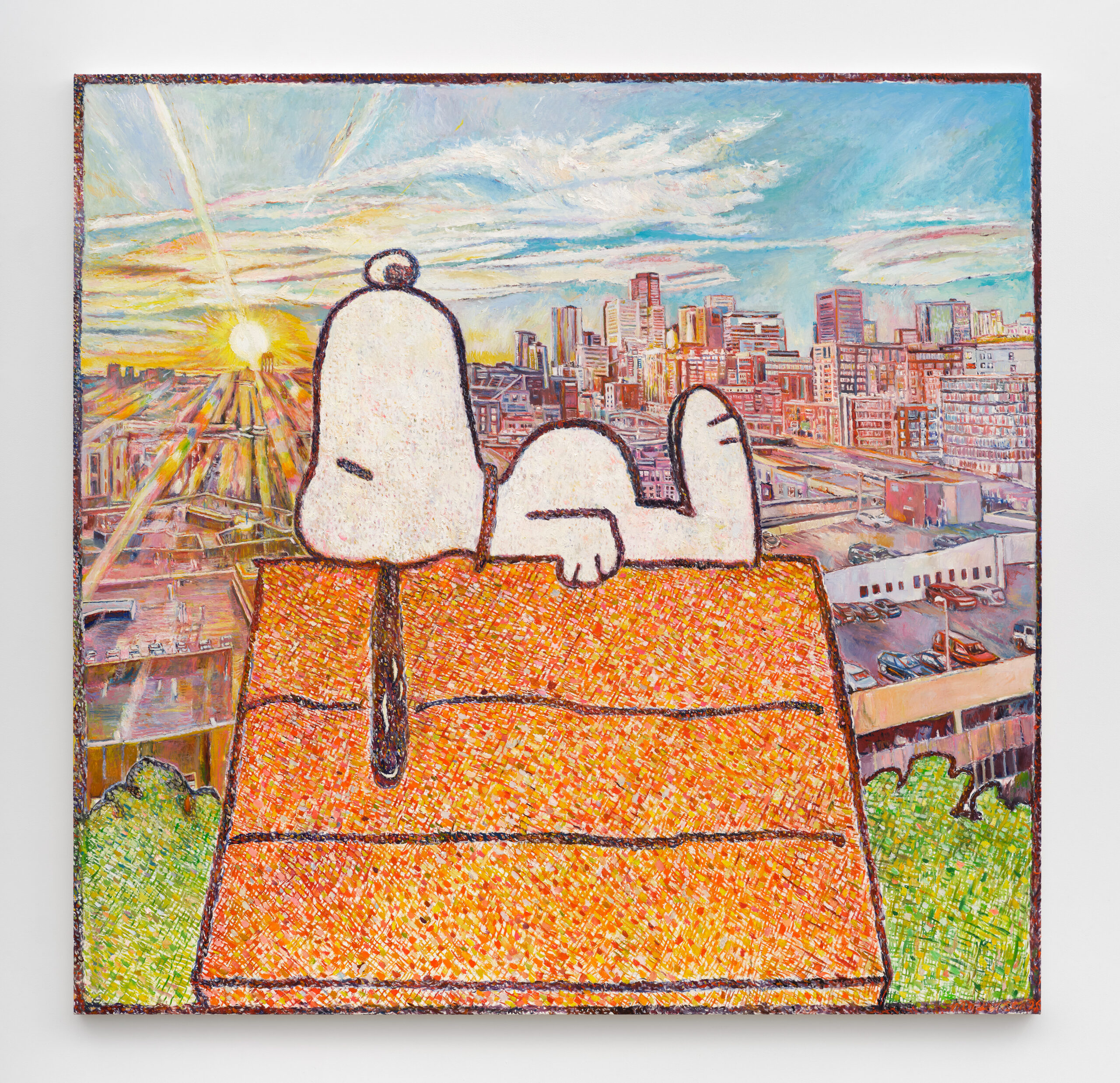
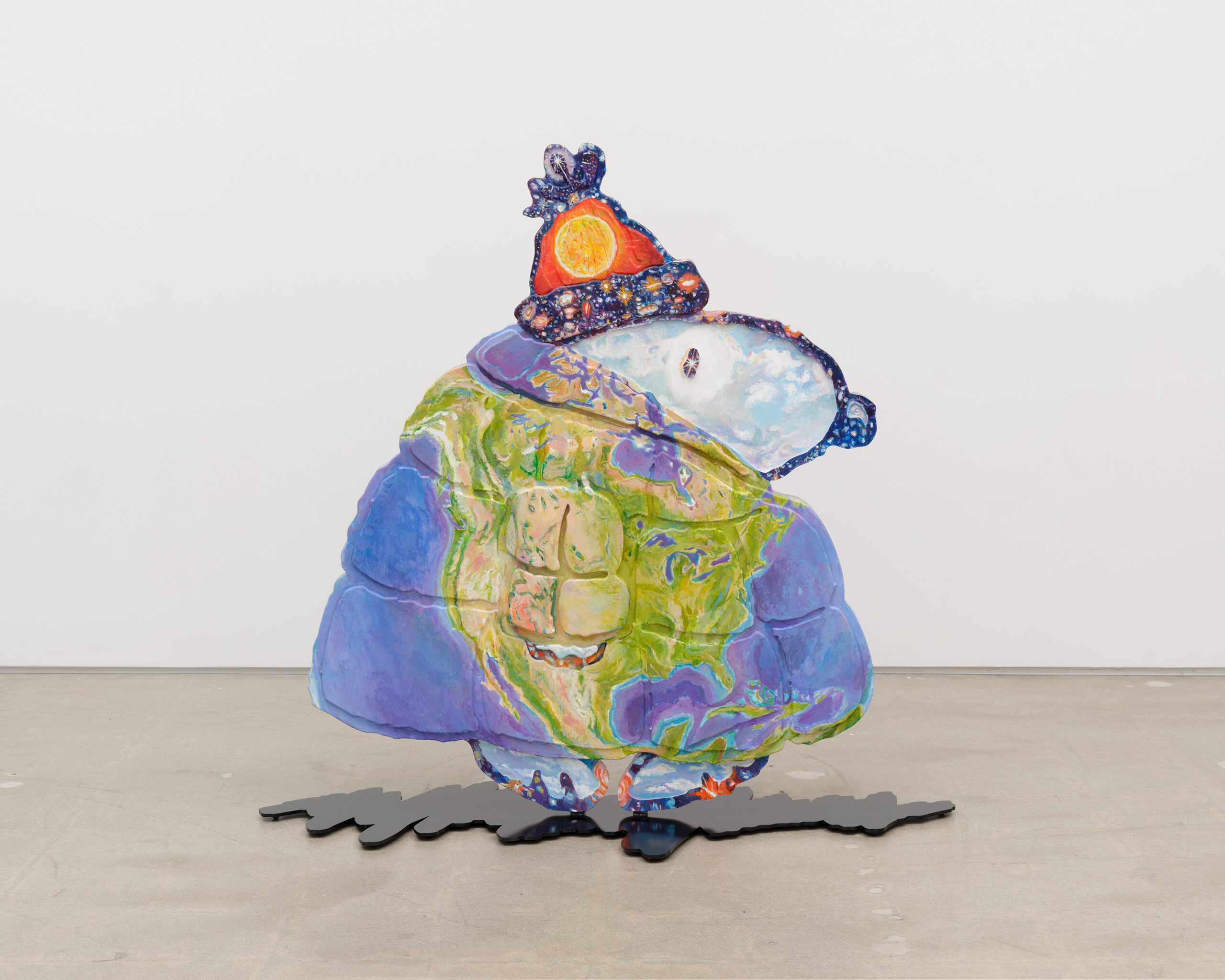
For the MCA Denver Colorado Currents show, I have a few bodies of work that I’m grateful to have included. There will be a large 72 x 70″ painting of Snoopy on his doghouse, “Snoopy Dawn over Denver,” with a background view of the sunrise from my parents’ downtown Denver condo; my first-ever sculpture, “Earth Snoopy”; and a family wall of salon images based on the “Rogues Wall” salon of photos my folks had in their bedroom.
My mom sadly passed away last November, and the salon is to honor her and to celebrate growing up in Colorado. A few of these paintings (and the Snoopy sculpture!) are from the solo show I had at the Aspen Art Museum this past spring, entitled “My American Dream: Rocky Mountain High.”
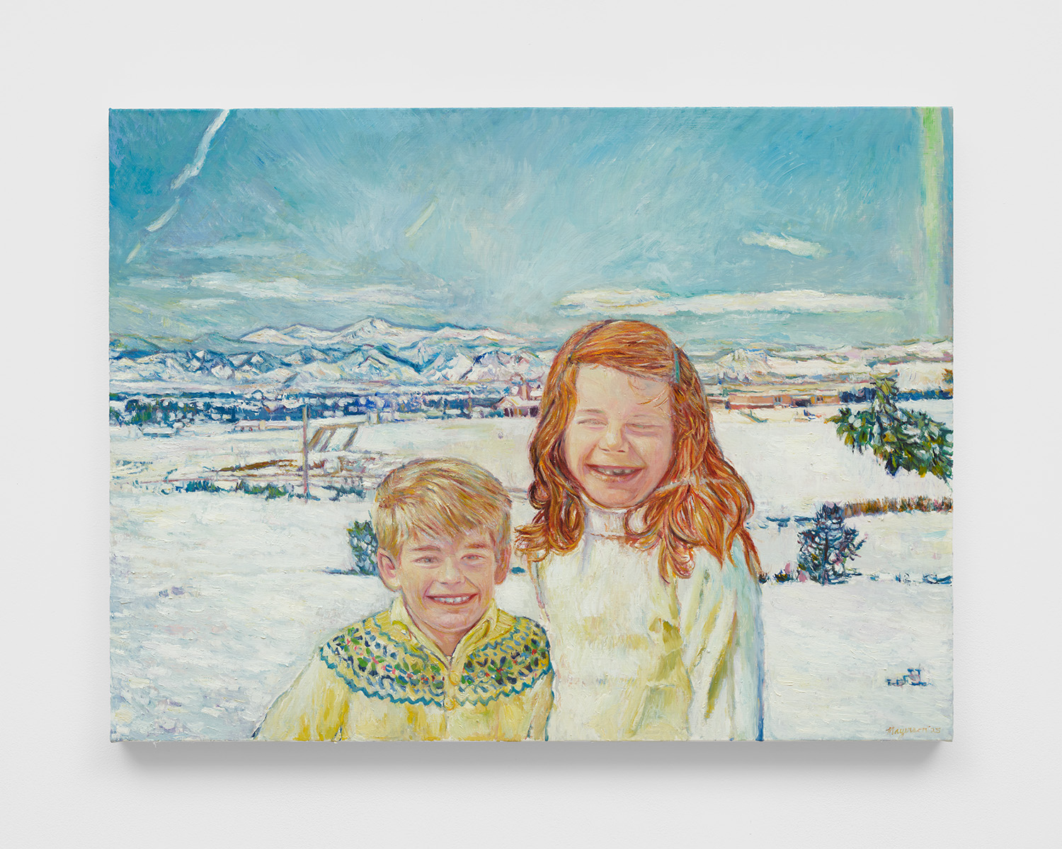
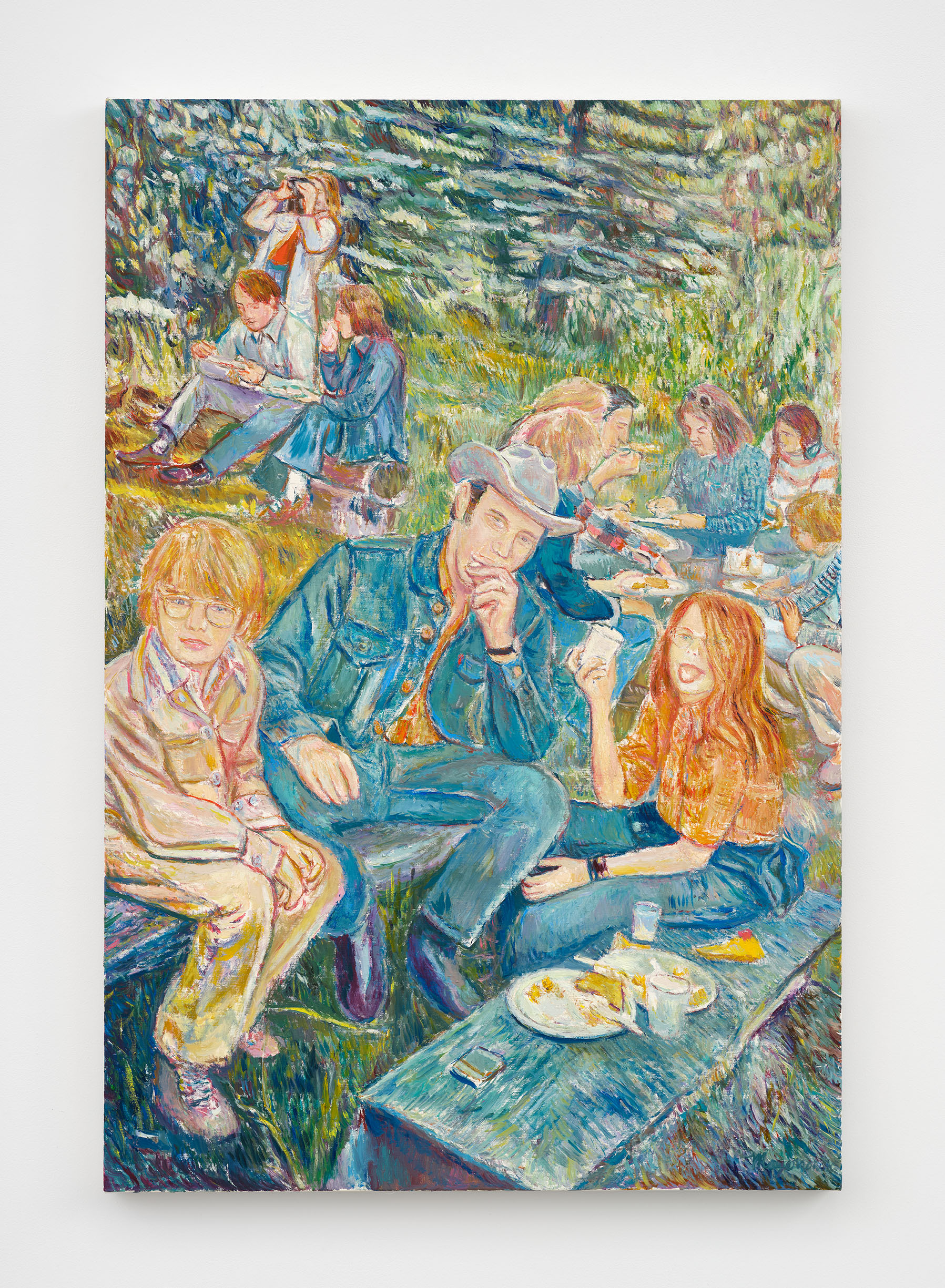
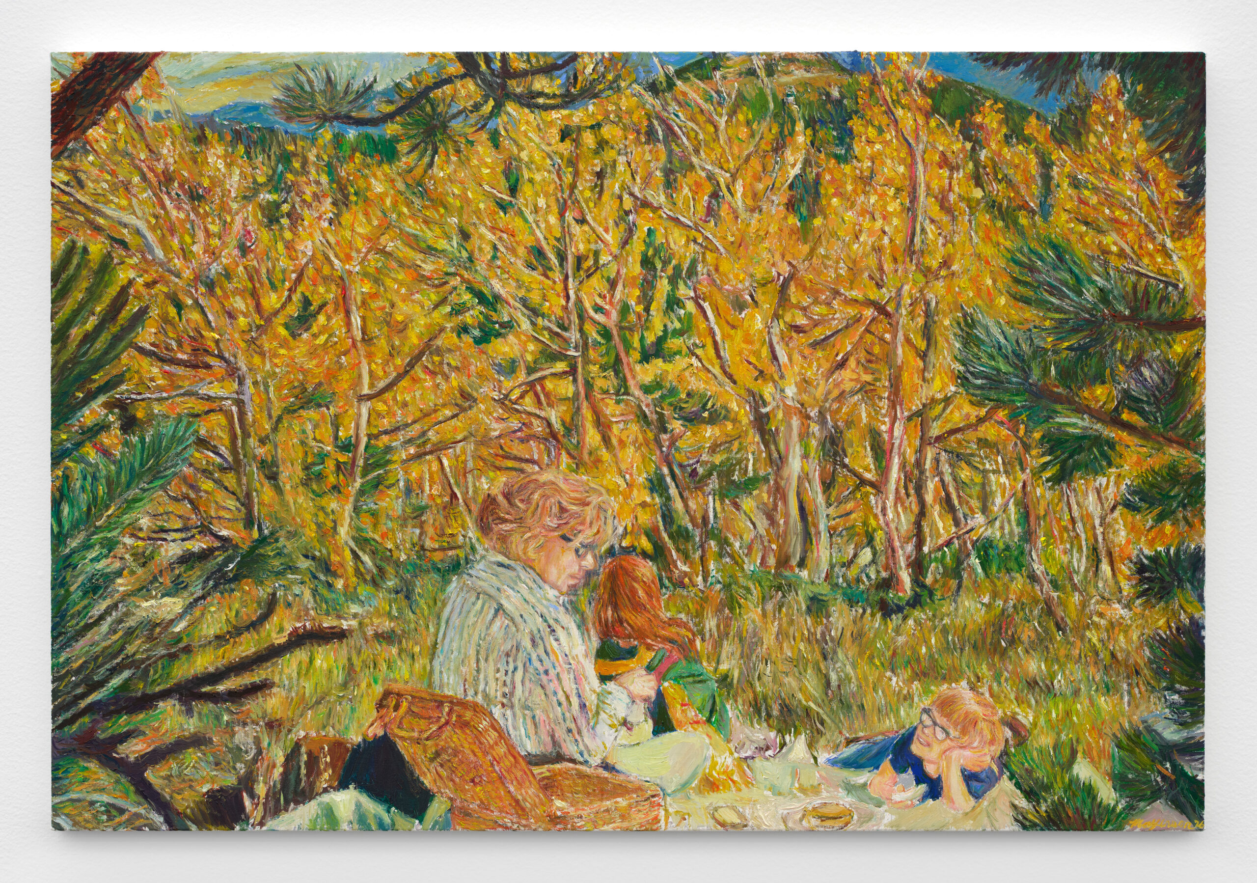
For the Family Salon, one is a painting of us having a picnic—my mom, my sister, and I—in Central City, from a photo taken by my dad. Weirdly, it was at the old cemetery that was there, but they had these beautiful aspen trees, and it was a favorite place for picnics for many folks. Also included is “Rocky Mountain Babies,” a picture of my sister and me from where we grew up in Greenwood Village, in the suburbs of Denver. Behind us, you can see the Rocky Mountains and West Middle School, where I used to walk through the snowy fields to get to school (which are now a whole bunch of houses and fences).
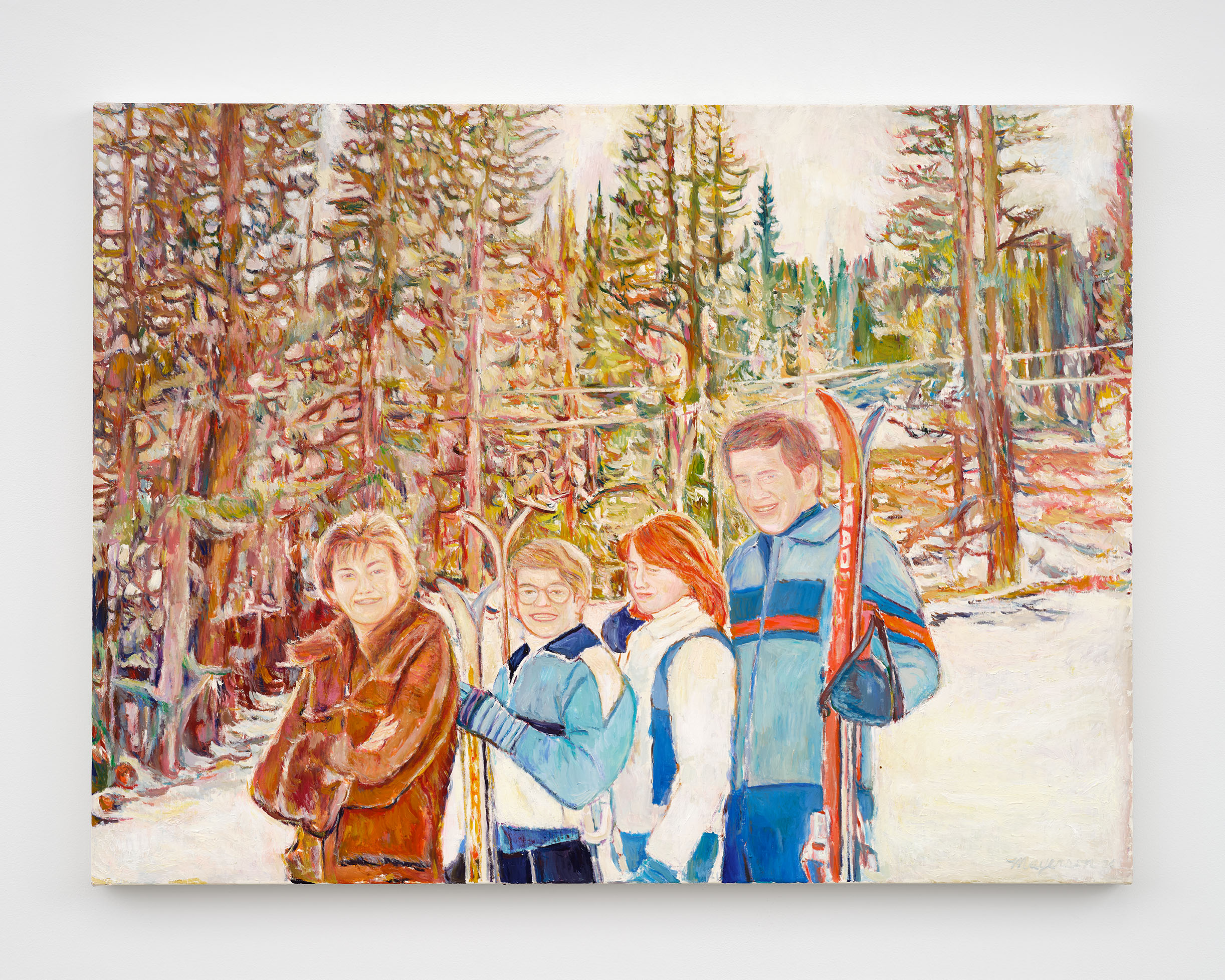
Also for the salon, I’m doing a different version of a 1977 Christmas card photo that was at the Aspen Art Museum. For the AAM, I painted an outtake from this humble shoot (my fellow 11-year-old friend Craig Young took the pictures for us!). In the AAM version, it was on the bunny hill at Copper Mountain where, as a group meeting post, there was a Cherokee sign in the background. Even in the ’70s, they were trying to be a little PC by having it be not for Indigenous people but conflated instead with the Cherokee station wagon. We decided that was just too edgy for the MCA Denver, so I created a new painting of the actual image we used for the Christmas card instead.
At the MCA Denver, I’m going to show the “Earth Snoopy” sculpture, and on the front of the sculpture is a picture of the sun in his hat and North America on his puffy jacket, and on the other side is a picture of the moon in his hat and Russia in the East. Hopefully, our world isn’t flat anymore, but this shows the West that is in constant conflict with the East, while we are all of the same Earth, and it’s obvious that the world has been turned upside down.
“Snoopy Dawn over Denver” is a painting I did exclusively for the show, and it’s Snoopy on his doghouse with a dawn over Denver in the background. This was actually from the guest room balcony at my parents’ condo at the Flower Mill Lofts, just five minutes away from the MCA Denver.
I was there to take care of Dad after Mom had passed, and I woke up really early, and this beautiful sunrise was happening right over the baseball stadium, and you can see downtown Denver behind us. My dad was Jewish, my mom was Southern Baptist, so I’m sort of a religious mutt, but I’m spiritual, and I feel like this was almost like my mom coming from the celestial heavens to tell me everything was okay . . .
I’m also from Colorado. I grew up in Littleton. I was looking at your paintings before this conversation and I thought he really gets Colorado color, you know, like that kind of clear bright sunlight that Colorado gets.
Unfortunately, with global warming, I feel like the sun’s beaming even harder in the mountains when you’re skiing. The atmosphere feels thinner than it used to be. But there’s nothing that presses my buttons more than being in the mountains, or even being in Denver, and being in that atmosphere and just feeling the cool air and that bright sky, and I’m so grateful that you said that.
Where did you go to high school?
I went to Cherry Creek. Everybody hated Creekers because we had one of the biggest schools, and so we had the best football team because we had so many kids to choose from!
 I went to Heritage High School, which was where one of the South Park guys, Matt Stone, I think, went there too. I mean I was a little kid when he was there but he’s a fellow alumnus.
I was talking to Miranda Lash, the curator of the MCA Denver show. We had a nice talk after the LA Frieze fair and about Colorado artists and people from Colorado who are involved in the arts and there’s too few, but there are some. You know, John Currin was from Boulder . . .
It’s interesting how we migrate out of Colorado and spread the word. One of my first jobs after college I was at the Robert Miller Gallery back in 1989 and I worked the front desk and gallerists Cheim & Read were the directors. They showed Kusama, and Joan Mitchell when I was there. They showed Alice Neel, and my heroes Mapplethorpe and Basquiat right after they died. I worked the front desk wearing my grandfather’s three-piece suits and they said, “Keith, you don’t have to be so nice to everybody.” I’m like, “But I’m from Colorado. We’re just nice people. We’re warm and open and affable. We can’t help it!” I like to think that I’ve maintained that attitude my entire career and my life.
 Did you know that Colorado also often gets rated as having the most attractive people because of how athletic everybody is. And so how I explain Coloradans out in the wild is that we are a very friendly and attractive, but poorly dressed people. Do not dress up. People will wonder what is going on with you.
But I mean, what a period in America to be an artist, and to have an art career in which you’re resisting cynicism, right? Have you ever had a period where your sincerity was tested?
I think it is that I don’t want to immerse myself in, you know, gay, homophobic kinds of feelings of repression or whatever. It is kind of interesting because I think, at least for my personal story as a gay man making the pictures that I do, sometimes people question the intent of the works, especially if they see them in reproduction. I actually make serious paintings about Kermit the Frog and the Peanuts gang that sometimes take a moment for folks to realize aren’t ironic!
Seeing a painting in person is never the same as seeing a digital reproduction. And hopefully the painterliness of a painting, how you could see brush strokes and maybe the tenderness of how it’s been painted which helps for the total integrity of the work to come through.
I’ve been creating this whole body of work called “My American Dream” since 2000, when I saw 9/11 happen. I had these nightmares of people jumping and falling from the World Trade Center, so I finally painted the scene of the second plane almost crashing into the building. My friends were like, “You know, you can never show this painting, right?” I’m like, “Yeah, I don’t want to show it.” “You can never sell this painting, right?” I’m like, “Yeah, I would never want to sell it.” But it ended up being at the Whitney, which I’m very proud of. I was doing it because I had to get the nightmares out and to record that historical event.
 The way you speak about your process reminds me of spiritualist painting, which is very American, has a lot to do with Americana and showbiz and all those things, too. The thing about how you’re sitting in conversation with something and you’re connecting to it; can you tell me more about that?
I did theater, and I wrote and directed plays and acted when I was at Brown. But later, I realized that I was more interested in rendering things.
Like a method actor, I really love the idea that in the meditation of something, you could channel the entities that you’re working with, or suture into the avatars of the characters that you’re portraying, or at least honor them to help bring their spirit and worlds to life.
After my mom died, I was doing a lot of these personal works from my own photos of landscapes, but also, of course, my family, and I was playing a lot of her favorite music, some of which happened to be Ella Fitzgerald. So I’ve been listening to a lot of Ella, whom I love. And with the painting I’m doing right now of our Colorado ski family, I made a playlist of all of our eight-track tapes. I have John Denver, the “Cabaret” soundtrack, the “Fiddler on the Roof” soundtrack, Simon & Garfunkel, and some of their favorite music, like Ella, playing when I paint. As it shuffles songs, I’m really thinking about my past and who I was then and who I am now, but also trying to get into that place of what it was like to be alive in 1977 and what those feelings were like . . .
Then, with my mom passing . . . I’m not the Hollywood Medium or anything like that, but channeling a little bit of my mom—in a good way and not in a serious spiritual way—where I’m really feeling like I’m channeling her, but, um, sort of feeling her spirit, and sometimes I do feel like she’s kind of coming to me as I’m painting.
I love Cézanne, but also the American Transcendental spirit, and Marsden Hartley, Charles Burchfield, Arthur Dove, and that first wave of American modernism—O’Keeffe and more—where they really are going back into nature and, in a non-denominational way, trying to find the spirit in that nature. Not trying to make things look real like a photo but trying to imbue the essence of what they’re seeing and the nature that flows through everything.
For me, I’m trying to extrapolate not just the dot matrix of what I’m looking at from my photos I printed out with my computer but trying to think about my thoughts. And as things become more abstract, especially painting nature, when you’re painting all those leaves or all those landscapes, it’s incredibly difficult to individuate those essential elements, but your mind’s making up stuff, and I think projecting an unconscious world onto it.
My epiphany about postmodernity is about agency being reified into Capital, like flour and pizza dough through the capitalist machine, and I think that’s definitely what happened to poor Elvis and Marilyn, and what Warhol successfully did with his imagery in the time that it was important to acknowledge this. But I think in the era post-Warhol, post-Richter, my job is to penetrate the surface of the photo, and, like Bonnard and Vuillard and the beginning of painters using photography as source material, to dive into the world that is portrayed in the photo and bring it to life on the canvas.
I think that’s just so important as an artist in the 21st century, not just being able to take care of your stuff, of the business of art, but to be able to make work in the world and have it exist without taking away the spirit or the soul of what it is that you were creating.
Another text I love to read to teach is Roland Barthes’ “The Third Meaning,” where, looking at Eisenstein film stills, he explains that the first meaning is literally what’s going on in the image. The second meaning is symbolically what the artist might have been intending. But the third meaning is sort of this vertical response of emotion and feelings—taking the work that an artist might create and just projecting it into your own life in a way that the artist would never even understand. Like, “Oh, this reminds me of my grandmother,” or “This is like when I was having that picnic in the park when I was five with my parents.”
For me, the third meaning is the thing that really makes a work of art, especially fine art, have a life of its own.
Hopefully, if we’re thinking our thoughts while making art, figuring out the puzzles in our mind’s eye about what the talisman of the image might be about, as we’re solving the puzzle of the composition in front of us, we might be solving the puzzles in our mind, and we “wake up” from our rendering with epiphanies and great art. I always say that art’s not necessarily therapy, but I think everybody’s working something out, even intellectually.
Right. It’s a statement that art does not have to be just a vehicle for someone else’s wealth that they’ve run out of places to stuff.
So, if I want to access my unconsciousness through painting, what do I do?
Well, first I always say, make something that’s meaningful. Like, why else do anything? As long as you care about it. Create a playlist for yourself that is about the image that you’re painting.
As you’re painting and allowing yourself to be free and in the flow of creation, hopefully learning the tools of your trade, being able to have access to your practice in a way that you aren’t thinking about technical things, then it can be a very liberating feeling.
Growing up skiing in Colorado, I really think that painting, for me, is a lot like skiing. You’re listening to music, and your body’s kind of doing things automatically. When you’re skiing, if you’re a good skier, you’re just having fun cruising down the slope and thinking your thoughts, and your mind is in one place, your body is in sort of another place, but you’re united, where your body is doing this action that makes you feel good. And when I’m carving turns with my brush, it feels very much like I’m carving turns when I was skiing, and then something extra can come out, like that extra thing that you can’t control: your unconscious thoughts, your emotions, your feelings, the painterliness of something that hopefully makes a work have a life of its own that extends beyond you to help enlighten the world.
Rachel Dalamangas
July 2026
New York, New York
Images (top to bottom):
“Snoopy Dawn over Denver,” 2026, Oil on linen, 70 x 72 in
“Rocky Mountain Babies (My Sister And I),” 2025, Oil on linen, 24¼ × 32 in
“Earth Snoopy,” 2026, Acrylic on wood and steel, 48 × 49 × 18 in
“Estes Park Picnic, August, 1975,” 2026; Oil on linen, 40 x 27 in
“Picnic in the Aspen Grove with Mom, at the Old Cemetery in Central City, CO, Fall 1972,” Oil on linen, 2025
“The Mayerson Family Ski Clan, Copper Mountain, 1977,” 2026, Oil on linen, 30 x 45 in
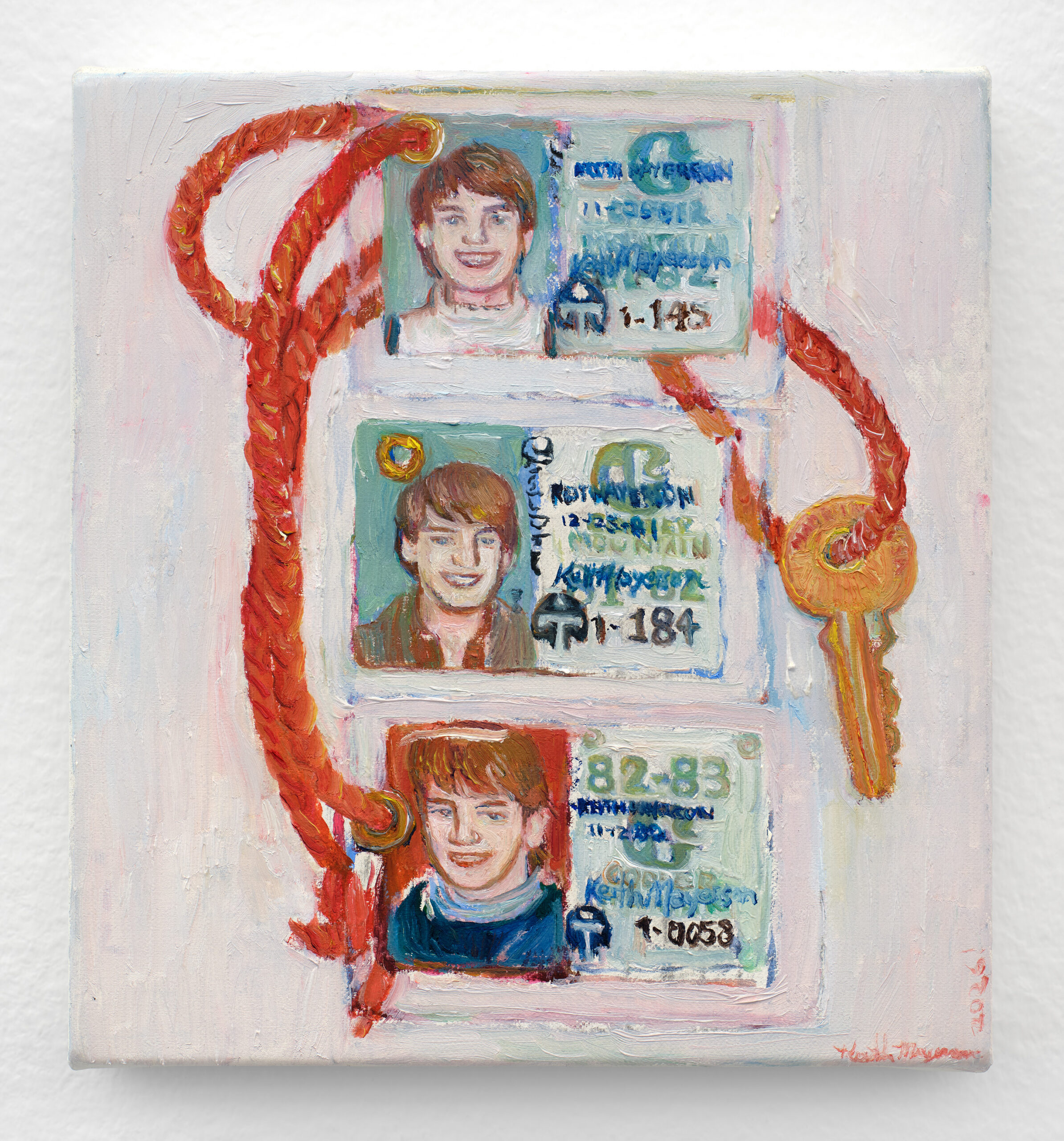
“Copper Mountain Ski Passes, 1981-83 (from when the artist was ages 15–16),” 2026, Oil on linen, 7½ × 7 in
All images courtesy of the artist and KARMA Gallery.
Colorado Currents curated by Miranda Lash, Ellen Bruss, and Leilani Lynch at MCA Denver will feature 28 Colorado artists, on view July 24-Nov 1, 2026.
Correction: an earlier posted version of this article mis-stated the number of works currently in “My American Dream” as 140. As of July 2026, that figure is actually in the hundreds. zing regrets the error.
1.Joseph F Lovett, curated by Mary Barone “Gay Sex in the 70s” Issue 21
Curator’s Note: Tom Bianchi’s Polaroids from the 70s were the beginnings of his career as a photographer. When I interviewed him for my film GAY Sex in the 70s, we looked over the Polaroids that I watched him take 30 years ago. I was struck by how they captured the sensuality of the era. I was so happy to be able to use them in the film and to show a selection of them in zing.
Joseph F Lovett, Director of GAY Sex in the 70s www.gaysexinthe70s.com, www.tombianchi.com
2. Jane Hart “Hollywood 101” Issue 15
Curator’s Note: Jane Hart is a curator, publisher, and artist who resides in Beachwood Canyon, Los Angeles —the location of the Hollywood sign. From somewhat humble origins, this now historic structure has become one of the most photographed an iconic landmarks on the planet. Each day, countless individuals throng to the intersection of the small cul-de-sac where Ms. Hart lives and works—which provides a prime vantage point for capturing images of the sign nestled up above in the hills.
3. Misaki Kawaii “Vitamin Island” Issue 22
Curator’s Note: thanks for putting my works in this issue! when I was little, my mom was looking for me in home. she found me playing in the toilet. after that day, my mom put lock on the toilet door. I love tropical ocean!
4. Luis Miguel Suro & Rodolfo Riviera “Language of Flowers” Issue 20
Curator’s Note: I invited Rodolfo Rivera to join this artist project by asking him to realize a series of decorative oil/canvas flower patterns for ceramics, a practice he has been realizing in the last 40 years in my father’s ceramic workshop in Tlaquepaque, I intend to demonstrate that a painting, strategic for decorative and visual purposes only, can, by switching materials (like oil/canvas), open a strong reference to the presence of flowers and nature’s interpretation in the history of art.
5. Enoc Perez “Form & Memory” Issue 22
Curator’s Note: Enoc Perez is an artist living and working in New York City.
6. Lawrence Seward “Drawings Bad Good” Issue 19
Curator’s Note: These drawings were plucked out of a couple of sketch books in an attempt to get a job doing a wall mural. Some of them are drawings for sculptures and others are simply illustrations of ideas. The selection process resembled roulette with the result looking like a BINGO card partially filled. Still, I hope these drawings elicit a pleasurable uncomplex response much like eating a good doughnut or swatting a pesky fly with a rolled up newspaper.
7. Marisa Aragona “Sunday” Issue 19
Curator’s Note: Marisa Aragona, 27, has wildly curly hair and always eats cherries on her birthday. Originally hailing from the Washington DC area she recently relocated to San Francisco after a seven year stint in NYC where she received her BFA from the School of Visual Arts. She is now studying at the San Francisco Art Institute for her MFA and “getting back to nature” in beautiful California. Marisa’s favorite photographic subjects include birthday cakes and girls in their panties. Look for Marisa’s work in this Fall’s current Photo Review. Look for Marisa with her camera and/or sipping a Shirley Temple. Recent exhibition include NYC’s PS122, The Independent Artists Organization and Seattle’s Photographic Center Northwest. You can reach Marisa at marisaaragona@hotmail.com
8. Faile “Faile” Issue 18
Curator’s Note: Faile is a constantly evolving idea and interpretation through art and design, a creative group of three young heads from the USA, Canada, and Japan, who celebrate this exploration as a team. Faile can be contacted through faile.net.
9. Karin Bravin “Proposal” Issue 25
Curator’s Note: In 1986 I was hired by the Peggy Guggenheim Collection to work for the Venice Biennale’s American Pavilion. One of the highlights of my time there was a friendship that developed with James Lee Byars. He was a fixture in Venice and had the capacity to find beauty in even the most mundane aspects of the city. He often would draw my eye to small, quiet details most would overlook. Each time I saw him, he would urge me to approach the Guggenheim with his idea for a site-specific project; it was poetic and beautiful and would have transformed the experience of passing in front of the Peggy Guggenheim Collection while on The Grand Canal. Subsequently, and probably not coincidently, I have spent the last decade, working with artists on various site-specific installations and curating in the public realm. For my zing project, I have asked six artists to envision their dream site-specific artwork. It didn’t need to be feasible—as long as they could render it with sketches, Photoshop, diagrams or text. While these particular projects may or may not come to fruition, the logistics and realization of an actual aesthetic intervention is an exciting process. Facilitating site-specific work that enables viewers to see and think about space and context differently than they have before is an artist’s greatest calling and challenge. The artists selected have all made extremely successful installations or projects in the public sphere, both indoors and outdoors. Thank you: William Corwin, Rachel B Hayes, Fabian Marcaccio, Melissa McGill, Jason Middlebrook, Jean Shin, and James Lee Byars.
10. Gaston Karquel, curated by Geraldine Postel & David Magnin—Collection David Magnin, Issue 25
Curator’s Note: David Magnin is an art collector and merchant born and raised in the French Alps. He collects contemporary art, and design, specializing in Charlotte Perriand over the last 20 years. From this quest of expertise in collecting Perriand, he discovered the photos of Gaston Karquel whom over a period of 30 years followed the Modernists from Le Corbusier, Jean Prouvé, Charlotte Perriand, and also UAM (Union of Modern Artists). Among the photos Magnin acquired was this series of “Megève: Two Days in the Summer of 1948.”
For the past two years David Magnin has collaborated with Geraldine Postel, a free electron wearing many hats in the fields of art and publishing. From associate publisher of referent art & fashion magazines over the years, she has occupied the roles of an artist, curator, art or advertising director. This curatorial project entitled “Megève: Two Days in the Summer 1948” by Gaston Karquel, is born from an edit of these Gaston Karquel images and will celebrate its anniversary with an exhibition in Megève in the Museum of l’Ermitage du Calvaire, where some of these images were taken 70 years ago.
11. Patricia Cronin “Classified” Issue 16
Curator’s Note: Patricia Cronin is a New York based artist. She moved a lot as a child and ever since has been searching for that perfect home. In keeping with this theme, she is currently overwhelmed with a three ton marble mortuary sculpture funded by Grand Arts, Kansas City, Missouri. It will be exhibited there, at The Aldrich Museum of Contemporary Art, Ridgefield, Connecticut, and ultimately, at her final resting place. Unless, of course, someone buys it, which might help pay for some real estate that would come in handy while she’s still alive. She teaches at Columbia University and School of Visual Arts.
12. Harrison Haynes “Mobile Acres” Issue 19
Curator’s Note: I’m writing to you from Woodinville, Washington where my band is recording some music. The studio is a renovated horse-barn and it’s reminding me of where I grew up: the rural outskirts of the North Carolina Piedmont, somewhere between the suburbs and the country. My parents’ friends, and my friends as well since my folks took me everywhere with them, were DIY redneck-hippies: welders and carpenters that listened to ZZ Top and burned big vanilla scented candles in their outhouses. They hosted demolition derbies, volleyball parties, big oyster roasts every fall, and homemade fireworks on the fourth of July. (The fireworks were made by a lunatic blacksmith, so the finale was the detonation of a homemade bomb underneath an anvil, and the resulting spectacle of a 300 pound block of steel soaring upwards into the night sky.)
13. Anna Knoebel “Kaiser Collectible” Issue 22
Curator’s Note: My good friend Danielle Kalinoski introduced me to Robert Kaiser in Jamaica. “Robert collects Modern homes,” she said. Intrigued (who wouldn’t be?), I flew to Orlando to see for myself. Tom Sibley came along so we could create this project for zing. We spent the weekend enjoying Robert’s unique and superbly restored home, nestled in a quiet community near those infamous theme parks. To experience Robert’s home yourself (as a vacation rental), email him at rlk@designage.net (http://www.themodernhouse.net/tmh/holiday).
14. Walter Robinson “Big & Beautiful” Issue 23
Curator’s Note: BURGER KING My original idea was for Walter Robinson to show his paintings of cheeseburgers in a series at Haunch of Venison Gallery this summer as an enhancement of Andy Warhol’s Soup Cans, 50 years after Campbell’s by Warhol first shocked the world. But as it turns out, a single cheeseburger was enough, as everyone at last week’s Haunch party posed in front of just one juicy Wallyburger for paparazzo Billy Farrell.
The Wallyburger becomes more excessive the more you examine its contents: drip equivalence achieves stasis in the paint Robinson meticulously applies, the tomatoes rolling into cheese in the imagery and the automatic Pavlovian drool which ensues. Never underestimate the power of a burger, even a painted one. Hamburglar Beth DeWoody couldn’t resist, requesting another Wallyburger for an upcoming London show that she is curating.
Only Walter Robinson shall suffer from too much surburgerrealism. To look at one Wallyburger is a trip to Wendy’s. To paint them is to be, and want to devour, the whole franchise. —Charlie Finch, New York, July 29, 2012.
Editor’s Note: The above curators’ notes are taken from the print issue in which the project was published. Therefore please note links and email addresses are dated and may be broken.
New York, New York
July 2026
Are you the same person you were a decade ago?
If you asked me to explain Animal Wisdom—a riveting quasi-immersive seance/play/existential crisis with no plot—based on what I remember from experiencing it at Bushwick Starr nearly ten years ago, I would say it is about death. Everybody’s and nobody’s. A series of deaths performed onstage, but also the many selves we go through and bury in one lifetime, and about death as something we all do ‘alone together.’
I was in a cynical period of my life. I’d watched the agonizing weeks my father spent dying of cancer at the age of 61. I was in my 30s and it felt like the great claw of capitalism had reached out and plucked me up like a stuffed animal in one of those toy vending machines and installed me in a life I was tremendously unhappy in and said, “you go here.” I was no longer sure what I wanted in a career or in a personal life or anything really but apparently I was put on this strange, glorious earth to take messages, make lunch reservations, send invites to ‘important’ people to ‘important’ events, manage ‘important’ projects and about a hundred other ‘important’ things, none of which had anything to do with anything that really mattered. Most of all, I had become disconnected from the closest thing I’ve ever had to religion: art.
Watching Obie-award winning playwright and musician Heather Christian take center stage that night was like witnessing a medium thin the veil between what the living can know about the dead and what the dead can tell the living about life. I remember thinking she played the piano like she was riding a horse: the instrument becoming more animal than object, powerful and willful.
In one scene, the lights in the theater went out and you could hear the music with your whole body, the voices of the performers, instruments, piano, and whatever other ghosts might be there, vibrating up and down the string of one’s own soul. There was an uncanny sense of both fear at the great emptiness, a black hole without a bottom that awaits us all, as well as a near-delirious relief at being one drop in an unimaginably great ocean.
In its second production, which will run through June 14 at Signature Theatre’s Romulus Linney Courtyard Theatre, directed by Keenan Tyler Oliphant, there are a number of changes to Animal Wisdom. Mum’s the word on how certain immersive elements and effects have been adjusted to suit the performance space. But perhaps the most notable difference is that Christian is no longer performing the intensely personal role of H, choosing to pass it on to longtime friend Kenita Miller, with Emma Duncan sharing the role in select matinees. And since Animal Wisdom is at its core about ‘escorting whatever ghost you have through hell and out the other side,’ this felt like a natural progression: what happens, Christian asks, if it’s just a ‘channel of a channel’? What if the onion’s just one layer thicker?
Heather Christian as Interviewed by Rachel Dalamangas
On your decision not to perform H for this production, you say that you’ve never seen your own play and want to see what someone else can show you about the role. Can you tell me more about the decision?
It’s tricky with work like this, which is not overtly autobiographical because there’s no narrative per se. There’s micro narratives and I’m very much telling stories surrealistically, poetically, sometimes in code.
I used the show as a way to get something out of me. And it’s ten years later and I’m ten years older and a lot of those specific griefs and questions live in a different place in my body. I felt like I articulated something for myself and with the help of the audience that showed up every single night, I was reminded that we are broken in community together.
But I’m not in the same place I was, and so it’s necessarily going to have to be a performance to a certain extent and if it’s already going to be a performance, I am more interested in the idea of the show becoming something that can expand beyond the bounds of my body.
And the piece is already about channeling and putting on the personality of your past selves, but also putting on the personality of whatever ghost it is that you’re trying to escort through hell and out the other side.
So this felt like a natural progression. What happens if it’s just a channel of a channel, if the onion’s just one layer thicker.
Tell me a little bit more about your creative practice actually. How much is it a kind of practice of spirituality?
I mean, all of it. I don’t know how I’m defining spirituality. I think because spirituality is so alive in my life that it infests everything that I become obsessed with. So I’m not thinking ever in terms of making something specifically spiritual but it always ends up that way because that’s just the kind of story that I am drawn to.
I’m interested in these unanswerable questions that increasingly we don’t sit with in this age of information where we can Google anything including why are we here? We don’t really have time to sit with those kinds of questions, nor do we have the practice of sitting with them.
There’s no real place to do that anymore because the churches have become more and more fundamentalist, and it’s gotten more tied up with politics. Christianity has turned into a four-letter word for a lot of us with moral conscience who want to be living in a place that has a moral conscience in terms of how it treats people.
There’s not really a place for us to go and mourn. There’s not really a place for us to go and scream. There’s not a productive place other than a protest for us to feel like we can get any of that shit out or to sit in contemplation of it.
And I don’t know that we’re going to get out of this tangle that we’ve gotten ourselves into, which is the confluence of so many different socopolitical and economic and technological things. Unless we sit with it as individuals either in community or alone or alone in community, which is, I think, what theater is.
I feel compelled to create a space where we can sit with these questions that we don’t have time or the wherewithal or the emotional distance to come up with a productive solution of how we might individually move forward, let alone how we might move forward as a group of humans.
And this big question of God or logic I think is just a deeply unhelpful lens of how to think about life.
Ultimately, I want to be doing what Carl Sagan was doing for a living, which is like everything’s a mystery. We can only know so much. But isn’t this stuff really cool? The whole point is curiosity. The whole point is to try to understand. That’s what makes a meaningful life. Knowledge that we will never have any of the answers regardless of what Google says.
That’s interesting because a lot of art right now is nihilistic and everything is just very bleak, and that’s something that stands out in Animal Wisdom. There’s this relief in being able to marvel at how tiny you actually are and that a lot of existence is unknowable.
This is why I think nihilism is such horseshit is because nihilism is a decision that it means nothing. We don’t have enough information to make a decision that it means nothing.
That reminds me of the blackout scene, which was one of the most beautiful experiences I’ve personally ever had at the theater. You’re in this cramped little playhouse and then you’re in the dark with the music and the space suddenly feels so big and vast.
You forget where you are at a certain point. And playing an instrument in the dark like that is a whole different experience.
In order to play an instrument in total darkness like that, I had to put gaff tape on different notes on the piano so I could get them by feel and orient myself ‘cuz you completely lose where you are. With a spatial instrument like a piano or a guitar or a cello, it’s like it’s a different thing. And it’s a weird trust thing. It’s very spiritual because it’s like you actually know how to do it. Your brain has told you that you’re an idiot way more than you actually are an idiot.
Where did you get the idea for the blackout scene and playing in the dark?
Well, there’s always a point where I’m like, we can’t get any further so we need to break everything. The idea was that the power should go out in the theater.
Then I spent some time in rooms that were truly dark, like a planetarium, and there is something that it does where it completely dislocates you from whatever you were doing before.
You could be having a conversation about lunch and then you walk into the planetarium and then that happens and it’s like what were we talking about?
I just had like a hunch that it was the right thing and I had to fight for it ‘cuz at every stage somebody was like that’s a terrible idea. But you can’t know until an audience shows up.
Does the darkness in your work ever scare you?
I do what I do specifically ‘cuz it scares me.
I’m about to be 45 years old. I’ve up until this stage in my life had this thing in me that was like if you’re not going to leave blood on the floor then why are you doing it? Why are we here?
I have felt at every stage that if I’m scared of a thing that means that I just need to do it. Like if I’m scared of a thing that means that it’s pointing me towards it.
When I started to write Animal Wisdom, I was just like, I don’t know what I’m doing. I think I’m telling my life story, but I don’t know what I’m doing and I don’t know where to go with it. And my friend, Salty Brine, was like, I want you to sit down and think of the scariest thing that you could say in a room full of people and then say exactly that out loud.
I think we went to a lot of places that we went in Animal Wisdom because Salty said that to me. I do a lot of things that scare the crap out of me because it feels like no show is just a show for me, like a show has to be some sort of ritualistic thing.
And that’s just my weirdness I think because I grew up singing at church where it’s like something needs to change by the end of tonight—not just for the audience but for the people who are performing it. The art kind of needs to be a vehicle or some sort of medium for us to put something inside and either let go or be changed a little bit. And you can’t really get at that unless you’ve got some blood in the game.
Since your work does ask these really big questions, I was wondering what do you think we lose when we pass and what do you think carries on?
Oh wow. I think that’s a question that changes periodically throughout life. When I wrote the show I thought a very specific thing, which is like what you lose is direct participation in the narrative, almost like the mundane narrative.
Like when my grandparents passed, they were no longer coming to my shows, we were no longer talking about the work. I was no longer going to Shreveport to see them. So those details I think you lose, but my experience has been I can feel them and they show up for the big stuff and the truly small shit that I thought was truly small they’re like that’s actually the point. You know, I think you gain perspective when you die.
I think the big relief after passing is that secrets are no longer necessary. In southern families, secrets are a big thing.
I’m now ten years older and I’ve had more people die on me and I’ve had a miscarriage so I have a little angel spirit that I feel attached to me now.
I still grieve these people and I still grieve these spirits because in my human body, the life that’s going on right now is the only important thing that I can think of. But I think when you pass, you get to understand what’s actually important.
Are you working on anything else after this show?
I work on way too much at once. That’s not meant to be a brag. I am compulsive and need a place to put all of it.
I’m working on my first opera, which is a retelling of the Dido and Aeneas story through the lens of a Baroque opera. The tech goes horribly wrong and the tech is being run by the Gods. So it’s like a Baroque opera that sits inside a straight play and it’s all whackadoo.
Then I’m trying to write a teeny tiny Gilgamesh. I’m calling it a teacup Gilgamesh. I don’t know why yet. I also adapted The Book of Revelations, which I don’t know how that becomes a show. We shall see.
So there’s a lot that’s cooking. I just haven’t had a whole lot of time. You’re sometimes doing two or three shows that you’ve already finished at once, but all of that stuff eats those logistical brains, eats the time that your creative brain can kind of be an idiot. ‘Cuz I don’t know about you, but my creative brain needs time to be an idiot—and that person doesn’t answer emails.
Rachel Dalamangas
New York, NY
May 2026
photo credit: portrait of Heather Christian by HanJie Chow, courtesy of the artist
Ana María Hernando’s exhibition Seguir Cantando at the Museum of Contemporary Art Denver takes its name and inspiration from “Como la cigarra” (“Like the Cicada”)—a song written by Argentine poet and composer María Elena Walsh in 1972. Walsh wrote it originally as a song of hope for artists who lose momentum in their careers, but its lyrics—tantas veces me mataron, tantas desaparecí, y seguí cantando (so many times they killed me, so many times I disappeared and I kept singing)—took on new and specific weight after the military coup of March 24, 1976, when General Jorge Rafael Videla overthrew the government of Isabel Perón and launched what the junta called the National Reorganization Process.
What followed was a systematic campaign of state terror: disappearances, torture, and murder targeting anyone considered subversive, with an estimated 30,000 people killed or disappeared over seven years. Artists, intellectuals, teachers, students, and union organizers were disproportionately targeted. Writers and musicians went into exile, among them Mercedes Sosa, Argentina’s most beloved folk singer, who was detained at a concert in 1979 with her entire audience and forced to flee the country. It was Sosa who made “Como la cigarra” a people’s anthem, recording it in exile while the song remained banned in Argentina. Walsh herself had been banned from radio and television.
Women occupied a particular and paradoxical position in this history. The junta’s ideology was explicitly patriarchal, built on order, hierarchy, and the suppression of anything ungoverned or ungovernable. Yet it was women, specifically the Mothers of the Plaza de Mayo, who began gathering in 1977 in front of the Casa Rosada with photographs of their disappeared children, and whose persistent, quiet, weekly presence helped delegitimize the regime. The feminine, it turned out, persevered.
Hernando, a Colorado-based artist who grew up in Buenos Aires during the coup and came of age as an artist after the return of democracy in 1983, carries this history into our own present moment with Seguir Cantando, the centerpiece of which are two 12’ waterfalls made of some 8,500 yards of pink tulle.
Ana María Hernando as Interviewed by Rachel Dalamangas
What is the picture right now in Argentina?
People are suffering. I have most of my family still in Argentina. And you think it cannot get worse. Last week, it was the 50th anniversary of the coup. So it’s an emotional time and you know this government censors a lot of things and stories and I think it might be producing the opposite of what they want because more people are coming out with their stories.
Before the coup, it was very chaotic and there were kidnappings and you didn’t know from what side. It was just very difficult and then at the same time you go, you know, this is life.
Then when the coup came, they took over the press and everything. My school was what they call intervened, meaning they took out the director, the principal, and they put one of their own. There were friends that you were going to meet and they didn’t show up. And at the same time you are reading what the government is putting out and then afterwards you see all the lies. It’s just a way of governing through lies and wanting to control what is uncontrollable.
What was school like after that?
I went to the same school from first grade until I graduated from high school. Before the coup, there were many moments that were very uncertain. I remember one instance, a group of people were marching towards our school and it seemed like maybe they were aggressive and they wanted to get into the school, so we were locked inside. Then by the time when the coup happened, that’s when my school got intervened.
My school was a nun school. In Argentina, Catholicism took different ways than how I have experienced it here, where the message was more about how to help each other and my school was more aligned with that part of Catholicism. And so when the coup happened, they sent these nuns away and then they put in a different director. There were other things happening like some teachers stopped coming and then later I learned that one of them was killed inside a church with six other seminarians.
And you couldn’t talk much about these things. It was all kind of in whispers and people wouldn’t ask, “Oh, that teacher stopped coming?” I mean it was years after that I learned that teacher had been killed.
Were you afraid of being targeted?
At the beginning before the coup, there were a lot of kidnappings and you hear this and that and they were saying the left and the right and we were all a bit afraid. Like, in the streets you had to be with your ID—if they would stop you and you didn’t have your ID, that was grounds for them to take you in. And I was stopped—there were times like I was with friends and it was late and we were stopped by—it wasn’t the police, it was people from the army with guns.
And then, I had another teacher. I was doing theater and one day we are waiting for the teacher, the teacher is not coming, not coming and nobody said anything . . . you know, you couldn’t be public about your fears. The government was very clear about how they were looking into everything. And at some high schools a lot of students disappeared.
All the press was in the hands of the junta, so I mean, all the information you had was not accurate, I would say, you know, they were lies, but nobody knew exactly. Some people, of course, when they took people from your family, you knew. But the messages that the government was saying was that “Oh, the left was doing things, they were killing people,”—but by then, it was mostly the government killing people. So there was a lot of misinformation.
By the time I got to art school, Argentina was already a democracy. The art school had been decimated of creativity. And the teachers—I’m not sure how it had been there in the art school before, but the teachers were very rigid and it was more academic in a way of like going to the gym, you had to draw perfectly in a way that really didn’t have much of a spirit in it.
And the art is a response to those experiences?
It was based on and some pieces are named after a song by María Elena Walsh, Como La Cigarra. It’s a song that she wrote in ’71 or ’72 and she was very outspoken. Over time it became an anthem about perseverance and persistence.
And I think we are in a way in a time that—as I see it, I think we need nourishment. I hope my work is like a vitamin in some ways for people and a way of connecting in the midst of everything to joy. I think if we don’t have that it depletes everything, depletes us, and it’s hard to stand strong and if you feel defeated it’s hard to fight and so it’s based in experiences like that and how trauma marks you. I love how the song says, “I have been killed so many times. I was dead so many times but I keep coming back and I keep singing.”
The part of “keep singing” I think it’s the part of the arts that brings this renewal and a life that is beyond each of us individually. So that was one thread and feeling of what’s happening in the world, in this country and everywhere.
It’s chilling how much you can see a lot of what’s happening today in what you experienced in the past.
Yes. The sense of someone telling you how things should be, that they know better than you and this sense of controlling everyone else, the views of some specific very small group of people. I think at the end that brings, well, poverty—poverty of heart, of spirit, of mind, and physical poverty.
No doubt that made a deep impression on you as a young artist.
Yeah, and I think not as a way of running away, but what I see is that for us our survival is in staying light, meaning—not superficial, but very dynamic, you know, very aware and our eyes open and be very fast and quick at reacting at things.
The world is full of heavy energy. When you are light, you can move quicker. You can let go of things and be more open to what’s there at the moment.
If you are swallowed by the darkness then you just cannot move, it paralyzes you. I have seen how that has been at times a danger for me personally. It’s like I have gotten paralyzed for that moment. And it’s hard to explain how—why—to other people who have not gone through that. Like, at times I could be stopped with people with guns, I just stay quiet and still and also as a woman you are also very aware of that too.
Tell me some more about this concept in Andean cosmology that is important to you—you called it salka?
I would like to acknowledge my friend and teacher Don Américo Yábar, mystic of these Andean traditions. Without him, I would have only had shimmers of all that beauty.
Salka is a Quechua word that means undomesticated. I have been to Peru a lot, but more in the area of the Andes and the high jungle. They talk a lot about the salka, that the salka is that energy that it’s uncontained, and I think also is the energy of creativity. Where is the energy of the river and the forest and the clouds and it’s something you cannot contain. It informs my work where I’m following intuitively a form and then I discover more what that form is about. I think the salka is very nourishing to us, to life.
For art if you can connect to that energy, I think your work expands. And then you are lighter because for the salka to happen, you need to be more in this light energy.
Which makes sense that you’re working with very light material.
I’m a painter and tulle and the fabrics that I have an attraction to allow me to paint with fabric. So I use all these different colors, but by layering them I can make other colors. The tulle allows me to make these sculptures and give shape and work with volume in a way that paint doesn’t let me.
But then tulle also you think of the bride and you think of the princess and the ballerinas and it’s an archetype of the feminine that tells you you’re better off if you stay innocent and beautiful as if you are a package for others. And I rebel against that archetype.
So I’m using that same tulle that communicates those ideas and I use enormous amounts of tulle as a way of talking about power and agency and to question those ideas for young women.
Why pink?
Pink because of all the connotations of pink and how people think of women or girls, and I wanted to make it really pink and explosive. I don’t know what time of the day you saw the show, but in the evening, when you’re on the terrace, and the color is coming out from the skylights and you see the pink on the floor. I don’t know how it is with tulle that it glows. I’m not sure about the physics of it but I love it. I just wanted it to be enormous and unapologetic.
How do you dream up these waterfalls and design them?
I am responding to the building that—as I said—I love it and when I have the luxury of being able to be in a place, I sit with that place and I mesh with it and I can see what I want to make and then I walk towards that image.
So I make sketches then I try to figure out what is that about and by now I really trust these images and I trust that afterwards I discover more about the work that it’s not coming from my head but I feel it comes from another part of me that is wise, that knows, that’s connected to other things that are happening that are unattached to the mind. I think the mind sometimes it’s more poor than all of these other things.
Were you thinking about the exhibition space as a landscape?
I don’t think of them as landscapes, but as happenings. For those pink waterfalls—how they are—they come together and they transform the space of that room. So you cannot cross the room, and one of the things that I want to invite people is to be more aware of the surroundings. And I know that in most museums or spaces when people go to see a show, they have been there before many other times. And I wanted in the room to present another way of relating to the space, that you couldn’t cross but you had to go around and go on the other side. Then when I think about water and how water looks for each other, looks for more water, and as it begins, you know, thin and a small amount and then more comes together and becomes more powerful as it finds more water and other waters. And I love that image for how we are more powerful as we find each other.
Rachel Dalamangas
New York, NY
2026
All Photos:
Installation view, Ana María Hernando: Seguir cantando (Keep Singing), Museum of Contemporary Art Denver, March 5, 2026–July 5, 2026. Photos by Wes Magyar.
 LIBERTY, 2025, wood and collaged paper
I first met Al Diaz over a decade ago when I was gathering oral histories of the 70s/80s downtown art scene. Obama was still president, and X wasn’t even yet a twinkle in Elon Musk’s eye. I wanted to ask Al about his days with his teenaged friend Jean-Michel, co-author/conspirator in the works of SAMO©, the street tag known for such pre-internet proto-memes as SAMO© . . . 4 THE SO-CALLED AVANT-GARDE and SAMO© . . . 4 MASS MEDIA MINDWASH.
Swept by the sensationalism around enfant terrible Basquiat from the lips of SoHo gallerists reading the writing on the walls of the Lower East Side, SAMO© was soon appropriated by the blue-chip gallery system it criticized, where it was rapidly becoming fashionable to stuff excess wealth with nowhere else to go into art made by those young, crowned celebrity-artists.
I was drawn, admittedly without specific aims, to this time and place in the course of interviewing artists for zing, when I noticed that among the 70s/80s downtown set—those who survived the 80s—there was a real flair for storytelling and that people from this time really were (and many of them, still are) characters, and in this way, Al is the same. He’s got the aura of someone who would be right at home in a Scorsese movie.
“We weren’t ‘making street art’ we were writing graffiti,” he said when I interviewed him that first time, drawing out the words to emphasize making and art. I immediately decided I liked him and wanted to know his story, suspecting that because it wasn’t over, hadn’t really been told, it might be the more interesting one.
Frozen in time at the height of his late celebrity, Basquiat was genuinely tormented by early trauma that made the art as raw and soulful as it made the artist painfully difficult at times with those whom he called friend. These painful off-and-on friendships with other highly creative people, Al early among them, were interwoven in the creative process of art-as-lifestyle and life-as-art that made Basquiat so charismatic, painting barefoot in an Armani suit.
In January 2017, Al came over to my apartment in Ridgewood with a mutual friend, to have coffee and talk about the impending inauguration of Trump. We were talking about how the election had been basically a Twitter prank that wouldn’t end, and then Al said that he was bringing SAMO© back.
Ironically, the unreleased Basquiat biopic Samo Lives, reportedly did not include the still living half of SAMO© in the process of the film’s production. Reinvigorating the same old buzz also provoked legal battles over copyright ownership in addition to threatening accuracy and preservation of the creative legacy.
In January 2026, now a full-time artist, dozens of gallery shows, two books, one arrest and a midnight sun later, looking around Al’s Sunset Park studio, the same hand that wrote SAMO© graffiti is undeniable everywhere. Distinct from the shared tag but nonetheless bluntly political and deliriously irreverent. Frenzied color and American iconography. Al is not an ‘activist’ artist but there is that quality of something insistent, urgent, and urban coming from the canvasses of recent paintings and artworks.
Al Diaz as Interviewed by Rachel Dalamangas
You’ve said you returned to an art career after Trump was elected in 2016. Your political positions have been remarkably consistent over the years. How does politics animate your work—structurally, not just thematically?
I returned to writing SAMO© graffiti in 2016. I had already been creating the WET PAINT/ Subway sign series for about five years, but the constraints of a 22-character alphabet were too much for articulating what I was feeling. At the same time, I had grown tired of hearing the cut and paste, remix story of SAMO© being JMB’s nickname so I set out to rectify the warped narrative. It was time that I give actual examples of actual SAMO© graffiti for an entire generation who had missed out on it, they would be mostly all new (updated for the 21st century) and true to the original format (AS AN END 2- AS AN ALTERNATIVE 2 etc.) Around this time I was playing with bringing the WET PAINT/ Subway sign series to life by mixing the text with imagery and color etc. This would be the direction I took as a visual artist.
FLOWERS GROW, 2024, mixed media on canvas
When you brought SAMO© back, what were some of the reactions you got?
Here’s a story. I got in some trouble, but it was funny. Did you hear about that?
I got in real trouble when I was writing SAMO© graffiti at the Prospect (Avenue) station. This woman at MTA said something and then there was a warrant out for my arrest. I had to get a criminal lawyer, which cost me like three grand.
I showed up at 5:30 or 6:00 in the morning to the precinct, right here in Sunset Park. They cuffed me, they took me in a fucking patrol car down to Central Booking. Put me in the system, gave me my own cell. I was like 60 years old and I’m like fucking locked up. I haven’t been in jail since I was using drugs, you know? Eight hours I’m waiting. That’s how long it takes. About 4:00 I get to see the judge. Like a week before I had been aware of the fact that I had to go give myself up, they had given me an award, it was the borough president and the mayor’s office, had given me an award for contributions to street culture for the same fucking thing that I’m getting arrested for.
So, my lawyer, he goes up and argues my case. They’re all friends, right? They go to lunch together. I walked out scot-free, nothing. They say ‘stay out of trouble and we’ll expunge it in six months. It’ll disappear,’ which I’m sure it has.
Somebody got wind of it, and they told somebody about it and their writer friend works for the Wall Street Journal, and they did an interview about the whole thing. I got an article in the fucking Wall Street Journal over this thing.
I mean, it’s absurd that you get arrested for what you get an award for.
So SAMO© became international. I had to stay in Iceland for a night ‘cuz we missed our flight and I did some SAMO©s, like I put a sticker on a sign at the airport parking lot and these kids that were following me on Instagram, they DM me, “Oh, you’re here?” And they came and they picked me up. It’s like plain daylight, right? But it’s 2:00 in the morning, June. Midnight sun. And these guys show up at 2:00 in the morning and they took me to the Blue Lagoon.
I mean just all this great stuff happened because of the same old thing, you know, the same old fame.
That would not have become so famous had it not been for Basquiat’s involvement.
But I wonder what Basquiat would have been without SAMO©. If you had never done SAMO© and made art with Jean-Michel so early, how do you think you would have developed as an artist?
I don’t do the HYPOTHETICAL thing all too easily but I think my career would have taken a very different trajectory had SAMO© and JMB never existed for me. First of all, SAMO© became a career move only as a result of it becoming so widely embraced. I can only speak for myself, but I did not think of any artistic endeavors at that time as a step towards anything greater. The idea of a CAREER was non-existent. I imagine that I would have still naturally grown interested in music/percussion and possibly even the making of percussion instruments. I don’t think that part of my history was at all influenced by the SAMO© project. Maybe I would have followed my younger wishes of drawing and writing my own comics (?) As for fine/visual art, it is hard to say what might have developed.
The artist’s Sunset Park studio, 2026
As he shows me around his studio he is rummaging through shelves of homemade instruments, materials, and books. He has a basket overflowing with strips of MTA wayfinding slats. He shows me a Middle Eastern doumbek and a ‘super primitive crazy instrument’ called a berimbau.
Here’s this insane thing I made. It’s funny.
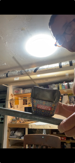
From a shelf, he produces a small homemade instrument made of a colorful square tin bound to a stick. He starts tapping it with a mallet, causing the tin to pop off.
I guess it’s been sitting there for a while but it’s this insane instrument. I made it from like a Trader Joe’s fucking smoked paprika thing. That’s the resonator. It sounded a lot better before. I think it got some heat. Anyway, I don’t have a name for that.
The artist in his studio with a homemade instrument, 2026
We were talking recently about the creative need for an audience—the desire to be saying something to someone—and how the raw pursuit of fame can warp the ego can warp the art. What did you learn from watching people take off that young?
I saw very young and presumably confident, conscious and certainly talented people being what I imagine was RUSHED into the limelight and public focus. In some cases, for more than just their art. The hype machine was running full throttle. That was good for some people’s careers, but I believe that a young ego is very impressionable and fragile. Too much, too soon, too early can have negative results. Burnt out, jaded and cynical before one has truly FOUND their VOICE. Only a few of the art-stars from the 80s explosion have survived to enjoy their success.
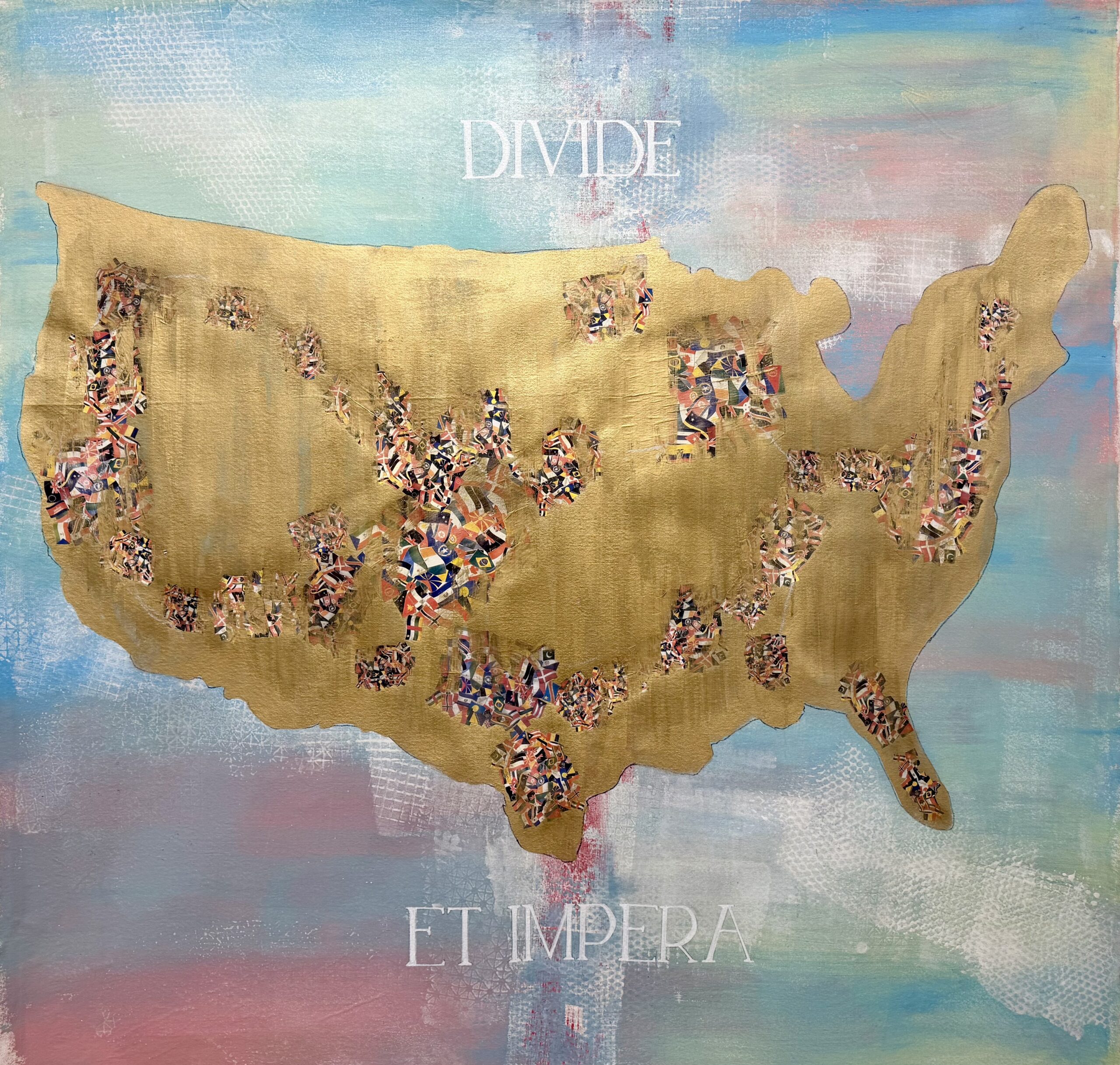
DIVIDE ET IMPERA, 2025, mixed media on canvas
What do you think art’s place is in a time like this one?
I think it’s like Nina Simone said that an artist has to reflect their time or their circumstance. Not every artist does that. Not every artist feels compelled to do that. But I do. I think it’s part of just how I grew up.
When I was talking about the 80s and how an artist had to have a product or something, I was raised in a working-class family. You have certain values you know? It’s harder, or you got to make more of an effort. You can’t be frivolous and like phony or whatever when you’re from a working-class kind of environment. A person like that doesn’t feel comfortable putting on an air or to pretend, it’s just absolutely unnatural.
Art doesn’t save the world though.
No, it doesn’t save the world, but it makes life better you know.
Well, I shouldn’t say it doesn’t save the world because evolutionarily it’s sort of an accidental byproduct of our ability to make tools.
And our ability to think and to create. To imagine and to do all the stuff that separates us from animals. I don’t know. I mean, apes can make tools, too. So, I’m not going to compare it to apes, but certain creatures don’t have those abilities. I don’t think a turtle would be able to make art. Nothing against turtles.
Anyway, I think it’s admirable when an artist shares some kind of message, be it hope or anger. Something that makes people think and can make people not feel so helpless. If you can give somebody some kind of hope in the sense of giving strength, as opposed to hopelessness.
I mean authoritarianism depends on the cynicism of the people.
Right, or people giving up and of course that’s what [authoritarian leaders] want. So, if you do that you‘re like just contributing to the downfall of human independence and human dignity.
It’s no secret that trust funds and proximity to power do much for the pursuit of a creative career. But not having these things doesn’t stop people—nor should it—from making careers as artists, even if it’s harder. As someone who really did play the long game, what is your advice to young artists today?
To young artists, particularly those who come from less privileged backgrounds. You need to realize early on that being an artist is not so much a career as it is a lifestyle. You need to surround yourself with others who have similar aspirations as well as those who do not understand anything about art. Go see as much art as you can stomach. Avoid being a KNOW-IT-ALL (life will humble you) Stay TEACHABLE. Seek adventure and absorb knowledge at every opportunity. Apply all experience to your creative process. Enjoy food, music, laughter and companionship. To quote Patti Smith “Take care of your teeth!!” And lastly
Love fiercely and allow others to love you.
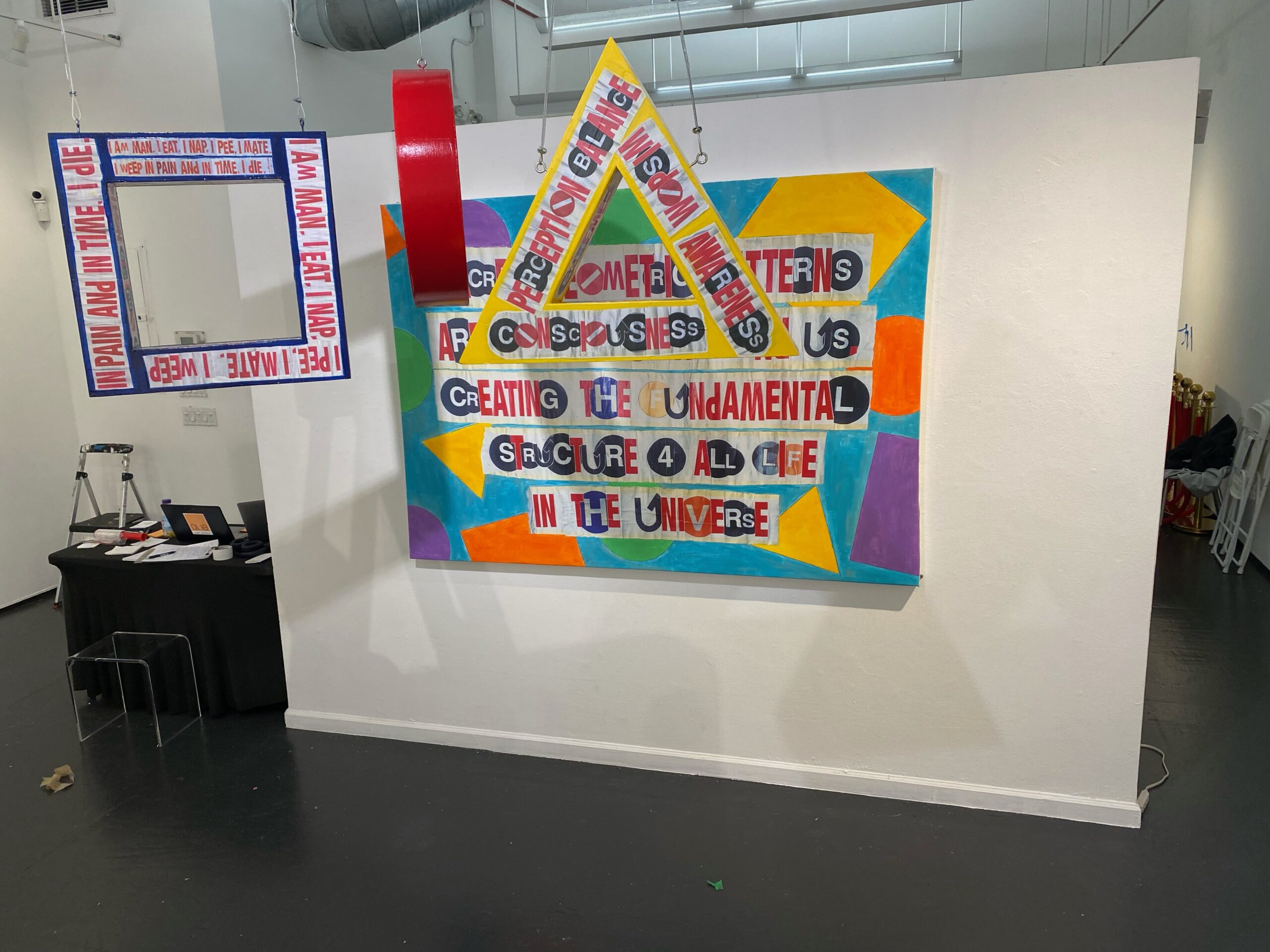
SACRED GEOMETRY, 2023, wood and hand embellished digital print on canvas
What are you working on right now?
I am working on a series of larger mixed media works (60” x 60”) specifically for a proposed show in Paris this May (fingers crossed). But I am always doing smaller projects like print editions and my own text postings on a daily basis.
Rachel Dalamangas
New York, New York
2026
All photos courtesy of the artist.