Devon Dikeou is a conceptual artist whose work engages with the lines, recesses, and in between places of the art world, and the interaction of roles within. Her most recent solo presentation ’Pray For Me’ –Pope Francis I is on view at James Fuentes through July 28, 2017. Other exhibitions include Foundation Barbin Presents Redeux (Sort of) at Kai Matsumiya, New York City (2016); Please at Outcasts Incorporated, Paris (2015); Inhabiting Ten Eyck at Storefront Tent Eyck, New York City (2014); Between the Acts: Virginia Woolf at NADA Art Fair, Miami Beach (2014); Game Changer at Boulder Museum of Contemporary Art, Boulder (2014; Please at The Contemporary, Austin (2013). Devon is also founder, editor, and publisher of zingmagazine and co-founder of the Dikeou Collection in Denver, CO.
Interview by Brandon Johnson
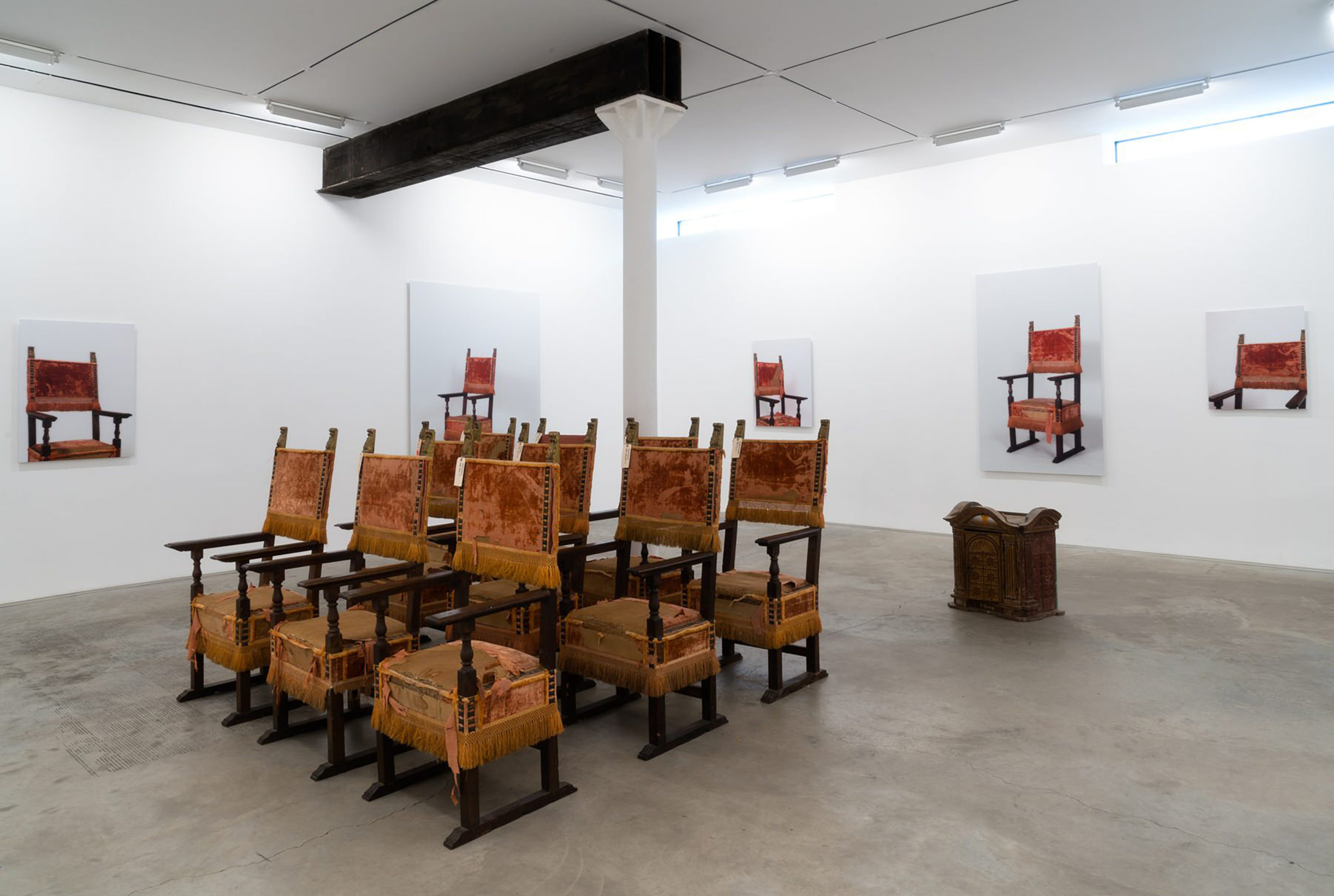
You’re not a studio artist, but this body of work came out of these antique friarlero chairs existing in your live/work space. Can you describe how the idea for this work developed?
As you know quite well, being the managing editor of zing for a kazillion years so you probably carried the chairs up, they appeared almost magically at zing HQ. Fernando bought these ten voluminous chairs and with my laissez attitude I had no idea what I was in for. THEN I saw them. They are fabulous of course, but take up the whole space wherever they are and the space at that time was my supposed studio . . . And the work that I make is very much about those in between spaces, invisible places and moments . . . And those nuanced things were being drowned by the Catholic Church . . . In what’s my “studio.” I wrestled with them even physically dragging them up and down any number of stairs any time an art person came over . . . I wished them away almost every second—this army of friarleros. . . But finally, like what often happens with me, something clicked, and I said “embrace the cheese”—so I thought: make these chairs that are stalking me into something. And then the idea just becomes very quickly what it is: each chair positioned after a Renaissance painting of a pope. We set up a photoshoot and voila! Ten photos modeled after the portraits of popes reproduced to the size of the original inspiration. Those inspirations are Raphael (two), Titian (three), Sebastiano del Piombo, El Greco, Caravaggio, Velasquez, Jacques Louis David. And each chair is rotated to almost the exact position of which those masters painted the popes in question, but without the subject or background, just an image of the armature that sets up the pictorial composition in the original.
This work follows the concept of your series Please by creating photographs based on historical paintings. What does it mean for you to translate a painting into a photograph?
Well the concept and practice I often employ is based on replication. I see something both in our regular everyday transactions as well as our art historical references (some more obvious than not) and I recreate them in my own manner . . . Be it a security gate from the street, the composition of which reminds me of an exquisite Barnet Newman or whose vastness makes me feel like I’m in a Monet lily pond . . . But clearly not. Or in this case, a more literal photographic sense, taking a cue from these historically important paintings and hopefully imbuing them with a bit of a chill. I was just at the Detroit Art Institute and going through its vast collection, and in the Dutch still life area/room there was this great guard who was explaining a painting in such a lovely way that I had never considered. The painting was a bouquet of flowers by Rachel Ruysch. Its background was black, dark. And he explained that was just the hardest thing to do, start from black and create light and color on top of that darkness. It was so touching, and expanding, making me think about how I come to do the things I do—which is that I often eliminate or highlight the background. In the case of Please, based on Manet’s last paintings, I’m highlighting presence, eliminating background. In Pray for Me, and even with the comedy curtains—Between the Acts—I take that thing, that main thing, the pope or the comedian and eliminate them and isolate that invisible segue or show it in a different and hopefully reinvigorating context. Of course, none of these gestures can happen without the Pictures Generation language and appropriation. My practice is indebted to them as well as lots of other art history.
So your process of replication is meant to present familiar objects or symbols in a new context? That reminds me not only of one of the original conceptualist gestures in Duchamp’s readymade Fountain but also Sherrie Levine’s appropriations (including Duchamp’s Fountain). Where do you see your work falling in this lineage? And what did you hope to highlight by isolating the chairs from historical paintings of popes?
Yes of course. Duchamp and his seminal gesture of creating the readymade allows for work like that of the Pictures Generation and Sherrie Levine . . . And naturally her recreating the urinal reads exactly into that . . . appropriation with a feminist touch—all that gold. Who said that statement “take an object, do something to it, then do something else to it.” Jasper Johns, I think . . . That leads the way. And I believe Robert Morris wrote an article, “Four Americans” in Art in America arguing that Pollack, Duchamp, Hopper, and Cornel were the touchstones from which our more contemporary visions stem . . . There’s some truth to that . . . all artists must react and know the fields in which they mine . . . And yes in that sense I would be following the Duchamp tradition in the Morris argument. So my gesture is related to the history of papal painting and implies appropriation—art of a more contemporary vein, while deconstructing the final visual platform and asking the viewer to make that visual and conceptual jump. And that jump can be from any position—that of the viewer, our contemporary and historical thoughts of the sitters in these chairs, the art historical references, ideas of patronage that come with citing art history and collecting, and even the parishioners and their little contributions. And how all these hierarchical conditions operate seemingly unknowingly. . . Or knowingly . . . And deposit that examination, again in the middle, Louise Lawler style, another pictures generation beauty.
This work was first shown as an artist’s project at NADA New York in 2014, where the emphasis was on seating at art fairs, engaging with the fair’s design and logistical dynamics—the border of fine art and functionality. But with recent political developments and the new context of a gallery space, “Pray for Me” takes on new readings. Can you speak to the pope’s chair as “seat of power,” the historical role of pope as art patron and powerbroker, and Pope Francis I’s more recent political engagements?
What’s that phrase that’s been fancied around “Truth to Power” or is it “Power or Truth”? It almost doesn’t matter . . . The chairs might act as metaphor for either. And yes the chairs were originally exhibited at Nada NYC . . . And as they are chairs as an installation address sitting wherever it may be—fair, gallery, monastery church, home (collector/patronage) studio and others . . . All of which pride themselves on both truth and power. Me I probably have neither, but I like to walk that line and examine the commercial venue, the visual venue, the critical venue and how we digest our visual, monetary, and critical metaphors . . . Truthfully . . And talk about the transactions that occur commercially, historically, and psychologically . . . Powerfully . . . Which answer in a way, to both, and again neither, power and truth. And the chairs themselves are already loaded as is the history of papal portraits so the natural segues either happen or don’t, at least that’s my hope. And yes high and low, Pope Francis I was a bouncer at a night club, I think, and even it’s not true, just urban myth, that’s what rocks!
The pope was arguably at one time the most powerful person in the world. Many would argue that position is occupied now by the President of the United States of America. Are there any new revelations to draw from this body of work being exhibited under the current political circumstances of the Trump administration—where power and truth are both at stake?
I’ll start with perspective. When these paintings which the photos are based on were painted, perspective has just been understood, comprehended, is a new discovery. And the paintings themselves along with this experiment, perspective, were the record of their holinesses. Keep in mind these painters we are discussing are the most talented painters at the time and we study them as students of art history and probably have an exam question regarding each one—something to this day I’d probably not pass. Certainly, the progression that perspective represented, at that time, was groundbreaking. Now our time (can’t help but reference to Fast Times at Ridgemont High) but in “our time” when we relook at these paintings we see they have not quite got that perspective thing down . . . Some of paintings are, well, a bit screwy . . . And as one tries to replicate them now, as I have, that becomes apparent. But they are forgiven, all those luscious masters. Perspective now . . . There is this other experiment called democracy that hmmmm is perhaps going through a similar growing pain, and the power structures both in government and the idea of the Papacy as a structure of truth may be more vital or just the reverse—and give us a different perspective to our understanding of the world. Will we forgive . . . “Pray for Me” —Pope Francis I.
Rebecca R. Hart is the Vicki and Kent Logan Curator of Modern and Contemporary Art at the Denver Art Museum. Three shows curated by Hart are currently on view in the Hamilton Building of the Denver Art Museum: Shade: Clyfford Still/Mark Bradford on view through July 16, Audacious Contemporary Artists Speak Out through August 6, and Mi Tierra: Contemporary Artists Explore Place through October 2017.
Interview by Rebecca Manning
With a BFA and MFA in Fiber from the Kansas City Art Institute and Cranbrook Academy of Arts, respectively, how did you became interested in pursuing a MA in Contemporary Art History, and eventually curating? How did your career evolve?
My first degree is from Williams College in art history. During my senior year, while writing a thesis on Mughal book illustration, I became curious about all Islamic decorative arts. Soon I found myself working in a Swedish tapestry studio (in the buildings that are now MASS MoCA) by day and writing my thesis at night. It opened a world to me that I hadn’t imagined. I followed my heart and spent twenty years as a fiber artist. All along I supported my studio practice by teaching and lecturing in museums.
When I was at Cranbrook most art academy students returned home in the summer. I had two daughters living with me so I stayed in Detroit. Gerhard Knodel, artist-in-residence for fiber, suggested that I volunteer at the Detroit Institute of Arts. Based on the work I did, the DIA invited me back to work as a curatorial assistant when I graduated. I was at the museum for twenty years, first in the department of twentieth century art, then when the department of contemporary art was formed in 2003 I joined it, and eventually lead it for ten years.
Since starting at the Denver Art Museum in 2015, what have you noticed that is unique about the arts community in Denver?
I’m always discovering new people and practices in Denver, in part because many strong, independent positions are articulated by local artists. There’s a diversity of practice, not a primary locale-centric mode as there was in Detroit. Sadly however, there’s not much attention given to promoting Denver artists in a larger arena. I wish that somehow artists could receive a fellowship, which included professional development and supported studio research; that we had a network to validate and showcase talent broadly.
There has been a great deal of positive response to your current exhibition Mi Tierra: Contemporary Artists Explore Place, which is on view in the Hamilton Building through October 22, 2017. What has been the most rewarding aspect of curating that show?
There was a moment just before the exhibition opened that was exhilarating. Jim and Julie Taylor hosted a dinner at The Vault for the artists, their work crews and galleries. For the eighteen months that we worked on the show, I focused on artists individually or sometimes in pairs if their installation dates or themes overlapped. At the pre-opening party spontaneous kinship formed among the artists, assistants, galleries and extended Denver family. Until then I thought of the artists as individuals and soon learned that together they became a powerful community. The potency of the individual and communal voices is one of the strengths of the exhibition.
I completely agree that the individual and communal voices are one of the many strengths of Mi Tierra. Together, your exhibitions Audacious: Contemporary Artists Speak Out, and Mi Tierra, seem to coexist rather seamlessly. As you move through the third and, then, fourth level of the Hamilton Building, the idea of categorization—groupings of works related to gender, ecologies, and ethnicities—fade away to an extent. Ultimately, the viewer is left with Contemporary art that is charged with socio-political relevancy. From Robert Colescott’s 1988 painting School Days, to Ana Mendieta’s video installation Volcán, 1979, to Jaime Carrejo’s One-Way Mirror, and Ana Teresa Fernández’s Erasure, the work is very topical. How much did you intend for these two exhibitions to converse with one and another when you were considering the experience of visitors going through both exhibitions?
The DAM’s contemporary collection has particular strength in artworks charged with socio-political commentary. This, in part, is the result of the leadership of my predecessors, Dianne Vanderlip and Christoph Heinrich, and also because collectors like Vicki and Kent Logan believe that contemporary art comments on our times. Two years ago, after I accepted the position but before I began working in Denver, I knew that I was curating a long-anticipated exhibition of Latino artists and reinstalling the third floor galleries with a selection from permanent collection. The reinstallation was scheduled first. I wanted to learn about public and institutional tolerance for controversy so I chose “audacious” as the leading theme. Although you mention that categorizations seem to fall away, I would contend that each artist asserts their position informed by their gender, ethnicity and peer group.
While I was working on Audacious, I was reviewing artists for Mi Tierra. Strategically I assembled a group of Latino advisors who helped me reflect on the thematic veracity and political valence that each artist brought to the project. My goal was to present an offering that engaged topical issues and featured artists who I profoundly respected. Many of the artists were under contract before we knew who the presidential candidates were. The present political climate in the United States encouraged some artists to “turn up the volume” in the final installation. However, their commentaries were already embedded in the installations months ago.
For me, the works in both Audacious and Mi Tierra go beyond representation of contemporary socio-political issues, and seem to be actively conversing with current discourse and events. So, in a way, that conversation keeps evolving, and the experience has been different each visit—depending on what I saw on the news that day, or read that day, etc. How did current events impact or at all influence the way in which the exhibitions were carried out after their initial conceptualization? Do current events continue to shape how you think about the exhibitions even now?
When I work on an exhibition I try to write a statement of one or two sentences that distills the theme. Then everything in the exhibition is tied to that idea. I rarely change the theme but sometimes need to adjust how I’m going to address it. Along the way there are conversations with the artists, who sometimes don’t realize how their work functions, which help us both understand the project in different dimensions. Good art resonates through time and echoes across varying situations.
You obviously have a great deal of expertise in your field given your time as a practicing artist, your substantial tenure at The Detroit Institute of Arts, and the prestigious position you now hold as the Denver Art Museum’s Vicki and Kent Logan Curator of Modern and Contemporary Art. What advice would you give to an aspiring curator?
As a curator who works primarily with living artists I see myself as a bridge builder working with an artist’s vision, institutional mandates and the need to communicate with an audience. Whenever I’m working on a project no matter who the artist is—Matthew Barney, Shirin Neshat or local artists like Jaime Carrejo and Dmitri Obergfell—I like to lead with sensitivity to their position and profound respect for their individual creative process. With Matthew, for instance, I sent him books about Detroit life written by popular authors. One scene, that I particularly liked, was realized in River of Fundament. It took only a suggestion to help Barney understand how he might translate the scene in the novel into his narrative but then I needed to let it evolve in his unique language. So to sum this up I might say: build bridges, listen respectfully and deeply, and allow each artist to express themselves in their own way. Authenticity always rings true.
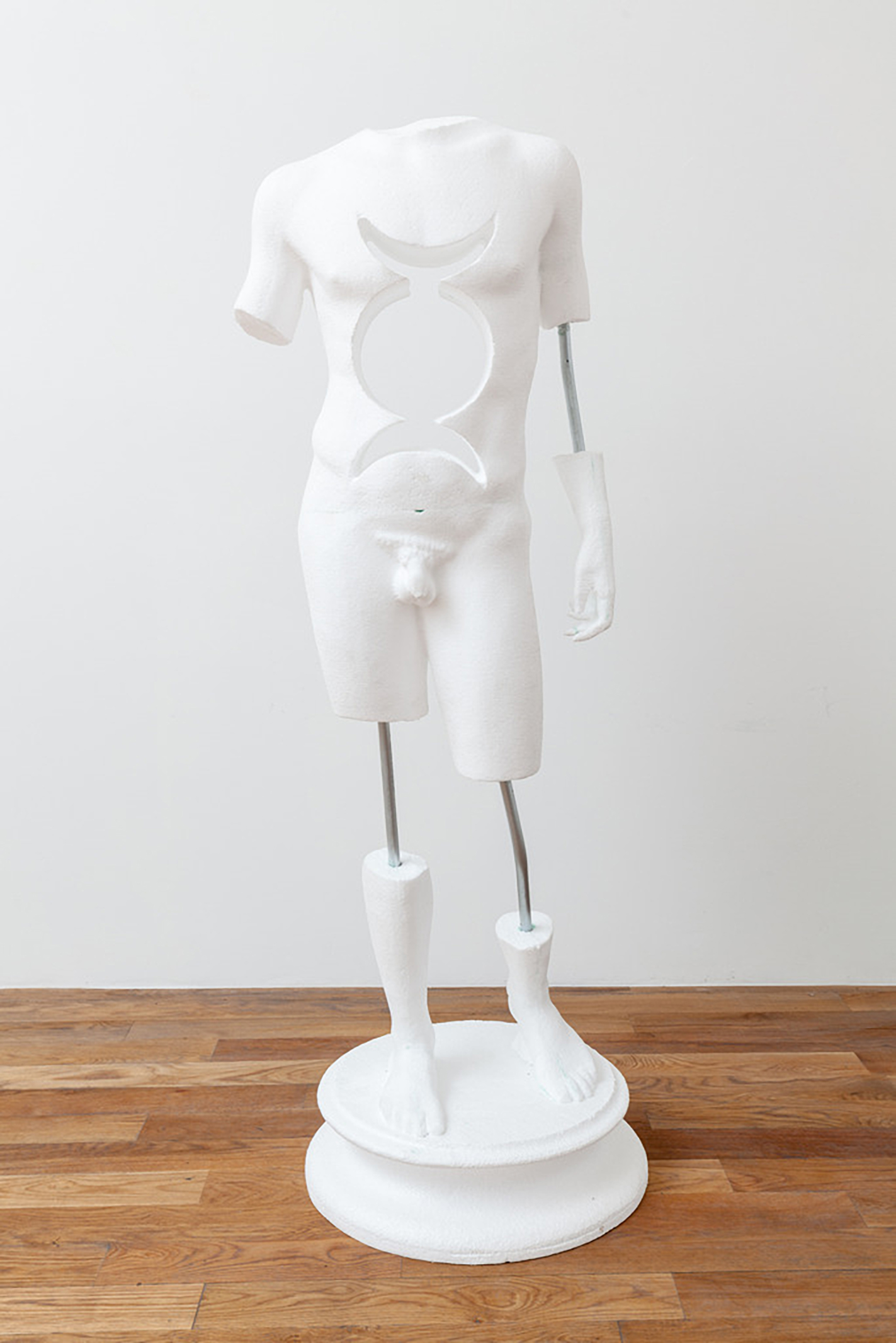
Dmitri Obergfell, Moonwatcher, polystyrene and steel, 2017 Photo: Wes Magyar
Dmitri Obergfell is a multimedia artist from Colorado. He received his BFA from Rocky Mountain College of Art and Design in 2010. Obergfell has exhibited in Denver, Chicago, Los Angeles, Rome, and the Czech Republic. He currently is showing work in both the Denver Art Museum’s Mi Tierra: Contemporary Artists Explore Place, and a solo show at Gildar Gallery, Man is a Bubble, Time is a Place. Obergfell’s solo show continues themes of classicism and considers concepts of time. Man is a Bubble, Time is a Place is on view until May 6 at Gildar Gallery in Denver.
Interview by Rebecca Manning
Initially you studied photography and video art at RMCAD, correct? At what point did you shift into sculptural work? How does your video/photographic background inform your current practice?
I have always made sculpture. Yes, I do have a degree in photography and video art, but the program I attended encouraged exploration. One of the reasons I focused on photo/video is because I could continue my interest in other mediums. I am happy with the basic knowledge of photography I maintain as it has helped me train my eye and hone some software skills, which I use in art fabrication nowadays.
Could you explain the process of fabrication that went into creating your sculpture Moonwatcher?
The fabrication process for Moonwatcher is an important part of the concept. This artwork would be totally different if it were carved out of stone by hand, rather than CNC routed out of polystyrene. Moonwatcher’s Greco-Roman form is used to create a contrast between ideas of the past and contemporary means of production. Moonwatcher’s fabrication process started as a 3D scan from the creative commons of the Internet. I downloaded the 3D form and then augmented it by cutting the limbs and cutting out the negative space in the torso. After I made my changes to the form, the file was sent to a CNC router, who carved it out of polystyrene foam. I am excited to continue with this process because it has a lot of possibilities moving forward. Projects like the Institute for Digital Archaeology are inspiring because they use similar techniques to resurrect artifacts that have been destroyed in places like war-ravaged Palmyra.
Moonwatcher has an ancient symbol cut out of its torso, the Triple Moon, and like the figure it is cut out of, it rather instantaneously signifies to the viewer that it is something ancient. To my knowledge, that symbol is associated with pagan goddesses. Embedded in a sculptural body that basically encapsulates the male ideal form, I can’t help but think that you are getting at some sort of ideal gender binary within your sculpture. Was this at all intended? Most of your sculptural work that I have seen contains male figures. Do you consider gender at all in your work?
No that wasn’t my intention, but I see how it might be read that way. It’s an interesting interpretation and question, but I can’t say that gender is my first consideration. I have picked figures based on gesture more than gender. Keeping that in mind, there is probably to be said about how women and men are represented in antiquity. I would be remiss to pretend to know what that is, but it would be interesting to research it more.
Not just in your current solo show, but in general, your work seems to link different important movements or imagery in art to present day, making them, in a sense, relevant once more. You are engaging with Greco-Roman art and its pervasive aesthetic, and subverting—at times—expectations and meaning that such an aesthetic inherently carries. Because of the process in which you fabricate your work, you are also dealing with the modern concept of the readymade. How do you go about reconciling concepts and imagery that seem inherently at odds?
I don’t believe the imagery and concepts are at odds. The history of Greco-Roman sculpture extends to mass reproductions being made today. I use the Greco-Roman forms in a present-day sense, they are devoid of their original color and are often displayed with limbs missing. These reproductions present themselves as ontologically charged ready-mades, which simultaneously reinforces the Greco-Roman aesthetic and erodes its original meaning.
I enjoy the way you employ ancient statuary. In your exhibition at Gildar Gallery, I felt almost as if the classical aesthetic of ancient sculpture is for you so reproduced and ubiquitous that it has become a recognizable object or sign. You use other ancient and contemporary symbols throughout the show, most of which are part of works that are coated with chameleon automotive paint. What are you trying to accomplish by embedding these different symbols into one piece of art? Are you trying to build on the associations and meaning that they carry, or are you trying to render them meaningless?
I am reflecting on the the symbols’ similarities despite the different times they were created in. I like to speculate on symbols from this period that might carry the same resonance as those from ancient times. Symbols like corporate logos and emojis may become our society’s version of hieroglyphs due to their wide-ranging distribution in commercial, cultural and social settings. One symbol that interests me in particular is the hashtag, because it has been around since people were drawing on cave walls in ancient Europe. The hashtag is one of 32 symbols that were found throughout ancient caves all over the continent. Today the hashtag is one of the most prolific symbols of our time because of its significance and function in social media. It is fascinating that the hashtag transitioned from a basic form of communication in ancient caves to one of the most prevalent technological symbols. It’s hard to say what the original meaning of the hashtag was, but this form has endured time and adopted new meaning over the course of human history. It is not hard to see how contemporary symbols like the Nike swoosh might carry the same potential.
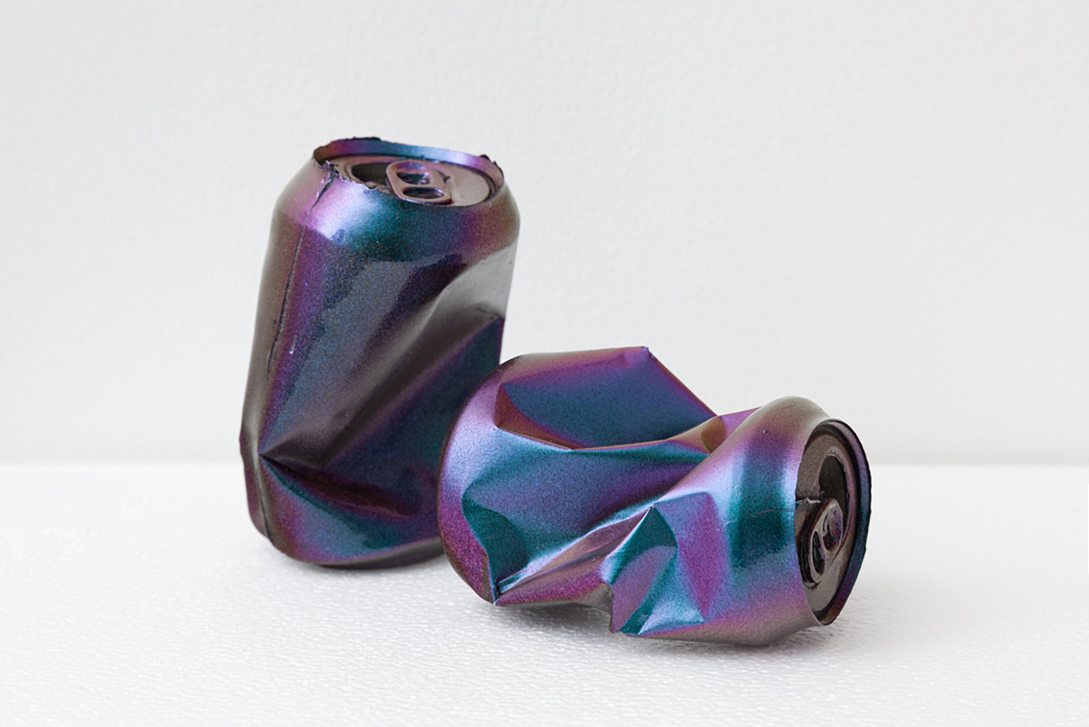
Dmitri Obergfell, Crushing Beers, chameleon auto paint and urethane plastic, 2017, Photo: Wes Magyar
When I teach an introductory art history course I typically assign David Macaulay’s satirical children’s book, the Motel of the Mysteries, in the first week. The book is set in the future and serves as a cautionary tale to students of art history/archeology about how easily one can misinterpret objects of material culture from the past when they are removed from their original context. In the book, mundane and humorous objects are misinterpreted as objects of veneration . . . I couldn’t help but think of that text as we were walking around the space at Gildar Gallery. Among the intrinsically monumental figurative statue, and sculpted mantel, are aluminum cans which you’ve coated with chameleon automotive paint. In consideration of the dazzling surface material you’ve given these objects, and their purposeful placement in close proximity to a classical-looking sculpture, it seems like you’ve set out to give these cans an intentional significance that they don’t typically possess. Am I onto something there? Can you tell me about your intention in placing these cans throughout the gallery?
I am interested in the commonality of aluminum cans and the fact that approximately a half million cans are used a day. This level of production and consumption reminds me of Monte Testaccio. Monte Testaccio was a garbage dump for olive oil vessels that was used for 250 years during the Roman empire. It is a testament to the consumption of olive oil during that period. It is estimated to contain the remains of 50 million vessels. Monte Testaccio is so large that on the surface it now looks like a large hill in the Roman landscape, rising to 115 feet tall. At the current rate of production, it would only take 100 days to create the same amount of aluminum cans. By comparison, aluminum cans might have a similar effect in creating a legacy like Monte Testaccio, scattering future artifacts of our societal consumption across the planet.
When we were walking through the gallery you were talking about concepts of “deep time,” or an allusion to “victory over time,” and the title of your show deals with time, too. The title Man is a Bubble, Time is a Place, to me, evokes the idea of Vanitas and memento mori—symbolic art that serves to remind man of his own mortality. With consideration of concepts of time and mortality, I felt that your use of materials here was particularly savvy in that Styrofoam, or aluminum cans, are inherently disposable consumer materials—we discard everyday objects comprised of aluminum or Styrofoam without a thought. And yet, those objects, particularly those made of Styrofoam will never break down, and are in a sense going to outlive all whom dispose of them. In a way, this material culture, what is basically considered trash, is what will be left of our existence to posterity. Thus, your work gets at this idea of “victory over time” through use of materials as much as it does in the appropriation of a hegemonic classical aesthetic. Are you trying to make any overtly political or poignant statement through the pairing of imagery from antique sculpture with a contemporary material of a mass-produced nature? Is the juxtaposition meant to make the viewer ponder the significance of their own contribution to the infinitely sprawling expanse of history and time?
Political or poignant, I don’t know. For me this exhibition is a way to process the information I have consumed. A lot of that info is about long time arcs and eternity. I have been studying both versions of 2001: Space Odyssey, Timothy Morton’s Hyperobjects, Matthew Arnold’s poem The Future, Karel Dujardin’s painting from 1663 Boy Blowing Soap Bubbles, and theories like Time Dilation. One passage I found particularly moving is from Arthur C. Clarke’s version of 2001: Space Odyssey,
“And somewhere in the shadowy centuries that had gone before they had invented the most essential tool of all, though it could be neither seen nor touched. They had learned to speak, and so had won their first great victory over Time. Now the knowledge of one generation could be handed on to the next, so that each age could profit from those that had gone before.”
The artwork is a more of a manifestation of my thinking process than a prescription for others. I see it as a presentation of information that the viewer can decipher how they see fit. The work in the exhibition isn’t encouraging people to recycle more or drive a Prius, but simply consider existence over a relatively long period of time.
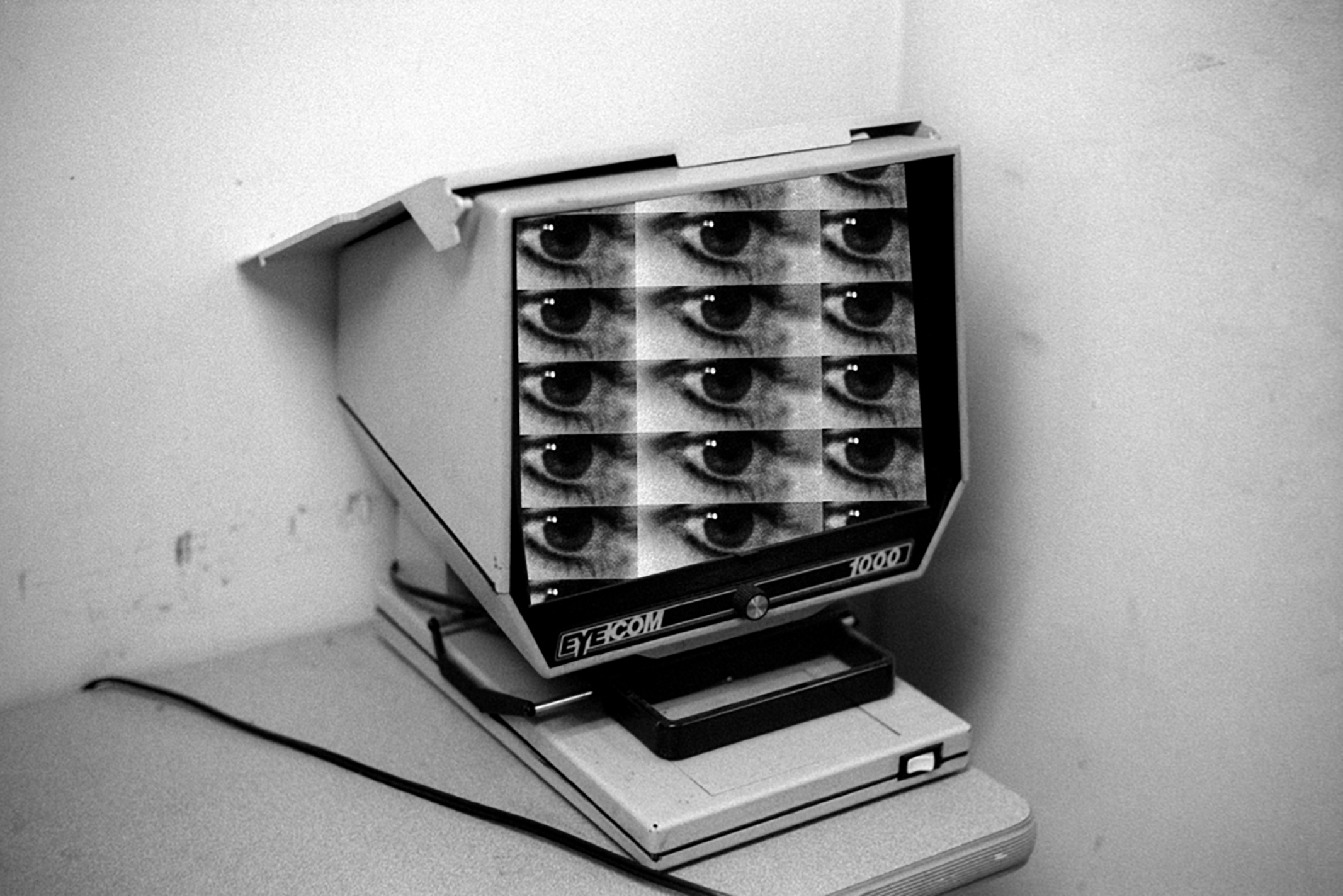
Maria Antelman, Eyecom, 2016, courtesy of Melanie Flood Projects
Maria Antelman works in photography, video, and sculpture, often through the lens of technology. Her latest exhibition, “My Touch, Your Command, Your Touch, My Command” opened at Melanie Flood Projects in Portland, Oregon on January 27th and is on view through February 25th. The work, a series of collages and a video, investigates human dependencies on informational tools and how these tools in turn shape their users. This exhibition is the fifth installment of an ongoing series at Melanie Flood Projects called Thinking Through Photography, which includes a comprehensive survey of contemporary photographic practices through programming that highlights experimental and diverse approaches to image-making.
Interview by Brandon Johnson
Let’s start with the title of the show: “My Touch, Your Command, Your Touch, My Command.” There’s a clear implication of control—losing control, but also being in control. The word touch implies something sensual, almost sexual. There’s a power dynamic that flows between two sources. Am I on the right track here?
In an uncanny manner, “touch”—sensual, sexual, personal, etc—turned into a technical gesture: I-touch. We touch screens all day. There are cuddling parties where one can experience the warmth of the human touch. Perhaps a new invention can be warm, soft screens at 98.6 °F, the temperature of the body. The collages in the exhibition show hands touching microfilms, the predecessors of big data. There was a time when one could physically touch information. In digital haptics every touch is a decision which releases a code which itself becomes a command. I am thinking of the hand as a tool. The thumb and the grip were related to the industrial revolution in handling machines. The index finger is the protagonist in this revolution. In the movie E.T., the extraterrestrial has an elongated index finger. The point of the index finger lightens up when E.T. feels a connection. The title of the show refers to emotional relations of interdependence with information and network systems.
Why use the dated technological form of microfilms in your collages? Is this related to being physically closer to information?
I was trained as an historian, to read the present and to think about the future through the lens of the past. Mechanical apparatuses are connected to our lineal thinking—one could make sense of how a machine functions. Digital devices surpass logical thinking; they are black boxes—one cannot understand how they work. I still use analogue film cameras because I need the slow processing time in a medium that is constantly advancing technologically. Microfilm technology is based on photographic memory, light and magnifying optics. In this body of work, these apparatuses are used literally and metaphorically to bring together the analogue past with the digital present.
There’s an element of Orwellian dystopianism to these works—like a scene from a David Lynch film where someone is watching themselves through a CCTV or is trapped within a monitor. Is there something inherently negative about our experiences with digital technology? And conversely, is there anything that redeems this?
You mean Videodrome by David Cronenberg which is indeed very tech noir. Communicating translates as the act of being social but in a digital format it has this transformative power, one that possesses people. There are so many platforms and choices: reviews, comments, likes, dislikes, loves, hates, faces and cute sounds. There is no silent time, time has turned into information, and information is data, and data is the new economy. I love my digital experience, it is super sexy and fun, and feels fresh, and we are all connected, and its participatory, and sharing moments can feel so good: it’s a validation. Perhaps there was a dormant part in my brain waiting to be filled with all this information and now this part is hungry: it needs to be constantly logged in, updated, saved, downloaded, etc. We are becoming automated: codes predict and cover all our needs and desires, and we never get lost, don’t close our eyes, rarely let go. It is a very interesting self-discovery. I like it (thumbs up emoji, happy face emoji).
I had Lynch’s Inland Empire in mind, but Videodrome works even better. There are some episodes of Black Mirror that also relate closely. Interesting that you speak of a dormant part of the brain being hungry and developing an appetite for information. I’ve always liked to think about how technology and communication fit within the grand scheme of evolution. How human language, tools, and abstract thinking allowed us to dominate the other species on the planet. It seems that technology has developed at a faster rate than our bodies (and brains) can adapt. The sheer amount of information is impossible to fully process and retain, in part due to the lack of idle time where reflection typically takes place—when we close our eyes and let go. Are reflection and imagination the antidotes to technology’s distraction? Or is this something that technology merely deprives us of? Are there aspects of technology that we need to resist?
I think the antidote to technology’s distraction is boredom. Sheer, old-fashioned, torturing boredom. Maybe we need to remember what it feels like to be bored. Then new habits may kick in. The problem is that the overload of information is getting boring as well. But while it’s constant input becomes repetitive, social media responses still release dopamine in our brain every time we get a FB like or even better a FB love. Now information needs to evolve, so our brains, hungry and addicted to their dopamine doses, will continue to stay engaged. Otherwise, we may turn into ADD zombies looking for exciting content to suck into. Nerve is a great teenager thriller. The story is about an online “truth or dare” game with players and watchers. The code of the game knows everything about the players from their social media and consumer profiles and uses this knowledge to challenge them in extreme, personally tailored situations. The more dares, the more likes and the more money gets transferred instantly in your bank account. Digital natives live in a different world. Most young entrepreneurialism is about some digital service: an app that replaces some gesture, some decision, some desire. Perhaps, it is all about mediating and facilitating experiences. Same as wellbeing, another new industry or the economy of wellbeing. I was reading the other day about this hi-tech, luxury meditation center somewhere in the Flatiron. A short meditation session leading to a nap (all in 20min), costs $18. It takes place inside a perfectly lighted dome room, with perfect sounds, blankets and pillows. It is a place where you don’t have to put any effort in meditating, instead you walk into a meditative environment equipped with the right props and boom, you think you are meditating. It is problematic. I think digital culture is picking up so easily because people understand technical skills better than experiences.
Getting back to the work itself for a minute. The Spacesaver works are collages, yet a viewer wouldn’t necessarily know it (especially when viewed on a screen)—they’re very seamless. Can you talk about your process in making this series? And since the show is part of an ongoing artist series at Melanie Flood Projects called Thinking Through Photography how the work engages with photography as medium?
When I got interested in microfilms, I visited a lab where they convert bulks of paper information into microfilms, from architectural drawings to checks and invoices. I ran some tests shooting with their duplicator cameras, with my hands in the shot handling paper. Then, I took those images, in microfilm format, and looked at them through the reader apparatus. It was very confusing and disorienting: the real and its representation were slipping into each other. I tried to capture this effect in my collages: a circle of motion from inside out and in reverse. I was thinking of screens opening to more screens, like a maze where you find yourself in every screen. Media is very narcissistic. Then, I started looking at technical, user manual and marketing images of apparatuses from the 60s. A female model poses with the device, touching it in a very soft machine-erotica style. The title of Melanie’s series Thinking Through Photography is very appropriate: images are the new communication form. Alexander, my son the other day explained one of his thoughts: numbers are infinite and combinations of language are infinite, so one day numbers will replace words. I will ask him whether images will one day replace numbers. Machines already speak images.

Working within a wide range of media including sculpture, installation, and performance, Connie Walsh uses her work to explore the transitional space between interior and exterior, intimacy and detachment, private and public, self and other. Currently working in Los Angeles, her work has been presented in numerous exhibitions throughout the country, including solo shows at Marianne Boesky Gallery and SculptureCenter in New York. In zing #24, Walsh presents the project “interior façade,” a series of photographic pairings of interior architectural details with amorphous sculptures made of rug-hooked canvas, beeswax, and yarn. Visually intricate and immersive, Walsh’s project provides an expansive inquiry into both the divisions and inextricable connections between places of interiority and exteriority.
Interview by Emma Cohen
Many of your works are sculptural, or created for installation. What was it like to create a sculptural work that would be presented in the two-dimensional format of a magazine? Is something lost, or added, when the work is photographed?
I am interested in the expansion and potential collapsing of illusionistic space when using different dimensions within a piece. The project consists of both the sculptures and large-scale digital prints. The photographs are a further investigation accessing the interiors of the three dimensional space of the sculptures. This space is then manipulated and flattened and finally juxtaposed with a detailed exploration of architecture, which offers structure for the biomorphic sculptural forms. The magazine format reinforced this pairing with a central seam. I became interested in this place of contact, both in how these differing spaces inform each other as well as with how they create visual tension with their proximity. The large format prints are the same ratio as the magazine with two images making up one print with a central transitional vertical line.
I really appreciate the freedom that comes out of Devon’s approach to magazine proposals being as projects—i.e., that she offers a span of pages in the magazine to do with it what you will. It allowed me to think of those pages as a three-dimensional space to work within. I was interested in the images being “read” horizontally and vertically with a centerfold. In the magazine, the thickness of the spine blurs the transitional space between the two images implicating the possibility of actual space.
Did you think about the readers of the magazine and the physical ways in which they would interact with the piece when you were creating your project?
Yes. The images are all full-bleeds and the layout varies within the pages of the project. I set up a spatial sequencing of an image of the sculptures with an image of the architectural details each on its own page and at times I interrupt that with one image taking up two pages entirely—these being images of the sculptures—a centerfold. This encourages the viewer to turn the magazine while looking at the project and maybe even disorienting the space of the subject and his/her relationship to the object of observation. I was interested in shifting the viewer’s positioning and his/her ability to distinguish between the space of the interior and its relation to the exterior being outlined.
You mentioned the relationship of interior/exterior in this piece, and in reference to other works you have written about investigating the relationships between self/other and individual/society. Did you learn anything about these relationships when working on interior façade? How has your understanding of or attitude towards these dichotomies developed throughout your career?
In past projects I’ve combined personal events or moments with environments that suggest and heighten the place of contact, or transaction, between private and public experience. In this project I was more interested in the ambiguity of these realms—as being oppositional and in exploring the transitional space between interior and exterior, intimacy and detachment. This suspended space is both permeable and of a shifting nature. The existence of a “skin-like” interruption of contiguity un-sites the viewer’s conventional perspective.
How do you see the opposing pages of “interior façade” interacting with one another?
As I was creating the piece, the idea of sculptural spheres—a metaphor for what was once inside and extracted—led to a tactile inquiry into a possible interior. I created these sculptures around balls of varying sizes, but eventually the spherical forms started to collapse due to the weight of the rug hooked yarn and leave more misshapen inaccessible spaces. I then had to go within the sculptures to take some of the photographs.
As for the architectural spaces, I am currently living in a Schindler apartment. Schindler’s proportions, fluidity of space, and continuity between inside and outside are framing my family and our domesticated movements. Images of the architectural details provide structure to the images of the biomorphic sculptural forms. Photographic pairings of the sculptures with chosen interior architectural details initiates the perceptual sense that exterior is defined by the interior and vice versa.
Do you have any current interests or projects that you’ve been working on that you can share?
Lately I’ve been interested in memory—how selective it is and seemingly private yet it functions within a larger context. I like the idea of selective memory. I have also been thinking about a further transformation of the sculptures in the project interior façade. I’m exploring the possibility of casting the sculptures out of silver or aluminum and having it be a one off burnt out process- losing the sculptures completely—the color and tactile material—into a more permanent weighted mass. In a sense giving the empty interior cavity a solid form.