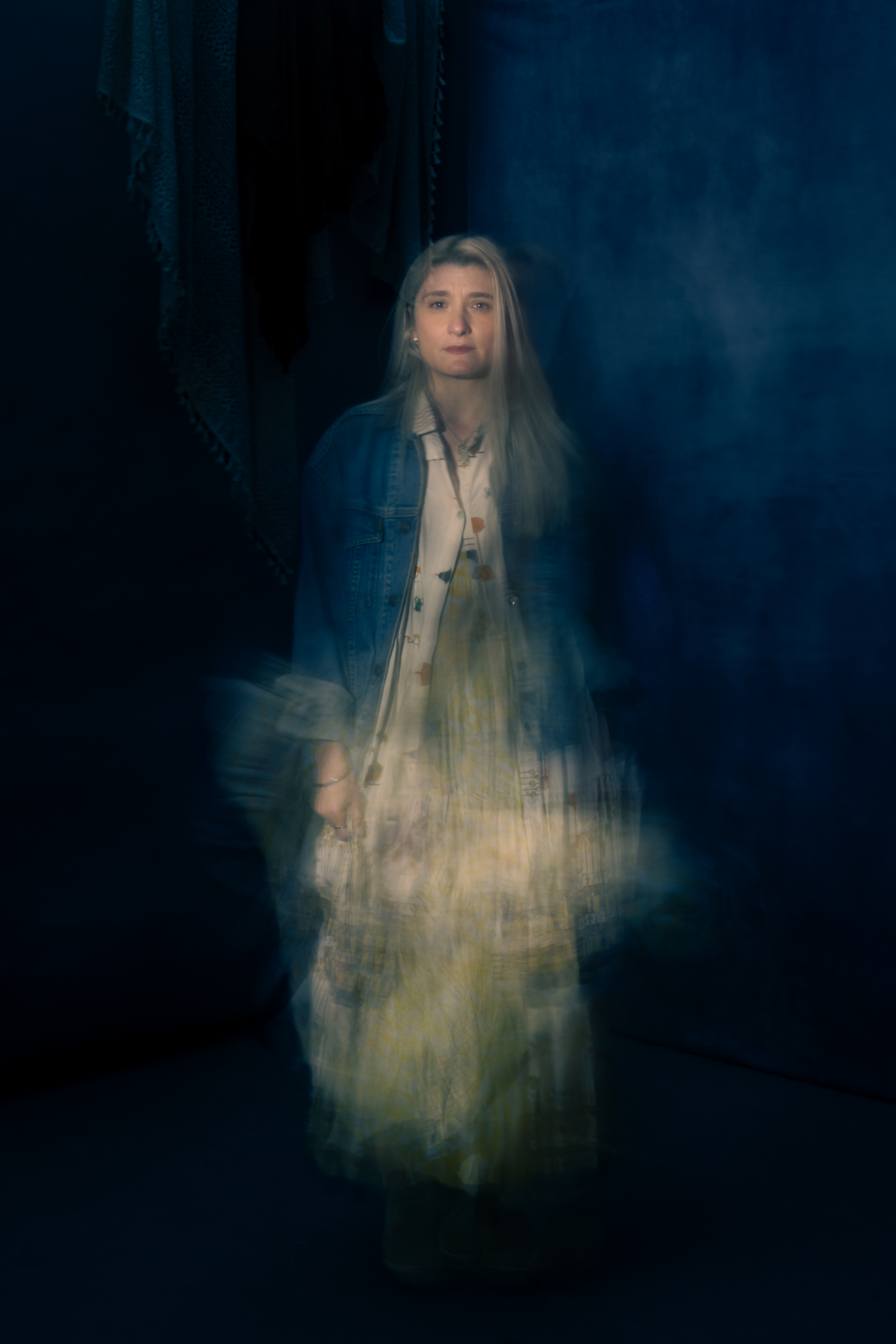
Are you the same person you were a decade ago?
If you asked me to explain Animal Wisdom—a riveting quasi-immersive seance/play/existential crisis with no plot—based on what I remember from experiencing it at Bushwick Starr nearly ten years ago, I would say it is about death. Everybody’s and nobody’s. A series of deaths performed onstage, but also the many selves we go through and bury in one lifetime, and about death as something we all do ‘alone together.’
I was in a cynical period of my life. I’d watched the agonizing weeks my father spent dying of cancer at the age of 61. I was in my 30s and it felt like the great claw of capitalism had reached out and plucked me up like a stuffed animal in one of those toy vending machines and installed me in a life I was tremendously unhappy in and said, “you go here.” I was no longer sure what I wanted in a career or in a personal life or anything really but apparently I was put on this strange, glorious earth to take messages, make lunch reservations, send invites to ‘important’ people to ‘important’ events, manage ‘important’ projects and about a hundred other ‘important’ things, none of which had anything to do with anything that really mattered. Most of all, I had become disconnected from the closest thing I’ve ever had to religion: art.
Watching Obie-award winning playwright and musician Heather Christian take center stage that night was like witnessing a medium thin the veil between what the living can know about the dead and what the dead can tell the living about life. I remember thinking she played the piano like she was riding a horse: the instrument becoming more animal than object, powerful and willful.
In one scene, the lights in the theater went out and you could hear the music with your whole body, the voices of the performers, instruments, piano, and whatever other ghosts might be there, vibrating up and down the string of one’s own soul. There was an uncanny sense of both fear at the great emptiness, a black hole without a bottom that awaits us all, as well as a near-delirious relief at being one drop in an unimaginably great ocean.
In its second production, which will run through June 14 at Signature Theatre’s Romulus Linney Courtyard Theatre, directed by Keenan Tyler Oliphant, there are a number of changes to Animal Wisdom. Mum’s the word on how certain immersive elements and effects have been adjusted to suit the performance space. But perhaps the most notable difference is that Christian is no longer performing the intensely personal role of H, choosing to pass it on to longtime friend Kenita Miller, with Emma Duncan sharing the role in select matinees. And since Animal Wisdom is at its core about ‘escorting whatever ghost you have through hell and out the other side,’ this felt like a natural progression: what happens, Christian asks, if it’s just a ‘channel of a channel’? What if the onion’s just one layer thicker?
Heather Christian as Interviewed by Rachel Dalamangas
On your decision not to perform H for this production, you say that you’ve never seen your own play and want to see what someone else can show you about the role. Can you tell me more about the decision?
It’s tricky with work like this, which is not overtly autobiographical because there’s no narrative per se. There’s micro narratives and I’m very much telling stories surrealistically, poetically, sometimes in code.
I used the show as a way to get something out of me. And it’s ten years later and I’m ten years older and a lot of those specific griefs and questions live in a different place in my body. I felt like I articulated something for myself and with the help of the audience that showed up every single night, I was reminded that we are broken in community together.
But I’m not in the same place I was, and so it’s necessarily going to have to be a performance to a certain extent and if it’s already going to be a performance, I am more interested in the idea of the show becoming something that can expand beyond the bounds of my body.
And the piece is already about channeling and putting on the personality of your past selves, but also putting on the personality of whatever ghost it is that you’re trying to escort through hell and out the other side.
So this felt like a natural progression. What happens if it’s just a channel of a channel, if the onion’s just one layer thicker.
Tell me a little bit more about your creative practice actually. How much is it a kind of practice of spirituality?
I mean, all of it. I don’t know how I’m defining spirituality. I think because spirituality is so alive in my life that it infests everything that I become obsessed with. So I’m not thinking ever in terms of making something specifically spiritual but it always ends up that way because that’s just the kind of story that I am drawn to.
I’m interested in these unanswerable questions that increasingly we don’t sit with in this age of information where we can Google anything including why are we here? We don’t really have time to sit with those kinds of questions, nor do we have the practice of sitting with them.
There’s no real place to do that anymore because the churches have become more and more fundamentalist, and it’s gotten more tied up with politics. Christianity has turned into a four-letter word for a lot of us with moral conscience who want to be living in a place that has a moral conscience in terms of how it treats people.
There’s not really a place for us to go and mourn. There’s not really a place for us to go and scream. There’s not a productive place other than a protest for us to feel like we can get any of that shit out or to sit in contemplation of it.
And I don’t know that we’re going to get out of this tangle that we’ve gotten ourselves into, which is the confluence of so many different socopolitical and economic and technological things. Unless we sit with it as individuals either in community or alone or alone in community, which is, I think, what theater is.
I feel compelled to create a space where we can sit with these questions that we don’t have time or the wherewithal or the emotional distance to come up with a productive solution of how we might individually move forward, let alone how we might move forward as a group of humans.
And this big question of God or logic I think is just a deeply unhelpful lens of how to think about life.
Ultimately, I want to be doing what Carl Sagan was doing for a living, which is like everything’s a mystery. We can only know so much. But isn’t this stuff really cool? The whole point is curiosity. The whole point is to try to understand. That’s what makes a meaningful life. Knowledge that we will never have any of the answers regardless of what Google says.
That’s interesting because a lot of art right now is nihilistic and everything is just very bleak, and that’s something that stands out in Animal Wisdom. There’s this relief in being able to marvel at how tiny you actually are and that a lot of existence is unknowable.
This is why I think nihilism is such horseshit is because nihilism is a decision that it means nothing. We don’t have enough information to make a decision that it means nothing.
That reminds me of the blackout scene, which was one of the most beautiful experiences I’ve personally ever had at the theater. You’re in this cramped little playhouse and then you’re in the dark with the music and the space suddenly feels so big and vast.
You forget where you are at a certain point. And playing an instrument in the dark like that is a whole different experience.
In order to play an instrument in total darkness like that, I had to put gaff tape on different notes on the piano so I could get them by feel and orient myself ‘cuz you completely lose where you are. With a spatial instrument like a piano or a guitar or a cello, it’s like it’s a different thing. And it’s a weird trust thing. It’s very spiritual because it’s like you actually know how to do it. Your brain has told you that you’re an idiot way more than you actually are an idiot.
Where did you get the idea for the blackout scene and playing in the dark?
Well, there’s always a point where I’m like, we can’t get any further so we need to break everything. The idea was that the power should go out in the theater.
Then I spent some time in rooms that were truly dark, like a planetarium, and there is something that it does where it completely dislocates you from whatever you were doing before.
You could be having a conversation about lunch and then you walk into the planetarium and then that happens and it’s like what were we talking about?
I just had like a hunch that it was the right thing and I had to fight for it ‘cuz at every stage somebody was like that’s a terrible idea. But you can’t know until an audience shows up.
Does the darkness in your work ever scare you?
I do what I do specifically ‘cuz it scares me.
I’m about to be 45 years old. I’ve up until this stage in my life had this thing in me that was like if you’re not going to leave blood on the floor then why are you doing it? Why are we here?
I have felt at every stage that if I’m scared of a thing that means that I just need to do it. Like if I’m scared of a thing that means that it’s pointing me towards it.
When I started to write Animal Wisdom, I was just like, I don’t know what I’m doing. I think I’m telling my life story, but I don’t know what I’m doing and I don’t know where to go with it. And my friend, Salty Brine, was like, I want you to sit down and think of the scariest thing that you could say in a room full of people and then say exactly that out loud.
I think we went to a lot of places that we went in Animal Wisdom because Salty said that to me. I do a lot of things that scare the crap out of me because it feels like no show is just a show for me, like a show has to be some sort of ritualistic thing.
And that’s just my weirdness I think because I grew up singing at church where it’s like something needs to change by the end of tonight—not just for the audience but for the people who are performing it. The art kind of needs to be a vehicle or some sort of medium for us to put something inside and either let go or be changed a little bit. And you can’t really get at that unless you’ve got some blood in the game.
Since your work does ask these really big questions, I was wondering what do you think we lose when we pass and what do you think carries on?
Oh wow. I think that’s a question that changes periodically throughout life. When I wrote the show I thought a very specific thing, which is like what you lose is direct participation in the narrative, almost like the mundane narrative.
Like when my grandparents passed, they were no longer coming to my shows, we were no longer talking about the work. I was no longer going to Shreveport to see them. So those details I think you lose, but my experience has been I can feel them and they show up for the big stuff and the truly small shit that I thought was truly small they’re like that’s actually the point. You know, I think you gain perspective when you die.
I think the big relief after passing is that secrets are no longer necessary. In southern families, secrets are a big thing.
I’m now ten years older and I’ve had more people die on me and I’ve had a miscarriage so I have a little angel spirit that I feel attached to me now.
I still grieve these people and I still grieve these spirits because in my human body, the life that’s going on right now is the only important thing that I can think of. But I think when you pass, you get to understand what’s actually important.
Are you working on anything else after this show?
I work on way too much at once. That’s not meant to be a brag. I am compulsive and need a place to put all of it.
I’m working on my first opera, which is a retelling of the Dido and Aeneas story through the lens of a Baroque opera. The tech goes horribly wrong and the tech is being run by the Gods. So it’s like a Baroque opera that sits inside a straight play and it’s all whackadoo.
Then I’m trying to write a teeny tiny Gilgamesh. I’m calling it a teacup Gilgamesh. I don’t know why yet. I also adapted The Book of Revelations, which I don’t know how that becomes a show. We shall see.
So there’s a lot that’s cooking. I just haven’t had a whole lot of time. You’re sometimes doing two or three shows that you’ve already finished at once, but all of that stuff eats those logistical brains, eats the time that your creative brain can kind of be an idiot. ‘Cuz I don’t know about you, but my creative brain needs time to be an idiot—and that person doesn’t answer emails.
Rachel Dalamangas
New York, NY
May 2026
photo credit: portrait of Heather Christian by HanJie Chow, courtesy of the artist
Ana María Hernando’s exhibition Seguir Cantando at the Museum of Contemporary Art Denver takes its name and inspiration from “Como la cigarra” (“Like the Cicada”)—a song written by Argentine poet and composer María Elena Walsh in 1972. Walsh wrote it originally as a song of hope for artists who lose momentum in their careers, but its lyrics—tantas veces me mataron, tantas desaparecí, y seguí cantando (so many times they killed me, so many times I disappeared and I kept singing)—took on new and specific weight after the military coup of March 24, 1976, when General Jorge Rafael Videla overthrew the government of Isabel Perón and launched what the junta called the National Reorganization Process.
What followed was a systematic campaign of state terror: disappearances, torture, and murder targeting anyone considered subversive, with an estimated 30,000 people killed or disappeared over seven years. Artists, intellectuals, teachers, students, and union organizers were disproportionately targeted. Writers and musicians went into exile, among them Mercedes Sosa, Argentina’s most beloved folk singer, who was detained at a concert in 1979 with her entire audience and forced to flee the country. It was Sosa who made “Como la cigarra” a people’s anthem, recording it in exile while the song remained banned in Argentina. Walsh herself had been banned from radio and television.
Women occupied a particular and paradoxical position in this history. The junta’s ideology was explicitly patriarchal, built on order, hierarchy, and the suppression of anything ungoverned or ungovernable. Yet it was women, specifically the Mothers of the Plaza de Mayo, who began gathering in 1977 in front of the Casa Rosada with photographs of their disappeared children, and whose persistent, quiet, weekly presence helped delegitimize the regime. The feminine, it turned out, persevered.
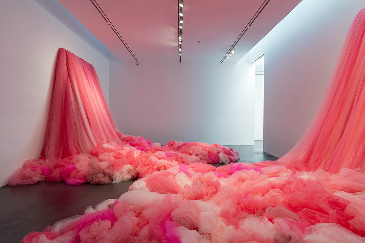
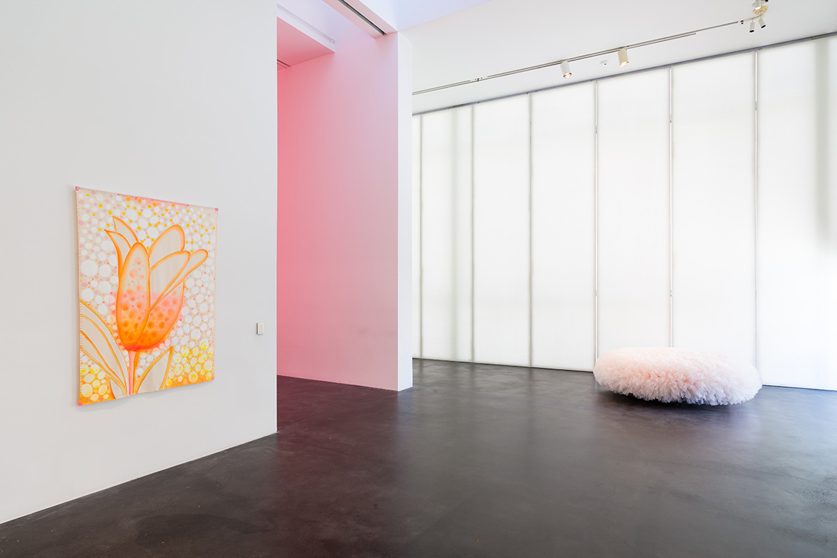
Hernando, a Colorado-based artist who grew up in Buenos Aires during the coup and came of age as an artist after the return of democracy in 1983, carries this history into our own present moment with Seguir Cantando, the centerpiece of which are two 12’ waterfalls made of some 8,500 yards of pink tulle.
Ana María Hernando as Interviewed by Rachel Dalamangas
What is the picture right now in Argentina?
People are suffering. I have most of my family still in Argentina. And you think it cannot get worse. Last week, it was the 50th anniversary of the coup. So it’s an emotional time and you know this government censors a lot of things and stories and I think it might be producing the opposite of what they want because more people are coming out with their stories.
Before the coup, it was very chaotic and there were kidnappings and you didn’t know from what side. It was just very difficult and then at the same time you go, you know, this is life.
Then when the coup came, they took over the press and everything. My school was what they call intervened, meaning they took out the director, the principal, and they put one of their own. There were friends that you were going to meet and they didn’t show up. And at the same time you are reading what the government is putting out and then afterwards you see all the lies. It’s just a way of governing through lies and wanting to control what is uncontrollable.
What was school like after that?
I went to the same school from first grade until I graduated from high school. Before the coup, there were many moments that were very uncertain. I remember one instance, a group of people were marching towards our school and it seemed like maybe they were aggressive and they wanted to get into the school, so we were locked inside. Then by the time when the coup happened, that’s when my school got intervened.
My school was a nun school. In Argentina, Catholicism took different ways than how I have experienced it here, where the message was more about how to help each other and my school was more aligned with that part of Catholicism. And so when the coup happened, they sent these nuns away and then they put in a different director. There were other things happening like some teachers stopped coming and then later I learned that one of them was killed inside a church with six other seminarians.
And you couldn’t talk much about these things. It was all kind of in whispers and people wouldn’t ask, “Oh, that teacher stopped coming?” I mean it was years after that I learned that teacher had been killed.
Were you afraid of being targeted?
At the beginning before the coup, there were a lot of kidnappings and you hear this and that and they were saying the left and the right and we were all a bit afraid. Like, in the streets you had to be with your ID—if they would stop you and you didn’t have your ID, that was grounds for them to take you in. And I was stopped—there were times like I was with friends and it was late and we were stopped by—it wasn’t the police, it was people from the army with guns.
And then, I had another teacher. I was doing theater and one day we are waiting for the teacher, the teacher is not coming, not coming and nobody said anything . . . you know, you couldn’t be public about your fears. The government was very clear about how they were looking into everything. And at some high schools a lot of students disappeared.
All the press was in the hands of the junta, so I mean, all the information you had was not accurate, I would say, you know, they were lies, but nobody knew exactly. Some people, of course, when they took people from your family, you knew. But the messages that the government was saying was that “Oh, the left was doing things, they were killing people,”—but by then, it was mostly the government killing people. So there was a lot of misinformation.
By the time I got to art school, Argentina was already a democracy. The art school had been decimated of creativity. And the teachers—I’m not sure how it had been there in the art school before, but the teachers were very rigid and it was more academic in a way of like going to the gym, you had to draw perfectly in a way that really didn’t have much of a spirit in it.
And the art is a response to those experiences?
It was based on and some pieces are named after a song by María Elena Walsh, Como La Cigarra. It’s a song that she wrote in ’71 or ’72 and she was very outspoken. Over time it became an anthem about perseverance and persistence.
And I think we are in a way in a time that—as I see it, I think we need nourishment. I hope my work is like a vitamin in some ways for people and a way of connecting in the midst of everything to joy. I think if we don’t have that it depletes everything, depletes us, and it’s hard to stand strong and if you feel defeated it’s hard to fight and so it’s based in experiences like that and how trauma marks you. I love how the song says, “I have been killed so many times. I was dead so many times but I keep coming back and I keep singing.”
The part of “keep singing” I think it’s the part of the arts that brings this renewal and a life that is beyond each of us individually. So that was one thread and feeling of what’s happening in the world, in this country and everywhere.
It’s chilling how much you can see a lot of what’s happening today in what you experienced in the past.
Yes. The sense of someone telling you how things should be, that they know better than you and this sense of controlling everyone else, the views of some specific very small group of people. I think at the end that brings, well, poverty—poverty of heart, of spirit, of mind, and physical poverty.
No doubt that made a deep impression on you as a young artist.
Yeah, and I think not as a way of running away, but what I see is that for us our survival is in staying light, meaning—not superficial, but very dynamic, you know, very aware and our eyes open and be very fast and quick at reacting at things.
The world is full of heavy energy. When you are light, you can move quicker. You can let go of things and be more open to what’s there at the moment.
If you are swallowed by the darkness then you just cannot move, it paralyzes you. I have seen how that has been at times a danger for me personally. It’s like I have gotten paralyzed for that moment. And it’s hard to explain how—why—to other people who have not gone through that. Like, at times I could be stopped with people with guns, I just stay quiet and still and also as a woman you are also very aware of that too.
Tell me some more about this concept in Andean cosmology that is important to you—you called it salka?
I would like to acknowledge my friend and teacher Don Américo Yábar, mystic of these Andean traditions. Without him, I would have only had shimmers of all that beauty.
Salka is a Quechua word that means undomesticated. I have been to Peru a lot, but more in the area of the Andes and the high jungle. They talk a lot about the salka, that the salka is that energy that it’s uncontained, and I think also is the energy of creativity. Where is the energy of the river and the forest and the clouds and it’s something you cannot contain. It informs my work where I’m following intuitively a form and then I discover more what that form is about. I think the salka is very nourishing to us, to life.
For art if you can connect to that energy, I think your work expands. And then you are lighter because for the salka to happen, you need to be more in this light energy.
Which makes sense that you’re working with very light material.
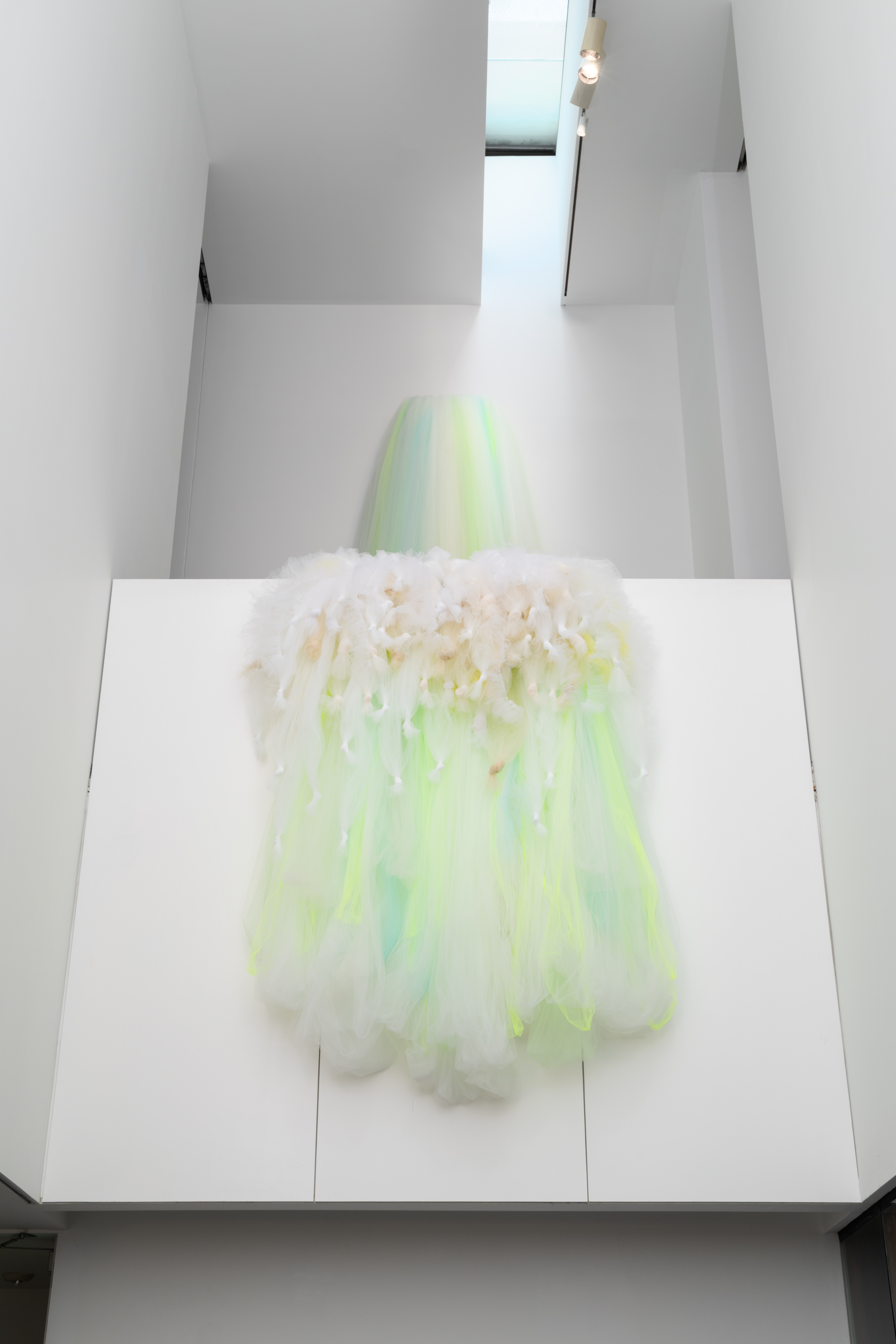
I’m a painter and tulle and the fabrics that I have an attraction to allow me to paint with fabric. So I use all these different colors, but by layering them I can make other colors. The tulle allows me to make these sculptures and give shape and work with volume in a way that paint doesn’t let me.
But then tulle also you think of the bride and you think of the princess and the ballerinas and it’s an archetype of the feminine that tells you you’re better off if you stay innocent and beautiful as if you are a package for others. And I rebel against that archetype.
So I’m using that same tulle that communicates those ideas and I use enormous amounts of tulle as a way of talking about power and agency and to question those ideas for young women.
Why pink?
Pink because of all the connotations of pink and how people think of women or girls, and I wanted to make it really pink and explosive. I don’t know what time of the day you saw the show, but in the evening, when you’re on the terrace, and the color is coming out from the skylights and you see the pink on the floor. I don’t know how it is with tulle that it glows. I’m not sure about the physics of it but I love it. I just wanted it to be enormous and unapologetic.
How do you dream up these waterfalls and design them?
I am responding to the building that—as I said—I love it and when I have the luxury of being able to be in a place, I sit with that place and I mesh with it and I can see what I want to make and then I walk towards that image.
So I make sketches then I try to figure out what is that about and by now I really trust these images and I trust that afterwards I discover more about the work that it’s not coming from my head but I feel it comes from another part of me that is wise, that knows, that’s connected to other things that are happening that are unattached to the mind. I think the mind sometimes it’s more poor than all of these other things.
Were you thinking about the exhibition space as a landscape?
I don’t think of them as landscapes, but as happenings. For those pink waterfalls—how they are—they come together and they transform the space of that room. So you cannot cross the room, and one of the things that I want to invite people is to be more aware of the surroundings. And I know that in most museums or spaces when people go to see a show, they have been there before many other times. And I wanted in the room to present another way of relating to the space, that you couldn’t cross but you had to go around and go on the other side. Then when I think about water and how water looks for each other, looks for more water, and as it begins, you know, thin and a small amount and then more comes together and becomes more powerful as it finds more water and other waters. And I love that image for how we are more powerful as we find each other.
Rachel Dalamangas
New York, NY
2026
All Photos:
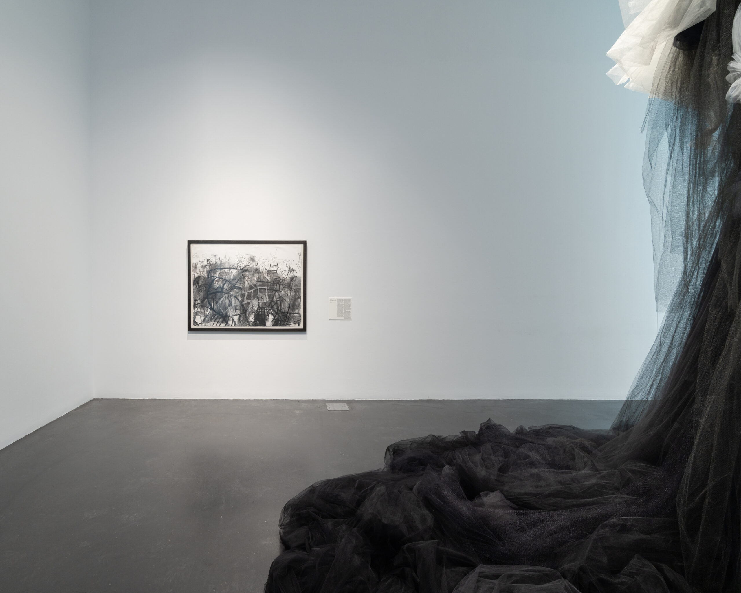
Installation view, Ana María Hernando: Seguir cantando (Keep Singing), Museum of Contemporary Art Denver, March 5, 2026–July 5, 2026. Photos by Wes Magyar.
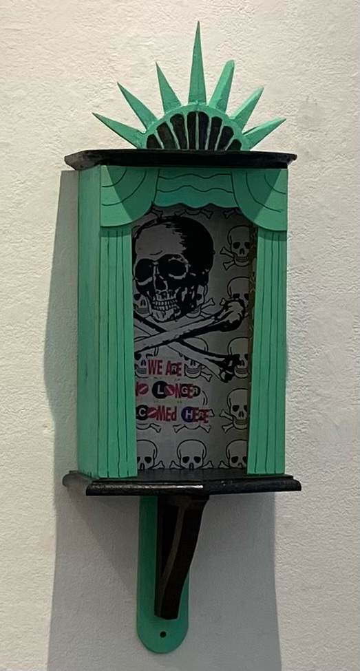 LIBERTY, 2025, wood and collaged paper
I first met Al Diaz over a decade ago when I was gathering oral histories of the 70s/80s downtown art scene. Obama was still president, and X wasn’t even yet a twinkle in Elon Musk’s eye. I wanted to ask Al about his days with his teenaged friend Jean-Michel, co-author/conspirator in the works of SAMO©, the street tag known for such pre-internet proto-memes as SAMO© . . . 4 THE SO-CALLED AVANT-GARDE and SAMO© . . . 4 MASS MEDIA MINDWASH.
Swept by the sensationalism around enfant terrible Basquiat from the lips of SoHo gallerists reading the writing on the walls of the Lower East Side, SAMO© was soon appropriated by the blue-chip gallery system it criticized, where it was rapidly becoming fashionable to stuff excess wealth with nowhere else to go into art made by those young, crowned celebrity-artists.
I was drawn, admittedly without specific aims, to this time and place in the course of interviewing artists for zing, when I noticed that among the 70s/80s downtown set—those who survived the 80s—there was a real flair for storytelling and that people from this time really were (and many of them, still are) characters, and in this way, Al is the same. He’s got the aura of someone who would be right at home in a Scorsese movie.
“We weren’t ‘making street art’ we were writing graffiti,” he said when I interviewed him that first time, drawing out the words to emphasize making and art. I immediately decided I liked him and wanted to know his story, suspecting that because it wasn’t over, hadn’t really been told, it might be the more interesting one.
Frozen in time at the height of his late celebrity, Basquiat was genuinely tormented by early trauma that made the art as raw and soulful as it made the artist painfully difficult at times with those whom he called friend. These painful off-and-on friendships with other highly creative people, Al early among them, were interwoven in the creative process of art-as-lifestyle and life-as-art that made Basquiat so charismatic, painting barefoot in an Armani suit.
In January 2017, Al came over to my apartment in Ridgewood with a mutual friend, to have coffee and talk about the impending inauguration of Trump. We were talking about how the election had been basically a Twitter prank that wouldn’t end, and then Al said that he was bringing SAMO© back.
Ironically, the unreleased Basquiat biopic Samo Lives, reportedly did not include the still living half of SAMO© in the process of the film’s production. Reinvigorating the same old buzz also provoked legal battles over copyright ownership in addition to threatening accuracy and preservation of the creative legacy.
In January 2026, now a full-time artist, dozens of gallery shows, two books, one arrest and a midnight sun later, looking around Al’s Sunset Park studio, the same hand that wrote SAMO© graffiti is undeniable everywhere. Distinct from the shared tag but nonetheless bluntly political and deliriously irreverent. Frenzied color and American iconography. Al is not an ‘activist’ artist but there is that quality of something insistent, urgent, and urban coming from the canvasses of recent paintings and artworks.
Al Diaz as Interviewed by Rachel Dalamangas
You’ve said you returned to an art career after Trump was elected in 2016. Your political positions have been remarkably consistent over the years. How does politics animate your work—structurally, not just thematically?
I returned to writing SAMO© graffiti in 2016. I had already been creating the WET PAINT/ Subway sign series for about five years, but the constraints of a 22-character alphabet were too much for articulating what I was feeling. At the same time, I had grown tired of hearing the cut and paste, remix story of SAMO© being JMB’s nickname so I set out to rectify the warped narrative. It was time that I give actual examples of actual SAMO© graffiti for an entire generation who had missed out on it, they would be mostly all new (updated for the 21st century) and true to the original format (AS AN END 2- AS AN ALTERNATIVE 2 etc.) Around this time I was playing with bringing the WET PAINT/ Subway sign series to life by mixing the text with imagery and color etc. This would be the direction I took as a visual artist.
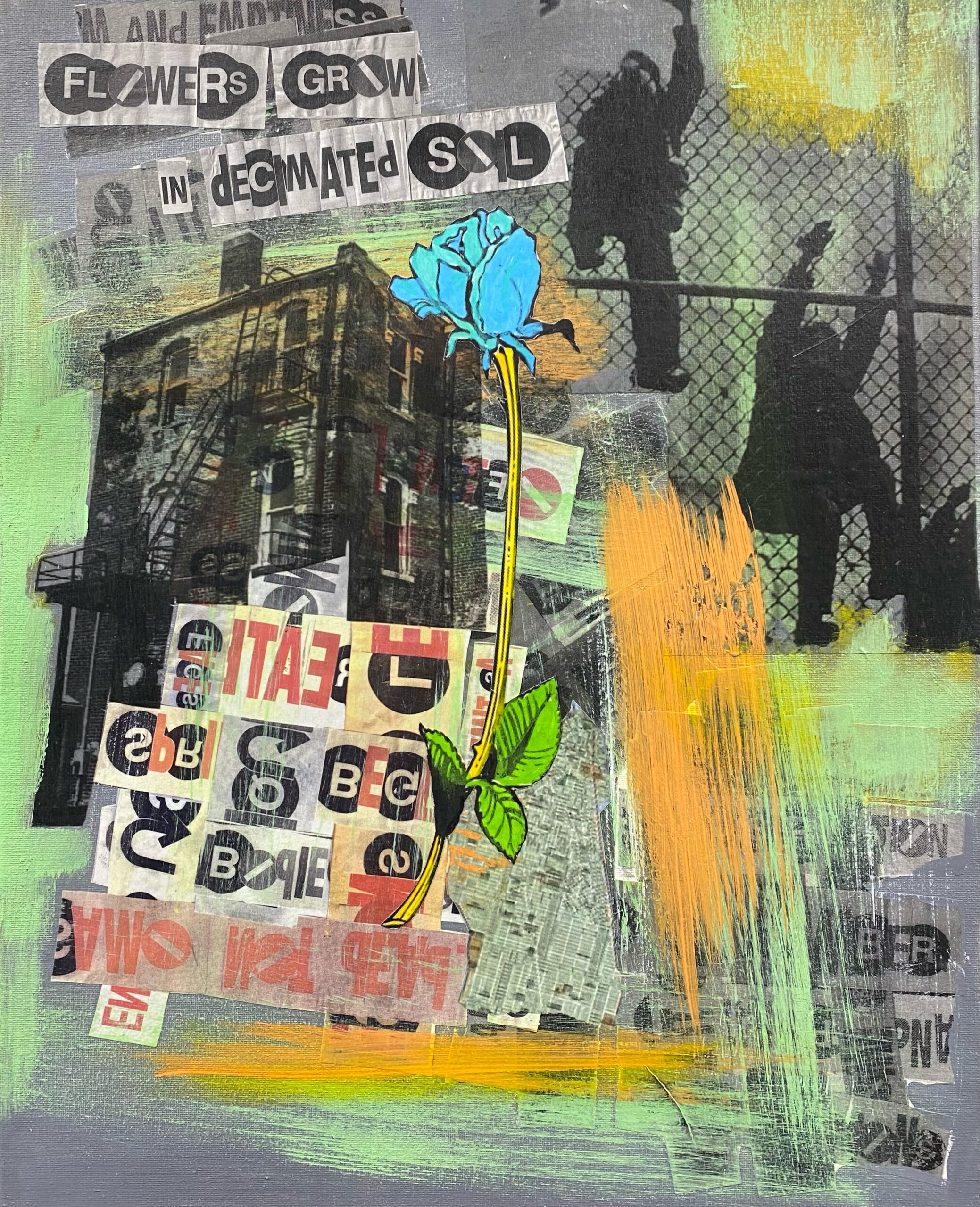
FLOWERS GROW, 2024, mixed media on canvas
When you brought SAMO© back, what were some of the reactions you got?
Here’s a story. I got in some trouble, but it was funny. Did you hear about that?
I got in real trouble when I was writing SAMO© graffiti at the Prospect (Avenue) station. This woman at MTA said something and then there was a warrant out for my arrest. I had to get a criminal lawyer, which cost me like three grand.
I showed up at 5:30 or 6:00 in the morning to the precinct, right here in Sunset Park. They cuffed me, they took me in a fucking patrol car down to Central Booking. Put me in the system, gave me my own cell. I was like 60 years old and I’m like fucking locked up. I haven’t been in jail since I was using drugs, you know? Eight hours I’m waiting. That’s how long it takes. About 4:00 I get to see the judge. Like a week before I had been aware of the fact that I had to go give myself up, they had given me an award, it was the borough president and the mayor’s office, had given me an award for contributions to street culture for the same fucking thing that I’m getting arrested for.
So, my lawyer, he goes up and argues my case. They’re all friends, right? They go to lunch together. I walked out scot-free, nothing. They say ‘stay out of trouble and we’ll expunge it in six months. It’ll disappear,’ which I’m sure it has.
Somebody got wind of it, and they told somebody about it and their writer friend works for the Wall Street Journal, and they did an interview about the whole thing. I got an article in the fucking Wall Street Journal over this thing.
I mean, it’s absurd that you get arrested for what you get an award for.
So SAMO© became international. I had to stay in Iceland for a night ‘cuz we missed our flight and I did some SAMO©s, like I put a sticker on a sign at the airport parking lot and these kids that were following me on Instagram, they DM me, “Oh, you’re here?” And they came and they picked me up. It’s like plain daylight, right? But it’s 2:00 in the morning, June. Midnight sun. And these guys show up at 2:00 in the morning and they took me to the Blue Lagoon.
I mean just all this great stuff happened because of the same old thing, you know, the same old fame.
That would not have become so famous had it not been for Basquiat’s involvement.
But I wonder what Basquiat would have been without SAMO©. If you had never done SAMO© and made art with Jean-Michel so early, how do you think you would have developed as an artist?
I don’t do the HYPOTHETICAL thing all too easily but I think my career would have taken a very different trajectory had SAMO© and JMB never existed for me. First of all, SAMO© became a career move only as a result of it becoming so widely embraced. I can only speak for myself, but I did not think of any artistic endeavors at that time as a step towards anything greater. The idea of a CAREER was non-existent. I imagine that I would have still naturally grown interested in music/percussion and possibly even the making of percussion instruments. I don’t think that part of my history was at all influenced by the SAMO© project. Maybe I would have followed my younger wishes of drawing and writing my own comics (?) As for fine/visual art, it is hard to say what might have developed.

The artist’s Sunset Park studio, 2026
As he shows me around his studio he is rummaging through shelves of homemade instruments, materials, and books. He has a basket overflowing with strips of MTA wayfinding slats. He shows me a Middle Eastern doumbek and a ‘super primitive crazy instrument’ called a berimbau.
Here’s this insane thing I made. It’s funny.
From a shelf, he produces a small homemade instrument made of a colorful square tin bound to a stick. He starts tapping it with a mallet, causing the tin to pop off.
I guess it’s been sitting there for a while but it’s this insane instrument. I made it from like a Trader Joe’s fucking smoked paprika thing. That’s the resonator. It sounded a lot better before. I think it got some heat. Anyway, I don’t have a name for that.
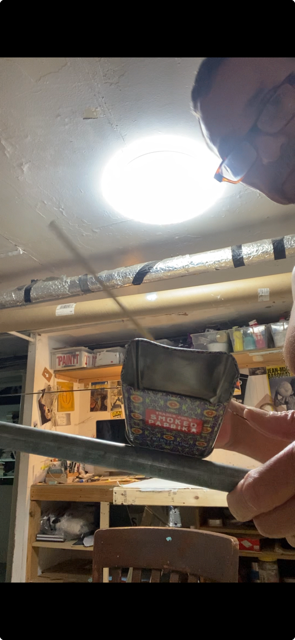
The artist in his studio with a homemade instrument, 2026
We were talking recently about the creative need for an audience—the desire to be saying something to someone—and how the raw pursuit of fame can warp the ego can warp the art. What did you learn from watching people take off that young?
I saw very young and presumably confident, conscious and certainly talented people being what I imagine was RUSHED into the limelight and public focus. In some cases, for more than just their art. The hype machine was running full throttle. That was good for some people’s careers, but I believe that a young ego is very impressionable and fragile. Too much, too soon, too early can have negative results. Burnt out, jaded and cynical before one has truly FOUND their VOICE. Only a few of the art-stars from the 80s explosion have survived to enjoy their success.
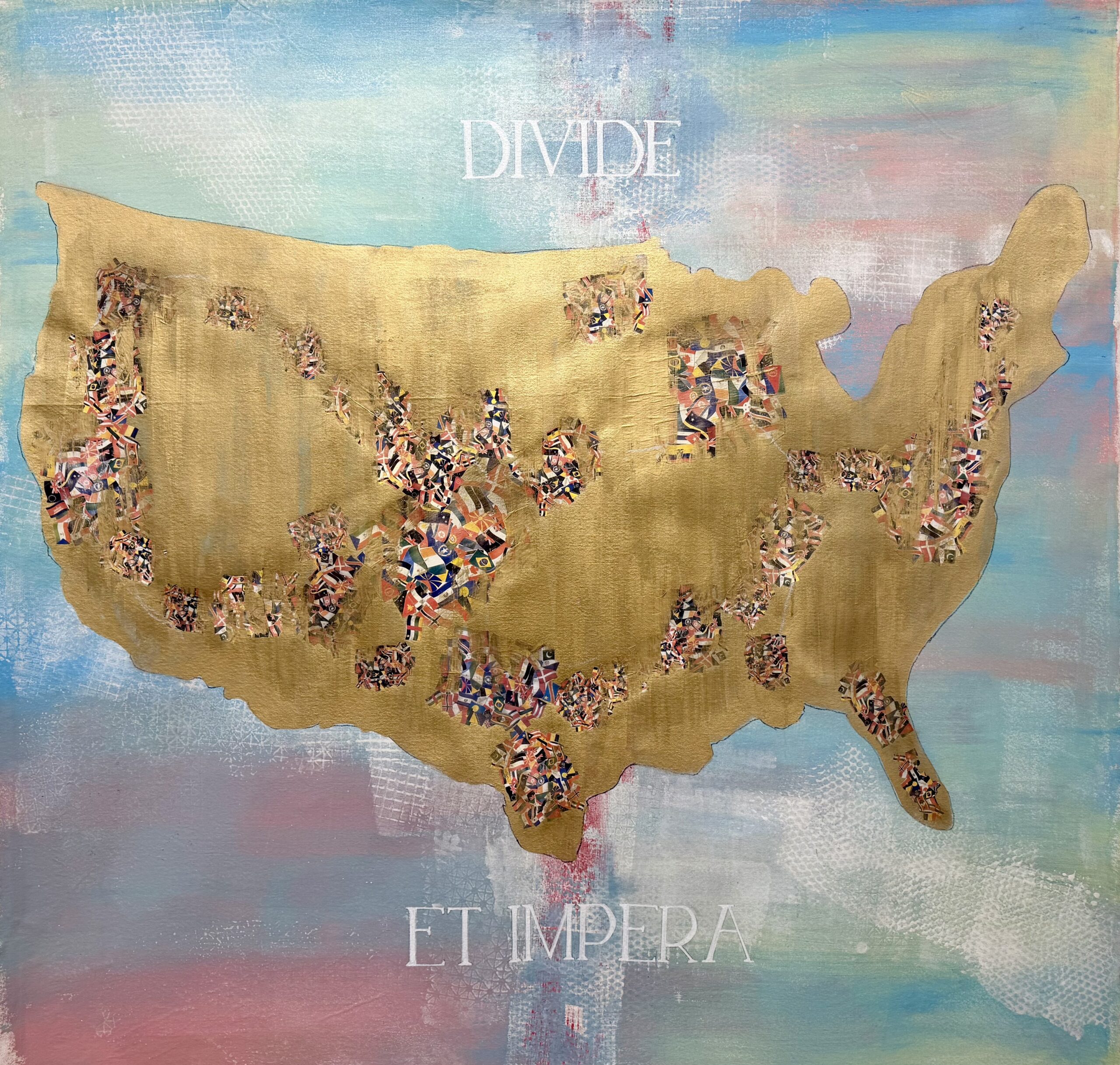
DIVIDE ET IMPERA, 2025, mixed media on canvas
What do you think art’s place is in a time like this one?
I think it’s like Nina Simone said that an artist has to reflect their time or their circumstance. Not every artist does that. Not every artist feels compelled to do that. But I do. I think it’s part of just how I grew up.
When I was talking about the 80s and how an artist had to have a product or something, I was raised in a working-class family. You have certain values you know? It’s harder, or you got to make more of an effort. You can’t be frivolous and like phony or whatever when you’re from a working-class kind of environment. A person like that doesn’t feel comfortable putting on an air or to pretend, it’s just absolutely unnatural.
Art doesn’t save the world though.
No, it doesn’t save the world, but it makes life better you know.
Well, I shouldn’t say it doesn’t save the world because evolutionarily it’s sort of an accidental byproduct of our ability to make tools.
And our ability to think and to create. To imagine and to do all the stuff that separates us from animals. I don’t know. I mean, apes can make tools, too. So, I’m not going to compare it to apes, but certain creatures don’t have those abilities. I don’t think a turtle would be able to make art. Nothing against turtles.
Anyway, I think it’s admirable when an artist shares some kind of message, be it hope or anger. Something that makes people think and can make people not feel so helpless. If you can give somebody some kind of hope in the sense of giving strength, as opposed to hopelessness.
I mean authoritarianism depends on the cynicism of the people.
Right, or people giving up and of course that’s what [authoritarian leaders] want. So, if you do that you‘re like just contributing to the downfall of human independence and human dignity.
It’s no secret that trust funds and proximity to power do much for the pursuit of a creative career. But not having these things doesn’t stop people—nor should it—from making careers as artists, even if it’s harder. As someone who really did play the long game, what is your advice to young artists today?
To young artists, particularly those who come from less privileged backgrounds. You need to realize early on that being an artist is not so much a career as it is a lifestyle. You need to surround yourself with others who have similar aspirations as well as those who do not understand anything about art. Go see as much art as you can stomach. Avoid being a KNOW-IT-ALL (life will humble you) Stay TEACHABLE. Seek adventure and absorb knowledge at every opportunity. Apply all experience to your creative process. Enjoy food, music, laughter and companionship. To quote Patti Smith “Take care of your teeth!!” And lastly
Love fiercely and allow others to love you.
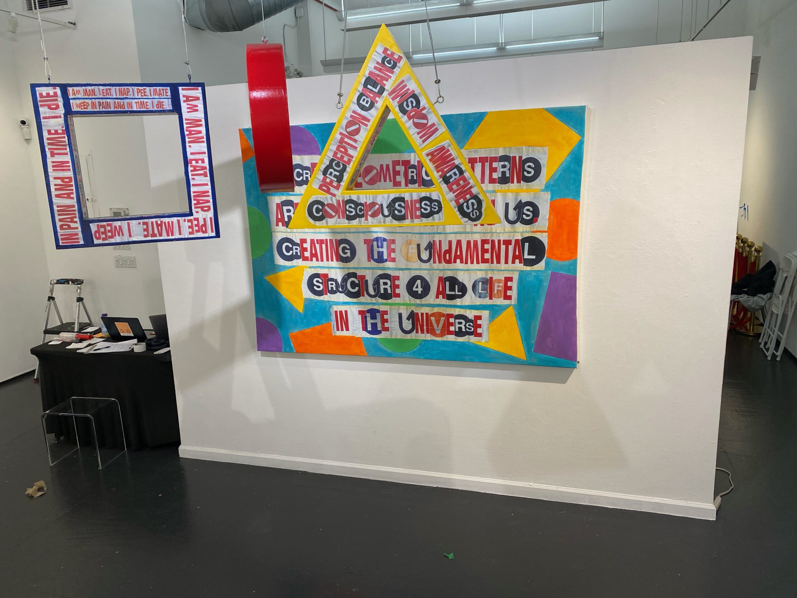
SACRED GEOMETRY, 2023, wood and hand embellished digital print on canvas
What are you working on right now?
I am working on a series of larger mixed media works (60” x 60”) specifically for a proposed show in Paris this May (fingers crossed). But I am always doing smaller projects like print editions and my own text postings on a daily basis.
Rachel Dalamangas
New York, New York
2026
All photos courtesy of the artist.
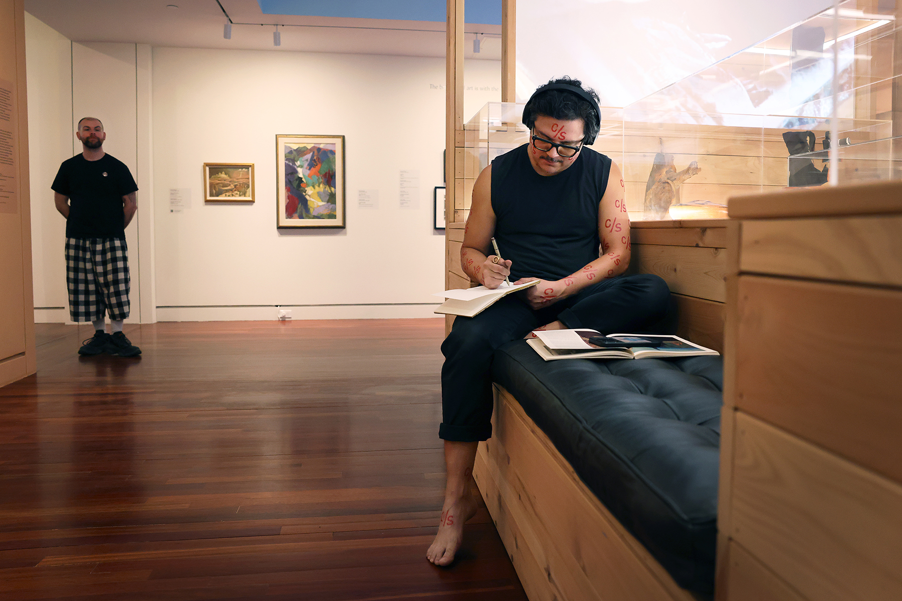
Josh T. Franco, Scriptorium con safos: Gathering Place, 2025, performance at Colorado Springs Fine Arts Center. Photo by Jamie Cotten / Colorado College
Josh T. Franco is an artist and art historian currently based in Hyattsville, Maryland. His dualistic practice, studio and scholarly, originates from his creative roots in West Texas, where he grew up surrounded by the intuitive and ever-evolving art environments constructed in his grandfather’s yard. For Josh, his lifelong immersion within the culture, history, objects, materials, sound, movement, space, and audience of the creative world coalesce into his ongoing “Scriptorium con safos” project, which he most recently performed at Colorado Springs Fine Arts Center at Colorado College. Witnessing the performance myself and chatting with Josh reminded me that immersion in this world is a choreographed balance of solitude and community . . . sometimes formidable but oh so blissful.
Josh T. Franco as Interviewed by Hayley Richardson
You are an artist whose “primary medium is the discipline of art history itself,” and a working art historian. I have to ask the “chicken or the egg” question . . . did your art practice grow from your scholarly pursuits or vice versa, or did they develop in tandem?
For many years, the narrative I held was that my AP art history course in high school was my awakening to the field. That is still in many ways true in terms of disciplinary training. However, after my grandfather passed away in 2015, there was a shift. He was a prolific yard artist, and I grew up among his creations in this constantly evolving hand-built environment. My brothers, cousins and I grew up watching and emulating him. This involved a lot of imagination and working with found objects and devised tools. I have been a maker of imagery, sculptural objects, spatial interventions, etc. since childhood. I was also a big reader from a young age. So now I say the art and scholarly pursuits really were always happening in tandem. It’s also important to note that my dissertation was a 2-year studio-based project involving a lot of collaborative research with fellow artists Joshua Saunders and Alison Kuo culminating in a large-scale installation and performance work in 2011. It was only after the show that I realized the subject of that work–the town of Marfa, Texas–would also be my dissertation subject. So the studio and the scholarly are inseparable for me. The book from the dissertation includes the related artworks and will be out in Fall 2026 from Duke University Press.
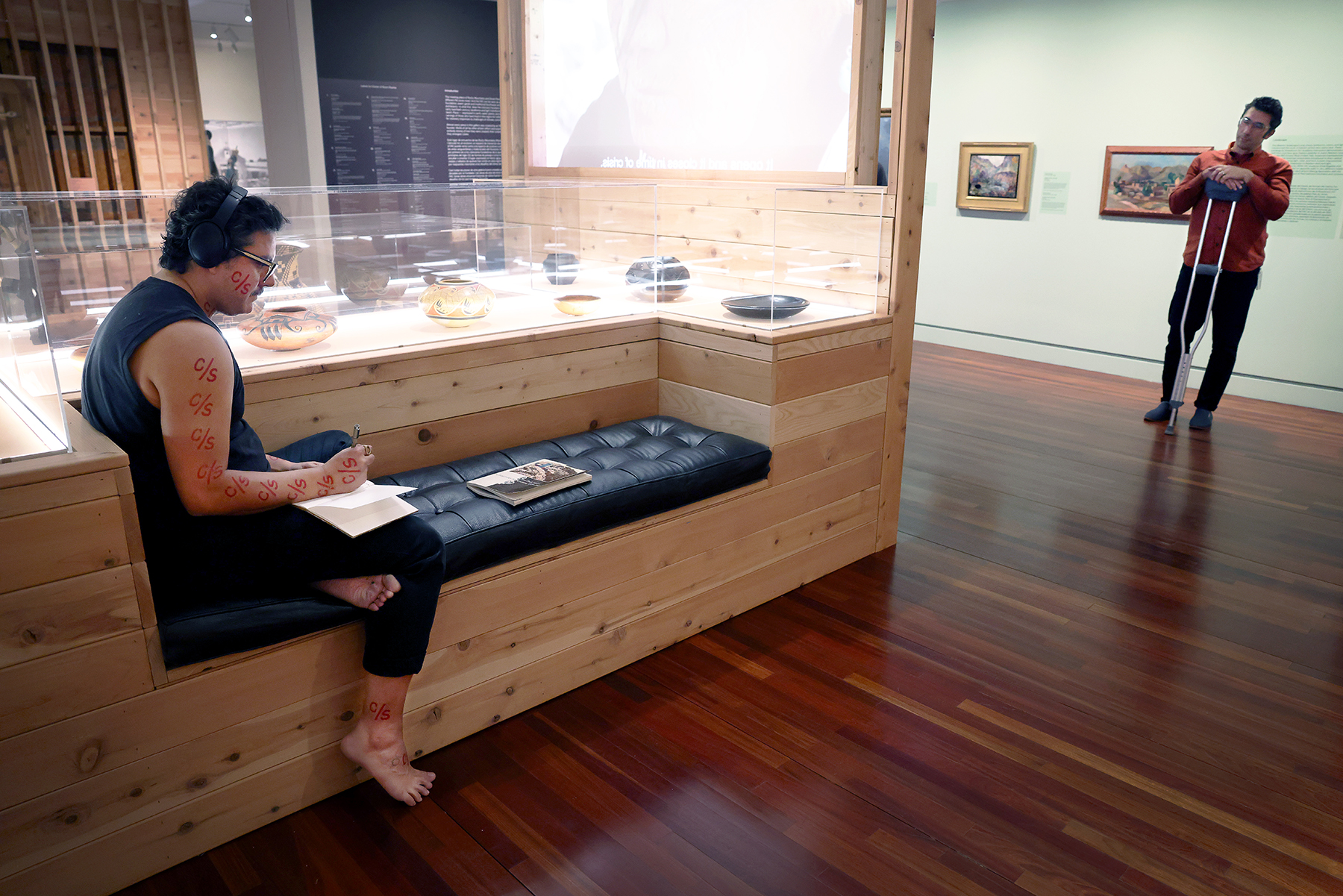
Your work “Scriptorium con safos,” which is a sculptural installation which can be activated as a performance, is the perfect embodiment of utilizing art history as medium. It has numerous elements at play with exhibitions and research at its core, as well as expressions of joy and enlightenment. Can you tell me about how you originally conceptualized this ongoing project?
The first Scriptorium came out of a very specific experience. As an art history PhD student, I proposed to teach a class on Chicano art in the department. The department–really just one faculty member among an otherwise wonderful supportive group–refused to cross-list it. I ended up teaching the class, but as a Latino studies course. No student received art history credit for it. I knew of the many historical instances of the discipline and museums rejecting Chicano art as unworthy of study, but it was wild to experience it directly in the 2010’s. I never forgot. In 2017, shortly after completing the doctorate, I received an invitation to be a visiting artist in the art and art history department at DePauw University. I am grateful for the opportunity and the timing; the invitation came when I was clearly ready to digest that experience, which meant making art from it.
My dissertation topic was directly tied to the Chicano art course I had proposed, as it works to understand the relationships between art by Mexican and Mexican-American Marfans with deep historical roots in West Texas, and the steady influx of people interested in so-called contemporary and Minimalist art that has occurred in the past 50-ish years. That first Scriptorium responded to a need for space in which I am not subject to disciplinary (or departmental) conventions or judgments. Thus the books on the ground mark out a spatial territory. The crystals emphasize groundedness, while also serving a practical purpose as bookweights. The “C/S” mark on my body and elsewhere in the work acts as a symbolic boundary. It stands for the phrase “con safos,” a Chicano term that signals solidarity, protection, and completion of a work of art. It typically appears abbreviated as “C/S” in paintings, murals, personal correspondence and a broad range of Chicano visual culture.
Books in the first scriptorium were arranged in a double arc; the inner row comprised books on Chicano art, while the outer ring included books on Minimalism. However, throughout the performance, they get mixed up. My promiscuity is the antidote to the rigid, possibly bigoted attitude that kept my Chicano art class from being listed in the art history department’s offerings.
I called the work Scriptorium con safos: Prologue, because I realized while making it that it could be useful for other topics, which it has been. Also, it’s an addictive work, at least for me. I think about it as being alone in my room, headphones on, doing what I do often in solitude, but as a performance in public. I crave opportunities to do it over and over.
I had the pleasure to witness this performance in action at Colorado Springs Fine Arts Center, predominantly within the exhibition “Gathering Place: Permanent Collection Reinstallation” which you had a hand in co-curating. How does the act of curating an exhibition compare & contrast with developing your own artistic response within it?
Gathering Place was such a dream experience. I do not consider myself a curator, but since 2020 I have been fortunate to receive a handful of invitations to guest curate in some amazing projects and institutions, the FAC among them. As an artist, I’ve taken these as opportunities to make new work that couldn’t happen without the collaboration of great institutions and teams.
In Colorado Springs, a new Scriptorium made sense. The project there is a fundamental re-imagining of the permanent collection installation following years of thinking with a 7-member curatorial team and FAC staff. It’s the result of a lot of deep study, which is what Scriptorium enables. Books were placed across the three wide thresholds of the galleries we had collectively curated. While the bibliography for each performance is planned, I never plan ahead which passages I am going to study and transcribe. In the moment, I realized I could also treat the wall text as another source, so that’s where I started. As I read my transcription of our exhibition statement, I unexpectedly choked up. It was the culmination of a really special collaboration that we were now offering to the world. I stopped myself crying that time, but I think in the future I’ll just let it happen.
These recent curatorial experiences have shown me that curating is a kind of making too. The difference between it and how I work in my studio is that there are a lot of people involved at every step. And now I have a whole body of work that is inseparable from institutions which is so interesting. For instance, Syracuse University Art Museum acquired Scriptorium con safos: Syracuse following a year-long installation. Writing out the paperwork for that pushed me to realize, in practical terms, how a work can exist within an institution as both a collection and a collaborator without my direct involvement.
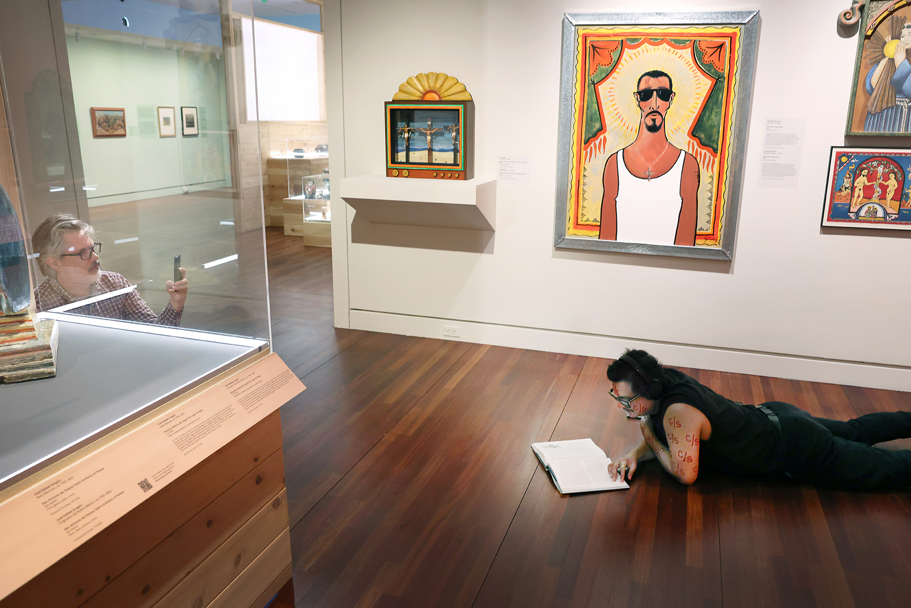
Josh T. Franco, Scriptorium con safos: Gathering Place, 2025, performance at Colorado Springs Fine Arts Center. Photo by Jamie Cotten / Colorado College
You’ve performed “Scriptorium con safos” five times. Each iteration employs components like movement (and rest), art historical texts, earth minerals, music, writing, and recitation that change with each exhibition and performance activation. What were some of the featured texts for the Colorado Springs performance? Playlist and mineral selections? How are these decisions made?
Some tracks from the playlist (again, what I might be listening to just hanging out alone in my room studying art through books):
Fog – The Ophelias
These Days – Foo Fighters
Standard Lines – Dashboard Confessional
Sympathy is a Knife – Charli xcx
Waiting – Alice Boman
Treehouse – kelseydog
Deceptacon – Le Tigre
Meet Me At Our Spot – The Anxiety, Willow & Tyler Cole
Man of the Year – Lorde
What Was That – Lorde
Drain You – Nirvana
Flash in the Pan – Jane Remover
Straight, No Chaser – Bush
Pinch and Roll – Hum
Age of Consent – New Order
I Fall Apart – Post Malone
Binz – Solange
Casual – Chappell Roan
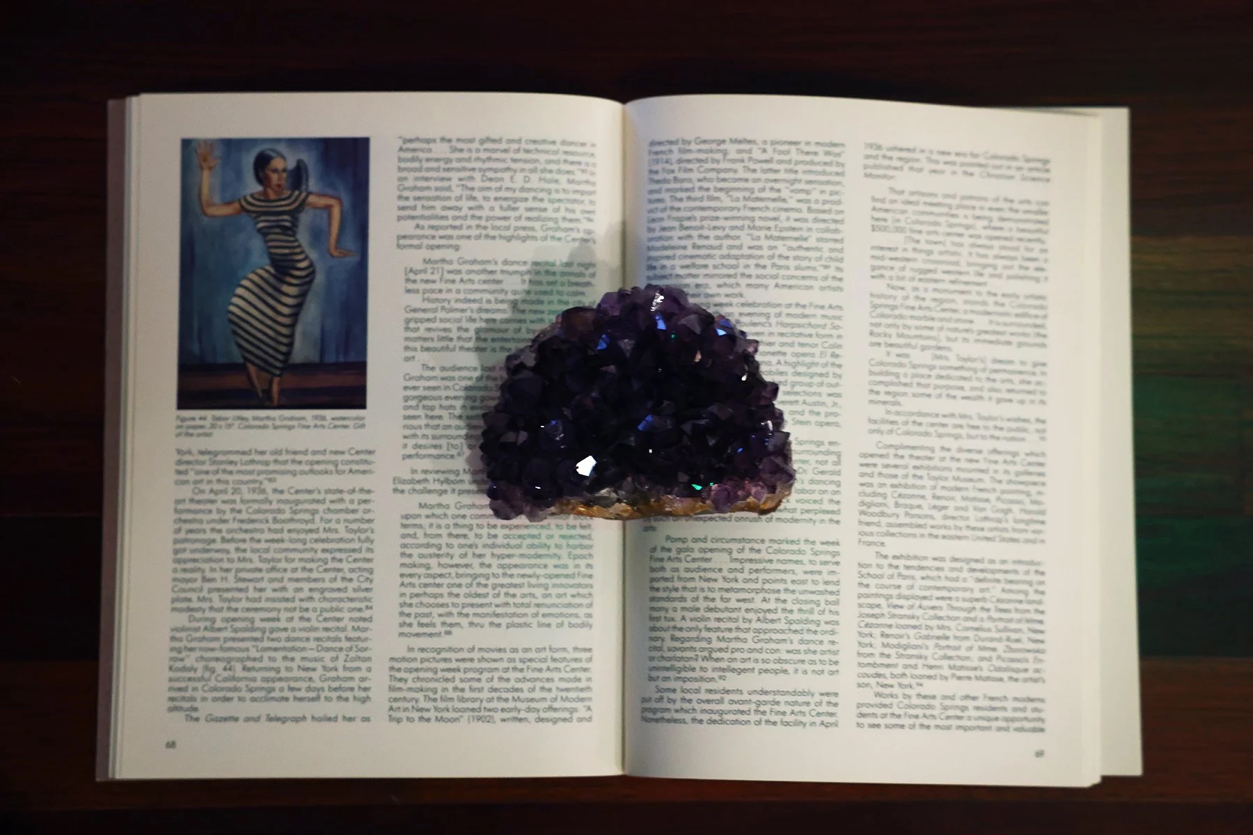
The books are chosen with much more intention than the music. FAC already includes books related to the exhibition in the entry hallway. We, the co-curators, had contributed to the list months prior, suggesting books related to the works and frameworks of our respective galleries. So for this Scriptorium, the books were already present. It was fun to perform selecting and removing them from the shelves to the floor as audience members looked on. Some of the bibliography for Gathering Place, which anyone who visits the show can peruse, can be reviewed here
I’m so glad you asked about the crystals, because Colorado opened the work up to colors in a new way. In the past, I’ve used a mix of palm-sized clear quartz chunks and selenite bars because they are readily available, relatively low-cost and, primarily, don’t command much visual attention as they are white and clear. ForGathering Place however, we had the budget and interest to elevate these choices a bit. It was also a fun outing for myself and FAC curator Katja Rivera who researched shops in the Colorado Springs area ahead of my trip for the performance. We drove around town and I think it was the third shop where we encountered the celestite and amethyst I ended up using. That pale translucent blue and the deep purple, respectively, are so seductive and play well with the dark wood floor and low lighting in those galleries. Shifting to these strong colors was significant for me as the artist and Katja as the curator, though the audience may not be aware how so.
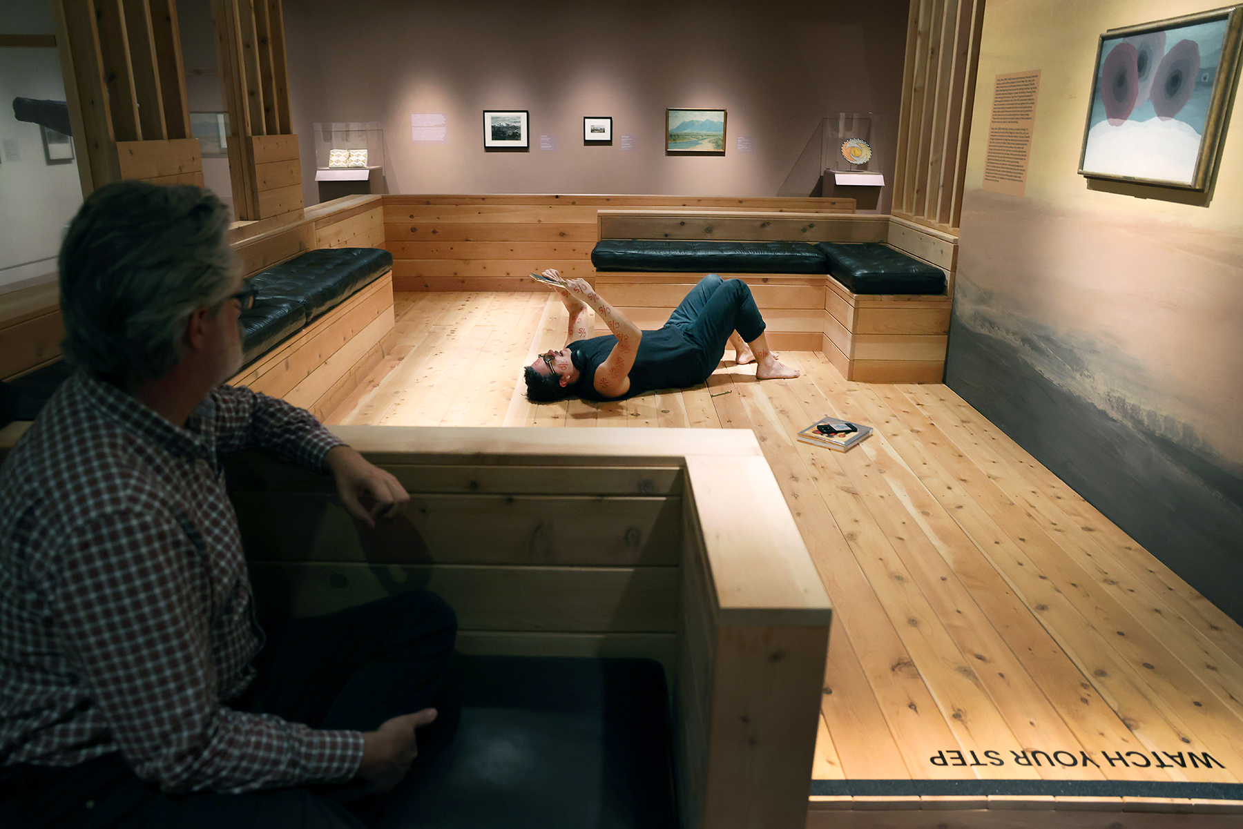
What role does the audience play in your performance?
The audience has choices; they can be witnesses, fellow activators, or something else they imagine. Scriptorium is a non-narrative ambient performance. Like the weather, it’s there regardless. How you respond to it is up to you.
When I work with institutions, I ask that there be no announcements or signage. Nor is there a timed score or pre-planned sequence. If you catch me reading a transcription aloud; if you catch me dancing; if you catch me laying on the ground reading; this is all up to chance and the length of time you’re willing to stick around. Additionally, nothing is stopping someone from also picking up the books, annotating, and reading aloud themselves, or from dancing for that matter. I am making these tools that enable the study of art available, and it’s great if others find them useful as well.
People enter museums with very specific preconceptions of how to behave. Scriptorium questions this default, and audiences have to actively ask themselves what they are willing to do differently in light of what I am doing. Who says going to museums only means standing still in front of each artwork for a few moments? All I, my hosts, and audiences ever know ahead of time is when a performance is scheduled to begin and end. What happens in between depends on our collective decision-making in real time.
What projects do you have coming up in the new year?
Another project in Colorado Springs, happily for me. On March 6, an exhibition I curated opens there: “Where I Learned to Look: Art From the Yard.” This show was originally made at ICA Philadelphia, and I hadn’t planned for it to travel until the FAC asked. With the team there, we’ve organized some really special new additions that speak to the Southern Colorado context. I will also be a visiting artist at Missouri State University in March. There are a couple of other things in the works. I’m looking forward to 2026.
Hayley Richardson
Denver, Colorado
2025
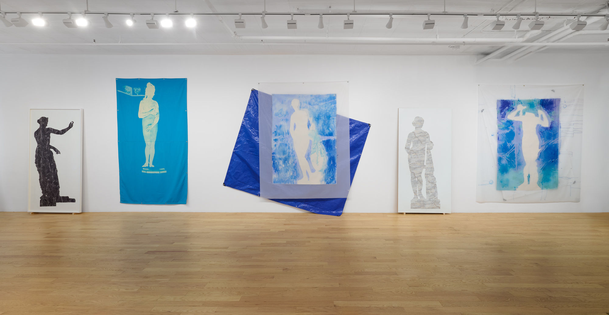
Among the earliest monumental female nudes is Praxiteles’ “Aphrodite of Knidos,” a 4th-century BCE marble statue widely copied and reimagined throughout the ancient world. Ironically, the original was lost to history, surviving only as a ghost haunting countless echoes—from Botticelli’s “The Birth of Venus” to the legendary “Venus de Milo”—thus setting the Western canon for the female form with her sensual contrapposto and suggestive modesty.
Artist Patricia Cronin’s recent body of work joins this long lineage, paying homage to the Goddess of Love, Beauty, and Grace as a heroic figure in a world that rewards hatred, destruction, and indecency.
A striking series of monumental paintings and statuettes, “Army of Love” showed recently at Chart Gallery, a Tribeca space founded by Kasmin alum Clara Ha in 2019 with the curatorial vision of presenting art predominantly by women—notably Cronin’s first solo show in New York in almost a decade.
This isn’t easy or sentimental work—not for the world and not for Cronin. “What is so important to you that you are willing to lose for it? What are you willing to lose for?” she asked me recently as we discussed the crush of political losses sustained by women in the United States, echoing the broader global backlash to progress. This radical acceptance of loss—the willingness to fail, to lose—brings into stark perspective the real grit and determination that love requires. In “Army of Love,” Cronin offers art as a vessel for that determined kind of love: a compulsion as old as humanity itself.
Patricia Cronin as Interviewed by Rachel Dalamangas
Walk me through how the large works were made because as I understand, it was a multi-step process where the materials are impossible to tightly control, with much left to chance and experimental.
In “Army of Love” at Chart Gallery, the multi-layered assemblage paintings are entirely process-based and showcase three ways of paintings all in one. If there is a hierarchy of painting techniques, three are in these works, hand painted, mechanical reproduction, and ready-made objects.
After a research trip to Rome—location of the highest concentration of Aphrodite and Venus statues, many “copies” of the great 4th Century BCE attic sculptor Praxiteles’ “Aphrodite of Knidos” (350 BCE) renowned original onward—I was impatient to work large and dove right in.
Because Aphrodite is born of the sea, oil paint felt wrong. I turned to water-based paints, though I dislike acrylics and had never used them before. On raw, unprimed canvas spread across a plastic-covered table, I painted the negative space around the statues’ silhouettes. When I hung the canvas up to dry on the wall, I turned around and realized that aquamarine, cobalt, and turquoise paint had seeped through the canvas fibers, leaving abstract sea-foam apparitions I couldn’t anticipate or control. That unknowability of what I was making was exhilarating—a liberation that defied the old binaries of abstraction versus representation.
To preserve these ghostly abstractions, I photographed the residue on the plastic sheets and transferred them via dye sublimation onto sheer fabric. Hung on the wall over the painted canvas, the veils hover like apparitions of Aphrodite—always shifting, never fully seen. Behind them hangs a third layer: a ready-made polyethylene tarp, utilitarian and protective, echoing the ship’s sails from the ancient port cities where public and private temples to Aphrodite stood and supplicants prayed to her for safety.
Your work often begins with a kind of excavation of art history, sometimes resurrecting women artists cannibalized by the (heavily) male-dominated canon, and in “Army of Love” a kind of excavation of Praxiteles’ “Aphrodite of Knidos”—lost to history but felt in its influence on every depiction of the Goddess of Love to follow. How does history inspire and inform your work?
History is where I find the best ideas! Knowledge of the past sharpens my understanding of the present and arms me for the future. I always look for what I call “the magic three”: the right image or form, the right materials, to perfectly match the contemporary content burning in my mind for that moment in time.
After the 2016 election, with women being pushed out of public life and our democracy on the brink, the Tampa Museum of Art invited me to be the inaugural artist in their Conversations with the Collection series and respond to their Antiquities Collection. The first object I saw was a headless, limbless 1st-century CE torso of Aphrodite, one of the two most powerful female figures of the Ancient Mediterranean World, the birthplace of democracy. Fragmented by blunt force or centuries of neglect, yet enduring, she became the perfect focus for my imagination.
Praxiteles’ “Knidian Aphrodite,” the first monumental female nude in the western canon, once stood in the Temple to Aphrodite Euploia in Knidos, Turkey. Though the original is long lost, its fame lived on in Pliny’s writings and dozens of copies now housed in major museums around the world. On July 20, 1969—the day man planted a flag on the moon—archaeologist Iris Love, a groundbreaking lesbian, discovered that temple in Knidos. Cosmic conquest above, female divinity unearthed below.
At the same time, the Italian Arte Povera movement was at its height. Its artists embraced humble materials and methods, but most of the celebrated artists were all men. I wanted to shift the frame—introducing domestic materials historically coded as feminine: bleach, salt, tarps, contact paper. In “Army of Love”, classical ideals collide with those overlooked materials, reframing women’s labor and presence in art history.
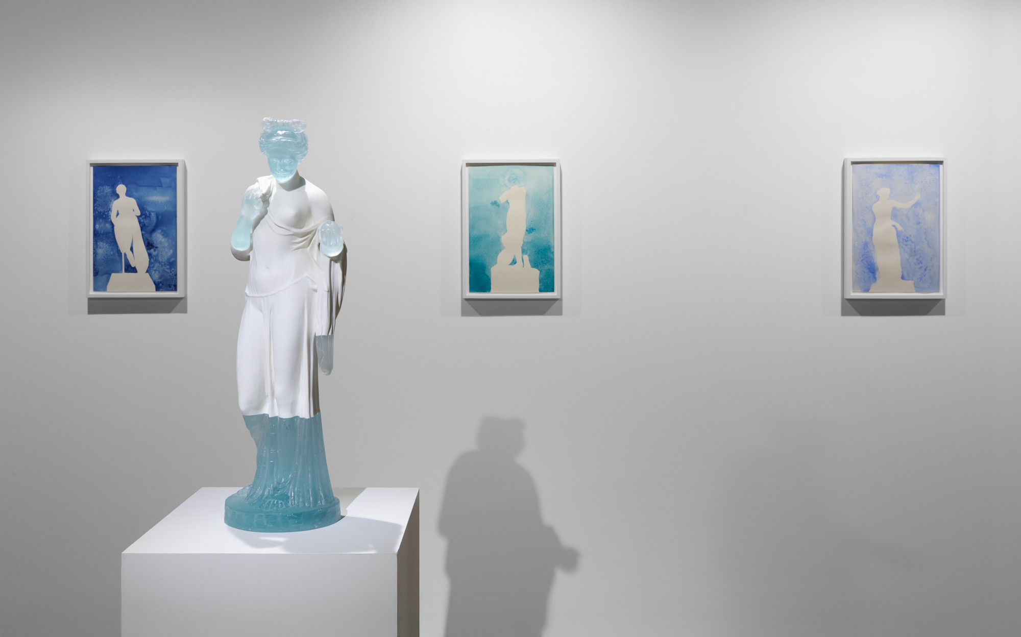
You’ve referenced something you called the “economy of care.” What is the economy of care as it relates to this exhibit?
In the Ancient Mediterranean World, gods and goddesses held both civic and spiritual authority for their city-states. A powerful deity, Aphrodite was worshiped and beseeched for almost everything, marriages, business contracts, safe voyages, harvests, harmony in the community and the home. Unlike gods of war (although she helped with military victories also), her power was protection through love.
That is the lineage I claim. The tarps—today used to protect what we value when they shield homes after hurricanes—become metaphors for survival. Salt, bleach, and contact paper—tools of the domestic sphere for cooking, cleaning and decor—are monumentalized. In my hands, “army” no longer signals only conquest but an assembly for love, safety, and dignity. Compassion over conflict.
We’re living in a time where relations between men and women seem broken. Even in the political climate, in broad sweeping generalizations, it’s kind of strange to see the difference in how men are reacting and how women are. Sometimes it feels like we really are speaking a different language. How is “Army of Love” responding to the societal breakdown of decency, old against young, man against woman, one people against another, civilization, rationality and objectivity, and the rolling apocalypse that it feels like the world is becoming?
Critiquing misogyny and homophobia have always been at the core of my life’s work, and “Army of Love” continues that fight. As Jimmy Carter once said, “subjugating half your population is not only immoral, it is irrational.”
Today, hard won rights are being stripped away—from women, LGBTQ+ people, immigrants, and people of color. History tells us authoritarian regimes rely on scapegoats. On the first day, the Trump administration’s Executive Order “Defending Women From Gender Ideology Extremism And Restoring Biological Truth To The Federal Government” legally mandated only two genders, and their March 27, 2025 “Restoring Truth and Sanity to American History” Executive Oder targeted the Smithsonian Museums, deeming all art about feminist, LGBTQ+ and African-American history “Un-American Ideology” that “must be eliminated.” This is McCarthyism 2.0. This attack on gender and LGBTQ+ existence, was never just policy—it was ideology designed to erase histories and lives. “Army of Love” resists that erasure, insisting on visibility, protection, and dignity.
It also seems like art by women is increasingly referencing empathy and compassion. Some dismiss these as sentimental, but I think they take enormous discipline and depth. Do you have a definition of compassion or empathy that you were working from for this show?
I believe empathy is at the core of every great artwork. For “Army of Love”, I drew from British Classics Professor Mary Beard’s analysis of Sappho’s sole complete poem “Ode to Aphrodite.” Beard identified that Sappho was echoing Homer in book five of The Iliad, when Diamides prays to the goddess Athena I the midst of battle. By using the same content and stanza structure, Sappho subverts the entire male heroic order by changing men at war to women in love. Sappho might be the first appropriation artist!
That’s what I wanted: to redefine “army” not as a force of domination and destruction, but as a body in the service of protection, care, and compassion.
This is urgent. We live in a culture of government sanctioned cruelty—where the language of “lethality” replaces diplomacy, where white supremacist militias cosplay war on our streets. It is terrifying. And yet, in my studio, I am surrounded by towering female sentinels, and I feel safer. Only in safety can my imagination flourish.
By freeing these canvases from wooden stretchers, letting them flutter like sails, I gave form to liberation itself. Love, empathy, compassion—these are not weak. They are revolutionary. They are the only true antidote to cruelty.
At your studio, I loved seeing the test swatches of blue paint. What are you looking for when you experiment with color?
There are so many blues, and they are all so gorgeous. Aphrodite, being born of the Mediterranean Sea, I needed to do a deep dive into the array of hues. And then the spontaneity of the creative processes, especially with the watercolors made with sea salt, I needed a visual legend, so that while I’m in the middle of creating, I can SEE the color and act, rather than pause, pick up different tubes, and read the names of the blues and then choose.
When you work with watercolor, the pigment binds into the paper simultaneously while water evaporates away from the paper. I add more pigment, more water, and then I throw in Mediterranean sea salt which up ends the curing process. Time is of the essence, and one develops the necessary expert aesthetic calculations over decades of working. There are no short cuts.
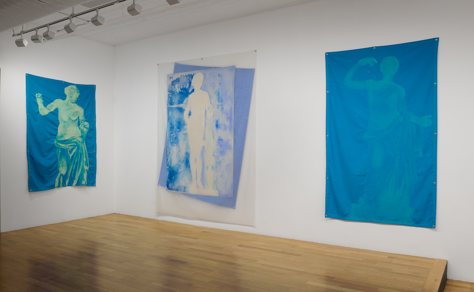
I was also thinking about how art asks us to re-orient how we relate to others and ourselves, toward the experiences of someone or something else, familiar and unfamiliar, and by that virtue, the experience of having empathy itself expands our own scope of experience and capacity for perception. How do you hope viewers’ perceptions might expand through encountering your art?
Viewing art is a contemplative experience. And this “Army of Love” series is very open ended. I want people to walk in thinking they know everything they want to know about Aphrodite and encounter paintings that change that perception, slow them down, take them off autopilot, lower their blood pressure, and unplug for a little while. I’ve taken a well-known icon, Aphrodite, the Goddess of Love, Beauty and Sex and hopefully my conceptual choices and material experimentations has produced paintings and sculptures that reveal something they can experience anew and not just validate what they already know. That’s so boring!
The installation at Chart Gallery’s lower-level gallery creates an almost sacred space with a sense of mysticism. How intentional is this atmosphere? What role does the physical environment play in how you want people to experience the work?
Clara Ha, the owner of Chart Gallery, made the curatorial decision to keep all the monumental work upstairs and have all the intimate scaled works in the lower level. We call it the inner sanctum! After walking through the more public cult statue scaled works, viewers descend the stairs to the lower gallery, and you feel you are entering a sacred space. I’ve exhibited and collaborated with religious, secular, and industrial historic spaces, including a cemetery, a church, a villa, and a former powerplant. Creating contemporary art for historic architectural environments must be rigorously and sensitively done, out of respect for the historic space and the art. Anachronistic pairings are a favorite aesthetic strategy for me. These time traveling combinations expand both the original function of the venue and art. It connects us to a longer continuum of art, cultural practices, and humanity. I know we should be asking a lot more of art.
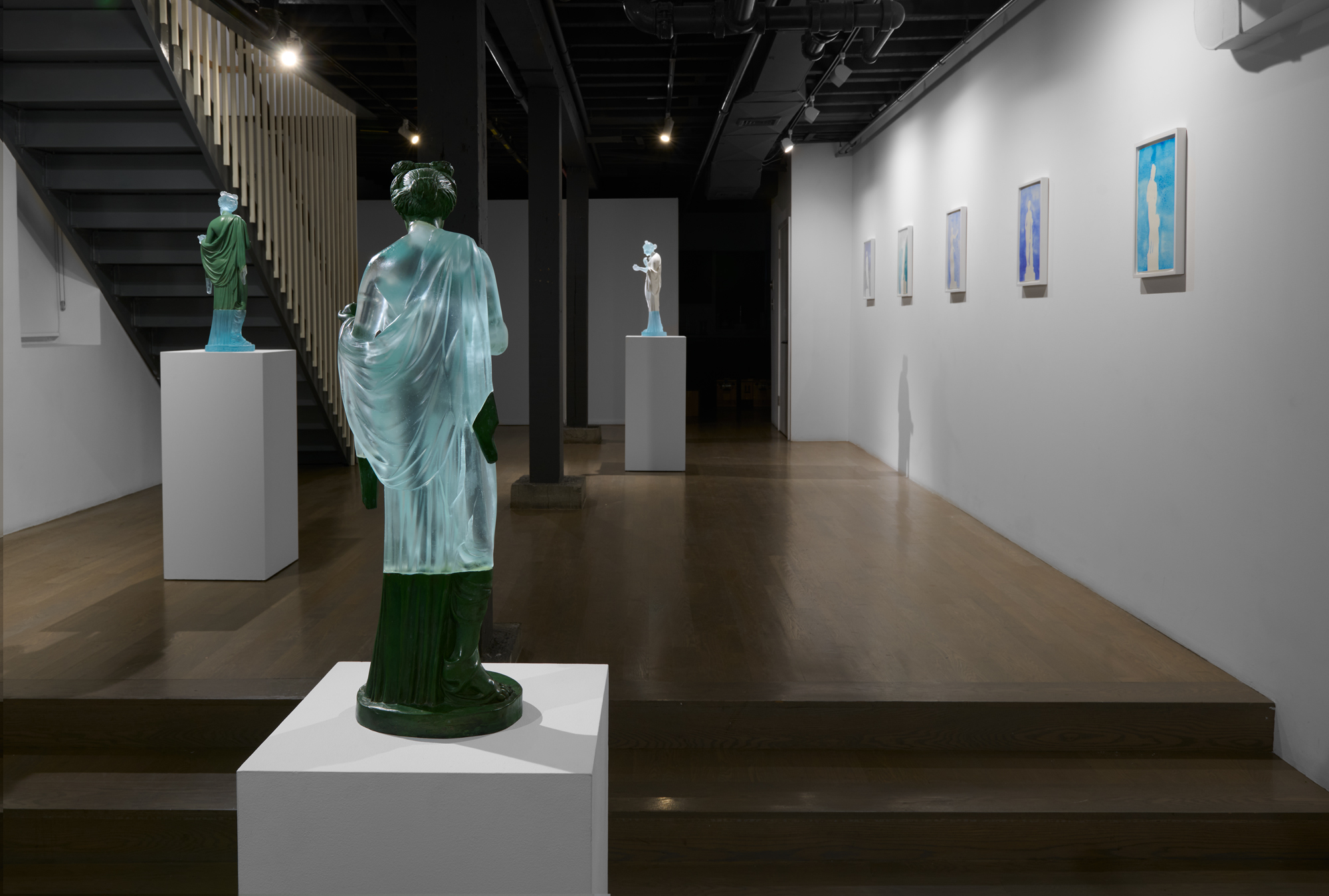
I noticed you used packing foam from a museum replica of Aphrodite to create two glass art works. How do you decide which found or utilitarian materials—like foam, canvas, and tarp—make it into the final work? What draws you to these everyday objects?
I like everyday objects for their transformative properties/potential. I animate them into a dual existence. And that expands their artistic and conceptual impact while also remaining true to their original purpose. My antennas are always on; I see the beauty and the potential in objects others don’t. The tarp is still a tarp, its function—to protect what we value remains the same, but I see its value and want to show others its inherent metaphorical properties. Elevating common domestic or utilitarian materials to the status of art history is a strong feminist statement.
What is the relevance of beauty in a world that is as you say is full of sanctioned cruelty?
Love and beauty are essential to combat and survive the rampant hatred and brutality. We are witnessing a race to the ethical bottom of who can be the most deceitful, the most bombastic, the greediest, the most selfish, the meanest, the most sadistic. The Ancient Greeks believed that beauty and goodness were connected, external physical beauty demonstrated internal moral virtue. While our 21st century selves might bristle at this concept, the beauty of the natural world is unanimously embraced as sites of solace and comfort after the daily barrage of chaos and cruelty. We must hold on to beauty in all its forms, especially now.
Rachel Dalamangas
New York, New York
2025
Image Credits:
KC Crow Maddux
Courtesy Patrica Cronin Studio LLC and CHART, New York
© Patricia Cronin