Richard Benari’s current work focuses on the possibilities of a pared-down photographic language and its ability to provoke a visceral response to form. His chief concern is the interpretation of that language in print. Relying solely on the literal qualities of the photographic object, meaning in his pictures derives from the unique interaction of surface, ink and light, rather than from the image, per se. His photographs are in numerous private, public and library collections including Smith College Museum of Art, the University of Oregon and Yale University.
Lauren Henkin grew up in Maryland, graduated with a Bachelor of Arts in architecture from Washington University in St. Louis and resides in New York City. She states, “My work focuses on the tension between preservation and extinction. I work from the inside out, using internal narrative as the foundation in which to reinterpret space, light and form found in the external.” Henkin is an educator, reviewer, writer, frequent speaker, author of numerous books, and active member in the arts. Her work is widely collected by private collectors as well as institutions such as Southeast Museum of Photography, Yale University, Smith College and Dartmouth College among others. Her work has been published in numerous journals on photography and the book arts including PDN, Shots Magazine, Black+White Magazine, Diffusion Magazine, Flak Photo, Urbanautica, Landscape Stories, Parenthesis and The Washington Post. She is a Px3 multi-category winner, Oregon Regional Arts & Culture Council grant winner, with other award nominations in both the Brink Emerging Artist and Contemporary Northwest Art Awards.
Interview by Josh T. Franco
The notion of a “touching photograph” is schmaltzy, saccharine. Well, at best, a photograph can be genuinely touching as a mnemonic talisman. And these are crucial. Distinguishing between personal and generic is the key. But touching a photograph feels illicit and irreversible. If the viewer is not imbedded with basic conservation protocol, she is nonetheless touching, and that is something in a world where looking at even shocking images is quotidian. The fingerprint will never fade. The human oil cannot be fully conserved out of the print. You have offered up your photographs explicitly for handling, manhandling. (Is mangling so far away?) To do so in the context of art is a risk. Thank you for taking a risk, not merely for the sake of being risqué. The touching matters, you tell us. It makes me begin my engagement with your work in a place other than the visual. Tactility seems the highway, visibility the exit ramp. The vehicles: hand-built vellum and sandpaper.
“Manhandling” feels a bit loaded. But “tactile” fits. That’s what we were after—reconnecting viewers to the haptic quality of a photographic print. And, yes, there’s some risk in that. Thanks for acknowledging it. The idea isn’t so much that the feel of the print in your hand supersedes the visual, but that you get to experience the print as we did when making it: up-close, unframed, unmediated and accessing the ambient light in which it is viewed.
And what is pictured in Pictures? What is visible? By beginning from touching I—nor you, I believe—am not implying that the visual is secondary. The labor and care with which the images are crafted seem guided by a desire to put in perpetual motion a scale. On one side of the scale are objects in space. On the other side, objects’ images as ideas. To tip the scale, the print and the viewer/handler must dialogue with one another. Orientation seems key. The process of holding up, rotating, flipping, is integral to the intended experience. I think?
Handling the print is secondary; that’s right. Again, we wanted to create an intimate viewing experience, and one in which the feel and weight of the print would be add something—a way to further convey, or sometimes play-against, the already-tactile quality that’s so much a part of the photographic print. So the scale of the prints became important. But our main concern: give the prints a chance to be viewed in different kinds of light. At the end of the day, Pictures is a study in photographic abstraction. Meaning here doesn’t depend on the image, it depends on the object—the print itself. So the ambient light in which the prints are viewed is as important an ingredient as the ink with which they are printed.
About orientation: Actually, it’s not so essential. Two of the project’s four folios are shot in portrait and what we noticed is that that’s a bit tough for viewers. People see the world in landscape, after all. So, many viewers try flipping the vertically-oriented images on their side. But, after a few minutes, they’ll right them vertically again. The visual clues in the images—the way the lines run, the way the light falls—tend to tip them off about our intention.
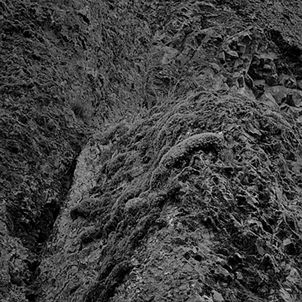
Orientation and vertigo do play a role in how one experiences scale in the works. Where there is a rocky landscape, the light’s presence in the photograph is manipulated in such a way as to confuse: is this a sheer rock cliff? A rocky, endless beach? A trompe l’oeil drawing? And when one is sufficiently disoriented: Is this an abstraction? But as vehemently as you want us to demystify the photograph’s claim to truth through touching it, you seem to want us to avoid abstracting this image as well. What does it mean to say that these are rocks? Or that they are not?
Yeah, these images are plenty disorienting. That’s purposeful. There are no clues about scale in these images and no tips about pictorial space. In fact, subtle shifts in tone purposely confuse the viewer’s read of pictorial space. So the Oregon landscapes, for example, tend to engage because of the sheer feel of rocks and because of perspective—the images feel at once vertiginous, like you said, and flat. But for us, “abstraction” and “disorientation” aren’t at all synonymous. We’re interested in abstraction because it intensifies the physicality of what’s photographed; disorientation is a by-product. A real useful one, but still a by-product. The Oregon landscapes, which say so much about abstraction in the found and the everyday, convey the sheer physicality of place—without reference to location and without documentary comment. Similarly, the sandpaper constructions create a tension, we hope, between the solidity a viewer sense and the fragility of the paper. They also feel voluminous, and this lends a kind of biomorphic feel to the prints. We were surprised that so many viewers see legs and pelvis in these images.
The onus to orient again falls on the viewer/handler herself in the photographs of interior walls. How did you get the images of stacked empty walls to behave as if nothing but two dimensions? I am thinking here of the odd moments where the edge of a wall closer to the foreground and the edge it creates (the same edge) against the wall behind it twist on one another. It’s as if the beginning of a braid happens in an arbitrary pinpoint where the walls are, in reality, just as far from one another as in any other spot. Is the editor exposed? Is the viewer working hard enough?
It’s a good read of the images. Thanks.
A big part of this project was to return the viewer to the pleasures of modernism. So, again, the idea of flattened perspective was key. In each of the prints, subtle shifts in tone confuse the viewers read of pictorial space. This is especially true of the interior shots, the architecture studies. So a part of the tension in these images is about, again, about depth and flatness. About how it was done: a lot depended on the light in which we photographed and a lot depended on how we interpreted these images in print. We tend to photograph at the tightest aperture available, which sharpens the image but also deepens pictorial space. So the flat light in which we photographed, the subtle gradation in tone and, later, careful spit-toning—all of this was key. It’s also generative. It’s helped shape one of our current projects, which focuses on the built environment and how we conceptualize space.
The slowest arriving question about this work is the question of text. It seemed at first to have nothing to do with the printed work, the alphabetical. Perhaps it is the handholding that takes me there. Do I engage these works like books? Why do they make me want to read them?
This is a terrific question. Thanks for asking it. The short answer: These photographs aren’t intended for the wall. First, there’s a lot of them—four series of five—and each image within a series dialogues with the next. So, seriality is key; that is, these images develop their ideas across a series. So there is a textual reference here, and a kinship with books—which is, in part, why we first decided on the folio format. Also, it was important for us to give a sense of those ideas unfolding, but without any narrative present. It feels like the majority of what’s photographed today hinges on narrative. We wanted to make a conscious break with that.
The longer answer, though, involves how we—the viewers—have become accustomed to looking at art: on the wall, episodically, and seldom within the context of what surrounds a work or how the work is lit. We tend not to engage the curatorial decisions that went into hanging the art—probably much to the frustration of curators. So a piece of this project involved a degree of “self-curation” on the part of the viewer. The viewer gets to order the prints and choose the light in which they’re experienced. By doing that, they create a kind of conversation with the work—and with us, a kind of questioning of our intention. There’s more to say here, but it’s a long conversation. Perhaps another day.
These works are meant to be consulted and engaged, to be brought out and experienced within the specific and viewer-chosen context of light and quiet room. In this sense, the textual reference goes deep—as if it’s a book one would wish to consult and experience, then later re-read. The impetus for this is the Chinese Handscroll, and the best feel for that is Maxwell Hearn, Chief Curator of Asian Art at the Met, talking about it. Here’s a link to that kind of kitschy vid from the Times. (Click.) Of course, we don’t intend to “lovingly swaddle” and of our work in silk.
You touch your work as well, beyond the touching required by all photographic production. Crumple: to create lines whose weight is not the detritus of graphite traveling on vellum, but the result of intimate handling in three dimensions. You have had such intimate relations with your material. I wonder why, and I wonder how the “why” changed as that mode of relating unfolded over time, forgive the pun. How does your relationship with the material set up the framework for our relationship with it? What will the institutions taking on this work have to consider in how they relate to their visitors as a result?
Materiality is the thing we wanted to convey most. We wanted to give a viewer a chance to experience the sensations and emotions one feels from touch, without reference to any actual thing. So the crumpled papers, for example, have an ethereal and often a fleeting quality to them. There are moments in the prints where the ink is barely visible on the paper and image and paper seem to become one. An interesting effect, considering that the image itself is of a piece of paper, though people have read these as any number of things, from aerial landscapes to bed sheets. We’re drawn to these prints because of the tension they create between the material fact of the print and the ethereal quality of what’s photographed. Plus, again, how these, in particular, depend on the ambient light in which they’re viewed. I hope viewers of these prints share that our take.
About how the institutions that have acquired this work will choose to exhibit them: of course, it’s not our call. We made an effort to reach out to those institutions which had study rooms, hoping this work would be accessible off the wall and in-hand. We also considered offering acquiring institutions two sets: an exhibition set and a handling set. But, like you said earlier, museums and library special collections—the institutions that have shown the greatest interest in these folios—have their own set of conservation protocols—and rightly so. Many institutions have incredibly good facilities—their study rooms—that enable viewers to page a work from the collection and view it up-close and personal. It’s a terrific resource, one we hope more viewers make use of. The white gloves don’t concern us. These institutions go to great trouble to make work available—and in a ways that acknowledge the artist’s intention—while still maintaining conservational safeguards.
I thank you both. Engaging your work has been, after all, a touching experience.
Thank you, Josh. These meetings have been terrific.